What is Goryeo Celadon 高麗青瓷?
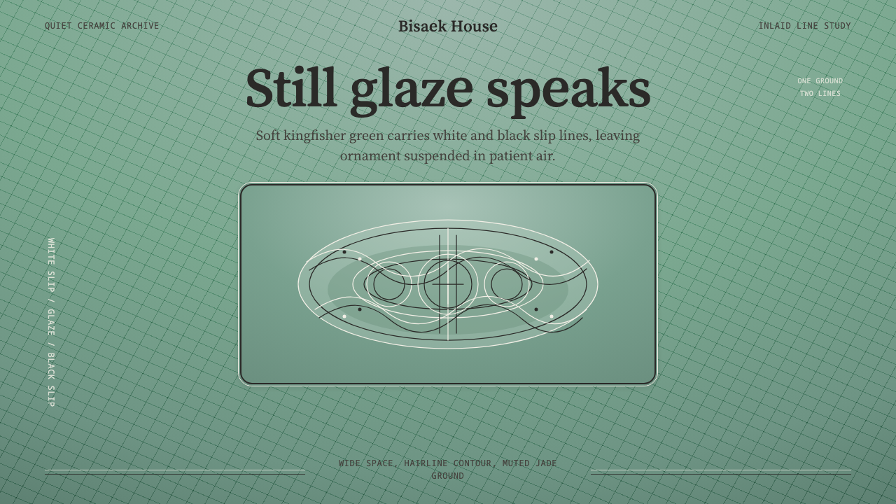
Goryeo celadon took a single glaze color and a single inlay technique and turned restraint itself into the ornament.
Goryeo Celadon 高麗青瓷 in brief
Goryeo inlaid celadon (sanggam cheongja) is a Korean ceramic tradition that reached its technical and aesthetic peak around the middle of the twelfth century. Its defining move is deceptively simple: a potter incises a fine linear motif — clouds, cranes, chrysanthemums, willow fronds — into leather-hard clay, packs the incised grooves with white and black slip, shaves the surface level, and then covers the whole body in a translucent jade-green glaze fired in a reduction kiln. The result is a surface where pattern lives inside the glaze rather than on top of it, visible but never raised, never competing with the glaze for attention.
The color the Goryeo court prized above all others was bisaek, sometimes translated as 'kingfisher color' — a soft, faintly grey-green jade tone, cooler and quieter than the bright teal or turquoise that popular imagination often assigns to 'celadon'. Bisaek was prized precisely because it was hard to achieve consistently: it depended on iron content in the glaze, the atmosphere inside the kiln, and the exact point at which reduction firing was stopped. A system built on this style treats that particular green as the entire ground plane of the page, and reduces every other visual element to hairline contour and wide, unhurried negative space.
What makes this style distinctive as a design language, rather than simply 'green with some line drawing,' is the discipline of the inlay itself. The white and black slip lines are never thick, never bold, never competing with the glaze for visual weight — they are drawn thin, sparse, and precise, then left to float in a sea of translucent color. Nothing is filled in solidly; nothing is rendered with volume or shading. The aesthetic asks for confidence in emptiness: most of the surface says nothing at all, and the little that is said, is said in a whisper.
Where does Goryeo Celadon 高麗青瓷 come from?
Celadon glazing itself arrived in Korea from Song-dynasty China, where potters had already perfected iron-reduction glazes that fired to soft blue-green tones. Korean kilns absorbed this technology in the early Goryeo dynasty (which ruled from 918 to 1392) and, over the following two centuries, refined it into something distinctly their own — a softer, greyer, more restrained green than the Chinese celadons it descended from. By the twelfth century, Korean potters were no longer following the Chinese model; contemporary Chinese observers themselves recorded admiration for Goryeo glaze quality, treating it as a peer tradition rather than an imitation.
The true Korean innovation, however, was not the glaze but the inlay technique layered beneath it. Sanggam — literally 'inlaid' or 'mutually engraved' — was a method rooted in Korean lacquerware and metal inlay traditions, adapted to ceramics sometime in the eleventh or early twelfth century. Rather than painting a design onto the surface, the potter carved it into the clay itself and filled the resulting channels with contrasting slip. This is a fundamentally sculptural approach to ornament: the pattern is structural before it is visual, embedded in the body of the object rather than applied to its skin.
The technique reached its most celebrated form under royal and aristocratic patronage in the middle of the twelfth century, produced at major kiln complexes on the southwestern coast of the Korean peninsula, in areas corresponding to modern Gangjin and Buan. These were court-supervised kilns producing wares for the Goryeo aristocracy and for ritual and diplomatic use — part of why the surviving pieces show such consistent restraint: this was ware made for a court audience that valued understatement as a marker of sophistication, not for a mass market that might have rewarded louder ornament.
The individual potters who achieved this peak of technical control are almost entirely anonymous; Goryeo ceramic production, like most East Asian court-kiln traditions, did not record artisan names. What survives is the collective achievement of workshops at Gangjin and Buan, whose finest wares are now treated as a high-water mark not just of Korean ceramics but of East Asian ceramic art generally — a peak that later Joseon-dynasty potters, working in different idioms, never attempted to directly reproduce.
What defines the Goryeo Celadon 高麗青瓷 look?
Color
The palette is built around a single dominant hue: bisaek jade-green, a soft, slightly grey-green tone rather than a bright or saturated teal. This green functions as ground, not accent — the color the entire composition rests on. Contrast comes only from the inlay: crisp white slip lines and, more sparingly, black slip lines, both used purely for linework rather than fill. There is no secondary color family; the palette's whole emotional range comes from how much green is left undisturbed.
Line and Inlay
Every motif is rendered as hairline contour — thin, continuous, drawn with a calligrapher's confidence rather than a draftsman's precision. Lines describe cranes in flight, cloud scrolls, or willow fronds, but never thicken into filled shapes and never accumulate into dense patterning. A motif is suggested by a few decisive strokes, then left alone. This is the single most transferable idea in the system: ornament exists, but it is drawn, never painted solid, and always outnumbered by the space around it.
Negative Space
Empty glazed surface is not a background waiting to be filled — it is the primary compositional material. A typical inlaid motif occupies a small fraction of the available surface, with the great majority left as pure, unbroken glaze. This is closer in spirit to the restraint of ink-wash painting than to Western decorative traditions that fear empty space. Applying this style means resisting the urge to balance every open area with another decorative element.
Motif Vocabulary
The recurring subjects are drawn from nature and read as auspicious symbols rather than pure decoration: cranes (longevity), clouds (impermanence), chrysanthemums (endurance), willow and reed (resilience). These motifs are typically arranged as isolated medallions or gently repeating bands rather than an all-over pattern — each appears as a considered event, not as wallpaper. A design system drawing on this vocabulary should treat each motif as a punctuation mark, not a texture.
Surface and Sheen
The glaze reads as smooth, cool, and faintly translucent, with a soft sheen rather than a hard gloss or matte chalkiness. Where it pools slightly — around incised lines, in low points of the form — the color deepens a shade, giving even a single-hue surface a quiet sense of depth without gradient or pattern. This translates into design work as a preference for soft, even surfaces over hard-edged flat color blocks, and subtle tonal shift over sharp value contrast.
Composition and Symmetry
Vessel-based composition tends toward a calm, centered symmetry — a single medallion centered on a bowl's interior, a repeating band evenly spaced around a vase's shoulder — rather than the dynamic asymmetry found in more modernist systems. The symmetry is quiet rather than rigid: motifs are hand-drawn, so perfect mechanical repetition is not the goal, and small variations between repeated elements are part of the style's handmade warmth rather than a flaw to be corrected.
Restraint as Signal
Because the court audience for this ware valued understatement, restraint itself became a marker of status and taste — the opposite of a design logic where more ornament signals more value. A piece that says less, and says it more precisely, reads as more refined than one that says more. This is perhaps the single hardest principle to import into contemporary design, where the instinct is often to fill space to demonstrate effort; the Goryeo system rewards the discipline to stop.

Who shaped Goryeo Celadon 高麗青瓷?
The Gangjin kiln complex, on the southern coast of the Korean peninsula, was one of two major production centers for Goryeo court celadon and is where much of the finest surviving inlaid ware was made. Operating under close court supervision, Gangjin potters had access to the best clay and glaze materials available and the sustained patronage needed to refine the sanggam technique over generations. Modern archaeological excavation of the Gangjin kiln sites has been central to reconstructing the technical history of the style.
Buan, on the western coast, was the second major court-supervised kiln complex and, alongside Gangjin, defines the geography of peak Goryeo celadon production. Buan wares are often noted for particularly fine, controlled inlay work, and excavated kiln sites there have yielded some of the clearest physical evidence of how the sanggam process was executed at scale — the layering of incision, slip-filling, and glaze this entire design system is built around.
Individual makers went unrecorded, as was standard for East Asian court-kiln production, but the collective technical achievement of these anonymous workshops is what modern scholarship treats as the peak of the tradition. Their surviving work is studied today primarily through museum collections and archaeological finds rather than through any documented biography or named school, which is itself consistent with the style's larger ethos: the object and its restraint speak for themselves, without an authorial voice demanding attention.
How do you use Goryeo Celadon 高麗青瓷 today?
Goryeo celadon is a demanding style to apply correctly because its entire logic runs against the instinct to fill a composition. Getting it right means treating the jade-green ground as the dominant compositional force and every other element — text, icon, chart — as a rare, deliberate mark placed into that field, the way a single crane medallion sits inside a large empty bowl.
For presentation slides, this style favors a cover built almost entirely from a calm green field, with a title rendered in thin, quiet type positioned off-center rather than dead-center — echoing the way a single motif sits within a vessel rather than commanding its full surface. Content and data slides should resist the temptation to add decorative dividers or background texture; a chart or a short list of figures should be drawn with hairline rules rather than filled bars or heavy borders, so that the data reads as inlay rather than as a solid block competing with the ground.
For web interfaces, this style suits dashboards and pricing pages that want to project calm authority rather than urgency — a jade-green field as base, with sparse linework used for dividers, icons, and card outlines instead of filled color blocks. Pricing tiers work well when the difference between plans is communicated through small, precise linework changes (a thin crane-like flourish marking the recommended tier) rather than through loud badges or saturated highlight colors. Interactive states should shift tone subtly, the way pooled glaze deepens near an incised line, rather than jumping to a bright accent color.
For editorial and marketing work, the style rewards a generous, magazine-like use of empty space: wide margins, a narrow measure for body text, and section markers rendered as single thin rules rather than boxed call-outs. Marketing pages benefit from committing to one full-bleed field of the jade tone per section, letting a single line of type or a single small motif do all the communicative work, rather than layering multiple colored panels.
The most common mistake is treating 'celadon' as any bright teal or turquoise background with some line-art on top — that misses both the greyed quality of bisaek and the discipline of sparse, considered placement. A second common mistake is over-filling: adding several motifs, borders, or icons to 'complete' a composition meant to stay mostly empty. The style succeeds when restraint reads as an intentional choice, not a decorative shortcut.
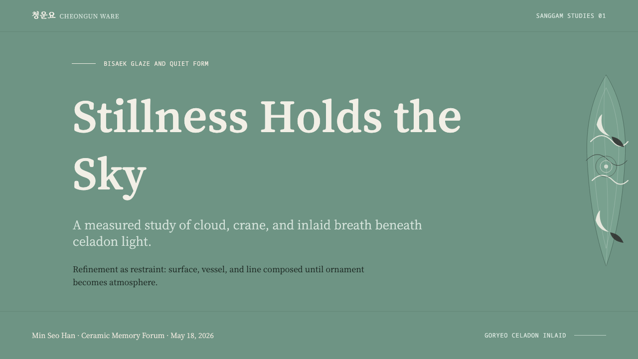
Goryeo Celadon 高麗青瓷 — FAQ
Is Goryeo celadon the same thing as Chinese celadon?
They share a technical origin but diverged into distinct traditions. Celadon glazing arrived in Korea from Song-dynasty China, and early Goryeo wares closely followed Chinese models. By the twelfth century, however, Korean potters had developed both a distinctive glaze tone — the softer, greyer bisaek jade-green — and the sanggam inlay technique, which has no direct Chinese equivalent at this level of refinement. The glaze family is shared; the inlaid style discussed here is a Korean innovation layered on top of it.
Why is the color called 'jade' when it's closer to grey-green?
'Jade' here refers to the prized East Asian nephrite tradition, where the most valued stones were not the bright, saturated green often associated with jade in Western popular culture, but softer, more subdued, slightly grey or milky tones. Bisaek celadon was named and prized by analogy to this refined jade aesthetic, not to a bright gemstone green. The comparison is about quality and restraint, not hue intensity.
What does 'inlay' actually mean here — is it painted on?
No — inlay is a carving-and-filling process, not a painting process, and that distinction is central to the style. The potter incises the design into the unfired clay, packs the grooves with white or black slip, then shaves the surface smooth before glazing. The pattern is embedded within the body of the object, sealed under the glaze, rather than sitting on top of it as paint would — which is why the lines read as so crisp and so permanently part of the surface.
Does this style only work with East Asian or historical subject matter?
No — the transferable core of the style is a compositional discipline, not a subject-matter requirement. The specific motifs (cranes, clouds, chrysanthemums) carry cultural meaning and are worth using thoughtfully, but the underlying principle — a single calm dominant color field, sparse hairline linework, and confident negative space — applies to any content that benefits from projecting calm and restraint, from a wellness brand to a financial dashboard. The motifs can be swapped for more neutral geometric marks while preserving the same logic.
How much negative space is 'too much' when applying this style digitally?
There is no fixed ratio, but the guiding test is whether the empty field still reads as intentional rather than unfinished. Historic inlaid celadon typically leaves the large majority of a vessel's surface as pure glaze, with a motif occupying only a modest fraction — often concentrated in a single band or medallion rather than spread evenly. In a digital layout, the practical failure mode is almost always adding too much rather than too little: a second decorative element, an extra border, or a gradient introduced to 'fill the emptiness.' If a composition still communicates its full hierarchy with half its ornament removed, it has likely reached the right amount, not too much.
Related design styles
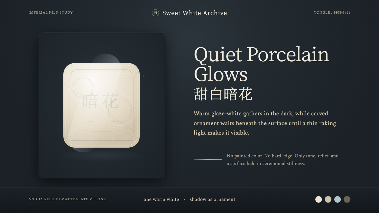 Jingdezhen BlancQuiet porcelain glows. Warm glaze-white on slate reveals hidden anhua incisio…
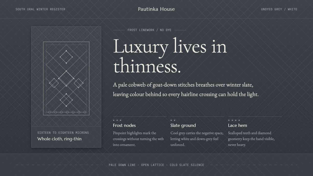 Orenburg Goat-Down Gossamer ShawlLuxury in thinness. Pale Cormorant type and down-lace lines breathe on Ural s…
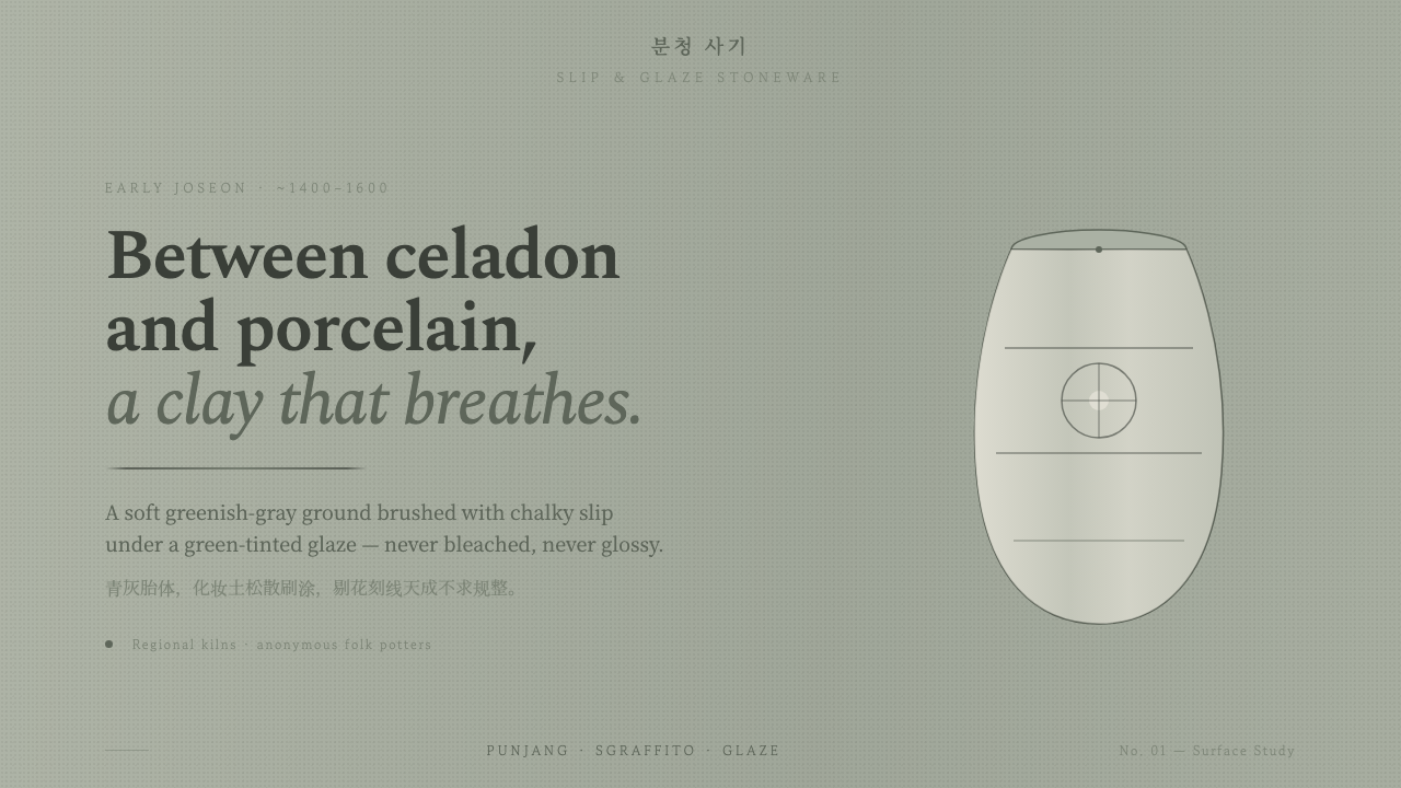 Buncheong Gray Slip WareBetween celadon and porcelain. Greenish-gray clay, chalky slip brushwork, dar…
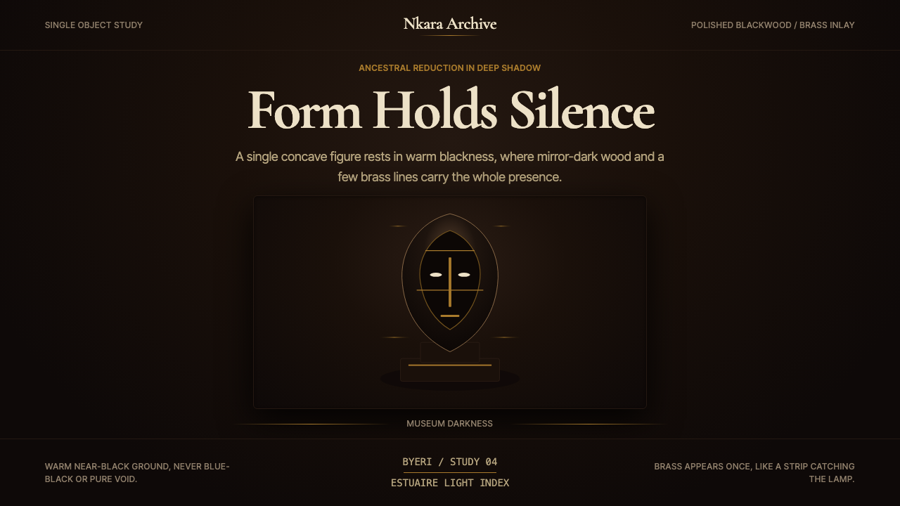 Gabonese Fang Mask & ByeriStillness has weight. Mirror-black forms, brass hairlines, and museum shadow…
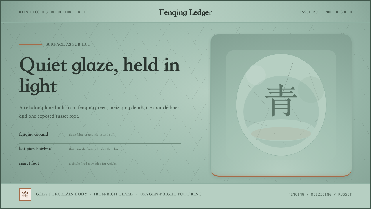 Longquan CeladonQuiet glaze carries the page. Fenqing green, crackle hairlines, and one russe…
 Song Ru Ware 宋汝窑Stillness made visible. Celadon ground, crab-claw crackle, one vessel in narr…