What is Longquan Celadon?
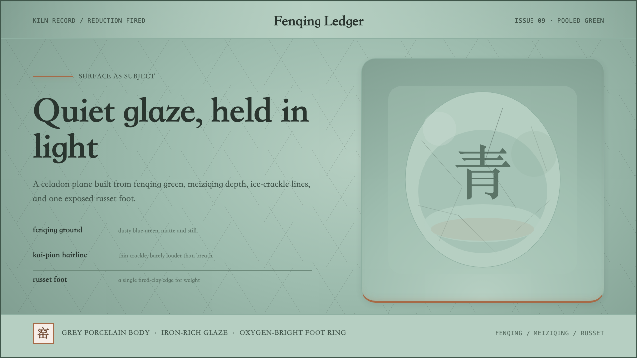
Longquan celadon turns the page into a glazed plane — quiet fenqing green pooled across every surface, a hairline ice-crackle running through the stillness, and a single russet accent at the base where iron meets fire.
Longquan Celadon in brief
Longquan celadon is a design system rooted in the glaze tradition of the Song-dynasty kilns of Zhejiang, southern China. Its visual logic treats every element on the page as if it were the surface of a fired ceramic vessel: the background is a cool, slightly dusty blue-green — the glaze color potters call fenqing — and all panels, cards, and content zones read as varying depths of the same pooled slip. The aesthetic is surface-first, material-honest, and deeply quiet.
Where most historical design movements organize by shape or type, Longquan celadon organizes by depth of field. Lighter areas feel closer to the glazed surface; darker celadon zones recede as if the glaze has thickened and puddled in a hollow. Occasional fine hairline textures running across the background evoke the ice-crackle network — called kaipian in Chinese — that forms when a glaze cools at a different rate than the clay body beneath it. This crackle is not a flaw; it is a signature of the kiln's chemistry and was cultivated deliberately by Song-era potters.
The one warm note in the entire palette is the unglazed foot-ring accent — the russet tone that emerges where iron in the clay body oxidizes during firing in spots where the glaze has pulled away. Used sparingly as a grounding accent for calls to action, borders, or typographic emphasis, this rust-brown element prevents the system from becoming purely cold. It is the trace of the human hand and the kiln's heat: exact, unplanned, and irreplaceable.
Where does Longquan Celadon come from?
The Longquan kilns of Zhejiang province have been producing celadon since at least the Five Dynasties period in the tenth century, but it was during the Song dynasty — particularly the Southern Song court's refuge at Lin'an (modern Hangzhou) after 1127 — that Longquan wares achieved their canonical form. Cut off from the northern kilns around Kaifeng and Ru by the Jin dynasty's invasion, the Southern Song court turned southward, and Longquan potters responded by refining their glaze formulas to achieve a color and surface quality that rivalled the court ceramics of the north. The kilns produced at enormous scale — by the Southern Song and Yuan periods, Longquan wares were being exported across the maritime Silk Road to the Persian Gulf, East Africa, and Southeast Asia.
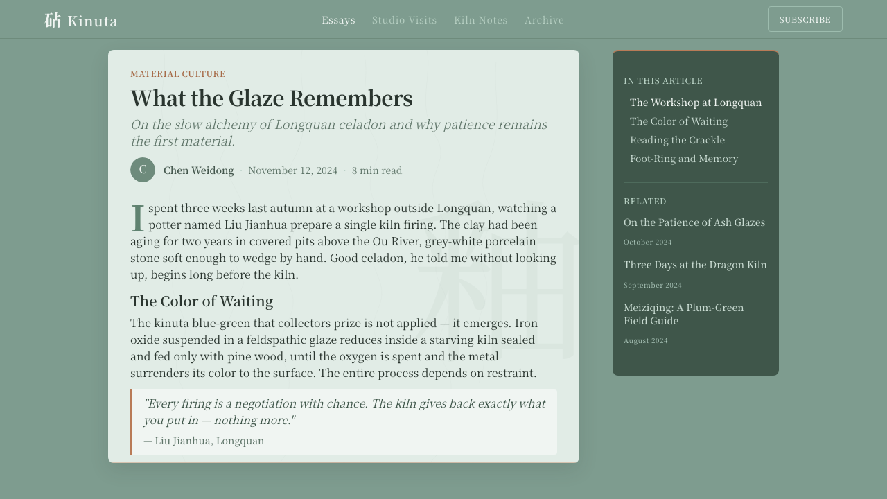
The glaze's color comes from iron oxide in the slip, fired in a reduction atmosphere — where oxygen is limited inside the kiln — which converts the iron to ferrous rather than ferric compounds, yielding the characteristic blue-green rather than a warm earth tone. Potters developed multiple named glaze types: kinuta (mallet) for the cooler jade-green associated with prestigious vessels; meiziqing (plum-green) for a deeper, more saturated blue-green; and fendiqing (powder ground celadon) for the palest, most translucent dusty variants. Each required precise control of kiln atmosphere, firing temperature, and glaze thickness. The kaipian crackle was a controlled accident — potters understood that applying a glaze that contracted more than the clay on cooling would produce the ice-crack network, and they learned to modulate its scale by adjusting glaze chemistry.
The literati aesthetic of the Song dynasty shaped what potters were valued for. Song scholars prized restraint, surface refinement, and the quality they called wen — a cultivated, understated elegance that opposed both ostentation and coarseness. Celadon vessels fit this aesthetic perfectly: their color evoked jade, the stone of moral virtue in Chinese tradition; their surface was quiet without being plain; and the subtle asymmetries and crackle patterns of hand-thrown and hand-glazed forms were read as evidence of authentic craft rather than mechanical repetition. This literati endorsement gave Longquan celadon a cultural authority that outlasted the Song dynasty itself.
Later dynasties continued and revived the tradition. The Ming dynasty saw expanded export production, and the Qing saw scholarly revivals in which kilns deliberately produced works in the Song glaze register. In the twentieth and twenty-first centuries, Longquan has been the subject of craft revivals tied to Chinese cultural heritage movements, and the town of Longquan in Zhejiang remains an active center of celadon production. UNESCO recognized Longquan celadon as an Intangible Cultural Heritage of Humanity in 2009, the first ceramic craft to receive this designation.
What defines the Longquan Celadon look?
Ground Color
The dominant hue is fenqing — a muted, slightly grey-tinged blue-green that sits between cool jade and celadon sea. It is never vivid or saturated; it reads as the color of something slightly translucent layered over a neutral ground, which is exactly what it is. The system applies this tone at multiple values: a paler, near-white variant for broad background fields, a mid-depth version for panels and cards, and a deeper pooled variant where elements sit closer to the notional bottom of the glazed vessel. The gradation is tonal, never sharp.
Ice-Crackle Texture
Kaipian — the hairline crack network that forms as the glaze contracts faster than the clay beneath it — is the system's signature textural element. In digital application, it appears as a barely-visible web of fine lines across background surfaces, light enough that it registers subliminally rather than competing with content. The crackle does not tile mechanically; it is irregular, organic, and distributed unevenly — denser in some areas, sparser in others — mimicking the kiln-born randomness of actual celadon. It is always lower in contrast than the surrounding glaze field.
Foot-Ring Accent
The single warm accent in the system is derived from the unglazed foot-ring of Song celadon — the russet, brownish-orange tone that the iron-rich clay body fires to where the glaze has not covered it. This accent appears sparingly: as the color of primary buttons, active states, key typographic emphasis, or fine borderlines used to ground a composition. Its warmth is stark against the cool celadon field, which means even small quantities carry significant visual weight. The contrast is not harsh — it is the contrast of a warm coal against cool ash, of human touch against glaze.
Typography
Body text sits in quiet Song-style serifs — typefaces that carry the brush-influenced stroke modulation of classical Chinese printing, with a horizontal base stroke and a slightly upward-angled finishing stroke. These serifed forms read as natural extensions of the ceramic surface's own refinement. For English text, a low-contrast serif with minimal wedge-shaped serifs serves the same register. Occasional brushed marks or informal calligraphic elements can appear as decorative anchors or section dividers, treated as ceramic maker's marks — singular, hand-placed, never repeated as a pattern.
Surface Softness
Song celadon glaze is described by collectors as yurong — jade-like in its warmth and soft translucency. The design system translates this as an absence of hard edges where depth is implied. Cards and panels do not have sharp drop shadows or crisp borders; they are differentiated from the background by subtle tonal shifts within the celadon range, by very slight opacity variation, or by the thinnest possible separator line in the foot-ring accent color. The overall impression is of elements floating just above the glazed ground, not crisply cut and mounted above it.
Negative Space
In actual Longquan celadon, the most important element of a vessel is often its undecorated surface — the glaze itself is the statement, and any added motifs (applied plum blossoms, incised fish, lotus petals) are subordinate accents on that field. The design system inherits this: generous negative space is not a compromise or a placeholder; it is the main event. Layouts breathe. Elements are placed with deliberate spacing that allows the fenqing ground to read as a presence in itself, not merely as a background waiting to be filled.
Ornament by Restraint
The Song literati aesthetic valued what it left out as much as what it included. Longquan celadon designs have no decorative borders for their own sake, no repeating pattern fills, no gradient washes, no drop caps or flourishes. When ornamental elements appear — a kaipian background texture, a maker's-mark brushstroke, a thin foot-ring line — they are singular and purposeful. The discipline is not minimalism in the contemporary marketing sense; it is the philosophical conviction that a well-chosen absence says more than a busy presence.

Who shaped Longquan Celadon?
Unlike the court-centered Ru or official kilns, Longquan celadon was largely the product of family workshop lineages whose names went unrecorded. Song-era Longquan potters — working in hundreds of kiln sites concentrated around the Ou River valley — developed the glaze formulas and reduction-firing techniques that defined the tradition. Their anonymity is itself characteristic: in the literati value system, the craft that submerged the maker's ego into the material's requirements was considered the highest form.
A persistent legend in Chinese ceramic history attributes the founding and refinement of Longquan celadon to two brothers — Zhang Shengyi (Elder Zhang) and Zhang Shenger (Second Zhang) — whose workshops supposedly established the kinuta and meiziqing glaze lineages respectively. Whether fully historical or partly legendary, the Brothers Zhang appear in gazetteers and local histories of the Longquan region, and their names remain attached to two distinct glaze traditions. The story functions as the tradition's creation myth: it assigns authorship and differentiates the style's major variants through a single narrative.
The elevation of Longquan celadon from a regional craft to an internationally traded prestige object was accomplished not by potters alone but by the Song dynasty's culture of literati connoisseurship. Scholars and officials who wrote treatises on ceramics — cataloguing glaze colors, comparing kiln outputs, debating the relative merits of different vessels — created the critical vocabulary and the social demand that drove the kilns' quality standards upward. This feedback loop between educated consumers and producing craftspeople is one of the distinctive features of Song material culture.
From the Qing dynasty onwards, successive waves of studio potters deliberately worked in the Song celadon register, studying kiln records, experimenting with reduction-atmosphere formulas, and producing works intended to evoke rather than imitate their Song predecessors. In the twentieth century, this revival tradition intersected with Chinese national cultural heritage movements. Contemporary Longquan potters — including several who have received state recognition as inheritors of the Intangible Cultural Heritage — continue to work within the glaze tradition while developing personal interpretations of the kaipian and the foot-ring accent.
While not a person, the UNESCO inscription of Longquan celadon as an Intangible Cultural Heritage of Humanity in 2009 — the first ceramic craft to receive this designation — marks a significant moment in the tradition's global legibility. The inscription formalized what scholars and collectors had long argued: that Longquan celadon represented not merely a local craft but a coherent aesthetic tradition with historical depth, technical complexity, and continuing vitality. For designers using this system, the UNESCO recognition underscores that engaging with Longquan celadon is engaging with a living tradition, not an archived one.
How do you use Longquan Celadon today?
Longquan celadon's fundamental principle — that the surface itself is the content — makes it unusually well-suited to contexts where calm authority and considered restraint communicate value. It works best when the product wants to signal cultural depth, craft heritage, or thoughtful quietness rather than energy, urgency, or novelty. Think ceramics studios, tea brands, cultural institutions, premium editorial publishing, architecture and interior design portfolios, or any digital product that values the idea of considered slowness.
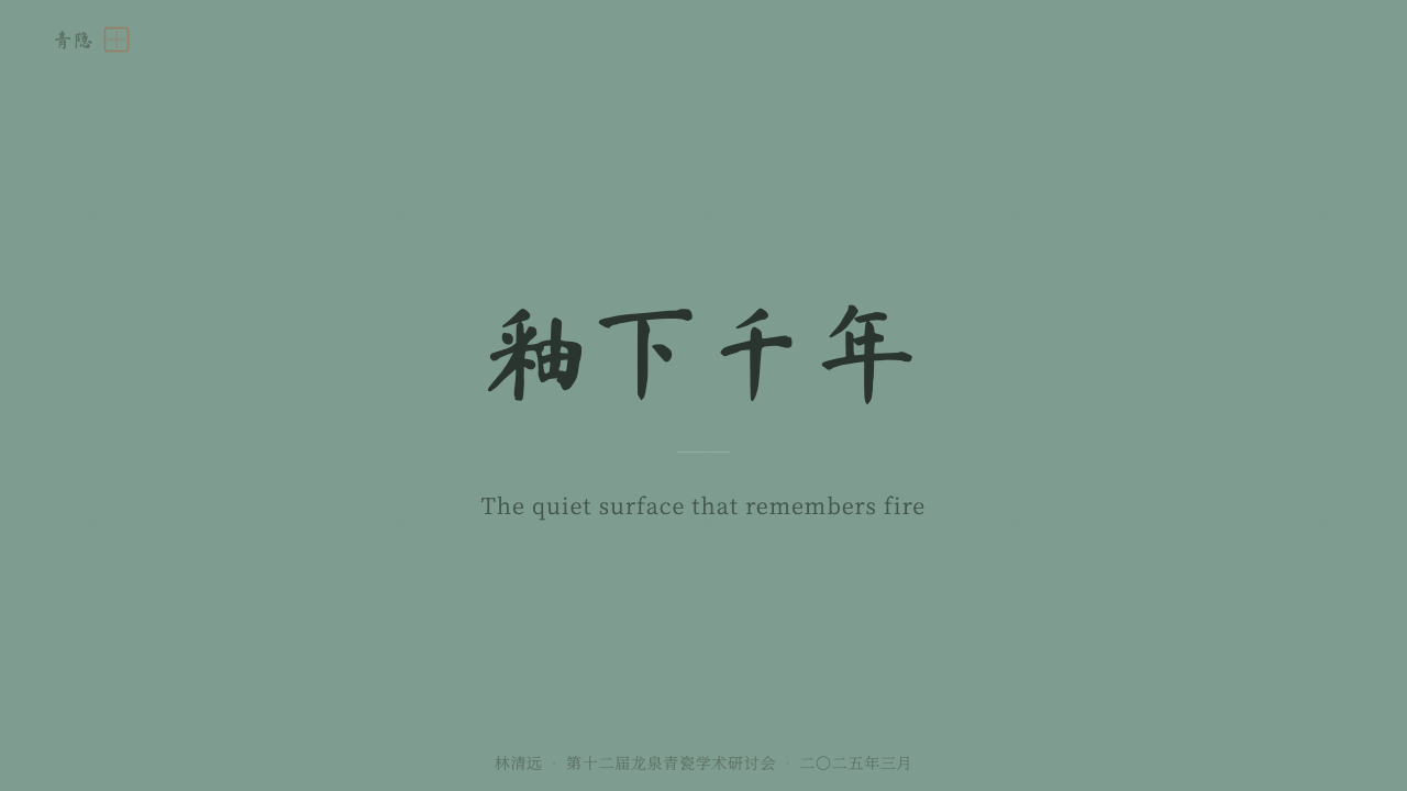
For presentation slides, the system excels on covers that need to convey gravitas without drama. A cover built on celadon works with the fenqing ground as the entire background, the title in a quiet serif, and perhaps a single foot-ring accent line separating the title from a subtitle. Content slides should treat data sparingly — fewer data points per slide, more breathing room around each — and reserve the warm russet accent for the single most important number or call-out on any given slide. Ice-crackle texture on data slide backgrounds, used at the lowest perceptible contrast, creates an impression of hand-crafted care around even the most functional content.
For web interfaces, Longquan celadon suits portfolio sites, cultural institution websites, premium product pages, and long-form editorial layouts. Dashboards can work if the data is intended to be contemplated rather than rapidly scanned — the system does not encourage eye-racing or anxiety. Navigation should be typographic and minimal; icon sets, if used at all, should be extremely reduced and line-drawn rather than filled or colorful. Cards and panels differentiate themselves from the ground through tonal depth within the celadon range rather than through shadow or border.
For editorial and marketing work, the style supports a pace that is slower and more considered than most contemporary digital content. Article layouts with generous margins, wide leading, and minimal inline interruptions are natural. Pull-quotes can appear in a slightly deeper celadon tone rather than in a separate accent color. Section dividers should be the thinnest horizontal lines in the foot-ring accent color — never bold rules, never decorative flourishes. Marketing pages work when the product's positioning genuinely supports quiet confidence; they fail when they fight the fenqing quietness with bold headlines and urgent calls to action.
The most common mistake when applying Longquan celadon is importing energy into a system that is fundamentally organized around stillness. Adding bright accent colors beyond the foot-ring russet, increasing saturation to compensate for perceived dullness, adding drop shadows with soft blur, or overlaying busy repeating patterns over the celadon ground all destroy the system's core character. The second most common mistake is treating the ice-crackle texture as a decorative pattern — it should be so subtle as to be nearly invisible; if visitors consciously notice it, it is already too prominent. The system rewards the designer who can sit with quietness and trust that restraint is itself a message.
Longquan Celadon — FAQ
How is Longquan celadon different from other Chinese ceramic design systems like blue-and-white?
Blue-and-white porcelain — which emerged as a dominant Chinese export aesthetic in the Yuan dynasty and was perfected at Jingdezhen — is fundamentally a system of painted decoration on a white ground. Its design logic is figural and narrative: motifs (dragons, landscapes, floral scrolls) are drawn onto the surface. Longquan celadon has no motifs in this sense; the glaze IS the design, and the surface is read as a field rather than a canvas. Blue-and-white is extrovert and descriptive; Longquan celadon is introvert and phenomenological. Both are unambiguously Chinese, but they express completely opposite aesthetic orientations.
Does Longquan celadon work in dark mode?
The historical celadon is unambiguously light: pale glaze on grey-white clay, read against natural light. A direct dark-mode inversion — deep blue-green background, near-white text — loses the most important quality of the system, which is the sense of glazed translucency. A more considered dark adaptation would use the deep meiziqing glaze color (the darkest variant of the celadon range) as the darkest background tone rather than pure black, preserve the tonal differentiation between background zones using celadon variants rather than switching to dark greys, and keep the foot-ring accent as the only warm element. Done carefully, this reads as the inside of a celadon-glazed vessel rather than as an inverted version of the light system.
Is Longquan celadon suitable for products that need to feel modern and contemporary, or does it read as historical?
The style has a dual valence that skilled designers can work with. Applied literally — Song-style serifs, overt ice-crackle textures, explicit ceramic motifs — it reads as deliberately historical and culturally situated. Applied with restraint — the celadon color field with generous white space and a minimal contemporary typeface, the foot-ring accent as a precise button color — it reads as considered quietness rather than overt historicism. Contemporary brands in premium goods, wellness, architecture, and cultural sectors have used celadon's palette without its most archaeological-looking elements, achieving something that reads as both principled and new. The key is to use the aesthetic logic (surface depth, tonal restraint, negative space) rather than the surface vocabulary (kaipian texture, brushwork marks).
How should the ice-crackle texture be treated to avoid looking decorative or busy?
The rule is simple: the crackle should be visible in close inspection and invisible in peripheral vision. If someone is reading the page and consciously sees the texture rather than the content, it is too prominent. The correct approach is to set the kaipian lines at a contrast ratio that is detectable when the eye deliberately looks for it — perhaps slightly lighter or slightly darker than the ground tone by the minimum perceptible amount — and to vary the density irregularly, denser in corners and edges, sparser in the central reading zone. The texture should never be more prominent in the center of any content block than at its periphery.
Can Longquan celadon work for a product aimed at users who are unfamiliar with Chinese ceramic history?
Yes, because the system's core qualities — tonal quietness, surface depth, warm-cool tension, negative space — communicate across cultural reference frames even when the specific historical source is not recognized. A viewer who has never seen a Longquan celadon vessel will still register the system as calm, considered, and materially serious. The cultural specificity becomes legible as they spend time with it, and for global audiences, the hint of cultural depth is an asset rather than a barrier. The risk is the opposite: applying the system in a context where energy, urgency, or populist accessibility are required values, regardless of the audience's cultural background.
Related design styles
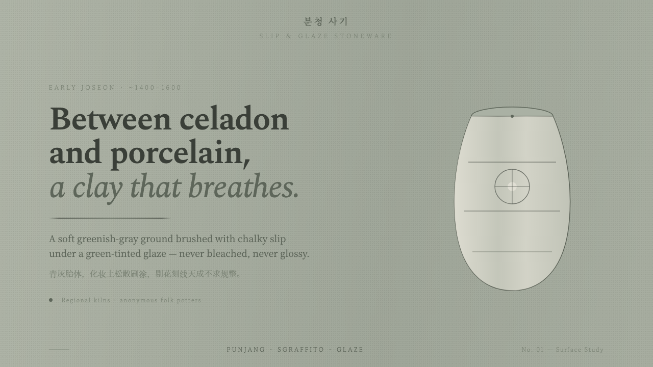 Buncheong Gray Slip WareBetween celadon and porcelain. Greenish-gray clay, chalky slip brushwork, dar…
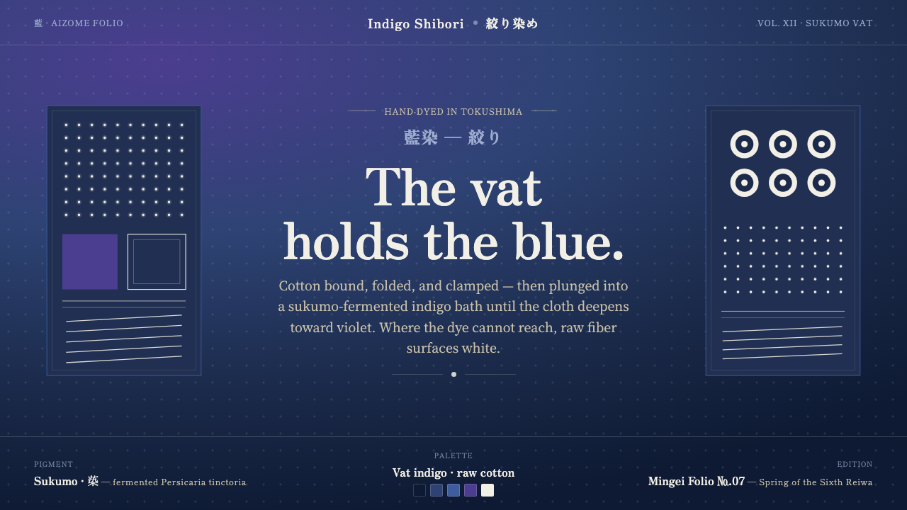 Indigo ShiboriCloth before image. Bound cotton plunged into sukumo vats — raw-white resist…
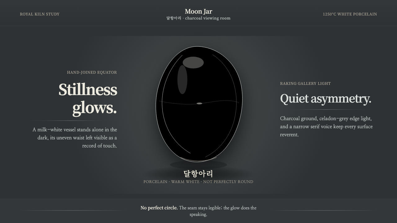 Joseon Moon JarQuiet imperfection glows. Milk-white porcelain floats on charcoal with a visi…
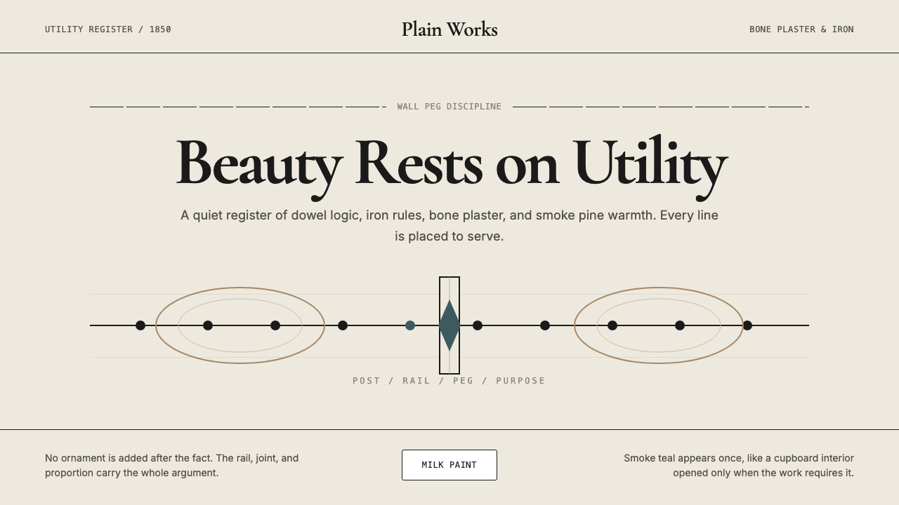 Shaker Furniture 1850Utility becomes beauty. Bone plaster, iron black, smoke pine, and one smoke-t…
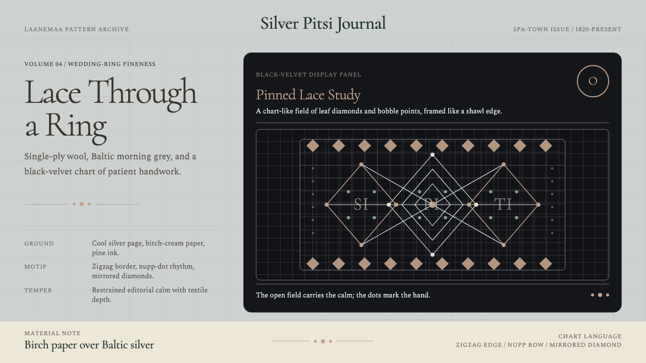 Estonian Haapsalu Lace ShawlQuiet craft, held in silver light. Cormorant type meets nupp dots and velvet…
 Goryeo Celadon 高麗青瓷Stillness carries ornament. Bisaek jade ground holds white and black hairline…