What is Cherry Blossom Hanami?
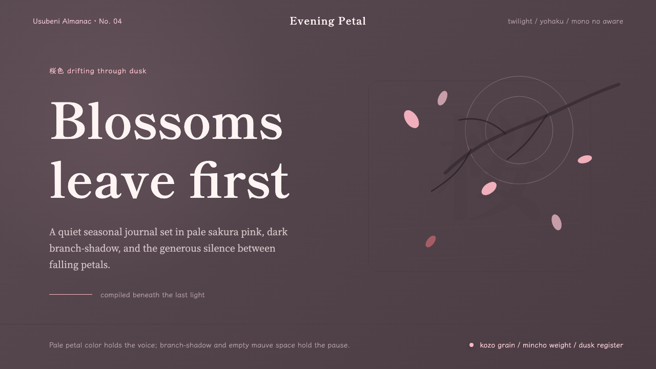
Cherry Blossom Hanami is the visual language of transience — pale sakura pink against dusk-grey bark, branch silhouettes reaching across wide empty fields, and the quiet conviction that beauty is most felt in the moment before it disappears.
Cherry Blossom Hanami in brief
Cherry Blossom Hanami draws its visual logic from the Japanese tradition of hanami — the practice, documented as early as the Nara period (710–794) and formalized in the Heian court by the ninth century, of gathering beneath flowering cherry trees to contemplate the blossoms and, in contemplating them, to reckon with the fact of their falling. The aesthetic is inseparable from the philosophical concept of mono no aware, the 'pathos of things': a gentle, bittersweet awareness of impermanence that the Japanese tradition regards not as melancholy but as a form of heightened attention.
The visual system refuses the cheerful postcard register of bright pink against blue sky. Instead it reads sakura in its authentic dusky light: petals that are almost white with the faintest blush, shadows the color of old bark and rain-soaked wood, and a background drawn from the grey-mauve of twilight. The mood is contemplative rather than celebratory, and this tonal restraint is what distinguishes Hanami from generic cherry-blossom illustration.
Structurally, the style is governed by yohaku — the cultivated Japanese practice of leaving space, of treating emptiness as an active compositional decision rather than an absence of content. Large fields of negative space are not blank but inhabited by mood. A few sparse branch elements and drifting petals do the work that a busier design would assign to dozens of objects. Type is handled in Shippori Mincho or similar Mincho-style faces: quiet, precise, carrying the weight of a brushed character without heaviness.
Where does Cherry Blossom Hanami come from?
The practice of hanami is older than any surviving visual record. The word itself — hana (flower) and mi (seeing, looking) — appears in poetry anthologies of the eighth century, where 'flower' in aristocratic usage meant sakura specifically. The earliest hanami were imperial rituals: the Emperor Saga (786–842) held flower-viewing banquets in the Imperial gardens at Kyoto, establishing a tradition that linked the blossom to courtly elegance and temporal power. The Heian-era poetry collection Man'yoshu and the later Kokinwakashu are full of sakura verse, and it is in this literature that the aesthetic values now associated with the blossom — its whiteness, its brevity, the ache of watching it fall — were first given formal expression.
The democratization of hanami came in the Edo period (1603–1868), when the Tokugawa shogunate planted thousands of cherry trees along river banks and in public parks, particularly in Edo (present-day Tokyo). The eighth shogun, Tokugawa Yoshimune, planted rows of Somei Yoshino trees at Ueno and along the Sumida River in the 1720s, explicitly to give the townsfolk (machishū) places to gather. By the late Edo period, hanami had become one of the largest mass events in Japanese urban life — festive, rowdy, and deeply communal, a counterpoint to the aristocratic solemnity of its origins.
The visual tradition of sakura representation runs through Japanese painting for over a millennium. The Yamato-e painters of the Heian court depicted blossoms in the pale-on-pale register now associated with the style, distinguishing them from the vivid mineral pigments used for other subjects. The Rinpa school, founded by Honami Koetsu and Tawaraya Sotatsu in the early seventeenth century, refined the visual grammar of sakura into something more abstract: gold ground, flat petal forms, near-monochromatic color, and deliberate empty space that the viewer must complete with their own attention. This is the visual lineage that the Hanami design system draws directly from.
The Meiji-era introduction of Western printing and color lithography gave sakura imagery a new popular channel, and woodblock artists including Hiroshige and, later, Kawase Hasui translated the blossom's atmospheric qualities into mass-printed form. Hasui's taisho and early Showa prints, in particular, capture the dusky, twilight register — blossoms seen at dusk or under lantern-light — that the Hanami design system consciously references. The system is not a citation of any single historical work but a distillation of the tonal and spatial logic shared across this long tradition.
What defines the Cherry Blossom Hanami look?
Color Palette
The palette is drawn from a single twilight moment: petals that read as almost-white with a barely perceptible pink undertone, bark and branch shadows in dark grey-brown, a background that sits in the register of ash, mauve, and rain-dampened stone. There is no bright pink, no sky blue, no synthetic warmth. The effect is chromatic compression — the eye perceives depth and atmosphere through the relationship between a very narrow set of closely related tones rather than through saturation contrast.
Negative Space
Yohaku — cultivated emptiness — is the primary structural device. In Hanami composition, the empty field is not the absence of content but the content itself: it holds the mood, extends the silence between petals, and forces the eye to complete the image. Designs following this principle resist the urge to fill. Two or three visual elements in a large field will feel more complete than a dozen competing for the same space. The emptiness is earned by the quality of what breaks it.
Branch and Petal Geometry
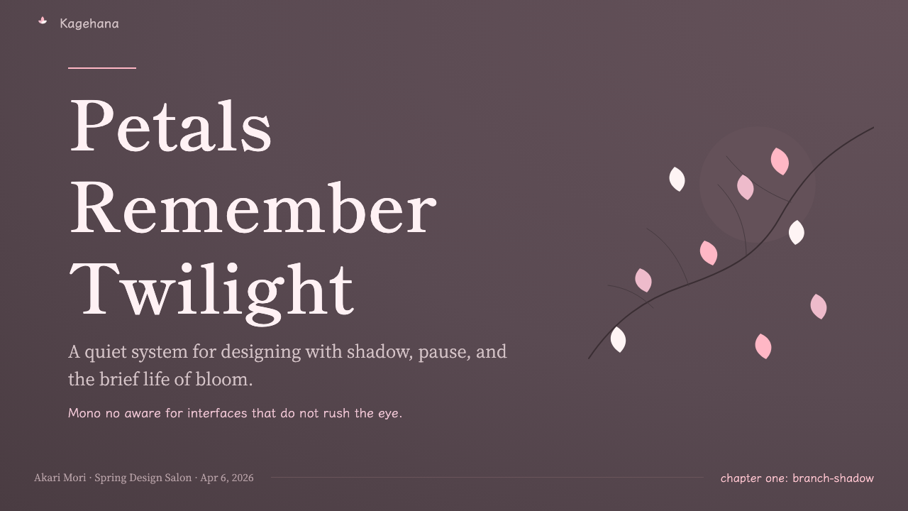
Branches in Hanami composition are never symmetrical. They enter the frame diagonally from a corner or edge, reaching without completing — the destination of the branch is always outside the frame. Petals drift off-centre, clustered loosely near the branch origin and scattered singly toward the open field. The irregularity is deliberate: it reproduces the actual asymmetry of a wind-moved blossom, and it prevents the composition from resolving into a closed, satisfying shape. A viewer's eye should still be moving when the image ends.
Typography
Mincho-style type — the Japanese serif, with its ink-brush-derived modulated strokes and triangular terminals — is the typographic soul of this style. It carries brushwork memory without looking calligraphic. In vertical settings, which are appropriate for more ceremonial uses, Mincho reads as classical and composed. In horizontal settings, it provides a quiet counterweight to the atmospheric image field. Type should be sparse: a few characters set at generous tracking, positioned with the same intentionality as a branch element, not crowded into a corner.
Dark Ground
Hanami is a dark-palette system. The blossoms are pale; everything else pulls toward shadow. This is not a decorative darkness but a representational one: sakura viewed at dusk, or under lantern-light, appear luminous against the dark precisely because the surrounding air has deepened. The dark ground gives petals their atmospheric glow. On a light background, the same petals flatten into illustration; against deep grey or near-black, they appear to float forward out of the picture plane.
Asymmetric Stillness
The mood of mono no aware is not agitation but arrested motion — the blossom already falling, already gone, the sensation of witnessing something in its last moment. Hanami compositions achieve this by balancing movement and stillness in the same frame: branches that imply motion, petals mid-drift, set against a completely static atmospheric ground. Symmetry would neutralize the tension; asymmetry preserves it. The viewer feels time moving even when nothing in the image is moving.
Restraint in Decoration
Hanami achieves its effect through subtraction, not addition. Every element that is not the branch, the petal, and the ground is a candidate for removal. Gradients, textures, and layered effects break the tonal compression that gives the palette its depth. Frames, borders, and geometric containers interrupt the flow of the branch across open space. The discipline is closer to the Japanese concept of ma — the meaningful pause — than to minimalism: it is not that less is more, but that silence, given enough room, becomes eloquent.

Who shaped Cherry Blossom Hanami?
The Emperor Saga (786–842) institutionalized hanami as an imperial ceremony, holding the first recorded flower-viewing banquets in the imperial gardens at Kyoto. The Heian court poets — including Ono no Komachi and Ki no Tomonori — produced the foundational sakura verse in the Kokinwakashu (905 CE), establishing the metaphors of brevity, beauty, and grief that define the Hanami aesthetic to this day. Without this literary institution, the blossom would not carry its symbolic weight.
Sotatsu (c. 1570–c. 1640), co-founder of the Rinpa school with Honami Koetsu, developed the tarashikomi technique — pooling wet ink and color into each other to create atmospheric, cloud-like forms — and applied it to sakura subjects on gold-ground screens. His works demonstrate the Hanami compositional principle most purely: a few bold elements placed asymmetrically in a field of deliberate emptiness, with the gold ground functioning as compressed light rather than mere background. Sotatsu's influence on subsequent Japanese visual art, and on the Hanami visual register specifically, is foundational.
Hiroshige (1797–1858) was the great chronicler of seasonal Japan in woodblock form, and his sakura prints — particularly his views of Ueno and the Sumida River during blossom season — established the popular visual vocabulary of hanami for mass audiences. His treatment of atmospheric depth through layered flat tones, his economy of color, and his ability to place figures within a blossoming landscape without diminishing the flowers' dominance all contributed to the visual language that the Hanami design system inherits. He demonstrated that the dusky sakura register could be achieved with a small number of carefully chosen colors.
Hasui (1883–1957) was a shin-hanga (new prints) artist whose work represents the fullest visual articulation of the twilight sakura aesthetic. His prints of blossoming trees at dusk, often reflected in still water, capture the atmospheric compression that defines the Hanami palette: blossoms that glow pale against deepening grey skies, the air itself becoming color. Hasui's work is the most direct visual precedent for the Hanami design system's dark-ground, luminous-petal composition — and his prints remain among the most collected Japanese artworks of the twentieth century.
Mono no aware — usually translated as 'the pathos of things' or 'an empathy toward things' — was theorized as a formal aesthetic concept by the eighteenth-century scholar Motoori Norinaga, though it describes a sensibility that runs through Japanese poetry and art from the earliest periods. Norinaga identified it as the defining characteristic of The Tale of Genji and, more broadly, of Japanese literary sensibility: the bittersweet awareness of transience that makes a thing's beauty inseparable from the knowledge of its passing. The Hanami visual system is, in part, an attempt to translate this feeling into a spatial and chromatic logic.
How do you use Cherry Blossom Hanami today?
Hanami is a style that communicates through atmosphere rather than information density. Applying it well requires resisting the conventions of contemporary digital design — the filled grids, the saturated color systems, the content-heavy layouts. The first principle is restraint: if you have added five elements, remove two. The space you reclaim is not empty; it is doing the work of conveying the mood that the remaining elements alone cannot achieve.
For presentation slides, Hanami excels at ceremonial or contemplative moments — opening slides, transition slides, and cover pages where the goal is to establish a feeling before content begins. A cover built on this system needs only three decisions: where the branch enters the frame, where the title sits in relation to the petal field, and what the ground color is. Content slides work when a single strong visual occupies the left half or top third of the slide while the right or lower portion holds type in Mincho at generous tracking — the layout suggests a scroll rather than a deck. Data slides are harder; the style does not support dense chart grids. Use it for a single key number or a simple ratio, set in large open type against the atmospheric ground.
For web interfaces and digital product design, Hanami is most naturally suited to landing pages, long-form editorial experiences, and product moments that call for contemplative slowing — a confirmation screen, an onboarding welcome, a premium tier presentation. The dark palette works well on OLED displays where black ground costs nothing in brightness. Navigation and UI controls should be typographic and minimal; any widget with rounded corners and gradient fills will break the tonal system immediately. If the interface requires density and interactivity, reserve the Hanami visual language for hero or interstitial moments only, and keep the functional UI in a separate neutral system.
For editorial and marketing work, the style is well-matched to cultural and luxury brand contexts: arts organizations, Japanese or Japanese-influenced products, hospitality, fragrance, fashion. A Hanami-derived layout places a single large atmospheric image — the branch, the petals, the dusky ground — as the primary visual, with type sitting within it rather than beside it. Headlines should be few words at large scale; body text, if present at all, sits at a size where it recedes rather than competes. The style supports vertical reading direction for Japanese audiences, and this orientation — type flowing downward on the right side of an image field — is worth exploring in bilingual contexts.
The most common mistake when applying Hanami is introducing color contrast too early. Designers accustomed to working with bright color palettes reach for accent colors to make elements stand out, but the Hanami system creates depth through tonal proximity, not contrast. Adding a vivid color — even a single instance of bright pink or blue — collapses the atmospheric compression and makes the composition feel illustrative rather than evocative. The second common error is overworking the branch element: multiple branches entering from multiple directions, fully rendered with every twig visible, eliminates the sense of incompleteness that gives the style its tension. A single partial branch, partially cropped, does more work than a full tree.
Cherry Blossom Hanami — FAQ
Is Hanami the same as general Japanese or 'wabi-sabi' aesthetics?
They are related but distinct. Wabi-sabi centers on imperfection, roughness, and the beauty of wear — it tends toward earthy textures, asymmetric handmade forms, and the patina of age. Hanami is more specifically about transience and atmospheric luminosity: the blossoms are not worn or aged but intensely alive for a brief moment. Wabi-sabi would be comfortable with a cracked ceramic glaze or a weathered wall; Hanami is specifically about something that is perfect while it lasts. The color systems are also quite different — wabi-sabi pulls toward warm earth tones, while Hanami stays in cool grey-mauve and pale pink.
Can Hanami work in a light-background, daytime register?
It can, but it loses something essential. The dusky dark ground is what gives the petals their atmospheric glow — against a light background, the same petals become flat illustration rather than luminous form. A daytime version is technically possible using very pale grey-lavender grounds and off-white petals, but the result tends to read as cherry-blossom motif rather than Hanami sensibility. If a light background is required by the context, use it, but expect to compensate elsewhere: more generous negative space, sparser petal elements, and even more restrained typography.
How do I prevent Hanami from reading as generic 'Asian-themed' design?
The difference between Hanami and generic Asian-themed decoration is structural, not superficial. Generic decoration uses cherry blossoms as pattern — repeated, symmetrical, filling space as texture. Hanami uses a single branch and a few petals as compositional architecture, with the empty ground as active space. The test is: if you removed the blossoms, would there still be a composition? In Hanami, yes — the branch placement and negative space hold the layout even without the petals. In generic decoration, no — there is only fill. Avoiding bright pink, avoiding symmetry, and avoiding fully rendered landscapes will do more than anything else to distance the work from cliché.
What kind of products does Hanami suit, and where does it struggle?
Hanami is well-suited to products and contexts where slowness, contemplation, and cultural refinement are genuine values: cultural institutions, Japanese products and experiences, luxury hospitality, high-end editorial, fragrance and cosmetics brands, and any brand whose proposition involves a considered, unhurried relationship with the user. It struggles wherever speed, clarity, and information density are required: SaaS dashboards, e-commerce category pages, news interfaces, and utility applications. The style's slowness is a feature, not a limitation — but it is only a feature in contexts where the user's time is meant to expand rather than compress.
How is Hanami different from other Japanese design styles like Metabolist architecture or Superflat?
They come from entirely different traditions within Japanese culture. Metabolist architecture (1960s) was forward-looking and techno-utopian, drawing on organic and cellular metaphors for an industrial future — its visual vocabulary is modular, structural, and cold. Superflat (coined by Murakami in 2000) is a postmodern commentary on consumer culture and anime, using flattened perspective, bright color, and graphic intensity. Hanami predates both by centuries and draws on a pre-modern literary and painterly tradition of nature contemplation. Where Metabolist and Superflat are responses to modernity, Hanami is an expression of something that predates it — a visual language for experiences that modernity cannot produce.
Related design styles
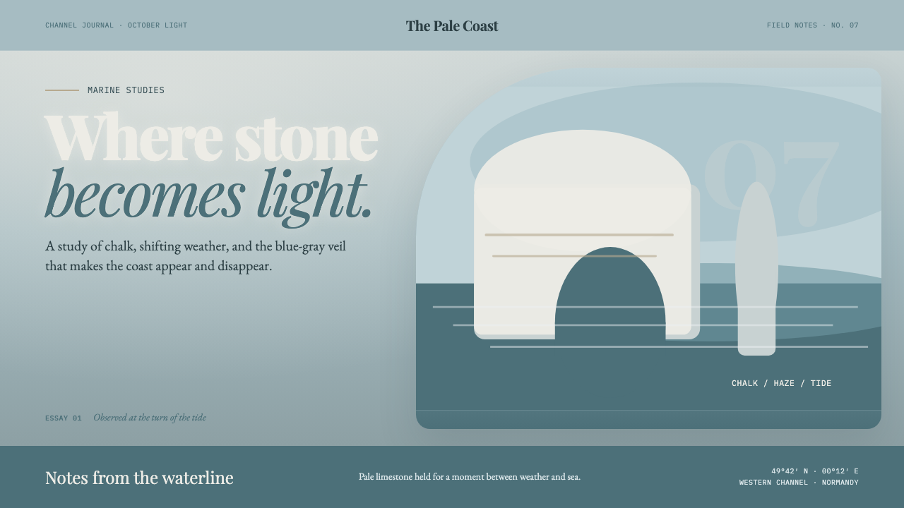 Étretat Chalk CliffsStone becomes light. Chalk-white forms dissolve through blue-gray mist and li…
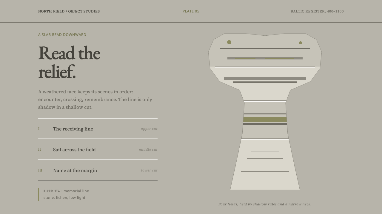 Gotland Picture StoneMeaning emerges slowly. Weathered limestone greys divide a story into shallow…
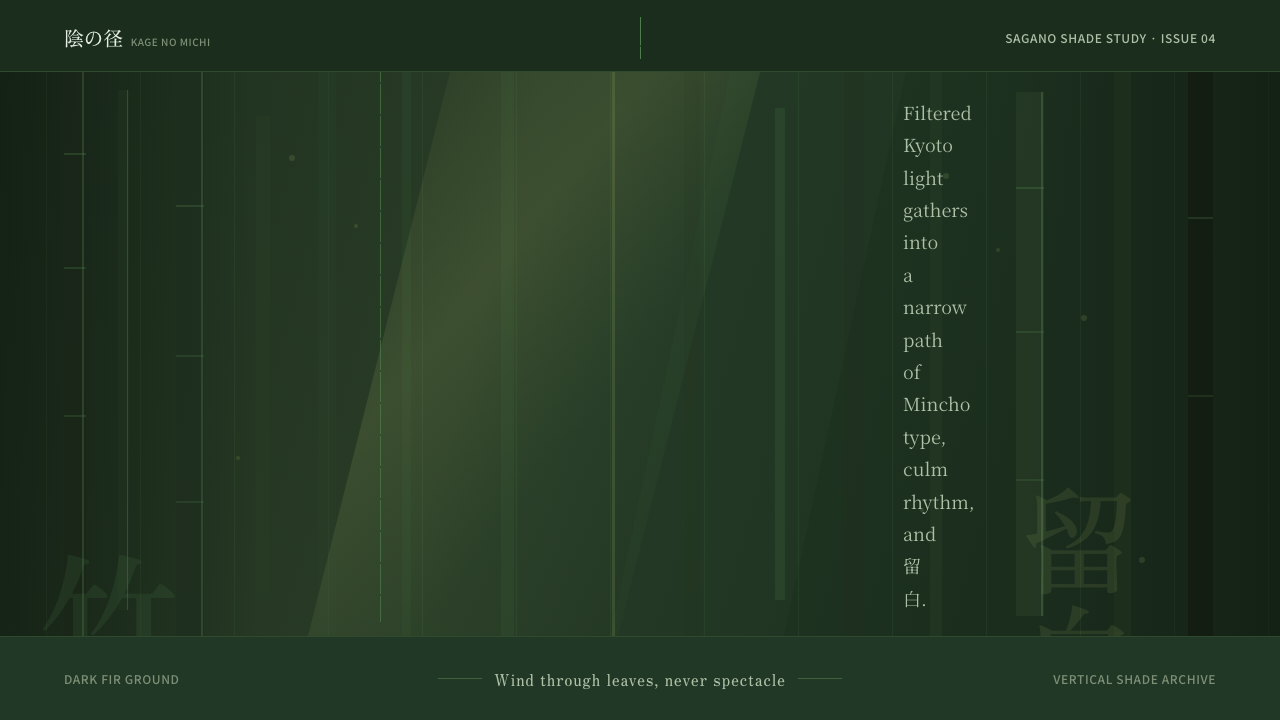 Bamboo GroveQuiet goes vertical. Fir green, Mincho type, and dappled culm rules create de…
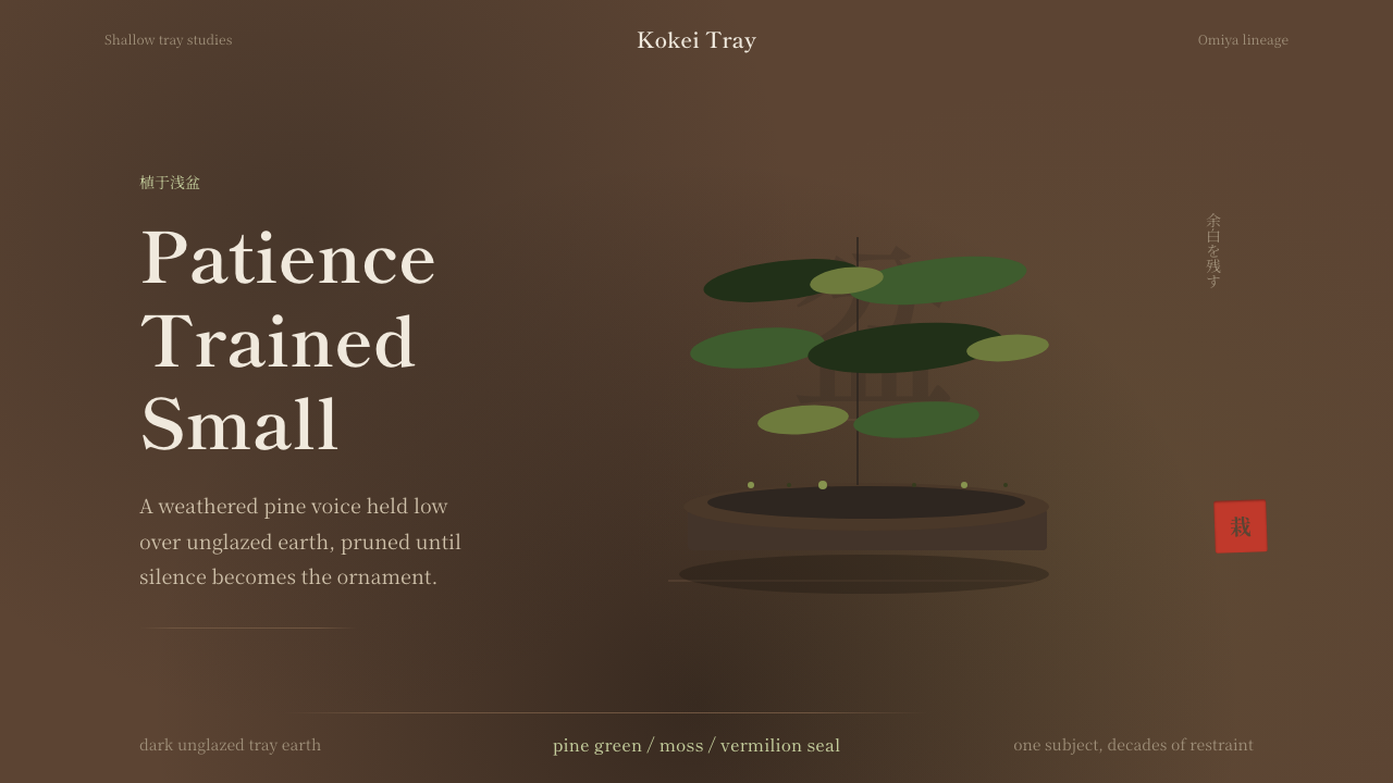 Bonsai CultivationQuiet asymmetry. Pine green rests on dark tray earth, sealed by one vermilion…
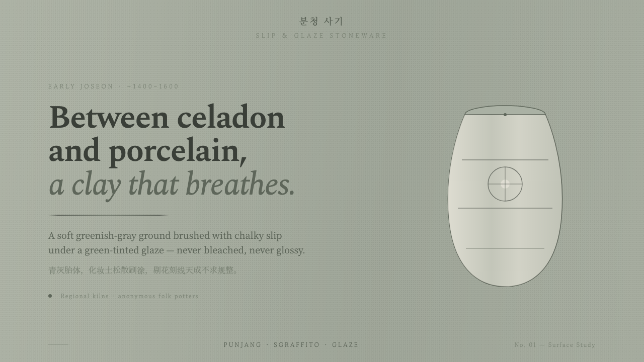 Buncheong Gray Slip WareBetween celadon and porcelain. Greenish-gray clay, chalky slip brushwork, dar…
 Chinese Ink Wash 水墨A thousand years of restraint. Six tones of ink on rice-paper warmth, a singl…