What is Chinese Ink Wash 水墨?什么是 Chinese Ink Wash 水墨?
A thousand years of monochromatic restraint — ink, emptiness, and a single seal-red accent that says everything by saying almost nothing.千年单色克制——墨、留白,与一抹印泥红,以近乎无言之姿道尽一切。
Chinese Ink Wash 水墨 in briefChinese Ink Wash 水墨 速览
Chinese Ink Wash (水墨) is a design language rooted in one of the world's oldest continuous painting traditions. Its visual grammar is built on a radical act of reduction: the entire chromatic vocabulary is six tonal grades of black ink — from charred, glossy black to the faintest translucent wash — laid on a warm rice-paper ground. A single seal-red accent is permitted, and it appears only where a master would press a carved stone chop onto a finished scroll: sparingly, decisively, and with full weight of meaning.水墨,是植根于世界上历史最悠久的连续绘画传统之一的设计语言。其视觉语法建立于一种彻底的削减之上:全部色彩词汇仅为六种墨色——从焦黑光亮到最淡的透明墨迹——落于宣纸般的暖白底色之上。仅允许一抹印泥红作为点缀,且只在大师将篆刻石章按于画卷末尾之处方才出现:克制、果断,且承载着完整的意义重量。
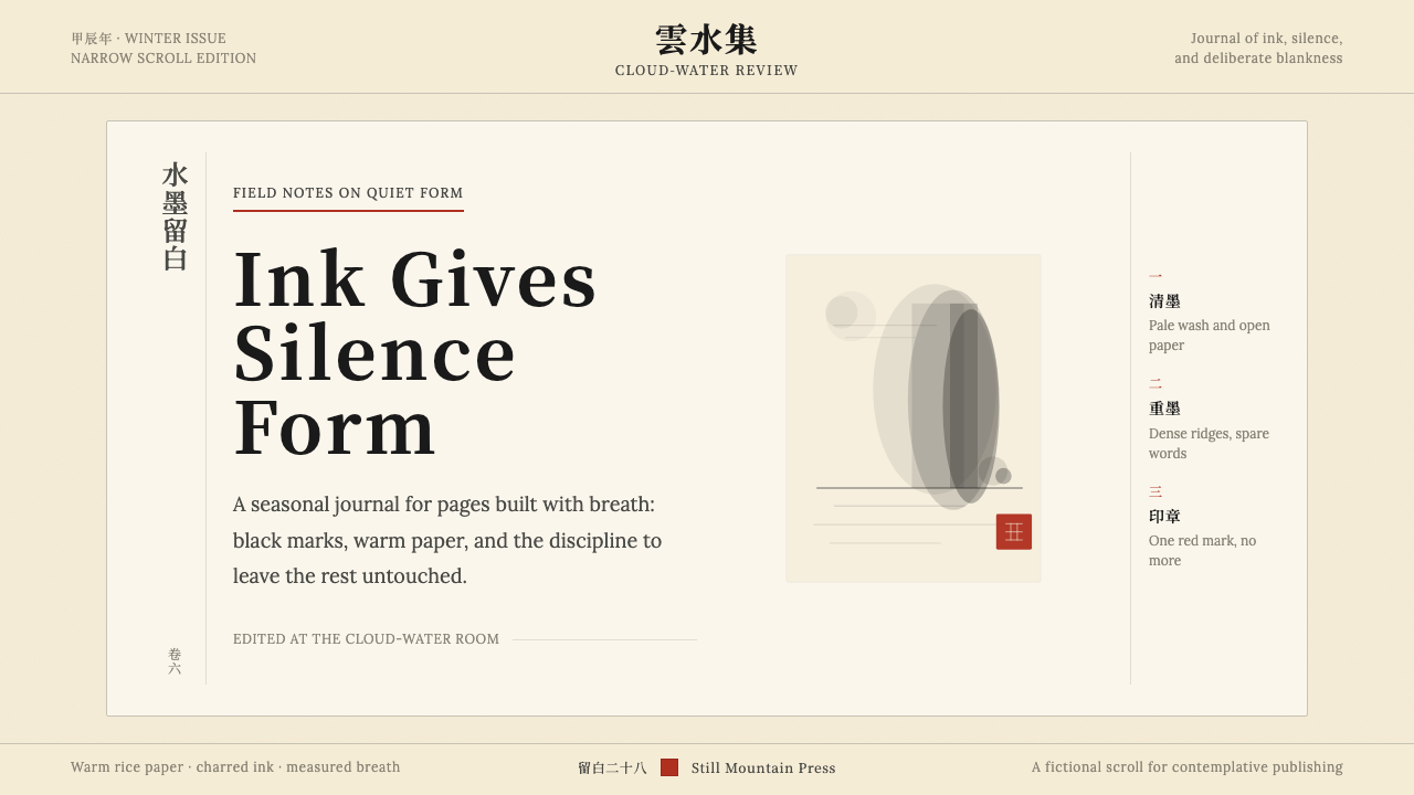
The animating principle of the style is 留白 (liú bái) — literally 'leaving white', more precisely 'deliberate emptiness'. In Chinese painting theory, the unpainted areas of a composition are not voids to be filled but active participants in the image. Fog is not absent mountain; it is mountain seen through different eyes. Applied to design, this means that generous negative space is not a stylistic preference but a philosophical commitment: the silence around a mark gives the mark its resonance.这种风格的核心原则是「留白」——字面意义为「留下白色」,更精确地说是「刻意的空」。在中国画论中,构图中未着墨的区域不是等待填充的空洞,而是画面的主动参与者。烟雾并非缺席的山峦,而是以另一种目光所见的山。应用于设计,这意味着大量留白不是风格偏好,而是哲学承诺——笔触周围的沉默,赋予笔触以回响。
Visually, Ink Wash work is immediately legible as a system. Brushwork ranges from the fluid, wet strokes of a bamboo stalk to the dry, broken texture of a scholar's rock. Classical serif typography — the digital descendant of Song Dynasty woodblock type — carries the weight of calligraphic authority. Vertical text orientation is natural rather than novelty. Asymmetric compositions create balance through tension rather than mirroring, and the entire arrangement breathes with a quality the tradition calls 气韵 (qìyùn): the vital rhythm that separates a living composition from a dead one.水墨作品在视觉上作为一套系统是即刻可辨的:笔触从竹竿的流畅湿润到怪石的干涩飞白,变化丰富;古典宋体排印——宋代木刻字体的数字传承者——承载着书法的权威感;竖排文字是自然而非噱头;不对称构图以张力而非镜像取得平衡;整体气韵——那种将活的构图与死的排布区别开来的生命节律——弥漫其中。
See the Chinese Ink Wash 水墨 design system查看 Chinese Ink Wash 水墨 完整设计系统
Where does Chinese Ink Wash 水墨 come from?Chinese Ink Wash 水墨 从何而来?
Ink wash painting as a distinct aesthetic mode crystallized during the Tang Dynasty (618–907 AD), when the poet-painter Wang Wei became one of the first artists to work exclusively in monochromatic ink rather than the polychrome palette then dominant at the imperial court. Wang Wei's landscapes — rendered in ink alone, without pigment — proposed a radical argument: that the expressive range of color was not only achievable through tonality, but could be surpassed by it. His practice established the conceptual foundation that would govern the tradition for over a millennium.水墨画作为一种独特美学模式,在唐代(618—907年)逐渐成形。诗人兼画家王维成为最早专以单色水墨而非当时宫廷流行的多彩色板作画的艺术家之一。王维的山水——仅以水墨、不施颜料——提出了一个激进命题:色彩的表现幅度不仅可以通过墨色层次实现,而且可以被超越。他的实践奠定了此后一千余年支配这一传统的概念基础。
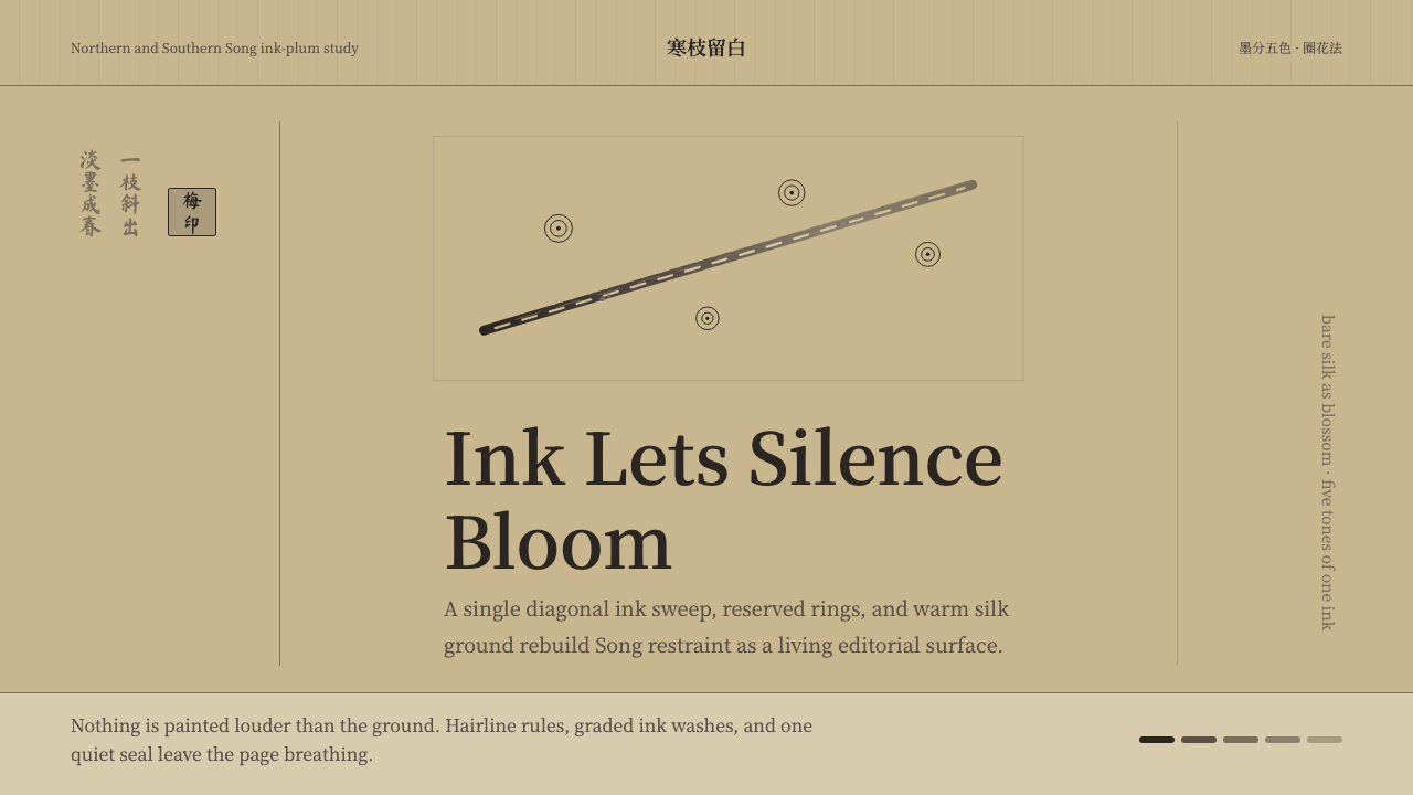
The style reached its first golden age under the Song Dynasty (960–1279), a period of extraordinary cultivation in which the literati — scholar-officials trained in classical learning, poetry, calligraphy, and painting as a unified practice — elevated ink wash to the highest form of artistic expression. Mi Fu (1051–1107), one of the Four Masters of Song calligraphy, developed the 'Mi dot' technique: clusters of horizontal ink strokes that evoke misty mountain ridges without depicting them literally, prioritizing atmospheric sensation over topographic accuracy. Song painters codified the vocabulary of brushwork — the grammar of wet and dry strokes, of loaded and spent brush — that designers today inherit as the style's most recognizable texture.这一风格在宋代(960—1279年)迎来第一个黄金时代。彼时,文人——以经典学问、诗、书、画为一体实践训练的士大夫——将水墨抬升为最高的艺术表达形式。宋代书法四大家之一米芾(1051—1107年)发展出「米点」技法:横向墨点的簇集,暗示烟雨山岚而非直接描绘,以大气感觉优先于地形准确。宋代画家将笔墨语汇系统化——湿笔与干笔、饱墨与渴墨的语法——这套语法正是今日设计师所继承的最具辨识度的风格质感。
The Yuan Dynasty (1271–1368) produced a second peak, shaped partly by the experience of Mongol conquest. Han literati who withdrew from government service under foreign rule turned to painting as a vehicle for expressing interior states that could not be spoken openly. The Chan Buddhist monk Mu Qi (active mid-thirteenth century) worked in a direct, spontaneous brushwork mode — his famous Six Persimmons is composed of six rough circles in graded wash, arranged asymmetrically on a near-empty ground — that carried Chan's 'sudden enlightenment' philosophy directly into visual form. The tradition's valorization of the unfinished, the gestural, and the economical traces directly to this period.元代(1271—1368年)在异族统治的历史背景下催生了第二个高峰。拒绝在蒙古政权下出仕的汉族文人,将绘画作为表达内心状态的载体——那些无法公开言说的情感。禅僧牧溪(活跃于十三世纪中叶)以直接、自发的笔法工作:他著名的《六柿图》以六个粗笔圆圈、墨色深浅各异,不对称地排列于近乎空白的画面之上,将禅宗「顿悟」的哲学直接转化为视觉形式。这一传统对未完成、对笔触性、对经济性的推崇,直接溯源于此时期。
By the twentieth century, the ink wash tradition had been challenged by Western academic painting but was revitalized by figures such as Xu Beihong (1895–1953), who synthesized Western compositional rigor with classical Chinese brushwork. The tradition also spread geographically: Japanese sumi-e and Korean sumukhwa are direct descendants, sharing both techniques and philosophical premises, though each developed its own regional inflections. Contemporary designers working in the style inherit not a single fixed canon but a living conversation across twelve centuries and three cultures, in which restraint, breath, and the eloquence of emptiness remain the constant values.进入二十世纪,水墨传统受到西方学院绘画的冲击,但经由徐悲鸿(1895—1953年)等人的振兴而重焕生机——他将西方构图严谨性与中国古典笔墨融为一体。这一传统也在地理上广泛传播:日本的水墨画与韩国的水墨画均是直接后裔,共享技法与哲学前提,各自发展出地区性变体。当代设计师使用这种风格所继承的,不是一套固定的单一规范,而是横跨十二个世纪、三种文化的活的对话——其中克制、呼吸与空的雄辩,始终是不变的核心价值。
What defines the Chinese Ink Wash 水墨 look?Chinese Ink Wash 水墨 的视觉特征是什么?
Tonal Ink Palette墨分六彩
The entire color system is built on six grades of ink, from charred black through rich dark, heavy, dilute, light, and the faintest translucent wash. No pigment or chromatic color enters the palette except the single permitted accent. This radical monochromatic constraint is not poverty but abundance: the eye, deprived of hue, becomes acutely sensitive to value, texture, and edge quality. Dark areas read as presence; pale washes read as recession, mist, or atmosphere. The tonal range must be used with deliberate spacing — packing too many mid-tones together collapses the depth that makes the system work.整套色彩系统建立于六种墨色之上:焦、浓、重、淡、清,乃至最薄透的墨迹。除唯一允许的点缀色外,无任何色素或彩色进入色板。这种彻底的单色约束不是贫乏而是富足——眼睛被剥夺了色相,便对明度、质感与边缘品质变得极度敏锐。深色区域传达实体感;淡墨传达后退、烟雾或大气。色调范围须刻意拉开间距——过多中间调叠压在一起,会令系统赖以运作的纵深感塌陷。
Deliberate Emptiness (留白)留白
Negative space is the style's most distinctive and most misunderstood feature. In Ink Wash, empty areas are not passive backgrounds but are compositionally active — they represent sky, water, mist, or the implied continuation of a form beyond the frame. The discipline is to resist the urge to fill. A layout in which every zone is occupied is a layout that cannot breathe. Effective 留白 means that the unmarked areas have been chosen as deliberately as the marked ones: their shape, their proportion to filled areas, and their placement all carry compositional weight.留白是这种风格最显著也最常被误解的特征。在水墨中,空白区域不是被动的背景,而是构图上的主动参与者——它们代表天空、水面、烟雾,或形态延伸至画面之外的暗示。这种修炼在于抵制填满的冲动。每个区域都被占据的版面,是无法呼吸的版面。有效的留白意味着未着墨区域的选择与着墨区域同样刻意——其形状、与实体区域的比例,以及位置,都承载着构图的重量。
Brushwork Texture笔触质感
The tradition distinguishes between wet strokes — fluid, continuous, with pooling ink at the tip — and dry strokes, where a nearly spent brush leaves a broken, fibrous mark revealing the ground beneath. Both have their roles: wet strokes convey vitality and movement, dry strokes convey age, resistance, and structural solidity. In digital contexts these textures are evoked rather than literally reproduced — a slight feathering of a border, an unevenly weighted stroke, or a subtle grain overlay that recalls rice paper. The goal is the quality of intention: marks that look made rather than generated.传统区分湿笔——流动、连续、笔尖积墨——与干笔,即近乎渴笔的笔触,留下飞白断裂的纹理,露出下方纸面。两者各有其用:湿笔传达生命力与运动感,干笔传达岁月感、阻力与结构上的坚实。在数字语境中,这些质感是被召唤而非直接复制的——边框的轻微羽化、粗细不均的笔触,或令人联想到宣纸的微妙颗粒叠加。目标是意图的品质:笔触看起来像是被「写」出而非「生成」的。
Seal-Red Accent朱红点睛
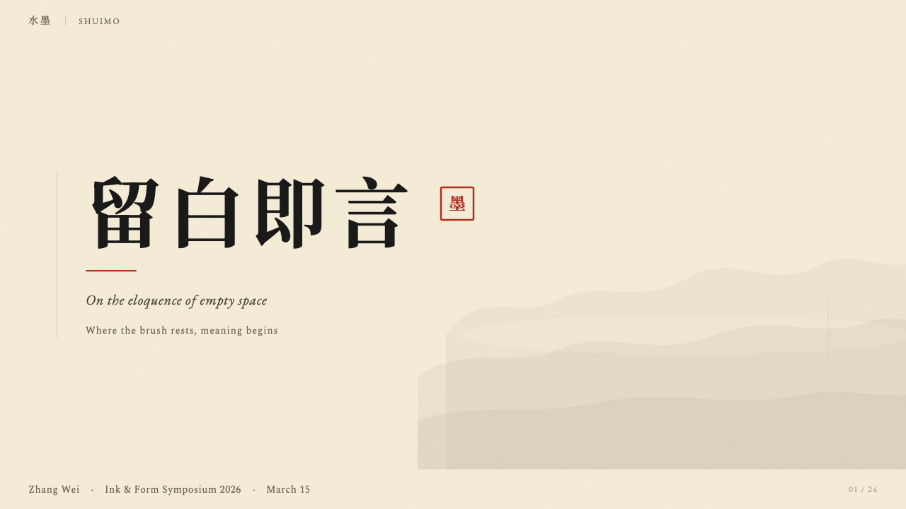
A single warm red — the color of cinnabar used in carved seal ink — is the style's only chromatic element. Its role is not decorative but authenticating: on a traditional scroll, the seal verifies authorship and completes the composition. In design, this accent functions the same way — it marks the one thing that matters most. It should appear once, or at most in a tightly controlled set of parallel uses. When it appears in multiple unrelated locations, it loses its weight entirely and the system collapses into something that merely looks vaguely Eastern. The accent color should feel discovered, not distributed.唯一一抹暖红——篆刻印泥所用朱砂之色——是这套风格的唯一彩色元素。其作用不是装饰,而是认证:在传统画卷上,印章确认了作者身份并完成了构图。在设计中,这一强调色以同样方式发挥作用——它标注那件最重要的事。它应当只出现一次,或最多在严格管控的一组平行用途中出现。若它在多个不相关位置分散出现,便会完全失去分量,整套系统随之崩解为仅仅隐约「像东方风格」的东西。这抹点缀色应当令人感到是「发现」的,而非「分配」的。
Calligraphic Typography书法性排印
Classical Chinese typography grows directly from calligraphy — the type forms used in Song Dynasty woodblock printing are the ancestors of today's Song and Ming typefaces (宋体, 明体). These faces carry historical authority and a structural quality that reflects the brush: vertical strokes are weighted, horizontal strokes are lighter, and the overall letterform has a tensile quality absent from most Western serifs. Vertical text setting is appropriate and historically natural. When combining Chinese and Latin type, the relative scales and weights require careful calibration so that neither script dominates inappropriately.中国古典排印直接生长于书法——宋代木刻印刷所用的字形,是今日宋体、明体的祖先。这些字体承载着历史权威与反映毛笔书写的结构品质:竖画有分量,横画较轻,整体字形具有大多数西文衬线体所缺乏的张力感。竖排文字是恰当且历史上自然的选择。当中文与拉丁字体混排时,相对大小与字重需要仔细校准,以免任何一种文字不恰当地主导视觉。
Asymmetric Composition不对称构图
Ink Wash compositions are never symmetrically balanced. The tradition instead seeks 气韵 (qìyùn) — vital rhythm — through weight, direction, and the interplay of presence and absence. A single pine branch occupying the upper-left corner is held in balance by an expanse of empty ground below and to the right. The visual tension this creates is not instability but the tension of a held breath. In layouts, this translates to placing the primary element off-center, allowing large empty margins to function as compositional counterweights, and resisting the grid's pull toward mechanical evenness.水墨构图从不取对称平衡。传统转而通过重量、方向以及实与虚的相互作用追求「气韵」——那种内在的生命节律。占据左上角的一枝孤松,由其下方与右侧大片空白的地面所平衡。这种视觉张力不是不稳定,而是一口屏住的气息所创造的张力。在版面中,这意味着将主要元素置于偏心位置,让大面积空白边距发挥构图上的配重作用,并抵制网格将一切拉向机械均匀的引力。
Economy of Mark惜墨如金
The great ink wash masters operated under an economy of mark: each stroke was committed to without correction, because lifting and re-laying a brush stroke destroys its vitality. This discipline of commitment translates in design to a preference for fewer elements executed with full intention over many elements hedging their bets. A composition should be complete when the last necessary mark has been placed — not when a designer has exhausted their inventory of possible additions. The question is never 'what else can I add?' but 'what can I remove without losing the essential?'水墨大师在「惜墨如金」的经济法则下工作:每一笔都是一次不可更改的承诺,因为提笔重来会毁掉笔触的生命力。这种承诺的修炼在设计中转化为一种偏好:以完整意图执行更少的元素,胜过以许多元素相互保险。构图应当在最后一个必要的笔触落定时完成——而非当设计师穷尽了所有可能添加的东西时。问题从来不是「我还能加什么?」,而是「我能减去什么而不失其本质?」

See the Chinese Ink Wash 水墨 design system查看 Chinese Ink Wash 水墨 完整设计系统
Who shaped Chinese Ink Wash 水墨?谁塑造了 Chinese Ink Wash 水墨?
Tang Dynasty poet, musician, and painter (699–759 AD), Wang Wei is credited as the progenitor of the monochromatic ink wash landscape tradition. Working at a time when polychrome court painting dominated, he chose to work exclusively in ink and laid the conceptual groundwork that later generations would build upon. His paintings survive only in later copies, but their influence — transmitted through generations of critical writing about his methods and intentions — shaped the entire literati painting tradition that followed.唐代诗人、音乐家兼画家(699—759年),王维被公认为单色水墨山水传统的开创者。在多彩宫廷绘画主导的时代,他选择专以水墨为媒介,为后世奠定了概念基础。其画作仅以后世摹本传世,但其影响力——经由历代关于其技法与意图的评论文字代代相传——塑造了此后整个文人画传统。
Song Dynasty polymath (1051–1107), Mi Fu was simultaneously a calligrapher, painter, art critic, and collector. His development of the 'Mi dot' technique — layered horizontal ink strokes that evoke mist-shrouded mountains without representing them topographically — was one of the most influential formal innovations in the tradition's history. His eccentric personality, legendary passion for rocks, and exacting standards of connoisseurship made him a defining figure of the literati ideal: the artist as cultivated sensibility rather than technical craftsman.宋代博学家(1051—1107年),米芾集书法家、画家、艺评家与收藏家于一身。他发展出的「米点」技法——横向墨点层层叠加,暗示烟雨山峦而不作地形描绘——是这一传统史上最具影响力的形式创新之一。其怪诞性情、对奇石的传奇热情与严苛的鉴赏标准,使他成为文人理想的典范人物:艺术家作为修养化的感受力,而非技艺性的工匠。
Chan Buddhist monk and painter active in the mid-thirteenth century, Mu Qi is best known for his Six Persimmons — six roughly brushed circles in graded ink wash, asymmetrically arranged on a near-empty ground. The painting's radical simplicity and the perfection of its asymmetric spacing make it one of the most studied compositions in East Asian art history. Mu Qi's work demonstrates how Chan's emphasis on directness, spontaneity, and 'beginner's mind' translated into a visual style that influenced Japanese ink painting (sumi-e) as much as it did the Chinese tradition.活跃于十三世纪中叶的禅僧画家,牧溪以《六柿图》最为人知——以粗笔画成的六个墨色深浅各异的圆形,不对称地排布于近乎空白的画面之上。这幅画的彻底简洁与不对称间距的完美,使其成为东亚艺术史上被研究最多的构图之一。牧溪的作品展示了禅宗对直接性、自发性与「初心」的强调,如何转化为一种视觉风格,对日本水墨画的影响不亚于对中国传统的影响。
Twentieth-century painter (1895–1953) and educator who spent years studying in France and synthesized Western academic technique with classical Chinese ink methods. Xu Beihong's galloping horses — rendered in a fusion of Western volumetric form and traditional brushwork — became some of the most recognized images in modern Chinese painting. As the founding president of the Central Academy of Fine Arts in Beijing, he shaped how ink wash tradition was transmitted through the twentieth century and into the contemporary period, keeping it as a living practice rather than a historical artifact.二十世纪画家(1895—1953年)兼教育家,曾旅居法国多年,将西方学院技法与中国古典水墨方法融为一体。徐悲鸿的奔马——以西方体积感造型与传统笔墨相融合的方式描绘——成为中国现代绘画中最广为人知的图像之一。作为中央美术学院首任院长,他塑造了水墨传统在二十世纪乃至当代的传承方式,使之保持为活的实践,而非历史遗物。
Self-taught master (1864–1957) who worked from a humble background as a carpenter before devoting himself entirely to painting. Qi Baishi's style combined monumental simplicity with intimate subject matter — shrimps, crabs, chicks, and vegetables rendered with a childlike directness that conceals enormous technical mastery. He demonstrated that the ink wash tradition could accommodate deep humor, tenderness, and vernacular subject matter without sacrificing its formal rigor. His work remains among the most commercially recognized in Chinese art and continues to influence contemporary designers who seek to balance gravitas with warmth.自学成才的大师(1864—1957年),出身木匠,后全身心投入绘画。齐白石的风格将宏大的简洁与亲切的题材相结合——虾、蟹、雏鸡与蔬菜,以孩童般的直接性描绘,掩藏着巨大的技术造诣。他证明了水墨传统可以容纳深沉的幽默、温柔与平民化题材,而不失其形式上的严格。他的作品在中国艺术中商业认知度最高,持续影响那些寻求在厚重感与温度之间取得平衡的当代设计师。
How do you use Chinese Ink Wash 水墨 today?今天怎么用 Chinese Ink Wash 水墨?
Chinese Ink Wash is one of the more demanding historical styles to apply well in contemporary design, because its power depends entirely on discipline. It is not a visual mood board of Eastern imagery; it is a formal system in which every element — the weight of a stroke, the proportion of empty space, the single permitted accent color — is load-bearing. Applying it correctly means internalizing the logic of 留白 and the economy of mark before touching the design surface, not reaching for brush textures and monochrome palettes as surface treatments.水墨是当代设计中应用难度较高的历史风格之一,因为其力量完全依赖于克制。它不是一块充斥东方意象的视觉情绪板,而是一套形式系统——其中每个元素——笔触的重量、空白的比例、唯一允许的点缀色——都是承重的。正确地应用它,意味着在触碰设计面之前,先将留白的逻辑与惜墨如金的经济法则内化,而不是将笔触纹理与单色色板作为表面处理来借用。
For presentation slides, the style suits both cover and content pages but in different registers. A cover works best as a near-empty field: the title in strong calligraphic type, positioned off-center with intent, against a warm off-white ground — and nothing else except perhaps a single ink gesture that anchors the composition. The seal-red accent, if used, appears once on the cover only. Content slides should embrace sparse layouts: one idea per slide, wide margins acting as breathing space, and any data rendered as ink-weight shapes rather than polished chart components. The empty areas are not failures of content; they are the style's argument.在演示文稿中,这种风格适用于封面与内容页,但各有不同的基调。封面最好是近乎空无一物的底面:标题以强劲的书法体排印,有意置于偏心位置,衬于暖白底色之上——除了锚定构图的单一墨韵笔触,别无其他。印泥红点缀色若要使用,仅在封面出现一次。内容页应拥抱稀疏版面:每张幻灯片一个想法,宽阔留白作为呼吸空间,所有数据以墨色深浅的形态呈现,而非精致的图表组件。那些空白区域不是内容的缺失,而是这种风格的论点。
For web interfaces and dashboards, Ink Wash performs well when the product communicates authority, craft, or cultural depth. A pricing or tier page in this style uses a light warm ground, ink-weight typography at strongly contrasted scales for hierarchy, and the accent color reserved for the single most important action. Navigation is typographic — horizontal or vertical text labels — with minimal iconography. Data visualizations work as tonal ink shapes: a bar chart where bars are rendered at different ink densities rather than different hues, a donut chart where segments graduate from deep to pale. The overall palette should feel complete and intentional, not assembled from separate design decisions.对于网页界面与仪表板,水墨风格在产品传达权威感、手工艺感或文化深度时表现出色。这种风格的定价或等级页面,使用浅暖色调底面、在强烈对比尺度下以墨色重量排印字体建立层级,并将点缀色保留给唯一最重要的行动。导航以字体为主——横排或竖排文字标签——图标极简。数据可视化呈现为墨色调的形态:柱状图的柱条以不同墨色浓淡而非不同色相渲染,环形图的扇区从深到淡渐变。整体色板应感觉完整而刻意,而非由各自独立的设计决策拼凑而成。
For editorial and marketing applications, the style creates immediate cultural signal and distinctive shelf presence. An editorial layout uses a narrow body-text column with wide surrounding margins that function as compositional ground rather than wasted space. Pull quotes or captions sit in those margins, positioned according to visual tension rather than mechanical alignment. Marketing pages work well with the style's poster-like capacity for bold reduction: a full-width feature composed of a single large ink gesture against a warm ground, with a headline and the accent mark as the only other elements. The discipline of using one accent moment per spread or page is essential — it is precisely the scarcity that makes the accent legible as signal rather than noise.对于编辑与营销应用,这种风格创造即刻的文化信号与鲜明的辨识度。编辑版面以窄幅正文栏为主体,周围宽阔边距作为构图的底——而非浪费的空间。引用语或图注处于那些边距之中,依据视觉张力定位,而非机械对齐。营销页面适合这种风格的海报式彻底削减能力:单一宽幅特性,以一笔大型墨韵笔触衬于暖色底面,配以标题与点缀印记作为唯二的其他元素。每个跨页或页面只使用一处点缀色的克制是根本的——正是这种稀缺性,使点缀色作为信号而非噪音被识别。
A common and damaging mistake is treating this style as a collection of Eastern motifs to be combined: a bamboo texture here, a brushstroke element there, a red lantern color borrowed from a festival palette. The authentic system is not assembled from parts but derived from principles. The related error is over-texturing — applying ink wash grain or rice-paper texture everywhere to signal the style. The texture should be structural: present where it carries meaning, absent where it would compete with composition. Finally, using the accent color in more than one or two locations destroys the economy on which the entire chromatic system depends. When the red appears on five different interactive elements, it is no longer an accent — it is a second primary color, and the monochromatic system has been abandoned.一个常见且破坏性的错误,是将这种风格视为可以组合使用的东方母题集合:这里一块竹纹,那里一个笔触元素,再从节日色板借来一抹红灯笼色。这套真实的系统不是从零件拼装而成,而是从原则中导出的。相关的错误是过度纹理化——无处不在地叠加水墨颗粒或宣纸质感来标榜风格。纹理应当是结构性的:在承载意义之处出现,在会与构图竞争之处缺席。最后,在多于一两处使用点缀色会摧毁整套色彩系统所依赖的经济法则。当红色出现在五个不同的交互元素上,它便不再是强调色——它成了第二种主色,单色系统已然被放弃。
See the Chinese Ink Wash 水墨 design system查看 Chinese Ink Wash 水墨 完整设计系统
Chinese Ink Wash 水墨 — FAQChinese Ink Wash 水墨 · 常见问题
How is Chinese Ink Wash different from Japanese minimalism or Scandinavian design?水墨风格与日式极简或北欧设计有何区别?
All three value restraint and negative space, but their underlying logic differs. Japanese minimalism (ma, wabi-sabi) emphasizes impermanence, imperfection, and the beauty of natural materials — it tends toward warm neutrals, rough textures, and an acceptance of asymmetric incompleteness as an end in itself. Scandinavian design values functional warmth — light neutrals, organic curves, materials that feel tactile and livable. Chinese Ink Wash, by contrast, is rooted in scholarly and philosophical authority: its emptiness is intentional argument, its monochromatic system is a demonstration of expressive range, and its asymmetry serves composition rather than comfort. The calligraphic heritage means letterforms carry weight in ways that purely Scandinavian or Japanese minimalist typography does not require.三者都重视克制与留白,但底层逻辑不同。日式极简(「间」、侘寂)强调无常、不完美与自然材料的美——倾向于暖中性色、粗糙质感,以及将不对称的未完成状态作为目的本身来接受。北欧设计重视功能性温暖——浅中性色、有机曲线、触感真实且宜居的材料。中国水墨则根植于学术与哲学权威:它的空是刻意的论点,它的单色系统是表现幅度的证明,它的不对称服务于构图而非舒适感。书法传承意味着字形承载着重量,这是纯粹的北欧或日式极简排印所不具备的要求。
Can the style work in dark mode or on a deep-colored ground?这种风格能用于深色模式或深色底面吗?
The canonical Ink Wash ground is warm off-white — the color of aged rice paper — and this is the context in which the tonal system performs best. A dark inversion is possible but requires rethinking the logic. On a deep charcoal or near-black ground, the ink tones must shift: what was deepest black becomes the lightest mark, and pale wash becomes the deepest value. The accent color shifts accordingly — on dark grounds, the warm red must be slightly desaturated to avoid glowing. The more fundamental challenge is that 留白 loses its primary metaphor on a dark ground: the empty areas no longer read as light, mist, or sky but as void. This changes the philosophical register of the composition, which may or may not suit the product's character.水墨的标准底面是暖白色——陈年宣纸之色——这是墨色体系表现最佳的背景。深色反转是可行的,但需要重新思考其逻辑。在深炭色或近黑的底面上,墨色调必须移位:原本最深的黑变成最浅的笔触,淡墨变成最深的色调。点缀色随之调整——在深色底面上,暖红须略微降低饱和度以避免发光的视觉效果。更根本的挑战在于,留白在深色底面上失去了其主要的比喻:空白区域不再被读作光、烟雾或天空,而是虚空。这改变了构图的哲学基调,是否适合取决于产品的性格。
How should I handle imagery and photography within this style?在这种风格中应如何处理图像与摄影?
Photography is not native to the Ink Wash tradition and should be used sparingly and with deliberate treatment. The most compatible approach is to convert photography to high-contrast monochromatic tones that echo the ink palette — not in the sense of a crude grayscale conversion, but processed so that the image reads in terms of ink weight rather than photographic detail. Silhouetting against a warm ground is effective: the figure or object becomes a shape in the ink system rather than a window into a literal scene. Full-color photography with naturalistic saturation and soft shadows fundamentally disrupts the monochromatic grammar and should be avoided. If representational imagery is essential, illustration reduced to gestural brushstroke form integrates more naturally than photography.摄影并非水墨传统的原生媒介,应谨慎且经刻意处理后使用。最兼容的方式是将摄影转化为高对比度的单色调,与墨色色板相呼应——不是粗粝的灰度转换,而是经过处理使图像以墨色重量而非摄影细节被解读。在暖色底面上做剪影处理效果出色:人物或物体成为墨色系统中的一个形态,而非通向字面场景的窗口。带有自然饱和度与柔和阴影的全彩摄影,从根本上破坏了单色的语法,应予避免。若具象图像不可或缺,简化为笔触形态的插图比摄影更自然地融入这一系统。
Is this style appropriate for Western or global audiences, or does it read as culturally specific?这种风格适合西方或全球受众吗?还是说它会被视为文化特定性的?
The style carries clear cultural signal, and that signal is a feature, not a bug — for products where cultural depth, heritage, or craft authority is part of the value proposition. For a luxury goods brand, a cultural institution, an editorial publication, or a platform that explicitly references Eastern aesthetics, the cultural specificity strengthens rather than limits the work. For globally neutral consumer products or utilitarian tools with no cultural positioning, the cultural weight can feel imposed. The practical test is: does the product benefit from the associations the style carries — restraint, depth, scholarly authority, antiquity — or does the cultural framing add friction between the user and the product's purpose? The style works globally when its philosophical values align with the product's values; cultural specificity becomes a problem only when it is superficial or arbitrary.这种风格承载着清晰的文化信号,对于那些文化深度、历史传承或工艺权威是价值主张一部分的产品而言,这个信号是特性而非缺陷。对于奢侈品品牌、文化机构、编辑出版物,或明确参照东方美学的平台,文化特殊性会强化而非限制作品的感染力。对于没有文化定位的全球中性消费品或实用工具,文化重量可能显得强加。实际的检验标准是:这款产品能否从这种风格所承载的联想中获益——克制、深度、学术权威、古典气质?还是文化框架会在用户与产品目的之间增加摩擦?当这种风格的哲学价值观与产品价值观契合时,它在全球范围内都有效;文化特殊性只有在流于表面或任意为之时,才会成为问题。
What is the single most common mistake when applying this style?应用这种风格时最常见的单一错误是什么?
Mistaking the style for a mood rather than a system. Designers who understand Ink Wash as 'looks Eastern' or 'uses brush textures and muted ink tones' tend to apply it as a surface treatment: they desaturate a palette, add some rice-paper grain, include a calligraphic element, and scatter the seal-red accent across several interactive components. The result has the visual vocabulary of the style but none of its logic. The style's power comes from its internal consistency — a monochromatic system that creates depth through tonal range alone, a negative space discipline that makes every marked area precious, and an accent economy that gives the single chromatic moment full weight. Break any of these principles and the result is not 'a lighter version of Ink Wash' — it is a different aesthetic that happens to borrow some visual cues. The discipline is all-or-nothing in a way that many other historical styles are not.将这种风格误认为情绪而非系统。将水墨理解为「看起来像东方风格」或「使用笔触纹理与低饱和墨色调」的设计师,往往将其作为表面处理来应用:他们降低色板饱和度,添加一些宣纸颗粒,加入一个书法元素,然后将印泥红点缀色分散到多个交互组件上。结果具备了这种风格的视觉词汇,但没有其逻辑。这种风格的力量来自其内在一致性——一套仅凭色调范围创造纵深的单色系统,一种使每个着墨区域都变得珍贵的留白修炼,以及赋予唯一彩色时刻以完整分量的点缀色经济法则。打破其中任何一条原则,结果便不是「水墨风格的轻量版」——而是恰好借用了某些视觉线索的另一种美学。这种修炼是全有或全无的,这一点比许多其他历史风格更为绝对。
Related design styles相关设计风格
 Plum Blossom Ink (宋)Silence carries the ink. Tea-tan ground, reserved blossoms, and one diagonal…静处见墨:茶褐绢底、留白梅花与一枝斜干。
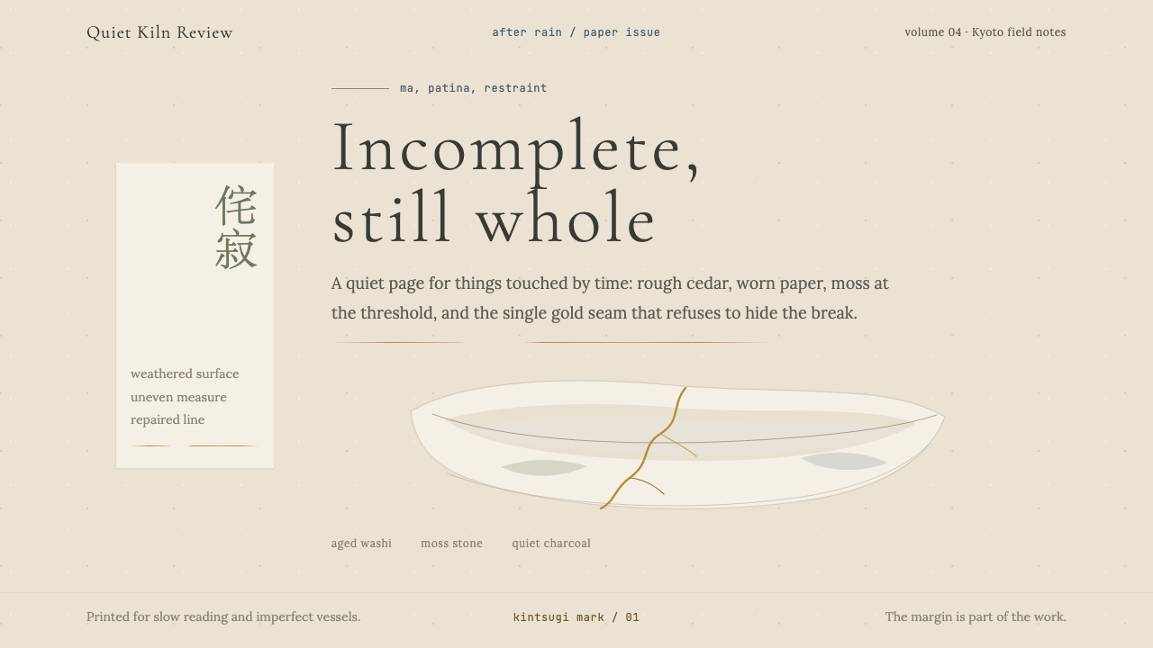 Wabi-SabiStillness makes imperfection whole. Washi beige, moss sage, and a spare gold…静默让缺憾完整:和纸米色、苔藓绿与一线金缮撑起留白。
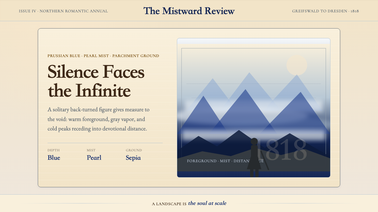 Caspar David FriedrichSilence becomes vast. Prussian blue depth, pearl mist, and parchment framing…寂静变得辽阔:普鲁士蓝纵深、珍珠雾与羊皮纸框层层后退。
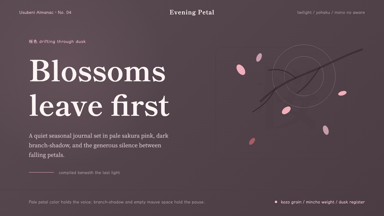 Cherry Blossom HanamiTenderness arrives in dusk. Sakura pink, branch-shadow, and Mincho type leave…暮色里的温柔:樱粉、枝影与明朝体,在大片留白中生出物哀。
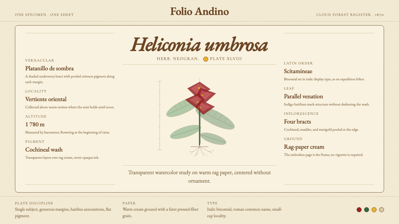 Colombian Botanical (Triana)Observation becomes ornament. Crimson watercolor specimen breathes on cream r…观察即装饰。绯红水彩标本静置于奶油破布纸。
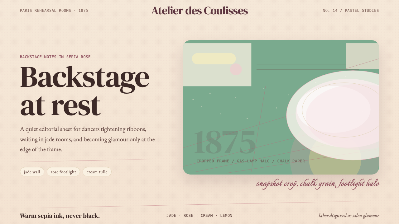 Degas Ballet PastelsBackstage glamour is labor. Jade walls, rose footlights, cropped serifs on cr…后台华丽即劳动。玉墙、玫瑰脚灯与裁切衬线落在奶油纸上。