What is Plum Blossom Ink (宋)?
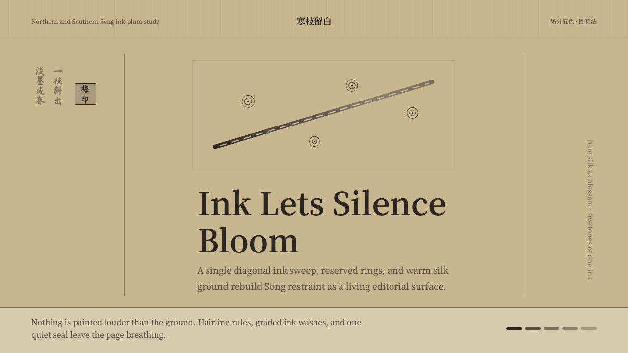
Ink-plum painting reduced an entire flowering branch to unmixed black ink and bare silk — proving that restraint, not color, is what makes a mark feel inevitable.
Plum Blossom Ink (宋) in brief
Ink-plum (墨梅) is a strictly monochrome way of painting plum blossoms that emerged among Song-dynasty literati painters. Every stroke is ink and ink alone: no vermilion for the petals, no green for the calyx, no wash of color anywhere on the silk. The blossoms themselves are not painted in the ordinary sense at all — they are reserved. A painter draws only the thin outline of each petal (圈花法, the 'outline-the-flower method'), and the petal's interior is simply the bare ground showing through: pale, untouched, and luminous by contrast with everything drawn around it.
Branches and twigs, by contrast, are built from ink alone but at radically different strengths — the tradition calls this 'ink's five tones' (墨分五色), the idea that diluted and concentrated ink can stand in for an entire chromatic range. A gnarled old branch is laid in with darker, drier strokes; young shoots reaching toward the blossoms are thinner and paler; the darkest accents — a knot in the wood, a cluster of stamens — are reserved for a final, almost startling touch of near-black. The result reads as fully three-dimensional despite using no color at all.
None of this survives in its original whiteness. The silk or paper that these scrolls were painted on has, over the centuries, absorbed smoke, humidity, and handling into a warm, tea-stained tan — closer to aged parchment than to snow. A design system built from this tradition inherits that aged warmth rather than clinical white: a diagonal branch crosses a wide, quiet field, a hairline rule stands in for a mounting seam, and a narrow vertical column — echoing a collector's brush-written colophon and seal — sits at the margin. Emptiness is not leftover space here; it is treated as deliberately as the ink itself.
Where does Plum Blossom Ink (宋) come from?
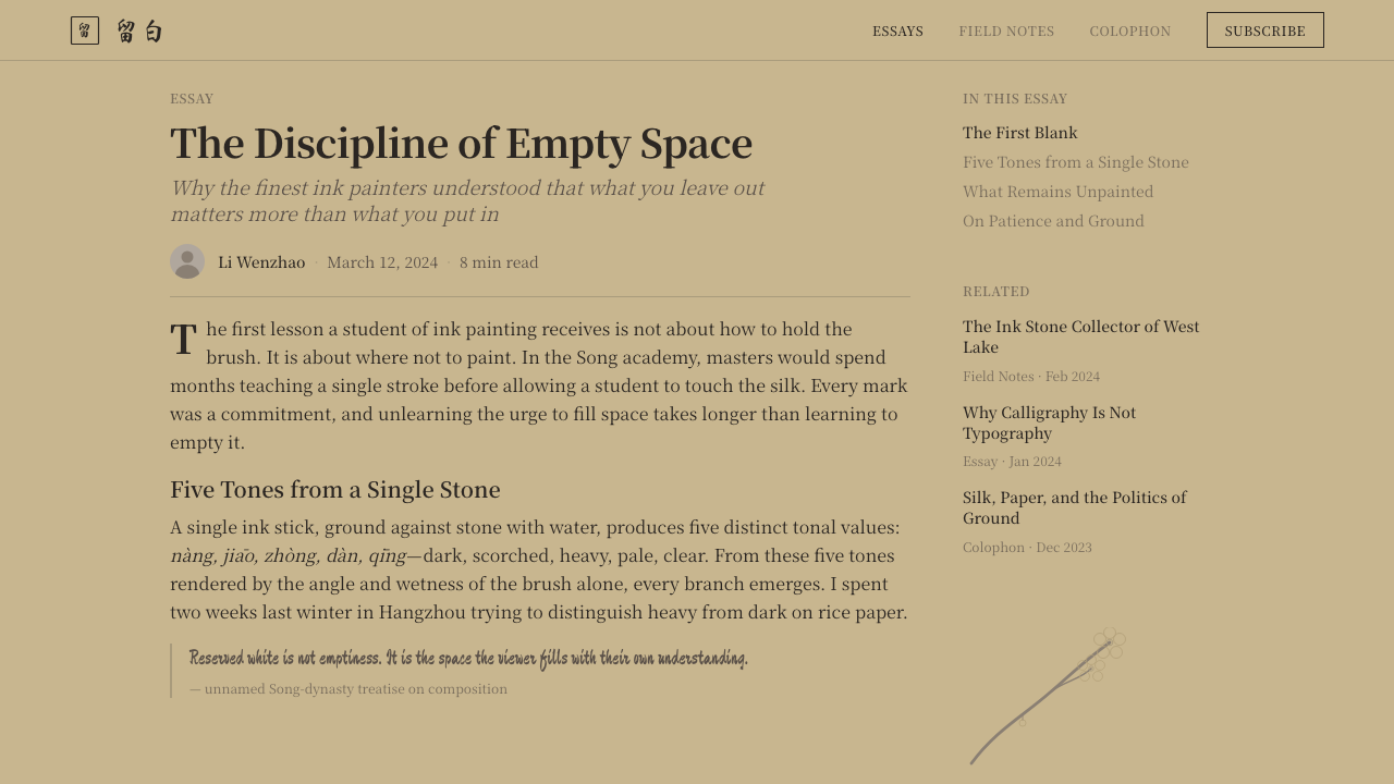
Ink-plum belongs to a broader current in Chinese art history known as literati painting (文人画) — work made by scholar-officials and monks for their own circle rather than for a court workshop or a paying patron, and judged by brushwork and sentiment rather than decorative finish. It sits inside the even wider practice of ink-wash painting (水墨), in which black ink diluted with water stands in for the entire visible world. Within that world, a subject as narrow as a single flowering branch became a lifelong specialty for certain painters precisely because its constraints — one color, one subject, endless variation of stroke — made it a proving ground for discipline rather than a limitation to work around.
Tradition credits the origin of ink-plum specifically to Zhongren (仲仁), a Buddhist monk active in the Northern Song period, sometimes associated with a monastery in Hunan where, according to later accounts, moonlight falling through a plum branch onto a paper window suggested the idea of rendering the flower as pure shadow and outline rather than color. Whatever the exact circumstance, the attribution matters less than what it established: that a devotional, contemplative subject could be painted with the same austerity a monk might bring to any other discipline — ink instead of pigment, silence instead of ornament.
The painter most responsible for turning ink-plum into a fully developed and widely imitated style was Yang Wujiu (楊無咎), active in the twelfth century during the transition from the Northern to the Southern Song. Yang is traditionally said to have studied and refined the technique associated with Zhongren, and to have pushed the 'outline-the-flower' method and the layered ink-tone branch technique into a mature, repeatable vocabulary that later painters — across the Southern Song and into the Yuan dynasty — continued to study and copy. His surviving handscrolls are still treated as reference points for how disciplined the reserved-petal technique can be.
The plum blossom itself was not a neutral subject choice. In Chinese literati culture, the plum flowers in the depth of winter, on bare wood, often against snow — blooming precisely when nothing else does. For scholars who prized personal integrity under political or social pressure, this made the plum a natural emblem of quiet resilience: beauty and character that do not depend on comfortable conditions to appear. Painting it in unmixed ink, stripped of any color that might read as decorative or fashionable, reinforced the same message formally — the subject and the technique were making the same argument about restraint.
What defines the Plum Blossom Ink (宋) look?
Monochrome ink, no color
Every mark in the system is ink and ink only — no accent hue is introduced anywhere, including in interactive or highlighted states. Emphasis is built entirely from how dark, how dry, or how deliberate a stroke is, never from switching to a different color family.
Reserved petals (留白)
The blossoms themselves are never filled in. Only their outline is drawn (圈花法), and the interior is left as bare ground — the same principle applied to an interface means the most important shapes are often defined by a thin contour against open space, not by a filled block.
Aged, tea-stained ground
The base surface reads as aged silk rather than clean white paper: a warm, muted tan that has visibly absorbed centuries of handling. This ground is never treated as neutral background — it is a color choice with its own quiet warmth, distinct from the cold white of a typical modern screen.
Graded ink branches (墨分五色)
Branches move through a full range of ink density in a single continuous gesture — dry and dark near the trunk, thinning and paling toward the newest shoots. Depth and hierarchy come from this tonal range alone, never from adding a second hue.
Single diagonal branch composition
Rather than a centered or symmetrical arrangement, the canonical composition is one branch entering the frame on a diagonal, leaving the majority of the ground empty. Balance comes from the tension between the branch's weight and the surrounding void, not from mirroring.
Vertical calligraphic colophon
A narrow vertical column of brush-written characters, along with collector's seals, traditionally sits at the margin of the composition — a running record of who painted, viewed, or owned the work. In an interface, this translates to a slim vertical text column reserved for metadata or attribution, set apart from the main field.
Quietness as a design value
Nothing in the system competes for attention simultaneously. A single branch, a single ink tone range, a single column of text — the discipline is in choosing one gesture per composition and letting it stand alone against emptiness, rather than layering multiple elements for visual richness.
Who shaped Plum Blossom Ink (宋)?
A Buddhist monk of the Northern Song period, traditionally credited as the originator of ink-plum painting. Later accounts associate him with a monastery setting in which moonlight and branch-shadow are said to have suggested rendering the flower in pure ink outline rather than color — establishing the devotional, austere character the tradition kept ever after.
A literati painter active in the twelfth century, spanning the transition from the Northern to the Southern Song, generally regarded as the figure who matured ink-plum into a fully developed, teachable style. He is traditionally said to have studied the technique associated with Zhongren and to have refined the reserved-petal outline method and the graded-ink branch technique into the form later painters continued to study.
A Yuan-dynasty scholar and painter widely known for continuing and further popularizing ink-plum long after the Song. His work, along with that of other Yuan and later literati, shows how the tradition Zhongren and Yang Wujiu established kept being reinterpreted rather than fossilizing into a single fixed formula.
How do you use Plum Blossom Ink (宋) today?
Ink-plum transfers well beyond painting because its logic is compositional and tonal rather than tied to any specific medium: one restrained gesture, a wide field of quiet ground, and hierarchy built from tone rather than hue. Applying it correctly means preserving that logic — a warm aged ground, reserved rather than filled focal shapes, and a single graded ink range for structure — rather than simply desaturating an existing layout to grayscale.
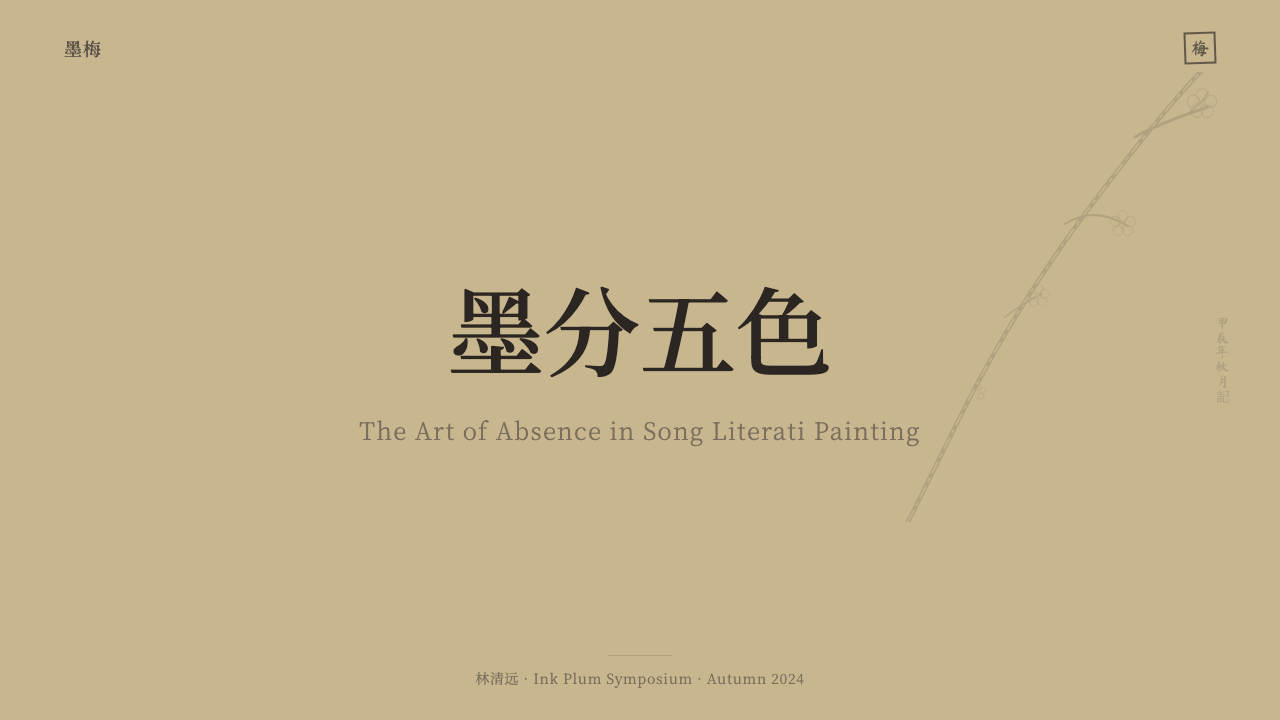
On presentation slides, the style is well suited to cover pages and quiet section breaks. A cover can place a single graphic gesture off-center against a wide tea-tan field, with the title set in a narrow, deliberate column rather than centered display type. Content slides should resist the urge to fill space: one supporting diagram or one quotation per slide, framed by generous emptiness, communicates more authority than a slide packed with bullet points and boxes.
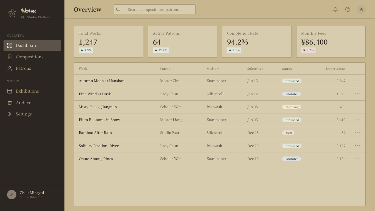
In web interfaces, the aesthetic suits dashboards and reading-focused pages where calm hierarchy matters more than dense information density. A hairline rule can stand in for a section divider the way a mounting seam divides a scroll; a narrow vertical sidebar of metadata echoes the colophon column; primary actions can be marked by weight and placement rather than by introducing an accent color, keeping the whole interface within a single tonal family.
For editorial and marketing pages, the style rewards long-form, contemplative content — essays, brand narratives, or product stories where the reader is meant to slow down. A single strong image or diagram, surrounded by more empty margin than a typical layout would allow, reads as considered rather than sparse. Pull-quotes work well set in a narrow vertical or near-vertical column, echoing the calligraphic colophon.
The most common mistake is treating this style as generic 'ink wash' clip art — dropping in loose black brush-splatter graphics or bamboo-and-mist stock illustrations that have nothing to do with the actual discipline of reserved petals and graded ink tone. A second common error is using a stark, cold white ground instead of the warm aged tan the tradition depends on; a third is over-filling the composition, treating the negative space as empty real estate to be populated rather than as the main compositional element carrying equal weight to the ink itself.
Plum Blossom Ink (宋) — FAQ
Does this style require actual painted brush textures to look authentic?
No. What makes the style read as authentic is the compositional logic — reserved rather than filled focal shapes, a single graded tonal range instead of flat color blocks, and generous empty ground — not literal brush-texture imagery. A clean digital layout that respects those structural choices will read as more faithful to the tradition than a busy layout dressed up with decorative ink-splatter textures.
Can this style use any color at all, even sparingly?
The historical tradition is strictly monochrome — that constraint is the entire point, not an incidental detail. Introducing even a single accent hue undermines the logic the whole system is built on, where hierarchy comes purely from ink density. If a product genuinely needs a functional color signal (an error state, for instance), it should be handled as an exception clearly outside this aesthetic rather than blended into it.
How much empty space is too much when applying this style?
There is no fixed ratio, but the test is whether the remaining ground still feels inhabited by the composition's tension — a single branch entering a frame on the diagonal still organizes the whole space even though it occupies a small fraction of it. If the empty ground starts to feel like it was simply left over rather than actively holding the composition together, the single gesture placed within it usually needs more deliberate weight or positioning, not more content added to fill the gap.
Is a warm tan background mandatory, or can this style work on plain white?
A plain, cold white ground works against the tradition's core visual signal — the aged, tea-stained surface is not a stylistic flourish, it is one of the two or three things that make the reference immediately recognizable. A version built on stark white will read as generic ink-wash rather than specifically ink-plum. If a product's brand system truly cannot accommodate a warm ground, this may not be the right historical reference to draw from.
Does the vertical colophon column need to contain real calligraphy?
No — the functional translation is simply a narrow vertical column set apart from the main field, reserved for metadata, attribution, or a short note, echoing where a collector's inscription and seals traditionally sat. It does not need to imitate brush calligraphy to do its job; what matters is its placement at the margin, its narrowness, and that it stays visually distinct from the primary composition rather than merging into it.
Related design styles
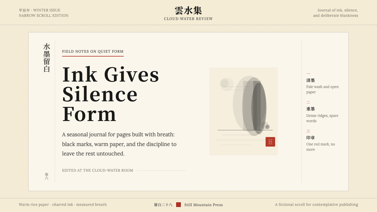 Chinese Ink Wash 水墨A thousand years of restraint. Six tones of ink on rice-paper warmth, a singl…
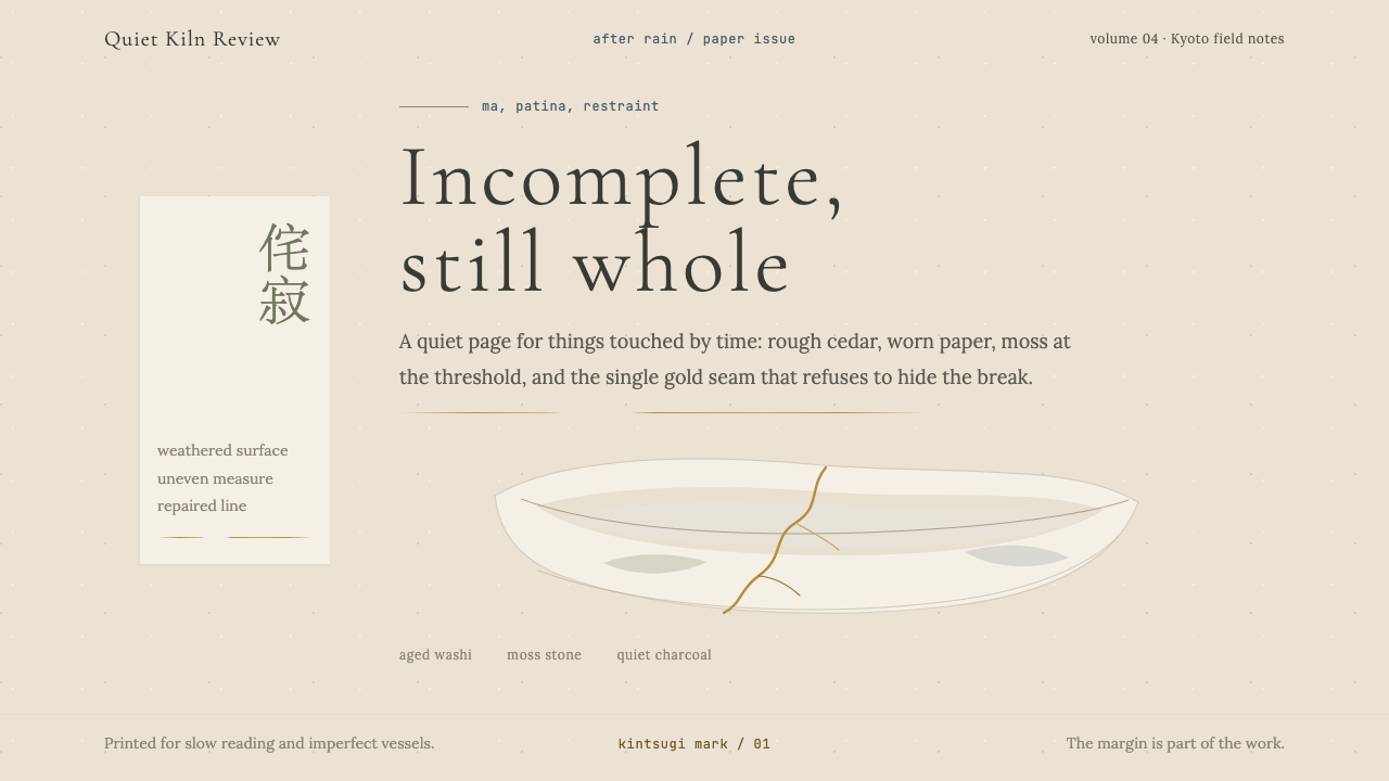 Wabi-SabiStillness makes imperfection whole. Washi beige, moss sage, and a spare gold…
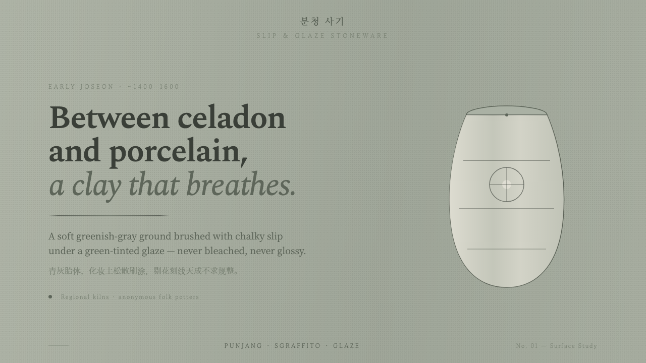 Buncheong Gray Slip WareBetween celadon and porcelain. Greenish-gray clay, chalky slip brushwork, dar…
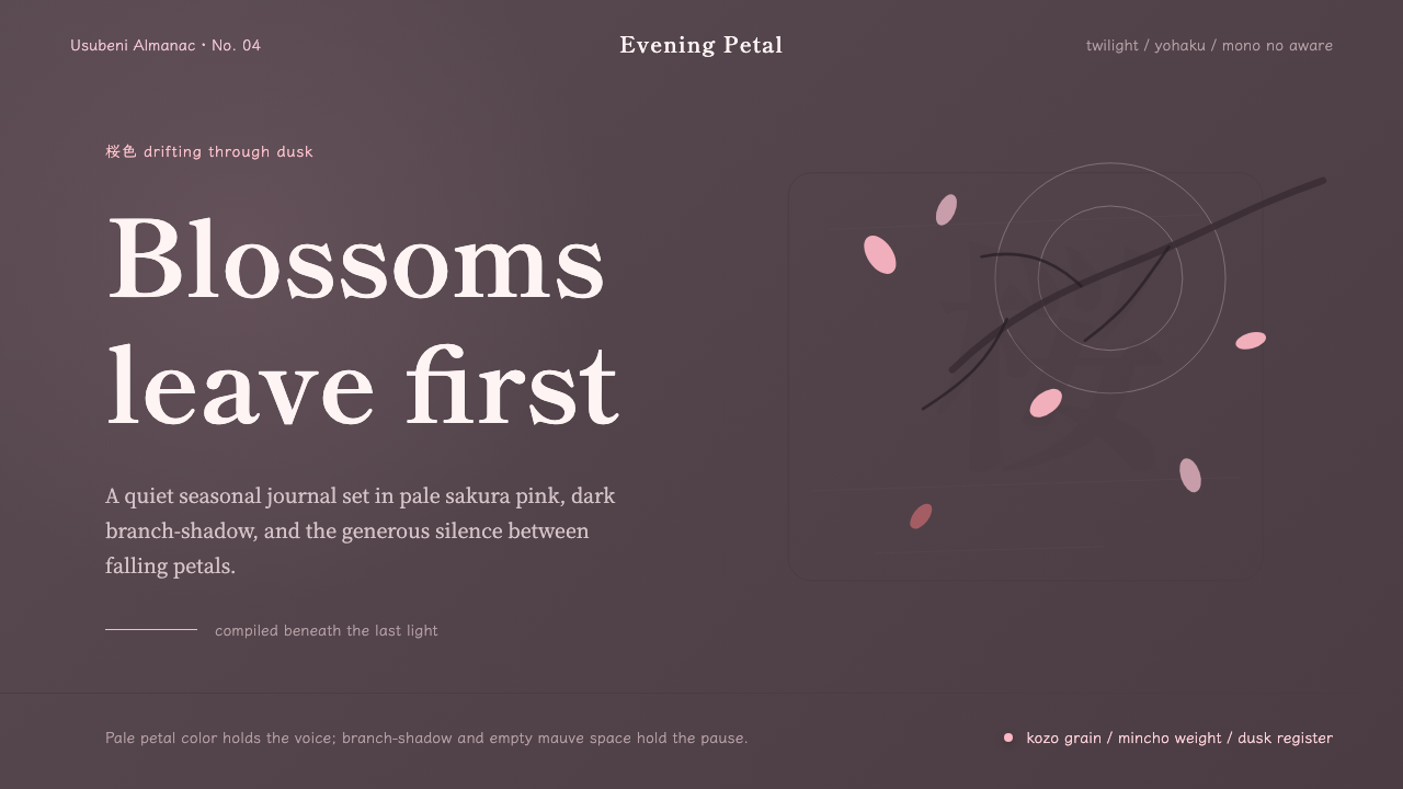 Cherry Blossom HanamiTenderness arrives in dusk. Sakura pink, branch-shadow, and Mincho type leave…
 Estonian Limestone GrayStone keeps its silence. Limestone grays, blackletter, and dry-laid bands car…
 Gotland Picture StoneMeaning emerges slowly. Weathered limestone greys divide a story into shallow…