Design style guide设计风格指南
What is Shaker Furniture 1850?什么是 Shaker Furniture 1850?
Shaker furniture distilled an entire theology into joinery — every dovetail and wall-peg a declaration that usefulness and beauty are not opposites but the same thing seen clearly.震教徒家具将整套神学浓缩进榫卯之中——每一道燕尾榫、每一条挂钉横栏,都在宣告:实用与美并非对立,而是同一事物的清醒呈现。
Shaker Furniture 1850 in briefShaker Furniture 1850 速览
Shaker Furniture 1850 is a design aesthetic rooted in the communal craft tradition of the United Society of Believers in Christ's Second Appearing — known as Shakers — who established workshop communities across the northeastern and midwestern United States between the late eighteenth and early twentieth centuries. Their furniture, cabinetry, and domestic objects share a visual language of spare geometry, joinery-forward construction, and a palette drawn from natural materials and milk paints: warm wood tones, bone-white plaster, ironwork black, and a quiet smoke-teal accent.震教徒家具1850是一套植根于“基督再临信徒联合会”(俗称震教徒)社区手工艺传统的设计美学。这些共同体在十八世纪末至二十世纪初遍布美国东北部与中西部,他们制作的家具、橱柜与日常器物共享同一套视觉语言:简洁几何、以榫卯构造为美、色彩来自天然材料与牛奶漆——烟松暖木色、骨白灰泥、铁件纯黑,以及一抹沉静的烟青点缀。
The style is defined by what it refuses as much as by what it includes. There are no carved decorations, no inlaid patterns, no turned flourishes on legs or posts that exist purely for show. Every curve in a Shaker chair back is there because it supports the sitter; every drawer pull is placed where the hand falls naturally. This discipline was not aesthetic minimalism in any modern sense — it was a moral position. The Shakers believed that vanity in craft was a form of spiritual corruption, and that honest work spoke for itself.这种风格的定义,与其说在于它包含了什么,不如说在于它拒绝了什么。没有雕花装饰,没有镶嵌图案,椅腿与立柱上没有任何纯粹为了好看而存在的旋削花纹。椅背的每一道弧线都是为了支撑坐者而存在;每一个抽屉拉手都安放在手自然落下的位置。这种自律并非任何现代意义上的极简主义——它是一种道德立场。震教徒相信,工艺中的虚荣是一种精神腐败,诚实的劳动自会说话。
As a digital design system, Shaker Furniture 1850 translates these principles into screen-native terms. The warmth of smoke-pine wood becomes a background tone with grain and depth but without ornamentation. Bone plaster becomes a near-white surface for text and content. Ironwork black anchors type and structural elements with the weight of forged metal. The single smoke-teal accent — drawn from the milk-paint pigments the Shakers mixed themselves — plays the role the Shakers reserved for their simplest color: a signal of care, applied sparingly.作为一套数字设计系统,震教徒家具1850将这些原则转化为屏幕原生的语言。烟松木的温度感化作一种有质感却无装饰的背景色调。骨白灰泥成为承载文字与内容的近白色表面。铁件纯黑以锻造金属的厚重感锚定文字与结构性元素。那一抹烟青点缀色——源自震教徒自己研磨调配的牛奶漆颜料——扮演着他们赋予最朴素色彩的角色:一个用心的信号,克制地施用。
See the Shaker Furniture 1850 design system →查看 Shaker Furniture 1850 完整设计系统 →
Where does Shaker Furniture 1850 come from?Shaker Furniture 1850 从何而来?
The Shakers trace their origin to a small dissenting Quaker group in Manchester, England, in the 1740s. Ann Lee, who became known as Mother Ann, led a splinter community that emphasized ecstatic worship — the 'shaking' that gave them their popular name — and a doctrine of communal living, celibacy, and equality between men and women. Fleeing persecution, Ann Lee brought eight followers to America in 1774, landing in New York and establishing the first American Shaker community at Niskayuna (later Watervliet) in 1776.震教徒的起源可追溯至1740年代英国曼彻斯特的一个贵格会分裂小团体。安·李——后被称为“安妈妈”——领导了一个强调狂喜礼拜的分裂社群,“颤抖”的礼拜方式赋予了他们这个俗称,其教义主张公共生活、独身主义以及男女平等。为逃避迫害,安·李于1774年率八名信徒来到美国,在纽约登陆,于1776年在尼斯卡尤纳(后称沃特弗利特)建立了美国第一个震教徒社区。
The Shaker movement reached its peak membership in the mid-nineteenth century, with communities stretching from Maine to Kentucky. The major furniture-producing villages — Mount Lebanon in New York, Hancock in Massachusetts, Pleasant Hill in Kentucky, Sabbathday Lake in Maine — each developed their own subtle variations within the broader Shaker idiom. Mount Lebanon, the spiritual center of the movement, became the reference point against which other communities measured their work, and Brother Robert Wagan's chair-making operation there in the 1870s produced the first commercially distributed Shaker furniture, sold through catalogs to the outside world.震教徒运动于十九世纪中叶达到人数巅峰,社区从缅因州延伸至肯塔基州。主要的家具生产村落——纽约州新黎巴嫩、马萨诸塞州汉考克、肯塔基州愉悦山、缅因州安息日湖——各自在震教徒的整体风格框架内发展出微妙的地域变体。新黎巴嫩作为运动的精神中心,成为其他社区衡量自身作品的参照点。1870年代,罗伯特·瓦根兄弟在此经营的椅子制作作坊生产出最早通过目录向外界商业销售的震教徒家具。
The craft tradition was shaped by theological necessity. Because Shakers practiced celibacy, they depended on converts and orphans taken in from the surrounding world. This meant constant renewal of skills through teaching, and a corresponding emphasis on transferable method rather than individual artistic genius. Furniture-making was documented in Millennial Laws — community regulations that addressed everything from the height of chair rails to the colors approved for paint. These regulations were not merely prescriptive; they encoded a theology of simplicity that held that any excess, however small, represented a turn away from God.工艺传统由神学必要性塑造。由于震教徒奉行独身主义,他们必须依靠皈依者和从外部世界收容的孤儿维持社群的延续。这意味着技能需要持续通过教学来传递,相应地也形成了对可传授方法的重视,而非对个人艺术天才的依赖。家具制作被记录在《千禧年法规》中——这些社区条例涉及从椅轨高度到获批漆色的方方面面。这些条规不仅是规定性的,更编码了一套简朴神学:任何多余,无论多么微小,都代表着对上帝的背离。
The milk-paint system deserves particular attention. Shaker communities mixed their own pigments from skimmed milk, lime, and earth oxides, producing colors that were saturated but never glossy — flat, breathable surfaces that absorbed light rather than reflecting it. The smoke-teal associated with many Shaker interiors was not a single standardized color but a family of blue-greens that varied by village and by batch, held together by a shared commitment to quietness. When Shaker furniture began attracting serious collector attention in the early twentieth century, and then scholarly study from the 1930s onward, this color register became one of the most recognized signatures of the tradition.牛奶漆体系值得特别关注。震教徒社区用脱脂牛奶、石灰与土矿颜料自行调配色料,产出的色彩饱和而无光泽——平哑、透气的表面吸收光线而非反射光线。许多震教徒内饰中出现的烟青色并非单一标准化颜色,而是因村落和批次不同而各异的蓝绿色家族,由一种共同的沉静感凝聚在一起。二十世纪初,震教徒家具开始引起认真的收藏关注,1930年代起又有学术研究跟进,这套色彩语言逐渐成为这一传统最广为人知的标志之一。
What defines the Shaker Furniture 1850 look?Shaker Furniture 1850 的视觉特征是什么?
Palette色彩
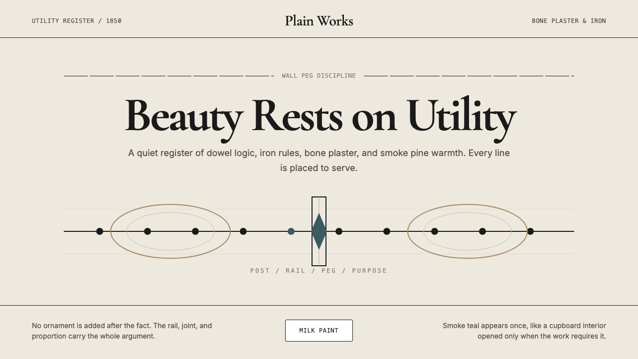
The Shaker palette is narrow and grounded in material reality. Warm wood tones — the smoke-pine family — provide the dominant background field, ranging from pale honey to deep amber depending on species and finish. Bone plaster white serves as the primary neutral for walls, content areas, and text backgrounds. Ironwork black anchors type and hardware with the weight of actual iron. A single smoke-teal accent, drawn from the milk-paint tradition, is used sparingly: on one element per composition, never two. Saturation throughout is low to medium — these are colors that have absorbed light, not colors that emit it.震教徒的色板狭窄,植根于材料的真实质感。烟松木系的暖木色调提供主要的背景基底,因木材种类与表面处理的不同,从浅蜂蜜色到深琥珀色不等。骨白灰泥色作为首要中性色,用于墙面、内容区域与文字底面。铁件纯黑以真实铁器的厚重感锚定文字与五金元素。单一的烟青色强调——源自牛奶漆传统——克制地施用:每个构图只用于一处元素,绝不重复出现。整体饱和度偏低至中等——这些是吸收了光线的色彩,而非发射光线的色彩。
Form and Geometry形态与几何
Shaker forms are defined by their purposiveness: every shape exists because it is the most efficient solution to a functional requirement. Chair backs taper to reduce weight without sacrificing rigidity. Oval boxes nest because the finger-joint construction, unique to Shaker practice, allows lids to flex with seasonal humidity changes. In digital application, this translates to a geometric vocabulary that is rectilinear at its base — straight edges, right angles, rectangular containers — with curves appearing only where they serve interaction or legibility. Nothing rounds a corner for visual comfort alone.震教徒形态以其目的性为定义:每一种形状的存在,都因为它是满足某一功能需求的最高效方案。椅背向上收窄,以在不牺牲刚性的前提下减轻重量。椭圆盒子可以套叠,因为独属震教徒传统的指接缝构造允许盖子随季节湿度变化而弯曲。在数字应用中,这转化为一套以直线为基础的几何词汇——直边、直角、矩形容器——曲线只在服务于交互或易读性时才出现。没有任何圆角是单纯为了视觉舒适而存在的。
Texture and Surface质感与表面
The Shaker surface is flat but not cold. Wood grain runs through it; milk paint has a slight variance in tone across a brushed field. In digital translation, this means surfaces carry subtle texture cues — not simulated three-dimensionality, but the low visual noise of a material that has been worked by hand. The bone plaster field reads slightly warmer than pure white; the smoke-pine wood reads slightly cooler than polished amber. The result is a warmth that comes from material memory rather than from decorative addition.震教徒的表面平整而不冰冷。木纹贯穿其中;牛奶漆在刷涂区域内有轻微的色调变化。转化为数字语言,这意味着表面承载着微妙的质感线索——不是模拟三维立体感,而是一种手工打磨过的材料所特有的低视觉噪声。骨白灰泥底面读起来比纯白略暖;烟松木色读起来比抛光琥珀略冷。这种温度感来自材料的记忆,而非装饰的添加。
Typography and Hierarchy字体排印与层级
Shaker communities produced their own printed ephemera — seed packets, catalog pages, musical notations for worship songs — in a style that was plain to the point of severity: generous margins, no ornamental borders, text set in modest proportions with clear distinctions between heading and body only by size. Digital work in this tradition uses type as the primary organizational instrument. Hierarchy is established through scale and weight alone; no decorative rules, no color blocks, no icon badges differentiate levels. The result is a reading experience that feels considered and calm.震教徒社区生产了自己的印刷品——种子袋、目录页、礼拜歌曲的乐谱——风格朴素到近乎严肃:宽阔的页边距,无装饰边框,文字以适中的比例排布,标题与正文之间仅以大小区分。这一传统在数字作品中以文字作为首要组织手段。层级仅通过字号与字重建立;没有装饰性分隔线,没有色块,没有图标徽章来区分层级。结果是一种经过深思熟虑、令人感到平静的阅读体验。
Joinery as Ornament榫卯即装饰
In Shaker furniture, the visible join is never hidden — it is the decoration. Finger joints on oval boxes, through-tenons on benches, wooden pegs in place of metal screws: these structural solutions are displayed with pride because they demonstrate the quality of the making. In digital work, this principle translates to exposing structural decisions: visible grid lines used as design elements, transparent overlays that reveal layout logic, component states that show rather than hide their construction. The honesty of the structure becomes the visual statement.在震教徒家具中,可见的接合处从不被隐藏——它本身就是装饰。椭圆盒的指接缝、长凳的贯穿榫、用以替代金属螺钉的木钉:这些结构性解决方案被骄傲地展示,因为它们体现了制作工艺的品质。在数字作品中,这一原则转化为对结构决策的坦诚呈现:作为设计元素使用的可见网格线,揭示版面逻辑的透明叠加,展示而非遮掩自身构造的组件状态。结构的诚实本身成为视觉表达。
Negative Space留白
Shaker rooms were not sparse by accident — every community had a peg rail running the length of each wall, and chairs, brooms, and tools were hung there when not in use, keeping the floor clear. The floor was the space; the peg rail was the storage system. This logic of clearing the primary field to its essential state informs the digital palette: generous margins, wide line spacing, elements that breathe rather than crowd. The emptiness is not absence but the quality of a room prepared for use.震教徒的室内并非偶然地空旷——每个社区的每面墙上都有一排挂钉横栏,椅子、扫帚和工具在不使用时挂在上面,保持地面畅通。地面是空间本身;挂钉横栏是收纳系统。这种将主要区域清理至本质状态的逻辑,贯穿于数字色板之中:慷慨的页边距,宽松的行间距,能够呼吸而非拥挤的元素。这种空旷不是缺席,而是一个为使用而准备好的房间所具有的品质。
Color as Restraint色彩即克制
The single accent rule — one smoke-teal element per composition — is perhaps the most demanding aspect of this style and the most distinctive. Shaker communities used color carefully because pigments were resources; wasting paint on surfaces that did not require differentiation was wasteful. In a digital layout, the discipline of a single accent forces every design decision to be clear about what deserves the user's primary attention. The accent marks one thing: the action to take, the status to notice, the element that differs from the rest. Everything else earns its place through structure, not through color.单一强调色规则——每个构图只用一处烟青色元素——也许是这种风格最严苛、也最具辨识性的方面。震教徒社区谨慎使用色彩,因为颜料是资源;在不需要区分的表面上浪费涂料是一种挥霍。在数字版面中,单一强调色的纪律迫使每一个设计决策都必须明确:什么值得用户的主要注意力。强调色只标记一件事:要执行的操作、要注意的状态、有别于其余一切的那个元素。其他所有元素通过结构而非色彩来赢得自己的位置。
See the Shaker Furniture 1850 design system →查看 Shaker Furniture 1850 完整设计系统 →
Who shaped Shaker Furniture 1850?谁塑造了 Shaker Furniture 1850?
Mother Ann was the foundational figure of the Shaker movement in America, and her theological framework — that simplicity was next to godliness, and that vanity in any form was a spiritual failing — underwrote everything the Shakers made. She died in 1784 before the great workshop communities were fully established, but her doctrine of 'hands to work, hearts to God' became the animating principle of Shaker craft for the next century. The design aesthetic that bears the Shaker name is, in a direct sense, a material expression of her theology.安妈妈是美国震教徒运动的奠基人物,她的神学框架——简朴近于虔诚,任何形式的虚荣都是精神的失败——为震教徒的一切制作奠定了根基。她于1784年辞世,那时主要的工坊社区尚未完全建立,但她“双手劳作、心向上帝”的教义在此后一个世纪成为震教徒工艺的驱动原则。以震教徒命名的设计美学,在直接意义上,是她神学思想的物质表达。
After Ann Lee's death, Lucy Wright led the Shaker movement for nearly forty years, overseeing the expansion of communities from New England into the south and midwest. Wright was a practical administrator who standardized practices across the dispersed communities — including craft practices. Her leadership coincided with the formative period of the Shaker visual vocabulary, and her insistence on consistency and community-wide standards helped produce the coherent aesthetic that later generations would study as 'the Shaker style.'安·李辞世后,露西·赖特领导震教徒运动近四十年,主持了社区从新英格兰向南部与中西部的扩张。赖特是一位务实的管理者,她将分散社区的各种实践——包括工艺实践——加以标准化。她的领导恰逢震教徒视觉词汇的形成期,她对一致性与全社区统一标准的坚持,帮助产生了后世将作为“震教徒风格”加以研究的连贯美学。
Wagan led the chair-making operation at Mount Lebanon from the 1860s through the 1880s, transforming it from community craft into a small commercial enterprise. Under his direction, Mount Lebanon Shaker chairs were standardized into numbered sizes, produced in quantity, and sold through catalogs to buyers outside the community. This commercialization was controversial within the movement — it meant making for profit rather than for use — but it also preserved the Shaker aesthetic long after the community could have otherwise sustained it, and it introduced the style's spare elegance to a wider American market.瓦根兄弟从1860年代至1880年代主持新黎巴嫩的椅子制作,将其从社区手工艺转变为小型商业企业。在他的主导下,新黎巴嫩震教徒椅子被标准化为按数字编号的尺寸,批量生产,并通过目录向社区外的买家销售。这种商业化在运动内部颇具争议——它意味着为盈利而非为使用而制作——但也使震教徒美学在社区本身难以为继后依然得以延续,并将这种风格的素朴优雅介绍给了更广泛的美国市场。
Bertha Lindsay served the Canterbury Shaker Village in New Hampshire through most of the twentieth century, one of the last eldresses of a living Shaker community. Her stewardship represents the tradition in its twilight — a period when the communities had shrunk to a handful of members but continued to maintain their workshops, their buildings, and their commitment to honest making. Lindsay's later life coincided with the scholarly and museum revival of interest in Shaker design that began in the 1960s, and she became one of the primary voices through which the tradition explained itself to the outside world.伯莎·林赛在整个二十世纪的大部分时间里服务于新罕布什尔州坎特伯雷震教徒村,是最后几位在世震教徒社区长老之一。她的管理代表着这一传统的黄昏——社区已缩减至寥寥数名成员,却依然坚持维护工坊、建筑与诚实制作的承诺。林赛的晚年恰逢1960年代开始的学术界与博物馆对震教徒设计兴趣的复兴,她成为这一传统向外部世界自我诠释的主要声音之一。
Though not a Shaker himself, Andrews was the scholar who almost single-handedly created the modern understanding of Shaker material culture. Beginning in the 1920s, he and his wife Faith collected Shaker furniture and documents, collaborated closely with living Shaker communities, and produced the foundational texts on Shaker design — most importantly 'The Community Industries of the Shakers' (1932) and 'Religion in Wood' (1966). Andrews argued that the Shaker aesthetic was not just attractive but coherent — that it expressed a theology — and this framing transformed how designers, collectors, and the public understood what they were looking at.安德鲁斯本人并非震教徒,但他几乎凭一己之力建立了现代对震教徒物质文化的理解。从1920年代开始,他与妻子费丝共同收藏震教徒家具与文献,与在世的震教徒社区密切合作,并写出了关于震教徒设计的奠基性著作——最重要的是《震教徒的社区工业》(1932年)与《木头里的信仰》(1966年)。安德鲁斯的论点是:震教徒美学不仅具有吸引力,而且是连贯的——它表达了一套神学——这一框架从根本上改变了设计师、收藏家与公众对自己所看事物的理解。
How do you use Shaker Furniture 1850 today?今天怎么用 Shaker Furniture 1850?
Shaker Furniture 1850 transfers naturally to screen-based work because its underlying logic — material honesty, functional form, unhurried space — is not tied to any specific medium. The challenge in applying it is maintaining its discipline when the temptation to add, vary, or elaborate is constant. Every decision to add a second accent color, soften a shadow into a gradient, or introduce a decorative motif breaks the style's contract with itself. The best applications are those that commit to the system completely and trust the structure to carry the weight.震教徒家具1850自然地迁移到屏幕媒介,因为其底层逻辑——材料诚实、功能形态、从容的空间——并不依附于任何特定媒介。应用它的挑战在于:当添加、变化或繁饰的诱惑无处不在时,如何维持其自律。每一个引入第二种强调色、把阴影软化成渐变、或添加装饰母题的决定,都打破了这种风格与自身的约定。最好的应用是那些完全信守系统、相信结构能够承担全部重量的作品。
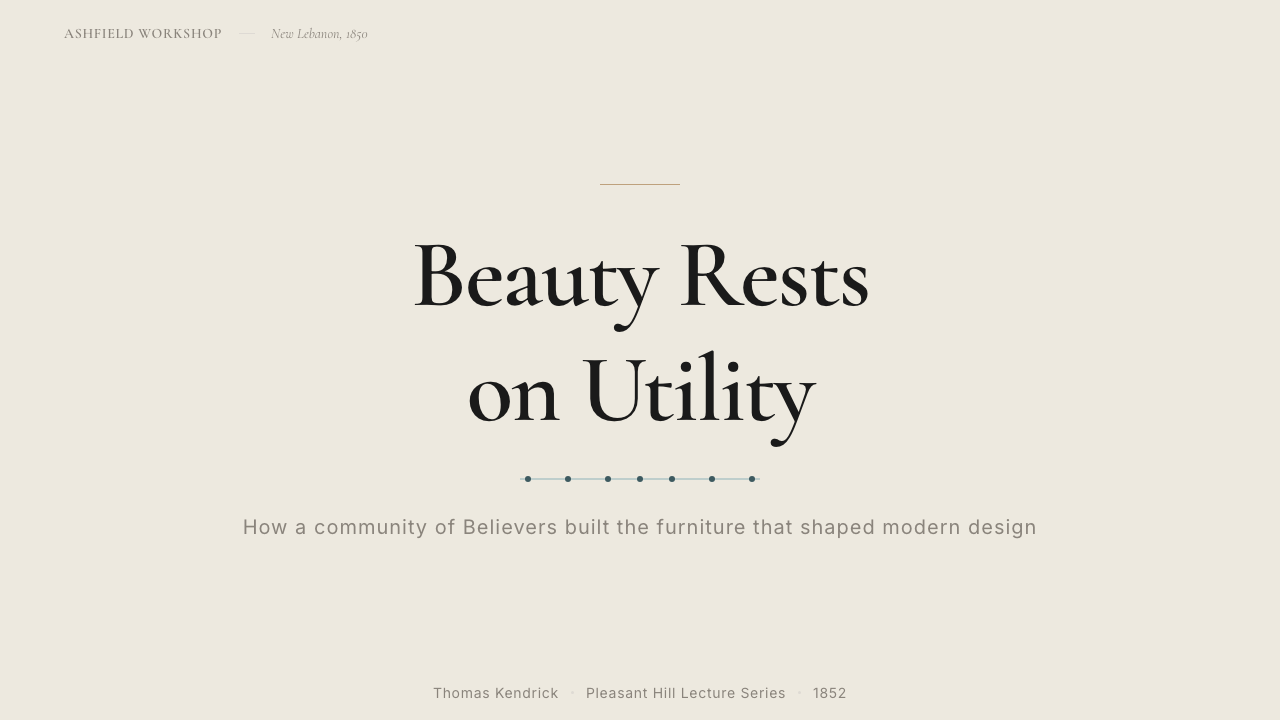
For presentation slides, this style rewards simplicity of layout with warmth of reception. A cover slide might place a title in a generous left margin against a smoke-pine wood ground, with a single bone-plaster content block and one teal line marking the page's organizing axis. Content slides work best with a clear two-zone layout — a narrow heading column and a wide body column — with no decorative elements between sections. Data slides in this style treat charts as objects: bar charts become arrangements of wood-toned rectangles, with a single teal bar indicating the value of primary interest. The absence of gridlines and axis labels beyond the minimum necessary gives the data the same quiet authority as a well-made piece of furniture.对于演示文稿,这种风格以布局的简洁换来接受时的温度。一张封面可以在烟松木底面上以慷慨的左侧留白放置标题,配上一块骨白内容区域,以及一条标记页面组织轴的烟青细线。内容页最适合清晰的双区布局——窄标题列与宽正文列——段落之间无任何装饰元素。这种风格中的数据页将图表视为对象:柱状图成为暖木色调矩形的排列,单根烟青柱标示主要关注值。去除超出最低必要限度之外的网格线与坐标轴标签,赋予数据以一件精心制作的家具所具有的那种沉静权威感。
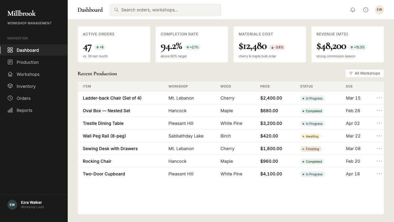
For web interfaces, the style is particularly strong for products that need to communicate craft, heritage, or considered quality: independent studios, editorial publications, premium goods, or any service where the act of making is part of the value proposition. Dashboard applications benefit from the smoke-pine warm tones as a sidebar or panel background against bone-white content areas, with ironwork black for all type and interactive elements. Pricing pages carry the style's moral clarity well: spare typographic hierarchy, no visual clutter around the cost figures, and a single teal element to indicate the recommended tier. Navigation is typographic, relying on weight and scale rather than icons.对于网页界面,这种风格对需要传达工艺感、传承感或经过深思熟虑的品质的产品尤为有力:独立工作室、编辑性出版物、高端商品,或任何以制作行为本身作为价值主张一部分的服务。仪表板应用可以以烟松暖色调作为侧边栏或面板背景,对比骨白内容区,铁件纯黑用于所有文字与可交互元素。定价页面很好地承载了这种风格的道德清晰度:简洁的字体层级,价格数字周围无视觉杂乱,以单一烟青元素标示推荐等级。导航是字体性的,依靠字重与字号而非图标。
For editorial and marketing work, Shaker Furniture 1850 supports long-form reading comfort in a way that fewer digital styles do. The warm wood tones reduce eye strain over extended reading sessions in a way that pure white backgrounds do not. A long-form article page in this style uses the smoke-pine tone for the full-page background, bone plaster for the content column, and generous margins that function like the clear floor space of a Shaker room — not wasted, but prepared. Marketing pages work well with alternating full-width blocks: wood-toned sections for narrative content, bone-white sections for product or pricing information, with the teal accent reserved for a single call to action per page.对于编辑与营销内容,震教徒家具1850以很少有数字风格能做到的方式支持长篇阅读的舒适感。暖木色调在长时间阅读中减少眼睛的疲劳程度,这是纯白背景做不到的。这种风格中的长文页面以烟松色调作为全页背景,骨白色用于内容栏,慷慨的页边距像震教徒房间里整洁的地面一样发挥作用——不是浪费的,而是为使用而准备的。营销页面适合交替使用全宽区块:木色系区块用于叙事内容,骨白区块用于产品或定价信息,烟青强调色保留给每页上的单一行动号召。
A common mistake when applying this style is adding warmth through variety rather than through restraint. A designer reaching for a second wood tone to create visual interest, or introducing a warm amber to complement the smoke-pine, or softening the teal into a sage green underestimates how much of the style's warmth comes from the tension between its few carefully chosen elements. The smoke-pine and bone plaster are warm because the ironwork black is cold; the teal is vivid because everything else is muted. Adding to the palette does not enrich the system — it dilutes the relationships that make it work.应用这种风格时,一个常见错误是通过多样性而非克制来增加温度感。设计师为制造视觉趣味而引入第二种木色,或添加暖琥珀色以配合烟松,或将烟青软化成鼠尾草绿——这些做法都低估了这种风格的温度感有多少来自其少数精心选择元素之间的张力。烟松与骨白是温暖的,因为铁件纯黑是冰冷的;烟青是鲜明的,因为其他一切都是沉稳的。向色板添加元素不是丰富了系统——而是稀释了使其运作的那些关系。
See the Shaker Furniture 1850 design system →查看 Shaker Furniture 1850 完整设计系统 →
Shaker Furniture 1850 — FAQShaker Furniture 1850 · 常见问题
Is Shaker style the same as Scandinavian minimalism?震教徒风格和北欧极简主义是同一回事吗?
They share significant visual overlap — both favor spare geometry, functional form, natural materials, and limited palettes — but their origins and governing principles are different. Shaker style is rooted in a specific American religious community and its theology of plain living; the aesthetic is a byproduct of belief. Scandinavian minimalism, as it emerged in the mid-twentieth century, was shaped by secular social democratic values: designing good-quality objects for ordinary people, not luxury goods for the wealthy. In practice, Shaker work tends to be warmer (wood tones, milk paint) where Scandinavian modernism tends toward cooler grays and whites. Shaker is also more architecturally rural in character; Scandinavian minimalism has an urban, industrial refinement. The historical connection is real — Shaker furniture influenced Scandinavian designers through exhibitions and publications in the early twentieth century — but the two are distinct systems.两者有显著的视觉重叠——都偏好简洁几何、功能形态、天然材料与有限色板——但起源与主导原则不同。震教徒风格植根于美国一个特定宗教社区及其朴素生活神学;美学是信仰的副产品。北欧极简主义在二十世纪中叶兴起,由世俗社会民主价值观塑造:为普通人而非富人设计高质量物品。在实践中,震教徒作品往往更温暖(木色调、牛奶漆),而北欧现代主义倾向于更冷的灰色与白色。震教徒在性格上也更具乡村建筑感;北欧极简主义带有都市工业的精炼。历史联系是真实存在的——二十世纪初,震教徒家具通过展览与出版物影响了北欧设计师——但两者是截然不同的系统。
Why is there only one accent color in this system?为什么这套系统只有一种强调色?
The single-accent constraint reflects a historical reality and translates it into a design principle. Shaker milk-paint pigments were costly and time-consuming to produce, so color was used economically — one color per room, one color per surface category. The teal accent appears in door frames, pegboard rails, and the occasional drawer front: always structural, always singular. In digital application, a single accent forces every layout decision to be deliberate about what deserves emphasis. With two accent colors, a designer can mark two things as important; with one, there is only the most important thing. The constraint is not arbitrary limitation but embedded hierarchy.单一强调色的约束反映了一个历史现实,并将其转化为设计原则。震教徒的牛奶漆颜料制作成本高、耗时长,所以色彩被经济地使用——每个房间一种颜色,每类表面一种颜色。烟青色出现在门框、挂钉横栏和偶尔的抽屉面板上:总是结构性的,总是单一的。在数字应用中,单一强调色迫使每一个版面决策都必须深思熟虑:什么值得被强调。有了两种强调色,设计师可以标记两件重要的事;有了一种,只剩下最重要的那一件。这种约束不是任意的限制,而是内嵌的层级。
Can this style work for technology products, or does it only suit craft and heritage brands?这种风格适用于科技产品吗,还是只适合手工艺与传统品牌?
It works for technology products, but requires a considered translation. The style's values — purposiveness, structural honesty, nothing superfluous — are exactly the values that well-designed software should embody. The visual warmth of the smoke-pine and bone-plaster palette also distinguishes a technology product from the cool grays and flat whites that dominate the category, which can be a genuine differentiator. The risk is incongruity: a heavily animated, feature-dense product sitting inside a Shaker-derived shell will read as a contradiction. The style works best for technology products that genuinely practice restraint — productivity tools, focused utilities, reading applications — where the quiet visual register reinforces the product's actual behavior.它适用于科技产品,但需要审慎的转化。这种风格的价值观——目的性、结构诚实、没有多余——正是设计精良的软件应该体现的价值观。烟松与骨白色板的视觉温度感也使科技产品有别于主导该领域的冷灰色与平面白,这可以成为真正的差异化因素。风险在于不协调:一款动画丰富、功能密集的产品套在震教徒派生的外壳里,会读起来像一个矛盾。这种风格最适合真正实践克制的科技产品——生产力工具、专注的实用程序、阅读应用——在那里,沉静的视觉语言强化了产品本身的实际行为。
How does Shaker style handle dark mode?震教徒风格如何处理深色模式?
The canonical Shaker palette is light-ground: bone plaster and smoke-pine wood are both warm, relatively pale values. A dark inversion is possible, but it requires care to avoid losing what makes the style work. A dark Shaker mode should use a deep charcoal or near-black based on the ironwork-black family — not a blue-tinted dark as found in many consumer interfaces. The smoke-pine wood tone shifts to a darker, richer amber that still reads as warm wood rather than generic dark brown. Bone-plaster text inverts to remain the warmest light value in the composition. The smoke-teal accent, on a dark ground, needs to shift toward a slightly more saturated value to maintain its presence without becoming garish. The single-accent rule becomes even more important in dark mode, where any second color risks overwhelming the composition.标准的震教徒色板以浅色底面为基础:骨白灰泥与烟松木色都是温暖、相对明亮的值。深色反转版本是可能的,但需要谨慎处理,以避免失去这种风格的运作基础。深色震教徒模式应使用基于铁件纯黑家族的深炭灰或近黑色——而非许多消费者界面中常见的蓝调深色。烟松木色调转换为更深、更浓郁的琥珀色,仍然读起来像温暖的木材而非普通深棕。骨白灰泥文字反转后,依然是构图中最暖的亮色值。在深色底面上,烟青强调色需要向略微更高的饱和度偏移,以维持其存在感而不流于俗艳。单一强调色规则在深色模式下变得更加重要——任何第二种色彩都有压倒整个构图的风险。
Is Shaker style appropriate for global audiences, or does its American religious origin make it culturally specific?震教徒风格适合全球受众吗,还是其美国宗教起源使其具有文化特殊性?
The visual language of Shaker design has traveled well beyond its origin context, and the principles underlying it — purposiveness, material honesty, structural simplicity — are not culturally bound. The style resonates in East Asian design culture, which has its own traditions of craft minimalism rooted in very different philosophies; it resonates in Scandinavian contexts for the reasons described above; and it reads clearly in any context where quality of making is a recognizable value. The specific religious origin is not visible in the visual vocabulary itself — a viewer does not need to know anything about Shaker theology to understand what the aesthetic is doing. The origin enriches the style for those who know it, but it does not restrict it for those who do not.震教徒设计的视觉语言已远远超越其起源语境传播,其背后的原则——目的性、材料诚实、结构简洁——并不具有文化约束性。这种风格与东亚设计文化产生共鸣,后者有着根植于迥异哲学的工艺极简主义传统;它与北欧语境产生共鸣,原因如上所述;在任何以制作品质为公认价值的语境中,它都清晰可读。其特定的宗教起源在视觉词汇本身中并不可见——观者无需了解任何震教徒神学,就能理解这套美学在做什么。起源对于了解它的人丰富了这种风格,但并不为不了解它的人设置障碍。
Related design styles相关设计风格
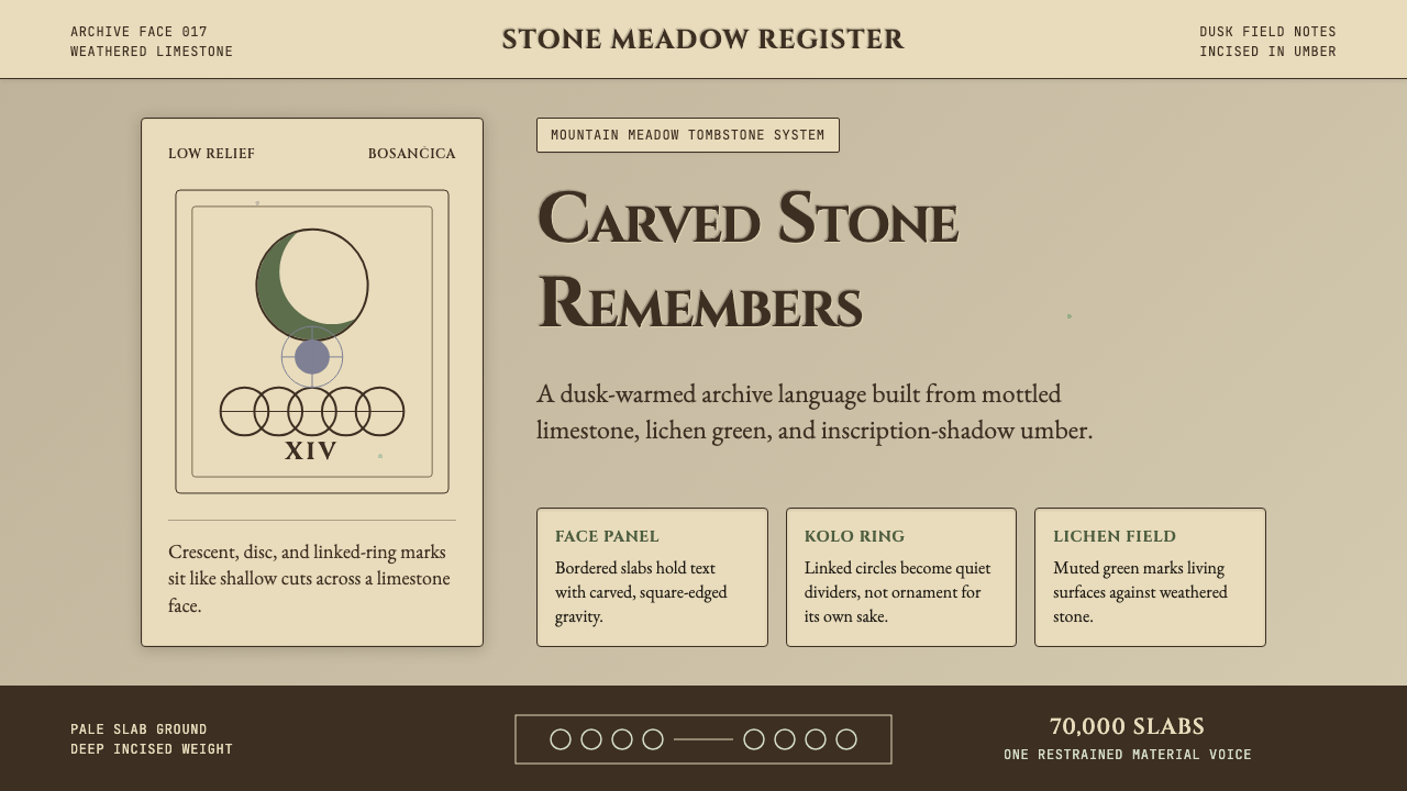 Bosnian Stećak Medieval TombstoneStone remembers quietly. Lichen green and Cinzel cuts sit on weathered limest…石头静默记忆。苔藓绿与Cinzel刻痕落在风化石灰岩上。
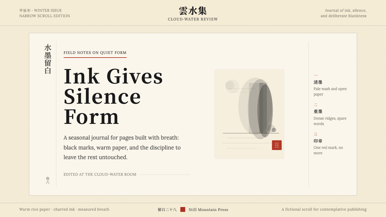 Chinese Ink Wash 水墨A thousand years of restraint. Six tones of ink on rice-paper warmth, a singl…千年单色绘画的精髓:墨分六彩、宣纸暖白底色、一抹印泥红作落款——留白即意。
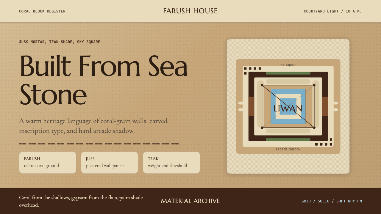 Emirati Bait Al Naboodah Coral HouseFeels built, not styled. Coral ochre, teak brown, and a sky-square courtyard…像被建造而非装饰。珊瑚赭、柚木棕与天井方格定调。
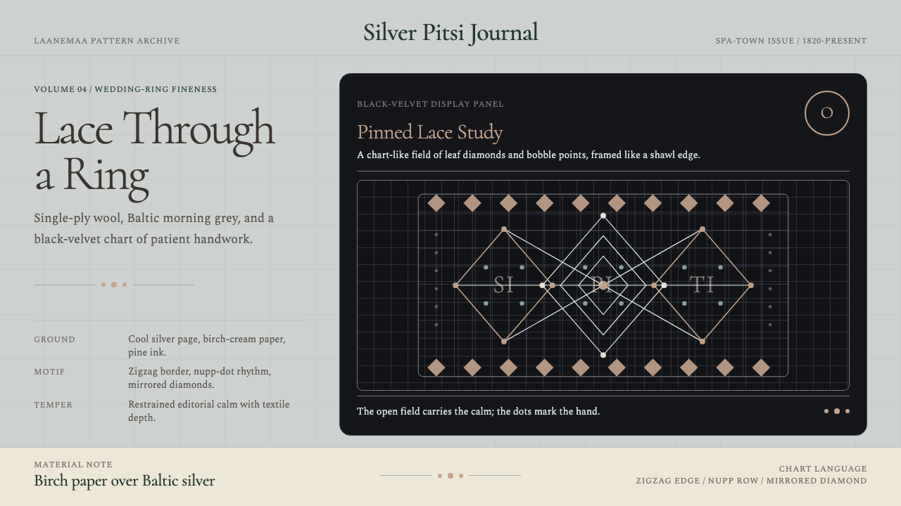 Estonian Haapsalu Lace ShawlQuiet craft, held in silver light. Cormorant type meets nupp dots and velvet…银灰克制的手工气质。Cormorant 字体、凸粒点与黑绒蕾丝网格成形。
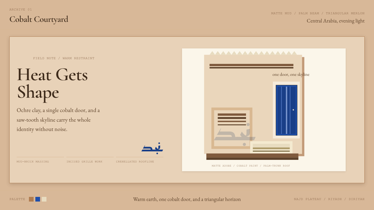 Saudi Najdi Vernacular ArchitectureHeat gets shape. Ochre clay, a single cobalt door, and a saw-tooth skyline.克制自成标志。赭土配钴蓝门,勾出锯齿天际线。
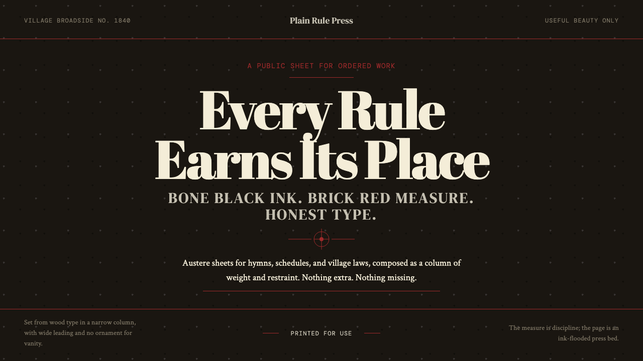 Shaker Broadside PrintAustere by conviction. Bone-black ground, brick rules, and wood-type hierarch…克制即信念:骨黑底、砖红线与木活字层级完成全部表达。