Design style guide设计风格指南
What is Shaker Broadside Print?什么是 Shaker Broadside Print?
The Shakers printed the way they prayed — with absolute conviction that nothing unnecessary should exist.震教徒印刷的方式如同祷告——以绝对的确信:凡多余之物,皆不应存在。
Shaker Broadside Print in briefShaker Broadside Print 速览
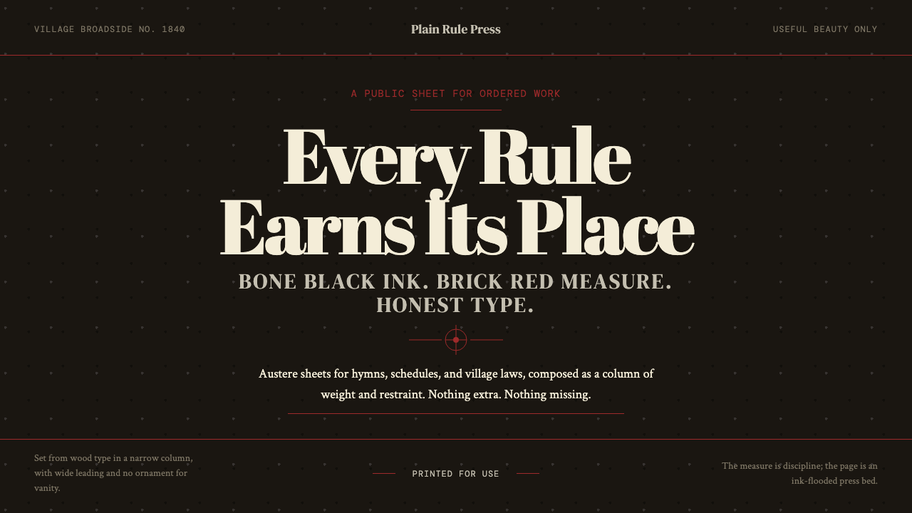
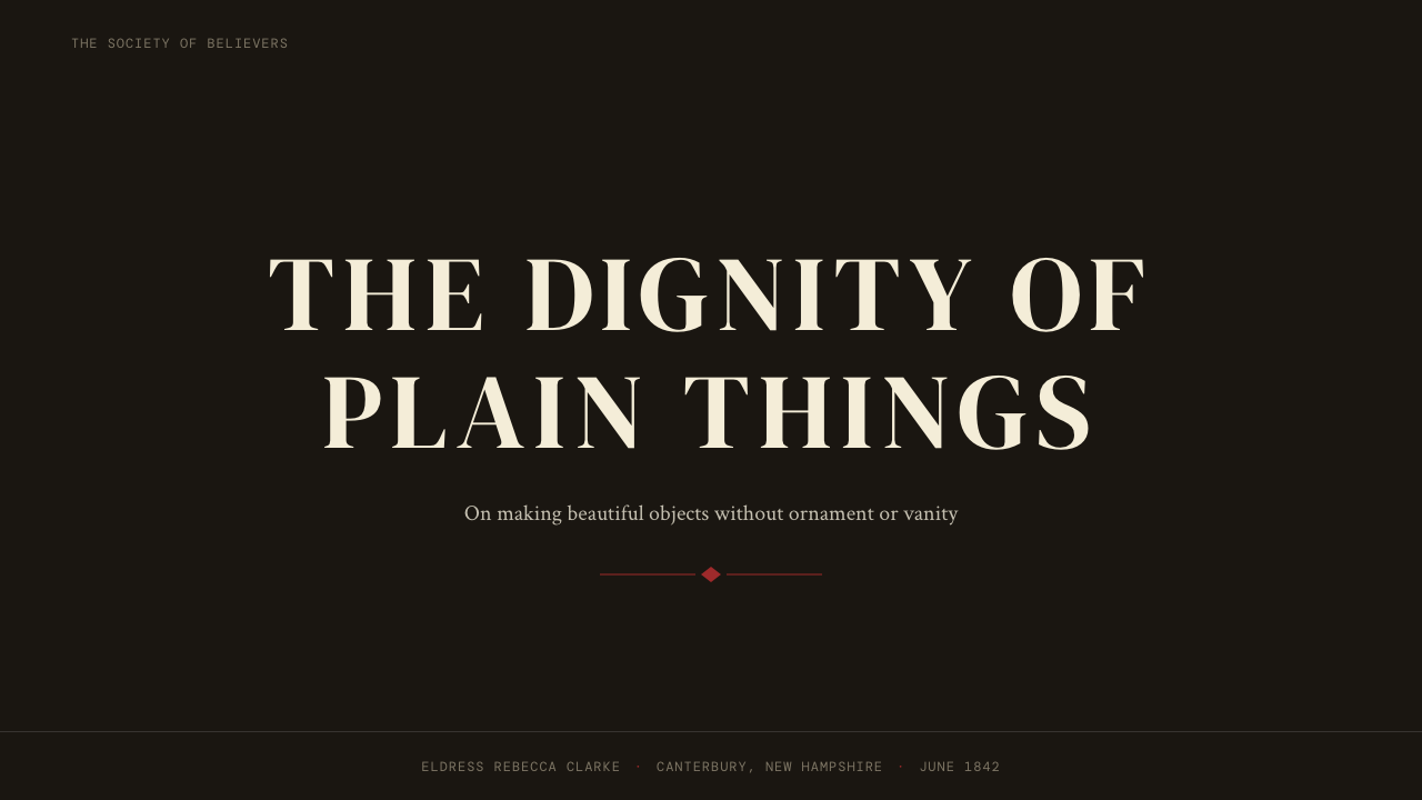
Shaker Broadside Print is the typographic and compositional tradition that emerged from Shaker communal villages in the northeastern and central United States between roughly 1810 and 1870. Working with wood type, hand-set lead, and letterpress equipment, Shaker printers produced hymn sheets, seed catalogs, rules broadsides, and community announcements that share a distinctive visual grammar: deep, near-black grounds, brick-red accent rules, massive display letterforms organized in strict architectural hierarchies, and an almost total absence of decorative ornament.震教徒宽版印刷(Shaker Broadside Print)是1810至1870年间在美国东北部与中部震教公社村庄中兴起的排印与版面传统。震教徒印刷师傅使用木活字、手排铅字与凸版印刷设备,制作赞美诗页、种子目录、村规公告与社区通知。这些印刷品共享一套鲜明的视觉语法:深沉近黑的底色,砖红色强调线,以严格建筑式层级堆叠的巨型展示字体,以及几近于零的装饰性元素。
What makes this tradition remarkable is that it predates the European modernist rejection of ornament by more than half a century. While Victorian commercial printing was piling on flourishes, ornamental borders, and competing typefaces, the Shakers were producing work of spare, disciplined clarity rooted not in aesthetic theory but in religious conviction. For them, beauty was a byproduct of usefulness; anything added purely for visual effect was a form of pride, and pride was a sin. The result was a print language that looks, to contemporary eyes, startlingly ahead of its time.这一传统的非凡之处在于:它比欧洲现代主义对装饰的拒绝早了半个多世纪。当维多利亚时代的商业印刷正疯狂堆叠花饰、装饰边框与互相竞争的字体时,震教徒已经在生产一种简朴、有纪律的清澈——这种清澈并非源于美学理论,而是宗教信念的自然结果。对他们而言,美是实用性的副产品;任何纯为视觉效果而添加的元素都是一种骄傲,而骄傲是罪。当代人看来,这套印刷语言超越时代的程度令人咋舌。
The system draws its visual authority from constraint: a narrow palette of bone-black and brick red, wood-type letterforms with their inherent irregularity and tactile weight, and compositions that use scale contrast and vertical stacking rather than decoration to create hierarchy. Ink pressed into rag paper left visible impression and texture — material honesty that was a consequence of the process, not a stylistic choice, and that gives surviving Shaker broadsides their distinctive warmth within austerity.这套体系的视觉权威来自克制:骨黑与砖红构成的窄调色盘,木活字字形固有的不规则性与触觉分量,以及用尺度对比和垂直堆叠而非装饰来建立层级的版面构成。油墨压入亚麻纸留下可见的压痕与质感——这是工艺过程的自然结果而非风格选择,也正是这种物质诚实,赋予了现存震教徒宽版印刷品在朴素中独有的温度。
See the Shaker Broadside Print design system →查看 Shaker Broadside Print 完整设计系统 →
Where does Shaker Broadside Print come from?Shaker Broadside Print 从何而来?
The United Society of Believers in Christ's Second Appearing — known universally as the Shakers — was founded in England by Ann Lee, who led a small group of followers to America in 1774. By the early nineteenth century, the movement had established a network of self-contained communal villages stretching from Maine to Kentucky, each organized around collective labor, celibacy, and the principle that work performed with skill and care was itself a form of worship. This theological foundation shaped every material object the Shakers made, from oval storage boxes and ladder-back chairs to the broadsides that governed community life.震教(The United Society of Believers in Christ's Second Appearing)由安·李在英格兰创立,1774年她带领一小群信徒来到美洲。到十九世纪初,这一运动已在从缅因州到肯塔基州的广阔地带建立起一系列自给自足的公社村庄,每一座村庄都围绕集体劳动、独身与一条核心原则组织起来:以技巧与专注完成的劳动本身就是一种礼拜。这一神学基础塑造了震教徒制造的每一件物品,从椭圆储物盒和梯背椅,到管理社区生活的宣传单。
Shaker printing developed out of practical necessity. Communities needed to communicate rules, share hymns, advertise surplus seeds and goods to the outside world, and distribute devotional texts. The first Shaker printing operations were modest — small hand presses, limited type inventories — but by the 1830s and 1840s, villages at Mount Lebanon, New York; Hancock, Massachusetts; Pleasant Hill, Kentucky; Sabbathday Lake, Maine; and Canterbury, New Hampshire had established functioning print shops with substantial wood-type collections. The peak years of Shaker broadside production, roughly 1830 to 1860, coincided with the movement's population zenith of around six thousand members.震教徒的印刷事业源于实际需要。社区需要传达规章、分享赞美诗、向外界推销剩余种子与商品,并分发灵修文本。最初的震教印刷作坊十分简陋——小型手动印刷机、有限的活字库存——但到1830至40年代,纽约州黎巴嫩山、马萨诸塞州汉考克、肯塔基州宜人山、缅因州安息日湖、新罕布什尔州坎特伯雷的村庄已建立起拥有大量木活字收藏的成熟印刷工坊。震教宽版印刷的鼎盛时期大约在1830至1860年间,与这一运动约六千名成员的人口顶峰相互呼应。
The visual character of Shaker printing owed as much to material constraint as to ideology. Wood type was large, heavy, and limited in variety — it naturally imposed a kind of typographic discipline, because the printer could not set small, intricate compositions without purpose-cut sorts that most shops did not own. Bone-black ink, made from charred animal bones, produced a deep, slightly warm black that differed from the bluer-black of lamp-black inks standard in commercial printing. Brick-red accent color — used for horizontal rules that separated sections, underscored headings, or marked the top and bottom of a broadside — was available cheaply through iron-oxide pigments and became a signature of the Shaker print vocabulary.震教印刷品的视觉风貌,既源于意识形态,也源于物质条件的制约。木活字体积大、分量重、种类有限——它天然地施加了一种排印纪律,因为印刷师傅若要排出精细复杂的版面,需要大多数工坊并不拥有的专用字模。由烧焦动物骨骼制成的骨黑油墨,呈现出一种深沉而略带暖意的黑色,不同于商业印刷中标准的灯黑油墨所产生的偏蓝黑色。砖红色强调色——通过廉价的氧化铁颜料获得,用于分隔段落的水平线、强调标题,或标记宽版印刷品的上下边界——成为震教印刷词汇的标志性符号。
The Shaker printing tradition began to decline in the latter half of the nineteenth century as membership fell and steam-powered commercial printing made outside production cheap and fast. By 1900, most Shaker villages had closed their print shops. What survived was a body of work preserved in Shaker museum collections and archives — most notably at the Shaker Heritage Society in Albany, the Shaker Museum in Old Chatham, and Sabbathday Lake, which remains the only active Shaker community. The broadsides themselves were rediscovered by typographers and design historians in the mid-twentieth century, who recognized in them a formal discipline that looked forward rather than back.随着会员人数下降和蒸汽动力商业印刷令外部生产既廉价又快速,震教印刷传统在十九世纪后半叶开始衰退。到1900年,大多数震教村庄已关闭印刷工坊。留存下来的是保存于震教博物馆与档案馆的一批作品——最重要的收藏地包括奥尔巴尼震教遗产学会、老查塔姆震教博物馆,以及至今仍是唯一活跃震教社区的安息日湖。这些宽版印刷品在二十世纪中叶被排印师与设计史学家重新发现,他们在其中认出了一种指向未来而非回望过去的形式纪律。
What defines the Shaker Broadside Print look?Shaker Broadside Print 的视觉特征是什么?
Ground Color底色
The Shaker broadside palette is built on bone-black — a deep, slightly warm near-black derived from charred animal bone that differs subtly from the cooler, bluer blacks of standard commercial printing ink. This warmth gives the dark ground an organic quality, softening the visual severity without sacrificing depth. The ground reads as authoritative but not cold, a distinction that separates the Shaker palette from later industrial or digital interpretations of black-ground composition.震教宽版印刷的色板以骨黑为基础——一种深沉而略带暖意的近黑色,由烧焦动物骨骼制成,与标准商业印刷油墨中更冷、更偏蓝的黑色有细微差别。这种暖意赋予深色底面一种有机品质,在不牺牲深度的前提下柔化了视觉的严峻感。底色读起来权威而不冰冷,这一区别将震教色板与后来的工业或数字黑底构图诠释区分开来。
Brick-Red Accent Rule砖红强调线
Horizontal rules in brick red — an iron-oxide color available cheaply to early nineteenth-century print shops — are the single accent element that Shaker broadsides deploy consistently. These rules serve structural roles: separating sections, underlining headings, banding the top and bottom edges of a composition. They are never decorative in intent; each one marks a boundary or a transition. The earthen warmth of brick red against bone-black creates a visual temperature that is rich without being ornate, and the restraint of using only this one accent color amplifies its authority when it appears.砖红色——十九世纪初印刷工坊唾手可得的氧化铁颜色——的水平线是震教宽版印刷品一以贯之部署的唯一强调元素。这些线条承担结构性功能:分隔段落、为标题加下划线、在版面上下边缘形成边带。它们从无装饰意图;每一条都标示一个边界或过渡。砖红在骨黑底上产生的视觉温度既丰富又不繁缛,而只使用这一种强调色的克制,在它出现时反而放大了它的权威感。
Wood-Type Hierarchy木活字层级
Display type in Shaker broadsides is set in massive wood letterforms, often cut from maple or boxwood, that create a bold visual architecture when stacked vertically. The organizing logic is pure scale contrast: the most important information — a community rule, a hymn title, a product category — occupies the largest type, and subsidiary information cascades downward in progressively smaller sizes. There are no decorative dividers between levels; scale alone creates the hierarchy. The inherent imperfection of hand-cut wood type — slight variations in letter-spacing, occasional ink irregularities — gives the composition a tactile quality absent from mechanically perfect type.震教宽版印刷品中的展示字体以巨型木活字排设,通常由枫木或黄杨木雕刻而成,垂直堆叠时形成大胆的视觉建筑结构。组织逻辑是纯粹的尺度对比:最重要的信息——一条社区规章、一首赞美诗标题、一个产品类别——占据最大字号,从属信息依次向下以递减的字号排列。各层级之间没有装饰性分隔线;单凭尺度建立层级。手工雕刻木活字固有的不完美——字间距的细微变化、偶发的油墨不均——赋予版面一种机械精准字体所没有的触觉品质。
Vertical Stacking垂直堆叠
Shaker broadside compositions are organized along a single vertical axis rather than across a horizontal spread. Text blocks are centered or flush within a narrow measure and stacked top-to-bottom with deliberate breathing room between them. This architectural stacking mirrors the communal symmetry of Shaker meeting houses and furniture arrangements — everything aligned to a central spine, nothing veering left or right without reason. The result is a formal authority that feels almost monumental despite the humble scale of the printed sheet.震教宽版印刷品的版面沿单一垂直轴组织,而非横向展开。文字块居中或在窄行宽内齐排,从上到下有意保留间距地堆叠。这种建筑式堆叠呼应了震教集会所与家具陈设的共同体对称感——一切对齐于中央脊柱,没有无缘由地向左或向右偏移。结果是一种近乎纪念碑式的正式权威,尽管印刷单页的物理尺度并不壮观。
Ink-into-Paper Texture油墨压纸质感
Letterpress printing leaves a physical impression in the paper — ink is not merely deposited on the surface but pressed into it, creating a tactile relief that catches light and registers as texture to the touch. Shaker broadsides were printed on rag paper, which has a more irregular, absorbent surface than wood-pulp stock, making this impression more visible and more variable. The texture reads as material honesty: the process is not concealed but evident. This quality distinguishes the style from any purely visual imitation and explains why digital recreations of the aesthetic require deliberate attention to simulating surface variation.凸版印刷在纸张上留下物理压痕——油墨不仅仅沉积于表面,而是被压入其中,形成一种捕捉光线、触摸可感的浮雕质感。震教宽版印刷品使用亚麻纸,其表面比木浆纸更不规则、更具吸收性,使这种压印更为可见、更为多变。质感读起来是材料诚实:工艺过程不被遮掩,而是清晰可见。这种品质将这一风格与任何纯视觉模仿区别开来,也解释了为何数字复刻这一美学需要刻意关注表面变化的模拟。
Zero Ornament零装饰
Shaker printing contains no decorative borders, no typographic flourishes, no ornamental woodcuts, no decorative initial capitals, and no illustrative imagery beyond the occasional simple hand. This is not aesthetic minimalism in the contemporary sense; it is theological restraint made visible. The printed page, like the furniture and architecture of a Shaker village, was governed by the principle that pride — expressed through unnecessary adornment — was incompatible with the spiritual life. Every absent ornament is a kept promise.震教印刷品不含装饰边框、排印花饰、装饰性木刻、装饰性首字母大写,以及偶发简单手形指示符之外的任何插图图像。这不是当代意义上的美学极简主义;这是神学克制的可见化。印刷页,如同震教村庄的家具与建筑,由一条原则支配:骄傲——以不必要的装饰表达——与灵修生活不相容。每一处缺席的装饰,都是一个被信守的承诺。
Centered Symmetry居中对称
Unlike the dynamic asymmetry of modernist print traditions, Shaker broadsides are almost universally centered along a vertical axis. This symmetry is not the classical balance of academic tradition but a communal and spiritual one: no element claims more spatial territory than it deserves, and no side of the composition is favored over the other. The centering creates calm authority rather than visual excitement, a quality appropriate to text whose purpose is governance, devotion, or practical instruction rather than persuasion or spectacle.与现代主义印刷传统的动态非对称不同,震教宽版印刷品几乎无一例外地沿垂直轴居中排列。这种对称不是学院传统的古典平衡,而是一种共同体的、精神性的对称:没有任何元素占据超出其应得的空间领地,版面的两侧也无一方比另一方更受偏爱。居中产生的是平静的权威而非视觉刺激——这种品质恰适于其目的是治理、虔诚或实际指引而非说服或景观的文本。
See the Shaker Broadside Print design system →查看 Shaker Broadside Print 完整设计系统 →
Who shaped Shaker Broadside Print?谁塑造了 Shaker Broadside Print?
Hannah Cohoon (1788–1864) was a member of the Hancock, Massachusetts Shaker community and one of the movement's most important visual artists. Best known for her spirit drawings — intricate images of trees, fruits, and flowers received in spiritual visions — Cohoon worked in a tradition of inspired Shaker visual culture that ran alongside the printed broadside tradition. Her work demonstrates the capacity of Shaker aesthetics to contain richness within radical constraint: even her most elaborate spirit drawings maintain a flat, diagrammatic quality that refuses illusionistic depth. Cohoon's drawings were not printed broadsides, but they share the same underlying visual theology: every mark present for a reason, nothing extra.汉娜·科恩(1788—1864年)是马萨诸塞州汉考克震教社区的成员,也是这一运动最重要的视觉艺术家之一。她以「灵魂图画」最为著名——在灵性异象中获得的繁复树木、果实与花卉图像——科恩在与宽版印刷传统并行的震教启示性视觉文化传统中工作。她的作品展示了震教美学在彻底克制中容纳丰富性的能力:即便是她最精细的灵魂图画,也保持着一种平面、示意图式的品质,拒绝错觉式的深度。科恩的图画不是印刷宽版,但共享同一底层视觉神学:每一个标记都有其存在的理由,没有多余的一笔。
Henry Clay Blinn (1824–1905) was the central printer, editor, and chronicler of the Canterbury, New Hampshire Shaker village and one of the most prolific figures in Shaker print culture. He managed Canterbury's print shop for decades, produced the community's publications, and kept meticulous records of Shaker life and history. Blinn's practical approach to typography — treating the printed page as a vessel for clear communication rather than an opportunity for display — exemplifies the Shaker print ethic at its most conscious and articulate. His publications demonstrate how the visual restraint of the broadside tradition was maintained even as outside commercial printing grew increasingly ornate.亨利·克莱·布林(1824—1905年)是新罕布什尔州坎特伯雷震教村庄的核心印刷师、编辑与编年史家,也是震教印刷文化中最多产的人物之一。他经营坎特伯雷印刷工坊数十年,制作社区出版物,并保存了关于震教生活与历史的详尽记录。布林对排印的务实态度——将印刷页视为清晰传达的容器而非炫耀的机会——最为自觉且清晰地体现了震教印刷伦理。他的出版物展示了宽版印刷传统的视觉克制是如何在外部商业印刷日益繁缛的同时得以维持的。
Brockmeyer was associated with Shaker print operations in the western communities, particularly in the Kentucky villages. His work illustrates how the Shaker print vocabulary traveled across geography while maintaining remarkable consistency — the same bone-black grounds, the same brick-red rules, the same wood-type hierarchies appeared in broadsides produced hundreds of miles apart, because the underlying theology was the same across all communities. This geographic consistency is itself significant: the visual language was not a regional style but a communal discipline, enforced by shared belief rather than shared instruction.布罗克迈耶与西部社区的震教印刷作坊有关,尤其是肯塔基州的村庄。他的工作说明震教印刷词汇如何在地理跨越中保持惊人的一致性——同样的骨黑底色、同样的砖红线条、同样的木活字层级出现在数百英里之遥分别生产的宽版印刷品上,因为底层神学在所有社区中是同一的。这种地理上的一致性本身意义深远:这套视觉语言不是一种地区风格,而是一种共同体纪律,由共同的信念而非共同的指令所强制执行。
Ann Lee (1736–1784) was the founder of the Shakers and the source of the theological convictions that shaped every aspect of Shaker material culture, including its print tradition. Lee taught that hands must be kept busy in honest labor and that all work should be performed as though for God. She did not herself engage in printing — the Shaker print tradition developed after her death — but the principle she articulated, that beautiful things arise naturally from honest work and the elimination of pride, is the direct theological ancestor of the visual discipline that distinguishes Shaker broadsides from all contemporary commercial printing.安·李(1736—1784年)是震教的创始人,也是塑造震教物质文化(包括其印刷传统)各个方面的神学信念的源头。李教导说,双手必须以诚实的劳动保持忙碌,所有工作都应如同为上帝所做。她本人并不从事印刷——震教印刷传统在她去世后才发展起来——但她所阐明的原则:美好之物自然源于诚实的工作与对骄傲的消除,是将震教宽版印刷品与所有同时代商业印刷区别开来的视觉纪律的直接神学根源。
Frederick William Evans (1808–1893) was the most public-facing Shaker leader of the nineteenth century, a prolific writer and the primary voice through which Shaker philosophy reached the outside world. As a writer and editor, Evans engaged directly with the print tradition as a medium of communication and outreach — his pamphlets and tracts were among the most widely distributed Shaker publications and helped establish the community's reputation for plain, clear, morally serious communication. His work illustrates the functional role of the broadside tradition: it was never art for its own sake but a vehicle for ideas, which is precisely why it looks the way it does.弗雷德里克·威廉·埃文斯(1808—1893年)是十九世纪最具公众面向的震教领袖,一位多产的作家,也是震教哲学通达外部世界的主要声音。作为作家与编辑,埃文斯直接将印刷传统作为传播与外展的媒介——他的小册子与传单是流传最广的震教出版物之一,帮助确立了该社区朴素、清晰、道德严肃的传播声誉。他的工作阐明了宽版印刷传统的功能性角色:它从不是为艺术而艺术,而是承载思想的载体——这恰恰是它之所以呈现这副面貌的原因。
How do you use Shaker Broadside Print today?今天怎么用 Shaker Broadside Print?
Shaker Broadside Print is a high-discipline style that rewards understanding its underlying logic before application. The visual system works because every choice — deep ground, limited accent color, massive wood-type scale, vertical stacking, absence of ornament — serves the same end: giving content an authority that comes from structure rather than decoration. Applied superficially, the aesthetic risks reading as merely gloomy or severe. Applied with attention to the underlying principle, it produces work with a rare quality of conviction.震教宽版印刷是一种高纪律风格,在应用之前理解其底层逻辑方能获益。这套视觉系统之所以有效,在于每一个选择——深色底面、有限的强调色、巨型木活字尺度、垂直堆叠、零装饰——都服务于同一目的:赋予内容一种源自结构而非装饰的权威感。肤浅地套用,这一美学可能只读起来阴沉或严峻。以理解底层原则为前提地应用,则能产生带有罕见信念品质的作品。
For presentation slides, the style is best suited to covers and section dividers where bold typographic hierarchy can do the structural work. A cover in this mode sets large display text — a company name, event title, or theme — in stacked lines against a near-black ground, with a single horizontal rule in warm red separating a subhead or date. Content slides should be spare: a clean off-white or pale ground, body text in a single weight, and section markers using a thin rule rather than a colored heading block. Data slides benefit from treating charts as geometric objects — axes and labels set with the same typographic economy as a Shaker hymn sheet, no legend boxes, minimal annotation.对于演示文稿,这一风格最适合封面与章节分隔页,在这些地方大胆的字体层级可以承担结构性工作。这种模式下的封面以大型展示字体——公司名称、活动标题或主题——在近黑底上分行堆叠,以一条暖红水平线分隔副标题或日期。内容页应当简朴:干净的近白或浅色底面,正文使用单一字重,以细线条而非色块标题标记段落分隔。数据页受益于将图表视为几何对象处理——坐标轴与标签以震教赞美诗页一般的排印经济设置,无图例框,注释极少。
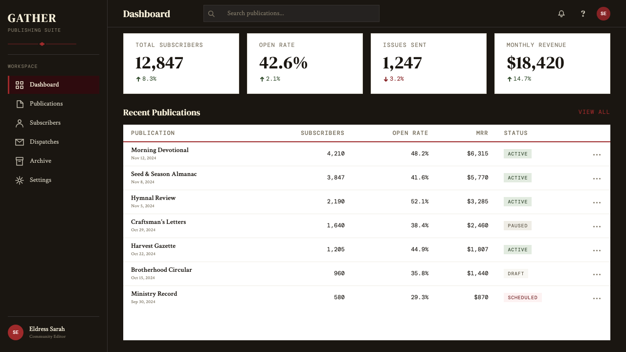
For web interfaces and dashboards, the style's grid discipline and dark-ground variant translate well to environments where data density is high and distraction should be low. The near-black ground reads as a focused environment, and the warm brick-red accent used for interactive states, alerts, or active navigation items creates a clear visual hierarchy without the visual noise of multiple competing accent colors. Pricing pages in this mode are compelling: large, stacked type hierarchies for plan names and prices, ruled separators between tiers, and a single warm-toned call-to-action. The approach works best when the typography is doing all the work and graphic elements are nearly absent.对于网页界面和仪表板,这一风格的网格纪律与深色底面变体,很好地转化于数据密度高且应减少干扰的环境。近黑底面读起来是一个专注的环境,而砖红强调色用于交互状态、警示或活跃导航项目,在不制造多种强调色竞争视觉噪音的前提下建立清晰的视觉层级。这种模式下的定价页面颇具说服力:方案名称与价格以大型堆叠字体层级呈现,等级之间用线条分隔,单一暖色调行动号召。当排印承担所有工作而图形元素几乎缺席时,这种方法效果最佳。
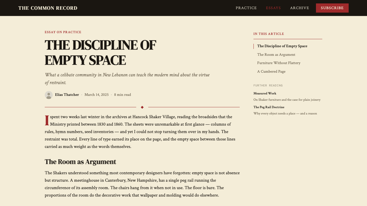
For editorial and marketing applications, the Shaker broadside register works well as a frameworkfor headline-led layouts, event posters, and any context where authority and seriousness are brand values. An event poster in this style stacks the event name in large display type at the top, followed by date and location in progressively smaller sizes, bound above and below by horizontal rules, all centered on a deep ground. For marketing landing pages, the approach benefits from generous vertical spacing — each content block allowed to breathe rather than packed together — with the brick-red rule marking section transitions and the typographic hierarchy carrying all information structure.对于编辑与营销应用,震教宽版印刷的语域,对以标题为主的版面、活动海报,以及任何权威性与严肃性是品牌价值的场景,都能提供良好的框架。这种风格下的活动海报将活动名称以大展示字体堆叠于顶部,其后日期与地点以递减字号排列,整体以水平线限定上下边界,全部居中置于深色底面上。对于营销落地页,这种方法受益于慷慨的垂直间距——每个内容块允许呼吸而非紧密堆挤——砖红线条标记段落过渡,字体层级承担所有信息结构。
A common mistake when working with this style is reaching for multiple accent colors to relieve the severity of the palette. The system depends on the brick-red rule being the only warm element against the deep ground; adding a second accent — say, an off-white for subheads or a muted gold for icons — diffuses the authority of the primary accent and produces something that reads as eclectic rather than disciplined. Similarly, mixing typefaces from different historical periods undermines the wood-type unity of the original. If a single typeface family cannot supply the weight and scale variation needed, the solution is to use fewer text levels, not to introduce a second family.使用这种风格时最常见的错误,是引入多种强调色以缓解色板的严峻感。这套系统依赖砖红线条成为深色底面上唯一的暖元素;添加第二种强调色——比如用近白色做副标题,或用暗金色做图标——会稀释主强调色的权威,产生折中而非有纪律的效果。同样,混合来自不同历史时期的字体会破坏原版木活字的统一性。如果单一字体家族无法提供所需的字重与尺度变化,解决方案是减少文字层级,而非引入第二个字体家族。
See the Shaker Broadside Print design system →查看 Shaker Broadside Print 完整设计系统 →
Shaker Broadside Print — FAQShaker Broadside Print · 常见问题
Is Shaker Broadside Print the same as general Victorian letterpress design?震教宽版印刷与维多利亚时代的一般凸版印刷设计是同一回事吗?
No — in fact, the two are almost opposites. Victorian commercial letterpress printing of the mid-to-late nineteenth century was characterized by extreme typographic variety, dense ornamental borders, competing display typefaces in multiple sizes, and the layering of decorative woodcuts and rules into compositions of considerable visual complexity. Shaker broadsides were produced during the same period but actively refused all of those conventions. Where Victorian printing sought to attract attention through visual abundance, Shaker printing commanded attention through visual restraint. The comparison is useful precisely because the contrast is so sharp: the same technology, the same material, opposite philosophies.不——事实上,两者几乎是对立的。十九世纪中后期的维多利亚商业凸版印刷以极度多样的排印、密集的装饰边框、多种尺度竞争的展示字体,以及装饰性木刻与线条的繁复叠加为特征。震教宽版印刷品生产于同一时期,却主动拒绝了所有这些惯例。维多利亚印刷通过视觉丰盛吸引注意力,震教印刷通过视觉克制命令注意力。这一比较之所以有价值,恰在于对比是如此鲜明:同样的技术,同样的材料,截然相反的哲学。
Why does the style use a dark ground rather than a white or cream field?为何这一风格使用深色底面而非白色或奶油色底面?
Not all Shaker broadsides used dark grounds — seed catalogs and rules sheets often used cream or off-white grounds with black ink, because those were the most economical production choices. The bone-black ground appears most prominently in devotional broadsides, community pronouncements, and hymn sheets where a more solemn, authoritative register was appropriate. In the design system, the dark ground is the signature choice because it best captures the visual temperature — deep, warm, weighty — that distinguishes Shaker print culture from both the lightness of contemporary minimalism and the chaos of Victorian commercial printing.并非所有震教宽版印刷品都使用深色底面——种子目录和规章单通常使用奶油色或近白色底面搭配黑色油墨,因为那是最经济的生产选择。骨黑底面最突出地出现在灵修宣传单、社区公告以及需要更为庄严、权威语调的赞美诗页中。在设计系统中,深色底面是标志性选择,因为它最好地捕捉了震教印刷文化的视觉温度——深沉、温暖、厚重——这将震教印刷文化与当代极简主义的轻盈和维多利亚商业印刷的喧嚣都区别开来。
How does the Shaker style relate to later modernist design movements?震教风格与后来的现代主义设计运动有何关联?
The relationship is one of parallel evolution rather than direct influence. Shaker design was largely unknown to European modernists; Gropius did not cite Shaker furniture when he founded the Bauhaus, and Tschichold did not reference Shaker typography in the New Typography. Both traditions arrived at similar conclusions — restraint, honest materials, structure over decoration — by different routes: the Shakers through theology, the European modernists through rationalist philosophy and industrial production logic. The convergence is intellectually interesting but historically coincidental. Appreciation for Shaker design by the design community came primarily through mid-twentieth century museum exhibitions and the Arts and Crafts revival, well after modernism had already reached its own conclusions.两者的关系是平行演进而非直接影响。震教设计在欧洲现代主义者中基本不为人知;格罗皮乌斯创立包豪斯时并未援引震教家具,齐肖尔德在《新排印学》中也未提及震教排印。两种传统通过不同路径抵达了相似的结论——克制、材料诚实、结构胜于装饰:震教通过神学,欧洲现代主义者通过理性主义哲学与工业生产逻辑。这种汇聚在思想上引人入胜,但在历史上是偶然的。设计界对震教设计的欣赏,主要来自二十世纪中叶的博物馆展览与工艺美术复兴运动,远在现代主义已经自行达成结论之后。
Can this style work for digital interfaces, given its roots in physical print?这一风格根植于实体印刷,能否适用于数字界面?
Yes, with intentional translation rather than literal imitation. The tactile qualities of letterpress — ink impression, paper texture, ink spread variation — cannot be reproduced on screen, and attempting to simulate them with digital effects tends to read as either nostalgic pastiche or low-fidelity artifact. What translates directly are the compositional principles: the near-black ground, the single warm accent, the vertical typographic hierarchy, the absence of decorative elements, and the use of a ruled line as the primary structural divider. These translate cleanly to screen environments and produce interfaces of considerable authority and focus. The key is to treat the digital application as an interpretation of the principles rather than a reproduction of the physical object.可以,但需要有意识地转译而非字面模仿。凸版印刷的触觉品质——油墨压痕、纸张纹理、油墨铺展的变化——无法在屏幕上再现,试图以数字效果模拟它们往往读起来是怀旧拼贴或低保真做旧。能够直接转化的是构图原则:近黑底面、单一暖色强调、垂直字体层级、装饰性元素的缺席,以及以线条规则作为主要结构分隔线。这些原则干净地转化于屏幕环境,产生具有相当权威感与专注度的界面。关键在于将数字应用视为对原则的诠释,而非对实体对象的复制。
What distinguishes an authentic application of this style from a superficial one?对这一风格的真实应用与肤浅应用有何区别?
The most reliable indicator is whether the visual restraint extends all the way through the design or only applies at the surface level. A superficial application takes the dark background and the red accent rule but then populates the layout with decorative icons, multiple typeface families, soft-shadow cards, and gradient buttons — elements that contradict the underlying logic at every level. An authentic application asks of each element: does this earn its place? Can I remove it without losing information or structure? The answer should be yes for anything ornamental. The second indicator is color discipline: one primary accent used consistently and sparingly, not as an opportunity for visual variety but as a structural tool. If a design needs more than one accent to function, it is compensating for compositional weakness rather than embodying the Shaker principle.最可靠的判断指标,是视觉克制是否贯穿整个设计,还是仅停留于表面。肤浅的应用采用了深色背景与红色强调线,但随后用装饰性图标、多种字体家族、软阴影卡片与渐变按钮填充版面——这些元素在每个层面上都与底层逻辑相矛盾。真实的应用对每一个元素都提出这个问题:它值得占据这里的位置吗?我能在不失去信息或结构的前提下移除它吗?对任何装饰性元素,答案都应该是肯定的。第二个判断指标是色彩纪律:单一主强调色被一贯且克制地使用,不是作为制造视觉多样性的机会,而是作为结构性工具。如果一个设计需要多于一种强调色才能运转,它是在以此补偿构图上的软弱,而非体现震教原则。
Related design styles相关设计风格
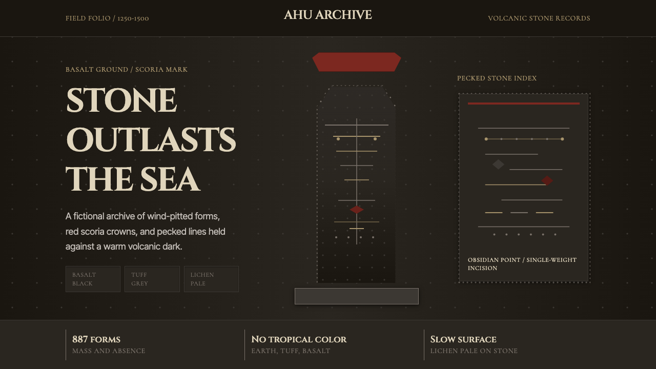 Rapa Nui Moai PetroglyphMonumental sparseness. Basalt black, scoria red, and pecked-dot borders hold…纪念碑式荒寂:玄武黑、火山红与凿点边框凝住沉默。
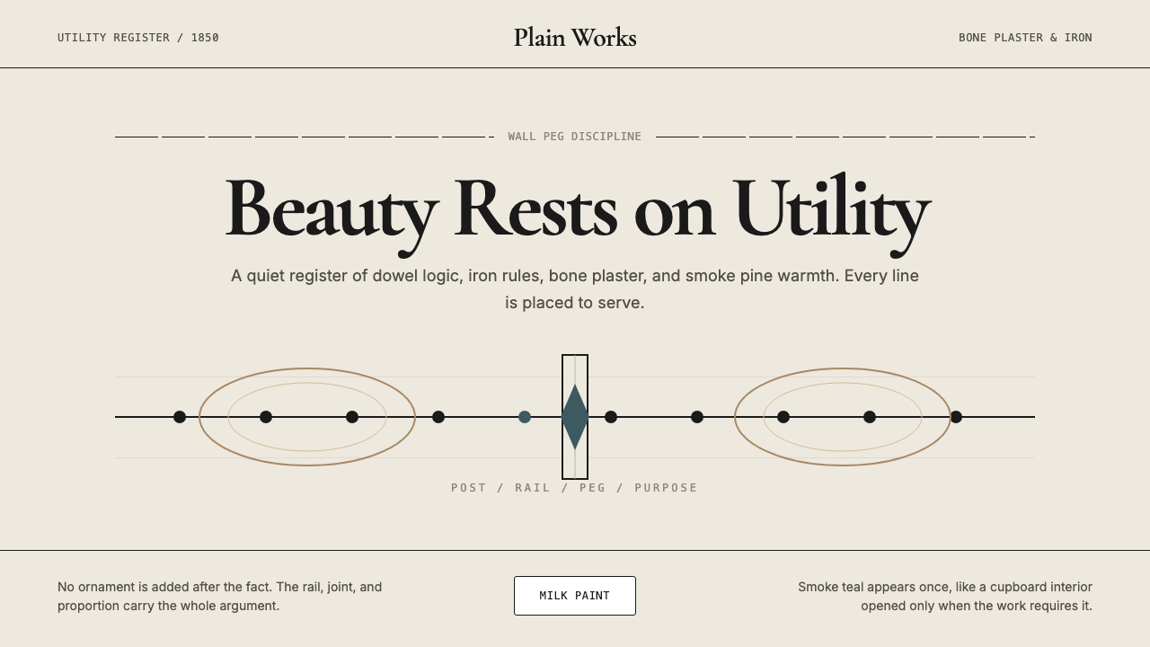 Shaker Furniture 1850Utility becomes beauty. Bone plaster, iron black, smoke pine, and one smoke-t…实用成为美:骨白灰泥、铁黑、烟松与一线烟青。
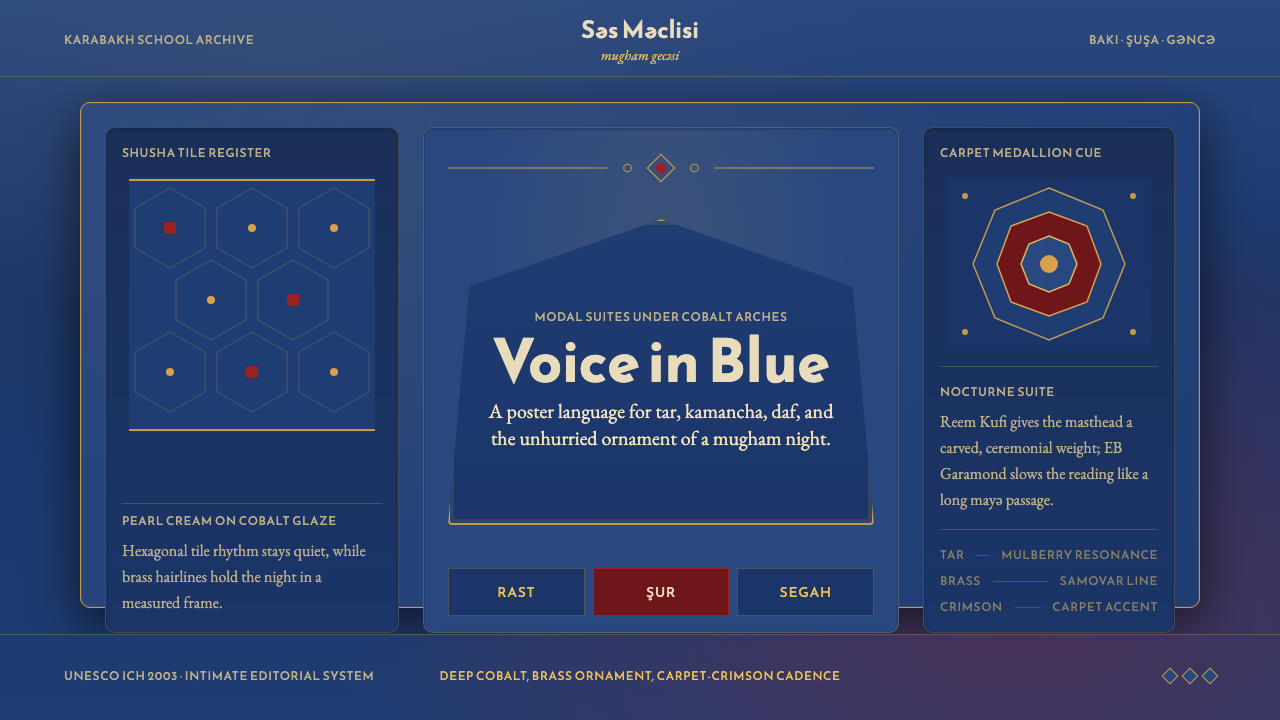 Azerbaijani Mugham Saz BlueMugham night, deeply tiled. Cobalt ground, brass hairlines, arched editorial…穆卡姆之夜深而温暖:钴蓝底、黄铜细线与拱形排版。
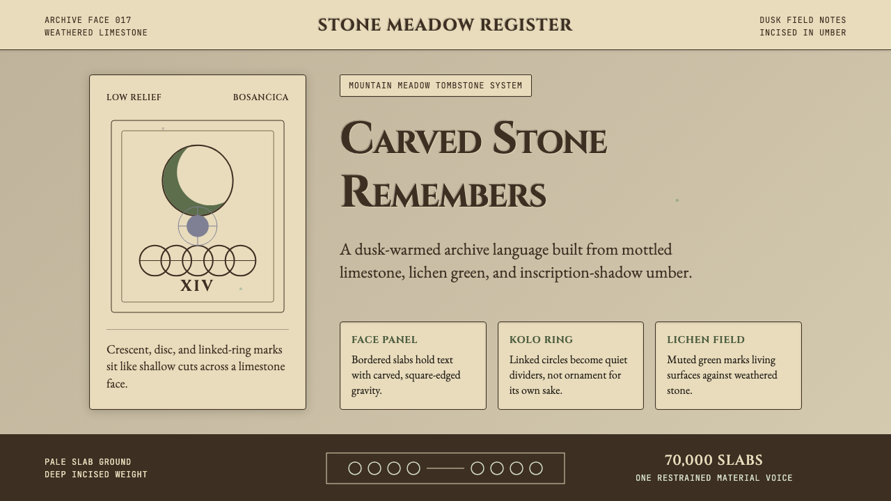 Bosnian Stećak Medieval TombstoneStone remembers quietly. Lichen green and Cinzel cuts sit on weathered limest…石头静默记忆。苔藓绿与Cinzel刻痕落在风化石灰岩上。
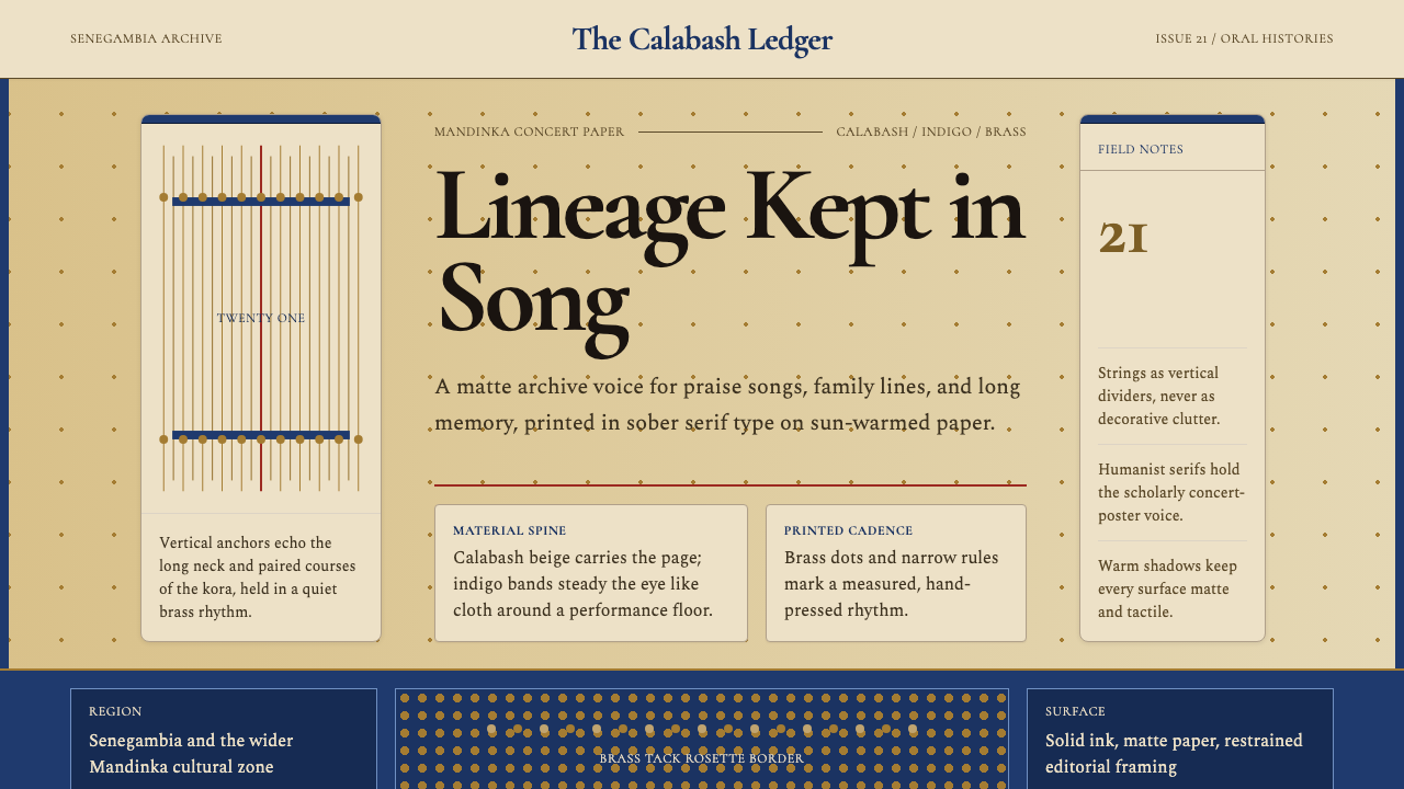 Gambian Griot Kora (21-string)Oral history feels tactile. Calabash beige, indigo bands, and 21 brass string…口述史有触感。葫芦米色、靛蓝带与21道黄铜弦线。
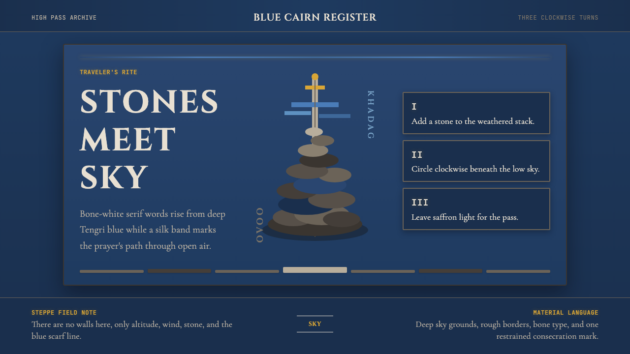 Mongolian Ovoo (Cairn Prayer Site)Sacred austerity. Steppe-blue ground, bone serif type, and one silk-blue pray…神圣而肃穆:草原蓝底、骨白衬线字与一线哈达蓝。