What is Estonian Haapsalu Lace Shawl?
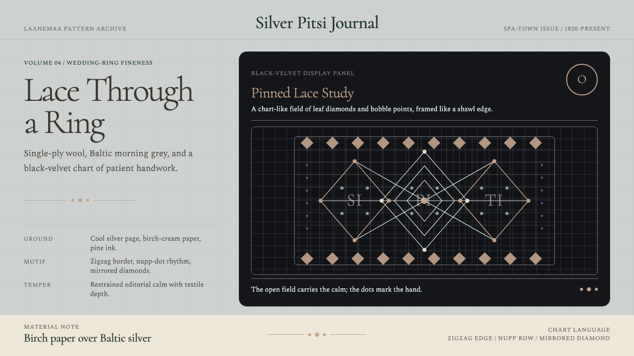
Born from a Baltic spa town's gift trade, the Haapsalu shawl distils two centuries of Estonian laceknitting into a visual language of silver grounds, velvet shadows, and nupp-dot geometry so fine the whole shawl threads through a wedding ring.
Estonian Haapsalu Lace Shawl in brief
The Haapsalu lace shawl is one of the most technically demanding textile traditions in the world: a single-ply wool knitted so delicately that the finished piece — sometimes nearly two meters across — passes through a finger ring without catching. The visual character of this tradition is immediately distinctive: pale grounds the color of Baltic morning fog, geometric repeat patterns derived from local flora, and occasional deep black-velvet panels that make the white lacework glow as if lit from behind.
As a design system, the Haapsalu tradition translates into something that is neither rustic craft nor sterile modernism. It occupies a precise middle register: handmade warmth expressed through rigorous geometric repetition. The core vocabulary includes zigzag lace borders that frame compositions the way shawl edges frame the knitted center; nupp dots — small bobble accents that punctuate repeat fields — used as rhythm markers in layout; and the diamond-and-leaf geometry of the interior patterns, which provide a visual density that feels organic rather than mechanical.
What distinguishes this aesthetic from other lace or textile traditions is its relationship with light. Haapsalu lace is designed to be backlit — held up against the pale Baltic sky so that the pattern reads as a negative-space silhouette. This light-dependence translates into a preference for translucency, delicate linework, and compositions in which the ground is as meaningful as the mark. Empty space is not absence; it is the lace itself.
Where does Estonian Haapsalu Lace Shawl come from?
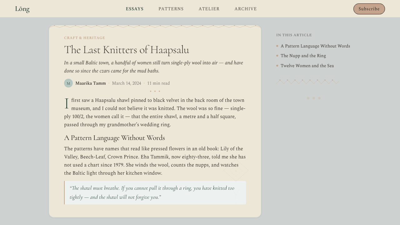
The town of Haapsalu sits on a narrow peninsula jutting into the western Estonian coastline, its streets lined with wooden houses and its shores edged with shallow, warm mud flats. From the 1820s onward, Haapsalu became a fashionable spa destination for the Russian imperial aristocracy, who traveled from Saint Petersburg to bathe in the therapeutic mud and take the sea air. The local women, who had long practiced a fine-gauge white lace knitting tradition, discovered a new market: wealthy visitors wanted souvenirs, and the town's lace shawls were unlike anything available in the capital.
The patterns these women knitted were named after the local landscape and its flora — Lily of the Valley, Beech Leaf, Strawberry, and Spider Web among them. Each pattern was a closely guarded family possession, passed from mother to daughter without written record and sometimes deliberately kept incomplete so that only the family could reproduce the full design. By the mid-nineteenth century, the shawls had become prestigious enough that they were displayed at the 1862 World Exhibition in London, introducing Estonian lace craft to an international audience for the first time.
The craft's golden era spanned the second half of the nineteenth century and the early decades of the twentieth, a period that coincides exactly with the heyday of Haapsalu as a spa resort. Writers and composers — including Pyotr Ilyich Tchaikovsky, who visited in 1867 — came to the town and left with shawls. The town built a dedicated pavilion on the promenade specifically for lace vendors, and the shawl became the defining emblem of Haapsalu's civic identity. Even after the Soviet occupation interrupted the commercial trade, the tradition survived in private households, with craft circles preserving the patterns through personal teaching networks.
After Estonian independence in 1991, the Haapsalu lace tradition underwent deliberate revival. The town now hosts an annual lace festival, and the craft has been recognized as part of Estonia's intangible cultural heritage. Museums have documented patterns that had nearly vanished, and younger practitioners have begun adapting the traditional vocabulary to contemporary contexts — including the digital design systems that this aesthetic now informs. The shawl's journey from a spa-town souvenir to a recognized national craft to a design language is a model of how vernacular traditions accumulate meaning over time.
What defines the Estonian Haapsalu Lace Shawl look?
Palette
The canonical Haapsalu palette is a study in tonal restraint: pale Baltic grey and misted white for grounds, charcoal and deep black for accent surfaces. The near-white ground is not a pure, clinical white but something cooler and softer — the color of unbleached linen left in a northern light. Against this, the lace pattern reads as a delicate shadow. When the black-velvet inversion appears, the contrast is absolute: the design reverses entirely, and white lacework floats on a ground that absorbs all ambient light. Color is rare and ceremonial; when it appears, it is the silver of morning water.
Pattern Geometry
The repeat units drawn from Haapsalu's historical patterns are built from diamonds, leaf-chevrons, and branching radiations — all derived from organic forms but abstracted into strict geometric logic. The repetition is not mechanical; the handmade origin means each iteration carries a slight human variance that prevents the grid from feeling cold. In design application, this geometry reads as a middle register between folk motif and data visualization: complex enough to reward attention, ordered enough to create visual rhythm without explanation.
Nupp-Dot Rhythm
The nupp — a small raised bobble knitted from multiple loops — is the signature accent of Haapsalu lace. In the shawl itself, nupps appear at regular intervals within the repeat field, creating a gentle surface relief that catches light differently from the surrounding openwork. As a design language element, the nupp translates to punctuation: a small circular accent placed at intersections, at the end of lines, or at intervals within a repeat to break monotony and create a sense of handmade care. It is the visual equivalent of a breath taken in a long phrase.
Negative Space as Structure
Lace is, by definition, mostly air. The Haapsalu shawl pattern exists not in the yarn itself but in the relationship between yarn and void — the holes are the design. This foundational principle carries directly into layout: backgrounds are not neutral containers but active participants in the visual composition. Generous open space is not emptiness to fill but structural whiteness that gives the finer linework room to breathe and to be read at distance. Crowding the field destroys the aesthetic entirely; restraint in element count is not minimalism but faithfulness to the medium.
Border and Interior Distinction
Every Haapsalu shawl is organized around a clear structural distinction: the zigzag lace border that frames the piece, and the patterned interior field that fills it. The border is a zone of heightened visual activity — denser, more directional — while the interior is a quieter, more meditative repeat. This two-register structure translates into page and screen design as the logic of framing: strong, articulated edges that contain and define a calmer, more information-dense center. Headers and footers with more visual weight; body content with more breathing room.
Tonal Depth Without Color
Because Haapsalu lace works almost exclusively in white and near-white, all visual hierarchy is achieved through tonal contrast rather than hue contrast. The difference between the open lacework, the denser pattern areas, and the solid cord edging is a matter of value — lightness versus darkness — with no color to assist. This discipline requires and produces an unusual sensitivity to grey relationships: a layout drawn from this tradition must be coherent and legible in desaturated form, because that is effectively what it is.
Craft Precision
The Haapsalu shawl demands absolute technical precision: a single dropped stitch is visible, and pattern irregularities propagate across the entire piece. This is not a tradition that tolerates approximation. In design, this principle translates to an intolerance for visual sloppiness — misaligned elements, inconsistent spacing, or pattern breaks that interrupt the rhythm. The aesthetic demands that everything intended to repeat actually repeats exactly, and that anything intended to align actually aligns. Perfectionism in this context is not neurosis; it is fidelity to the tradition's core standard.
Who shaped Estonian Haapsalu Lace Shawl?
One of the most respected practitioners of the Haapsalu lace tradition in the twentieth century, Jaani was instrumental in preserving pattern knowledge that might otherwise have been lost during the Soviet period. Her work demonstrated that the fine-gauge white knitting tradition was not merely a decorative souvenir craft but a rigorous technical discipline requiring years of study to master. She represents the generation of practitioners who kept the tradition alive in private households when public commerce was restricted.
Edasi worked extensively to document and systematize the Haapsalu pattern vocabulary at a time when that vocabulary existed almost entirely in the memories and hands of working knitters rather than in any written archive. Her contribution was to create a bridge between the oral-and-manual transmission of the craft and the documentary record that later revival efforts could draw from. Without systematic documentation of this kind, the scale of the post-independence revival would have been far more limited.
Reimann contributed to the international recognition of Estonian lace as a distinct and significant textile tradition. Her work helped establish Haapsalu lace knitting not merely as local folk craft but as a practice worthy of serious scholarly and curatorial attention. Her efforts during the period of Soviet cultural policy, when local craft traditions were sometimes patronized and sometimes suppressed, required navigating complex institutional pressures while preserving the integrity of the tradition itself.
Puhvel represents the scholarly dimension of the Haapsalu tradition — the work of contextualizing Estonian lace within the broader history of European textile craft and within the specific social history of Haapsalu as a spa town. Scholarly attention of this kind is what transforms a living craft into a documented cultural inheritance, ensuring that the tradition's significance is legible not just to practitioners but to the wider public, to institutions, and to the designers who now draw from it.
How do you use Estonian Haapsalu Lace Shawl today?
The Haapsalu lace aesthetic is best suited to contexts that benefit from a combination of fine detail and tonal restraint — editorial publications, cultural institution websites, craft and artisan brands, and any presentation context where the subject matter itself calls for careful attention rather than bold announcement. The system works because it makes quietness feel intentional and refinement feel earned rather than imposed.
For presentation slides, the style works best on covers that use the black-velvet inversion: a deep, near-black ground with the primary motif rendered in delicate pale linework or nupp-dot punctuation. This creates an immediate sense of occasion without resorting to loud color or dramatic photography. Content slides should lean into the tonal grey palette — three or four values of grey separating headers, body text, labels, and rules — with the white ground doing structural work that color would do in a more conventional deck. Data visualizations benefit from the border-and-interior logic: a strong framing element that contains the chart, with pattern-inspired geometric markers replacing conventional legends.
For web interfaces — particularly dashboards, portfolio sites, and editorial platforms — the tradition offers a clear organizing principle: let the ground carry the weight. A near-white or cool pale grey background with fine, consistent linework creates a surface that feels handcrafted without being folksy. Navigation and structural elements borrow the zigzag-border logic: slightly more visual density at the edges and headers, a quieter, more open interior for content. Pricing pages work well when tier distinctions are made through tonal contrast rather than through saturated color — the premium tier rendered in deep charcoal on pale grounds, rather than in a branded color.
For editorial and marketing contexts, the lace-inspired approach prioritizes linework and pattern over photography and illustration. Headers use typefaces with fine stroke contrast that echo the yarn's thin-to-thick variation. Pull quotes and callouts gain visual separation through delicate ruled borders rather than colored backgrounds. Pattern-derived graphic elements — a nupp-dot row, a section of the zigzag border — can function as decorative dividers that feel culturally grounded rather than generically ornamental. The key is to apply them sparingly, as the shawl-maker would: one well-placed element is worth more than a field of competing motifs.
A common mistake when applying this aesthetic is conflating lace-inspired design with general decorativeness. The Haapsalu tradition is not about adding delicate ornament to a layout; it is about organizing the layout around the logic that makes lace readable in the first place — negative space, tonal clarity, and a strict repetition that rewards the eye's patience. Overcrowding with pattern elements, mixing multiple geometric vocabularies, or trying to make the system work alongside loud color all break the underlying logic. The discipline is to do less, more exactly.
Estonian Haapsalu Lace Shawl — FAQ
Is this aesthetic suitable for dark-mode interfaces?
Yes — and uniquely so, because the black-velvet inversion is native to the tradition rather than an adaptation. Haapsalu shawls have historically been displayed on black velvet to make the white lacework glow, which means a deep-ground version is not a compromise but a reference to one of the tradition's authentic modes. The key is maintaining the tonal discipline: on a near-black ground, use a pale, slightly warm near-white for primary content, a medium cool grey for secondary content, and reserve pure white for only the most important elements. Avoid introducing color into the dark version — the aesthetic's power comes from its restraint.
How does this style differ from Scandinavian minimalism?
Both traditions work in restrained palettes with generous white space, which makes them superficially similar. The difference lies in pattern and depth. Scandinavian design minimalism is often radically reductive — it removes pattern as well as ornament, arriving at surfaces that are essentially plain. The Haapsalu lace tradition is restrained but not plain: it fills its ground with intricate geometric repetition and relies on that repetition to create visual richness without color. The result is a surface that rewards close attention in a way that flat Scandinavian minimalism does not. Haapsalu is quiet, not empty.
Can the lace pattern motifs be used literally in digital design?
With care. The motifs — diamonds, leaf-chevrons, nupp-dot rows — translate well as SVG patterns for backgrounds, dividers, or watermark-like overlays when used at low opacity on appropriate grounds. The mistake is using them at full saturation or scale, where they become dominant and compete with content. The shawl's pattern is designed to be seen at a distance, reading as texture before resolving into detail; digital pattern elements should work the same way. Used as a subtle, repeating background grid or a fine decorative border, they enhance the aesthetic. Used as hero illustrations or prominent graphic elements, they become costume rather than character.
What kinds of typography complement this aesthetic?
The Haapsalu lace tradition is a fine-stroke art, which means it has a natural affinity with display typefaces that show visible thin-to-thick stroke contrast — the category sometimes called transitional or high-contrast serif. These typefaces echo the yarn's own alternation between fine spans and denser knot points. For body text, a legible light-weight serif or even a refined geometric sans-serif maintains the tonal quietness without competing with the pattern vocabulary. What to avoid: heavy slab serifs or thick display sans-serifs, which introduce a visual weight that overwhelms the delicacy of the pattern language. Type should feel like it belongs in the same room as the lace, not in the room next door.
Is this aesthetic appropriate for tech or SaaS products?
It depends on the positioning. For tech products that want to signal craft, precision, and thoughtful restraint — developer tools, documentation platforms, archival or research software, high-end creative tools — the Haapsalu lace aesthetic can be powerfully differentiating. Its fine detail and tonal discipline communicate that the product takes quality seriously without announcing it loudly. For products that need to signal speed, boldness, or broad accessibility, the aesthetic is likely too quiet and too detail-dependent to carry the right message. It is most effective when the product itself values the same things the style values: exactness, patience, and the idea that true quality reveals itself gradually rather than immediately.
Related design styles
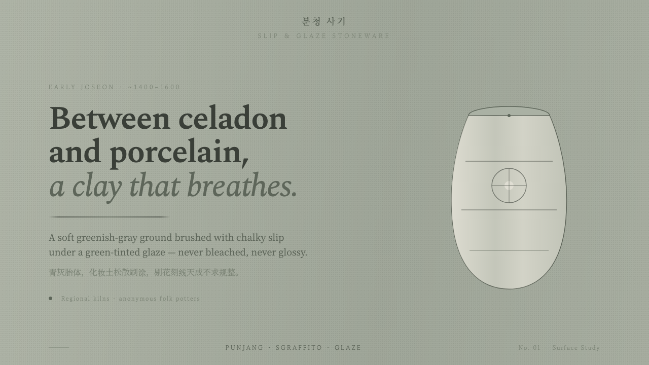 Buncheong Gray Slip WareBetween celadon and porcelain. Greenish-gray clay, chalky slip brushwork, dar…
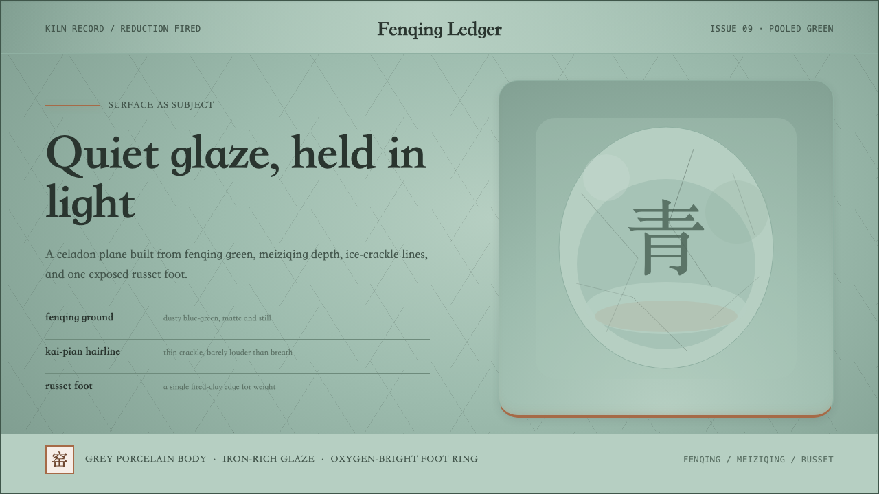 Longquan CeladonQuiet glaze carries the page. Fenqing green, crackle hairlines, and one russe…
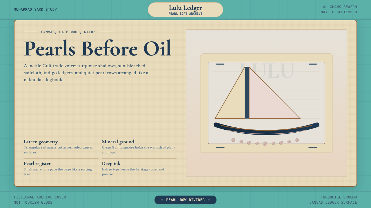 Bahraini Dhow Pearl-Diving BoatMineral and sun-bleached. Gulf turquoise, canvas cream, and pearl rows frame…
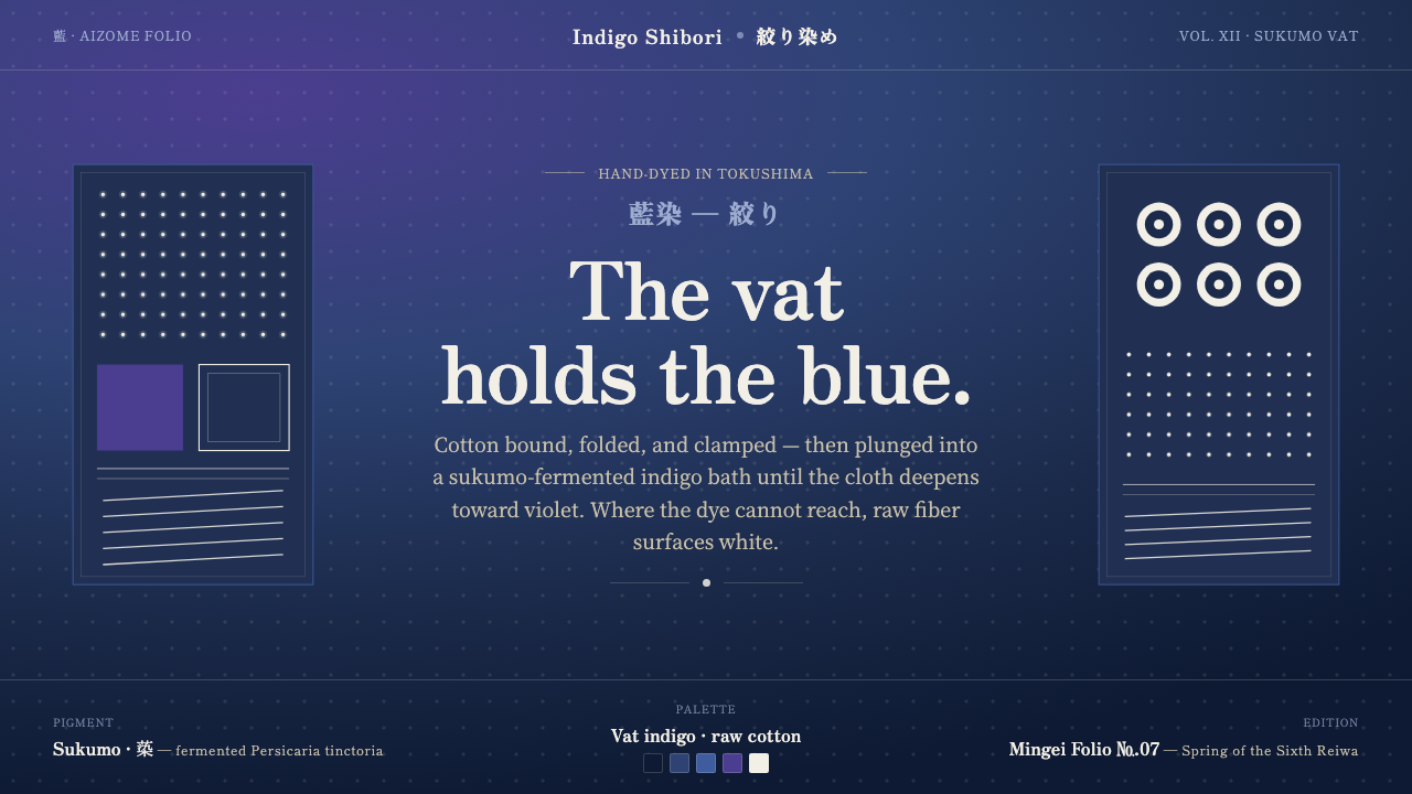 Indigo ShiboriCloth before image. Bound cotton plunged into sukumo vats — raw-white resist…
 Joseon Moon JarQuiet imperfection glows. Milk-white porcelain floats on charcoal with a visi…
 Shaker Furniture 1850Utility becomes beauty. Bone plaster, iron black, smoke pine, and one smoke-t…