Design style guide设计风格指南
What is Bahraini Dhow Pearl-Diving Boat?什么是 Bahraini Dhow Pearl-Diving Boat?
Before oil rewrote the Gulf, Bahrain ran on pearls — and the dhow yards of Muharraq encoded four thousand years of maritime craft into a visual language of mineral turquoise, sun-bleached canvas, and iridescent shell.石油改写波斯湾之前,巴林靠珍珠立国——穆哈拉格的船坞将四千年的航海工艺凝结成一套视觉语言:矿物质蓝绿、日晒褪色的帆布,以及虹彩流动的贝壳光泽。
Bahraini Dhow Pearl-Diving Boat in briefBahraini Dhow Pearl-Diving Boat 速览
The Bahraini Dhow Pearl-Diving Boat design style takes its visual logic from the material world of the Gulf pearl trade at its peak — roughly the nineteenth and early twentieth centuries — before synthetic Japanese cultured pearls collapsed the industry in the 1930s. Every element of the palette, the texture vocabulary, and the ornamental grammar traces back to a real artifact or environment: the dhow hull's sun-bleached date-wood planking, the mineral shallows south of Sitra island, the iridescent interior of the lulu oyster, the canvas of a lateen sail gone cream under sustained sun, the deep indigo of open-water navigation charts.巴林独桅帆船珍珠采集风格的视觉逻辑,源自波斯湾珍珠贸易鼎盛时期的物质世界——大约是十九世纪至二十世纪初,彼时日本养殖珍珠尚未在1930年代摧垮这一产业。色板中的每一个色调、纹理词汇中的每一种质感、装饰语法中的每一个图案,都能追溯至真实的器物或环境:独桅帆船船身那晒白的枣木色板、锡特拉岛以南的矿物质浅海、卢卢蚝内壁流动的虹彩、长期日晒后褪成奶油色的三角帆布,以及远洋航行图表所用的深海靛蓝。
What makes the style distinctive is its combination of warmth and restraint. This is not the aggressive saturated heat of many Gulf-inspired color systems. The turquoise is mineral and slightly muted — the color of shallow seawater over white sand rather than the electric teal of modern branding. The cream tones carry texture and age. The indigo is reserved for depth and emphasis rather than decoration. Together they create a palette that reads as both historically grounded and quietly luxurious, evoking the world in which a single exceptional pearl could fund a merchant family for a generation.这套风格的独特之处在于温暖与克制的平衡。它并非许多海湾风格系统中那种咄咄逼人的高饱和热烈。这里的蓝绿色带有矿物质感,略显沉静——是浅海覆盖白沙时的那种颜色,而非当代品牌惯用的电子青绿。奶油色调中承载着质感与岁月的痕迹。靛蓝被留给深度与强调,而非用于装饰。三者合力构成一套色板,既有历史根基,又透着低调的贵气——令人联想到那个一颗上品珍珠便能供养一个商贾世家数代的世界。
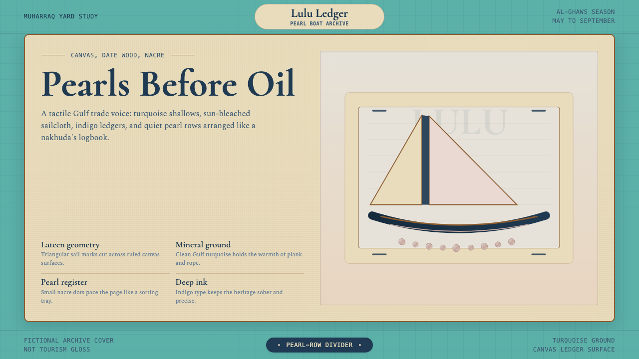
Ornament in this style is earned and specific. The lateen-sail triangle, the repeating pearl-row dot, the curved hull-line divider — these motifs appear because they are readable shorthand for the trade itself, not because they fill empty space. Used with restraint, they function the way a maker's mark functions on fine objects: as a quiet signal of authenticity rather than a shout for attention.这套风格中的装饰是有来由、有分寸的。三角帆轮廓、成排珍珠圆点、弧线船身分隔线——这些图案之所以出现,是因为它们是珍珠贸易本身可辨识的视觉速记,而非用来填充空白。克制地运用时,它们的功能如同精良器物上的制作者印记:是真实性的低语,而非博取注意的高喊。
See the Bahraini Dhow Pearl-Diving Boat design system →查看 Bahraini Dhow Pearl-Diving Boat 完整设计系统 →
Where does Bahraini Dhow Pearl-Diving Boat come from?Bahraini Dhow Pearl-Diving Boat 从何而来?
Bahrain's relationship with pearling stretches back to the Dilmun civilization of the second millennium BCE, when the archipelago served as a major entrepôt between Mesopotamia and the Indus Valley. Ancient Sumerian texts describe Dilmun as a source of fish-eyes — their term for pearls — and archaeological sites at Qal'at al-Bahrain have yielded evidence of organized pearl-working as far back as 2000 BCE. But it was the convergence of Islamic luxury demand, Mughal court taste, and European colonial appetite for precious gems that transformed the Gulf pearl trade into a global industry between roughly the seventeenth and early twentieth centuries.巴林与珍珠业的渊源可上溯至公元前二千年的迪尔蒙文明,当时这片群岛是美索不达米亚与印度河谷之间的重要中转贸易地。古代苏美尔文献记载迪尔蒙是“鱼眼”——即珍珠——的产地,巴林古城考古遗址出土的证据表明,有组织的珍珠加工早在公元前2000年便已存在。然而,正是伊斯兰世界的奢侈品需求、莫卧儿宫廷品味与欧洲殖民者对贵重宝石的渴求相互叠加,才在大约十七世纪至二十世纪初之间,将波斯湾珍珠贸易推升为一项全球性产业。
At its height in the 1880s through the 1920s, the Bahraini fleet comprised several thousand dhows — primarily the sambuk, a double-ended wooden vessel built from imported teak or local date wood, rigged with a triangular lateen sail — and employed tens of thousands of divers and crew. The annual diving season, al-ghaws, ran from late spring through early autumn. Divers worked without equipment: a nose clip of carved tortoiseshell, a leather finger-stall, a stone weight tied to the ankle, and a rope. A skilled diver could make sixty or more descents per day, staying under for ninety seconds at a time. The pearls were sorted on deck by the vessel's musakkim using graduated sieves, then sold through specialist merchants in Muharraq and Manama to international buyers from India, Paris, and London.1880年代至1920年代的鼎盛期,巴林船队拥有数千艘独桅帆船——主要是桑布克(sambuk),一种以进口柚木或本地枣木建造的两端尖翘的木质船只,装配三角帆。每年的采珠季节“加瓦斯”(al-ghaws)从暮春延续至初秋。潜水者徒手下水:雕花龟壳鼻夹、皮革指套、绑在踝部的石坠、一根绳索——别无其他。技艺精湛的潜水者每天可下潜六十次以上,每次憋气约九十秒。珍珠在甲板上由船上的穆萨基姆(musakkim)用分级筛逐一分类,再经穆哈拉格和麦纳麦的专业商人之手,出售给来自印度、巴黎与伦敦的国际买家。
The social world of the pearl trade was elaborately structured. The nakhuda — the boat captain and commercial owner — occupied the highest position; below him, the divers (ghawwas) and the haulers (siyb) who pulled them to the surface were bound to their captain by a credit system that often functioned as debt bondage. Poetry and music were integral to the work rhythm: the fidjeri songs sung by the crew during the return voyage are now recognized by UNESCO as an Intangible Cultural Heritage of Humanity. The trade also generated a sophisticated merchant class in Muharraq whose coral-plastered courtyard houses, with their wind-catchers (barjeels) and ornamental carved plasterwork, survive as a UNESCO World Heritage Site.珍珠贸易的社会世界层级分明。纳胡达(nakhuda)——船长兼商业持有人——地位最高;潜水者(ghawwas)与将其拉出水面的拉绳者(siyb)被一套信贷制度束缚于船长名下,这套制度往往近似债务奴役。歌谣与音乐是劳作节奏不可分割的一部分:船员在归航途中演唱的菲德杰里(fidjeri)歌曲,如今已被联合国教科文组织列为人类非物质文化遗产。这一贸易还在穆哈拉格孕育出一个成熟的商人阶层,其珊瑚灰泥抹面的庭院式宅邸——带有风塔(barjeels)和雕花灰泥装饰——作为联合国教科文组织世界遗产保存至今。
The collapse came swiftly. Mikimoto Kokichi's Japanese cultured-pearl technology, perfected during the 1920s, made gem-quality pearls available at a fraction of the cost of natural Gulf pearls. By 1932, the price of Gulf pearls had fallen so catastrophically that most of the fleet was laid up permanently. The discovery of oil in 1932 — the same year — provided an economic replacement, but the material culture of the pearl trade survived in the built environment of Muharraq, in the fidjeri musical tradition, and in the visual archive of dhow-building and pearl-sorting that Bahrain has consciously preserved as a marker of pre-oil identity.崩溃来得迅猛。御木本幸吉在1920年代完善的日本养殖珍珠技术,使宝石级珍珠的供应价格仅为天然海湾珍珠的一小部分。至1932年,海湾珍珠的价格已跌至灾难性低位,大部分船队就此永久停航。同年发现的石油提供了经济替代,但珍珠贸易的物质文化却在穆哈拉格的建筑遗存、菲德杰里音乐传统,以及巴林有意识保存的造船与珍珠分拣视觉档案中延续下来,成为石油时代之前身份认同的标记。
What defines the Bahraini Dhow Pearl-Diving Boat look?Bahraini Dhow Pearl-Diving Boat 的视觉特征是什么?
Palette色板
The color system is built on three anchors drawn directly from the physical environment of the dive: a mineral Gulf turquoise that reads as the shallow sea over white sand, a canvas cream that carries the warm age of sun-bleached sailcloth, and a deep-sea indigo reserved for text, depth, and navigational emphasis. A fourth tone — the soft iridescent shimmer of mother-of-pearl — appears as a surface quality rather than a flat color, used to give highlights and accent elements a living, light-catching quality. The palette is warm overall but never garish; saturation is kept at the level of natural pigment rather than modern synthetic dye.色彩体系建立在三个直接取自潜水物质环境的锚定色上:一种矿物质海湾蓝绿,读来如浅海覆盖白沙时的水色;一种帆布奶油色,携带着日晒帆布的温热岁月感;以及一种深海靛蓝,留给文字、深度与航行强调。第四种色调——珍珠母贝柔和的虹彩微光——以表面质感而非平面色块的形式出现,用于赋予高光与点睛元素一种鲜活的、捕光的品质。整体色板温暖但不俗艳,饱和度保持在天然颜料的水准,而非现代合成染料的强度。
Ornamental Grammar装饰语法
Decorative elements in this style are not generic geometric patterns but specific visual shorthand derived from the objects of the trade. The lateen-sail triangle — a slender, acute isosceles form — functions as a directional and compositional accent. Pearl-row dots, arranged in graduated sequences that echo the sorting sieves, serve as dividers and progress markers. Hull curves, drawn from the sambuk's distinctive double-ended profile, act as section separators with more warmth than a ruled line. Each motif earns its presence by referencing something real; promiscuous use of all three simultaneously tips the design into costume rather than character.这套风格中的装饰元素并非通用几何图案,而是从贸易器物中提炼出的特定视觉速记。三角帆轮廓——纤细的锐角等腰三角形——充当方向性与构图性点缀。珍珠排列圆点,以模拟分级筛的递增序列排布,用作分隔线与进度标记。船身弧线,取自桑布克独特的两端尖翘轮廓,用作章节分隔符,比直线多一分温度。每个图案都以指涉某种真实事物来获得出场资格;若将三者同时堆砌,设计便会从有性格滑向戏服。
Texture and Surface质感与表面
Unlike purely flat digital styles, this aesthetic acknowledges the weathered materiality of its source world. Canvas surfaces carry a slight grain that reads as age rather than noise. Wood-plank textures appear in full-bleed backgrounds and dividers, rendered with enough restraint that they register as atmosphere rather than wallpaper. The mother-of-pearl iridescence — a gentle interference shimmer that shifts across a narrow range of cream, pale gold, and blue-white — is the style's most distinctive surface quality and should be used sparingly: a highlight stripe, an activated state, a premium tier indicator.与纯粹的平面数字风格不同,这套美学承认其源世界那种历经风霜的物质性。帆布表面带有轻微的颗粒感,读来是岁月的痕迹而非噪点。木板纹理出现在全出血背景与分隔线中,克制到刚好营造氛围而非变成壁纸。珍珠母贝的虹彩——一种在奶油、淡金与蓝白之间微微游移的干涉光泽——是这套风格最独特的表面质感,应当节制使用:一条高光细条、一个激活状态、一个高级层级标识。
Typography字体排印
The typographic pairing mirrors the social hierarchy of the trade itself. Display type calls for serif letterforms with the authority and formal confidence of an auction-house catalogue or a merchant ledger — tall, slightly condensed, with bracketed serifs that suggest both tradition and precision. Body text shifts to a quieter editorial face with generous line spacing, evoking the patient logbook entries of a nakhuda recording the season's harvest. The contrast between the two creates natural hierarchy without requiring color or heavy weight shifts. Arabic calligraphy, where appropriate, draws from the Naskh tradition rather than ornate Thuluth, keeping the register legible and archival rather than ceremonial.字体组合映照了贸易本身的社会层级。展示性字体要求衬线字形,带有拍卖目录或商人账册般的权威与形式自信——字形修长、略显收窄,有托架衬线,兼具传统感与精确感。正文字体转向更沉静的编辑风格,行距宽裕,令人联想到一位纳胡达耐心记录当季收成的航海日志条目。两者的对比自然形成层级,无需借助色彩或大幅字重跳跃。阿拉伯书法若适用,应取自纳斯赫(Naskh)传统而非繁复的蒙太利(Thuluth),保持字形可读而存档,而非仪式性的。
Composition and Whitespace构图与留白
Layout in this style favors the logbook and ledger tradition: wide margins that read as breathing room, content organized in clear vertical columns, and a consistent sense that each element has been placed with deliberate economy. Crowding is the visual antithesis of the style — the pearl's value came from its isolation and presentation, not from being piled. Headers and section anchors are given generous space above them; the canvas-cream ground is meant to show, not be covered. On grid-based layouts, the style works best with a clearly defined central measure and broad, unhurried gutters.这套风格的版面倾向于航海日志与账册的传统:宽阔的页边距读来是呼吸空间,内容以清晰的垂直栏组织,每个元素都流露出经过审慎权衡后放置的感觉。拥挤是这套风格的视觉对立面——珍珠的价值来自其孤立与呈现,而非堆砌。标题与章节锚点之上留有充裕的空间;帆布奶油色底面应当显露出来,而非被覆盖。在基于网格的版面中,这套风格最适合定义清晰的中心栏宽与宽阔、从容的栏间距。
Light and Iridescence光泽与虹彩
The style's most unusual quality is its treatment of light as a surface property rather than a source. Mother-of-pearl does not reflect light from a single direction — it diffracts it, producing a color that shifts with viewing angle. This translates, in flat digital contexts, to subtle gradient overlays that move within a very narrow tonal range (cream to pale gold, or turquoise to blue-white) rather than strong directional shadows. The effect should feel like looking at a pearl in indirect light: quietly alive, never flashy. Hard shadows and sharp highlights work against the aesthetic; the style prefers soft, ambient, almost watercolor-like depth.这套风格最罕见的品质,是其将光泽视为表面属性而非光源的处理方式。珍珠母贝并非从单一方向反射光线——它使光线衍射,产生随观察角度变化的色彩。在平面数字语境中,这转化为在极窄色调范围内(奶油至淡金,或蓝绿至蓝白)游移的微妙渐变叠加,而非强烈的方向性投影。效果应当像在漫射光下凝视一颗珍珠:静静地鲜活,绝不炫目。硬边阴影与锐利高光与这套美学相悖;这套风格偏爱柔和、环境弥漫、近乎水彩般的深度感。
Restraint and Authenticity克制与真实性
The hardest discipline the style demands is knowing when to stop. The visual vocabulary — turquoise, cream, indigo, pearl iridescence, three specific motifs — is rich enough to be evocative and specific enough to be coherent, but it can tip into pastiche if every element is deployed at once. Authentic application looks like a merchant's ledger page or a navigator's chart: functionally complete, ornamented only where ornament serves a communicative purpose, with the elegance coming from selection rather than accumulation. When in doubt, remove one element rather than add another.这套风格要求最难把握的自律,是知道何时收手。其视觉词汇——蓝绿、奶油、靛蓝、珍珠虹彩、三种特定图案——足够丰富以触发联想,又足够具体以保持连贯,但若将所有元素同时呈堂,便会滑向戏服。真实的应用看起来像一页商人账册或一张航行图:功能上完整,装饰仅在服务于传达目的时出现,其优雅来自选择而非堆砌。拿不准时,减去一个元素,而非添加另一个。
See the Bahraini Dhow Pearl-Diving Boat design system →查看 Bahraini Dhow Pearl-Diving Boat 完整设计系统 →
Who shaped Bahraini Dhow Pearl-Diving Boat?谁塑造了 Bahraini Dhow Pearl-Diving Boat?
Al-Shamlan was a Bahraini historian and the foremost chronicler of the pearl-diving era. His research and writing — produced across several decades of the twentieth century — preserved the social, economic, and technical vocabulary of the trade at a moment when living memory of it was fading. His accounts of the fidjeri music tradition, the social hierarchy of the diving fleet, and the mechanics of the sorting and sale process gave subsequent scholars and designers a primary-source understanding of what the material world of the dhow yards actually looked like, sounded like, and felt like.沙姆兰是一位巴林历史学家,也是记录珍珠采集时代的最重要编年史家。他在二十世纪数十年间撰写的研究著作,在这段历史的亲历记忆逐渐消逝之际,保存了这一行业的社会、经济与技术词汇。他对菲德杰里音乐传统、采珠船队社会层级以及珍珠分类与销售机制的记录,让后来的学者和设计师得以从第一手资料的层面,理解船坞世界的物质面貌、声音与质感。
Al-Zayani was among the most respected nakhuda — boat captains and commercial owners — of the late pearl-diving era, operating out of Muharraq during the final decades of the trade's viability. His role embodied the dual function that gave the style its visual tension: he was simultaneously a skilled maritime navigator and a sophisticated commercial agent, keeping meticulous ledgers that recorded the season's dives, the pearl grades sorted, the advances made to crew, and the prices received from Indian and European buyers. The visual language of the style — chart-like clarity combined with the warmth of handwritten record — derives in part from the documentary culture he represents.扎亚尼是珍珠采集晚期最受尊重的纳胡达之一,在这一行业可维系的最后数十年间以穆哈拉格为基地运营船队。他的角色体现了赋予这套风格视觉张力的双重功能:他既是经验丰富的海上领航者,又是精明的商业代理人,详细记录着每个季节的潜水次数、分级珍珠、船员预支款项,以及来自印度和欧洲买家的成交价格。这套风格的视觉语言——类似航行图的清晰与手写记录的温度之结合——在一定程度上正源自他所代表的文献文化。
Al-Madhoob was a celebrated fidjeri musician — a lead singer in the choral tradition performed by pearl-diving crews during the return voyage home. The fidjeri songs, which UNESCO recognized in 2016 as an Intangible Cultural Heritage of Humanity, were functional music: they synchronized the haulers' rope-pulling rhythm, maintained morale during the exhausting final days of a season, and encoded navigational and meteorological knowledge in poetic form. Al-Madhoob's mastery of the tradition represents the style's sonic equivalent — an art form that is simultaneously working knowledge and aesthetic expression, practical and beautiful without contradiction.马杜布是一位著名的菲德杰里歌手——即珍珠采集船队在归航途中演唱的合唱传统的领唱者。菲德杰里歌曲于2016年被联合国教科文组织列为人类非物质文化遗产,是一种功能性音乐:它同步拉绳者的节奏,在漫长季节的最后几天维持士气,并以诗歌形式编码航行与气象知识。马杜布对这一传统的精通,代表了这套风格的听觉等价物——一种同时是实用知识与审美表达的艺术形式,实用与美丽并不矛盾。
A prominent merchant family representative from the height of the trade era, Al Bin Ali typifies the class of Muharraq merchants whose courtyard houses — the surviving UNESCO World Heritage buildings — defined the architectural language of Gulf pearl wealth. Their buildings translated the material values of the trade into architecture: the barjeel wind-catcher cooling the courtyard as the shallows cooled the divers, carved plasterwork as intricate as a sorted pearl display, and the logbook-like precision of the courtyard's spatial organization. The visual identity of the style draws as much from these mercantile interiors as from the dhow deck itself.作为贸易鼎盛时期的一位知名商人家族代表,宾阿里家族典型地代表了穆哈拉格商人阶层——其庭院式宅邸正是今日留存的联合国教科文组织世界遗产建筑——定义了波斯湾珍珠财富的建筑语言。他们的建筑将贸易的物质价值转译为建筑空间:巴热勒风塔为庭院降温,如同浅海为潜水者降温;雕花灰泥装饰繁复如同一场珍珠分级展示;庭院的空间组织则带有账册式的精确。这套风格的视觉身份,从这些商业内部空间中汲取的养分,与从独桅帆船甲板上汲取的一样多。
Mikimoto is not a Bahraini figure, but his influence on the style's historical context is decisive. The Japanese entrepreneur perfected cultured-pearl technology in the 1920s and brought it to commercial scale by the early 1930s, making gem-quality pearls available at prices that the natural Gulf trade could not match. The industry's collapse in 1932 — simultaneous with the discovery of oil — froze the pearl trade's material culture at the moment of its disappearance, creating the preserved and coherent visual archive from which the style draws. Without Mikimoto's disruption, the dhow culture would have evolved and blended; the abrupt end preserved it whole.御木本幸吉并非巴林人,但他对这套风格历史语境的影响是决定性的。这位日本企业家在1920年代完善了养殖珍珠技术,并于1930年代初实现商业化量产,使宝石级珍珠以天然海湾贸易无法比拟的价格供应市场。1932年的产业崩溃——与石油的发现同年——将珍珠贸易的物质文化在其消逝的瞬间冻结,形成了这套风格所援引的完整而连贯的视觉档案。若无御木本的冲击,独桅帆船文化将持续演变融合;戛然而止的终结将其完整地保存了下来。
How do you use Bahraini Dhow Pearl-Diving Boat today?今天怎么用 Bahraini Dhow Pearl-Diving Boat?
The Bahraini Dhow Pearl-Diving Boat style is well-suited to work where heritage, quiet luxury, and cultural specificity are genuine values rather than decorative claims. It carries the authority of a real and documented history, which means it rewards applications where that authority is earned — premium products with genuine craft lineage, cultural institutions, travel and hospitality brands operating in the Gulf region, or any context where the user should feel they are receiving something rare and carefully sourced rather than mass-produced.巴林独桅帆船珍珠采集风格尤其适合那些将传承、低调奢华与文化特殊性作为真实价值而非装饰性标榜的设计场合。它承载着一段真实且有文献记录的历史的权威感,这意味着它在权威感有所依据的应用中回报最丰:拥有真实工艺传承的高端产品、文化机构、在海湾地区运营的旅行与待客品牌,或任何应当让用户感受到所获得的是经过审慎遴选的稀有之物而非量产品的场合。
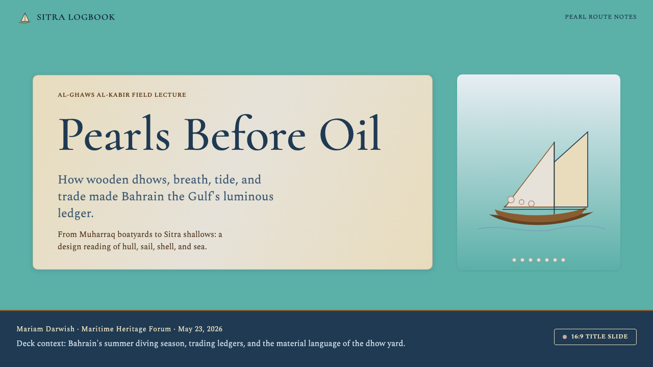
For presentation slides, the style performs well on cover pages that need to communicate premium positioning without aggression. A cover built in this vocabulary uses the mineral turquoise as a full-bleed ground, places the title in a tall authoritative serif at generous scale, and introduces the pearl-row motif as a quiet horizontal accent rather than a centrepiece. Content slides work best as clean two-column layouts with the canvas-cream ground, body text in an editorial weight, and section headers in the taller display face — the shift in register carries hierarchy without the need for color blocks or decorative dividers. Data slides should be treated with the same restraint: chart elements draw from the three-color anchor palette, with annotations in a quiet warm tone rather than arbitrary accent colors.在演示文稿中,这套风格在需要传达高端定位而不失于咄咄逼人的封面页上表现出色。以这套视觉语言构建的封面,以矿物质蓝绿做全出血底色,标题以修长权威的衬线字体放置于充裕的尺度中,珍珠排列图案作为低调的横向点缀而非视觉主角引入。内容页以帆布奶油底色的简洁双栏版面效果最佳,正文使用编辑字重,章节标题使用更高挑的展示字体——字形语调的转换本身承载层级,无需色块或装饰分隔线。数据页应保持同等克制:图表元素取自三锚色色板,注释使用沉静的暖色调而非任意的点缀色。
For web interfaces, the style adapts best to contexts where considered pacing is part of the experience — portfolio sites, long-form editorial, hospitality landing pages, and premium e-commerce. The approach is to build on the canvas-cream ground as the default surface, reserve the turquoise for primary interactive elements and key calls to action, and use the indigo only for body text and depth. Card components should carry the soft iridescent surface quality rather than hard drop shadows — a gentle, light-catching finish that distinguishes a selected or hovered state from a resting one. Navigation should be typographic and unhurried: wide spacing between items, a clear current-state indicator in turquoise, and no decorative icon clutter.对于网页界面,这套风格最适合从容节奏是体验本身组成部分的场景——作品集网站、长篇编辑内容、待客类落地页以及高端电商。方法是以帆布奶油色作为默认表面底色,将蓝绿留给主要交互元素与关键行动号召,靛蓝只用于正文与深度。卡片组件应携带柔和的虹彩表面质感而非硬边投影——那种细腻的、捕光的收尾感,使选中或悬停状态有别于静止状态。导航应当是字体性的、从容的:条目间距宽阔,当前状态指示器以蓝绿色清晰呈现,无装饰性图标堆砌。
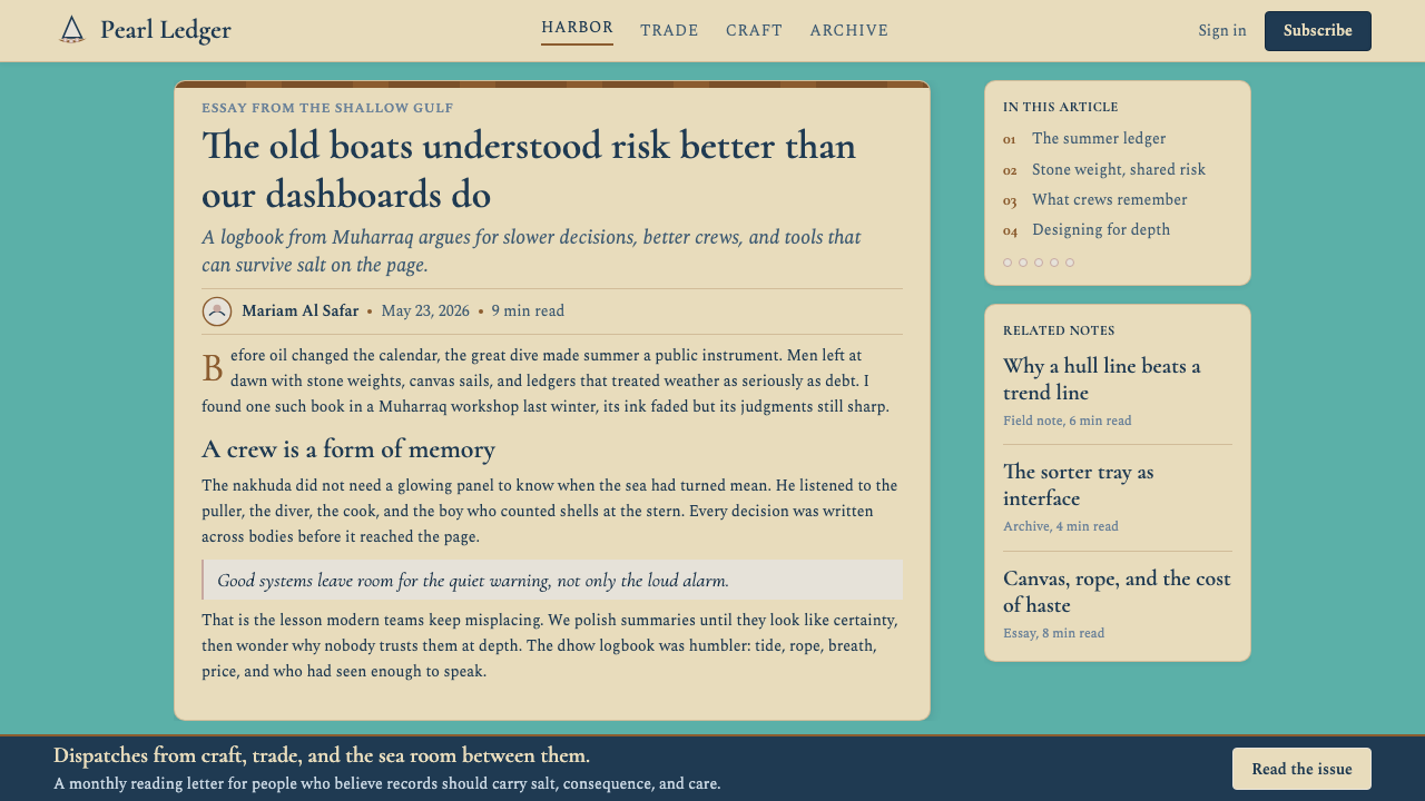
For editorial and marketing work, the style's logbook-and-ledger aesthetic supports confident long-form layout. An editorial article benefits from a wide single-column measure on the canvas-cream ground, with generous margins that can hold pull-quotes set in the display serif. Section breaks marked by a short hull-curve line or a single row of pearl dots feel earned rather than gratuitous. Marketing pages work best when they commit to the pearl as a structural metaphor: one exceptional thing, presented in isolation, with all the surrounding space treating that isolation as a value. Feature sections should be sparse, with the turquoise ground used for one or two standout moments rather than throughout.对于编辑与营销内容,这套风格的航海日志与账册美学支持自信的长篇版面。编辑文章以帆布奶油底色搭配宽阔的单栏行宽效果最佳,充裕的页边距可容纳以展示衬线字体排布的引文。以短船身弧线或一排珍珠圆点标记章节分隔,显得有据可依而非多余。营销页面在将珍珠作为结构性隐喻时效果最佳:一件非凡之物,孤立呈现,周围的空间将这种孤立本身视为价值。特性展示区块应简疏,蓝绿底色用于一两处突出时刻,而非贯穿始终。
A common mistake when applying this style is deploying all three palette anchors and all three motifs simultaneously in an attempt to signal richness. The style's visual logic is closer to that of a pearl dealer's display — a few exceptional items, given space — than to a bazaar stall covered in inventory. Using the turquoise as a dominant background color throughout an entire interface, rather than reserving it for emphasis, drains it of the depth and rarity that make it effective. Similarly, the iridescent shimmer should appear in no more than two or three places in a given composition; used widely, it becomes a surface effect rather than a signal of quality.应用这套风格时最常见的错误,是同时将三个色板锚点与三种图案全部呈上,试图以此信号化丰富感。这套风格的视觉逻辑更接近珍珠商人的展示台——寥寥数件精品,各得其所——而非铺满存货的集市摊位。在整个界面中将蓝绿作为主导背景色贯穿使用,而非留给强调,会耗尽赋予它深度与稀缺感的张力。同样,虹彩光泽在一个构图中出现不应超过两三处;大面积使用时,它便沦为表面效果而非品质信号。
See the Bahraini Dhow Pearl-Diving Boat design system →查看 Bahraini Dhow Pearl-Diving Boat 完整设计系统 →
Bahraini Dhow Pearl-Diving Boat — FAQBahraini Dhow Pearl-Diving Boat · 常见问题
Is this style appropriate for brands with no connection to Bahrain or the Gulf?这套风格适合与巴林或海湾地区毫无关联的品牌使用吗?
It depends on how it is applied. The style's visual vocabulary is specific enough that using it without acknowledgment can read as appropriation. However, the underlying values the style encodes — patience, rarity, careful craft, the elevation of a single exceptional thing — are universal enough to support application in contexts that genuinely share those values, even without a geographic connection to the Gulf. A watch brand, a specialist ingredient supplier, or a conservation organization whose actual work embodies careful selection and long time-horizons can apply the aesthetic honestly. A fast-fashion brand applying it decoratively cannot. The question to ask is whether the style's values match the product's actual values, not just its aspirational positioning.这取决于应用方式。这套风格的视觉词汇足够特定,未加说明地使用可能被解读为挪用。然而,这套风格所编码的底层价值——耐心、稀缺、精心的工艺、将一件非凡之物置于核心——具有足够的普遍性,可以支撑那些真正认同这些价值的场合使用,即使在地理上与海湾地区毫无关联。一个手表品牌、一家专业原料供应商,或一个实际工作体现了审慎遴选与长远时间观的保育机构,可以诚实地应用这套美学。一个快时尚品牌将其作为装饰则不可以。需要问的问题是:这套风格的价值观是否与产品的真实价值观吻合,而不只是与其渴望的定位吻合。
How does this style differ from other Middle Eastern or Islamic design traditions?这套风格与其他中东或伊斯兰设计传统有何区别?
The key distinction is specificity and restraint. Many Middle Eastern design aesthetics draw on the elaborate geometric tessellation of Islamic architecture, the rich tile-work of Safavid Persia, or the gold-and-arabesque tradition of Mamluk manuscripts — all of which tend toward complexity, all-over pattern, and visual density. The dhow pearl-diving aesthetic goes in the opposite direction: it is sparse, logbook-practical, and derives its ornament from maritime and commercial objects rather than architectural or calligraphic ones. The turquoise it uses is the mineral color of Gulf water, not the ceramic glaze blue of Persian tilework. The motifs are a sailor's and merchant's vocabulary, not a scholar's or a cleric's. It is a Gulf coastal tradition, not a pan-Islamic or pan-Arabian one.关键区别在于特定性与克制。许多中东设计美学援引伊斯兰建筑繁复的几何镶嵌、萨法维波斯丰富的釉砖工艺,或马木鲁克手稿的金色与藤蔓装饰传统——这些倾向于复杂性、全面铺展的图案以及视觉密度。独桅帆船珍珠采集美学走向相反:简疏、如账册般实用,其装饰来自海事与商业器物,而非建筑或书法器物。它所使用的蓝绿是海湾水体的矿物质颜色,而非波斯釉砖的陶瓷蓝。其图案是水手与商人的视觉词汇,而非学者或宗教人士的。它是海湾沿岸的地域传统,而非泛伊斯兰或泛阿拉伯的传统。
Can this style work well in dark-background or night-mode contexts?这套风格在深色背景或夜间模式下能有效呈现吗?
A dark variant is possible but requires a careful rethinking of the palette's logic. In the canonical light-ground version, the canvas cream is the breathing space and the turquoise and indigo provide depth. Inverting to a dark ground — a deep indigo or a very dark charcoal with a warm undertone — requires a corresponding inversion in the role of the other colors: the cream becomes an accent and highlight rather than a ground, the turquoise moves to foreground emphasis, and the iridescent mother-of-pearl quality becomes more prominent because shimmer reads more vividly against dark surfaces. The style's warmth can survive the inversion, but it requires discipline: a cold dark background strips the maritime warmth and produces something closer to a generic deep-blue ocean palette than the specific Gulf character the style is after.深色变体是可行的,但需要对色板逻辑进行仔细的重新思考。在标准的浅色底面版本中,帆布奶油色是呼吸空间,蓝绿与靛蓝提供深度。翻转为深色底面——深靛蓝或带有暖色底调的极深炭灰——需要其他颜色角色的相应翻转:奶油色成为点缀与高光而非底面,蓝绿移至前景强调,珍珠母贝的虹彩质感因光泽在深色表面上更为鲜明而变得更加突出。这套风格的温暖感可以在翻转后存活,但需要自律:一个冷调的深色背景会剥去海事的温度感,产生某种接近通用深蓝海洋色板的效果,而非这套风格所追求的特定海湾气质。
What is the single most common error when referencing this style?援引这套风格时最常见的单一错误是什么?
Treating turquoise as a dominant, wall-to-wall color rather than as the mineral ground of a specific environment. In the actual Gulf shallow-water context, turquoise is the color you look at — the sea itself — not the color of the objects on it. Applied to an interface, this means turquoise should anchor key elements, mark primary actions, and punctuate the composition, not fill every container and background. When turquoise saturates the entire layout, the composition loses the contrast that makes the pearl — the point of the whole aesthetic — readable against it. Reserve the color, and it creates desire; flood the space with it, and it becomes background noise.将蓝绿视为主导性的、铺天盖地的颜色,而非特定环境中矿物质底色。在真实的海湾浅水语境中,蓝绿是被注视的颜色——大海本身——而非其上漂浮的器物的颜色。应用于界面,这意味着蓝绿应当锚定关键元素、标记主要操作、为构图点睛,而非填满每一个容器与背景。当蓝绿浸透整个版面时,构图失去了使珍珠——这套美学的全部意义所在——在其上可辨的对比。保留这种颜色,它创造渴望;以它漫灌空间,它便成为背景噪音。
Is the fidjeri musical tradition relevant to how the visual style behaves rhythmically?菲德杰里音乐传统与这套视觉风格在节奏感上有关联吗?
It is a useful analogy for understanding the style's pacing. Fidjeri is call-and-response music built around a steady, repeated pull rhythm — the haulers synchronizing their effort to bring a diver to the surface. There is a strong, clear beat and long breathing space between phrases. The visual style has the same quality: clear structural beats (a header, a section anchor, a key motif) separated by generous negative space, with the ornamentation appearing in clusters at specific moments rather than distributed evenly. The mistake of filling every space with decoration is equivalent to a musician turning the call-and-response into continuous sound — it destroys the rhythm that makes each element audible. Generous pauses are not empty space; they are the beats between the beats.这是理解这套风格节奏感的一个有用类比。菲德杰里是围绕稳定、反复的拉绳节奏构建的呼唤应答式音乐——拉绳者同步着将潜水者拉回水面的力气。它有清晰有力的节拍,乐句之间有漫长的呼吸空间。这套视觉风格具有同样的品质:清晰的结构性节拍(标题、章节锚点、关键图案),被充裕的留白分隔,装饰以组群的形式出现在特定时刻,而非均匀分布。以装饰填满每一处空间的错误,相当于音乐家将呼唤应答变成连续不断的声音——它摧毁了使每个元素得以被听见的节奏。慷慨的停顿不是空白;它们是节拍与节拍之间的呼吸。
Related design styles相关设计风格
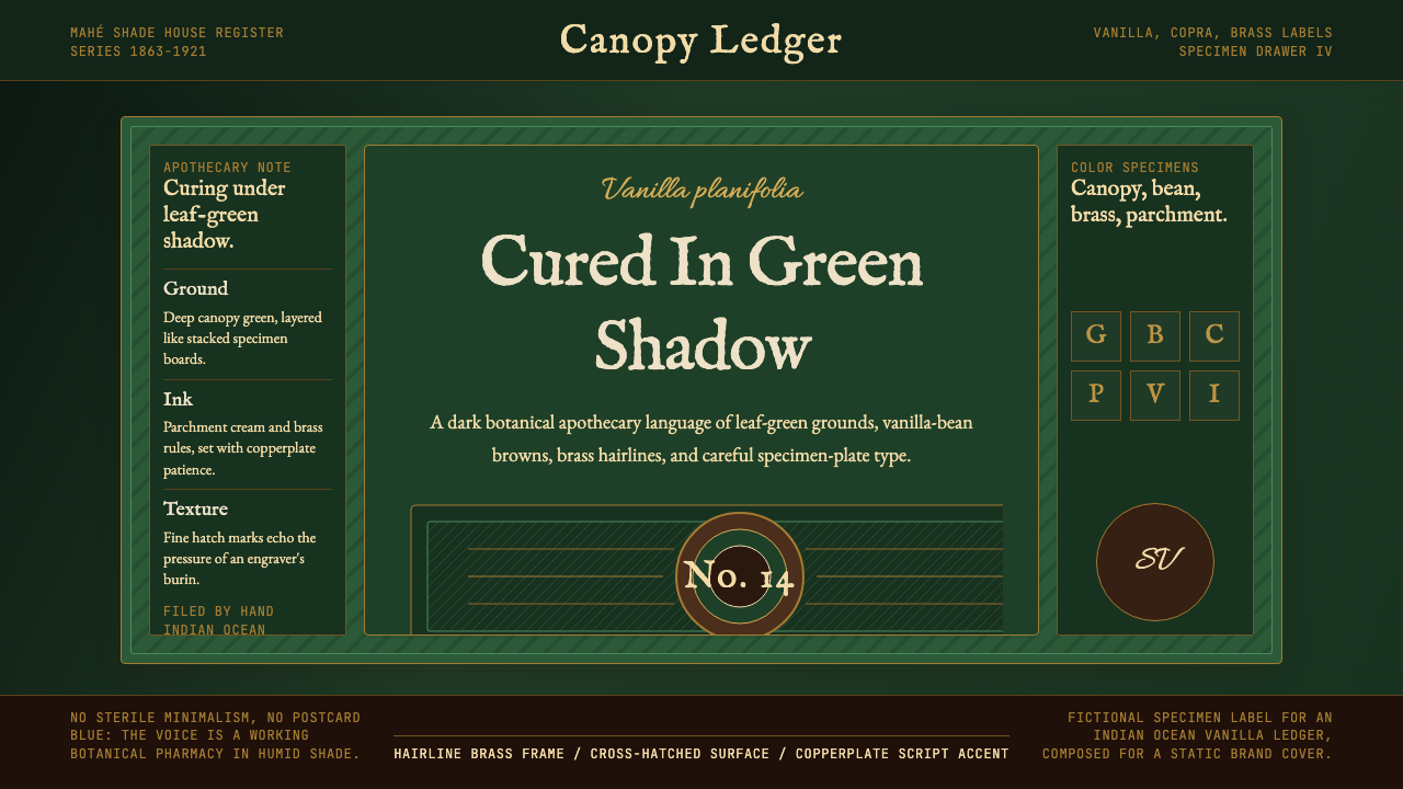 Seychellois Vanilla TakamakaBotanical apothecary in shadow. Deep green, brass hairlines, and copperplate…阴影中的植物药房:深绿底、黄铜细线与铜版字体。
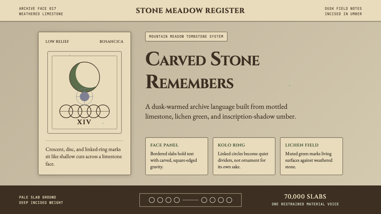 Bosnian Stećak Medieval TombstoneStone remembers quietly. Lichen green and Cinzel cuts sit on weathered limest…石头静默记忆。苔藓绿与Cinzel刻痕落在风化石灰岩上。
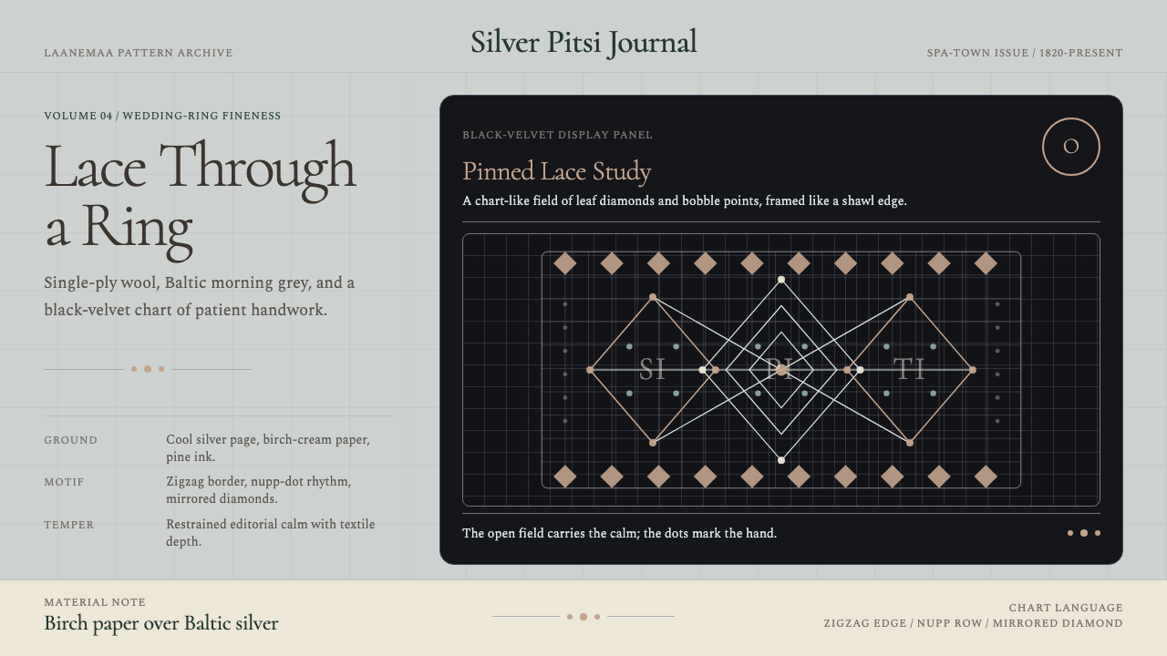 Estonian Haapsalu Lace ShawlQuiet craft, held in silver light. Cormorant type meets nupp dots and velvet…银灰克制的手工气质。Cormorant 字体、凸粒点与黑绒蕾丝网格成形。
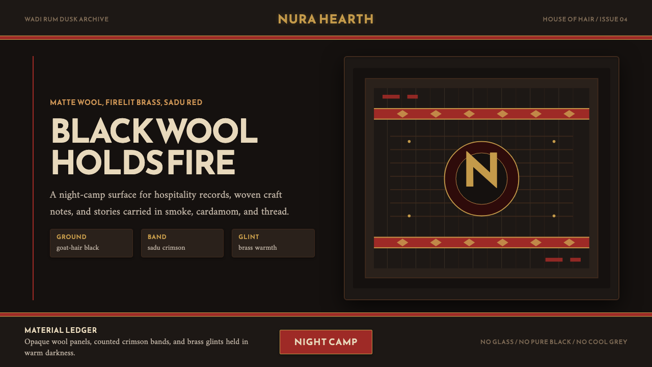 Jordanian Bedouin Black TentNight camp honesty. Goat-hair black, sadu crimson, brass lines.夜营般诚实。黑羊毛底、萨杜绛红与黄铜线。
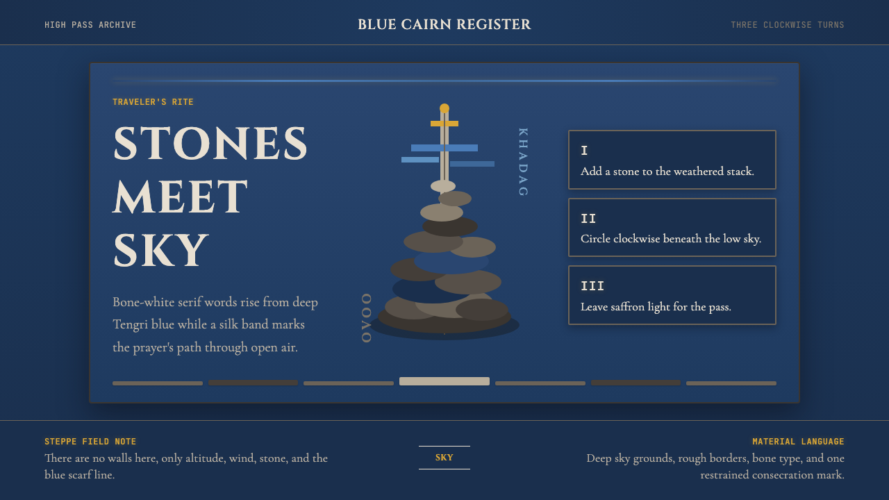 Mongolian Ovoo (Cairn Prayer Site)Sacred austerity. Steppe-blue ground, bone serif type, and one silk-blue pray…神圣而肃穆:草原蓝底、骨白衬线字与一线哈达蓝。
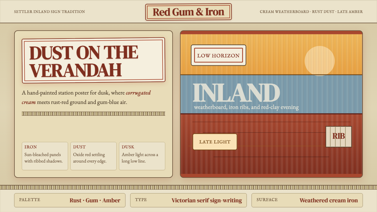 Australian Outback VernacularWeather is the voice. Rust dust, gum-blue bands, and serif sign-writing age t…风化就是声音:锈红尘土、桉蓝横带与衬线招牌让页面有年岁。