Design style guide设计风格指南
What is Melbourne Third-Wave Coffee Modern?什么是 Melbourne Third-Wave Coffee Modern?
Melbourne's laneway cafés invented a visual language as precise as a tasting note — eucalyptus green, kraft warmth, and provenance-dense type that made sourcing transparent and design inseparable from the coffee itself.墨尔本巷弄咖啡馆创造了一套精确如杯测记录的视觉语言——桉树叶绿、牛皮纸温度与产地溯源式排版,让采购透明度与设计美学融为一体。
Melbourne Third-Wave Coffee Modern in briefMelbourne Third-Wave Coffee Modern 速览
Melbourne Third-Wave Coffee Modern is the visual language that emerged from the city's specialty-coffee culture between roughly 2008 and 2018, crystallising in the cafés, roasteries, and retail packaging of Fitzroy laneways and Collingwood warehouse conversions. It is a hybrid aesthetic: Japanese restraint in the handling of negative space and quiet color, Scandinavian editorial clarity in grid structure and typographic hierarchy, and a distinctly Australian frankness in material choices — raw concrete, unvarnished timber, kraft board — that refuses to dress up what can honestly be left bare.墨尔本第三波咖啡现代风格是这座城市精品咖啡文化在大约2008年至2018年间孕育出的视觉语言,在菲茨罗伊巷弄和科林伍德仓库改造而成的咖啡馆、烘焙坊与零售包装中逐渐成型。它是一种混合美学:日式克制体现在留白与低调色彩的运用上,北欧编辑式清晰体现在网格结构与排版层级上,而一种独特的澳大利亚坦诚则渗透于材质选择之中——原始混凝土、未上漆木材、牛皮纸板——凡是可以诚实地保持本色的,绝不加以修饰。
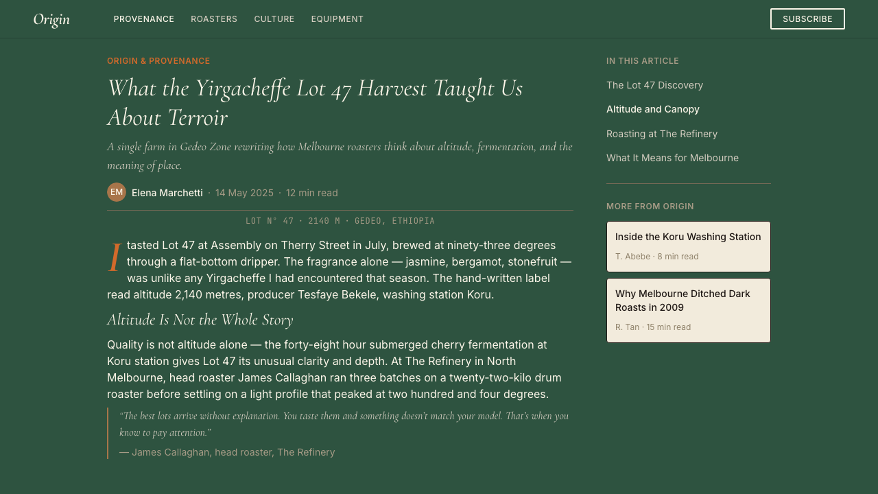
At its core the style is about provenance legibility. Third-wave coffee culture insists that a drinker should be able to trace a cup to its farm, harvest season, varietal, and processing method. The visual system was built to carry that information without overwhelming it: the typography is unhurried and detailed, the palette is natural and earth-anchored rather than attention-grabbing, and every layout decision serves readability over decoration. The result is a design register that feels simultaneously humble and expert — the confidence of a roaster who knows exactly where their beans come from.这种风格的核心是产地可读性。第三波咖啡文化坚持认为,饮用者应当能够追溯一杯咖啡到其庄园、采收季节、品种与处理方式。这套视觉系统被构建用来承载这些信息,而不使其喧宾夺主:排版从容而细腻,色板自然贴近大地而非追求注意力,每一个版面决策都服务于可读性而非装饰性。结果是一种感觉同时谦逊而专业的设计语调——那是一位清楚知道豆子来自何处的烘焙师所具备的自信。
Though it originated in printed menus, retail bags, and café interiors, the style has migrated convincingly into digital product design, particularly for brands in food, wellness, sustainability, and independent retail where a sense of careful curation and honest material sourcing is a genuine value rather than a marketing posture.尽管这种风格源于印刷菜单、零售袋与咖啡馆室内设计,它已令人信服地迁移到数字产品设计领域,尤其适用于食品、健康、可持续性和独立零售品牌——在这些领域,精心策划与诚实溯源的感觉是真实价值,而非营销姿态。
Where does Melbourne Third-Wave Coffee Modern come from?Melbourne Third-Wave Coffee Modern 从何而来?
Melbourne's specialty-coffee scene has roots in the city's post-war Italian immigrant community, which established espresso culture along Brunswick Street and Lygon Street decades before the term 'third wave' existed. But the contemporary aesthetic owes more to a second generation of influence: the Japanese kissaten and sake-bar culture that Melbourne's design community had absorbed through the 1990s travel and publishing boom, and the Scandinavian café tradition arriving via Copenhagen and Stockholm-trained baristas who migrated south in the early 2000s. These two threads — Japanese material minimalism and Scandinavian typographic rigour — were grafted onto an Australian openness to raw, unfinished surfaces.墨尔本精品咖啡文化的根源在于这座城市战后意大利移民社区,他们早在「第三波」这个词出现之前数十年,就已在布朗斯维克街和利贡街建立起浓缩咖啡文化。但当代美学更多归功于第二代影响:通过1990年代旅行与出版热潮,墨尔本设计界吸收的日本喫茶店与清酒吧文化,以及2000年代初从哥本哈根和斯德哥尔摩移居南方的北欧受训咖啡师带来的斯堪的纳维亚咖啡馆传统。这两条线索——日式材质极简与北欧排版严谨——被嫁接到澳大利亚对原始未加工表面的开放态度之上。
The era that most directly shaped the visual language runs from roughly 2008, when the post-global-financial-crisis contraction made conspicuous luxury brand language feel dishonest, through to 2018, when the style had become legible enough to be taught, imitated, and exported. Key figures include Mark Dundon, whose Seven Seeds roastery in Carlton helped define the warehouse-as-tasting-room format and its associated print identity; Jason Scheltus of St. Ali in South Melbourne, who brought an editorial intelligence to coffee packaging at a moment when most roasters were using generic commodity design; Bowen Holden, whose work helped establish the standard of botanical illustration as a complement to origin storytelling; and Salvatore Malatesta, whose multiple venues demonstrated that the aesthetic could scale without losing its handmade conviction.直接塑造这套视觉语言的时代,大约从2008年(全球金融危机后的收缩使显眼的奢华品牌语言显得不诚实)延伸至2018年(这种风格已足够清晰,可被教授、模仿和输出)。关键人物包括:Mark Dundon,其位于卡尔顿的Seven Seeds烘焙坊帮助定义了仓库即品鉴室的格式及其配套印刷识别系统;南墨尔本St. Ali的Jason Scheltus,他在大多数烘焙商仍使用通用商品设计的时期,将编辑智识带入咖啡包装;Bowen Holden,其工作帮助确立了植物插图作为产地叙事补充的标准;以及Salvatore Malatesta,其多个场馆证明这种美学可以在不失手工信念的情况下实现规模化。
The style's typographic identity was shaped in part by the letterpress and risograph revival that moved through Melbourne's independent publishing scene during the same period. Small-run zines, craft-market print ephemera, and independent bookshop posters fed back into café print culture, establishing a preference for type that showed visible impression and ink variation — the material evidence of process — over the sterile precision of commercial offset printing. This gave the style its characteristic warmth: even when digitally produced, the typography often pays homage to the slight unevenness of a physical printing press.这种风格的排版身份,部分由同期穿越墨尔本独立出版圈的活版印刷与孔版印刷复兴运动所塑造。小批量杂志、手工市集印刷品和独立书店海报反哺了咖啡馆印刷文化,建立起一种对显示可见压印与油墨变化的字体的偏好——这些是过程的物质证据——胜过商业胶印的无菌精确。这赋予了这种风格其特有的温度:即便是数字制作的排版,也往往向实体印刷机轻微不均匀性致敬。
By the mid-2010s the aesthetic had consolidated around a stable set of conventions — eucalyptus green, warm cream or off-white grounds, kraft board textures for tactile packaging, italic serif details for provenance annotations, and a generous commitment to negative space — that were being applied consistently across Melbourne's highest-profile specialty café groups. The visual system then began to travel: first to Sydney and Brisbane, then to London's specialty-coffee scene (where the Melbourne influence on Antipodean cafés became a recognised phenomenon), and eventually into the branding vocabularies of farm-to-table restaurants, natural wine bars, and artisan food producers globally.到2010年代中期,这种美学已围绕一套稳定的惯例固化——桉树绿、温暖奶油色或近白底面、牛皮纸板触感包装、斜体衬线产地注释细节,以及对负空间慷慨的承诺——并被墨尔本最具知名度的精品咖啡集团一致运用。这套视觉系统随即开始传播:先到悉尼和布里斯班,再到伦敦精品咖啡圈(墨尔本对南半球咖啡馆的影响在那里成为一种公认现象),最终进入全球农场直送餐厅、自然酒吧和手工食品生产商的品牌词汇。
What defines the Melbourne Third-Wave Coffee Modern look?Melbourne Third-Wave Coffee Modern 的视觉特征是什么?
Palette色板
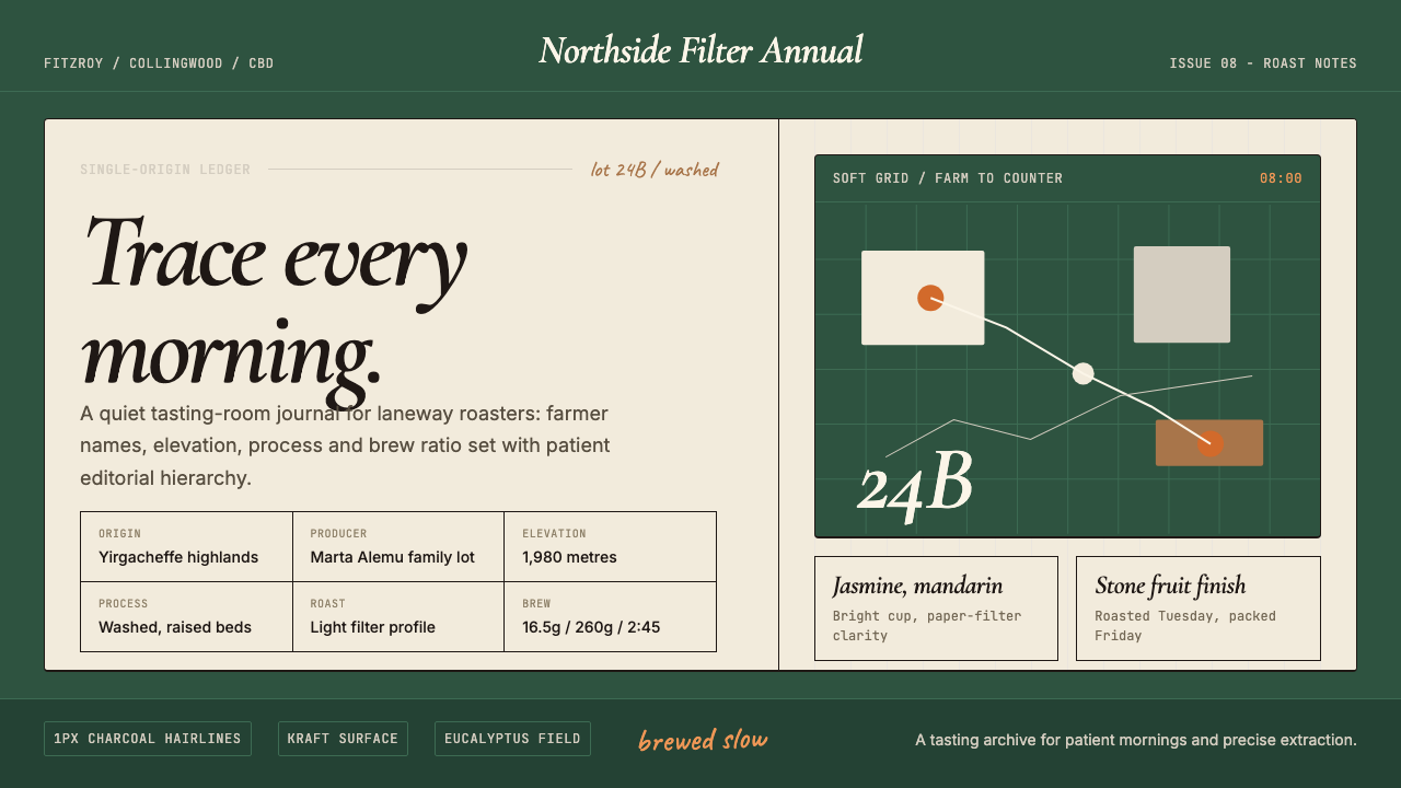
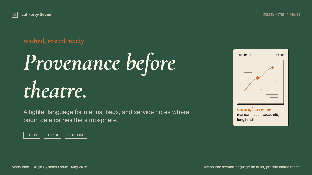
The palette is anchored by eucalyptus green — a muted, slightly grey-green that reads as botanical rather than corporate — paired with warm cream or aged-white grounds. Secondary tones borrow from the roasting process itself: the deep brown of a medium roast, the pale gold of a washed natural, the near-black of a dark roast used sparingly as a structural anchor. The palette deliberately avoids high saturation; every hue carries grey, as if it has been left out in the Australian light for a season. Accent color, when it appears, tends toward terracotta, warm ochre, or the dusty rose of a dried banksia rather than the clean primaries of modernist tradition.色板以桉树绿为核心——一种沉静、略带灰调的蓝绿色,读起来像植物标本而非企业色彩——与温暖奶油或陈旧白色底面搭配。次要色调借鉴自烘焙过程本身:中度烘焙的深棕、水洗日晒豆的淡金、深度烘焙的近黑(作为结构性锚点被克制使用)。这套色板刻意回避高饱和度;每一种色相都含有灰调,仿佛在澳大利亚的阳光下晾晒了一个季节。强调色若出现,倾向于赤陶、暖赭,或干燥山龙眼的尘玫瑰色,而非现代主义传统的干净原色。
Typography字体排印
Typography is the most distinctive feature of the style. The primary workhorse is an upright or slightly condensed serif — often with visible bracketed serifs and moderate stroke contrast — used for longer-form provenance text: farm names, altitude, varietal, harvest notes. Running alongside it is an italic cut of the same or closely related face, deployed specifically for handwritten-feeling annotations, tasting descriptors, and origin details. This upright-plus-italic pairing gives the system its characteristic warmth and legibility while maintaining a quiet formality. Display work sometimes introduces a grotesque or geometric sans-serif for weights and prices, creating a deliberate contrast between the warmth of provenance detail and the directness of transactional information.排版是这种风格最鲜明的特征。主力字体是一款直立或略微压缩的衬线体——通常带有可见的括弧衬线与适度笔画对比——用于较长篇幅的产地文字:庄园名、海拔、品种、采收记录。与之并行的是同款或近亲字体的斜体版本,专门用于手写感注释、杯测描述词和产地细节。这种直立加斜体的组合赋予了这套系统特有的温度与可读性,同时保持一种低调的正式感。展示性文字有时引入一款怪诞体或几何无衬线体用于重量和价格,在产地细节的温度与交易信息的直接性之间制造刻意对比。
Negative Space and Layout负空间与版面
Generous negative space is non-negotiable. The style treats emptiness not as unused area but as a material presence — the visual equivalent of the silence a cupper maintains while evaluating a cup. Layouts are loosely gridded rather than rigidly ruled: text blocks appear slightly off-centre or anchored at unconventional margins, botanical illustrations float with deliberate asymmetry, and information hierarchies are created through scale and spatial breathing room rather than ruled lines or boxes. The overall effect is unhurried and attentive — the visual equivalent of a hand-poured filter in an unhurried Tuesday morning.慷慨的负空间是不可妥协的。这种风格将留白视为一种物质存在,而非未使用的区域——相当于杯测师在评估一杯咖啡时保持的那种视觉沉默。版面是松散的网格而非严格的直线:文字块略微偏离中心或锚定在非惯常的边距上,植物插图以刻意的非对称方式漂浮,信息层级通过尺度与空间呼吸感而非直线或方框来建立。整体效果是从容而专注的——相当于一个悠闲的周二早晨手冲滤泡咖啡的视觉等价物。
Material Texture and Surface材质纹理与表面
In print and packaging work, the style has a strong preference for materials that show their own nature: uncoated or lightly coated stock, kraft board in natural or bleached form, and paper weights heavy enough to convey substance without ostentation. Digital applications translate this material sensitivity into a preference for textured or slightly tonal backgrounds over pure white, and for design elements that carry a sense of hand-production — slight irregularity in illustrated marks, visible grain in photographic assets, type with the feel of letterpress impression even when set digitally. The goal is warmth and tactility rather than digital gloss.在印刷与包装作品中,这种风格对能够展示自身本质的材料有强烈偏好:无涂布或轻涂布纸张、自然或漂白牛皮纸板,以及足够厚重以传达质感而不显张扬的纸重。数字应用将这种材质敏感性转化为对有质感或略带色调背景的偏好(而非纯白),以及对携带手工制作感的设计元素的偏好——插图标记中的轻微不规则、摄影资产中的可见颗粒感、即便以数字方式设置也带有活版印刷压印感的字体。目标是温度与触感,而非数字光泽。
Illustration Style插图风格
Botanical and naturalist illustration is central to the visual vocabulary. These illustrations — typically rendered in fine ink line work with selective flat washes of muted color — serve both a decorative and an informational function: they depict the coffee plant, the growing region's flora, or the processing environment. The style draws explicitly on nineteenth-century scientific illustration, particularly the kind found in natural history publications and colonial botanical surveys, which gives the work a sense of careful observation and accumulated knowledge. The illustration palette is always constrained to the overall design system: no illustration color appears that does not echo the broader palette.植物与博物插图是视觉词汇的核心。这些插图——通常以精细钢笔线条加上选择性的低饱和色平涂渲染——同时具有装饰与信息功能:它们描绘咖啡植株、产地区域的植被,或处理环境。这种风格明确借鉴十九世纪科学插图,尤其是自然历史出版物和殖民时期植物调查中的那类,赋予作品一种仔细观察与积累知识的感觉。插图色板始终被约束在整体设计系统之内:不会出现任何不呼应更广色板的插图色彩。
Information Density and Provenance Detail信息密度与产地细节
Where most consumer brand design hides complexity behind benefit statements, Melbourne Third-Wave Coffee Modern surfaces it. A retail bag or menu card might carry the farm name, the growing altitude, the varietal, the harvest date, the processing method, the cupping score, and the roaster's tasting notes — all set in carefully differentiated type that makes scanning efficient and reading rewarding. This commitment to specificity is itself an aesthetic statement: it communicates expertise, respect for the producer, and the confidence that the audience is literate enough to care about the difference between a washed Ethiopian and a natural Colombian.大多数消费品牌设计将复杂性隐藏在利益陈述背后,而墨尔本第三波咖啡现代风格则将其呈现出来。一个零售袋或菜单卡片可能载有庄园名、种植海拔、品种、采收日期、处理方式、杯测分数和烘焙师的品鉴记录——全部以仔细区分的字体排印,使浏览高效、阅读有趣。这种对具体性的承诺本身就是一种美学声明:它传递专业知识、对生产者的尊重,以及对受众足够懂行、关心水洗埃塞俄比亚与日晒哥伦比亚之间区别的信心。
Restraint and Anti-Trend Posture克制与反潮流立场
The style is notably resistant to the visual trends of the mainstream branding industry. At the moment when rounded geometric logos and candy-bright palettes dominated venture-backed startups, Melbourne Third-Wave Coffee Modern remained committed to organic irregularity, muted tones, and serif formality. This anti-trend posture is not conservative — it is a value statement. The style signals that the work is not trying to appeal to the widest possible audience but to the right audience: people who slow down enough to read a tasting note and are put off rather than attracted by visual noise.这种风格明显抵制主流品牌行业的视觉潮流。在圆角几何标志和糖果亮色调主导风险投资支持的初创公司之际,墨尔本第三波咖啡现代风格始终坚守有机不规则、低饱和色调与衬线正式感。这种反潮流立场并非保守——它是一种价值声明。这种风格表明,作品并不试图吸引尽可能广泛的受众,而是吸引合适的受众:那些愿意放慢脚步阅读品鉴记录、被视觉噪音排斥而非吸引的人。
Who shaped Melbourne Third-Wave Coffee Modern?谁塑造了 Melbourne Third-Wave Coffee Modern?
Co-founder of Seven Seeds in Carlton and Market Lane Coffee, Dundon was instrumental in establishing the warehouse-as-tasting-room format that gave Melbourne's third-wave scene its signature spatial and visual grammar. Seven Seeds' print identity — spare, typographically rigorous, and firmly rooted in provenance detail — became a widely referenced template for specialty-coffee branding not only in Melbourne but internationally. His approach treated the café as an educational institution as much as a hospitality venue, and the design system reflected that seriousness.卡尔顿Seven Seeds及Market Lane Coffee的联合创始人,Dundon在确立仓库即品鉴室格式方面发挥了关键作用,赋予了墨尔本第三波咖啡圈其标志性的空间与视觉语法。Seven Seeds的印刷识别系统——简洁、排版严谨、牢固扎根于产地细节——成为精品咖啡品牌塑造的广泛参考模板,影响不仅限于墨尔本,更延伸至国际。他的方式将咖啡馆视为教育机构与待客场所同等重要,设计系统也反映了这种严肃性。
Creative director behind St. Ali in South Melbourne, Scheltus brought an editorial intelligence to specialty-coffee design at a period when the category was still largely using commodity packaging conventions. His approach to the St. Ali identity — layered, reference-dense, and visually confident — demonstrated that coffee branding could sustain the same visual ambition as independent magazine publishing, and he helped position Melbourne's scene as a place where design was itself part of the product.南墨尔本St. Ali背后的创意总监,Scheltus在该品类大多仍沿用商品包装惯例之际,将编辑智识带入精品咖啡设计。他对St. Ali识别系统的处理——层次丰富、参考密集、视觉自信——证明了咖啡品牌可以承载与独立杂志出版同等的视觉抱负,他帮助将墨尔本咖啡圈定位为一个设计本身即是产品组成部分的地方。
A graphic designer who became closely associated with the botanical illustration strand of Melbourne's coffee aesthetic, Holden helped establish the precedent of commissioning original naturalist illustration as an alternative to photography for coffee packaging and in-café signage. His work demonstrated that the high production values associated with fine-art publishing could translate directly into the specialty-food and beverage sector, and it contributed to the normalization of illustration as a premium signal within the category.一位与墨尔本咖啡美学植物插图流派密切相关的平面设计师,Holden帮助确立了为咖啡包装和店内标识委托原创博物插图(替代摄影)的先例。他的工作证明,与精品艺术出版相关的高制作价值可以直接转化到精品食品与饮料领域,并有助于在该品类中将插图正常化为优质信号。
Founder of multiple Melbourne venues including Sensory Lab and St. Ali, Malatesta demonstrated that the third-wave aesthetic could be deployed at scale without becoming formulaic. His venues maintained the visual language's sense of craft and restraint while achieving commercial scale, and his influence extended to the staff culture and training materials that became part of Melbourne's broader hospitality design conversation. The consistency of his brand application across multiple sites helped prove the system's robustness as a transferable visual identity.Sensory Lab和St. Ali等多个墨尔本场馆的创始人,Malatesta证明了第三波美学可以在不变得公式化的情况下规模化部署。他的场馆在实现商业规模的同时,保持了视觉语言的手工感与克制性,他的影响还延伸至成为墨尔本更广泛待客设计对话一部分的员工文化与培训材料。他在多个场地一致的品牌应用有助于证明这套系统作为可转移视觉识别的稳健性。
Rather than a single named designer, Market Lane's visual identity was developed collaboratively, and its consistency over more than a decade made it one of the most studied examples of the style. The Market Lane system — restrained serif type, kraft packaging, botanical line illustration, and a commitment to naming every farm on every bag — functioned as a worked example of how information density and visual restraint could coexist productively, and it influenced the standard of transparency documentation across the Australian specialty-coffee industry.Market Lane的视觉识别不是由某位具名设计师单独完成的,而是协作发展的,其超过十年的一致性使它成为这种风格被研究最多的案例之一。Market Lane系统——克制衬线字体、牛皮纸包装、植物线描插图,以及在每个袋子上标注每个庄园名的承诺——作为信息密度与视觉克制如何富有成效地共存的实践范本,影响了澳大利亚精品咖啡行业的透明度文档标准。
How do you use Melbourne Third-Wave Coffee Modern today?今天怎么用 Melbourne Third-Wave Coffee Modern?
Melbourne Third-Wave Coffee Modern transfers well to any context where the brand's credibility rests on demonstrated expertise, careful curation, and honest sourcing — rather than on lifestyle aspiration or status signalling. The style works because it communicates a specific set of values: we know where this comes from, we care about the details, and we trust you to care too. Applied correctly, it creates the feeling of being handed something by someone who really knows what they're doing.墨尔本第三波咖啡现代风格能很好地迁移到任何品牌公信力建立在展示专业知识、精心策划与诚实溯源之上的场景——而非生活方式向往或身份信号。这种风格之所以有效,是因为它传递了一套特定价值观:我们知道这来自哪里,我们关心细节,我们相信你也会关心。正确应用时,它会制造出一种被真正懂行的人递出某样东西的感觉。
For presentation slides, the style suits cover pages built around a single strong typographic statement: a name, a provenance line, a season or date — set in a serif face against a warm cream or textured ground, with generous empty space carrying at least as much visual weight as the type itself. Content slides should be treated as curated information rather than projected bullet lists: use ample white or cream space, set body text unhurriedly in a readable serif, and reserve italic for annotations and qualitative asides. Data slides can adopt the naturalist illustration palette — replacing generic chart colors with the style's muted greens, warm browns, and pale golds — to maintain visual coherence without sacrificing readability.对于演示文稿,这种风格适合围绕单一有力排版声明构建的封面页:一个名称、一行产地信息、一个季节或日期——用衬线字体置于温暖奶油色或有质感的底面上,慷慨的空白空间所承载的视觉分量至少与字体本身相当。内容页应被视为策划信息而非投影项目符号列表:使用充足的白色或奶油空间,以从容可读的衬线体排布正文,将斜体保留给注释和定性旁白。数据页可采用博物插图色板——用这种风格的低饱和绿、暖棕和淡金替代通用图表颜色——在不牺牲可读性的同时保持视觉连贯。
For web and digital product design, the style is particularly suited to dashboards where information density must coexist with calm readability: farm-to-table delivery platforms, natural wine subscription interfaces, wellness tracking tools, and any product category where the user's trust depends on visible evidence of care and specificity. Use a slightly warm or tonal background rather than pure white; keep body type in a legible serif at a comfortable reading size; reserve the eucalyptus green for primary interactive states and confirmations; and use negative space generously — the temptation to fill mobile screens with content should be resisted in favor of a layout that breathes. For pricing pages, lean on the typographic contrast between the serif detail font and a clean sans-serif for numbers and tier names.对于网页和数字产品设计,这种风格尤其适合信息密度必须与平静可读性共存的仪表板:农场直送配送平台、自然酒订阅界面、健康追踪工具,以及任何用户信任依赖于可见的关怀与具体性证据的产品品类。使用略微温暖或带色调的背景而非纯白;在舒适的阅读尺寸下保持可读衬线体的正文;将桉树绿保留给主要交互状态与确认;慷慨使用负空间——填满移动端屏幕的诱惑应被抵制,转而倾向于一种能呼吸的版面。对于定价页,依靠衬线细节字体与用于数字和套餐名称的简洁无衬线体之间的排版对比。
For editorial and marketing work — brand books, lookbooks, product stories, social content — the style rewards a slow, considered pace of disclosure. Open with the origin: where, when, by whom. Let the botanical illustration or a detail photograph carry the visual weight on opening spreads. Introduce the product through specificity: not 'ethically sourced' but 'washed, 1,900 metres, Yirgacheffe.' Marketing copy should be written in the same register as the design — precise, unhurried, trusting. The most effective social content in this visual system is the single beautifully set provenance card: a farm name, a region, a harvest note, and nothing else.对于编辑与营销工作——品牌手册、lookbook、产品故事、社交内容——这种风格奖励缓慢而深思熟虑的披露节奏。以产地开篇:哪里、何时、由谁。让植物插图或细节摄影在开篇跨页承载视觉重量。通过具体性介绍产品:不是「道德采购」,而是「水洗,1900米,耶加雪菲」。营销文案应与设计保持同一语调——精确、从容、信任受众。这套视觉系统中最有效的社交内容,是那张精美排版的产地卡片:一个庄园名、一个产区、一条采收记录,除此之外别无他物。
A common mistake is applying the palette without the restraint. Eucalyptus green is a quiet color that depends on its partners — the warmth of cream, the weight of deep brown, the openness of negative space — to register properly. Saturating a layout with green, or combining it with competing accent colors, collapses the system's careful calibration. Similarly, the style's affection for serif type does not mean mixing multiple serif families: the warmth comes from depth within a single well-chosen face at multiple weights and cuts, not from variety for its own sake. The other common error is irony: this is a style that means what it says, and any hint of pastiche or knowingly retro application undermines the sincerity that is its entire foundation.一个常见错误是在没有克制的情况下应用色板。桉树绿是一种安静的色彩,它依赖于伙伴——奶油的温度、深棕的重量、负空间的开放——才能正确呈现。用绿色饱和一个版面,或将其与竞争性强调色组合,会瓦解这套系统精心校准的平衡。同样,这种风格对衬线字体的偏爱并不意味着混用多个衬线字族:温度来自于在单一精心选择的字体以多个字重和字切深耕,而非为多样而多样。另一个常见错误是带有反讽意味:这是一种言出必行的风格,任何仿制或刻意复古应用的暗示,都会破坏其整个基础所在的真诚性。
Melbourne Third-Wave Coffee Modern — FAQMelbourne Third-Wave Coffee Modern · 常见问题
Is this style only appropriate for food and beverage brands?这种风格只适合食品与饮料品牌吗?
No, though it originated there. The underlying values — provenance transparency, demonstrated expertise, honest materiality, restrained palette — transfer effectively to any brand whose credibility depends on the audience believing that real care and knowledge went into making the product. Natural cosmetics, independent publishing houses, craft textile producers, small-batch architectural materials, farm-to-table software tools for agriculture — all of these have been successfully expressed in this visual language. What the style cannot carry is a brand that is fundamentally about aspiration, luxury status, or mass-market accessibility. It is a style for specificity, not for everyone.不,尽管它起源于那里。其基础价值观——产地透明度、展示专业知识、诚实材质感、克制色板——能有效迁移到任何公信力依赖于受众相信产品制作投入了真正关怀与知识的品牌。天然化妆品、独立出版社、手工纺织品生产商、小批量建筑材料、农业农场直送软件工具——所有这些都已在这套视觉语言中得到成功表达。这种风格无法承载的,是根本上关乎向往、奢华地位或大众市场可及性的品牌。它是一种服务于具体性的风格,而非面向所有人的风格。
How does this style relate to Japanese minimalism and Scandinavian design?这种风格与日式极简和斯堪的纳维亚设计有何关系?
Melbourne Third-Wave Coffee Modern is a hybrid that consciously synthesises both traditions without being reducible to either. From Japanese aesthetics it takes the comfort with asymmetry, the preference for materials that age gracefully, and the conviction that restraint is an active rather than a passive quality — something you choose and maintain, not simply the absence of decoration. From Scandinavian design it takes the editorial rigour: the commitment to legible typographic hierarchy, the trust in the grid as an organisational structure, and the sense that good design should be a background condition of daily life rather than a statement. The Melbourne contribution is the frank materiality — an Australian directness that says: this is what it is, no more, no less.墨尔本第三波咖啡现代风格是一种有意识地综合两种传统而无法被还原为任何一种的混合体。从日式美学中,它汲取了对非对称的自在感、对优雅老化材料的偏好,以及克制是一种主动而非被动品质的信念——是你选择并维持的东西,而不仅仅是装饰的缺席。从斯堪的纳维亚设计中,它汲取了编辑式严谨:对清晰排版层级的承诺、对网格作为组织结构的信任,以及好设计应当是日常生活背景条件而非声明的感觉。墨尔本的贡献是坦率的材质感——一种澳大利亚直接性:这就是它的样子,不多不少。
Can the style work in a dark-mode or dark-background application?这种风格能用于深色模式或深色背景应用吗?
With care, yes — but it requires recalibration rather than simple inversion. The canonical form of the style is light-ground: warm cream or off-white is fundamental to its sense of material warmth and the legibility of fine serif type. A dark inversion risks losing both. If a dark variant is necessary, the approach that works best is to treat the background as deep, warm charcoal or near-black rather than true black, preserve the eucalyptus green as an accent rather than a ground, and ensure the serif type is large enough and well-spaced enough to remain legible at low contrast. The botanical illustration strand of the style is particularly vulnerable to dark inversion — fine line work typically needs a light ground to breathe.谨慎处理的话可以——但它需要重新校准而非简单反转。这种风格的经典形态是浅色底面:温暖奶油色或近白色对于其材质温度感与精细衬线字体的可读性都是根本性的。深色反转有丢失两者的风险。若深色变体是必要的,最有效的方法是将背景处理为深沉温暖的炭灰色或近黑色而非纯黑,将桉树绿保留为强调色而非底色,并确保衬线字体足够大、间距足够宽以在低对比度下保持可读性。这种风格的植物插图流派对深色反转尤为脆弱——精细线描通常需要浅色底面才能呼吸。
What distinguishes an authentic application from a superficial imitation?真实应用与表面模仿之间的区别在哪里?
The most reliable distinguishing test is specificity. Authentic Melbourne Third-Wave Coffee Modern carries real information at its core: the design exists to make knowledge legible, not to perform the appearance of knowledge. An imitation typically borrows the palette, the serif type, and the kraft texture, but deploys them around generic benefit language — 'artisan', 'crafted', 'small-batch' — rather than around actual provenance data, real producer names, and genuine sourcing specifics. The other tell is restraint: authentic work resists the urge to add one more element, one more accent, one more flourish. The hardest discipline in this style is knowing when to stop.最可靠的区分测试是具体性。真实的墨尔本第三波咖啡现代风格在其核心携带真实信息:设计的存在是为了使知识可读,而非表演知识的样子。模仿通常借用色板、衬线字体和牛皮纸质感,但将它们部署在通用利益语言周围——「手工」「精制」「小批量」——而非围绕实际产地数据、真实生产者姓名和真实采购具体信息。另一个辨别标志是克制:真实作品抵制再添一个元素、一个强调、一个花饰的冲动。这种风格中最艰难的自律,是知道何时停手。
How does the style handle photography versus illustration?这种风格如何处理摄影与插图的关系?
The style uses both, but they serve different functions. Photography is typically deployed for immediacy and environmental evidence: the texture of a coffee cherry, a portrait of a producer, the morning light on a warehouse floor. It tends toward the restrained and documentary rather than the styled and aspirational — natural light, minimal post-processing, compositions that feel observed rather than constructed. Illustration — particularly the botanical and naturalist strand — is used for information that benefits from the precision and legibility of the drawn line: the anatomy of the coffee plant, a map of the growing region, the range of varietal shapes. The two can coexist in the same system provided each is used for its appropriate purpose, but illustration is the more distinctive and harder-to-imitate element of the style.这种风格同时使用两者,但它们服务于不同功能。摄影通常被部署用于即时性与环境证据:咖啡浆果的质感、生产者肖像、仓库地板上的晨光。它倾向于克制与纪实而非风格化与向往性——自然光、最少后期处理、感觉是被观察而非被构建的构图。插图——尤其是植物与博物插图流派——用于受益于绘制线条精确性与可读性的信息:咖啡植株解剖、产地区域地图、品种形态范围。两者可以在同一系统中共存,前提是每种都用于其适当目的,但插图是这种风格更具辨识度、更难以模仿的元素。
Related design styles相关设计风格
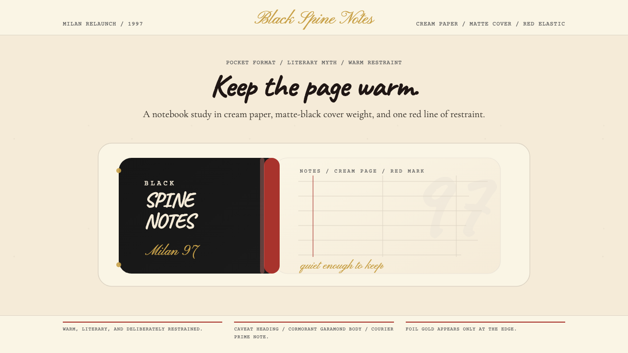 Moleskine Sketchbook (1997)Quietly literary. Cream paper, matte black, and a red elastic stripe do the w…安静而文学。奶油纸、哑黑封面与红色松紧带构成画面。
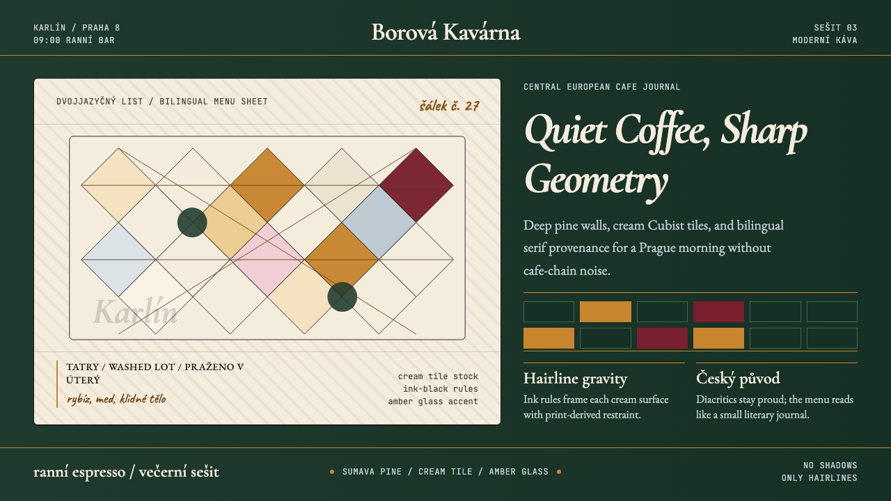 Czech Prague Modernist Cafe (2020)Quietly assured. Pine green, cream hairlines, amber Cubist tiles, and literar…安静而笃定:松林绿、奶油发丝线、琥珀立体主义瓷砖与文学衬线。
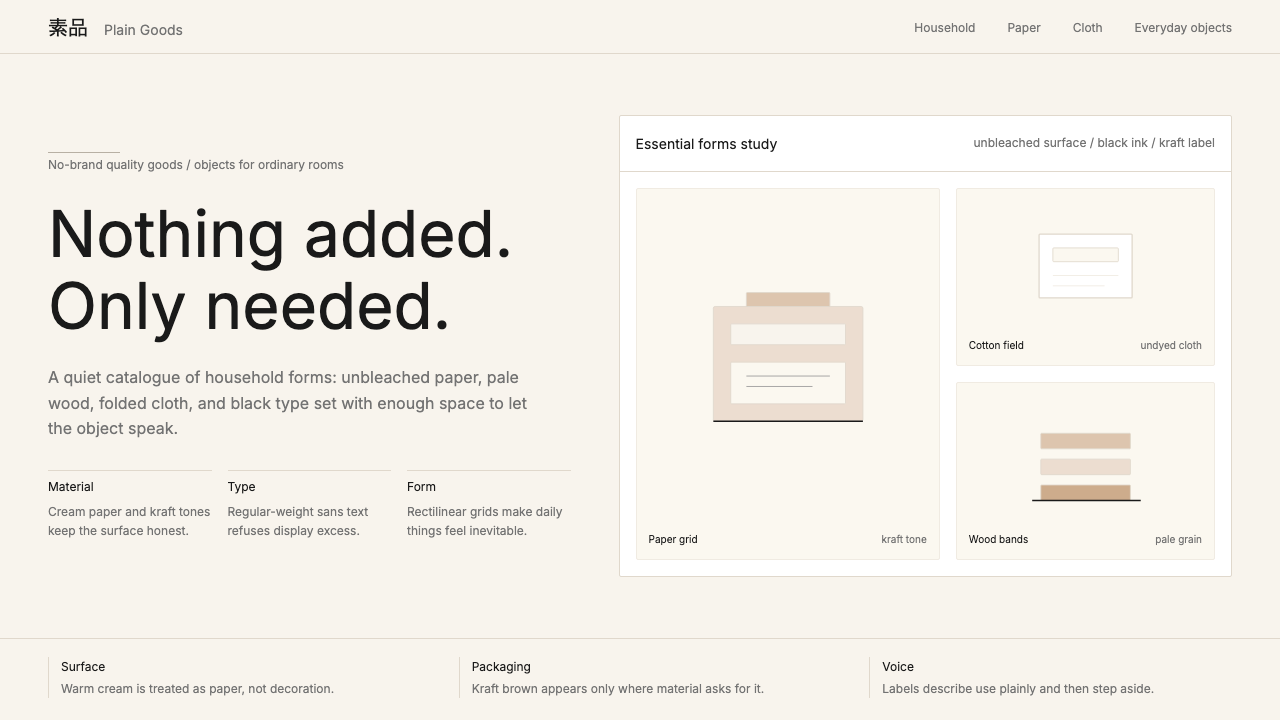 MUJIAnti-brand restraint. Cream paper, kraft brown, and regular Inter leave only…反品牌的克制:米白纸底、牛皮纸棕与常规字重,只留下必要。
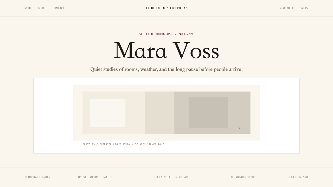 Photographer Light FolioMakes the browser a gallery wall. Warm cream, hairline serif type, and one im…浏览器即画廊墙:暖奶油底、纤细衬线与单幅影像。
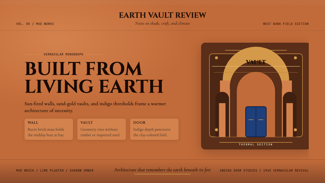 Egyptian Hassan Fathy Vernacular (1945)Earth remembers craft. Burnt brick, sand-gold vaults, and indigo doors carry…土地记住手艺。烧砖橙、沙金拱顶与靛蓝门带出温度。
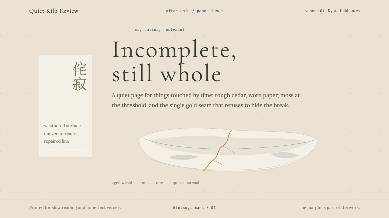 Wabi-SabiStillness makes imperfection whole. Washi beige, moss sage, and a spare gold…静默让缺憾完整:和纸米色、苔藓绿与一线金缮撑起留白。