What is Czech Prague Modernist Cafe (2020)?什么是 Czech Prague Modernist Cafe (2020)?
Prague's third-wave cafes distilled a century of Bohemian-Cubist geometry and Central European editorial craft into a quietly commanding visual language with no latte-art clichés in sight.布拉格第三波精品咖啡馆将一个世纪的波西米亚立体主义几何与中欧编辑传统,提炼为一种安静而强势的视觉语言——没有任何拉花照片的陈词滥调。
Czech Prague Modernist Cafe (2020) in briefCzech Prague Modernist Cafe (2020) 速览
Czech Prague Modernist Cafe is a visual design system that emerged from the specialty coffee culture of Prague in the years around 2020, consolidating a distinctive aesthetic that had been taking shape through the Karlín neighborhood cafe boom of the late 2010s. It draws on two deep wells: the Bohemian-Cubist architectural tradition — unique to Czech lands — and the editorial graphic design lineage descended from the Devětsil avant-garde of the 1920s. The result is a design language that feels simultaneously rooted in place and rigorously contemporary.捷克布拉格现代主义咖啡馆是一套视觉设计体系,发端于2020年前后布拉格的精品咖啡文化,并在卡尔林区晚期2010年代的咖啡馆热潮中逐渐成型。它汲取了两个深厚的源泉:波西米亚立体主义建筑传统——这是捷克土地所独有的遗产——以及源自1920年代前卫艺术团体Devětsil的编辑平面设计传统。最终呈现出的设计语言,既深深扎根于地方文化,又具有严谨的当代气质。
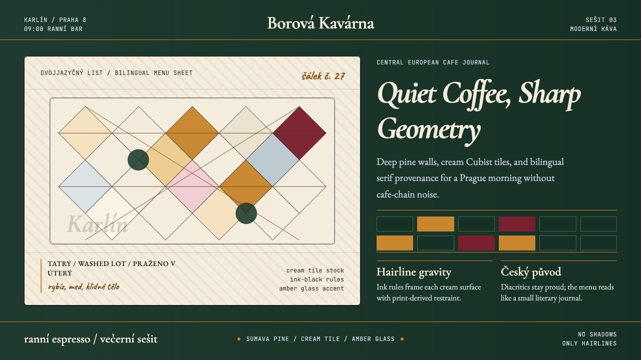
Visually, the style is organized around a palette of deep Šumava pine-green, warm cream, ink-black, and Czech-glass amber. Surfaces are structured by hairline rules rather than shadows, Cubist-tile geometry replaces organic ornament, and serif typography carries the quiet authority of a literary magazine rather than the friendly cheerfulness of mainstream coffee-chain branding. Everything about the system communicates confidence without loudness — the visual equivalent of a perfectly pulled espresso served without explanation.在视觉上,这套风格以深邃的舒马瓦松林绿、温暖的奶油色、墨黑色和捷克玻璃琥珀色为基础构建。界面由发丝线条而非阴影来划分层次,立体主义瓷砖几何取代有机装饰,衬线字体承载着一本文学杂志的静谧权威感,而非主流咖啡连锁品牌那种热情洋溢的亲切。这套体系的一切都在传递一种不高声的自信——正如一杯萃取完美的浓缩咖啡,无需多余的解释。
The system is not nostalgia. It acknowledges the Cubist and Constructivist heritage of Czech design while translating that heritage into the requirements of a contemporary digital and print context. Bilingual Czech-English copy is treated as a design element in its own right, and the kraft-paper grain that grounds physical menus and packaging brings a tactile intelligence that distinguishes handmade from hand-crafted.这套体系并非怀旧。它承认捷克设计中立体主义与构成主义的历史遗产,同时将这一遗产转化为当代数字与印刷语境的具体需求。捷克语与英语并置的双语文本被当作设计元素本身来处理,而锚定实体菜单与包装的牛皮纸纹理,则带来一种触觉智识,使手工质感与手工精制之间的区别清晰可辨。
See the Czech Prague Modernist Cafe (2020) design system查看 Czech Prague Modernist Cafe (2020) 完整设计系统
Where does Czech Prague Modernist Cafe (2020) come from?Czech Prague Modernist Cafe (2020) 从何而来?
The story begins with Czech Cubism itself — a movement that existed almost nowhere else in the world. In the years just before and after 1910, architects and designers in Prague developed a distinctive interpretation of Cubist painting principles into three-dimensional form. Architects such as Josef Gočár and Pavel Janák applied prismatic faceting and angular crystalline geometry to building facades, furniture, ceramics, and decorative objects. The result was an architecture and applied arts movement of unusual specificity: the angular volumes, the diamond-shaped tile patterns, and the amber and cream palette are intrinsically Bohemian, with no direct parallel in French or German modernism.故事的起点是捷克立体主义本身——这几乎是一个在世界其他地方都不存在的运动。1910年前后,布拉格的建筑师与设计师发展出一种将立体主义绘画原则转化为三维形式的独特诠释。约瑟夫·戈恰尔、帕维尔·亚纳克等建筑师将棱柱形切面与有棱角的晶体几何应用于建筑立面、家具、陶瓷与装饰品。其结果是一场异常特定的建筑与应用艺术运动:那些有棱角的体量、菱形瓷砖图案、琥珀与奶油色的色调,天生属于波西米亚,在法国或德国的现代主义中都找不到直接的对应。
The second root is the Devětsil avant-garde of the 1920s, led by the designer, typographer, and theorist Karel Teige. Teige championed what he called Poetism — a Czech synthesis of Constructivism, Surrealism, and lyric poetic sensibility — and developed a typographic practice of considerable editorial sophistication. His covers for literary journals combined geometric layouts, bilingual captions, and fine serif letterforms in a way that was simultaneously rigorous and warmly literary. This tradition of editorial intelligence flowing through coffee-table culture and literary café society became a defining characteristic of Prague's intellectual self-image across the twentieth century.第二个根源是1920年代由设计师、字体排印师兼理论家卡雷尔·泰格领导的Devětsil前卫运动。泰格倡导他所称的「诗意主义」——一种将构成主义、超现实主义与抒情诗意融为一体的捷克综合——并发展出一套具有相当编辑成熟度的字体实践。他为文学期刊设计的封面,将几何版式、双语说明文字与精细衬线字形并置,在严谨与文学温情之间取得了微妙的平衡。这种穿流于咖啡桌文化与文学咖啡馆沙龙中的编辑智识传统,成为布拉格知识阶层自我形象贯穿二十世纪的一个定义性特征。
The modern Prague specialty coffee scene began emerging seriously around 2010, initially in response to the third-wave movements in Scandinavia and the United Kingdom. But it quickly developed its own local inflection. The Karlín district — historically an industrial and working-class quarter that was being redeveloped after the 2002 floods — became the center of gravity. Cafes opening in Karlín from around 2015 onward found themselves inhabiting spaces with raw brick walls, industrial ceilings, and occasionally surviving Cubist-era tile details. The design response was to engage directly with this material context rather than overlay a generic third-wave aesthetic.现代布拉格精品咖啡场景大约从2010年起认真发展,最初是对斯堪的纳维亚和英国第三波运动的回应。但它很快发展出自己的本土倾向。卡尔林区——历史上是一个工业与工人阶级聚居区,在2002年洪灾后正在重建——成为了重心所在。从2015年前后开始在卡尔林区开业的咖啡馆,发现自己置身于裸露砖墙、工业天花板,乃至偶有残存立体主义时代瓷砖细节的空间之中。设计上的回应是直接与这种物质语境进行对话,而非叠加一套通用的第三波美学。
By 2018 to 2024, the visual system had consolidated into something recognizable and specific: deep green walls, hairline typography, amber-accented surfaces, bilingual serif menus that read like exhibition catalogue copy, and a complete absence of the chalk-board cheerfulness that characterized the international third-wave cafe look. Designers including Pavel Holub, Tatiana Tomšů, Adam Neubauer, and Tomáš Pražák worked across multiple Karlín and Prague venues, creating enough consistency across independent projects for a coherent style to emerge. The system is not the product of a single studio or a manifesto; it is a collective visual response to a specific place and cultural moment.到2018至2024年间,这套视觉体系已凝固成一种可辨认的、特定的面貌:深绿色墙面、发丝线排版、琥珀色点缀的界面、读来像展览图录文本的双语衬线菜单,以及对国际第三波咖啡馆黑板体愉悦感的彻底摒弃。包括帕维尔·霍卢布、塔季亚娜·托姆舒、亚当·诺伊鲍尔和托马什·普拉日克在内的设计师,先后在卡尔林区及布拉格多个场所工作,跨项目积累起足够的一致性,使一种连贯的风格得以浮现。这套体系并非某个单一工作室的产物,也并无宣言背书——它是一种集体性的视觉回应,对应着一个特定的地方与文化时刻。
What defines the Czech Prague Modernist Cafe (2020) look?Czech Prague Modernist Cafe (2020) 的视觉特征是什么?
Color Palette色彩体系
The palette is anchored by a deep, forested green — the color of Šumava pine-tree shadow rather than moss or sage — deployed as the dominant wall or background tone. Against this, warm cream surfaces carry body text and fine detail. Czech-glass amber appears as an accent, referencing the mineral-rich glass tradition of Bohemia, and tends to catch light rather than fill areas. Ink-black handles wayfinding, borders, and all typographic hierarchy. Together, these four tones create a system that reads as neither warm nor cold but as settled and specific — a palette that could only come from one place.色彩体系以一种深邃的森林绿为基调——是舒马瓦松树阴影的颜色,而非苔藓或鼠尾草绿——作为主导的墙面或背景色调。与之相衬的是承载正文与精细细节的温暖奶油色表面。捷克玻璃琥珀色作为点缀色出现,呼应波西米亚富含矿物质的玻璃传统,倾向于捕捉光线而非填满区域。墨黑色处理导视、边框与所有字体层级。这四种色调合在一起,构建出一个既不温暖也不冷漠,而是沉稳且特定的体系——一套只可能来自某一个地方的色盘。
Typography字体排印
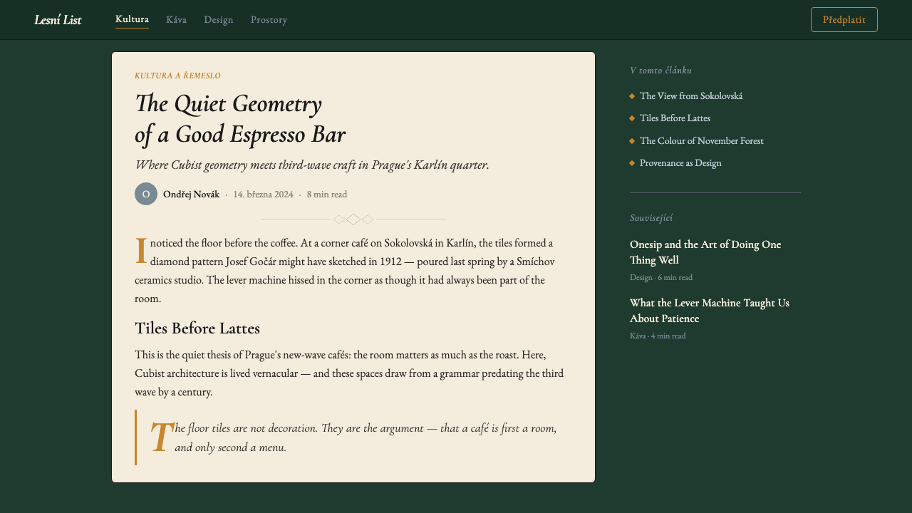
Serif type is the editorial backbone of this system — a deliberate inversion of the clean sans-serif uniformity that dominates global third-wave cafe branding. The serifs chosen are literary in character: the kind of letterform associated with Central European publishing rather than with corporate efficiency. Text is typically set with generous leading and a measured line length, giving menus and printed matter the unhurried quality of a journal read over a second espresso. Bilingual Czech-English setting is treated as a design asset rather than a practical compromise, with the two languages often stacked or paired in ways that create their own quiet typographic rhythm.衬线字体是这套体系的编辑脊梁——这是对主导全球第三波咖啡馆品牌的整洁无衬线统一体的刻意颠覆。所选用的衬线字体具有文学气质:那种与中欧出版传统而非企业效率相关联的字形。文本通常以慷慨的行距和克制的行宽排版,赋予菜单与印刷品一种不急不忙的气质,如同在第二杯浓缩咖啡旁翻阅的期刊。捷克语与英语的双语排版被视为设计资产而非实用妥协,两种语言常以叠排或对排的方式呈现,形成自己的静谧字体韵律。
Hairline Rules and Cubist Geometry发丝线条与立体主义几何
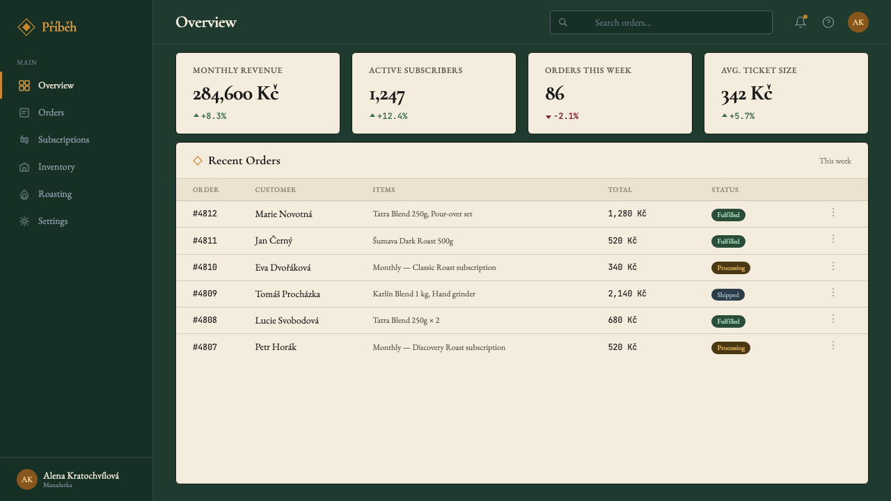
Where other design systems use shadow or color fields to separate areas, this system uses hairline rules — strokes so fine they read as precision rather than structure. These hairlines are used for table borders, sectional dividers on menus, and the organizational grid of printed pieces. The Cubist geometry enters as tile motifs, angular cropping, and faceted surface treatments inspired by the prismatic decorative vocabulary of Czech Cubist ceramics and building facades. Diamond and triangular tessellations appear in background textures and decorative frames, always restrained and never dominant.当其他设计体系使用阴影或色彩块面来划分区域时,这套体系使用发丝线条——细到读起来像精密度而非结构的笔画。这些发丝线用于表格边框、菜单的区段分隔线以及印刷品的组织网格。立体主义几何以瓷砖母题、有棱角的裁切和刻面表面处理的形式进入,灵感来自捷克立体主义陶瓷与建筑立面的棱柱形装饰词汇。菱形与三角形的密铺图案出现在背景纹理与装饰框架中,始终克制,从不喧宾夺主。
Kraft and Material Texture牛皮纸与材质纹理
A distinguishing feature of the physical manifestation of this style is the use of kraft-paper grain and uncoated stock as the ground for print materials. Rather than the glossy lamination common in luxury restaurant branding, menus and packaging sit on surfaces that age visibly and carry a slight roughness to the touch. This material choice is not accidental: it grounds the system in honest craft, signals provenance and quality over spectacle, and creates a tactile counterpoint to the visual precision of the hairline typography. The grain also acts as a gentle texture in digital translations of the style.这种风格实体呈现的一个显著特征,是以牛皮纸纹理与非涂布纸作为印刷材料的底面。与奢华餐厅品牌中常见的光泽覆膜不同,菜单与包装所在的表面会随时间显现出痕迹,触感略带粗糙。这一材质选择并非随意为之:它将体系扎根于诚实的工艺,以产地与品质而非视觉奇观作为信号,并为发丝排版的视觉精准性创造出一种触觉上的对位。这种纹理颗粒在风格的数字化转译中,也充当着温柔的肌理。
Measured Restraint克制的分寸感
Perhaps the most difficult characteristic to imitate is the system's complete refusal of demonstrative gestures. There is no illustrative photography of coffee being poured, no brand mascots, no calligraphic script, and no gradient warmth added to soften the palette. Negative space is used generously and purposefully — menus breathe, labels hold their quiet, and nothing competes for attention that has not earned it. This restraint is not coldness: the palette and material choices maintain a sensory warmth. It is, rather, a form of editorial confidence — the assurance of a publication that does not need to shout its own quality.这套体系最难被模仿的特征,或许是它对一切炫耀性姿态的彻底拒绝。没有咖啡倒入杯中的图片摄影,没有品牌吉祥物,没有书法手写字体,也没有为软化色调而添加的渐变温暖感。留白被慷慨而有目的地使用——菜单有呼吸空间,标签保持安静,没有什么在未经赢得注意力之前就去争夺注意力。这种克制不是冷漠:色盘与材质选择维持着感官上的温暖。毋宁说,这是一种编辑层面的自信——一份无需大声宣告自身品质的出版物所具备的那种笃定。
Wayfinding and Ink-Black Precision导视系统与墨黑精准
Signage and wayfinding elements within this aesthetic system are treated with the same editorial gravity as the printed menus. Ink-black letterforms on cream or green grounds, set in the same literary serif used for menus, carry café names, directions, and menu categories with a precision that avoids both the clinical neutrality of modernist sans-serif wayfinding and the nostalgic warmth of vintage lettering. The system assumes a visitor who reads carefully rather than scans quickly — an assumption that is itself a statement about the kind of experience being offered.这套美学体系中的标识与导视元素,与印刷菜单受到同等分量的编辑对待。奶油色或绿色底面上的墨黑字形,使用与菜单相同的文学衬线字体,承载着咖啡馆名称、指引方向与菜单类别,以一种既回避现代主义无衬线导视的临床中立感、又回避复古字体的怀旧温情的精准度呈现。这套体系预设了一个仔细阅读而非快速扫视的访客——这一预设本身,就是对所提供体验类型的一种宣言。
Literary Bilingualism文学性双语
Bilingual Czech-English copy is not a concession to tourism but a structural design decision that runs through the entire system. Menu descriptions, origin notes about Tatra-mountain beans, and café naming conventions all exist in both languages, and the typographic system is designed to hold two languages with equal visual dignity. This bilingual character places the system in a specifically Central European intellectual tradition — the literary café as a space where multiple languages and cultures coexist without hierarchy.捷克语与英语并置的双语文本,并非对旅游业的妥协,而是贯穿整套体系的结构性设计决策。关于塔特拉山咖啡豆的菜单描述、产地注释以及咖啡馆命名惯例,均以双语存在,字体体系的设计承载着两种语言,以平等的视觉尊严对待彼此。这种双语特质,将这套体系置于一种特定的中欧知识传统之中——文学咖啡馆作为多种语言与文化无阶层共存的空间。
See the Czech Prague Modernist Cafe (2020) design system查看 Czech Prague Modernist Cafe (2020) 完整设计系统
Who shaped Czech Prague Modernist Cafe (2020)?谁塑造了 Czech Prague Modernist Cafe (2020)?
Teige (1900–1951) was the intellectual and typographic engine of the Devětsil movement and the single most important antecedent for the editorial sensibility that characterizes the Prague modernist cafe aesthetic. As a designer, critic, and theorist, he produced layouts for literary journals and avant-garde publications that combined strict geometric composition with fine serif letterforms and bilingual captions — a template that would lie dormant for half a century before being revived in the Karlín cafe scene. His concept of Poetism — a synthesis of Constructivist rigor and lyric warmth — anticipates precisely the quality that distinguishes this style from generic Scandinavian minimalism.泰格(1900—1951年)是Devětsil运动的智识与字体引擎,也是布拉格现代主义咖啡馆美学所具备的编辑感性最重要的单一先驱。作为设计师、批评家与理论家,他为文学期刊和前卫出版物制作的版式,将严格的几何构图与精细衬线字形及双语说明文字结合在一起——这一模板在沉寂半个世纪后,在卡尔林区的咖啡馆场景中得到了复兴。他的「诗意主义」概念——构成主义严谨性与抒情温情的综合——恰恰预见了这种风格区别于通用斯堪的纳维亚极简主义的那种品质。
Gočár (1880–1945) was the architect most responsible for giving Czech Cubism its distinctive applied identity. His House of the Black Madonna (1911–1912) in Prague's Old Town remains the most celebrated example of Cubist architecture in the world — a building whose prismatic facade, angular cornices, and diamond-tile staircase created a visual vocabulary that became foundational to Czech design identity. The amber, green, and cream palette of the Prague cafe style, and particularly its Cubist-tile surface treatments, descend directly from the material and geometric language that Gočár and his contemporaries developed in the first two decades of the twentieth century.戈恰尔(1880—1945年)是赋予捷克立体主义其独特应用身份的最重要建筑师。他在布拉格旧城区的「黑色圣母之家」(1911—1912年)至今仍是世界上最著名的立体主义建筑案例——这座建筑的棱柱形立面、有棱角的飞檐与菱形瓷砖楼梯,创造了一套成为捷克设计身份基础的视觉词汇。布拉格咖啡馆风格的琥珀、绿色与奶油色色盘,尤其是其立体主义瓷砖表面处理,直接承袭自戈恰尔及其同时代人在二十世纪头二十年所发展的材质与几何语言。
Holub is among the contemporary Prague graphic designers most closely associated with the visual identity of the Karlín specialty coffee scene. Working across cafe branding, menu design, and environmental graphics in the 2015–2024 period, his work helped establish the specific combination of literary serif typography, hairline rules, deep-green grounds, and bilingual editorial copy that distinguishes the Prague modernist cafe aesthetic from both generic Scandinavian third-wave design and from nostalgic Czech folk-revival styles. His practice represents the living connection between the historical Devětsil tradition and current cafe culture.霍卢布是与卡尔林区精品咖啡场景视觉身份联系最为密切的当代布拉格平面设计师之一。在2015至2024年间的咖啡馆品牌设计、菜单设计与环境图形领域工作,他的作品帮助确立了文学衬线字体、发丝线条、深绿色底面与双语编辑文字的特定组合,使布拉格现代主义咖啡馆美学区别于通用的斯堪的纳维亚第三波设计,也区别于怀旧的捷克民俗复兴风格。他的实践代表了历史上Devětsil传统与当下咖啡馆文化之间的活生生的连接。
Tomšů brought a strong editorial sensibility to the Prague specialty coffee visual scene, with work that emphasizes the literary and cultural positioning of the cafe as an intellectual space. Her approach to menu design and printed collateral treated the document as a publication in the tradition of Central European literary reviews — typographically precise, editorially considered, and designed to be read at leisure rather than scanned for information. This editorial framing, applied to the context of a contemporary espresso bar, is one of the defining moves that gave the Prague modernist cafe style its particular cultural gravity.托姆舒将强烈的编辑感性带入了布拉格精品咖啡的视觉场景,她的作品强调咖啡馆作为知识空间的文学与文化定位。她对菜单设计与印刷附属品的处理,将文件视为中欧文学评论传统中的一份出版物——排版精准、编辑周全,设计为闲适阅读而非信息扫描。这种编辑框架,应用于当代浓缩咖啡吧的语境,是赋予布拉格现代主义咖啡馆风格其特定文化重量的定义性举措之一。
Neubauer's contribution to the Prague cafe visual scene lies in his attention to material consistency — the way a design system must hold together across printed menus, environmental signage, packaging, and digital touchpoints without losing its essential character in any translation. His work across multiple Karlín venues demonstrated that the Prague modernist cafe aesthetic was not a single commissioned identity but a reproducible and transferable system with its own internal logic. This consistency across multiple independent projects is what allowed the style to be recognized as a movement rather than a house style.诺伊鲍尔对布拉格咖啡馆视觉场景的贡献,在于他对材质一致性的关注——设计体系如何在印刷菜单、环境标识、包装与数字触点之间保持连贯,而不在任何转译中失去其本质特征。他在卡尔林区多个场所的工作证明,布拉格现代主义咖啡馆美学并非某单次委托的视觉身份,而是一套拥有内在逻辑的、可复现且可转移的体系。这种跨越多个独立项目的一致性,正是使这种风格被认定为一场运动而非一种门店风格的关键所在。
How do you use Czech Prague Modernist Cafe (2020) today?今天怎么用 Czech Prague Modernist Cafe (2020)?
Applying the Prague modernist cafe style correctly requires understanding that it is a system of restraint and editorial hierarchy, not a mood board of green walls and amber accents. The visual language works because every element has been selected for a reason and every absence has been chosen deliberately. Adding decorative warmth, softening the hairline rules into thicker borders, or substituting a friendly rounded sans-serif for the literary serifs will not produce a variation of the style — it will produce a different style that merely borrows a color.正确应用布拉格现代主义咖啡馆风格,需要理解它是一套克制与编辑层级的体系,而非一个关于绿墙与琥珀点缀的情绪板。这套视觉语言之所以有效,是因为每个元素都经过有理由的选择,每处缺席都是刻意为之。添加装饰性温暖感、将发丝线条软化为更粗的边框、或以圆润友好的无衬线字体替换文学衬线字体,产生的不是这种风格的变体——而是一种仅仅借用了一种颜色的不同风格。
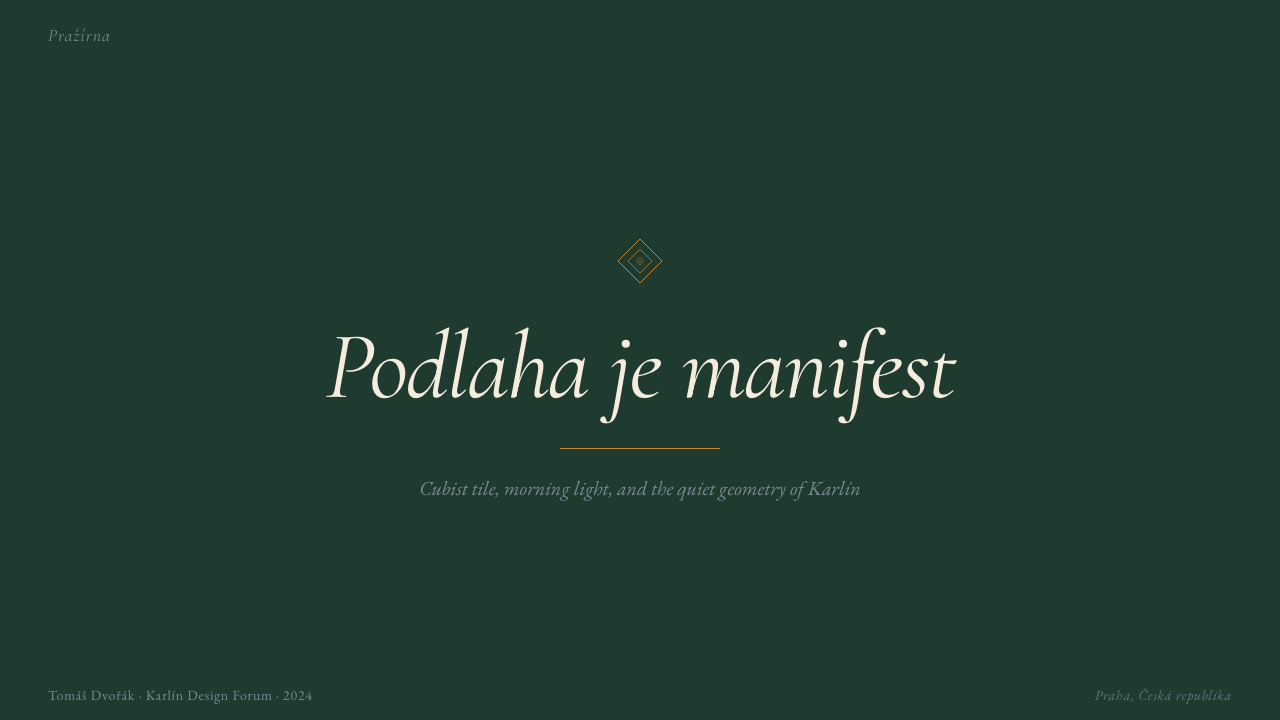
For presentation slides, the style translates most effectively when treated as a typographic system. Cover slides benefit from a single dominant tone — deep green or ink-black — with the title set in a sized-up version of the editorial serif, positioned off-center in a way that creates visual tension without abandoning structure. Content slides should hold the palette to two tones per slide, use hairline rules as organizational dividers, and allow substantial negative space around text blocks. Data slides work well when charts are treated as geometric objects that belong to the same visual family as the Cubist-tile motifs — angular bar charts, tight circle elements, and a color coding that draws from the amber, green, and black palette rather than introducing external data colors.在演示文稿中,当这种风格被作为字体系统处理时,转译效果最佳。封面页受益于单一主导色调——深绿色或墨黑色——以加大版本的编辑衬线字体设定标题,偏离中心放置,以制造视觉张力而不放弃结构感。内容页每张幻灯片应将色盘控制在两种色调以内,以发丝线条作为组织性分隔符,并在文字块周围留出充足的留白。数据页在图表被视为与立体主义瓷砖母题属于同一视觉家族的几何对象时效果最好——有棱角的条形图、紧凑的圆形元素,以及从琥珀、绿色与黑色色盘中汲取的色彩编码,而非引入外部数据颜色。
For web interfaces, the style suits contexts where calm authority is the desired user experience — editorial platforms, cultural institutions, premium product catalogues, and specialty food-and-drink brands. Dashboards built in this language benefit from the hairline-rule grid system: columns separated by fine lines rather than background-color alternation, with amber used only for active states or key metrics. Pricing pages work well when type does the work of differentiation rather than color blocks or illustrated icons — set tiers in the same serif with scale and weight as the only differentiators. Navigation should be spare and typographic, using the full Czech-editorial confidence to resist the temptation of icon decoration.在网页界面上,这种风格适合平静权威是期望用户体验的语境——编辑平台、文化机构、高端产品目录与精品食品饮料品牌。以这套语言构建的仪表板,受益于发丝线条网格体系:以细线而非背景颜色交替来分隔列,琥珀色仅用于激活状态或关键指标。定价页面在字体承担差异化工作而非色块或插画图标时效果最佳——在同一衬线字体中以尺寸和字重作为唯一区分维度来设定各档位。导航应当简练而字体化,以完整的捷克编辑自信抵制添加图标装饰的诱惑。
For editorial design and marketing applications, the style provides a ready-made framework for premium positioning without resorting to generic luxury tropes. Article layouts benefit from generous margins and narrow text measure, with section breaks marked by hairline rules rather than ornamental dividers. Pull quotes can be set in a slightly enlarged version of the body serif, indented to create a typographic pocket rather than boxed in a colored panel. Marketing pages and campaign posters work well when a single tonal ground — green, black, or cream — anchors a full-width field, with the headline in the contrasting tone and amber reserved for a single call-to-action element or key visual accent.对于编辑设计与营销应用,这种风格为高端定位提供了现成的框架,而无需诉诸通用奢华套路。文章版式受益于充裕的页边距与窄行宽,以发丝线条而非装饰性分隔符标记段落分隔。引用语可在正文衬线字体的略微放大版本中排版,通过缩进创造一个字体型的凹槽,而非封在彩色面板中。营销页面与活动海报在以单一色调底面——绿色、黑色或奶油色——锚定全宽区域时效果最佳,标题用对比色调,琥珀色保留给单一的行动号召元素或关键视觉重点。
A common mistake is reaching for the amber accent too freely. In the authentic system, amber functions the way Czech glass functions in architecture — as a material that catches and refracts available light rather than a paint color applied to fill areas. In digital terms, this means using amber for illuminated states, hover interactions, and key data points rather than as a background tone or a section-header fill. Similarly, the deep green should function as a ground, not as a pattern or repeating decorative element. Designers who scatter amber and green across a composition without establishing the cream-and-ink-black typographic armature first will produce something colorful but not something that carries the specific gravity of this system.一个常见的错误是过于随意地使用琥珀色点缀。在真实的体系中,琥珀色的功能类似于捷克玻璃在建筑中的功能——作为捕捉和折射现有光线的材质,而非涂满区域的油漆颜色。在数字语境中,这意味着将琥珀色用于高亮状态、悬停交互与关键数据点,而非作为背景色调或区段标题填充。同样,深绿色应当作为底面发挥功能,而非作为图案或重复性装饰元素。设计师若在没有首先建立奶油色与墨黑色字体骨架的情况下,将琥珀色与绿色散布于构图各处,呈现出的将是色彩丰富的东西,而非承载这套体系特定重量的东西。
See the Czech Prague Modernist Cafe (2020) design system查看 Czech Prague Modernist Cafe (2020) 完整设计系统
Czech Prague Modernist Cafe (2020) — FAQCzech Prague Modernist Cafe (2020) · 常见问题
How does this style differ from generic Scandinavian third-wave cafe design?这种风格与通用的斯堪的纳维亚第三波咖啡馆设计有何不同?
The Scandinavian third-wave aesthetic typically uses a light, warm, organic vocabulary — natural wood, muted earth tones, casual hand-lettered scripts, and a general softness that signals approachability. The Prague modernist cafe style inverts almost every one of these choices: deep green rather than warm beige, literary serif rather than casual script, hairline rules rather than rough edges, and a systematic editorial precision rather than studied informality. Where Scandinavian cafe design suggests the domestic and the personal, the Prague style suggests the literary and the considered. Both are forms of restraint, but they are restraining different impulses.斯堪的纳维亚第三波美学通常使用轻盈、温暖、有机的词汇——天然木材、柔和的大地色调、随性的手写字体以及整体上传递亲近感的柔软质感。布拉格现代主义咖啡馆风格几乎颠覆了这些选择中的每一个:深绿色而非温暖米色,文学衬线字体而非随意手写体,发丝线条而非粗糙边缘,以及系统性的编辑精准度而非刻意营造的非正式感。斯堪的纳维亚咖啡馆设计暗示家居与个人,布拉格风格则暗示文学与经过思考。两者都是一种克制,但克制的是不同的冲动。
Can this style work for a brand or product that has no connection to Czech culture?这种风格能用于与捷克文化毫无关联的品牌或产品吗?
Yes, but the application requires honesty about what you are borrowing. The Prague modernist cafe style is a system built on specific cultural and historical references — Czech Cubism, Devětsil typography, the literary cafe tradition of Central Europe — and applying it to an unrelated context means adopting the visual logic while detaching it from the source. What remains is still a coherent and sophisticated design system: the editorial serif, the hairline rules, the deep-green-and-cream palette, the amber accent. These translate effectively to any context that calls for calm authority, intellectual positioning, and craft-over-spectacle values. What will not transfer is the specific cultural resonance — and that is fine, as long as the designer is clear that they are working with a design vocabulary, not performing a cultural identity.可以,但应用时需要对所借鉴的内容保持诚实。布拉格现代主义咖啡馆风格是一套建立在特定文化与历史参照之上的体系——捷克立体主义、Devětsil排版、中欧文学咖啡馆传统——将其应用于无关的语境,意味着采用视觉逻辑的同时将其与来源剥离。留存下来的依然是一套连贯而精致的设计体系:编辑衬线字体、发丝线条、深绿与奶油色盘、琥珀色点缀。这些元素能有效转译到任何需要平静权威、知识定位和以工艺胜于奇观的价值导向的语境中。不会转移的是特定的文化共鸣——而这没有关系,只要设计师清楚自己是在运用一套设计词汇,而非扮演一种文化身份。
Is this a dark or light design system?这是一套深色还是浅色设计体系?
The canonical Prague modernist cafe aesthetic is light-ground: cream and warm white are the dominant surfaces, with ink-black typography and the deep green used as an accent or wall tone rather than as the primary field. This is consistent with the editorial tradition it descends from — Central European literary journals were printed on cream stock with black ink, not on dark grounds. A dark inversion is possible, using the deep green or ink-black as the primary background, but it requires careful management: the amber accent tends to carry too much visual weight on a dark ground, and the hairline rules need to be adjusted in weight to maintain readability. The light-ground version is more versatile and more historically grounded.经典的布拉格现代主义咖啡馆美学是浅色底面的:奶油色与暖白色是主导表面,墨黑色排版与深绿色用作点缀色或墙面色调,而非主要色域。这与它所承袭的编辑传统一致——中欧文学期刊是以黑色油墨印在奶油色纸张上的,而非在深色底面上。深色反转版本是可能的,以深绿色或墨黑色作为主背景,但需要谨慎处理:琥珀色点缀在深色底面上往往会承载过多的视觉重量,而发丝线条的粗细也需要调整以维持可读性。浅色底面版本更具通用性,也更有历史依据。
How should photography be handled within this design system?在这套设计体系中,摄影应如何处理?
Photography, when used at all, should be treated with the same editorial restraint as everything else. Images work best when they are tightly cropped to isolate a specific material detail — the surface of a Cubist tile, the pour of espresso into a ceramic cup, the grain of kraft paper — rather than as wide environmental shots of cafe interiors. Color treatment should bring the image into the palette rather than introducing external tones: a slight green cast or a warm amber tone-mapping will integrate photography more effectively than a neutral color balance. Avoid photography that foregrounds people in casual, approachable poses — this style assumes a contemplative rather than a sociable viewer. Architectural photography of Czech Cubist buildings is a natural and appropriate image source.摄影若被使用,应以与其他一切相同的编辑克制来处理。图像在被紧密裁切以隔离特定材质细节时效果最佳——立体主义瓷砖的表面、浓缩咖啡注入陶瓷杯的瞬间、牛皮纸的纹理颗粒——而非作为咖啡馆室内空间的宽幅环境照片。色调处理应将图像带入色盘而非引入外部色调:轻微的绿色调或温暖的琥珀色调映射,比中性色彩平衡更能有效整合摄影。避免将人物以随意、亲近姿态置于前景的摄影——这种风格预设的是沉思型而非社交型的观看者。捷克立体主义建筑的建筑摄影是自然而恰当的图像来源。
What is the difference between this style and Art Deco revival aesthetics?这种风格与装饰艺术复兴美学有什么区别?
The surface similarities — geometric ornament, jewel-toned accents, serif typography, and a sense of elevated craft — can make the two styles appear related, but their underlying principles are quite different. Art Deco is fundamentally celebratory and decorative: its geometry serves spectacle, its gold and amber tones signal abundance, and its typography tends toward elaborate stylization. The Prague modernist cafe style is editorial and restrained: its geometry is structural rather than ornamental, its amber is an accent rather than a dominant, and its typography favors legibility and literary character over stylistic display. Art Deco turns up the volume; the Prague style holds it at a conversational level. Both are confident, but confidence in Art Deco is expressed through accumulation, while in the Prague style it is expressed through selection.表面上的相似性——几何装饰、宝石色调点缀、衬线字体以及一种精湛工艺感——可能使这两种风格看起来颇为相关,但它们的底层原则大相径庭。装饰艺术从根本上是庆典性的、装饰性的:它的几何服务于视觉奇观,其金色与琥珀色调传递丰盛,其字体倾向于精致的风格化。布拉格现代主义咖啡馆风格是编辑性的、克制的:它的几何是结构性而非装饰性的,其琥珀色是点缀而非主导,其字体偏重可读性与文学气质而非风格展示。装饰艺术将音量调高;布拉格风格将其保持在对话级别。两者都是自信的,但装饰艺术的自信通过积累来表达,而布拉格风格的自信通过选择来表达。
Related design styles相关设计风格
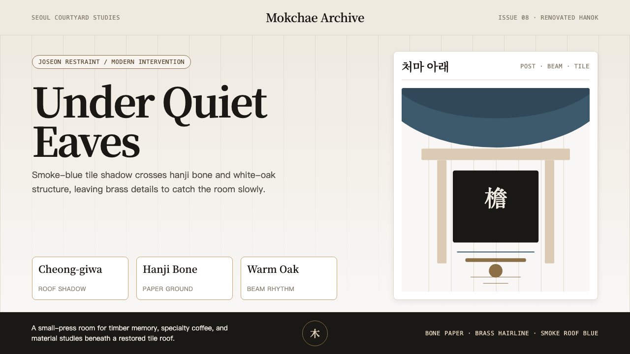 Korean Hanok Eaves RevivalJoseon restraint, not generic minimalism. Smoke-blue eaves cross hanji bone a…朝鲜式克制,不是泛极简。烟蓝檐影压过韩纸骨色与橡木网格。
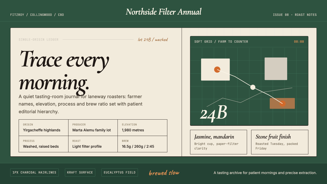 Melbourne Third-Wave Coffee ModernQuiet provenance. Eucalyptus green, cream cards and italic serif tables pace…安静溯源。桉树绿底、奶油纸卡与斜体衬线排出烘焙路线。
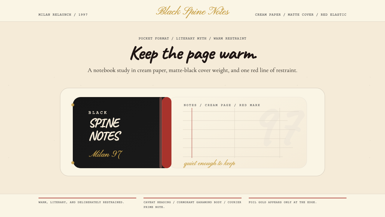 Moleskine Sketchbook (1997)Quietly literary. Cream paper, matte black, and a red elastic stripe do the w…安静而文学。奶油纸、哑黑封面与红色松紧带构成画面。
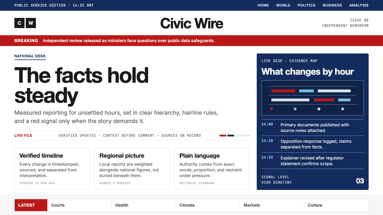 BBC NewsPublic trust, stripped bare. Red alerts, deep navy and hairline grids make ur…公共信任被剥至纯粹:红色警示、深海军蓝与发丝网格,让紧迫保持事实感。
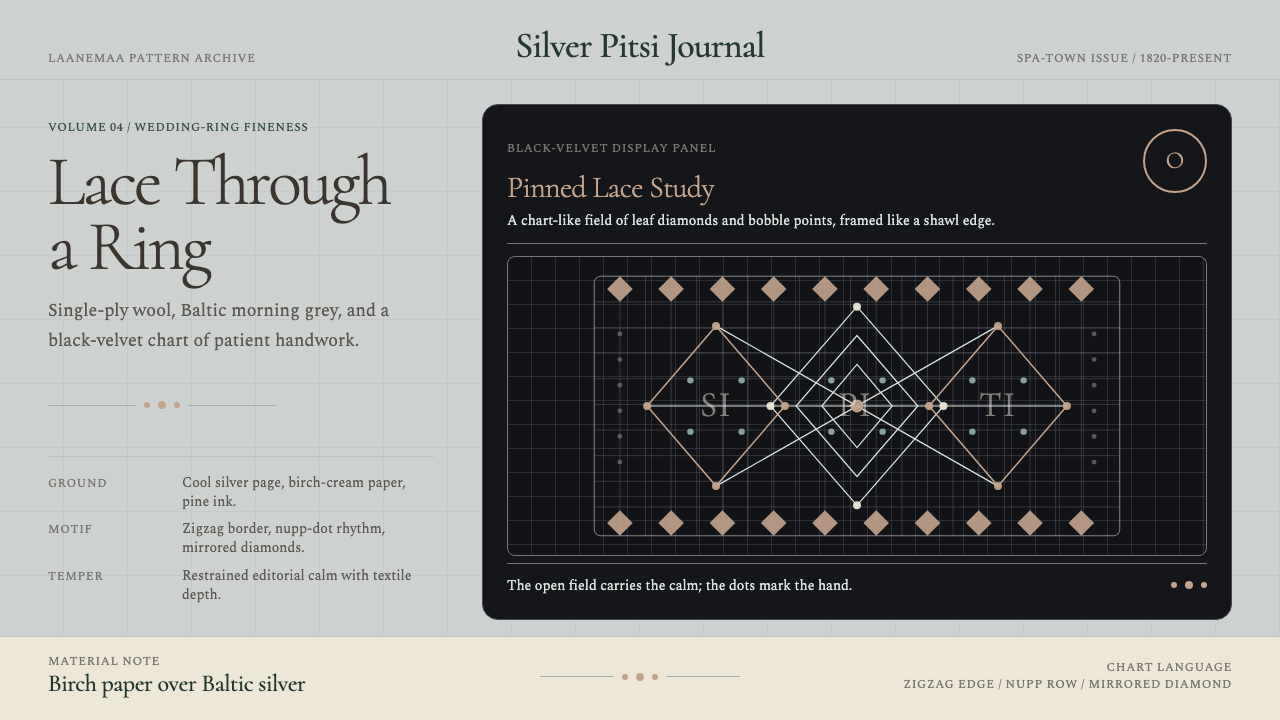 Estonian Haapsalu Lace ShawlQuiet craft, held in silver light. Cormorant type meets nupp dots and velvet…银灰克制的手工气质。Cormorant 字体、凸粒点与黑绒蕾丝网格成形。
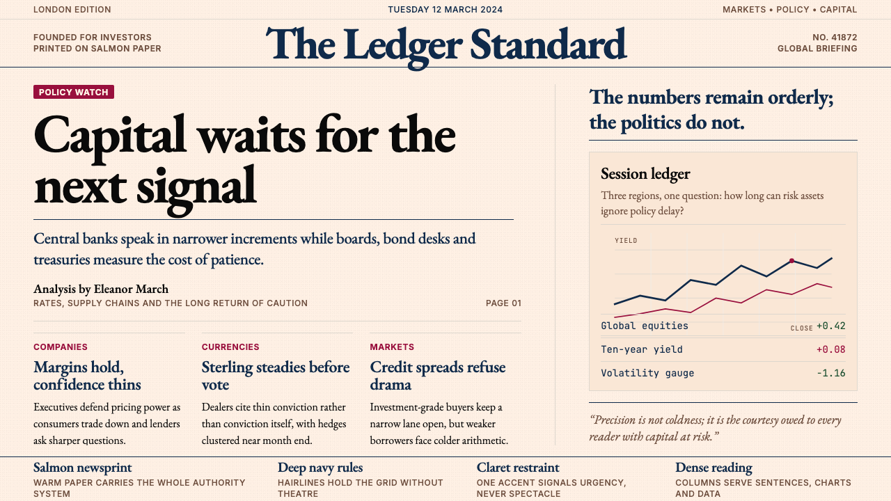 Financial Times (Pink Paper)Authority on salmon paper. Deep navy rules and claret accents discipline dens…三文鱼粉纸上的权威:深海军蓝细线与酒红点缀,约束密集衬线栏。