What is BBC News?什么是 BBC News?
A century of public trust made visible — BBC News's deep navy, alarm red, and disciplined white space turn breaking news into institutional authority.百年公共信任的视觉化身——BBC新闻以深海军蓝、警示红与严谨留白,将突发资讯凝固为机构权威。
BBC News in briefBBC News 速览
BBC News is the visual language of the world's most recognized public broadcaster, built on a strict three-color logic: an alarm red that marks urgency and carries the NEWS wordmark, a deep navy that anchors navigation and category structure, and white or near-white space that holds everything else. The palette is not decorative — each hue carries a precise communicative assignment and never strays from it. The result is a design system that reads as trustworthy before a single headline is absorbed.BBC新闻是全球最具辨识度的公共广播机构的视觉语言,建立在严格的三色逻辑之上:标记紧迫感并承载NEWS文字标志的警示红,锚定导航与分类结构的深海军蓝,以及承托一切的白色或近白色留白。这套色板并非装饰性的——每种颜色都承载着精确的传达职能,绝不越轨。结果是一套在读者吸收任何标题之前就已传递出可信赖感的设计系统。
The system's authority comes from typographic discipline as much as color. The Reith typeface family — commissioned in 2017 from the Swiss type foundry Dalton Maag — replaced decades of Gill Sans dependence with a humanist design built expressly for digital screens. Reith works from narrow mobile columns to broadcast lower-thirds to large-format editorial displays, giving the BBC a proprietary voice that is both warm enough to feel human and structured enough to feel institutional.这套系统的权威感同样来自字体排印的纪律。2017年委托瑞士字体铸造厂Dalton Maag设计的Reith字体家族,以一套专为数字屏幕而生的人文主义字体,取代了数十年对Gill Sans的依赖。Reith从窄幅移动端栏目到电视下方字幕,再到大尺寸编辑展示,赋予BBC一套既足够温暖以感受人性、又足够严整以彰显机构气质的专属字体声音。
What distinguishes BBC News design from ordinary 'clean' or 'minimal' digital design is that every restraint is purposeful and every element carries editorial weight. Hairline rules separate sections with surgical precision. Grid columns are observed without exception. Color appears only where it signals something: danger, navigation state, category identity. The entire system is organized around the principle that a global audience reading in moments of stress or urgency should never have to wonder where to look.BBC新闻设计区别于普通「简洁」或「极简」数字设计的地方,在于每一处克制都是有目的的,每一个元素都承载着编辑分量。发丝般的分割线以外科手术的精度区分版块;网格栏目被严格遵守;色彩仅在传递信号时出现:危险、导航状态、分类标识。整个系统围绕一个原则组织:全球受众在压力或紧迫时刻阅读新闻,不应该在任何瞬间不确定该看哪里。
Where does BBC News come from?BBC News 从何而来?
The BBC — British Broadcasting Corporation — was founded in London in 1922, initially as a radio consortium of six manufacturers. John Reith, its first director-general, established the foundational ethos: to inform, educate, and entertain, free from commercial and political pressure. Reith's vision of public service broadcasting shaped not only the editorial character of the BBC but also its visual and institutional identity: sober, authoritative, structured for universal comprehension rather than market segmentation.BBC——英国广播公司——于1922年在伦敦成立,最初是六家制造商组成的无线电广播联盟。其首任总裁约翰·里斯确立了奠基性的核心理念:在不受商业与政治压力干预的前提下,告知、教育并娱乐公众。里斯的公共服务广播愿景不仅塑造了BBC的编辑性格,也塑造了其视觉与机构身份:端正、权威、为普遍理解而非市场细分而构建。
For most of the twentieth century, the BBC's television identity relied heavily on Gill Sans — a humanist sans-serif designed by Eric Gill in 1928 that had become synonymous with British institutional identity. Gill Sans appeared on BBC presentation graphics, announcements, and lower-third captions for decades. But as television gave way to multiplatform digital publishing, the limitations of licensing a third-party typeface across an enormous and varied output became increasingly acute. The BBC needed a proprietary voice that it could own, develop, and deploy consistently from a broadcast control room to a mobile notification.二十世纪的大部分时间里,BBC的电视识别系统高度依赖Gill Sans——这款由埃里克·吉尔于1928年设计的人文主义无衬线字体,早已成为英国机构身份的代名词。数十年间,Gill Sans出现在BBC的演播室图形、播报字幕与下方叠字中。但随着电视媒体向多平台数字出版转型,在庞大而多元的内容输出中授权使用第三方字体的局限愈发突出。BBC需要一套属于自己的专属声音——从广播控制室到移动端推送通知,都可一致拥有、持续开发、统一部署。
The pivotal decision came in 2017, when the BBC commissioned Dalton Maag — a Swiss-British type foundry known for its work on humanist and legibility-focused typefaces — to design the Reith family. The brief demanded a typeface that honored the warmth and legibility of the BBC's long humanist tradition while performing at every scale modern publishing required. Reith Sans and Reith Serif together form a complementary system: the sans-serif carries news headlines and navigation labels, while the serif carries long-form journalism and feature writing. The family was named in honor of John Reith, connecting the typographic modernization explicitly to the corporation's founding values.转折点出现在2017年,BBC委托以人文主义与易读性字体著称的瑞士英国字体铸造厂Dalton Maag设计Reith字体家族。设计简报要求这套字体在继承BBC长期人文主义传统的温暖感与易读性的同时,能在现代出版所需的每一种尺度下高效呈现。Reith Sans与Reith Serif共同构成互补系统:无衬线字体承载新闻标题与导航标签,衬线字体承载长篇新闻与特写写作。字体家族以约翰·里斯命名,将这次字体现代化明确联结至公司的创始价值观。
The visual identity refinements of the 2017-to-2024 period went beyond the typeface. The BBC's distinctive blocks logo — a trio of bold rectangles housing the letters B, B, C — was sharpened and standardized across digital and broadcast contexts. The red-and-navy color system was formally codified, assigning specific roles to each hue across platforms. The resulting identity draws on a century of public trust while being genuinely optimized for the conditions of contemporary digital news consumption: fast loading, high contrast, screen-legible typography, and a visual hierarchy that works at a glance.2017年至2024年间的视觉识别精炼工作超越了字体本身。BBC标志性的积木式标志——三个承载字母B、B、C的粗方块——在数字与广播两套语境中得到锐化与标准化。红蓝双色系统被正式编纂为规范,为每种颜色跨平台分配了明确职能。最终形成的识别体系既汲取了百年公共信任的积淀,又真正为当代数字新闻消费的现实条件而优化:快速加载、高对比度、屏幕友好的字体排印,以及一套一目了然即可把握的视觉层级。
What defines the BBC News look?BBC News 的视觉特征是什么?
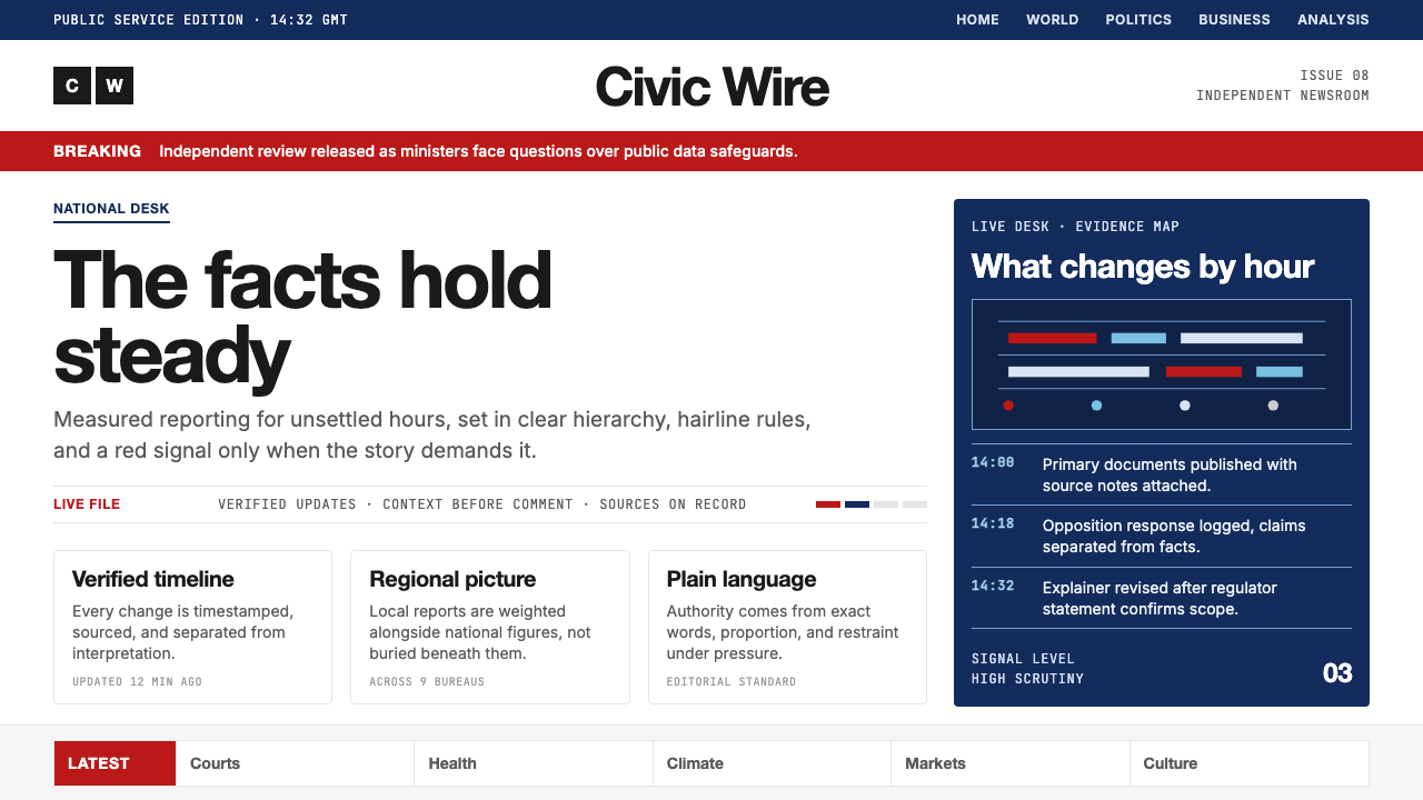
Alarm Red警示红
BBC Red is not a branding flourish but a functional signal: it marks urgency, identifies the NEWS logotype, and serves as the primary action color across interactive elements. Its use is deliberately restrained — the red never floods a layout but appears as an accent on headers, breaking-news banners, and the distinctive blocks logo. This economy of red means that whenever it appears, it commands immediate attention without needing to compete with other warm tones.BBC红色并非品牌点缀,而是一种功能性信号:它标示紧迫,承载NEWS文字标志,并作为整个交互元素中的主要动作颜色。其使用受到刻意克制——红色从不泛滥于版面,而是作为标题栏、突发新闻横幅与标志性积木徽标上的强调色出现。这种红色的节制用法意味着,每当它出现,便能立即吸引注意,无需与任何其他暖色调竞争。
Deep Navy深海军蓝
The deep navy acts as the structural backbone of the visual system. It grounds navigation bars, category headers, and section chrome — the framing elements that tell users where they are within the editorial hierarchy. Navy communicates authority and stability without the harshness of pure black, and its depth gives editorial content on white grounds an anchoring contrast. In broadcast graphics, navy performs well against both light and dark backgrounds, making it a versatile structural tone across platforms.深海军蓝是视觉系统的结构骨干。它奠定导航栏、分类标题与版块框架的基调——这些框架元素告知用户自己处于编辑层级的哪个位置。海军蓝传递权威与稳定感,同时避免了纯黑的生硬,其深沉感为白色底面上的编辑内容提供了锚定性对比。在广播图形中,海军蓝在浅色与深色背景上均表现出色,使其成为跨平台的多用途结构性色调。
Typographic Hierarchy字体排印层级
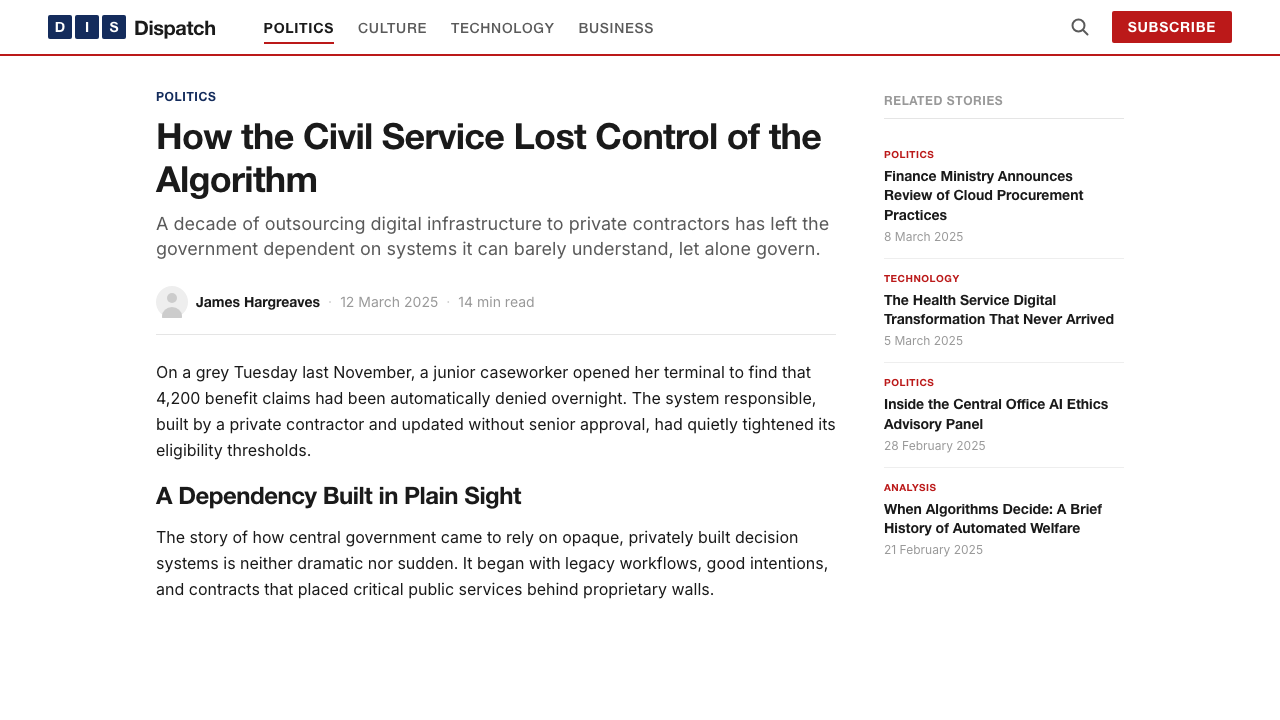
BBC News deploys the Reith family at multiple scales to create a hierarchy that is immediately readable at a glance. Major headlines are set large, dark, and at a weight that commands the page. Subheadings step down in size while maintaining the same humanist proportions. Body text is set at a measure and weight optimized for sustained reading on screens. Category labels and timestamps sit lighter still, handled by narrower weights or smaller sizes rather than a different typeface. The system achieves rich hierarchy from a single type family.BBC新闻将Reith字体家族部署于多个尺度,构建出一套一目了然即可解读的层级体系。主标题以大号、深色、高字重的形式主导页面。副标题在保持同等人文主义比例的前提下缩减尺寸。正文以经过屏幕持续阅读优化的行宽与字重排版。分类标签与时间戳采用更细的字重或更小的尺寸,而非引入另一套字体。这套系统从单一字体家族中实现了丰富的层级区分。
Hairline Grid Structure发丝网格结构
The layouts are governed by hairline rules — extremely thin horizontal and vertical lines that divide sections, frame story cards, and define the edges of content blocks. These rules are structural rather than decorative: they create a lattice that organizes dense editorial content without consuming visual space. The hairline grid gives BBC News its characteristic quality of being simultaneously dense with information and uncluttered in appearance — a balance almost impossible to achieve without rigorous structural discipline.版面由发丝线条支配——极细的水平与垂直线条分隔版块、框定故事卡片、界定内容区块的边缘。这些线条是结构性的,而非装饰性的:它们构建出一套格栅,在不占用视觉空间的前提下,组织密集的编辑内容。发丝网格赋予BBC新闻一种标志性的品质:同时呈现出信息密集与外观整洁这两种几乎相互矛盾的特质——若非严苛的结构纪律,这种平衡几乎无从实现。
White Space as Editorial Judgment留白即编辑判断
The generous white space in BBC News layouts is not passive emptiness but an active editorial tool. Story cards breathe. Headline type has room above and below it. Pull quotes and secondary items are separated by clear margins that signal their relative importance. This discipline mirrors the editorial role of a well-designed newspaper page: the space around a story tells readers how important that story is before they read its words.BBC新闻版面中慷慨的留白并非消极的空白,而是一种主动的编辑工具。故事卡片得以呼吸;标题上下均有余地;引用段落与次级条目以清晰的边距分隔,传递其相对重要性。这种纪律映照出一份设计精良的报纸版面的编辑职能:故事周围的空间,在读者读到文字之前,便已告知他们这篇报道有多重要。
Blocks Logo and Visual Identity Marks积木标志与视觉识别符号
The three bold rectangles of the BBC blocks logo are themselves a micro-exercise in the system's broader logic: maximum contrast, geometric clarity, zero decoration. The blocks appear in red against white, or white reversed out of navy or red, depending on context — never in a tertiary color, never with gradients or shadows. This consistency means the mark reads equally at broadcast resolution and at the scale of a mobile app icon. The NEWS wordmark similarly relies on weight and scale rather than any supplementary graphic device.BBC积木标志的三个粗方块本身就是该系统更宏观逻辑的一次微型演习:最大对比度、几何清晰度、零装饰。方块在不同语境下以红底白字或深蓝、红底反白的形式出现——绝不使用第三种颜色,绝不添加渐变或阴影。这种一致性使得标志在广播分辨率与移动端图标尺寸下均能同样清晰识别。NEWS文字标志同样依赖字重与尺寸,而非任何附加的图形装置。
Color as Categorical Signal色彩即分类信号
Beyond the three anchor colors, BBC News uses a limited range of category-specific accent colors — muted, lower-saturation tones — to identify editorial verticals such as Sport, Business, Culture, and Science. These category colors are carefully chosen to remain subordinate to the primary red and navy, never competing for dominance. They function as navigational waypoints within the system, telling users at a glance which editorial territory they have entered. The underlying discipline is consistent: color signals category, not aesthetic preference.除三种锚点颜色之外,BBC新闻为体育、商业、文化、科学等编辑垂类使用有限的分类专属强调色——这些色调较为低调、饱和度较低,以确保始终从属于主导性的红色与海军蓝,从不争夺视觉主导权。它们在系统内发挥导航路标的作用,让用户一眼便知自己进入了哪个编辑领域。其底层纪律始终如一:色彩传递分类,而非审美偏好。
Who shaped BBC News?谁塑造了 BBC News?
Reith was the BBC's founding director-general from 1927 to 1938 and the architect of its public-service ethos. His conviction that broadcasting should inform and educate without pandering to the lowest common denominator shaped the BBC's editorial character for a century. The Reith typeface commissioned in 2017 carries his name as an explicit acknowledgment that its visual identity is inseparable from its founding values.里斯是BBC从1927年至1938年间的创始总裁,也是其公共服务精神的奠基者。他坚信广播应在不迎合最低公约数的前提下告知与教育公众,这一信念塑造了BBC百年来的编辑性格。2017年委托设计的Reith字体以其名命名,明确表达了视觉识别与创始价值观不可分割的认知。
The British brand identity designer Martin Lambie-Nairn is credited with modernizing the BBC's visual identity in the 1990s, most notably by developing the animated globe ident sequence that became synonymous with BBC One, and by systematizing the BBC's use of color and typography across channels. His work established the disciplines of consistency and purposeful restraint that the subsequent digital identity inherited and refined.英国品牌识别设计师马丁·兰比-内恩以1990年代对BBC视觉识别系统的现代化改造而著称,最具代表性的是他为BBC One开发的动画地球仪片头序列,以及对BBC跨频道色彩与字体排印的系统化整合。他所确立的一致性与目的性克制原则,成为后续数字识别系统继承并精炼的基础。
Dalton Maag is the Swiss-British type foundry commissioned in 2017 to design the Reith typeface family. The foundry — known for large-scale custom typeface projects for major corporations — produced both Reith Sans and Reith Serif as a complementary pair capable of handling the full range of BBC publishing contexts: broadcast lower-thirds, mobile news alerts, long-form web articles, and print supplements. The Reith commission is one of the most significant proprietary typeface projects in recent British design history.Dalton Maag是2017年受BBC委托设计Reith字体家族的瑞士英国字体铸造厂。这家以为大型企业承接定制字体项目而著称的铸造厂,设计了Reith Sans与Reith Serif这对互补字体,使其能够应对BBC出版语境的全部范围:电视下方叠字、移动端新闻推送、长篇网络文章与印刷副刊。Reith委托项目是近年英国设计史上最重要的专属字体项目之一。
Tim Davie became BBC Director-General in 2020 and has overseen the corporation's most significant digital transformation phase, including the consolidation of BBC News's global digital platforms and the standardization of its visual identity across an increasingly fragmented media landscape. Under his tenure, the refined blocks logo and codified color system have been extended to BBC News's streaming and on-demand contexts, reinforcing visual consistency as the organization accelerates its shift away from linear broadcasting.蒂姆·戴维于2020年出任BBC总裁,主持了公司最重要的数字化转型阶段,包括BBC新闻全球数字平台的整合,以及在日益碎片化的媒体格局中对视觉识别的标准化工作。在其任期内,精炼后的积木标志与编纂成规的色彩系统已延伸至BBC新闻的流媒体与点播语境,在机构加速转向非线性广播之际强化了视觉一致性。
How do you use BBC News today?今天怎么用 BBC News?
BBC News style translates most effectively when it is understood as a functional system rather than an aesthetic mood. The visual logic is built around three decisions made at the start of any project: which elements signal urgency (red), which elements structure navigation (navy), and which elements carry editorial content (white space and dark type). Getting these roles assigned correctly is more important than any surface-level styling choice.BBC新闻风格的最佳迁移方式,是将其理解为一套功能性系统,而非一种审美情绪。其视觉逻辑建立在每个项目开始时的三个决定之上:哪些元素传递紧迫(红色),哪些元素构建导航(海军蓝),哪些元素承载编辑内容(留白与深色字体)。正确分配这些职能,比任何表面层面的风格选择都更为重要。
For presentation slides, the system works well on both cover and content pages. A cover page benefits from a strong typographic statement in a headline-weight sans-serif against a white or navy ground, with a red accent restricted to the title word or a single horizontal rule. Content slides should treat the slide grid the way BBC News treats a news page: one reading direction, section labels set small and unobtrusive, body text generous in weight and scale but economical in volume. Data slides work best when charts are treated as editorial objects — clear labels, restrained color, values large enough to read without effort.对于演示文稿,这套系统在封面页与内容页上均表现出色。封面页适合以标题字重的无衬线字体在白色或海军蓝底面上呈现强有力的字体陈述,红色强调色仅限于标题文字或单条水平线。内容页应以BBC新闻对待新闻页面的方式对待幻灯片网格:单一阅读方向,版块标签小而不抢眼,正文字重与字号宽裕但文字量节制。数据幻灯片在将图表视为编辑对象时效果最佳——清晰标签、克制用色、数值大到无需费力便可读取。
For web dashboards and product interfaces, the BBC News approach maps naturally onto any context where users need to orient quickly and process information under time pressure. Apply a strict column grid, hold the background white or very near-white, and use navy for the persistent navigation layer. Reserve red exclusively for alerts, error states, or primary calls to action — never as a background fill for decorative sections. Card-based layouts work well: each card with a hairline border, a category label in a small weight, a headline in a large weight, and a clearly readable body excerpt.对于网页仪表板与产品界面,BBC新闻的方法自然映射到任何需要用户快速定向、在时间压力下处理信息的语境。应用严格的栏目网格,保持背景为白色或接近白色,以海军蓝覆盖持久导航层。将红色专用于警示、错误状态或主要行动号召——绝不作为装饰性版块的背景填充。卡片式布局效果良好:每张卡片配发丝边框、小字重的分类标签、大字重的标题与清晰可读的正文摘要。
For editorial and marketing contexts, the style communicates institutional credibility. Long-form article layouts benefit from a narrow body-text column flanked by a wider margin reserved for captions, metadata, or pull quotes — a structure that signals editorial seriousness. Marketing landing pages can use alternating full-width sections in navy-on-white and white-on-navy to create rhythm without resorting to decorative imagery. The red accent, used sparingly on calls to action and key data points, prevents the layout from reading as flat.对于编辑与营销语境,这种风格传递机构公信力。长篇文章版面适合采用窄幅正文栏配合更宽的留白边距,用于承载说明文字、元数据或引用段落——这种结构传递出编辑的严肃性。营销落地页可使用海军蓝底白字与白底海军蓝字的全宽版块交替排列,在不依赖装饰性图像的前提下制造节奏感。红色强调色在行动号召与关键数据点上的节制运用,可防止版面显得平淡无味。
A common mistake when borrowing this system is treating navy and red as interchangeable structure colors and using them simultaneously at comparable saturation across a layout. In authentic BBC News design, red and navy are never in competition: red punctuates, navy structures, and white separates them. A second frequent error is losing the hairline discipline — replacing it with heavy borders or padded card shadows that undercut the sense of editorial precision. The system's authority comes from thinness and restraint, not from visible framing effort.借用这套系统时最常见的错误,是将海军蓝与红色视为可互换的结构色,以相近的饱和度在版面中同时大量使用。在真正的BBC新闻设计中,红色与海军蓝从不形成竞争关系:红色点缀,海军蓝构建,白色将二者分隔。另一个常见错误是失去发丝线条的纪律——以粗边框或有厚重阴影的卡片取而代之,由此削弱了编辑精准感。这套系统的权威来自纤细与克制,而非显眼的框架力度。
BBC News — FAQBBC News · 常见问题
Can BBC News style work for brands that are not news organizations?BBC新闻风格能用于非新闻机构的品牌吗?
Yes, but the values it communicates must align with the product's actual positioning. The visual system carries strong connotations of institutional authority, urgency, and public accountability. It works well for financial platforms, government services, healthcare information systems, educational publishers, and any product where users need to trust the information they are receiving. It does not translate easily to consumer brands that depend on warmth, playfulness, or personal identity — the style's precision and sobriety can register as cold or impersonal in those contexts.可以,但它所传递的价值观必须与产品的实际定位吻合。这套视觉系统携带着强烈的机构权威、紧迫感与公共责任感。它适用于金融平台、政府服务、医疗信息系统、教育出版机构,以及任何需要用户对所接收信息产生信任的产品。它不易迁移至依赖温暖感、趣味性或个人身份认同的消费品牌——该风格的精准与端庄在那些语境中可能被解读为冷漠或缺乏个性。
How should the red accent be used without overwhelming a layout?如何使用红色强调色而不至于压制版面?
The key is treating red as a punctuation mark rather than a color block. In BBC News design, red appears on narrow horizontal bands, logo elements, category labels, and interactive states — never as a section background filling large areas. A practical rule: if the red occupies more than roughly one-tenth of a given view, it is probably doing decorative work rather than communicative work. Reserve it for the one or two elements on each screen that must be seen first.关键在于将红色视为标点符号,而非色块。在BBC新闻设计中,红色出现在窄幅横向色带、标志元素、分类标签与交互状态上——绝不作为覆盖大面积区域的版块背景。一个实用法则:如果红色占据某一视图超过约十分之一的面积,它很可能在做装饰性工作,而非传达性工作。将它保留给每个屏幕上必须被最先看到的一两个元素。
Does this style support dark-mode or dark-background layouts?这种风格支持深色模式或深色背景版面吗?
A dark variant is possible but requires careful restructuring of the color roles. On a dark background, navy loses its structural contrast advantage and must be replaced by a lighter tone or white for navigation elements. Red continues to work as an accent but should be used even more sparingly — on dark grounds its saturation reads as highly aggressive. The most successful dark adaptations of this style keep the dark ground neutral and very dark, use white as the primary type color, and allow red to appear only on the most critical interactive or alert elements.深色变体是可行的,但需要对色彩职能进行仔细重构。在深色底面上,海军蓝失去了其结构性对比优势,导航元素必须改用较浅的色调或白色。红色仍可作为强调色发挥作用,但应使用得更加节制——在深色底面上,其饱和度会呈现出强烈的侵略感。这种风格最成功的深色改编,是将深色底面保持为中性且极深,以白色为主要字体颜色,并仅将红色用于最关键的交互或警示元素。
How does this style handle imagery and photography?这种风格如何处理图像与摄影作品?
Photography plays an important role in BBC News design, but it is always treated as editorial content rather than decorative background. Images are cropped with editorial precision — filling a defined card or column width exactly, never bleeding freely across layouts. They appear in full color because news photography depends on realism, but they are always framed within the grid structure rather than allowed to escape it. Background-covering hero images are used sparingly and typically pair with high-contrast white type. Avoid using photography as atmospheric texture behind text — the style's precision depends on typography having a clean, unambiguous field to occupy.摄影在BBC新闻设计中扮演重要角色,但始终被视为编辑内容而非装饰性背景。图像以编辑精准度裁切——精确填充定义好的卡片或栏目宽度,绝不随意出血贯穿版面。图像以全彩显示,因为新闻摄影依赖写实性,但始终被框定于网格结构之内,而非被允许逃逸。覆盖背景的主视觉大图使用节制,通常搭配高对比度的白色字体。避免将摄影用作文字背后的氛围性纹理——这种风格的精准感有赖于字体拥有一个干净、无歧义的占据空间。
What makes BBC News design feel authoritative rather than merely corporate?是什么让BBC新闻的设计显得权威,而非仅仅是企业化?
Authority in this system comes from editorial discipline rather than from power signals like large logos or heavy use of black. The BBC News visual system earns trust by being consistent, legible, and free of visual noise — the user never has to decode the interface because every element does exactly one thing. The hairline rules, the restrained color palette, and the typographic hierarchy all convey the same underlying message: care has been taken here. This quality of visible care is what distinguishes authoritative design from merely formal design. Copying the surface elements without the underlying discipline produces work that looks institutional but does not feel trustworthy.这套系统中的权威感来自编辑纪律,而非大尺寸标志或大量使用黑色等强权信号。BBC新闻视觉系统通过一致性、易读性与无视觉噪音来赢得信任——用户无需解码界面,因为每个元素恰好只做一件事。发丝线条、克制的色彩板与字体层级体系,都传递着同一条底层信息:这里经过了精心处理。这种可见的用心品质,正是权威设计与仅仅形式化设计之间的区别。复制表面元素而不遵守底层纪律,产出的作品看起来具有机构气质,却感觉不值得信赖。
Related design styles相关设计风格
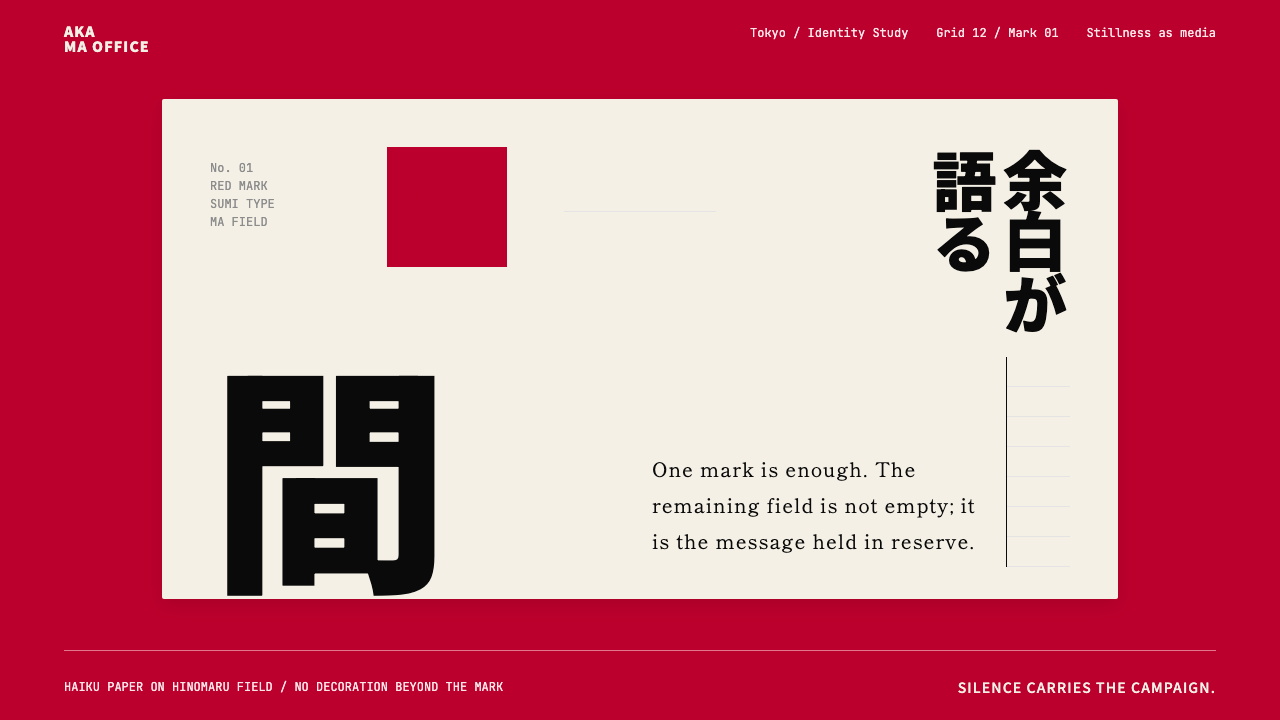 Dentsu Tokyo CreativeSilence does the selling. Hinomaru red, sumi type, and empty columns carry th…以静制胜:日之丸红、墨黑字体与空列共同承托标记。
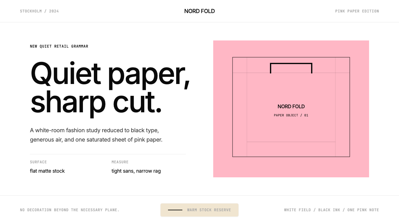
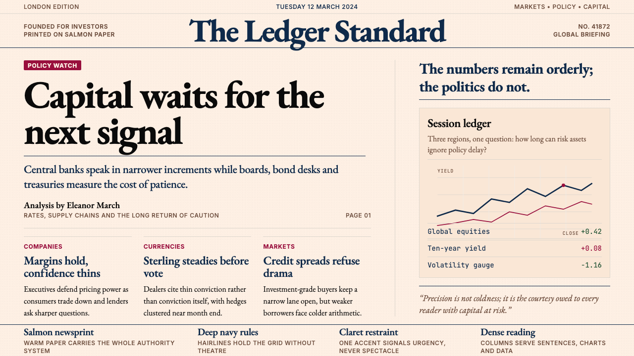 Financial Times (Pink Paper)Authority on salmon paper. Deep navy rules and claret accents discipline dens…三文鱼粉纸上的权威:深海军蓝细线与酒红点缀,约束密集衬线栏。
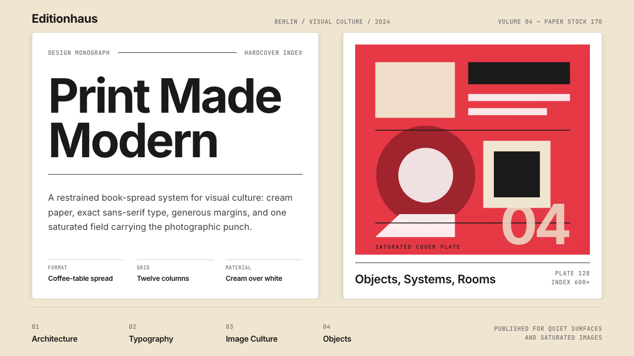 Gestalten Design BookCoffee-table calm. Cream paper, tight sans, one saturated block, and a strict…咖啡桌式冷静。奶油纸、紧凑无衬线、单一高饱和色块与严格网格。
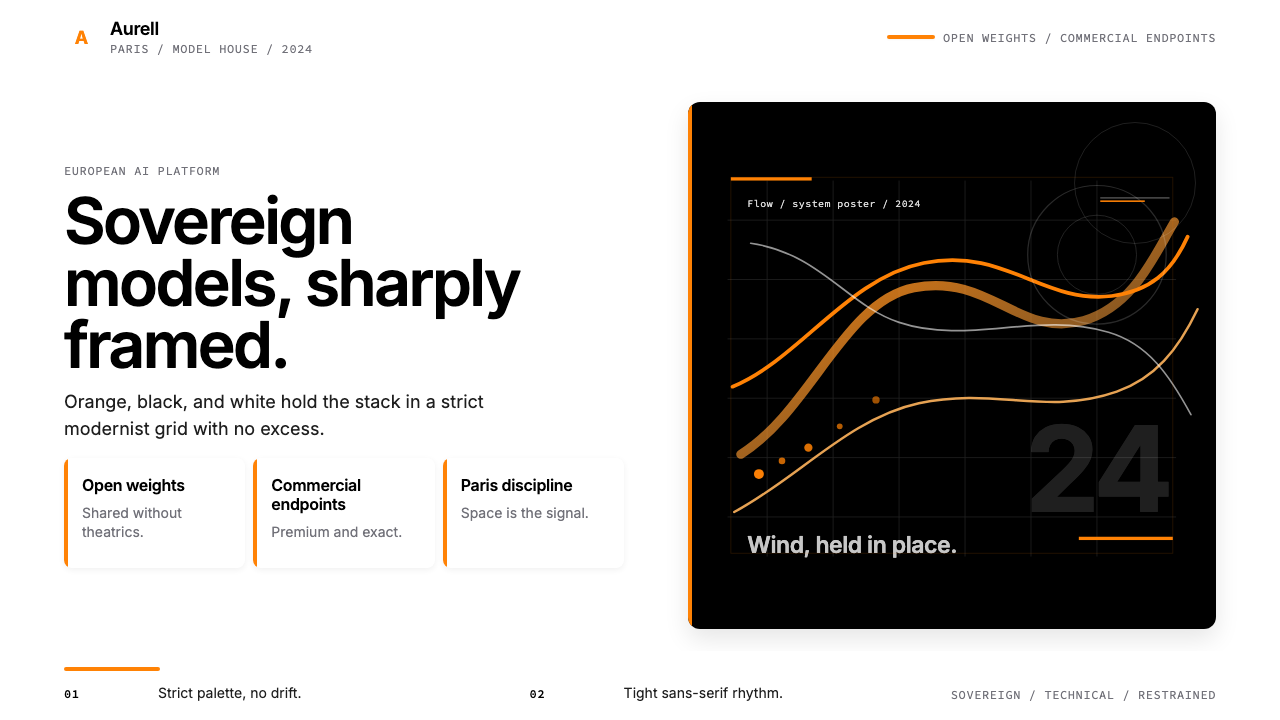 Mistral AI OrangeSovereign AI with restraint. Orange, black, and white lock the grid.主权AI很克制。橙黑白锁定网格。
 Acne Studios Pink-PaperQuiet luxury in one pink plane. Inter type floats on white with a bag-like re…粉色平面定义安静奢华:Inter 黑字漂浮于白场,像一只纸袋。
 FarfetchLuxury as absence. Charcoal type, white canvas, and hairline editorial plates.奢华即留白。炭灰字、纯白画布与发丝线编辑图版。