What is Dentsu Tokyo Creative?什么是 Dentsu Tokyo Creative?
Dentsu Tokyo Creative built a visual language from almost nothing — one red mark, sumi-black type, and the silence the Japanese call ma.电通东京创意以近乎虚无之物构建视觉语言——一枚红色印记、墨黑字体,以及日本人称之为「間」的寂静。
Dentsu Tokyo Creative in briefDentsu Tokyo Creative 速览
Dentsu Tokyo Creative refers to the art direction philosophy that emerged from Japan's largest advertising agency and spread to define a distinct strand of modern Japanese visual culture. At its core the system is built around three ideas that work in tension: a single bold mark that claims attention, type so controlled it borders on calligraphy, and negative space treated not as emptiness but as an active structural element. The resulting aesthetic is among the quietest in commercial advertising — and among the most authoritative.「电通东京创意」指的是从日本最大广告公司内部生长出来、并扩散为日本现代视觉文化一支独特脉络的艺术指导哲学。其核心由三种相互张力的理念构成:一个声张注意力的大胆印记、近乎书法境界的严谨字体,以及不被视为空洞、而被当作主动结构元素的留白。由此产生的美学是商业广告中最安静的——也是最具权威感的。
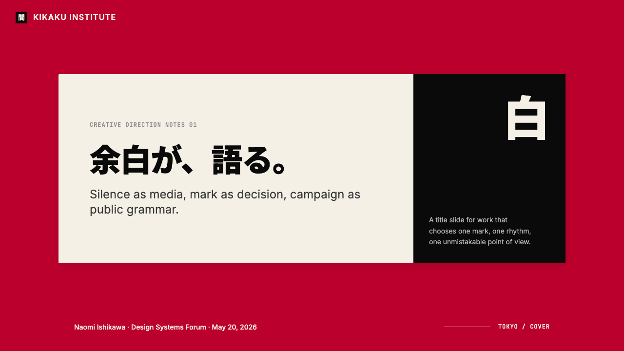
The visual grammar centers on what practitioners call the hinomaru red: a deep, saturated crimson drawn from the Japanese flag, used with discipline as a singular focal point rather than a background or fill. Against it, sumi-black — a tone that reads more as ink than as color — carries all typographic weight. Paper white, or a white so close to unbleached paper that it carries a subtle warmth, provides the breathing field. The entire palette rarely exceeds three values: the red mark, the black text, the white ground.这套视觉语法以从业者所称的「日之丸红」为中心:一种深沉、饱和的绯红,取自日本国旗,作为唯一焦点以克制的姿态使用,而非作为背景或填充色。与之相对的是「墨黑」——一种读起来更像墨水而非颜色的色调,承载所有字体重量。纸白,或接近本色纸的白带有些许暖意,提供了呼吸的底场。整套色板很少超过三个层次:红色印记、黑色文字、白色底面。
What distinguishes this system from generic minimalism is its relationship to ma, the Japanese concept of meaningful interval. In music, ma is the space between notes. In Dentsu-influenced design, ma is the column left deliberately vacant, the margin that could accommodate text but does not, the half-second of visual silence before the eye arrives at the mark. This purposeful emptiness is not restraint imposed from outside the composition — it is the composition's primary argument.将这套系统与泛泛的极简主义区别开来的,是它与「間」的关系——日语中「有意义的间隔」这一概念。在音乐中,間是音符之间的空隙。在电通影响的设计中,間是刻意空置的栏位,是本可容纳文字却没有的留白,是视线抵达印记之前那半秒的视觉寂静。这种有目的的空缺并非从构图外部强加的克制——它是构图本身的首要论断。
See the Dentsu Tokyo Creative design system查看 Dentsu Tokyo Creative 完整设计系统
Where does Dentsu Tokyo Creative come from?Dentsu Tokyo Creative 从何而来?
Dentsu was founded in 1901 by Hoshiro Mitsunaga, initially as a news wire and advertising agency combined — a dual structure that positioned it from the start at the intersection of information and persuasion. Through the twentieth century it grew into the dominant force in Japanese advertising, representing major national accounts across every consumer category. But its aesthetic identity crystallized not through size alone, but through the influence of a generation of postwar Japanese art directors who brought a distinctly Japanese sensibility to the European modernist vocabulary they had inherited.电通由光永星郎于1901年创立,最初兼具新闻通讯社与广告代理的双重结构——这一格局从一开始就将其置于信息与说服的交叉点。整个二十世纪,电通发展成为日本广告业的主导力量,代理跨越每一消费领域的主要全国客户。但它的美学身份并非单由规模铸就,而是通过一代战后日本艺术指导的影响结晶——这些人将鲜明的日本感性带入了他们所继承的欧洲现代主义词汇。
The broader context is Japan's postwar visual culture, which absorbed and then transformed Western modernism. Japanese designers of the 1950s through 1970s — Tadanori Yokoo, Eiko Ishioka, and others who moved between advertising, fine art, and theatrical design — developed a graphic language that owed something to the Bauhaus and Swiss International Style but was governed by different underlying principles. Where the Bauhaus rejected ornament on industrial grounds, Japanese art direction reduced imagery on philosophical grounds rooted in Zen aesthetics, the tea ceremony, and the ma concept embedded in Japanese spatial culture.更宏观的背景是日本战后视觉文化——它吸收了西方现代主义,而后将其改造。从二十世纪五十年代到七十年代,横尾忠则、石冈瑛子等在广告、纯艺术与戏剧设计之间穿梭的日本设计师,发展出一套视觉语言:对包豪斯与瑞士国际主义风格有所借鉴,却被不同的底层原则所统驭。包豪斯以工业理由拒绝装饰,日本艺术指导则以扎根于禅学美学、茶道以及内嵌于日本空间文化之「間」概念的哲学理由减省意象。
The pivotal figure in the mature articulation of this aesthetic within the corporate sphere is Kashiwa Sato, whose career from the mid-1990s onward produced a body of work — identity systems for Uniqlo, the National Art Center Tokyo, Rakuten, and other major Japanese institutions — that became the clearest contemporary expression of the Dentsu creative tradition. Sato's approach made explicit what earlier practitioners had practiced intuitively: that a single geometric mark, repeated with discipline across every surface and scale, could carry more brand weight than an elaborately detailed visual system. The Uniqlo red square and the National Art Center's circular void became the two most widely recognized examples of this reduction-to-mark principle.在这一美学于企业领域成熟表述的过程中,关键人物是佐藤可士和。他从1990年代中期起的职业生涯产出了一批作品——优衣库、国立新美术馆、乐天及其他日本重要机构的视觉识别系统——成为电通创意传统最清晰的当代表达。佐藤的方法将早期从业者直觉践行之事明确化:一个单一的几何印记,以严格的一致性跨越所有界面与尺度复制,所承载的品牌重量超过任何精心繁复的视觉系统。优衣库的红色方块与国立新美术馆的圆形空洞,成为这一「归简为记」原则最广为人知的两个例证。
Geographically, the sensibility radiates outward from Dentsu's headquarters in the Shiodome district of Tokyo — a campus designed by Jean Nouvel whose glass tower above the old Shimbashi neighborhood itself embodies a certain Japanese modernist ambition. Creative satellites in Osaka, Nagoya, and Fukuoka adapted the central aesthetic to regional registers, while international offices in New York, London, and Singapore translated it for export. The result is a style that remains recognizably Japanese even when deployed in global campaigns — in part because its foundational restraint is itself culturally specific, not easily assimilated into Western advertising conventions that treat visual abundance as persuasive virtue.从地理上看,这种感性从电通位于东京汐留区的总部向外辐射——让·努维尔设计的玻璃塔矗立于旧新桥街区之上,本身就体现了某种日本式的现代主义抱负。大阪、名古屋与福冈的创意卫星机构将中心美学调适于地方语境,纽约、伦敦与新加坡的国际办公室则将其翻译为可出口的形态。其结果是一种即便用于全球广告战役时仍可辨认为日本的风格——部分原因在于其根本性的克制本身就具有文化特殊性,不易被视觉丰盛为说服美德的西方广告惯例所同化。
What defines the Dentsu Tokyo Creative look?Dentsu Tokyo Creative 的视觉特征是什么?
The Single Mark单一印记
The organizing principle of the system is reduction to a single geometric or semi-calligraphic mark — a circle, a square, or a kanji-derived symbol — that operates as the visual anchor for an entire identity. This mark is never decorative; it carries the full semantic and emotional weight of the brand. Its power derives from consistency and isolation: placed in white space without competition, scaled to command attention without shouting, it functions as a seal rather than a logo in the Western sense.这套系统的组织原则是归简为单一的几何或半书法性印记——一个圆、一个方块、或一个源自汉字的符号——作为整套识别系统的视觉锚点。这枚印记绝非装饰性的;它承载着品牌全部的语义与情感重量。其力量来源于一致性与孤立性:在没有竞争的留白中安置、以主宰注意力而非喧嚣的尺度呈现,它的功能更像印章而非西方意义上的标志。
Ma — Productive Emptiness間——有生产力的空无
Negative space in this system is not leftover area after content is placed — it is the first content decision. Columns are left vacant not because there is nothing to fill them with but because vacancy is structurally load-bearing. The eye must travel across white field before arriving at the mark; that journey is part of the communication. This treatment of emptiness as content distinguishes the style from Western minimalism, which tends to use negative space as a luxury signal rather than a structural argument.这套系统中的负空间不是内容置入后的剩余区域——它是第一个内容决策。栏位之所以留空,不是因为没有内容可填,而是因为空置在结构上承重。视线必须穿越白色场域才能抵达印记;这段旅程本身就是传达的一部分。将空无视为内容的这种处理,将这种风格与西方极简主义区分开来——后者倾向于将负空间用作奢侈感信号,而非结构性论断。
Hinomaru Red日之丸红
The chromatic signature of the system is a single deep, saturated red — associated with the Japanese national flag — that appears as a focal accent rather than a field color. In practice this red is used for the primary mark, a single rule, or a key typographic element, never as a background wash. Its restraint is what gives it authority: because red appears rarely, it commands the composition entirely when it does appear. All other colors are subordinate or absent.这套系统的色彩签名是单一深沉、饱和的红——与日本国旗相关联——以焦点强调色而非底场色的形式出现。在实践中,这种红用于主要印记、单根线条,或关键字体元素,绝不作为背景色大面积铺陈。正是这种克制赋予了它权威感:因为红色鲜少出现,它一旦出现便完全主宰构图。其余所有颜色要么从属,要么缺席。
Sumi-Black Typography墨黑字体排印
Type in this aesthetic is set in a tonal black that recalls the depth and saturation of traditional sumi ink — a quality that makes letterforms feel weighted and intentional rather than merely present. Japanese compositions use vertical type runs alongside horizontal Latin, creating rhythmic alternation between the two reading directions. Weight hierarchies are achieved through dramatic scale contrast and stroke contrast, not through multiple typeface families. Type columns are typically narrow and precisely regulated, with generous space around them.这种美学中的字体以一种令人联想到传统墨汁深度与饱和度的墨黑调排布——这种品质使字形感觉有分量、有意图,而非仅仅存在。日文构图将竖排文字与横排拉丁文并置,在两种阅读方向之间创造出节奏性交替。字重层级通过戏剧性的尺度对比与笔画对比来实现,而非通过多个字体家族。文字栏通常狭窄且精确规整,四周留有充裕空间。
Hairline Structure细线结构
Where the Bauhaus used bold rules and geometric fills to divide space, the Dentsu Tokyo aesthetic uses a single hairline — a rule so thin it barely registers as a mark — to separate sections, define columns, or frame the composition. This hairline acts more like a crease in paper than like a barrier; it suggests division without imposing it. The decision to use hairlines rather than solid bands reflects the broader preference for whispered structure over declared structure.包豪斯以粗线条与几何填充分割空间,电通东京美学则使用单根极细线——细到几乎不构成标记——来分隔段落、界定栏位或框定构图。这根细线的作用更像纸上的折痕,而非屏障;它暗示分割而不强加分割。选择细线而非实心色带的决定,反映了更宏观的偏好:对耳语式结构而非宣告式结构的青睐。
Grid as Discipline, Not Formula网格作为纪律,而非公式
The compositions are rigorously structured — every element occupies a considered position — but the grid is internalized rather than mechanically applied. Unlike Swiss International Style, which makes the grid visible through consistent column widths and baseline alignment, this approach uses the grid as a hidden architecture. The result can appear almost intuitive: marks and text seem to float in the white field, yet they are precisely calibrated to invisible coordinates. The discipline shows in what is not there.构图是严格有序的——每个元素都占据经过思量的位置——但网格是内化的,而非机械应用的。不同于将网格以一致栏宽与基线对齐显露于外的瑞士国际主义风格,这种方法将网格用作隐藏的建筑骨架。结果看起来几乎是直觉性的:印记与文字似乎漂浮在白色场域中,却被精确校准于无形坐标。纪律显现在那些不存在之物上。
Monochromatic Restraint单色节制
Beyond the focal red, the palette is effectively monochromatic: deep black, paper white, and at most one additional neutral tone. Photography, when used, is treated monochromatically — converted to high-contrast black and white or given a single-color tint — so that it integrates into the system rather than interrupting it. This chromatic discipline means that color, whenever it appears, operates as pure signal rather than atmosphere. Nothing drifts into decorative coloring.除焦点红之外,色板实际上是单色的:深黑、纸白,以及至多一种附加的中性色调。摄影图像一旦使用,会被单色处理——转化为高对比度黑白,或赋予单一色彩色调——以融入系统而非打断它。这种色彩纪律意味着,色彩每当出现,都是作为纯粹信号而非氛围运作。没有任何元素漂移进装饰性着色。

See the Dentsu Tokyo Creative design system查看 Dentsu Tokyo Creative 完整设计系统
Who shaped Dentsu Tokyo Creative?谁塑造了 Dentsu Tokyo Creative?
Sato is the defining figure of contemporary Japanese corporate identity design, and the clearest single embodiment of the Dentsu creative philosophy at its most distilled. His work for Uniqlo — reducing the brand to a red rectangle containing the Japanese characters for the name — became one of the most recognized identity transformations of the late twentieth century, turning a discount retailer into a globally recognized design object. His subsequent identities for the National Art Center Tokyo, Rakuten, and Sumitomo used the same reduction principle: one mark, maximum restraint, total consistency across all surfaces.佐藤可士和是当代日本企业识别设计的核心人物,也是电通创意哲学提炼至极致的最清晰个人体现。他为优衣库所做的工作——将品牌简化为包含品牌日文名称的红色矩形——成为二十世纪末最广为人知的识别系统转型之一,将一家折扣零售商变成全球可辨认的设计物。他此后为国立新美术馆、乐天和住友所做的识别设计运用了同一归简原则:一个印记、最大克制、跨越所有界面的绝对一致。
Yokoo represents the psychedelic and countercultural dimension of postwar Japanese graphic design — an influence that may seem distant from the severe restraint of Dentsu's corporate aesthetic, but which establishes the historical baseline against which that restraint operates. His poster work of the 1960s and 1970s, combining Japanese woodblock print traditions with Pop Art and psychedelia, demonstrated that Japanese visual culture was not simply absorbing Western modernism but generating its own syntheses. His career at the intersection of advertising, fine art, and cultural provocation established the model of the Japanese art director as cultural figure.横尾忠则代表着战后日本平面设计中迷幻与反文化的一面——这种影响看似与电通企业美学的严峻克制相距甚远,却构建了该克制得以运作的历史基准线。他于1960至70年代的海报作品将日本木版画传统与波普艺术和迷幻风格融合,证明了日本视觉文化并非简单吸收西方现代主义,而是生产着自身的综合体。他在广告、纯艺术与文化挑衅交叉点上的职业生涯,确立了日本艺术指导作为文化人物的范型。
Ishioka was the first woman to win Japan's most prestigious advertising award, working across theatrical costume design, film art direction, and corporate advertising in ways that treated each domain with equal seriousness. Her advertising work in the 1970s and 1980s — particularly campaigns for cosmetics brand Parco — introduced a confrontational, image-driven approach to Japanese advertising that challenged the prevailing preference for gentleness and indirection. Her trajectory from advertising to Hollywood costume design (she won an Academy Award for Bram Stoker's Dracula in 1993) demonstrated the internationalism latent in Japanese commercial visual culture.石冈瑛子是日本广告界最重要奖项的首位女性获得者,她跨越戏剧服装设计、电影艺术指导与企业广告,以同等的严肃性对待每一个领域。她在1970至80年代的广告作品——尤其是为美妆品牌PARCO所做的战役——将一种对抗性的、以图像为驱动的方式引入日本广告,挑战了盛行的温和与迂回倾向。她从广告到好莱坞服装设计的轨迹(她凭借《吸血僵尸》于1993年获得奥斯卡奖)展示了日本商业视觉文化中潜在的国际主义。
Hara is the art director of Muji and the author of several books on design philosophy — including Wa, a meditation on Japanese aesthetics — that have made him one of the most articulate theorists of the minimalist sensibility underlying the Dentsu tradition. His concept of 'emptiness' as design philosophy, developed through his Muji work and writings, provides the clearest intellectual framework for understanding why the Dentsu aesthetic treats negative space as primary rather than residual. His work demonstrates that the aesthetic is not merely a house style but the surface expression of a coherent philosophical position about the purpose and limits of design.原研哉是无印良品的艺术指导,也是数部设计哲学著作的作者——包括沉思日本美学的《和》——这使他成为阐释电通传统底层极简主义感性最雄辩的理论家之一。他通过无印良品工作与著述所发展的「空」的设计哲学,为理解电通美学为何将负空间视为主要而非剩余元素,提供了最清晰的思想框架。他的作品证明,这种美学不仅仅是一种品牌风格,而是关于设计目的与边界这一连贯哲学立场的表面表达。
How do you use Dentsu Tokyo Creative today?今天怎么用 Dentsu Tokyo Creative?
Applying the Dentsu Tokyo Creative aesthetic requires internalizing a discipline that runs counter to most contemporary design instincts: less is not just acceptable, it is the argument. This means resisting the pull to fill empty space, to add a second accent color, to increase the number of typographic weights, or to use imagery as atmosphere. The style rewards those who can sit with near-emptiness and trust that the single well-placed mark does the work that ten decorative elements could not.应用电通东京创意美学,需要内化一种与当代大多数设计直觉相悖的纪律:少不仅仅是可以接受的,少本身就是论断。这意味着要抵制填充空白空间的冲动,抵制添加第二种强调色、增加字重种类、或将图像用作氛围的冲动。这种风格奖励那些能够与近乎空无共处、并相信一枚精心置放的印记所能完成的工作超越十个装饰元素的人。
For presentation slides, the system performs exceptionally well when the content itself is substantive — strategy decks, brand reviews, investor materials, cultural or institutional reports. A cover slide in this aesthetic typically shows the mark alone, or the mark beside the title in one typographic weight, against full white or a white field with a single hairline. No background texture, no gradient, no ambient imagery. Content slides are built on a strict invisible grid: wide margins, narrow text columns, and section breaks marked by the hairline rather than a colored rule. Data visualizations should be treated monochromatically, with the single red reserved for the most significant data point or the call-to-action element — never applied across all bars in a chart for decorative consistency.对于演示文稿,这套系统在内容本身具有实质分量时表现尤为出色——战略提案、品牌复盘、投资方材料、文化或机构报告。这种美学下的封面页通常只展示印记本身,或在全白底面上以单一字重将印记与标题并置。无背景纹理、无渐变、无氛围图像。内容页建立在严格的隐形网格上:宽阔的页边距、狭窄的文字栏,以及用细线而非彩色分隔线标记的段落分隔。数据可视化应以单色处理,保留单一的红色用于最重要的数据点或行动号召元素——绝不为了装饰一致性而将其应用于图表中的所有柱条。
For web interfaces and digital product design, the aesthetic translates naturally to dashboards, institutional landing pages, and high-consideration product pages where authority and clarity are more important than warmth. Implement a strict grid with generous gutters, a near-white or paper-white background, and a monochromatic body that uses only deep black and mid-grey for type hierarchy. The focal red appears in one location per screen: a primary action button, an alert state, a navigational mark. Avoid using it in multiple places simultaneously, as this collapses the hierarchy that the restraint is designed to create. Card components should use defined borders rather than soft shadows; interactive states should be communicated through weight and color shift rather than blur or lift effects.对于网页界面与数字产品设计,这种美学自然地转化为仪表板、机构登陆页以及权威感与清晰度比温暖感更重要的高考量产品页面。实施严格的网格,留有充裕的栏间距,使用接近白色或纸白的背景,以及仅用深黑与中性灰建立字体层级的单色主体。焦点红每屏只出现在一处:一个主要操作按钮、一个警示状态、一个导航标记。避免同时在多处使用,因为这会瓦解克制所设计要创造的层级。卡片组件应使用定义明确的边框而非柔和阴影;交互状态应通过字重与颜色转变而非模糊或悬浮效果来传达。
For editorial and marketing applications, the aesthetic is well-suited to cultural institutions, luxury brands, and any organization for which restraint functions as a positioning signal. An editorial layout derived from this tradition uses a single-column or narrow two-column body with a wide margin for dates, attributions, or pull quotes. Section breaks are single hairlines, not decorative ornaments. Photography, if used, is cropped to isolate geometric or structural qualities in the subject — not used as atmosphere or narrative window. Marketing materials lean on the poster logic of the tradition: a single mark at large scale, the name in controlled type below or beside it, and white field completing the composition. The headline does not need to explain the mark; the mark explains itself.对于编辑与营销应用,这种美学尤其适合文化机构、奢侈品牌,以及任何以克制作为定位信号的组织。源于这一传统的编辑版面,为正文使用单栏或窄双栏,在宽阔的页边距中安置日期、出处或引文。段落分隔是单根细线,而非装饰性元素。摄影图像若使用,则裁剪以隔离主体的几何或结构品质——不用作氛围或叙事窗口。营销材料依托这一传统的海报逻辑:大尺度的单一印记、其下或旁以控制性字体呈现的名称、以及完成构图的白色场域。标题无需解释印记;印记自我解释。
A common and damaging mistake is to treat this style as a form of sterile minimalism, stripping out color and imagery without substituting the structural intentionality that makes the original work feel considered rather than empty. Blank space in this aesthetic is never arbitrary — every margin, every empty column, every hairline is placed in precise relationship to the mark. Applying the look without the underlying discipline produces work that reads as unfinished or timid rather than authoritative and resolved. The second common mistake is using more than one focal color: introducing a secondary accent color immediately diffuses the singular authority of the red and shifts the system toward generic corporate design. If the composition calls for more visual complexity, add it through typographic scale and weight, not through chromatic addition.一个常见且具破坏性的错误,是将这种风格视为一种贫乏的极简主义——去除颜色与图像,却没有以使原始作品感觉是经过思量而非空洞的结构意图来填补。这种美学中的空白绝非任意——每一处页边距、每一列空栏、每一根细线,都以精确的关系置于印记之旁。只套用外观而不具备底层纪律,所产生的作品读起来是未完成或怯懦的,而非权威与确定的。第二个常见错误是使用超过一种焦点色:引入第二种强调色会立即分散红色的唯一权威,将系统转向泛化的企业设计。如果构图需要更多的视觉复杂度,应通过字体尺度与字重来添加,而非通过增加色彩。
See the Dentsu Tokyo Creative design system查看 Dentsu Tokyo Creative 完整设计系统
Dentsu Tokyo Creative — FAQDentsu Tokyo Creative · 常见问题
How is Dentsu Tokyo Creative different from Japanese minimalism in general?电通东京创意与广义的日本极简主义有何不同?
Japanese minimalism is a broad cultural tendency that appears across architecture, ceramics, fashion, and product design, and is often associated with the wabi-sabi aesthetic of imperfection and transience. The Dentsu Tokyo Creative sensibility is specifically a commercial art direction tradition — it is concerned with mark-making, typographic authority, and brand legibility rather than material honesty or the beauty of imperfection. It is minimal in the sense that it strips composition to essentials, but its essential elements are bold and precise rather than rough and organic. The hinomaru red is not a wabi-sabi color; it is an assertive, flag-derived mark of identification.日本极简主义是一种广泛的文化倾向,出现于建筑、陶瓷、时尚与产品设计中,通常与侘寂——不完美与无常之美——的美学相关联。电通东京创意的感性则是一种特定的商业艺术指导传统——它关注的是印记制造、字体权威与品牌可辨认性,而非材料诚实或不完美之美。它是极简的,因为它将构图剥至要素,但其要素是大胆而精确的,而非粗粝与有机的。日之丸红不是侘寂的颜色;它是一种来自国旗的、主张性的识别标记。
Can this aesthetic work for brands that are not Japanese?这种美学适用于非日本品牌吗?
Yes, and several global brands have applied it successfully — but with an important caveat. The system derives much of its authority from cultural associations that a non-Japanese audience may not consciously recognize but still feels: the weight of sumi ink, the restraint of the tea ceremony, the spatial intelligence of traditional Japanese room design. When a Western brand applies the aesthetic, those associations are absent, and the style must carry its authority through sheer compositional discipline alone. This raises the bar: a composition that reads as assured in a Japanese context may read as merely sparse in a context where the cultural underpinnings are not in play. The style works best for non-Japanese brands when the brand itself has values — restraint, precision, intentionality — that align with the aesthetic's underlying philosophy.是的,一些全球品牌已成功应用了它——但有一个重要的注意事项。这套系统的权威感很大程度上来自文化关联,非日本受众可能不会有意识地识别,但仍能感受到:墨汁的重量、茶道的克制、传统日式空间设计的空间智慧。当一个西方品牌应用这种美学时,这些关联是缺席的,风格必须单凭纯粹的构图纪律来承载其权威感。这提高了门槛:在日本语境中读来胸有成竹的构图,在文化底蕴不在场的语境中可能只读作稀疏。这种风格最适合那些自身具有与美学底层哲学相契合的价值观——克制、精准、意图性——的非日本品牌。
Is there a dark-background version of this aesthetic?这种美学有深色背景的版本吗?
Historically, the system is almost entirely light-ground — the white or near-white field is as fundamental as the mark itself, because the mark's authority depends on the expanse of white it commands. A dark inversion is possible but significantly changes the character of the system. On a dark ground, the focal red reads very differently — warmer and more luminous — and the hairline structures that rely on paper-white contrast must be re-calibrated entirely. The strongest dark variant keeps the focal mark as the only saturated element, uses a near-black ground rather than pure black, and relies on off-white or warm grey for typography. Pure-black grounds risk making the composition feel more like cinematic title design than corporate art direction.历史上,这套系统几乎完全是浅色底面的——白色或接近白色的场域与印记本身同等基础,因为印记的权威感依赖于它所统驭的白色空间范围。深色反转是可能的,但会显著改变系统的性格。在深色底面上,焦点红的读感非常不同——更温暖、更发光——而依赖纸白对比的细线结构必须被完全重新校准。最有力的深色变体保持焦点印记为唯一饱和元素,使用接近黑色而非纯黑的底面,并依靠近白色或暖灰色处理字体。纯黑底面有使构图读起来更像电影片名设计而非企业艺术指导的风险。
How does this aesthetic handle photography and illustration?这种美学如何处理摄影图像与插图?
Photography is used sparingly and always treated as a flat compositional element rather than a narrative window. When it appears, it is typically cropped to isolate geometric or structural qualities — an aerial view of a city grid, a close-up that reduces a face to planes of tone, an architectural fragment that reads as abstract shape. Photography is almost never used to create mood or tell a story; it is used as another kind of mark in the composition. Illustration is nearly absent; this tradition prefers the authority of pure type and the primary mark over any representational imagery. When illustration appears, it tends toward the calligraphic or the diagrammatic — a single brushstroke, a technical line drawing — rather than anything pictorial.摄影图像被节制使用,且始终被视为平面构图元素而非叙事窗口。当它出现时,通常被裁剪以隔离几何或结构品质——城市网格的俯瞰视角、将面孔简化为色调平面的特写、读来如抽象形状的建筑片段。摄影几乎从不用于营造氛围或讲述故事;它被用作构图中的另一种印记。插图几乎缺席;这一传统倾向于纯字体与主要印记的权威,而非任何具象图像。当插图出现时,它倾向于书法性或示意图性——一笔笔触、一张技术线描——而非任何图画性的东西。
Where does this style struggle or fail?这种风格在哪些场景中力不从心或会失败?
The style's authority depends on its restraint, and restrained aesthetics struggle in contexts where communication must compete for attention — social media feeds, advertising in high-clutter environments, or any interface where the user's attention is pulled in many directions simultaneously. A single red mark on white is commanding in a gallery or a high-end publication; it disappears in a scrolling feed surrounded by full-bleed photography and bright gradients. The style also fails when applied by practitioners who understand the visual surface but not the underlying philosophy: compositions that look sparse rather than intentional, that feel unfinished rather than resolved. Finally, the aesthetic is genuinely unsuited to products and services that require warmth, emotional closeness, or cultural inclusivity — healthcare contexts, children's services, or community-oriented platforms where the severity of the system actively works against the brand's core promise.这种风格的权威感依赖于其克制,而克制的美学在传达必须争夺注意力的场景中会力不从心——社交媒体信息流、高度嘈杂环境中的广告,或任何用户注意力同时被多方向拉扯的界面。白底上的单一红色印记在画廊或高端出版物中是主宰性的;在被满幅摄影与明亮渐变包围的滚动信息流中则会消失。当美学被理解表面外观却不理解底层哲学的从业者应用时,这种风格也会失败:构图看起来稀疏而非意图明确,感觉未完成而非确定解决。最后,这种美学对于需要温暖感、情感亲密或文化包容性的产品与服务真正不适用——医疗场景、儿童服务,或以社区为导向的平台,其中系统的严肃性会主动对抗品牌的核心承诺。
Related design styles相关设计风格
 BBC NewsPublic trust, stripped bare. Red alerts, deep navy and hairline grids make ur…公共信任被剥至纯粹:红色警示、深海军蓝与发丝网格,让紧迫保持事实感。
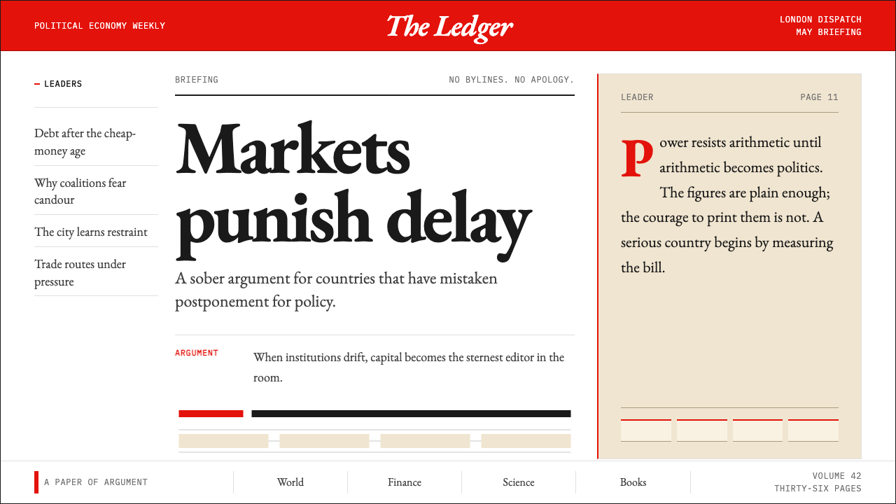 The Economist (Red-Banner)Argument made visible. Red banner, cream paper and Garamond columns enforce t…论点即版面:红刊头、米色纸面与Garamond分栏收紧栅格。
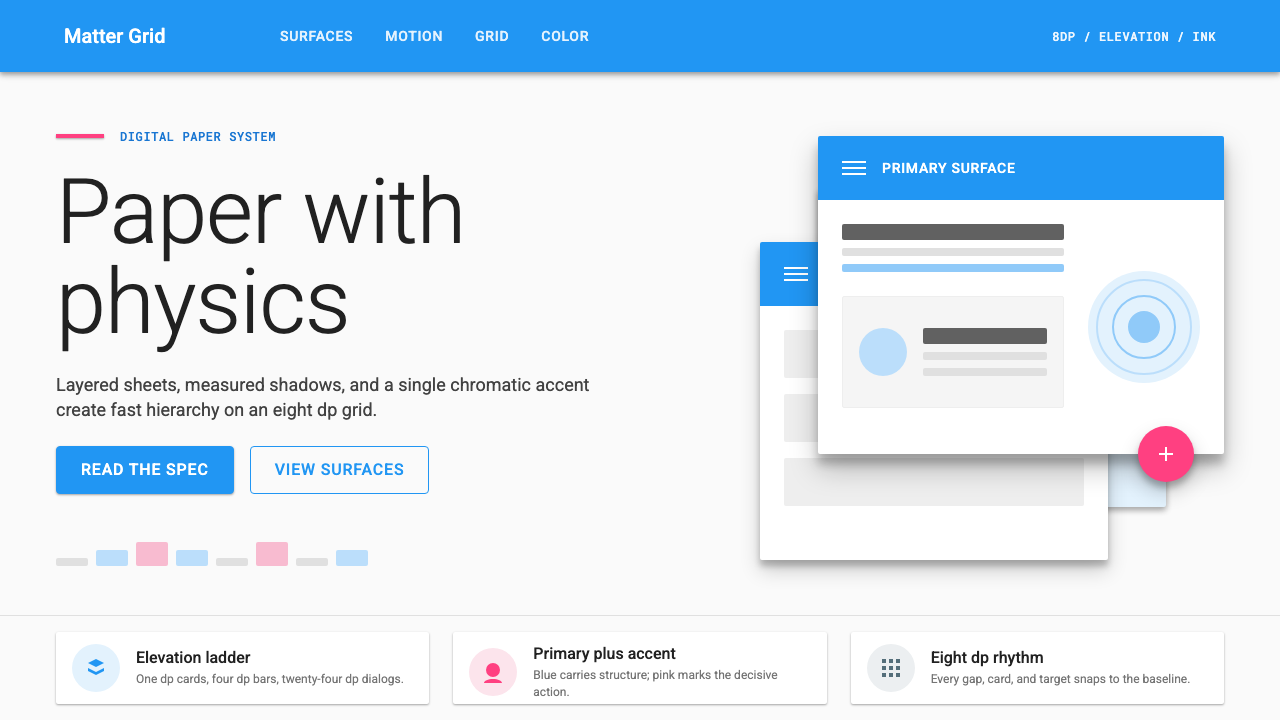 Material Design 1.0Depth made flat usable. Blue app bars, pink FABs, 8dp grids, and crisp paper…让扁平拥有深度:蓝色应用栏、粉色FAB、8dp网格与纸张投影。
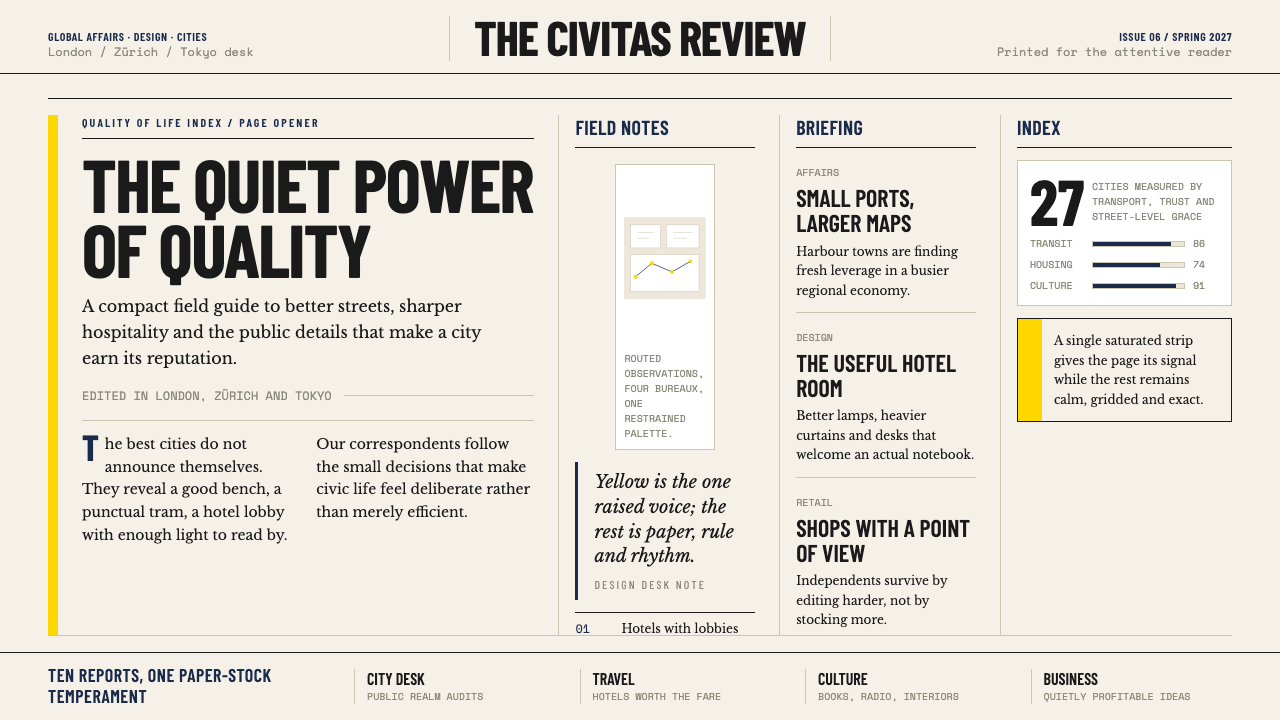 Monocle MagazineQuiet authority. Yellow spine, warm paper and dense ruled columns speak at li…安静的权威。黄色书脊、暖纸色与密集栏线,低声建立品味。
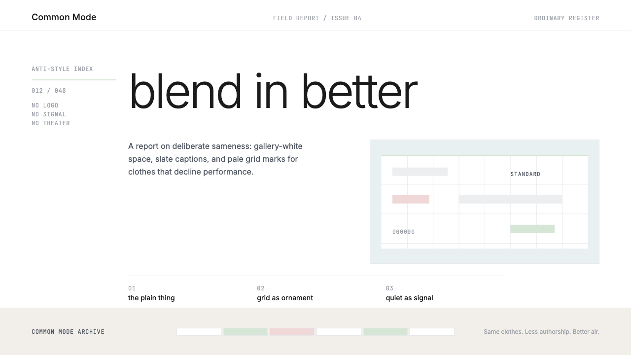 Normcore (2014)Quiet is radical. Inter, slate captions, and pale mint grid marks make refusa…安静即激进:Inter、石板灰注释与淡薄荷网格,让拒绝表演可见。
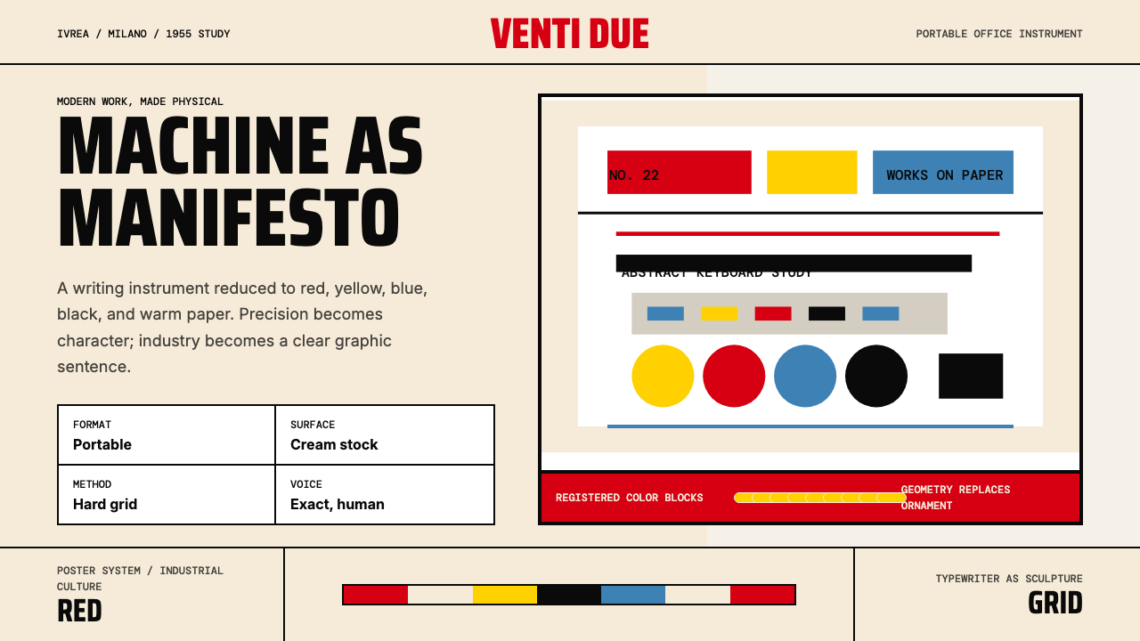 Olivetti Pintori (1955)Industry becomes poetry. Cream paper, machine red, and hard geometry abstract…工业成为诗:奶油纸、机器红与硬朗几何,将打字机抽象化。