Design style guide设计风格指南
What is Normcore (2014)?什么是 Normcore (2014)?
Normcore proved that the loudest statement a designer can make is choosing to say nothing at all.Normcore 证明了一件事:设计师能发出的最响亮的声明,是选择什么都不说。
Normcore (2014) in briefNormcore (2014) 速览
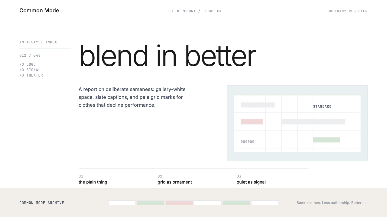
Normcore is a visual aesthetic that treats deliberate plainness as a form of radical expression. Rather than competing for attention through boldness, contrast, or novelty, it achieves its effect through restraint so complete that the restraint itself becomes the message. The palette tends toward neutral whites, pale grays, and muted pastels — colors that recede rather than assert. Typography is set at low optical weight, in functional sans-serif faces, with generous spacing that reads as unhurried and undemanding. The overall impression is of something that has pointedly refused to perform.Normcore 是一种将刻意的朴素视为激进表达方式的视觉美学。它不通过大胆、对比或新奇来争夺注意力,而是以一种彻底的克制来制造效果——克制本身就是信息。色板倾向于中性白、浅灰和低饱和度柔和色调,这些颜色选择退场而非宣告自身。字体以极轻的视觉重量排列,采用功能性无衬线字形,行距宽松,读来不急迫、不索取。整体印象是:这件作品刻意拒绝了表演。
The style takes its visual cues from institutional documents, technical manuals, and the kind of undesigned everyday object that nobody notices. This is intentional. Normcore aesthetics borrow credibility from contexts where design was never the goal — the spreadsheet, the government form, the plain cardstock business card. By applying that same resolute non-style to intentional creative work, the aesthetic makes a philosophical argument: opting out of the visual attention economy is itself a sophisticated position.这种风格的视觉线索来自制度性文件、技术手册,以及那种无人在意的日常无设计感物件。这是有意为之的。Normcore 美学从「设计从未是目的」的语境中借取可信度——电子表格、政府表格、朴素的名片纸。将那种坚定的无风格应用于有意识的创作,这套美学提出了一个哲学命题:选择退出视觉注意力经济,本身就是一种成熟的立场。
What separates normcore from careless design is precision. The spacing is measured, the type hierarchies are considered, the grid is consistent. Achieved properly, the style looks effortless in a way that is quietly difficult to pull off. The absence of decoration is not the absence of decisions — it is the product of many decisions, all made in the direction of removal rather than addition.将 normcore 与粗心设计区分开来的,是精确性。间距是量过的,字体层级是经过考量的,网格是一致的。做得好的时候,这种风格看起来轻巧自然,而这种自然感在实践中悄然难以达到。没有装饰,不等于没有决策——那是许多决策的产物,全部朝着减法而非加法的方向做出的。
See the Normcore (2014) design system →查看 Normcore (2014) 完整设计系统 →
Where does Normcore (2014) come from?Normcore (2014) 从何而来?
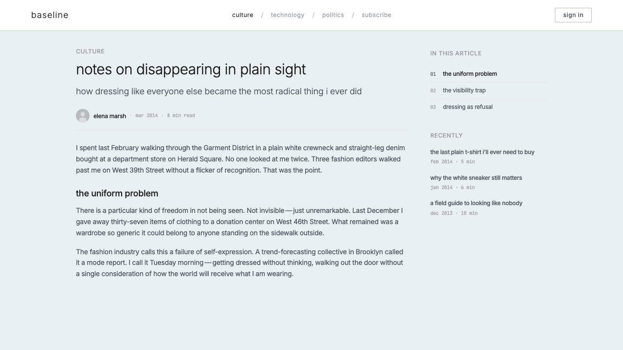
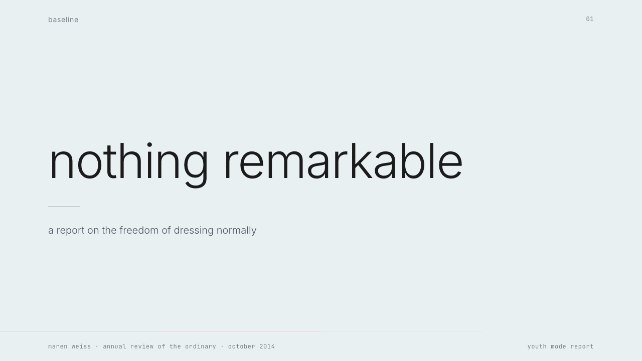
Normcore as a named concept was born in October 2013, when the New York-based trend-forecasting collective K-HOLE published a PDF zine called *Youth Mode: A Report on Freedom*. K-HOLE — founded by Sean Monahan, Emily Segal, and others — argued that the contemporary obsession with personal branding and subcultural differentiation had become its own kind of trap. True freedom, they proposed, lay not in finding the most distinctive possible identity but in surrendering the need for distinction altogether. The document's visual design matched its argument: sparse, institutional, lifted from the language of business reports and academic papers.Normcore 作为一个命名概念,诞生于 2013 年 10 月。纽约趋势预测团体 K-HOLE——由 Sean Monahan、Emily Segal 等人创立——发布了一份名为《Youth Mode: A Report on Freedom》的 PDF 小志。K-HOLE 认为,当代对个人品牌与亚文化差异化的执念本身已成为一种陷阱。他们主张:真正的自由不在于找到尽可能独特的身份,而在于彻底放弃对独特性的需求。这份文件的视觉设计与其论点一致:稀疏、制度性,语言风格取自商业报告与学术论文。
The concept jumped into mainstream culture in early 2014, when journalist Fiona Duncan wrote a piece for New York Magazine observing a new kind of anti-look on the streets of downtown Manhattan — people dressed in white sneakers, plain fleeces, and Gap basics, their clothes indistinguishable from what a dad might wear to a shopping mall. The article positioned this not as a failure of taste but as a posture of studied casualness, a deliberate opting out of the fashion cycle. Almost overnight, Jerry Seinfeld and Larry David became unwitting style icons, and the white New Balance 992 became a loaded cultural object.这一概念在 2014 年初跃入主流文化。记者 Fiona Duncan 为《纽约杂志》撰文,描述她在曼哈顿下城街头观察到的一种新型反时尚装束——白色运动鞋、无 logo 抓绒衫和 Gap 基础款,衣着与一个父亲去购物中心时的穿搭无从分辨。这篇文章将此定性为精心为之的随意感,是对时尚循环的刻意退出,而非品味缺失。几乎一夜之间,Jerry Seinfeld 和 Larry David 成了无辜的时尚偶像,白色 New Balance 992 也成了饱含文化分量的符号。
The broader context was the early-to-mid 2010s internet culture of what critics called peak irony — a period when every subculture and aesthetic had been catalogued, commodified, and made available for instant consumption via platforms like Tumblr and Pinterest. Against this backdrop, K-HOLE's proposal to embrace mass normality rather than fight for a unique niche felt genuinely transgressive. Choosing the unbranded, the generic, the overlooked — not out of ignorance but out of full awareness — reframed blandness as a knowingly radical act.更宏观的背景是 2010 年代初中期的网络文化,批评者称之为「讽刺感巅峰」时代——一个每一种亚文化和美学都已被编目、商品化,并经由 Tumblr、Pinterest 等平台可被即时消费的时期。在这个背景下,K-HOLE 提出的「拥抱大众常态而非争夺独特生态位」的主张,感觉是真正的反叛。选择无品牌、通用款、被忽视的事物——不是出于无知,而是出于充分的自知——将平淡重构为一种知情的激进行为。
In visual culture, normcore's trajectory paralleled the rise of a particular mode of digital minimalism that emerged from tech product design: the stripped-back, content-first aesthetic of early Medium, early Stripe, and a generation of developer-facing tools that took pride in their lack of marketing gloss. The K-HOLE report's design sensibility — muted palette, low-contrast, institutional-feeling typography — anticipated what would become a dominant mood in web and print design through the mid-2010s and into the decade that followed.在视觉文化中,normcore 的轨迹与一种特定的数字极简主义浪潮并行而生:早期 Medium、早期 Stripe,以及一代以缺乏营销光泽为自豪的开发者工具——内容优先、去除修饰的美学。K-HOLE 报告的设计感性——低饱和度色板、低对比度、制度感排版——预示了在整个 2010 年代中期乃至之后的十年中,网络与印刷设计的主导情绪。
What defines the Normcore (2014) look?Normcore (2014) 的视觉特征是什么?
Neutral Palette中性色板
The normcore color range is deliberately undramatic: off-whites, pale grays, washed-out beiges, and the occasional muted pastel — mint, blush, or dusty lavender — deployed in small quantities. These are colors that do not compete with content. Accent colors, when they appear at all, are similarly muted: a slate blue annotation or a pale mint rule rather than a saturated pop of color. The effect is a visual temperature that reads as cool and institutional, similar to the palette of a scientific journal or a well-designed invoice.Normcore 的色彩范围刻意缺乏戏剧性:米白、浅灰、褪色米黄,偶尔以小面积使用柔和的粉彩色——薄荷、腮红或尘灰薰衣草。这些颜色不与内容竞争。强调色(若出现)同样低调:石板蓝的注释或淡薄荷色的分隔线,而非饱和的跳色。整体视觉温度读来冷静、制度化,接近科学期刊或设计精良的发票的色调。
Whisper-Weight Typography极轻字重排版
Type is set at the lightest usable weight, conveying information without visual insistence. Body text is given room to breathe through generous line-height and comfortable measure; headlines are often only marginally larger than the text they introduce, relying on spacing and position rather than dramatic size contrast to establish hierarchy. The overall typographic register reads as functional, not expressive — it is closer to a government document than to a magazine.字体以最轻的可用字重排列,传递信息而不强迫注意。正文通过充裕的行距和舒适的行宽获得呼吸空间;标题往往只比其引介的正文略大,依靠间距与位置而非戏剧性的尺寸对比来建立层级。整体排版基调读来是功能性的,而非表达性的——更接近政府文件,而非杂志。
Institutional Grid制度化网格
The underlying structure in normcore work is orderly but not aggressive. Columns are regular, margins are generous, and elements align to a consistent rhythm without the kind of geometric precision that announces itself. The grid is felt rather than seen — it produces a sense of quiet organization without drawing attention to the organizational system itself. This differs from more rigorous grid-centric styles where the structure is part of the aesthetic statement.Normcore 作品的底层结构是有序的,但不强势。栏目规则,边距宽敞,元素对齐于一致的节奏,却不具备那种自我宣告式的几何精确感。网格是被感知到的,而非被看见的——它产生一种安静的秩序感,同时不将组织系统本身纳入视线焦点。这与那些更严格的以网格为中心的风格不同,在那类风格中,结构本身是美学声明的一部分。
Functional Flatness功能性平面感
Shadows, gradients, and texture are treated as noise rather than refinement. The aesthetic assumes that surfaces should be what they are — a background is flat, a card is flat, a button is flat — and that any simulation of depth or material richness detracts from the clarity of the content it frames. This flatness is not starkly geometric in the Bauhaus sense; it is more like the flat quality of a well-formatted plain-text document: everything is present, nothing is embellished.阴影、渐变和纹理被视为噪音而非精致感。这种美学预设界面元素应当如实呈现——背景是平的,卡片是平的,按钮是平的——任何对深度或材质丰富性的模拟都会削弱它所框定的内容的清晰度。这种平面感不像包豪斯那样几何鲜明;它更像是一份排版良好的纯文本文档的平整质地:一切都在场,没有任何东西被点缀。
Negative Space as Content留白作为内容
White space in normcore work is not merely the absence of content — it is deployed in amounts that actively communicate unhurriedness and confidence. A layout that uses twice the whitespace a conventional design would use signals that the content does not need to compete for attention; it assumes the reader will come to it. This use of space borrows from gallery and editorial conventions but strips away the luxury-brand associations those contexts usually carry.Normcore 作品中的留白不仅仅是内容的缺席——它被以双倍于常规设计的用量部署,主动传达出一种不急迫、有底气的态度。一个使用加倍留白的版面在暗示:这些内容不需要争夺注意力,它默认读者自会前来。这种空间的运用借鉴自画廊与编辑设计的惯例,但剥去了那些语境通常携带的奢侈品联想。
Anti-Brand Iconography反品牌图符
When imagery or iconography appears, it tends toward the generic and unrefined: simple geometric indicators, unlabeled diagrams, or photographs of unremarkable everyday objects shot without art direction. The aesthetic avoids polished illustration, custom iconography, or any visual element that signals craft or originality. The aim is imagery that could plausibly have come from a stock library or a clip-art collection — chosen precisely because it makes no claim to uniqueness.当图像或图符出现时,它们倾向于通用且未经雕琢:简单的几何指示符、无标注的示意图,或是未经美术指导拍摄的平凡日常物件照片。这种美学回避精致的插图、定制图标,以及任何传递工艺感或独创性的视觉元素。目标是那种完全可能来自图库或剪贴画集合的图像——被选用,恰恰因为它不主张任何独特性。
Legibility Over Expression可读性优于表达性
Every decision in normcore prioritizes the reader's ease over the designer's statement. Line lengths are comfortable, contrast is sufficient but not extreme, color is used sparingly enough that it retains informational value. Nothing competes with the text. This is a design ethic borrowed from technical writing and information design traditions, applied to contexts — marketing pages, presentations, editorial spreads — that would conventionally expect something more demonstrative.Normcore 中的每个决策都将读者的轻松感置于设计师的声明之上。行长舒适,对比度足够却不极端,色彩足够节省以保持其信息价值。没有任何东西与文字竞争。这是一种借鉴自技术写作与信息设计传统的设计伦理,被应用于通常会期望更多表达感的语境——营销页面、演示文稿、编辑版面。

See the Normcore (2014) design system →查看 Normcore (2014) 完整设计系统 →
Who shaped Normcore (2014)?谁塑造了 Normcore (2014)?
The New York-based trend-forecasting group founded by Sean Monahan, Emily Segal, and their collaborators. K-HOLE's *Youth Mode* report (October 2013) originated the normcore concept and gave it its theoretical framework: the idea that mass normality could be adopted not out of conformity but as a conscious rejection of differentiation culture. The group's reports were themselves exemplary design artifacts — distributed free as PDFs, formatted with deliberate institutional plainness, and positioned against the trend-forecasting industry's usual luxury-market assumptions.由 Sean Monahan、Emily Segal 及其合作者在纽约创立的趋势预测团体。K-HOLE 于 2013 年 10 月发布的《Youth Mode》报告原创了 normcore 概念并赋予其理论框架:大众常态可以被有意采纳,不是出于从众,而是对差异化文化的自觉拒绝。这个团体的报告本身就是典范性的设计作品——以 PDF 格式免费分发,以刻意的制度感朴素排版,并将自身定位为对抗趋势预测行业惯常奢侈品市场预设的产物。
The journalist whose 2014 New York Magazine piece, *Normcore: Fashion for Those Who Realize They're One in 7 Billion*, brought the K-HOLE concept to mainstream attention. Duncan's street-level observation — that a new mode of studied plainness was appearing in downtown Manhattan — translated an abstract theoretical proposition into something legible to a general audience. Her framing of the white sneaker and the fleece vest as loaded anti-fashion statements was instrumental in making normcore a widely understood cultural phenomenon.记者,其 2014 年发表于《纽约杂志》的文章《Normcore: Fashion for Those Who Realize They're One in 7 Billion》将 K-HOLE 的概念推向主流视野。Duncan 在街头的观察——曼哈顿下城出现了一种新型的刻意朴素穿搭——将一个抽象的理论命题转化为大众可读的现象。她将白色运动鞋和抓绒马甲定性为饱含分量的反时尚声明,这一解读对于 normcore 成为广为人知的文化现象至关重要。
Co-founder of K-HOLE and one of the primary authors of *Youth Mode*. Monahan's theoretical framing of normcore drew on concepts from sociology and cultural theory, arguing that the post-ironic embrace of mass culture was a more genuinely radical position than subcultural resistance. His subsequent writing and interviews elaborated the idea that normcore was fundamentally about adaptability — the capacity to fit in anywhere, to surrender the performance of distinctiveness, and to find that surrender liberating rather than diminishing.K-HOLE 联合创始人,《Youth Mode》的主要作者之一。Monahan 对 normcore 的理论建构借鉴了社会学与文化理论的概念,主张对大众文化的后讽刺式拥抱,是一种比亚文化抵抗更真正激进的立场。他后续的写作与访谈进一步阐发了这一观点:normcore 从根本上关乎适应性——在任何地方都能融入的能力,放弃独特性表演的能力,以及在那种放弃中找到解放而非贬低的能力。
Co-founder of K-HOLE whose background spanned art, branding, and cultural criticism. Segal brought a visual sensibility to the collective's work that was as important as the theoretical content: the PDF reports were carefully undesigned in a way that required active choices. Her subsequent work as a novelist and cultural commentator continued to explore the territory K-HOLE had mapped — the aesthetics of blankness, the cultural politics of refusal, and the strange appeal of the generic.K-HOLE 联合创始人,背景横跨艺术、品牌与文化批评。Segal 为团体作品带来的视觉感性与理论内容同等重要:那些 PDF 报告以一种需要主动抉择的方式被「精心地做到无设计感」。她后续作为小说家与文化评论者的工作,持续探索 K-HOLE 所勘测的领域——空白感的美学、拒绝的文化政治,以及通用物的奇特吸引力。
How do you use Normcore (2014) today?今天怎么用 Normcore (2014)?
Normcore translates most naturally into contexts where the content is the authority and the design is expected to stay out of the way. This makes it well-suited to presentation slides where the credibility of the argument should not be undermined by visual theatrics. Cover slides work through studied quietness: a single short title in light-weight type against a large field of off-white, perhaps accompanied by a muted-palette rule or a small institutional logotype. Content slides benefit from the style's bias toward legibility — wide margins, comfortable reading measure, and hierarchies established through spacing rather than decoration. Data slides take on a documentary quality: charts are rendered with minimal stylistic intervention, labels are plain, and color is used only to distinguish categories rather than to make the visualization feel designed.Normcore 最自然地适用于那些内容本身是权威、设计被期待退到幕后的语境。这使它特别适合演示文稿——论点的可信度不应被视觉戏剧感削弱。封面页通过刻意的安静发力:轻字重的简短标题置于大片米白色底面上,或许配以低饱和度的分隔线或小号制度感标识。内容页受益于这种风格对可读性的偏向——宽边距、舒适行宽,以及通过间距而非装饰建立的层级。数据页呈现一种纪录片质感:图表以最低限度的风格干预呈现,标签朴素,色彩仅用于区分类别,而非让可视化看起来「有设计感」。
For web interfaces, the style is particularly effective on dashboards, documentation pages, and pricing tables where users need to scan and extract information quickly. The approach calls for a near-white or light gray background, body text in a neutral weight that reads effortlessly at extended lengths, and interactive elements — buttons, form inputs, toggles — that announce their function through position and label rather than through color or shadow. Navigation is typographic: links and labels without icon decoration. The result is a product that communicates competence through restraint, appropriate for developer tools, data platforms, and SaaS products aimed at professional users.对于网页界面,这种风格在用户需要快速扫描提取信息的仪表板、文档页面和定价表上尤为有效。具体做法是:接近白色或浅灰的背景,正文以中性字重排列确保长篇阅读的轻松感,交互元素——按钮、表单输入框、切换开关——通过位置与标签而非色彩或阴影来宣告其功能。导航是字体性的:链接与标签,无图标装饰。结果是一个通过克制传达能力的产品,适合面向专业用户的开发者工具、数据平台和 SaaS 产品。
In editorial and marketing contexts, normcore works well for brands and publications that want to position themselves as intelligent, considered, and independent of trend cycles. A feature article layout in this register uses a wide-margin column format, section breaks marked by a single light rule, and pull quotes set at the same weight as body text — distinguished by their isolation in the white space rather than by any decorative treatment. Marketing pages can use the style's institutional coolness strategically: a hero section that makes its case with a single clear sentence in understated type, followed by organized content that trusts the reader to engage with the argument.在编辑与营销语境中,normcore 适合那些希望将自身定位为智识性、深思熟虑且独立于流行循环的品牌与出版物。这种基调的特写文章版面使用宽边距栏目格式,以单条细线标记段落分隔,引文以与正文相同字重排列——靠在留白中的孤立感而非任何装饰处理来区分。营销页面可以战略性地利用这种风格的制度感冷静:一个 hero 区块用一句低调字体写就的清晰句子陈述观点,随后以有序的内容信任读者自行深入论点。
Applied to brand identity and visual systems, normcore supports organizations that want visual consistency without overt personality — research institutes, independent publishers, technology platforms that want to seem tool-like rather than consumer-facing. The system relies on typographic discipline and spatial consistency rather than a distinctive color palette or proprietary illustration style. Identity elements are plain enough to feel almost undesigned, which paradoxically makes them more durable: they do not become dated because they never claimed to be of a particular moment.应用于品牌识别与视觉系统时,normcore 支持那些希望视觉一致而不追求显性个性的组织——研究机构、独立出版社、希望看起来像工具而非消费品的技术平台。这套系统依靠排版纪律与空间一致性,而非独特的色板或专属插画风格。识别元素朴素到几乎感觉未经设计,这反而使其更为持久:它们不会过时,因为它们从未声称属于某个特定时刻。
The most common mistake when applying normcore is treating neutrality as permission for sloppiness. The style requires exact spacing, careful hierarchy, and a deliberate relationship between elements; without that precision, the result reads not as confident restraint but as inattention. A second common error is introducing too many competing neutral tones — when three or four shades of beige and gray appear without clear relational logic, the visual field becomes muddy rather than calm. Normcore works best when the palette is edited to the fewest tones necessary and each is given a specific functional role.应用 normcore 时最常见的错误,是把中性感理解为对随意的许可。这种风格要求精确的间距、细心的层级,以及元素之间刻意的关系;缺乏这种精确性,结果读来不是自信的克制,而是粗心。第二个常见错误是引入过多相互竞争的中性色调——当三四种米色和灰色在没有清晰关系逻辑的情况下并置出现时,视觉场变得浑浊而非平静。Normcore 在色板被精简到所需最少色调、且每种色调被赋予特定功能角色时效果最佳。
See the Normcore (2014) design system →查看 Normcore (2014) 完整设计系统 →
Normcore (2014) — FAQNormcore (2014) · 常见问题
Is normcore just minimalism with a different name?Normcore 只是换了名字的极简主义吗?
The two share aesthetic territory but differ in motivation. Minimalism, as a formal design tradition, values the reduction of elements as an end in itself — the goal is elegance, purity, or formal resolution. Normcore's plainness is motivated by a cultural argument: it is a refusal of the performance of taste, not a pursuit of perfection. Minimalism often feels aspirational and expensive; normcore is deliberately adjacent to the generic and the institutional. A minimalist poster is trying to be beautiful. A normcore document is trying to look like it is not trying.两者共享美学领域,但动机不同。极简主义作为一种形式设计传统,将元素的简化本身视为目的——目标是优雅、纯粹或形式上的解决。Normcore 的朴素由一个文化论点驱动:它是对品味表演的拒绝,而非对完美的追求。极简主义往往感觉充满抱负感且昂贵;normcore 刻意毗邻通用感与制度感。一张极简主义海报在努力变得美丽。一份 normcore 文件在努力看起来它没有在努力。
Can normcore work for a consumer brand, or is it only suited to B2B products?Normcore 适合消费品品牌,还是只适合 B2B 产品?
It can work in consumer contexts, but the fit is specific. Normcore aesthetics suit consumer brands that want to signal intelligence, independence, or a deliberate rejection of trend-chasing — certain book publishers, independent food producers, personal finance tools, or brands positioning themselves against the noise of heavily marketed competitors. It struggles for brands that need warmth, sensory richness, or emotional accessibility: children's products, food categories where appetite appeal is paramount, or wellness contexts where softness and care are the primary signals.可以在消费品语境中有效,但契合度是具体的。Normcore 美学适合那些希望传达智识感、独立性或刻意拒绝追逐潮流的消费品品牌——某些图书出版社、独立食品生产商、个人理财工具,或将自身定位为对抗密集营销竞争者噪音的品牌。它在需要温度感、感官丰富性或情感亲近性的品牌中则力不从心:儿童产品、食欲吸引力至关重要的食品类别,或柔软与关怀是主要信号的健康语境。
How does normcore relate to the Swiss International Style or other grid-based approaches?Normcore 与瑞士国际主义风格或其他基于网格的设计方法有什么关系?
Swiss International Style uses similar tools — strict grids, neutral sans-serif type, generous white space — but in service of a universalist ambition: the belief that rational design systems could communicate objectively across cultures and contexts. The style is visibly precise and proudly systematic. Normcore, by contrast, is not trying to be a universal system; it is mimicking the look of things that were never designed as systems at all — the plain document, the institutional form, the unambitious template. Swiss Style is disciplined; normcore aspires to look like it was not thinking about design at all.瑞士国际主义风格使用类似的工具——严格网格、中性无衬线字体、充裕留白——但服务于一种普世主义抱负:理性设计系统可以跨文化和语境客观传达信息的信念。这种风格明显精确,自豪地系统化。Normcore 相反,它不试图成为一套通用系统;它在模拟那些从未被作为系统设计的事物的外观——朴素的文件、制度性的表格、没有抱负的模板。瑞士风格是有纪律的;normcore 希望看起来它根本没有在思考设计。
Why does normcore feel contemporary even though the concept is from 2013–2014?为什么 normcore 在概念诞生于 2013—2014 年之后仍然感觉当代?
Because the conditions that produced it have intensified rather than faded. The attention economy has become more demanding, platform visual culture more saturated, and the pressure on individuals and organizations to maintain a distinctive visual identity more relentless. Against that backdrop, the choice to appear undesigned, institutional, or generically plain reads as increasingly deliberate and even legible as a form of critique. Normcore did not peak and recede as a trend; it evolved into a persistent mode that aligns with how many digital-native organizations — particularly those in technology, research, and publishing — choose to present themselves.因为产生它的条件已经加深而非消退。注意力经济变得更加苛求,平台视觉文化更加饱和,个人与组织维持独特视觉身份的压力更加持续。在这一背景下,选择看起来无设计感、制度化或通用朴素,读来越发显得刻意,甚至可读为一种批评形态。Normcore 没有像趋势一样达到顶峰后消退;它演化为一种持续的模式,与许多数字原生组织——尤其是科技、研究和出版领域——选择呈现自身的方式相吻合。
What is the biggest risk when using a normcore aesthetic?使用 normcore 美学时最大的风险是什么?
The biggest risk is that the restraint reads as absence of effort rather than abundance of confidence. A normcore layout done without precision becomes simply plain — uninviting and forgettable rather than pointedly understated. The style has no decorative elements to fall back on when the spacing is off or the hierarchy is unclear; its entire communicative weight rests on invisible decisions about proportion, spacing, and type treatment. This means normcore demands more typographic skill, not less, even as it looks simpler than more ornamented alternatives.最大的风险是克制被读作缺乏努力,而非充分的底气。一个缺乏精确性的 normcore 版面,仅仅变得平淡——不吸引人且容易被遗忘,而非刻意低调。这种风格在间距失准或层级不清时没有装饰性元素可以作为退路;它全部的传达重量都压在关于比例、间距和字体处理的无形决策上。这意味着 normcore 要求更多而非更少的排版技巧,尽管它看起来比更多装饰的替代品简单。
Related design styles相关设计风格
 Monocle MagazineQuiet authority. Yellow spine, warm paper and dense ruled columns speak at li…安静的权威。黄色书脊、暖纸色与密集栏线,低声建立品味。
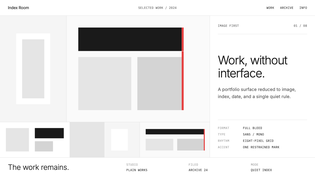 Cargo Collective PortfolioInterface disappears. White space, full-bleed blocks, mono metadata and hairl…界面退场:留白、全出血块面、等宽元数据与极细线。
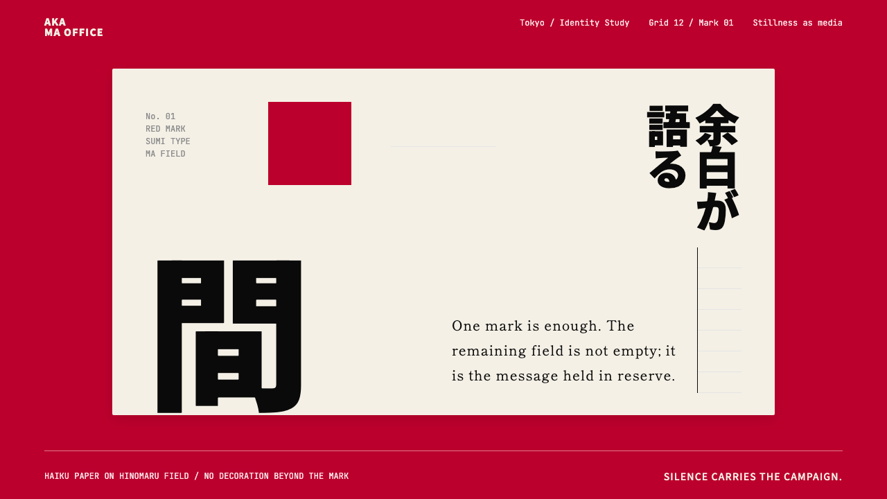 Dentsu Tokyo CreativeSilence does the selling. Hinomaru red, sumi type, and empty columns carry th…以静制胜:日之丸红、墨黑字体与空列共同承托标记。
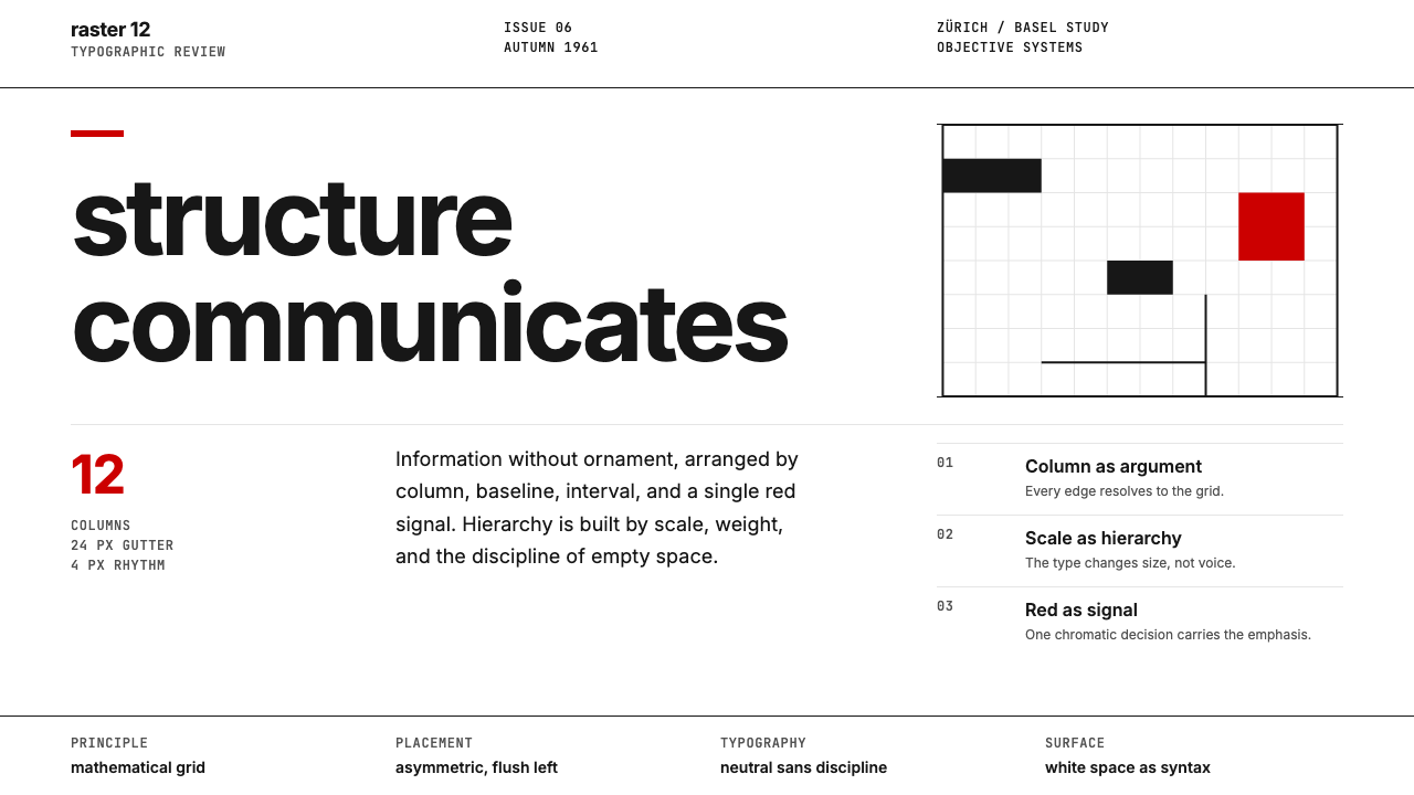
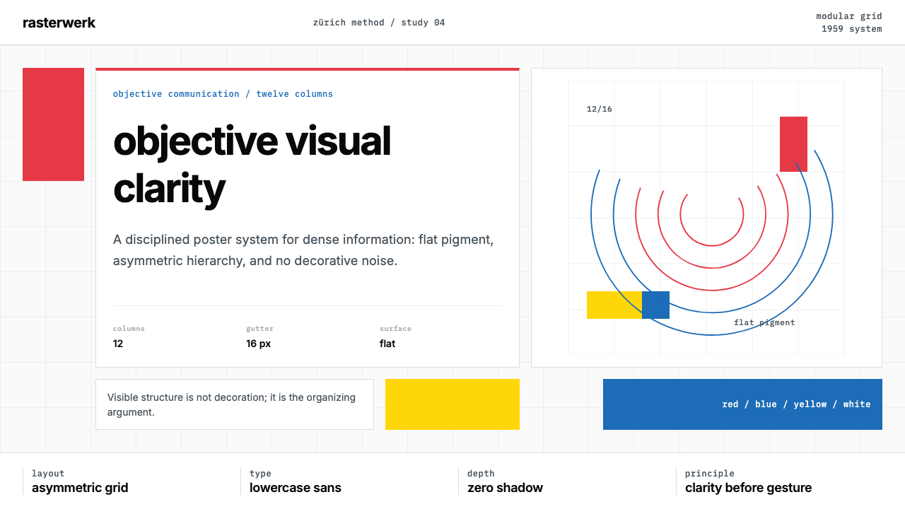 Müller-Brockmann SwissClarity is the system. Inter grids, red-blue blocks, and concentric arcs make…清晰即系统:Inter网格、红蓝色块与同心弧显露结构。
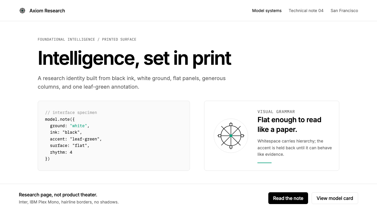 OpenAI 2024Research-grade restraint. Black-on-white Inter, flat code panels, one leaf-gr…研究级克制:黑白 Inter、扁平代码框、一枚叶绿色标记。
 Swiss International StyleObjectivity made visible. Inter scale, white space, and one red block expose…客观性可见:Inter 尺度、留白与单一红块显露网格。