What is Cargo Collective Portfolio?什么是 Cargo Collective Portfolio?
Cargo Collective made the designer's portfolio invisible — leaving only the work, framed by full-bleed imagery, monospace metadata, and silence.Cargo Collective 让设计师的作品集变得「隐形」——只剩下作品本身,被全出血图像、等宽元数据与沉默包裹。
Cargo Collective Portfolio in briefCargo Collective Portfolio 速览
Cargo Collective Portfolio is the visual language codified by the invite-only portfolio platform founded in 2007. Its aesthetic is defined by deliberate subtraction: no decorative chrome, no personality-driven interface elements, no visual noise competing with the work on display. What remains is a rigorously restrained system of full-bleed imagery, hairline rules, generous whitespace, and typographic hierarchy built from a single monospace voice for metadata alongside a tight-tracked sans for names and titles.Cargo Collective Portfolio 是由2007年创立的邀请制作品集平台所凝固的视觉语言。它的美学由刻意的减法定义:没有装饰性界面元素,没有彰显个性的视觉噪声,没有任何与展示中的作品争夺注意力的东西。留下的是一套极度克制的系统——全出血图像、极细分割线、充裕的留白,以及由单一等宽字体构成的元数据层级,配合紧凑字距的无衬线字体用于名称与标题。
The style's central conviction is that the designer's interface should disappear. Unlike portfolio platforms that offer expressive customization, Cargo templates enforce a shared visual grammar — one that signals belonging to a community of taste-makers rather than individual brand identity. The work fills the frame; the frame refuses to speak. This philosophy produces layouts that feel simultaneously editorial and architectural: pages read more like museum vitrine arrangements than conventional web design.这种风格的核心信念是:设计师的界面本身应当消失。与提供丰富个性化定制的作品集平台不同,Cargo 模板强制执行一套共享的视觉语法——它传递的是对某个品味共同体的归属感,而非个人品牌身份。作品充满整个画面;而画面本身拒绝开口。这一哲学产生的版面同时具有编辑性与建筑性:页面读起来更像博物馆陈列柜的排布,而非惯常的网页设计。
What makes Cargo Collective Portfolio distinct from generic minimalism is its specific vocabulary of restraint. Hairline rules separate rather than decorate. Monospace type for project metadata — client names, years, categories — creates a ledger-like factual register that contrasts with the expressive imagery it annotates. White or off-white grounds are near-absolute; color, where it enters, does so only through the photography and artwork on display, never through the interface itself.让 Cargo Collective Portfolio 有别于泛泛极简主义的,是其克制的特定词汇。极细线条用于分隔而非装饰。项目元数据——客户名称、年份、类别——使用等宽字体,创造出账目式的事实语调,与它所标注的表现性图像形成对比。白色或近白色底面几乎是绝对的;色彩若要进入,也只能通过展示的摄影作品与图稿,而永远不是界面本身。
See the Cargo Collective Portfolio design system查看 Cargo Collective Portfolio 完整设计系统
Where does Cargo Collective Portfolio come from?Cargo Collective Portfolio 从何而来?
Cargo Collective was founded in 2007 by Folkert Gorter, a Dutch designer, and Adam Spektor in Los Angeles, California. The platform launched as an invite-only community at a moment when portfolio hosting options for working designers were either generic (content management systems not built for visual work) or expensive (custom-developed sites). By restricting entry to designers vouched for by existing members, Cargo created a curated context — a signal that placement on the platform itself carried aesthetic credibility.Cargo Collective 由荷兰设计师 Folkert Gorter 与 Adam Spektor 于2007年在美国洛杉矶创立。平台以邀请制社区的形式上线,彼时面向职业设计师的作品集托管选项,要么太过通用(内容管理系统并非为视觉工作而生),要么代价高昂(定制开发的网站)。通过将入场资格限制于由现有成员推荐的设计师,Cargo 创造了一个经过甄选的语境——能出现在这个平台上,本身就是一种美学信誉的背书。
The platform's visual templates were shaped by the dominant taste currents in design culture during the late 2000s and early 2010s: a reaction against the decorative excess of the mid-2000s web, an embrace of Swiss typographic rigor, and the influence of print-derived editorial design on screen layout. Designers trained in print brought their page-layout instincts online — the narrow column for body text, the wide margin for annotations, the hairline rule as a structural device. Cargo's templates translated these sensibilities into repeatable screen patterns.平台的视觉模板受到2000年代末至2010年代初设计文化中主流品味潮流的塑造:一种对2000年代中期网页装饰过剩的反动,对瑞士排印严谨性的拥抱,以及印刷衍生的编辑版式设计对屏幕布局的深刻影响。受过印刷训练的设计师将他们的页面排版直觉带到了线上——正文的窄行宽、注释的宽边距、作为结构装置的极细线条。Cargo 的模板将这些感性转化为可复制的屏幕模式。
The current visual iteration of the Cargo aesthetic — the one recognizable in the broader design conversation — solidified roughly between 2020 and 2024, as the platform updated its template system for contemporary screen environments. This phase saw the full-bleed image grid become canonical: projects presented as edge-to-edge photographs in a masonry or strict grid layout, with all metadata collapsed beneath or overlaid in translucent monospace type. The interface chrome reduced to near-nothing: a persistent name in one corner, a navigation list in another, nothing else.如今在更广泛设计对话中可辨认的 Cargo 美学,大约在2020年至2024年间完成了巩固——彼时平台为当代屏幕环境更新了其模板系统。这一阶段见证了全出血图像网格成为标准:项目以覆盖边缘至边缘的照片呈现于砌砖式或严格网格布局中,所有元数据折叠于图像之下或以半透明等宽字体叠加其上。界面本身被削减至几乎虚无:一角是持久显示的姓名,另一角是导航列表,此外一无所有。
Cargo's influence spread far beyond its user base because the aesthetic it codified aligned with a broader professional designer ethos: restraint as expertise, whitespace as confidence, the refusal to decorate as a form of authority. Agencies, studios, and independent practitioners who never used the platform absorbed its vocabulary through exposure to portfolios that did. By the early 2020s, the Cargo aesthetic had become a recognizable genre — one shorthand for 'serious designer' in the same way that certain editorial magazines signal serious journalism.Cargo 的影响力远超其用户群体,因为它所凝固的美学契合了一种更广泛的职业设计师精神气质:克制即专业,留白即自信,拒绝装饰即一种权威形式。从未使用过这个平台的机构、工作室与独立从业者,通过接触使用该平台的作品集,吸收了它的视觉词汇。到2020年代初,Cargo 美学已成为一种可辨认的类型——正如某些编辑类杂志是严肃新闻的标志,它是「认真的设计师」的速记符号。
What defines the Cargo Collective Portfolio look?Cargo Collective Portfolio 的视觉特征是什么?
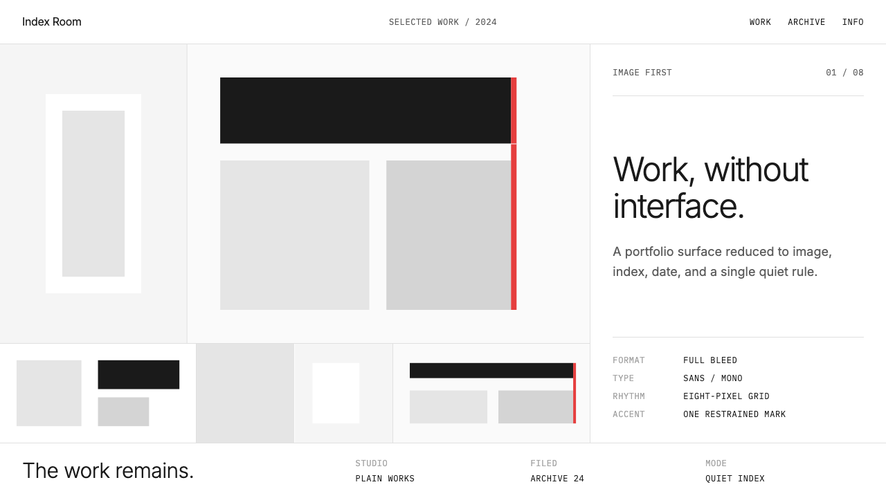
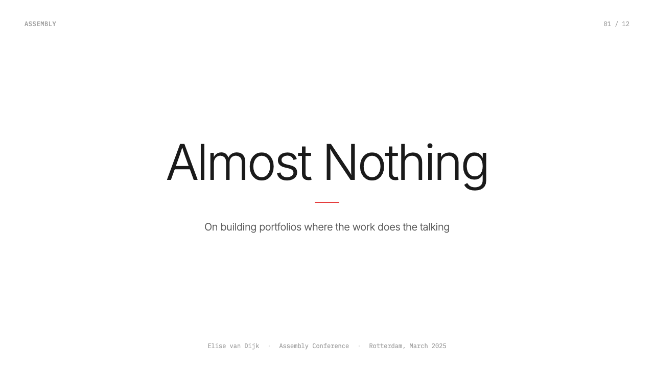
Full-Bleed Imagery全出血图像
Photography and project imagery extend to the absolute edges of the container or viewport, with no visible margin, padding, or border separating the image from the interface boundary. This treatment makes the work itself the ground — the space the viewer inhabits — rather than an object placed inside a decorative frame. Full-bleed grids, where multiple projects tile edge-to-edge without gutters, amplify this effect: the portfolio becomes a continuous visual surface rather than a catalogue of discrete items.摄影与项目图像延伸至容器或视口的绝对边缘,图像与界面边界之间没有可见的边距、内边距或边框。这种处理方式使作品本身成为底面——观者所处的空间——而非放置在装饰性框架内的对象。全出血网格中,多个项目无间距地拼接至边缘,放大了这种效果:作品集成为连续的视觉表面,而非独立条目的目录。
Monospace Metadata等宽元数据
Project information — client names, years, categories, brief descriptions — is rendered in a monospace typeface that creates a deliberate register contrast with the display type used for names and titles. Monospace carries associations with code, ledgers, and technical documentation; in a portfolio context it frames the factual details of a project with a cool, systematic objectivity. The fixed-width character spacing also produces a quiet visual rhythm that is legible without drawing attention to itself.项目信息——客户名称、年份、类别、简短描述——以等宽字体呈现,与用于姓名和标题的展示字体之间形成刻意的语域对比。等宽字体带有代码、账目与技术文档的联想;在作品集语境中,它以一种冷静、系统的客观性框定了项目的事实性细节。固定字宽的字符间距也产生了一种安静的视觉节奏,清晰可读却不会吸引注意力。
Hairline Rules极细分割线
Extremely thin horizontal or vertical rules divide sections, separate metadata from imagery, or mark the edges of content regions. These lines are structural rather than decorative — they provide spatial orientation without competing with the work they frame. Their weight is calibrated to be visible against a white ground without becoming a design element in their own right. The hairline rule is perhaps the single most recognizable signature of the Cargo visual language.极细的水平或垂直线条分隔各个区块,将元数据与图像分开,或标记内容区域的边缘。这些线条是结构性的,而非装饰性的——它们提供空间方位感,而不与它们所框定的作品竞争。线条的粗细被精心校准:在白色底面上清晰可见,但不会自身成为一个设计元素。极细分割线或许是 Cargo 视觉语言中最具辨识度的单一标志。
Neutral Ground中性底面
Backgrounds are consistently white or near-white — sometimes a very pale warm gray — creating a neutral ground from which the work can emerge without color competition from the interface. This is a deliberate renunciation of the designer's personal palette: the portfolio surface itself has no aesthetic agenda beyond reception. The neutrality is absolute in most templates; any warmth or coolness in the ground is barely perceptible and never a design statement.背景始终是白色或近白色——有时是极浅的暖灰——创造出一个中性底面,让作品得以浮现,不受界面颜色的竞争干扰。这是对设计师个人色板的刻意放弃:作品集表面本身没有超越接收功能的任何美学意图。在大多数模板中,这种中性是绝对的;底面中任何微弱的暖意或冷意都几乎无法感知,绝不是一种设计声明。
Typographic Economy字体排印经济性
The typographic system is built on the minimum number of voices required to establish hierarchy. Typically two: a sans-serif for names, section titles, and navigation, and a monospace for project-level metadata. There is no decorative type, no display font used for expressive purposes, no mixing of historical styles. Scale and weight carry all hierarchical meaning — a name set very large against a smaller monospace credit is the entire system. The restraint signals that the designer trusts the work to carry the expressive weight.字体排印系统建立在建立层级所需的最少声部之上。通常只有两种:用于姓名、区块标题与导航的无衬线字体,以及用于项目级元数据的等宽字体。没有装饰性字体,没有出于表现目的使用的展示字体,没有历史风格的混搭。所有层级意义由尺寸与字重承载——一个极大号的姓名搭配较小的等宽字体署名构成整个系统。这种克制传递的信号是:设计师相信作品本身承担表现性重量。
Navigation as Ghost幽灵导航
Navigation elements are reduced to their minimum functional form: a name or wordmark, a short list of section labels, possibly a contact link. These elements are positioned at the periphery of the layout — corners or edges — and rendered at a weight and size that keeps them visibly present but perceptually recessive. The viewer's eye is not drawn to the navigation; it is available when needed. This is the interface equivalent of the hairline rule: present, structural, and willfully unobtrusive.导航元素被削减至其最小功能形式:一个名称或文字标识,一个简短的区块标签列表,也许还有一个联系链接。这些元素被定位于版面的外围——角落或边缘——以保持视觉可见但知觉上退隐的字重和大小渲染。观者的眼睛不会被导航吸引;它在需要时存在。这是界面层面的极细分割线:存在、结构性,且刻意不引人注目。
Silence as System沉默即系统
Whitespace in the Cargo aesthetic is not empty — it is structural material. The generous space around titles, between metadata and imagery, at the edges of the viewport, is calibrated to give every element air to exist independently before the eye moves to the next. This differs from the whitespace in luxury branding (which signals premium positioning) or minimalist software UI (which signals focus). In a portfolio context, the silence is curatorial: it insists that each work receives the viewer's full attention before the next begins.在 Cargo 美学中,留白并非空无——它是结构性材料。标题周围、元数据与图像之间、视口边缘的充裕空间,被精心校准,让每个元素在眼睛移向下一个之前独立呼吸。这不同于奢侈品牌中的留白(传递高端定位)或极简软件界面中的留白(传递专注感)。在作品集语境中,这种沉默是策展性的:它坚持让每件作品在下一件开始之前获得观者的全部注意力。
See the Cargo Collective Portfolio design system查看 Cargo Collective Portfolio 完整设计系统
Who shaped Cargo Collective Portfolio?谁塑造了 Cargo Collective Portfolio?
A Dutch designer working in Los Angeles, Gorter co-founded Cargo Collective in 2007 and shaped the platform's curatorial identity as much as its technical infrastructure. His own design practice — characterized by typographic rigor, editorial restraint, and a preference for work that recedes in favor of its subject — became a template for the aesthetic the platform promoted. Gorter's decisions about which designers to admit during the invite-only era effectively defined the taste community the platform represented, and those curatorial choices became legible in the visual conventions the platform's templates enforced.荷兰设计师,常驻洛杉矶。Gorter 于2007年联合创立了 Cargo Collective,对平台策展身份的塑造与其技术基础设施同等重要。他自身的设计实践——以排印严谨性、编辑克制力和让作品退让于主题的偏好为特征——成为平台所推崇的美学模板。在邀请制时代,Gorter 关于接纳哪些设计师的决定,实际上定义了平台所代表的品味共同体,而这些策展选择最终在平台模板所强制执行的视觉惯例中变得可读。
Spektor co-founded Cargo Collective alongside Gorter and served as a central figure in the platform's technical and product development. His contributions shaped the infrastructure that made the platform's distinctive template system possible — the constraints that enforce the visual grammar rather than simply offering it as an option. The platform's design decisions reflect a product philosophy aligned with the aesthetic it served: the fewer the choices offered to users, the more coherent the community's output.Spektor 与 Gorter 共同创立了 Cargo Collective,是平台技术与产品开发的核心人物。他的贡献塑造了使平台独特模板系统成为可能的基础设施——那些强制执行视觉语法而非仅仅将其作为选项提供的约束机制。平台的设计决策折射出一种与其所服务的美学一致的产品哲学:给用户的选择越少,社区输出就越连贯。
The Dutch graphic designer whose system-based typographic approach — developed in the 1960s and 1970s through his work at Total Design — represents a direct ancestor of the Cargo aesthetic's typographic sensibility. Crouwel's belief that the designer's role was to create transparent systems through which content could pass, rather than expressive vehicles for personality, maps exactly onto the Cargo philosophy. His grid-based poster and catalogue designs for the Stedelijk Museum, with their strict typographic hierarchy and rejection of decorative convention, are a visible precedent for the portfolio layouts the platform would codify decades later.荷兰平面设计师,其在1960至70年代通过 Total Design 工作室发展出的系统化排印方法,是 Cargo 美学排印感性的直接先驱。Crouwel 相信设计师的角色是创造让内容得以穿越的透明系统,而非表达个性的载体——这与 Cargo 的哲学完全契合。他为市立博物馆设计的基于网格的海报与目录,以其严格的排印层级和对装饰惯例的拒绝,是数十年后该平台所凝固的作品集版式的可见先例。
The Dutch book designer known for her extreme typographic restraint and her insistence that the designed object should never compete with its content. Boom's book designs — sometimes nearly typeless, always architecturally structured — demonstrate the same conviction that animates the Cargo aesthetic: that the highest form of design service is to become invisible. Her work was widely admired in the design culture from which Cargo emerged, and her approach to whitespace as active material rather than passive absence influenced how a generation of portfolio designers thought about the role of the empty page.荷兰书籍设计师,以极度排印克制和坚持设计对象永远不与其内容竞争而闻名。Boom 的书籍设计——有时几乎没有文字,却始终具有建筑性结构——体现了驱动 Cargo 美学的同一信念:设计服务的最高形式是变得隐形。她的作品在 Cargo 所诞生的设计文化中广受推崇,她将留白视为主动材料而非被动空白的方式,影响了整整一代作品集设计师对空白页面角色的思考。
The Amsterdam-based design studio whose rigidly typographic, system-driven approach to graphic design — built almost entirely from Helvetica in varying weights and sizes, with no imagery that could not be justified structurally — became one of the defining visual references for the design culture that Cargo Collective would serve. Experimental Jetset's insistence on typography as the primary visual material, and their rejection of photography and illustration in favor of textual form, represents the extreme ideological end of the restraint spectrum that Cargo templates navigate in a more accessible register.总部位于阿姆斯特丹的设计工作室,其极度排印化、系统驱动的平面设计方法——几乎完全由不同字重与尺寸的 Helvetica 构成,不使用任何无法在结构上得到正当理由的图像——成为 Cargo Collective 所服务的设计文化中最具定义性的视觉参照之一。Experimental Jetset 对排版作为首要视觉材料的坚持,以及他们拒绝摄影与插图而转向文字形式的立场,代表了 Cargo 模板在更易接触的层次上所回应的克制谱系的意识形态极端。
How do you use Cargo Collective Portfolio today?今天怎么用 Cargo Collective Portfolio?
The Cargo Collective Portfolio aesthetic is transferable to any presentation context where the goal is to foreground content while the containing system recedes. The key discipline is consistency of restraint: every decorative impulse resisted, every added element justified by function. Applying it correctly means understanding what the system is refusing — not just what it contains.Cargo Collective Portfolio 美学可迁移至任何以内容为前景、包容系统退隐为目标的展示语境。关键的自律是克制的一致性:抵制每一个装饰冲动,以功能为依据为每一个添加的元素辩护。正确应用它意味着理解这套系统在拒绝什么——而不仅仅是它包含什么。
For presentation slides, the style works best when treated as an editorial layout system rather than a slide template. Cover slides should use a single full-bleed image or a dominant near-white field with a name and perhaps a hairline rule — no background illustration, no gradient, no branded color block. Content slides follow a strict typographic grid: headlines in a clean sans-serif at large scale, body text restrained in weight and measure, monospace type for captions or data labels. Section-divider slides are pure whitespace with a centered label in small caps or tight-tracked sans — no decorative transitions. Data slides take on an almost diagrammatic quality: charts and tables should use the same typographic system as surrounding slides, with color reserved for data differentiation only and never for decoration.对于演示文稿,这种风格在被当作编辑版式系统而非幻灯片模板使用时效果最佳。封面幻灯片应使用单张全出血图像,或主导性的近白色底面配上姓名和可能的一条极细线——没有背景插图,没有渐变,没有品牌色块。内容幻灯片遵循严格的排印网格:大尺寸的简洁无衬线标题,字重与行宽克制的正文,用于图注或数据标签的等宽字体。章节分隔幻灯片是纯粹的留白,配合居中的小型大写或紧凑字距无衬线标签——没有装饰性过渡。数据幻灯片呈现出近乎示意图式的品质:图表应使用与周围幻灯片相同的排印系统,颜色仅保留用于数据区分,永远不用于装饰。
For web UI applications — dashboards, pricing pages, product landing pages — the aesthetic translates into a strict grid structure with a neutral background, all interactive elements defined by border and position rather than color or shadow, and monospace type used consistently for any data or metadata display. Navigation should be typographic: a wordmark or name and a flat list of labels, positioned at the viewport edge. Call-to-action elements are the one place where a single non-neutral color may appear, used consistently and sparingly. Avoid soft drop shadows, rounded corners beyond a very slight radius, gradient backgrounds, and any decorative iconography.对于网页界面应用——仪表板、定价页面、产品落地页——这种美学转化为严格的网格结构:中性背景,所有交互元素由边框与位置而非颜色或阴影定义,等宽字体一致用于任何数据或元数据显示。导航应当是排印性的:一个文字标识或姓名与一个平铺的标签列表,定位于视口边缘。行动号召元素是唯一可能出现单一非中性颜色的地方,使用一致且克制。避免柔和投影、超过极小圆角半径、渐变背景,以及任何装饰性图标。
For editorial and marketing contexts — article layouts, event materials, agency capabilities documents — the style supports a high-information density that reads as authoritative rather than austere. A two-column layout with a narrow text column and a wide annotation margin, divided by a hairline rule, creates the characteristic Cargo register in a document format. Full-bleed section openers alternate between an image and a near-white field with large display type. Marketing copy should be short and direct; the aesthetic is incompatible with verbose body text or densely bulleted feature lists. When deploying the style for a campaign or brand presentation, the visual quiet of the system creates a strong contrast with busier competitive materials — but only if that quiet is maintained consistently throughout.对于编辑与营销语境——文章版式、活动材料、机构能力文件——这种风格支持高信息密度,读起来具有权威感而非苦涩感。双栏版式配合窄文字栏与宽注释边距,以极细线条分隔,以文件格式创造出典型的 Cargo 语域。全出血章节开篇在图像与搭配大号展示字体的近白色底面之间交替。营销文案应当简短直接;这种美学与冗长的正文或密集的功能要点列表不相容。将这种风格用于活动或品牌展示时,系统的视觉静默与更喧嚣的竞品材料形成强烈对比——但前提是这种静默在始终如一地贯穿整体。
The most common mistake when applying this aesthetic is treating restraint as minimalism and minimalism as simply reducing element count. Cargo's restraint is not about fewer elements — it is about elements that do not speak. A page with three large images and two lines of type can be visually loud if the type is expressive, the images are stylistically inconsistent, or the spacing is arbitrary. Conversely, a dense project listing with many items reads as quiet if every spacing decision is consistent and the typographic voice never deviates. The discipline is not reduction; it is refusal. Every design decision should be answerable with a functional reason, and anything that cannot be so justified should not be there.应用这种美学时最常见的错误,是将克制等同于极简主义,将极简主义等同于减少元素数量。Cargo 的克制不是关于更少的元素——而是关于不开口的元素。一个有三张大图和两行字的页面,如果字体富有表现力、图像风格不一致或间距随意,视觉上仍然可以非常嘈杂。相反,一个包含许多条目的密集项目列表,如果每个间距决定都保持一致且排印声音从不偏离,读起来也会是静默的。这门自律不是削减;它是拒绝。每一个设计决定都应当能以功能性理由来回答,任何无法如此辩护的东西都不应存在。
See the Cargo Collective Portfolio design system查看 Cargo Collective Portfolio 完整设计系统
Cargo Collective Portfolio — FAQCargo Collective Portfolio · 常见问题
Is the Cargo Collective Portfolio aesthetic the same as minimalism?Cargo Collective Portfolio 美学与极简主义是同一回事吗?
They overlap but are not identical. Contemporary minimalism — as seen in luxury brand identities or high-end consumer product interfaces — uses whitespace and restraint as signals of premium positioning. The Cargo aesthetic uses whitespace and restraint as curatorial discipline: the point is not to signal luxury but to create conditions in which the work can be seen without interference. Minimalism can be a style applied to any content; the Cargo aesthetic is specifically about the relationship between a designer's work and the frame that holds it. A minimal layout can still have expressive typography, a distinctive color ground, or a branded visual identity — the Cargo aesthetic refuses all of these.两者有交叠,但并不相同。当代极简主义——如奢侈品牌视觉识别或高端消费品界面中所见——将留白与克制用作高端定位的信号。Cargo 美学则将留白与克制用作策展自律:重点不是传递奢华感,而是创造让作品得以在无干扰状态下被观看的条件。极简主义可以是应用于任何内容的风格;Cargo 美学特指设计师作品与承载它的框架之间的关系。一个极简版面仍然可以有富有表现力的字体、独特的色彩底面或有品牌感的视觉识别——而 Cargo 美学拒绝所有这些。
Can this aesthetic work for a brand that needs a strong visual identity, not just a portfolio?这种美学能用于需要强视觉识别而非仅仅作品集的品牌吗?
With adaptation, yes — but the core tension must be acknowledged. The Cargo aesthetic is designed to suppress the container's identity in favor of what it holds. A brand that needs to communicate values, personality, or differentiation through its visual system is working against this logic. The style can be adapted for brand contexts by introducing a single consistent color as a brand mark (used at the same restrained frequency the style demands), and by allowing the typographic voice to have slightly more weight and distinctiveness. What cannot transfer is any decorative layering, illustrative elements, or expressive color system. The brand must be willing to let its identity speak almost entirely through typographic tone and spatial discipline.经过调整可以——但核心张力必须被承认。Cargo 美学被设计为压制容器的身份,以换取内容的彰显。一个需要通过视觉系统传递价值观、个性或差异化的品牌,与这一逻辑背道而驰。这种风格可以为品牌语境调整:引入单一一致的颜色作为品牌标志(以风格所要求的同等克制频率使用),并允许排印声音具有略多的重量与独特性。无法迁移的是任何装饰性分层、插图元素或表现性色彩系统。品牌必须愿意让其身份几乎完全通过排印语调与空间自律来发言。
How does this aesthetic handle color photography — especially work that is itself visually loud?这种美学如何处理彩色摄影——尤其是本身视觉上很喧嚣的作品?
This is one of the aesthetic's genuine productive tensions. The neutral, recessive interface is designed to accept whatever the work brings — including vibrant, complex, or visually aggressive imagery. The system does not suppress the photography; it insulates it. A full-bleed fashion photograph with intense color and high visual energy sits against the same white ground as a quiet typographic print — both read clearly because neither competes with a designed interface that is itself expressive. The discipline for the curator or designer is to maintain the system's neutrality even when the work it holds is anything but neutral. The moment interface color, expressive type, or decorative elements are introduced to 'match' a particular project's energy, the system breaks.这是这种美学真正具有生产性张力的地方之一。中性、退隐的界面被设计为接纳作品带来的任何东西——包括充满活力、复杂或视觉上具有攻击性的图像。系统不压制摄影;它隔离摄影。一张色彩强烈、视觉能量高的时尚摄影全出血照片,与一张安静的排印印刷品并置于同一白色底面上——两者都能清晰呈现,因为两者都不与一个本身富有表现力的设计界面竞争。对于策展人或设计师而言,这门自律在于:即使所承载的作品本身完全不中性,也要维持系统的中性。一旦为了「匹配」某个项目的能量而引入界面颜色、表现性字体或装饰元素,系统就崩溃了。
Is this aesthetic appropriate for designers early in their career, or does it require a strong body of work to sustain it?这种美学适合职业早期的设计师吗,还是需要强大的作品积累才能支撑它?
The aesthetic carries an implicit claim: that the work is strong enough to stand without any supporting system. This makes it a high-stakes choice for portfolios with limited or uneven work. When the aesthetic succeeds, it reads as confidence and curatorial precision. When the work is thin, the neutral system has nothing to amplify — the whitespace becomes emptiness, and the absence of decorative support makes weaknesses more visible rather than less. Early-career designers building this kind of portfolio should prioritize depth over breadth: three or four thoroughly presented projects in this system will read more strongly than ten projects treated at a surface level. The aesthetic rewards completeness and penalizes incompleteness.这种美学承载着一个隐含的主张:作品本身足够强大,无需任何辅助系统的支撑。这使它成为作品有限或参差不齐的作品集的高风险选择。当美学成功时,它读起来是自信与策展精准的表现。当作品单薄时,中性系统无从放大——留白变成了空虚,装饰支持的缺席使弱点更加而非更少可见。以这种系统构建作品集的职业早期设计师,应优先考虑深度而非广度:在这套系统中深入呈现三到四个项目,比表面处理十个项目读起来更有力量。这种美学奖励完整性,惩罚不完整性。
Does the Cargo aesthetic translate well to dark-mode or dark-background layouts?Cargo 美学能很好地迁移至深色模式或深色背景版面吗?
A dark inversion is possible and not uncommon among designers who use the platform, but it changes the aesthetic's character significantly. The canonical Cargo register is light-ground: the white or near-white background is what creates the neutral reception field for photography. On a dark background, the full-bleed imagery reads differently — colors shift in perceived saturation, and the interface boundary becomes more visible rather than less, because dark grounds assert themselves in a way that light grounds do not. A dark variant can work well if it is treated as a consistent choice — every slide, every page, every section — rather than alternating between dark and light. Hairline rules and monospace metadata require slightly increased weight on dark grounds to maintain the same perceptual lightness they have on white.深色反转版本是可能的,在使用该平台的设计师中也并不罕见,但它会显著改变美学的性格。典型的 Cargo 语域是浅色底面:白色或近白色背景正是为摄影创造中性接收场的东西。在深色背景上,全出血图像的阅读方式不同——颜色的感知饱和度发生偏移,界面边界变得更加而非更少可见,因为深色底面以浅色底面所不具备的方式自我主张。如果深色变体被视为一致的选择——每一张幻灯片、每一个页面、每一个区块——而非在深色与浅色之间交替,它可以很好地运作。在深色底面上,极细线条与等宽元数据需要略微增加字重,以维持与白色底面上相同的感知轻盈感。
Related design styles相关设计风格
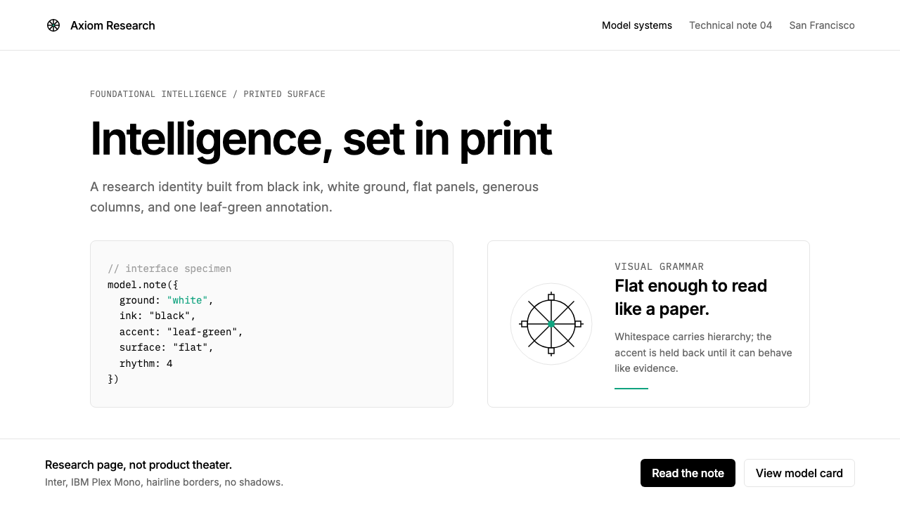 OpenAI 2024Research-grade restraint. Black-on-white Inter, flat code panels, one leaf-gr…研究级克制:黑白 Inter、扁平代码框、一枚叶绿色标记。
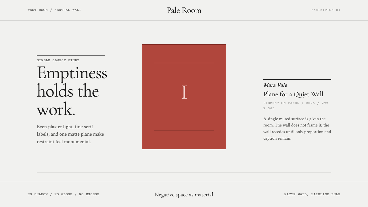 White Cube GalleryEmptiness is the medium. Cormorant labels and one terracotta plane hold the w…留白即媒介。Cormorant 标签与赭红平面撑起冷白墙。
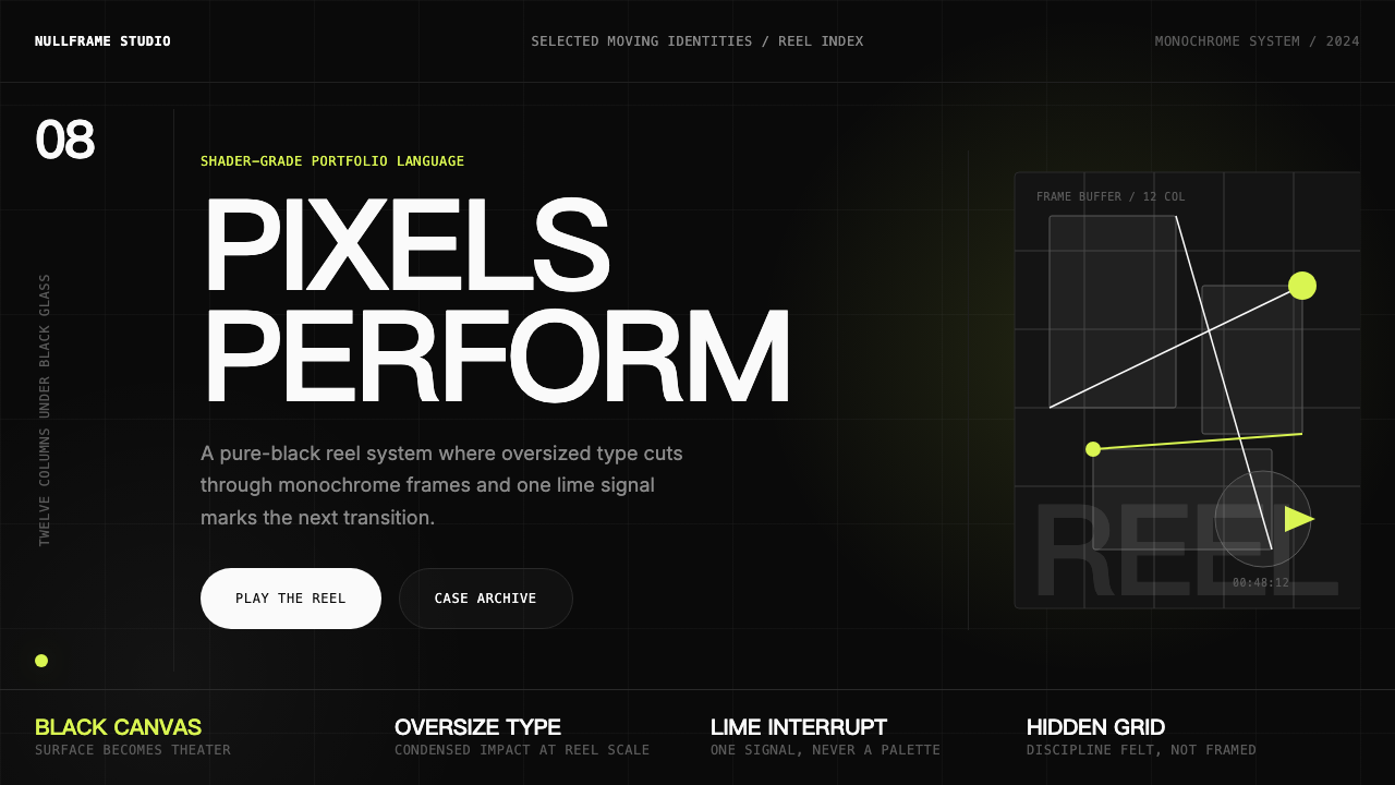 Awwwards Swiss PortfolioCinema, not interface. Black canvas, huge condensed type, and one lime signal…不是界面,是电影:黑底、巨型窄体字与一抹青柠推动作品卷轴。
 FarfetchLuxury as absence. Charcoal type, white canvas, and hairline editorial plates.奢华即留白。炭灰字、纯白画布与发丝线编辑图版。
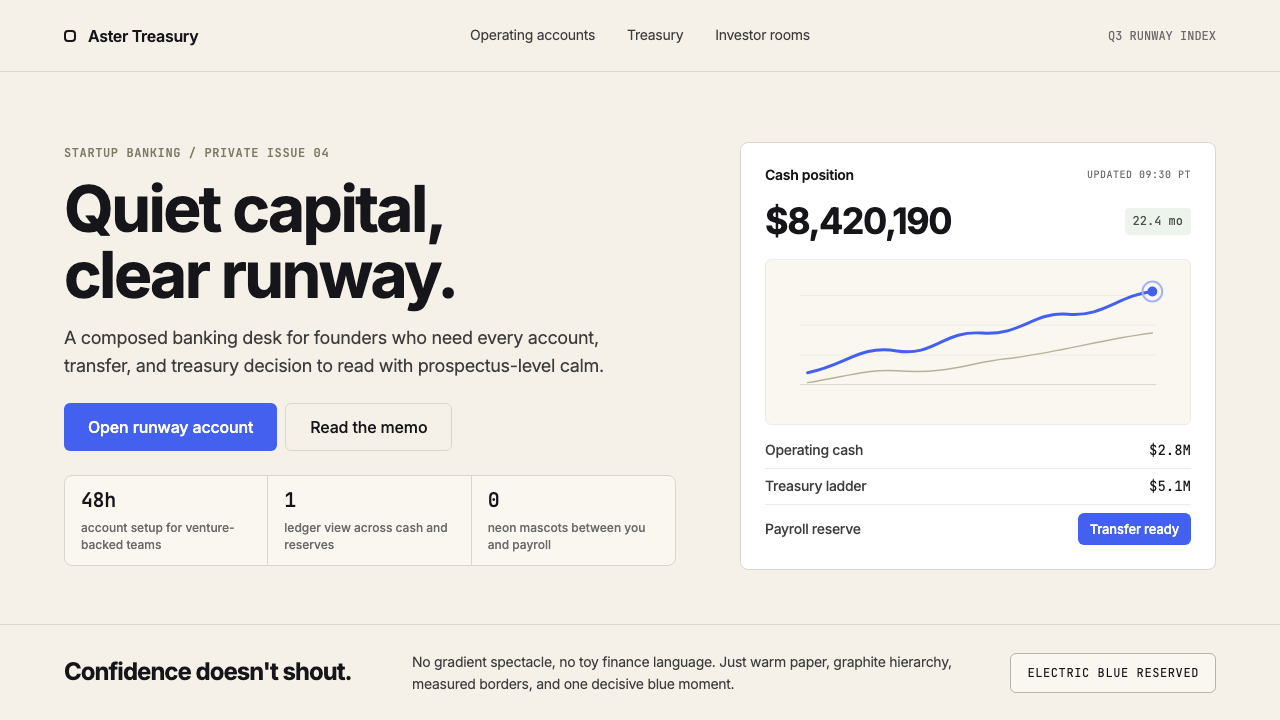 Mercury BankQuiet precision wins. Cream paper, charcoal Inter, and one electric-blue spar…安静精确胜出:奶油纸底、炭灰 Inter 与一抹电光蓝建立信任。
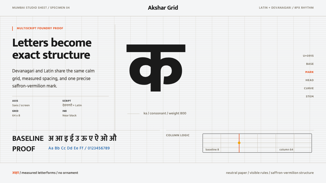 Modern Devanagari TypeType is the subject. Warm off-white grid, giant glyphs, one saffron-vermilion…字形即主角:暖灰网格、巨字形与一抹藏红朱橙。