What is Modern Devanagari Type?
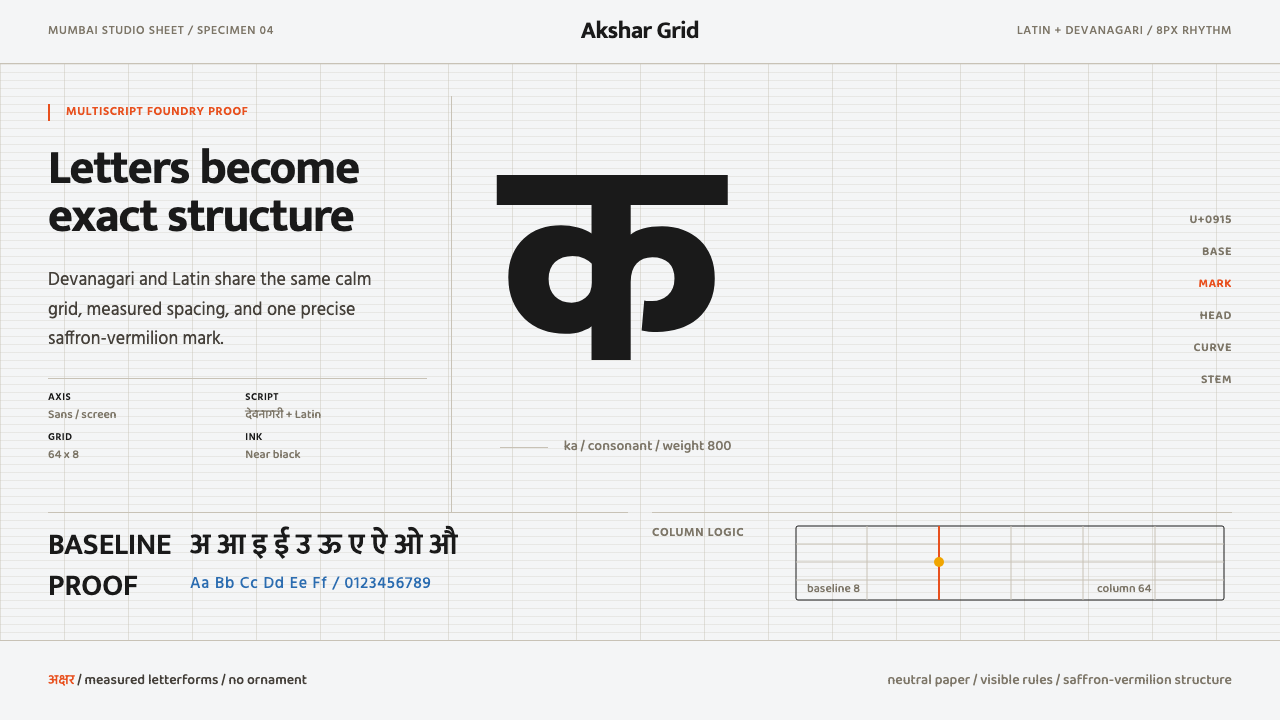
Modern Devanagari Type treats the letterform itself as the subject — a clean studio specimen sheet where giant glyphs, a strict grid, and one saturated rule do all the talking.
Modern Devanagari Type in brief
Modern Devanagari Type is the visual language of a new generation of Indian type foundries who treat the Devanagari letterform as a precise, rational object to be studied and displayed, rather than an ornament to be wrapped around a message. The page reads like a working type specimen sheet: a warm-neutral off-white canvas, a strict modular grid, and a single saturated saffron-vermilion accent carrying the entire color budget.
Nothing in this system is decorative in the traditional sense. The design's content is the type itself — vast glyph showcases at dramatic scale, baseline rules left visible rather than hidden, column structures that organize the page the way a foundry catalogue organizes a family of weights, and disciplined negative space around every character so that its full form can be read without competition.
The system is multiscript by default. Devanagari and Latin type are set side by side within the same rational grid, at matched scale and rhythm, exactly the way a working type foundry presents a typeface family that ships with both scripts. This is not a Devanagari accent added to a Latin-first layout — it is a genuinely bilingual specimen where either script could be read first.
Where does Modern Devanagari Type come from?
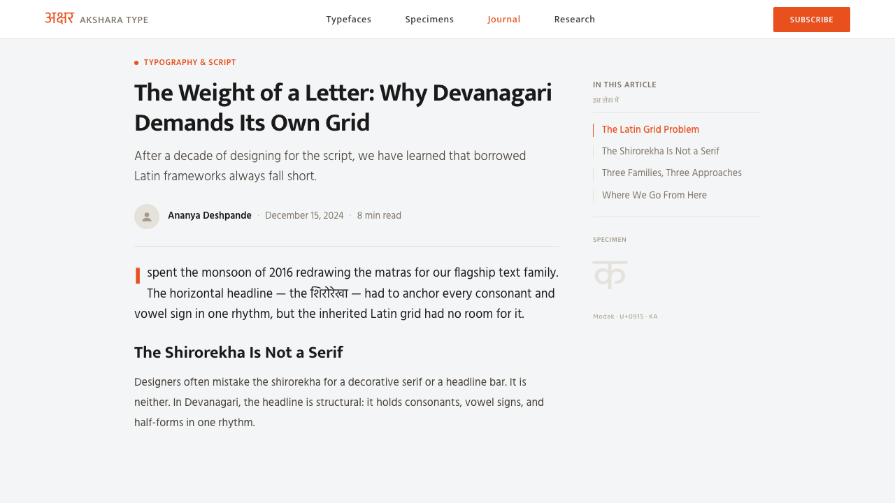
Devanagari is the script used to write Hindi, Marathi, Nepali, Sanskrit, and several other South Asian languages, and it descends from the ancient Brahmi script through a long chain of regional developments over roughly two millennia. Its most distinctive structural feature is the shirorekha, the continuous horizontal line that runs along the top of most characters and visually links the letters of a word into a single connected unit — a feature with no real equivalent in Latin type design, and one that makes adapting historical Latin type logic directly onto Devanagari a poor fit.
For most of the twentieth century, Devanagari type available for print and later for digital use was comparatively limited in range compared to Latin type, often adapted from a small number of metal-type era designs rather than drawn as original digital families. That began to change significantly from the 2000s onward, as a new generation of Indian type designers and foundries began treating Devanagari type design as a serious, well-funded discipline in its own right rather than an afterthought to Latin type licensing.
Mumbai-based Ek Type became one of the most visible players in this shift, building a studio practice explicitly centered on treating Devanagari letterforms with the same rigor, research, and display-specimen culture that Latin type foundries had long applied to their own scripts. Alongside foundries such as Indian Type Foundry, this generation of studios began publishing type specimens that showcased Devanagari families at large scale, with visible construction grids and technical annotation — treating the letterform itself as worthy of the same graphic attention a poster or a product would receive.
This foundry culture is the direct source of the modern system's aesthetic: the warm off-white ground and modular grid are the working materials of a type specimen sheet, the giant glyph display is the foundry's habit of showing a letterform at a scale no reader would ever encounter in body text, and the disciplined multiscript pairing of Devanagari and Latin reflects the real, everyday requirement that a contemporary Indian typeface ship in both scripts for a bilingual national market.
What defines the Modern Devanagari Type look?
Color
The canvas is a warm-neutral off-white rather than a stark paper white or a cool gray, giving the whole system a slightly organic, printed-paper warmth. Against it, a single saturated saffron-vermilion accent — used for a rule, a baseline marker, or a small annotation — is the system's entire color statement; everything else stays in ink-black or the warm ground tone.
Typography as Subject
The Devanagari letterform is displayed at a scale far beyond anything encountered in ordinary reading — a single character or short glyph cluster can occupy most of a page. This is the specimen-sheet habit of showing a letterform large enough that its construction, proportion, and stroke logic become visible in a way normal-size text never allows.
The Shirorekha as Structure
The continuous horizontal headline that runs across Devanagari letterforms is treated as a genuine structural element in layout, not just a linguistic feature to render correctly. It is echoed in the surrounding grid — rule lines, baseline markers, and column dividers pick up the same horizontal discipline the script itself already carries.
Modular Grid
A strict, visible column and baseline grid organizes every page, in the manner of a working type foundry's internal specimen documents. Grid lines are often left partially visible rather than hidden after layout, signaling that the composition's rigor is itself part of the message.
Multiscript Pairing
Devanagari and Latin type are set at matched scale, weight, and rhythm within the same grid, reflecting the real bilingual requirement of a contemporary Indian typeface family. Neither script is treated as primary with the other as a translation; both are shown as first-class citizens of the same design system.
Negative Space
Disciplined empty space surrounds every glyph and every text block, so that scale and structure — rather than density — carry visual interest. A page may show a single giant character with the rest of the canvas left empty, trusting that the letterform's own construction is compelling enough to fill the page.
Zero Ornament
There is no decorative border, no illustrative flourish, no pattern derived from textile or manuscript tradition. Every visual choice serves the display or study of the letterform itself; anything that does not serve that purpose is treated as noise and removed.
Who shaped Modern Devanagari Type?
A Mumbai-based type foundry that treats Devanagari letterform design with the same rigor, research culture, and specimen-driven presentation long applied to Latin type, publishing large-scale glyph showcases that became a reference point for the wider contemporary Indian type movement.
One of the foundries central to expanding the range and technical quality of digital Devanagari typefaces available to designers, helping establish Devanagari type design as a well-resourced discipline rather than an adaptation of existing Latin families.
The broader generation of type designers working across Mumbai and other Indian design centers from the 2010s onward built the specimen-sheet visual culture — giant glyphs, visible grids, disciplined multiscript pairing — that defines the modern Devanagari type aesthetic.
How do you use Modern Devanagari Type today?
Modern Devanagari Type is a discipline built on letting typography itself carry the design, and applying it well means resisting the urge to add illustration or texture where the letterform should be doing the work. The two non-negotiables are the warm off-white ground and the single saffron-vermilion accent; nearly everything else should reinforce the grid and the scale of the type.
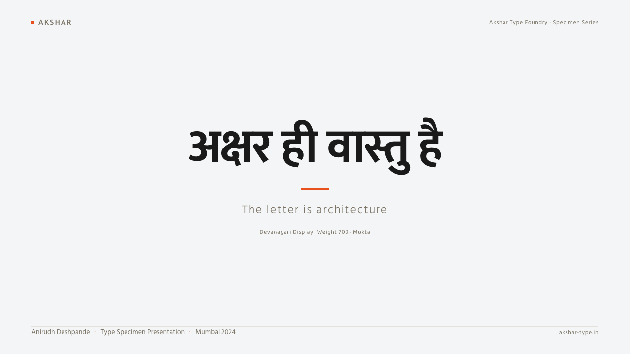
For presentation slides, a cover works well built around a single giant glyph or word treated at dramatic scale against the off-white ground, with a thin saffron-vermilion rule marking a baseline or section division. Content slides should keep the modular grid visible where practical — column guides, baseline markers — and reserve the accent color strictly for structural marks like dividers or numbering, never for large fills.
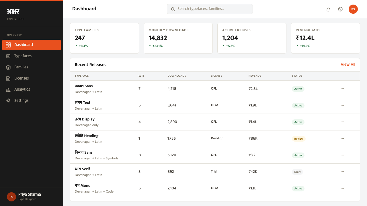
For web interfaces, the system suits editorial and portfolio-style pages, foundry or type-focused product pages, and any brand wanting to foreground craftsmanship in language and communication. A hero section built around large bilingual type treatment, generous surrounding space, and a single accent-colored rule or button captures the discipline well. Dense data interfaces are a weaker fit, since the system's core strength is typographic display rather than information density.
For editorial and marketing work, the style rewards headline-led layouts: a masthead or title set at large scale in both scripts, wide margins, and pull quotes that use scale and weight rather than color or boxes to signal importance. Marketing pages benefit from letting the type itself be the hero image — no photography required when a well-constructed glyph at full scale can carry the same visual weight.
A common mistake is treating the saffron-vermilion accent as a background color to fill large areas, which collapses the specimen-sheet restraint the system depends on; the accent should always read as a rule, a mark, or a small annotation, never a field. A second common mistake is pairing Devanagari display type with a Latin companion that does not match its weight or rhythm, which breaks the multiscript coherence that is central to this style's authority.
Modern Devanagari Type — FAQ
Is this style just a Devanagari version of generic Swiss typographic minimalism?
There is a real kinship — both traditions foreground grid, scale, and typographic hierarchy over illustration. But Modern Devanagari Type is specifically shaped by problems Swiss typography never had to solve, chiefly the shirorekha headline and the technical challenge of building a genuinely matched multiscript pairing between Devanagari and Latin. The grid discipline is shared; the letterform problem it is solving is distinct.
Why does the system use an off-white ground rather than pure white?
A warm-neutral off-white evokes the printed specimen sheets and paper stock long used by type foundries, giving the system a slightly tactile, crafted quality rather than the colder feel of a pure digital white. It also lowers overall contrast slightly, which keeps the giant glyph displays from feeling harsh at large scale.
Does this style require actual Devanagari content, or can the grammar be borrowed without the script?
The compositional grammar — giant glyph display, visible modular grid, single accent rule, disciplined negative space — can transfer to other scripts or even to Latin-only content. But calling the result 'Devanagari type' when no Devanagari is present misrepresents the source; the style's specific identity comes from treating this particular script's structure, especially the shirorekha, as the subject.
How should Latin type be chosen to pair with a Devanagari display face?
The pairing should match in weight, proportion, and rhythm rather than simply looking pleasant side by side — this is precisely the technical work contemporary Indian type foundries specialize in. A mismatched pairing, where one script reads as heavier or more ornate than the other, breaks the sense that both scripts belong to a single coherent family.
Is this style suited to dense information products like dashboards or data tables?
Not naturally. Its strength is typographic display at generous scale with disciplined negative space, which works against the density dashboards typically require. It is better suited to brand pages, editorial features, and portfolio or foundry-style presentations where craftsmanship in language and communication is the point, rather than to interfaces optimized for scanning large volumes of numeric data.
Related design styles
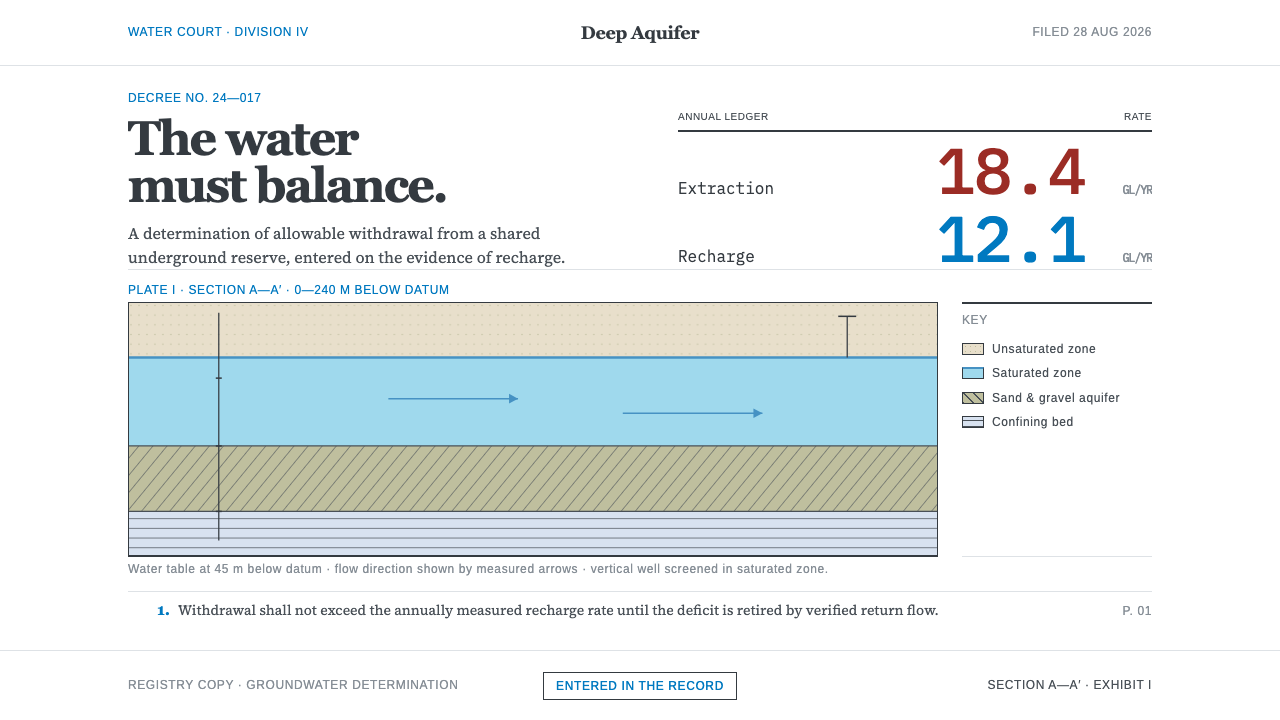 Deep Aquifer Water CourtRestraint makes the deficit undeniable. White bond, book serif, and a keyed a…
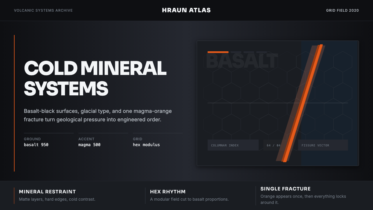 Icelandic Basalt VolcanoCold geology, engineered. Basalt black, Sora type, and one magma fissure hold…
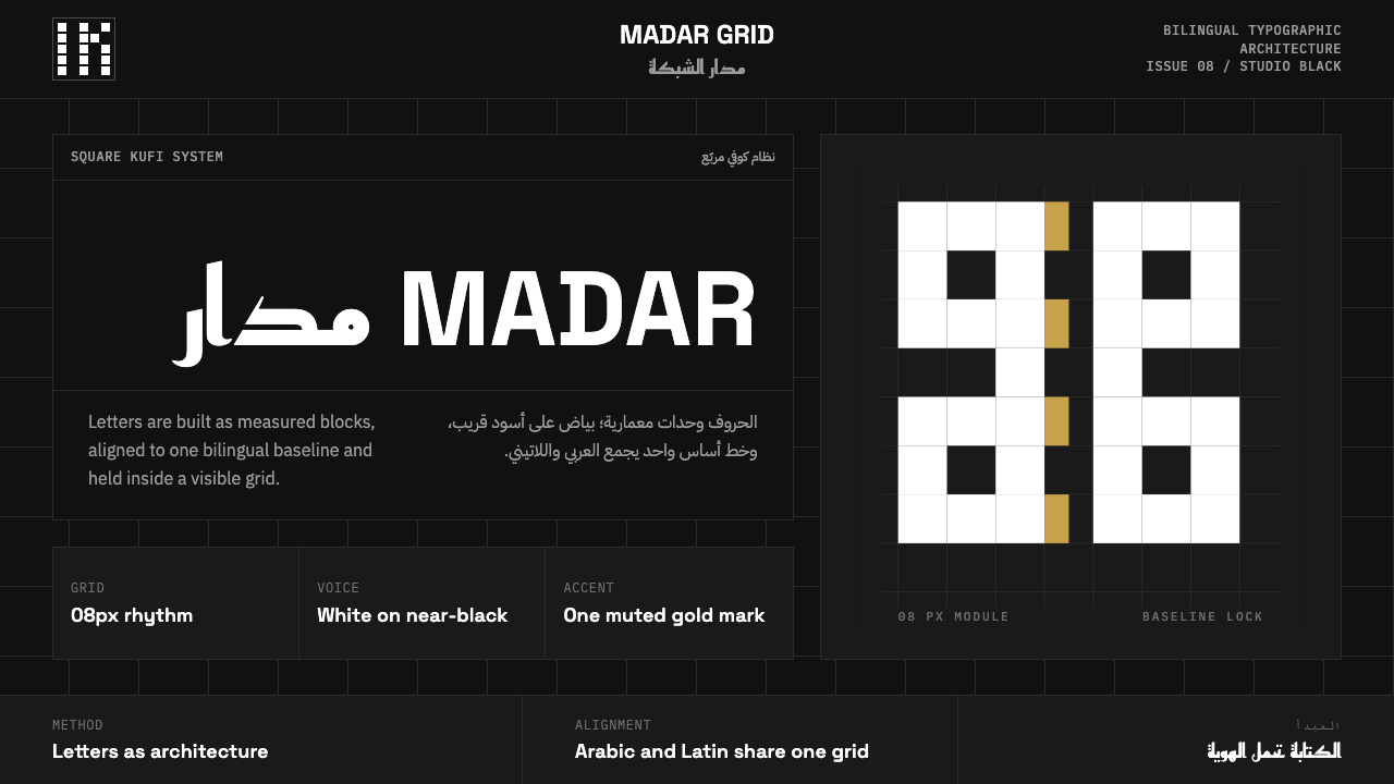 Modern Kufi BrandingRestraint becomes architecture. White Kufi blocks on near-black obey a biling…
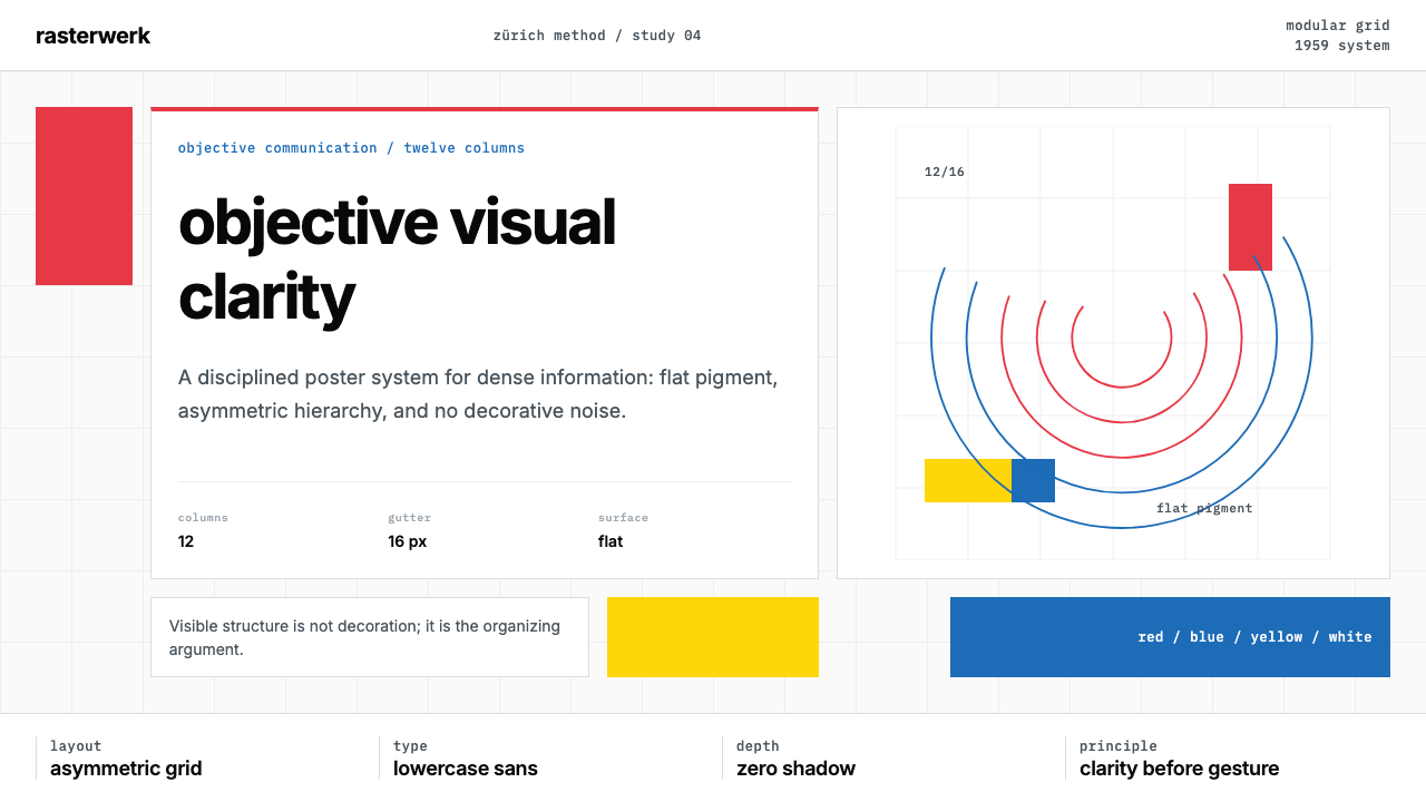 Müller-Brockmann SwissClarity is the system. Inter grids, red-blue blocks, and concentric arcs make…
 Wim Crouwel GridGrid becomes freedom. Cobalt, red and yellow blocks lock Inter type to a 12-c…
 Airport Baggage TagBuilt to be read in motion. Burned-black codes, hard rules and functional cha…