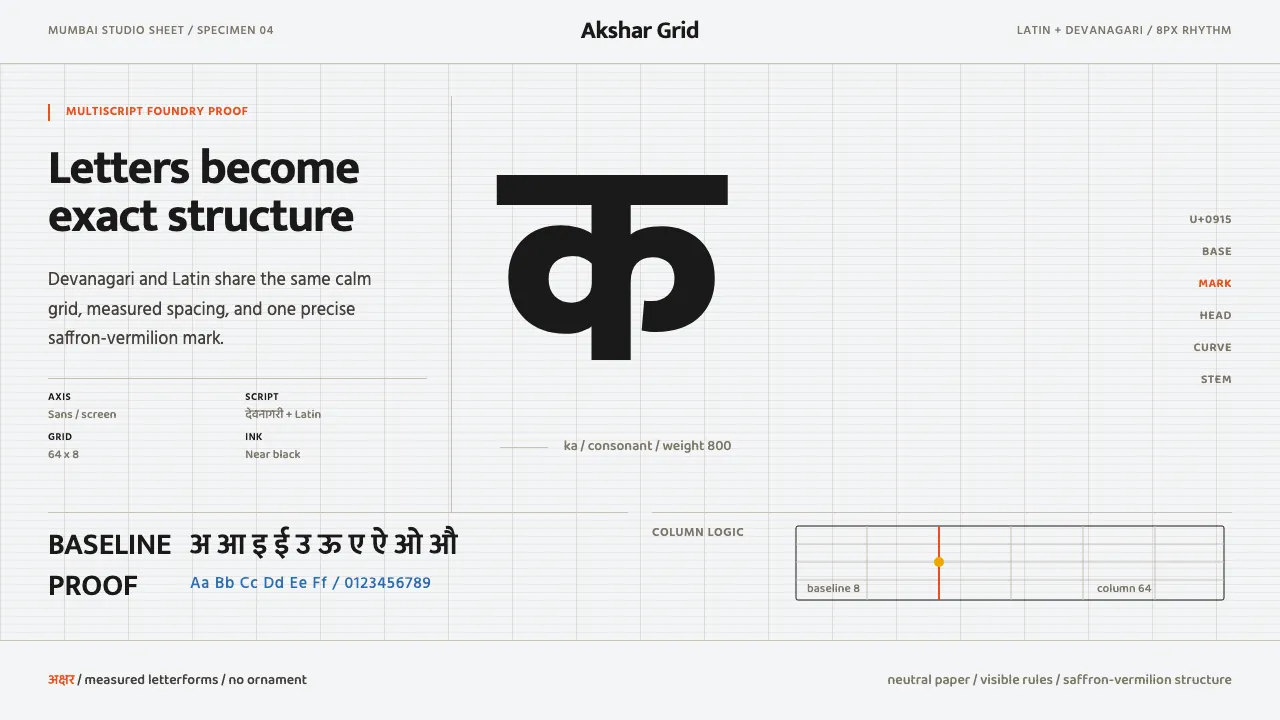
About Modern Devanagari Type
Modern Devanagari Type takes its cue from Mumbai's Ek Type and the wider wave of contemporary Indian foundries that treat the Devanagari letterform as a precise, rational object rather than an ornament. The page is a clean studio specimen sheet: a warm-neutral off-white canvas where a strict modular grid and a single saturated saffron-vermilion accent do all the work.
Nothing is decorative. Type carries the design — vast glyph showcases, baseline rules, column structure, and disciplined negative space. It is multiscript by default: Devanagari and Latin set side by side in the same rational system, the way a working type foundry presents its families.
- Origin
- Mumbai, India (Asia South)
- Era
- 2010–present; contemporary Indian type-foundry practice
- Key figures
- Ek Type · Indian Type Foundry
- Movements
- Contemporary Devanagari type design · Modular-grid type specimens · Minimalist multiscript typography
Modern Devanagari Type design spec
Colors
Typography
The other 11 sections — buttons, cards, spacing, motion, techniques and more — open once you unlock. Download the DESIGN.md or send it to your AI in one click. Unlock once, yours forever.
Sign up nowStyles similar to Modern Devanagari Type
Also inspired by print & type, with a close feel.
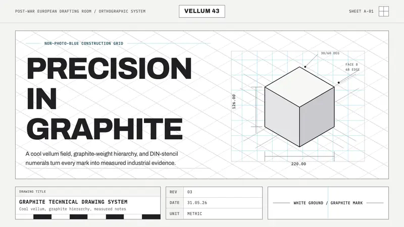 Graphite Technical DrawingDrafting-room precision. Non-photo-blue grid and graphite DIN lettering do the work.
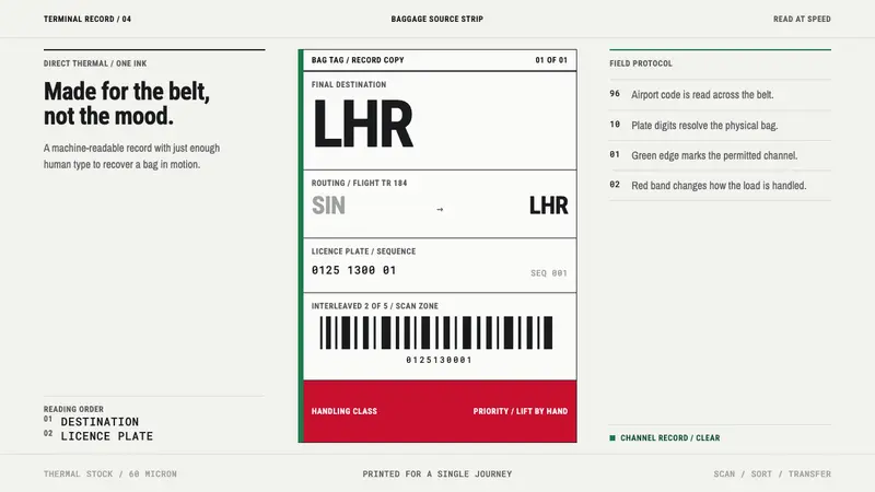 Airport Baggage TagBuilt to be read in motion. Burned-black codes, hard rules and functional channel flags.
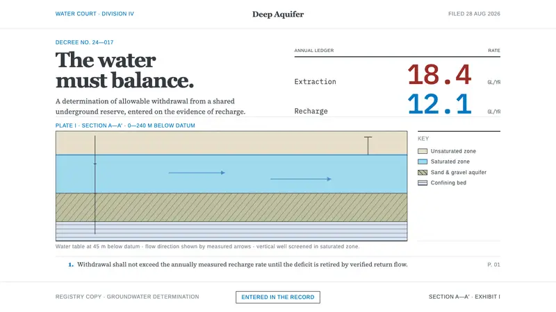 Deep Aquifer Water CourtRestraint makes the deficit undeniable. White bond, book serif, and a keyed aquifer section frame two rates.
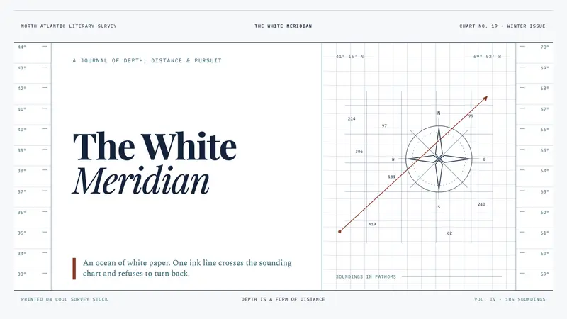 Moby-Dick (1851)White space becomes open sea. Ink-navy rules and oxblood bearings pull across a cold chart.