What is Modern Kufi Branding?
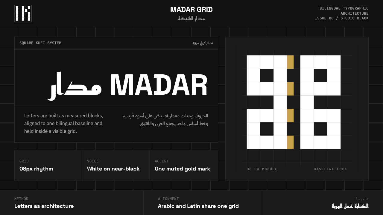
Modern Kufi Branding treats square, modular Arabic letterforms as architecture — restraint on a near-black ground, where the writing itself is the whole identity.
Modern Kufi Branding in brief
Modern Kufi Branding is the contemporary studio language built around geometric Kufic Arabic: letterforms constructed from squares and right angles, set as monochrome white blocks against a strict near-black ground, with Arabic and Latin type sharing a single rigorous baseline grid.
The style is defined by what it refuses as much as by what it includes. There is no calligraphic flourish, no ornamental border, no gradient — only disciplined geometry and a near-total absence of color, with a single muted gold or red permitted as the sole accent. This is branding built on the conviction that a script this precise does not need decoration to carry weight; it needs space to be read.
Because the system is bilingual by design, it also solves a problem that pure Arabic calligraphy traditions never had to: making Arabic and Latin type feel like a single coherent voice rather than two competing scripts bolted together. Baselines align, weights are matched, and scale is coordinated, so a wordmark reads as one designed object regardless of which script a viewer's eye lands on first.
Where does Modern Kufi Branding come from?
Kufic is one of the oldest formal styles of Arabic script, taking its name from the city of Kufa in present-day Iraq, where it developed in the seventh and eighth centuries as the script of choice for early Quran manuscripts and monumental stone inscriptions. Its earliest forms are angular and deliberate — broad, low horizontal strokes and sharp verticals suited to being carved or drawn with a reed pen at scale, rather than the flowing cursive later associated with everyday Arabic handwriting.
Over the following centuries, Kufic branched into many regional and functional variants, but one branch is especially relevant to the modern system: square Kufic, sometimes called banna'i or 'brick' Kufic, which emerged in Central Asian and Persian architecture as a way to render words entirely from straight segments set on a strict grid — effectively composing script the way a mosaic tilesetter composes a pattern. This construction method, which reduces every letterform to a small number of grid-aligned strokes, produced inscriptions on minarets, mausoleums, and mosque facades that read as geometric ornament and legible text simultaneously.
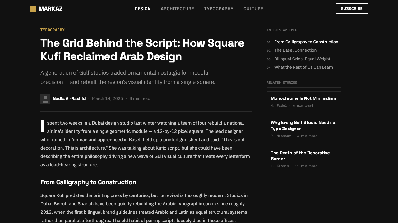
That grid-based, architectural quality of square Kufic is what the contemporary revival picked back up, starting roughly in the 2010s as a new generation of Arabic type foundries in Dubai, Doha, Beirut, and Cairo began designing digital typefaces for a growing market of regional brands, media companies, and cultural institutions that wanted an Arabic visual identity rooted in something older than mid-century commercial Arabic type, but far removed from calligraphic pastiche. Type houses such as 29LT and typefaces such as Reem Kufi became reference points for this movement, treating the geometric Kufic letterform as a serious contemporary display face rather than a historical curiosity.
The movement grew alongside — and was shaped by — the practical demands of bilingual branding across the Gulf and Levant, where nearly every commercial and institutional identity needs to function in both Arabic and Latin script simultaneously. Type designers working in this space had to solve genuinely new problems: how to give a squared, modular Arabic display face a Latin companion that shares its proportions and weight, and how to build baseline and spacing systems that let both scripts sit in the same grid without either one looking like an afterthought.
What defines the Modern Kufi Branding look?
Color
The palette is almost entirely monochrome: white or ivory letterforms against a near-black ground, with color rationed to a single muted gold or deep red used only as a rare accent — a rule, an underline, a small mark — never as a field. The restriction is deliberate: it forces every ounce of visual interest into the letterform and the grid rather than into decoration.
Typography
Arabic letterforms are constructed from squares and straight segments rather than the flowing curves of traditional calligraphy, giving each character a modular, almost architectural quality. The Latin companion type is chosen or drawn to match this geometric discipline — clean, unadorned, and weight-matched — so the two scripts read as a single voice rather than a translation bolted on after the fact.
Bilingual Grid
A single strict grid governs both scripts at once: baselines align across Arabic and Latin, cap-heights and x-heights are calibrated to feel proportionate side by side, and margins are shared rather than independently set. This is the system's most technically demanding move, and also its clearest signature — nothing in the layout suggests one script was designed first and the other adapted afterward.
Geometry
Every letterform, whether Arabic or Latin, is reducible to a small vocabulary of squares, right angles, and straight segments — the same construction logic that square Kufic used on stone centuries ago, now rendered in vector precision. Curves, where they exist at all, are kept minimal and structural rather than decorative.
Negative Space
Generous, unbroken dark field surrounds the letterforms; the near-black ground is treated as an active compositional element, not empty background waiting to be filled. This is what allows a monochrome, single-accent palette to feel rich rather than sparse — the darkness itself does compositional work.
Restraint as Identity
The system's central discipline is refusal: no calligraphic flourish, no ornamental border, no gradient fill, no more than one accent color at a time. What remains after every possible addition is stripped away is treated as the actual brand identity — the writing, precisely rendered, is enough.
Who shaped Modern Kufi Branding?
Zoghbi founded 29LT, one of the type foundries most closely associated with the contemporary Arabic type revival, and has published extensively on the intersection of Arabic typography and regional visual identity — work that helped establish geometric Kufic as a serious contemporary display option rather than a historical reference.
A type designer known for her research into Arabic typeface legibility and her work adapting major Latin type families into Arabic companions, Chahine's work is a reference point for the bilingual-grid discipline central to modern Kufi branding — building Arabic and Latin faces that genuinely share proportion and rhythm.
A type designer working across Arabic and Latin scripts, Apelian's contribution to the field lies in treating multiscript type design as a single unified design problem rather than two separate scripts translated into each other, reinforcing the coherence that defines the contemporary bilingual branding movement.
Known for open-source Arabic type design and typesetting tools, Hosny's work broadened access to high-quality Arabic typefaces and technical typesetting infrastructure, supporting the wider ecosystem of studios and independent designers now working in the geometric Kufic idiom.
How do you use Modern Kufi Branding today?
Modern Kufi Branding is a restraint-first system, and applying it well means resisting the urge to add rather than the urge to remove. The near-black ground and the strict bilingual grid are the two non-negotiables; almost every other decision should be in service of making the letterforms and the negative space around them do more work with less material.
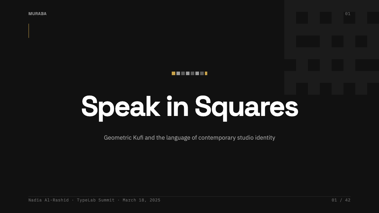
For presentation slides, a cover works well as pure typography: a wordmark or title in geometric Kufic paired with its Latin companion, centered or grid-aligned on a near-black field, with the single accent color reserved for one small mark. Content slides should keep body text sparse and left-aligned within the shared grid, using the accent color only for the rare emphasis — a section number, a single underline — rather than for headers throughout.
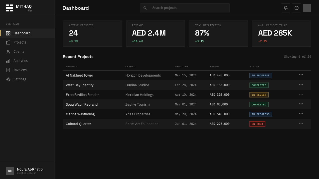
For web interfaces, the system suits brand and marketing pages more naturally than dense dashboards, since its strength is identity rather than data density. A dark-ground hero section with large bilingual wordmark treatment, generous vertical space, and a single accent-colored call-to-action button captures the style's core discipline. Where data or tables are required, keep them monochrome with the accent reserved strictly for status or primary actions, never decoration.
In editorial and marketing contexts, the style supports confident minimal layouts: a masthead or headline set bilingually at large scale, wide margins, and pull quotes rendered in the same geometric Kufic treatment as headlines rather than in a softer secondary face. Marketing pages benefit from full-bleed dark sections that let the wordmark or headline breathe against real negative space rather than a busy background.
A common mistake is importing decorative or calligraphic Arabic type into this system, which immediately breaks its logic — the whole point of the geometric Kufic revival is precision and grid discipline, not the expressive flourish associated with classical calligraphy. A second common mistake is using more than one accent color at once, or applying the accent as a background fill rather than a rationed mark; both moves dilute the restraint that gives the style its authority.
Modern Kufi Branding — FAQ
Is Modern Kufi Branding the same as traditional Arabic calligraphy?
No, and the distinction matters. Traditional calligraphy, including cursive styles like Naskh or Thuluth, is built on flowing, connected strokes and expressive variation in line weight. Modern Kufi Branding descends instead from square Kufic, a much more architectural, grid-based construction method in which letters are built from straight segments — closer to geometric type design than to calligraphic penmanship.
Why is the ground almost always near-black rather than white?
A dark ground lets the white or ivory letterforms sit forward with maximum contrast while keeping the overall composition calm rather than stark; a pure black-on-white treatment tends to read as harsher and less architectural. The near-black also reinforces the sense that the letterforms are carved or inlaid objects sitting in space, echoing the stone and tile origins of square Kufic.
How difficult is it to make Arabic and Latin type feel like one system?
It is one of the hardest problems in multiscript design, because the two scripts have fundamentally different structural logic — connected cursive forms in Arabic versus separate letterforms in Latin. Solving it requires matching weight, proportion, and baseline behavior deliberately rather than simply setting a Latin face alongside an Arabic one and hoping they harmonize; this is precisely the technical work that defines the contemporary geometric Kufic movement.
Can this style work with more than one accent color?
It is possible but risky. The style's authority comes specifically from rationing color to a single accent — using it consistently for one kind of signal, such as a call-to-action or a section marker. Introducing a second accent color usually requires very disciplined separation of purpose, otherwise the composition starts to read as generic dark-mode branding rather than the specific, restrained system it descends from.
Does this style suit brands outside the Middle East?
It transfers well to any brand seeking a precise, architectural, and restrained identity, regardless of region — the underlying logic of grid, geometry, and rationed color is not culturally exclusive. That said, using the actual geometric Kufic script meaningfully requires a real bilingual or Arabic-facing context; borrowing the visual grammar (monochrome, grid, single accent) without the script itself is a legitimate adaptation, but calling it Kufic when no Arabic is present misrepresents the source.
Related design styles
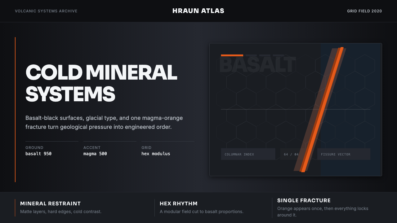 Icelandic Basalt VolcanoCold geology, engineered. Basalt black, Sora type, and one magma fissure hold…
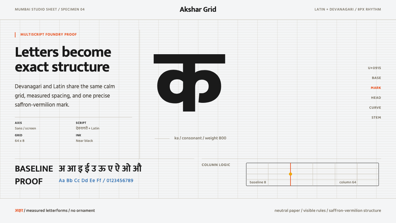 Modern Devanagari TypeType is the subject. Warm off-white grid, giant glyphs, one saffron-vermilion…
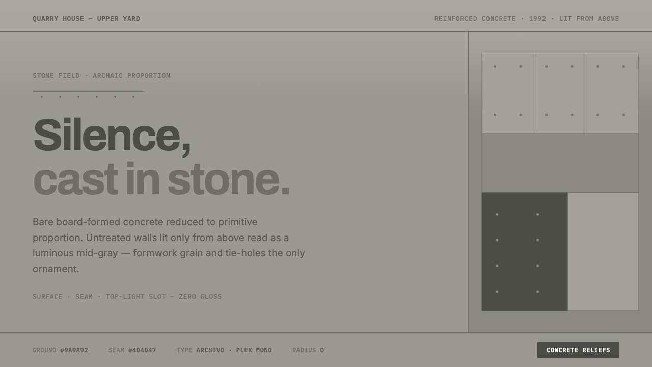 Peter Märkli Concrete ReliefsSilence cast in stone. Luminous mid-gray concrete, hairline formwork seams, t…
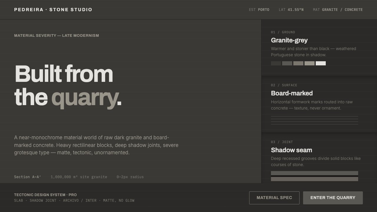 Souto de Moura GraniteArchitecture as raw matter. Dark Portuguese granite ground, board-marked conc…
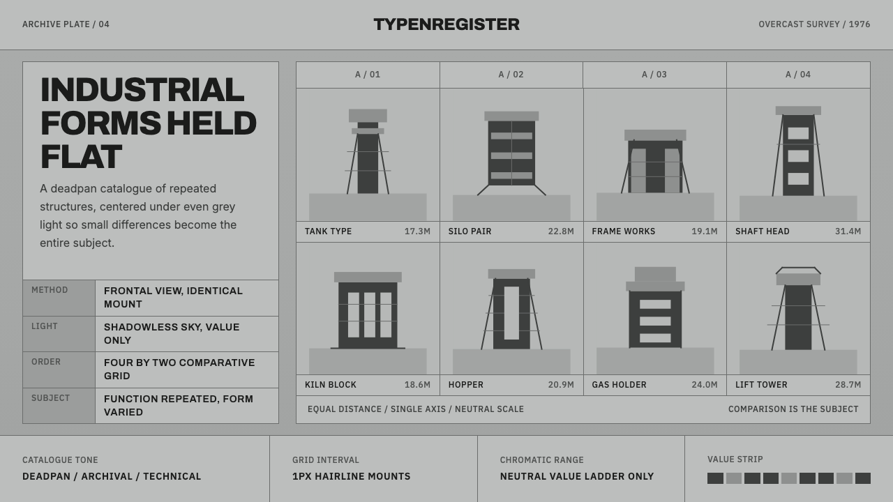 Bechers Industrial TypologyDeadpan order. Mid-grey ground, Archivo labels, and strict hairline grids rev…
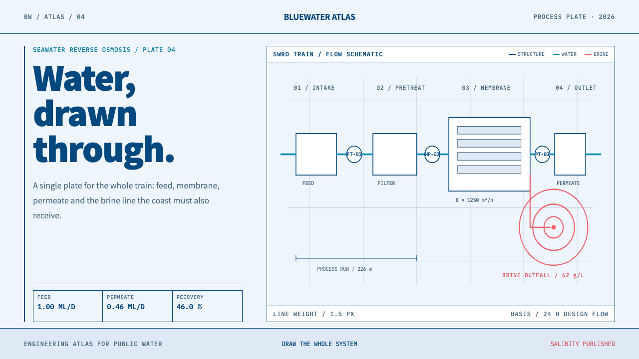 Desalination MegaplantInfrastructure made legible. Navy process lines map cyan water flow and coral…