What is Giant's Causeway Basalt?

Giant's Causeway Basalt is a design system forged from geology — the wet matte stone, fractured hexagonal geometry, and cold iron-oxide palette of Northern Ireland's most elemental coastline, translated into a rigorous editorial language for screens and pages.
Giant's Causeway Basalt in brief
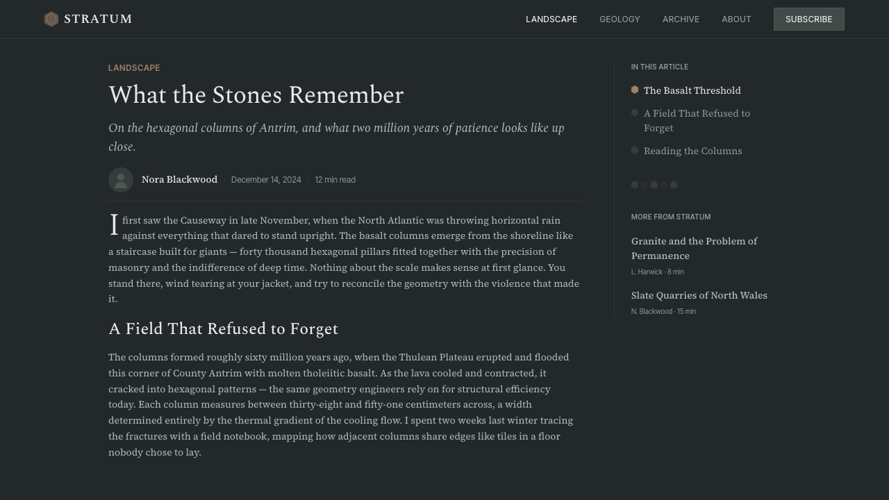
Giant's Causeway Basalt draws its entire visual vocabulary from one geological event: the cooling and fracturing of a Paleogene lava flow along the Antrim coast of Northern Ireland roughly 50 to 60 million years ago. As the tholeiitic basalt solidified, thermal contraction cracked it into roughly 40,000 interlocking hexagonal columns — a natural tessellation of uncanny precision. The design system reads this landscape the way contemporary geo-photography does: as a study in cold neutrals, fractured regularity, and the damp matte surface of very old stone.
The palette is anchored in the chromatic reality of basalt under North Atlantic light: deep charcoal grounds, slate-blue midtones, and the pale gray of rain-wet rock faces, with hairline accents in weathered iron oxide — a faint rust that appears where mineral seepage has traced itself across the stone. Type is set in literary serifs that suggest printed scientific atlases and geological survey documents, lending a scholarly authority that contrasts with the raw material it describes.
Formally, the system is organized around the hexagon: column-edge dividers mark section boundaries, tessellated grid overlays structure layouts, and decorative motifs derive their geometry strictly from the six-sided polygon. The discipline is geological in spirit — nothing is added that the rock itself would not produce. No warmth, no gloss, no softness.
Where does Giant's Causeway Basalt come from?
The Giant's Causeway itself was formed during the Paleogene period, when a massive effusion of tholeiitic basalt lava flooded the Antrim plateau. As the lava cooled slowly from the top and bottom surfaces, it contracted with remarkable uniformity, fracturing into the hexagonal columns that define the site today. The columns range in height from a few centimeters at the coastal edge to over twelve meters further inland, and the cross-sections vary — most are hexagonal, some pentagonal or heptagonal — but the clustering creates an impression of engineered regularity that has astonished visitors since the seventeenth century.
European natural philosophers were fascinated and divided by the Causeway. The Reverend Richard Bulkeley presented the first written account to the Royal Society in London in 1693, and the site became a touchstone of early geological debate: could nature alone produce such geometric order, or was it the work of a 'giant' — the mythological Fionn mac Cumhaill of Irish legend, said to have built a road across the sea to Scotland? The systematic geological explanation, based on the physics of columnar jointing during basalt cooling, was worked out gradually through the eighteenth and nineteenth centuries, culminating in a scientific consensus that displaced the mythological one without entirely displacing its imaginative power.
UNESCO designated the Giant's Causeway a World Heritage Site in 1986, citing its outstanding geological significance and the exceptional clarity with which it illustrates the process of columnar basalt formation. This formal recognition cemented its status as the canonical site for the study of this geological phenomenon — one that appears at other locations worldwide, including Fingal's Cave in Scotland, the Devil's Postpile in California, and the basalt fields of Iceland, but nowhere with the same combination of scale, accessibility, and visual drama.
The design tradition that the system draws upon is not the landscape itself but the contemporary photographic and documentary culture that has grown up around it: the cold, high-contrast editorial photography of coastal geology, the restrained gray-on-gray palette of natural history publishing, and the diagrammatic precision of geological survey illustration. These visual languages — forged in the twentieth century — translate the Causeway from a tourist destination into a formal source of design logic.
What defines the Giant's Causeway Basalt look?
Color
The palette is exclusively derived from the mineral reality of wet basalt: very deep charcoal grounds that read as near-black without true black's harshness, cool blue-gray midtones modeled on the slate-blue of column faces in overcast North Atlantic light, and pale near-white highlights suggesting the bleached top surfaces of the tallest columns above the tideline. The single chromatic departure is iron-oxide — a muted, desaturated rust appearing only as hairline accents, tracing the mineral weathering paths visible on the real stone. No warm tones, no saturated hues, no borrowed color from outside the geology.
Typography
The typographic choice is the literary serif — the kind of high-contrast typeface associated with nineteenth-century natural history atlases, geological survey publications, and scientific monographs. These faces carry an authority that connects printed scientific knowledge to material reality. They are set with generous leading and careful measure, prioritizing readability over display drama. Contrasting scale marks hierarchy: primary headings are large and widely tracked, body text is dense and intimate, captions are diminutive. No ornamental flourishes are permitted on letterforms, but ligatures and oldstyle figures are encouraged as scholarly marks appropriate to the material.
Hexagonal Grid
The hexagonal column is the structural module of this system, as the rectangular grid is to Swiss International Style. Layouts are organized around hexagonal tessellations used as sectional containers, background overlays, or explicit decorative fields. Section dividers echo the vertical join lines between columns. In digital interfaces, cards and panels may be edge-defined by the six-sided geometry. The grid is not rigid — natural basalt columns vary slightly in their cross-sections — and this slight irregularity is preserved: the system allows for controlled variation within the tessellation, avoiding the mechanical perfection that would betray the geological source.
Surface and Texture
Basalt has a distinctively matte, fine-grained surface — no shine, no translucency, no reflective quality. This material character translates directly: the system avoids all gloss effects, gradients, and specular highlights. Backgrounds read as matte stone rather than polished material. Where subtle variation appears — a field that is almost but not quite uniform — it is modeled on the micro-texture of the rock face rather than on graphic noise or grain. The effect is geological: cool, still, old.
Dividers and Structural Lines
The vertical joint lines between basalt columns — fine dark fissures running the full height of each column — translate into a distinctive divider language. Hairline vertical rules and column-edge borders are used to structure sections, separate content areas, and mark the boundaries between typographic zones. Horizontal rules appear at section transitions, mimicking the horizontal fracture planes visible on the column tops. These lines are always fine, always in the palette's darkest neutral, and always structural rather than decorative — their logic is the logic of the rock's own jointing pattern.
Depth and Shadow
Depth in this system comes not from cast shadows or elevations in the digital sense, but from the tonal contrast between column faces caught in different angles of North Atlantic light. One face reads darker; the adjacent one lighter — the same geometric form, two different luminosities. This principle translates into the interface as a tonal adjacency technique: neighboring panels or sections are distinguished by step-shifts in gray value rather than by borders or shadow effects. Where true shadow is used, it is barely perceptible — a whisper of depth, as if the element sits a millimeter above the stone surface, never a dramatic floating card.
Editorial Reserve
The system has a strong editorial personality rooted in geological documentation: measured, authoritative, slow. It does not animate urgently, does not use exclamation points in layout, and does not compete for attention through density or variety. White space — here rendered as the pale gray of the stone's bleached upper surfaces — is used generously. A layout using this system should feel like opening a well-produced natural history monograph: confident, unhurried, and arranged as if the information itself determines the form, not any desire to attract attention.

Who shaped Giant's Causeway Basalt?
Drury was the Dublin-based painter who produced the first detailed artistic record of the Causeway in 1739, creating two gouache panoramas that were engraved and widely circulated across Europe. Her images — depicting the Grand Causeway and the western coast with geological precision unusual for the era — were the primary visual record through which European natural philosophers first understood the site's scale and character. The engravings made from her paintings were awarded a premium by the Royal Dublin Society, and she is now recognized as having established the visual vocabulary that subsequent artists and, eventually, photographers would inherit.
Banks visited the Causeway in 1772, shortly before his voyage with Captain Cook's second expedition. His written account, widely read in London scientific circles, helped cement the site's reputation as a major geological curiosity at precisely the moment when the debate between Neptunists (who believed basalt was sedimentary) and Vulcanists (who correctly argued it was volcanic) was sharpening. Banks's testimony, in favor of the volcanic origin, carried significant scientific authority and helped push the debate toward the eventual correct resolution.
The mythological Irish giant said to have built the Causeway as a crossing to Scotland — either to fight or to meet his Scottish counterpart Benandonner — is not a historical figure but an imaginative force. The legend predates systematic geological study by centuries and established a narrative in which the Causeway's inhuman regularity demanded explanation through an agency more deliberate than geological process. The myth continues to shape how the site is culturally framed: even in a geological context, the columns invite the sense of intentional construction that their precision implies, and the Curio system deliberately preserves some of that uncanny quality.
The 1986 World Heritage designation formalized the Causeway's global scientific status and brought it into the framework of sites considered of 'outstanding universal value' for their geological significance. The designation functions as a historical punctuation mark: it is the moment at which the site moved from regional wonder to international scientific monument. For the design system, this institutional recognition matters because it anchors the visual tradition in documentary and scientific communication rather than in tourism — the design treats the site as a subject of serious study rather than spectacular scenery.
How do you use Giant's Causeway Basalt today?
Giant's Causeway Basalt is a system for work that demands authority and depth rather than warmth or approachability. Its natural territory is editorial, documentary, and analytical: long-form reading experiences, reports, scientific or technical communications, and products that want to position themselves as rigorous and considered. It is not a style for light consumer applications, marketplaces, or social products — the register is too cool and too slow for contexts where energy and immediate engagement are the values.
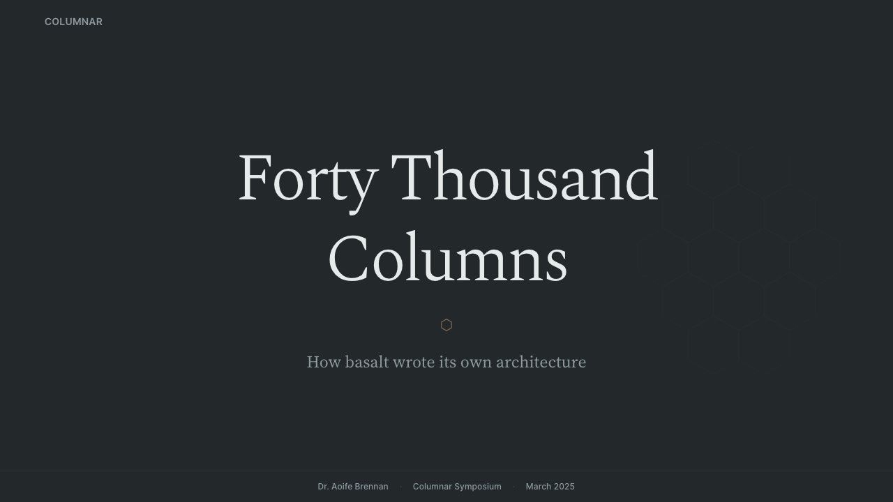
For presentation slides, this system rewards a restrained approach. Cover slides work well with a full charcoal or deep slate-blue ground, the title set in a large literary serif at generous scale, and a single thin horizontal rule or hexagonal border element as the only graphic device. Avoid the temptation to use the iron-oxide accent color broadly — it reads best as a single hairline detail on a field of near-black, not as a fill color or a primary graphic element. Content slides should be spare: generous white space rendered in the system's pale gray, body text in the literary serif at comfortable scale, and data presented as clean diagrammatic charts where the geometry of the bar or line is the only decoration.
For web interfaces, the system is most at home in contexts where the content itself has density and weight: reference products, documentation sites, research platforms, and editorial publications. In these contexts, apply the hexagonal grid logic loosely — not by literally tiling hexagons across a layout, but by using six-sided geometries as container shapes for cards, callouts, or featured content modules. The matte stone palette translates well to a dark-mode interface where the deep charcoal ground serves as the primary surface and the slate-blue midtone marks interactive elements and hover states.
For editorial and marketing work, the system's strength is its seriousness. A report or whitepaper designed in this language signals that the content is substantive rather than promotional. Long-form article layouts benefit from the typographic hierarchy: the literary serif at large scale for chapter headings, a slightly smaller weight for subheadings, and a comfortable reading size for body text, all on a ground that uses the pale stone gray for backgrounds rather than a fully saturated white. Marketing materials — if they must use this system — should rely on the scale and restraint of geological survey posters: one large statement, generous space, minimal graphic elaboration.
The most common mistake when applying this system is treating it as a generic dark theme with some hexagonal decorations added. Authentic use requires understanding that the palette is qualitatively specific — it models the chromatic range of a particular geological surface under a particular quality of light. Substituting a warmer dark tone, introducing any saturated color beyond the iron-oxide hairline, or using drop shadows with warmth or spread immediately breaks the geological logic. The discipline of the rock is also the discipline of the designer: everything absent is a decision, not an oversight.
Giant's Causeway Basalt — FAQ
Is this system only suited to dark-mode interfaces?
Not exclusively. The system has a light variant grounded in the pale gray of the Causeway's bleached upper column surfaces — an off-white with the faint cool undertone of wet stone rather than the warm cream of paper. In light mode, the deep charcoal becomes the text and structural color, the slate-blue midtone marks secondary elements and borders, and the iron-oxide accent remains as a hairline detail. The light variant suits editorial long-form reading particularly well. The dark variant — charcoal grounds with pale type — is more dramatic and suits data-heavy or analytical contexts where the background needs to recede. Both are geologically honest; neither is 'more correct' than the other.
How does the hexagonal grid work in practice without making layouts feel gimmicky?
The key is using hexagonal geometry as a structural logic rather than a literal motif. Most successful layouts using this system do not actually tile hexagons across the visible canvas — they use the six-sided edge as a container shape for a featured card, use the column-joint line as a divider, or organize a background pattern at a scale so small that it reads as texture rather than graphic. When hexagons appear at large scale as primary visual elements, they should be confined to a single zone — a hero panel, a callout block — not deployed as a repeating system across the full layout. The geological source is disciplined, not decorative.
What kinds of content or subjects pair naturally with this design system?
The system pairs best with subjects that share its qualities: age, geological or physical depth, scientific precision, elemental natural phenomena, and anything associated with the North Atlantic world — Irish, Scottish, Icelandic, and Nordic cultural contexts. It is also well-matched to documentary journalism, long-form investigative reporting, academic publishing, and archival or museum digital experiences where the weight of history and evidence is itself part of the content. It struggles against content that needs lightness, play, or cultural warmth — the system has no mechanism for these qualities and imports them only at the cost of its own coherence.
How should the iron-oxide accent be used, and what happens when it is overused?
Iron oxide in this system functions precisely as it does on the actual basalt columns: as a trace mineral presence, visible only where geological process has left a thin deposit on the stone surface. In design terms, it is a hairline color — used for a single thin border, a data point marker, a link underline, or a tiny informational badge. The moment it appears at significant area — as a fill, as a background, as a prominent graphic element — it stops reading as geological trace and starts reading as a conventional accent color, which breaks the system's logic entirely. Used correctly, it gives the reader a quiet moment of warmth in an otherwise cold field. Overused, it becomes decoration without meaning.
Does this system work for branding, or is it too literal in its geological references?
The system works for branding in specific conditions: when the brand's own values — precision, age, geological patience, North Atlantic severity — align with the system's aesthetic register. It is distinctly unsuited to brands that rely on approachability, energy, or cultural warmth. For brands that do align, the system offers unusual distinctiveness, because the geological palette and hexagonal grammar are specific enough that misattribution is unlikely — no one will mistake a brand using this system for a generic dark-mode product. The risk is that the references are specific enough to limit the brand's expressive range over time. A brand that commits to this system is essentially committing to basalt as a permanent metaphor, which can be a powerful choice or a constraining one depending on the brand's ambitions.
Related design styles
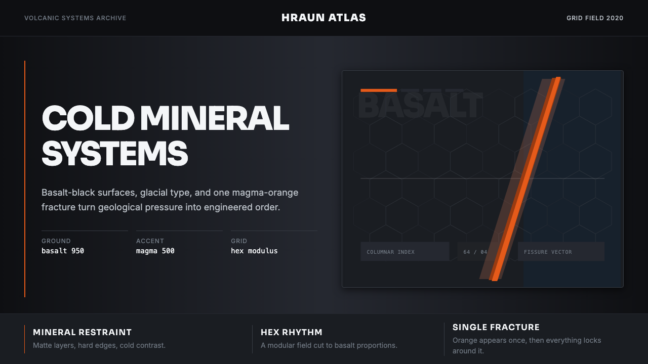 Icelandic Basalt VolcanoCold geology, engineered. Basalt black, Sora type, and one magma fissure hold…
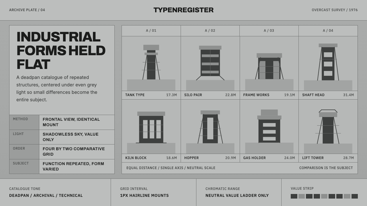 Bechers Industrial TypologyDeadpan order. Mid-grey ground, Archivo labels, and strict hairline grids rev…
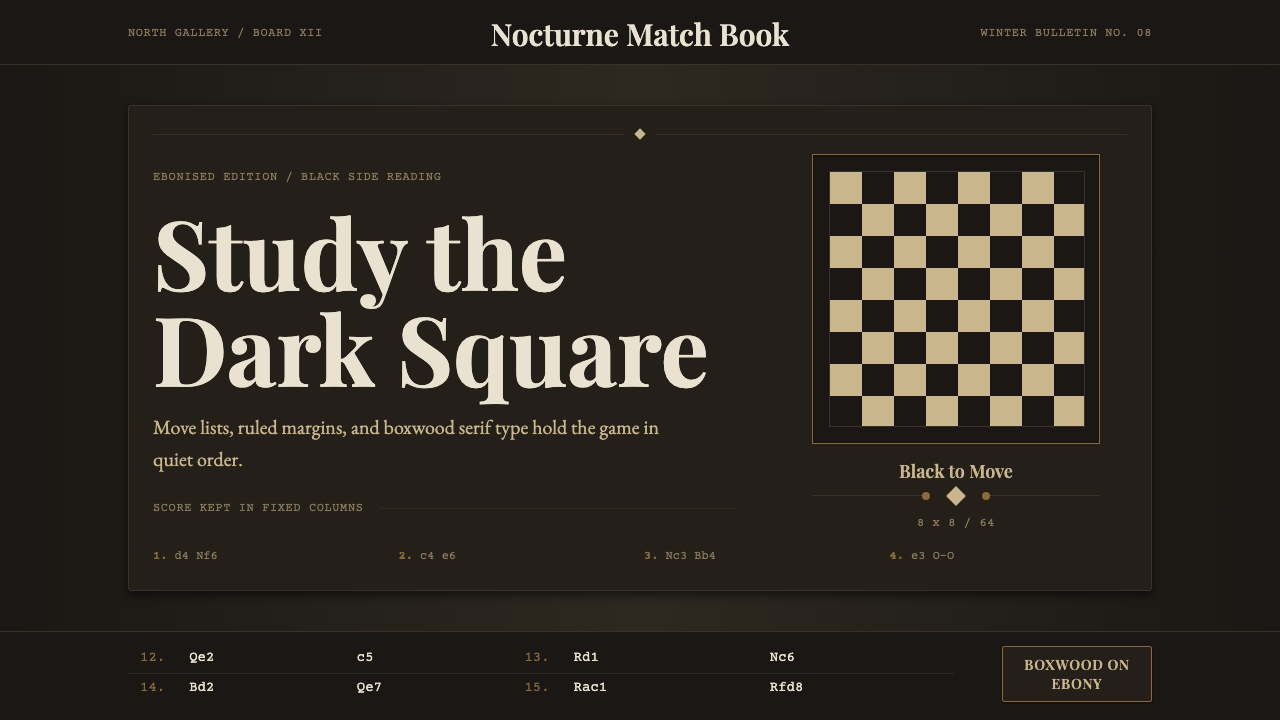 Chess TournamentQuiet intellect. Cream Playfair type, walnut rules, and notation glow on ebon…
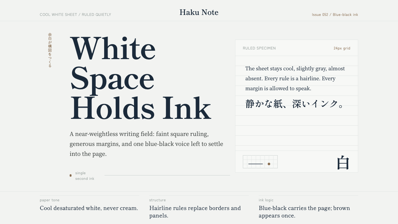 Japanese StationeryNear-weightless restraint. Pale gray grid and blue-black Mincho type hold the…
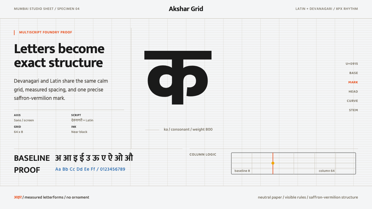 Modern Devanagari TypeType is the subject. Warm off-white grid, giant glyphs, one saffron-vermilion…
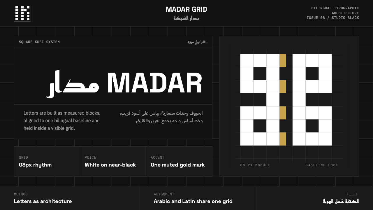 Modern Kufi BrandingRestraint becomes architecture. White Kufi blocks on near-black obey a biling…