What is On Growth and Form?
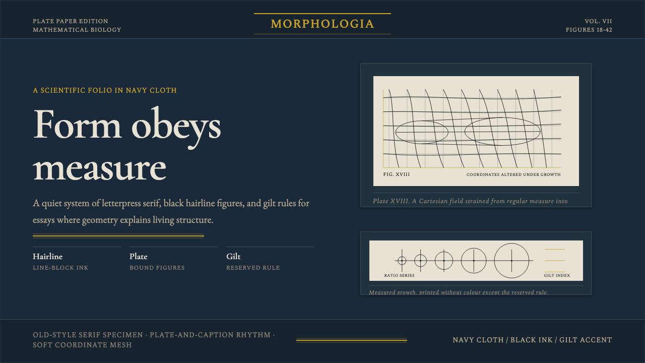
On Growth and Form translates D'Arcy Thompson's 1917 mathematical biology treatise into a design system — deep navy cloth, gilt rules, old-style serif letterpress, and hairline transformation grids — where every visual decision is answerable to natural law.
On Growth and Form in brief
On Growth and Form is a design style rooted in D'Arcy Wentworth Thompson's landmark 1917 scientific treatise of the same name — a 793-page volume published by Cambridge University Press in dark navy publisher's cloth, its spine gilt-lettered, its interior a marriage of old-style serif letterpress and precise black line-block diagrams. The visual system distills that book's physical character into a usable design language: deep blue-black grounds, hairline black geometry, gilt gold used only for rules and accents, and plate-paper figures that float in disciplined silence.
The style's governing logic is mathematical morphology. Thompson's central argument was that the shapes of living organisms are not arbitrary but are the direct outcome of physical forces — gravity, surface tension, rates of growth — and can be described through coordinate transformation grids, logarithmic spirals, and differential equations. The design system borrows this rigor: form is not chosen for decorative effect but derived from underlying structure, whether that structure is the Cartesian grid deforming a fish outline or the golden ratio mapping a shell cross-section.
Visually, the style is matte, restrained, and unmistakably scholarly. It does not signal modernity or commercial energy; it signals authority, precision, and the long view. The cloth-like dark ground, the warm gilt accent, and the quiet serif typeface together evoke the Victorian and Edwardian scientific tradition at its most serious — a tradition that believed careful observation and rigorous mathematics could reveal the deep order hidden in natural form.
Where does On Growth and Form come from?
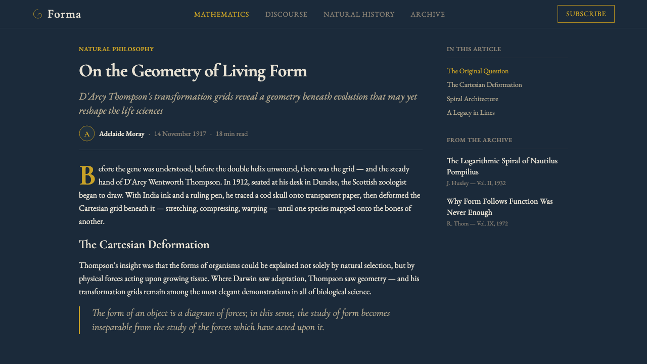
D'Arcy Wentworth Thompson (1860–1948) was a Scottish mathematical biologist and classicist who spent his career at University College Dundee and later the University of St Andrews. His 1917 work, published by Cambridge University Press, argued against pure Darwinian selection as the sole explanation for biological form. Thompson believed that physical and mathematical laws — the same forces governing soap bubbles and river deltas — were responsible for the spiral of a nautilus, the branching of a tree, and the hexagonal cell of a honeycomb. The book was not an art book; it was a monumental work of natural philosophy, and its visual language emerged entirely from scientific necessity.
The publication design of the original 1917 edition was standard for Cambridge scholarly volumes of the period: dark navy cloth boards with gilt spine lettering, acid-free plate paper for the diagram pages, and the body text set in a classic old-style serif that had been the standard of scholarly letterpress for centuries. The diagrams — coordinate transformation grids, logarithmic spirals, shell cross-sections, comparative morphology plates — were reproduced as black line-block prints, chosen for their precision and reproducibility rather than for aesthetic effect. Together, these functional choices produced an aesthetic of unusual coherence and gravity.
The 1942 second edition, greatly expanded to nearly 1200 pages, reinforced the visual system while adding further material. By this time the book had acquired a kind of canonical status in scientific and cultural circles well beyond biology: Le Corbusier cited Thompson, the sculptor Henry Moore kept a copy alongside his sketchbooks, and later the graphic designer Alan Fletcher and the typographer Jan Tschichold would invoke Thompson's coordinate grids as precedents for systematic visual thinking. The book's reputation as a work of literary beauty as well as scientific argument meant that its physical form — the cloth binding, the gilt lettering, the spacious typographic layout — became inseparable from its intellectual identity.
The design system that takes Thompson's book as its source does not represent a historical movement in the way that Bauhaus or Art Nouveau do. There was no school, no manifesto, no collective practice. Instead, it represents a species of scholarly material culture: the visual conventions of high-quality British scientific publishing in the first half of the twentieth century, distilled through one exceptional and exceptionally beautiful object. What the system offers is not historical citation but a sensibility — the sensibility that mathematical order and careful craftsmanship are themselves forms of beauty.
What defines the On Growth and Form look?
Ground and Color
The foundational ground is deep blue-black — the color of navy publisher's cloth in lamplight, not true black and not midnight blue but something between: a color that reads as formal, serious, and slightly warm. Against this ground, the palette is severely restricted. Black carries all line work and body text, rendered in high contrast against the dark field when needed or used in inset lighter zones that simulate the cream plate paper of the original diagrams. Gilt gold — warm, metallic, never bright yellow — appears only as ruling lines, accents, and lettering of the highest structural hierarchy. No other colors are introduced. The restraint is absolute.
Typography
The typographic model is Victorian scholarly letterpress: an old-style serif with pronounced stroke contrast, generous x-height, and the slightly irregular rhythm of hand-set metal type. This is not a geometric or humanist sans-serif tradition — the serif here carries historical weight deliberately. Size hierarchies are modest by contemporary standards: the difference between a heading and body text is one of degree rather than dramatic contrast. Everything is set with the measured pace of a book meant to be read across months, not scanned in seconds. Captions to diagrams sit close to their figures, in slightly smaller type, in the tradition of scientific plate captions.
Diagram Geometry
The defining visual element of the system is the line-block scientific diagram: hairline geometry rendered in pure black on a cream or pale field, whether that field is the full page or an inset panel. The diagrams are not decorative — they are arguments made visible. Cartesian transformation grids show how one form morphs into another under coordinate change; logarithmic spirals trace shell growth; comparative morphology plates arrange multiple species in systematic array. These forms carry the system's visual authority. Ornamentation does not exist; precision is the aesthetic.
Surface and Materiality
The entire system is inflected by its material source. The cloth ground is matte, not glossy — cloth absorbs light rather than reflecting it, giving the system its characteristic gravity. The gilt is warm and slightly uneven in the manner of genuine gold blocking on real cloth, not the bright metallic of digital mockups. Plate-paper insets — slightly whiter, slightly smoother, slightly different in weight from the text pages — create a layered sense of materials within the same object. This materiality cannot be perfectly replicated in digital environments, but it can be evoked through matte textures, restrained contrast ratios, and a refusal of anything that reads as glossy or high-definition-smooth.
Spatial Composition
Layout in this system is symmetrical and centered in the manner of a book rather than asymmetric in the manner of a poster or screen. The organizing principle is the text column, wide enough for comfortable reading of dense scholarly prose, flanked by generous margins in which captions, annotations, and cross-references can breathe. Diagrams are either full-column-width or occupy a formal inset proportion derived from classical book typography. There is no dynamic asymmetric tension; the visual energy comes from the density and authority of the content itself, not from compositional drama.
Mathematical Ornament
The only ornamental vocabulary permitted in this system is derived from mathematics and natural morphology. A page divider may be a logarithmic curve; a border may be a coordinate grid fragment; a decorative initial or section mark may invoke the spiral, the transformation grid, or the shell cross-section. This is ornament that earns its presence by being simultaneously informative and beautiful — it refers to the system's intellectual content rather than applying decoration from a separate tradition. Any ornamentation that does not carry this double meaning is excluded.
Tone and Register
The emotional register of the system is serious, measured, and unhurried. It does not excite or alarm; it persuades through accumulation and precision. The dark ground evokes contemplation rather than action. The gilt accent evokes distinction rather than glamour. The serif typeface evokes argument rather than announcement. This is a style for work that wants to be taken seriously over a long horizon — annual reports with a philosophical dimension, institutional publications with a sense of their own history, or digital products that serve audiences who value considered judgment over speed.

Who shaped On Growth and Form?
Thompson (1860–1948) was a Scottish zoologist, classicist, and mathematician whose career at University College Dundee and St Andrews spanned six decades. 'On Growth and Form' — first published in 1917 and greatly expanded in 1942 — is his central work and one of the longest-running books in scientific publishing, never having gone out of print. Thompson argued that the shapes of organisms are mathematical necessities rather than purely historical accidents of selection, and his coordinate transformation diagrams demonstrating the continuous morphological relationships between fish species remain among the most visually compelling arguments ever made in science. His prose, admired by W.H. Auden and praised by Peter Medawar as the best scientific writing in the English language, is inseparable from the book's aesthetic identity.
As Thompson's publisher for both the 1917 and 1942 editions, Cambridge University Press was the institutional author of the book's material form. The press's production standards in this period — the selection of cloth binding grades, the quality of plate paper for diagrams, the choice of typefaces and compositors — established the physical character that the design system draws on. CUP's house style in the first half of the twentieth century represented the apex of British scholarly publishing craft, and its conventions for the presentation of scientific illustration were widely imitated by academic publishers throughout the English-speaking world.
The sculptor Henry Moore kept a well-worn copy of 'On Growth and Form' among his studio reference materials, and Thompson's morphological analysis of shells, bones, and organic growth structures is directly traceable in Moore's mature work — the voids and cavities in his sculptures mirroring Thompson's interest in the structural logic of organic form. Moore's engagement demonstrates the book's crossover from scientific text to visual artists' reference, and helps explain how Thompson's visual language acquired aesthetic authority beyond the scientific community.
The British graphic designer Alan Fletcher, co-founder of Pentagram, cited Thompson's coordinate transformation grids as an influence on his thinking about visual systems. Fletcher's interest in Thompson reflects a broader tendency among post-war British graphic designers to find intellectual authority for systematic visual thinking in scientific and mathematical precedents. For the design system derived from Thompson's book, Fletcher represents the link between the book's scientific origins and its reception as a design reference — the moment when the book's visual logic was recognized as a design principle rather than merely a scientific illustration technique.
Not a person but a mathematical form — the logarithmic spiral is the single most recurring visual motif in Thompson's book, and in the design system it functions as the equivalent of what the circle-square-triangle triad is to Bauhaus. The spiral describes the growth of the nautilus shell, the arrangement of seeds in a sunflower, the curl of a ram's horn — in each case, growth at a constant angle to a fixed center. As a compositional device, the logarithmic spiral provides a natural organizing principle that is neither symmetrical nor arbitrary: it is ordered by a ratio, and that ratio is everywhere in nature.
How do you use On Growth and Form today?
Applying On Growth and Form correctly requires resisting the temptation to treat it as a generic dark-academic aesthetic. The system has specific sources — a specific book, a specific publication tradition, a specific intellectual argument — and work that draws on those sources with precision reads entirely differently from work that merely uses dark backgrounds and serif type. The starting point is always the diagram: the hairline black geometry on a lighter inset field is the system's most distinctive element, and compositions that feature this kind of precise scientific illustration as a primary visual element will feel most authentically grounded in the source.
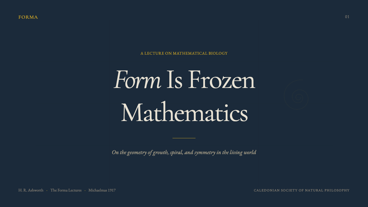
For presentation slides, the style is well-suited to institutional, scientific, educational, and long-form strategic work. Cover slides work as a dark-ground composition with a large diagram element — a coordinate grid, a spiral, a morphological comparison — centrally placed or occupying one side, with the title set in a modest old-style serif at a scale that reads as measured rather than emphatic. Content slides should be treated as book pages: a single text column with generous margins, diagram plates inset as formal elements, no decorative backgrounds behind text blocks. Data visualizations take on the character of scientific figures — labeled with precision, stripped of chartjunk, with axes and reference lines in hairline weight.
For web interfaces, the style is appropriate for contexts that require gravitas and intellectual authority: research platforms, archival projects, long-read publishing, museum and institutional digital presences, and scientific or educational tools where the audience is there to think rather than to be entertained. The dark ground with gilt accent is a strong choice for hero sections and feature headers; plate-paper inset zones — white or cream panels set against the dark ground — work for content areas requiring high text legibility. Navigation should be spare and typographic, relying on the serif typeface rather than icon systems.
For editorial and marketing contexts, the system is suited to brands and publications that want to position themselves in a tradition of intellectual seriousness: academic publishers, scientific institutions, museums, consultancies with a research-forward identity, or luxury goods that trade on historical craft. Annual reports, institutional prospectuses, and long-form editorial features are natural homes. The key tension to manage is legibility: the dark ground demands careful attention to contrast ratios, and extended body text on a dark field will fatigue readers in print and on screen alike, so lighter inset panels for running text are almost always preferable.
The most common mistake when applying this style is mistaking historical reference for authentic engagement. Designers who apply a dark ground and a serif typeface without understanding the system's mathematical and material logic produce work that reads as generic Victorian pastiche rather than as a serious invocation of Thompson's scientific aesthetic. The corrective is to build from the diagram outward: start with a coordinate grid or logarithmic spiral as the central visual idea, derive the composition from that form rather than imposing a layout on it, and let the mathematical structure determine proportions and spatial relationships throughout.
On Growth and Form — FAQ
How does this style differ from generic dark academic or Victorian gothic aesthetics?
The distinction is intellectual precision. Generic dark academic aesthetics use old books, dark grounds, and serif type as mood signals — they are about atmosphere and cultural association. The Thompson system is about a specific argument: that natural forms are governed by mathematical law, and that the visual language appropriate to that argument is the language of precise scientific illustration. The diagrams are not mood-setting props; they are the content. A layout that does not feature coordinate grids, logarithmic spirals, or morphological analysis plates as serious visual elements is borrowing the system's surface without engaging its logic. The mood follows from the precision, not the other way around.
Can this style work for digital products, or is it inherently a print system?
It translates to digital, but requires deliberate adaptation. The matte cloth ground, the warmth of genuine gilt, and the tactility of plate paper are material qualities that digital screens cannot replicate exactly — a monitor will always render the deep blue-black with more luminance and crispness than cloth has. The solution is restraint in the digital interpretation: avoid maximum contrast and high saturation; aim for a display mode that feels settled rather than vivid; use the hairline geometry and diagram elements as the primary visual markers of the system rather than trying to simulate materiality directly. The style works particularly well in dark-mode interfaces where the ambient context already reduces luminance expectations.
Does the gilt accent have to be literal gold, or can it be replaced?
The gilt is an essential character of the system, not a color option. Replacing it with a cool metallic, a bright yellow, or a silver tone loses the specific warmth and historical reference that makes the accent meaningful. In digital applications, the closest approximation is a muted warm gold that reads as metallic under close inspection but does not shout for attention — a tone that is clearly not white, cream, or yellow, but sits in the territory of aged gilding. The gilt must always be used sparingly: ruling lines, titles of the highest hierarchy, and structural accents only. Extending it to body text, icons, or decorative fill would undermine the system's authority by making it ornamental rather than structural.
What contexts is this style wrong for?
The system is wrong for contexts that require speed, approachability, or sensory warmth. It reads as slow and serious in the best sense — which means it will read as slow and alienating in contexts where users need to act quickly, feel welcomed, or experience pleasure and ease. Consumer-facing e-commerce, social applications, entertainment platforms, children's products, food brands, and wellness or health applications are all contexts where the style's severity would work against the product's fundamental purpose. It is equally wrong for work that wants to position itself as cutting-edge or future-facing: the system's historical anchoring in 1917 is inseparable from its authority, and attempts to modernize it by stripping the historical references produce neither good Thompson nor good modernism.
How should the transformation grid be used as a compositional device?
The Cartesian transformation grid — Thompson's most visually distinctive diagram type, showing how one organic form continuously deforms into another under coordinate change — is the system's most powerful compositional tool when used with discipline. It should appear as a complete or nearly complete element: a grid that is clearly a grid, with its coordinate lines visible and its deformed subject legible within it. Fragmentary grids used purely as texture are a misuse — they borrow the form without the meaning. The transformation grid works best as a large-scale central element, a full-panel diagram, or a carefully proportioned inset, always set in hairline black on a pale or cream field. It should never be filled, tinted, or treated as a background pattern.
Related design styles
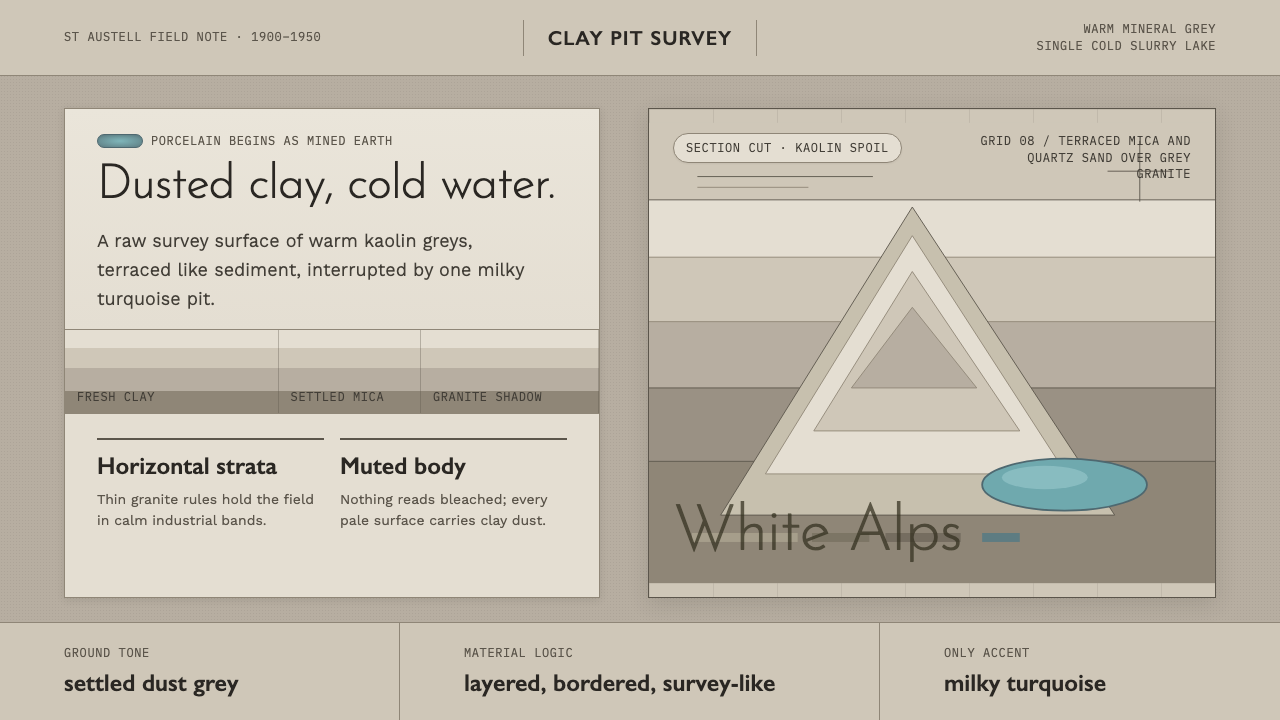 Kaolin Porcelain Clay PitIndustrial calm in dust grey. Horizontal clay strata break for one milky turq…
 Chess TournamentQuiet intellect. Cream Playfair type, walnut rules, and notation glow on ebon…
 Bentley SnowflakeClinical rarity. Crystal white on scraped black, centered by hex geometry and…
 Dragonfly Wing VenationPrecision, nearly weightless. Cyan-grey veins rule a foxed paper taxonomy pla…
 Estonian Haapsalu Lace ShawlQuiet craft, held in silver light. Cormorant type meets nupp dots and velvet…
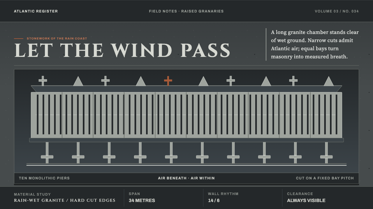 Galician HórreoStone learns to breathe. Wet granite, narrow slits and raised bays conduct At…