What is Cloud Atlas Plate?
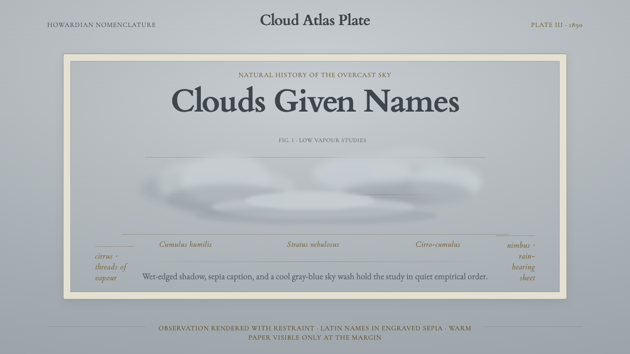
Cloud Atlas Plate captures the moment science first learned to name the sky — a palette of overcast grays and cool blues, soft watercolour masses drifting over warm paper, and engraved Latin captions carrying the quiet authority of Victorian natural history.
Cloud Atlas Plate in brief
Cloud Atlas Plate is a design style derived from the scientific illustration plates of early meteorology, most directly from Luke Howard's 1803 publication that introduced the Latin nomenclature for clouds — cirrus, cumulus, stratus, nimbus — still in use today. The aesthetic is defined by muted overcast gray-blue grounds, soft watercolour cloud forms with wet-edged shadows, warm paper tones showing at margins, and engraved italic Latin captions in sepia ink.
Unlike decorative historical styles that borrow period ornament, Cloud Atlas Plate draws on a strictly functional tradition: the scientific atlas plate existed to classify, differentiate, and record. Every element — the controlled wash, the careful labeling, the restrained palette — served observational accuracy rather than aesthetic pleasure. The resulting visual language is simultaneously clinical and atmospheric, precise in its organization yet dreamlike in its colour.
The style occupies an unusual position in design history: it is neither fine art nor folk illustration, but a disciplined vernacular developed by natural-history illustrators working at the edge of a new empirical science. Its visual grammar — tonal restraint, layered washes, deliberate negative space, and a typographic authority rooted in Latin scholarship — translates surprisingly well to contemporary contexts requiring both scientific credibility and poetic resonance.
Where does Cloud Atlas Plate come from?
The immediate historical source is Luke Howard (1772–1864), a British Quaker pharmacist and amateur meteorologist who delivered his landmark paper 'On the Modifications of Clouds' to the Askesian Society in London in 1802 and published it in expanded form in 1803. Howard proposed a Latin-based classification system — cirrus (curl), cumulus (heap), stratus (layer), and nimbus (rain cloud) — that was internationally adopted within a generation. His system gave meteorology its first stable descriptive vocabulary and made the scientific cloud atlas possible as a publishing genre.
The visual conventions of Howard's era were those of the late-eighteenth-century natural-history plate: watercolour or hand-tinted engraving on laid paper, disciplined tonal washes rather than flat fills, italic Latin captions set in letterpress below the image, and a carefully restrained palette in which the paper's own warmth served as the lightest tone. Artists working in this tradition — producing plates for botanical atlases, geological surveys, and natural-history journals — developed a vocabulary of controlled imprecision: the wet-in-wet edge that suggests a cloud's softness without romanticizing it, the shadow wash that marks mass without overstatement.
John Constable, Howard's near-contemporary, is a pivotal figure in the cultural reception of cloud classification. Between 1821 and 1822 Constable made over a hundred oil sketches of the sky from Hampstead Heath, explicitly annotating many with Howard's cloud types, time of day, and wind direction. These 'skying' studies — painted on the spot, in changing weather — helped legitimize the scientific observation of the sky as a subject worthy of sustained artistic attention and cemented the visual language of observed cloud form in British visual culture.
The broader context is the early nineteenth century's transformation of natural history from a gentleman's hobby into a systematic empirical discipline. Scientific societies, illustrated journals, and subscription atlas publications created a market for accurate observational illustration that was simultaneously legible to a lay readership and precise enough to be useful to working naturalists. The cloud atlas plate sits at this intersection: a functional scientific object that acquired aesthetic authority through the quality of its restraint.
What defines the Cloud Atlas Plate look?
Ground and Atmosphere
The background is never a bright white page. Instead, a muted overcast wash — ranging from a cool pewter gray to a desaturated steel blue — establishes the sky as a continuous tonal field. This ground is not flat: it carries subtle variation within a very narrow range, suggesting the depth and humidity of real atmospheric conditions. The paper's warmth shows through at the margins and in unpainted reserves, providing the lightest tone in the composition.
Watercolour Cloud Mass
Cloud forms are rendered in wet-on-wet and wet-on-dry watercolour technique, producing edges that range from softly diffused at the top of a cumulus mass to crisply defined where a cloud catches direct light. Shadows within cloud forms are warm-gray washes laid over the cooler ground, never opaque, always translucent. The technique avoids both photographic precision and decorative stylization — the goal is accurate description of form type, not portrait of a specific cloud.
Sepia Caption Typography
Text is set in italic letterpress type in a warm sepia or dark umber ink, placed below or alongside the cloud illustration. The Latin names — cirrus, cumulus, stratus, nimbus, and their compounds — carry a taxonomic authority. The typographic treatment is that of the scientific atlas: structured, unhurried, with generous leading and consistent baseline alignment. This captions-as-authority convention distinguishes cloud atlas plates from purely decorative sky paintings.
Tonal Restraint
The palette occupies a deliberately narrow band: cool grays, muted blue-grays, soft white cloud masses, and the warm ochre of aged laid paper. Saturated color is absent — not because the style avoids color but because accurate atmospheric observation rarely encounters it. This constraint produces a kind of visual quiet: the eye moves through the plate by reading tonal differences rather than hue contrasts, which mirrors how the human eye actually scans an overcast sky.
Scientific Margin and Notation
Authentic atlas plates preserve generous white or cream margins around the image field, used for plate numbers, collection titles, and supplementary notes. This margin is not decorative: it is a functional zone that situates the plate within a larger systematic work. In design applications, reproducing this convention — a clearly demarcated field of observation surrounded by classified information — produces the characteristic combination of analytical precision and contemplative space that defines the style.
Engraved Line Quality
Where outlines appear — at cloud edges, in notation borders, or in any linear element — they carry the slight imprecision and warmth of hand-engraved or lithographic line rather than the mechanical cleanliness of digital vectors. This quality is not error: it is evidence of the making process. The line breathes slightly, widens and narrows, and behaves like something drawn under observation rather than plotted on a grid. In contemporary applications, any linear elements should emulate this quality rather than defaulting to uniform digital strokes.
Who shaped Cloud Atlas Plate?
Howard's 1802 paper and 1803 publication established the Latin nomenclature for cloud classification that remains standard today. Working outside the formal scientific establishment — he was a Quaker pharmacist, not a university professor — he produced a system of sufficient elegance and empirical accuracy that it was adopted internationally within decades. His work transformed cloud observation from casual sky-watching into a systematic, reproducible scientific practice, and in doing so created the intellectual and visual need for the scientific cloud atlas as a publishing form.
Constable's 'skying' studies of 1821–1822, made from Hampstead Heath and annotated with Howard's cloud terminology, represent the moment when the scientific classification of clouds was absorbed into the practice of landscape painting. Constable did not illustrate Howard's system; he used it as observational discipline, recording cloud type alongside weather condition, light quality, and time. The result was a body of work that demonstrated that atmospheric accuracy and painterly authority were not in conflict — a lesson directly relevant to the aesthetic sensibility of the cloud atlas plate.
The Askesian Society — a London circle of gentleman scientists founded in 1796 — provided the institutional setting for Howard's first presentation of his cloud nomenclature. The Society exemplified the culture of amateur empiricism that made early meteorology possible: its members were chemists, physicians, and natural philosophers who shared experimental results outside the formal structures of the Royal Society. The club's reading culture, in which papers were presented, discussed, and printed in small editions, established the format of the illustrated scientific pamphlet from which the cloud atlas plate eventually emerged.
While Howard's cloud atlas was relatively modestly illustrated, the broader genre of natural-history atlas illustration that gave cloud plates their visual grammar was defined by engravers and aquatint printers like Robert Havell the Younger, who worked with Audubon on the Birds of America plates. Havell's technical mastery of layered aquatint — building atmospheric depth through successive acid baths and hand-coloring — established the standard for tonal watercolor illustration reproduced at scale. The wet-edged, atmospherically diffuse quality of the cloud atlas plate is indebted to this printmaking tradition even when the plates were produced by other hands.
Johann Wolfgang von Goethe became fascinated with Howard's cloud classification system and in 1820 wrote a cycle of poems dedicated to Howard — one for each cloud type. Goethe's engagement illustrates how Howard's system crossed from scientific utility into cultural symbolism: the Latin names acquired the quality of philosophical categories, not merely observational tags. Goethe's poems helped establish the cloud atlas aesthetic as a meeting point between empirical science and contemplative art — precisely the resonance that makes the style compelling in contemporary design contexts beyond strictly scientific applications.
How do you use Cloud Atlas Plate today?
Cloud Atlas Plate is a style of considered restraint — its power comes from the deliberate reduction of the palette to atmospheric grays and muted blues, from the softness of the cloud forms against the structured stillness of the background, and from the authority that Latin text lends to any adjacent visual element. Applying it well means accepting these constraints fully: resist the temptation to brighten the palette, to clarify the cloud edges beyond what observation would suggest, or to replace the sepia caption text with a more modern typeface.
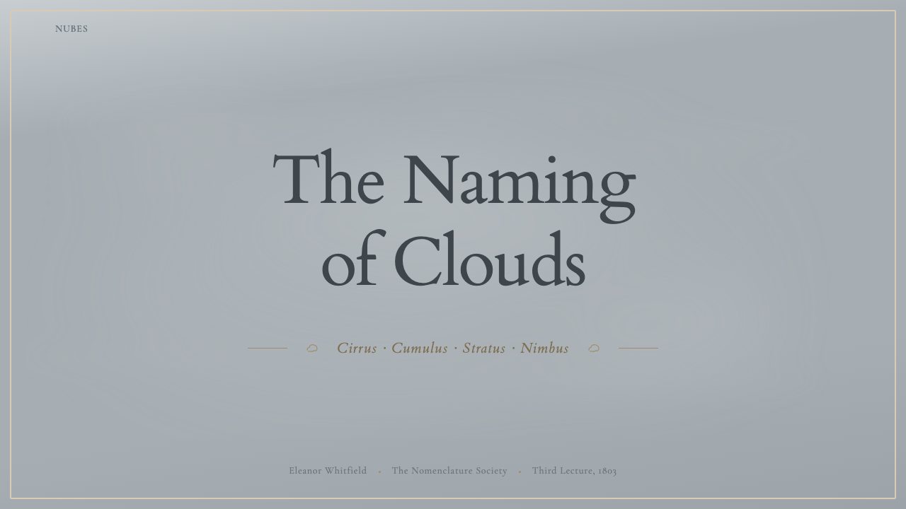
For presentation slides, the style works with particular strength for scientific, research, or analytical content where a sense of empirical seriousness is required. A cover slide can treat the overcast gray-blue wash as the full-bleed background, place the title in a sepia or dark umber editorial typeface with generous white space, and position a single carefully rendered atmospheric image — whether an actual cloud illustration or a similarly tonal photographic image — as the organizing visual element. Content slides benefit from the atlas plate convention: a clearly demarcated image or data field, generous margins reserved for annotation, and text handled as caption rather than headline.
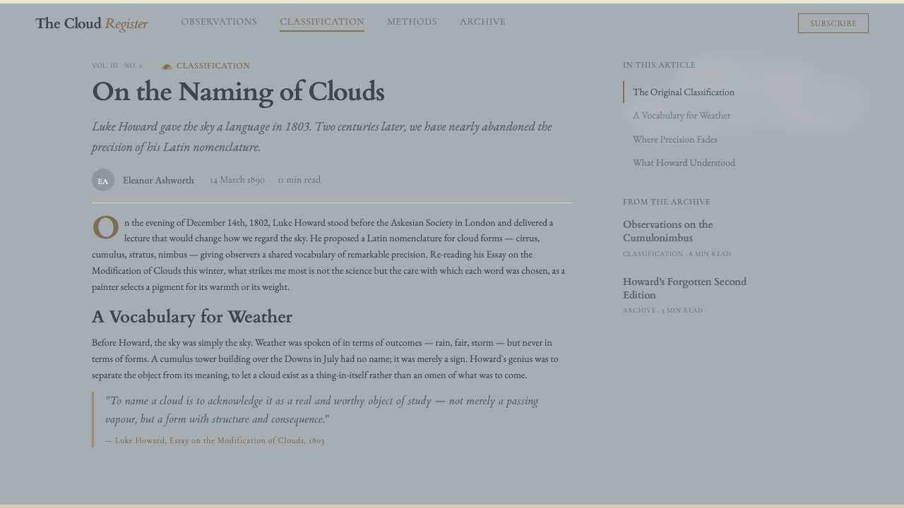
For web interfaces, the style translates best to editorial contexts — long-form reading experiences, archival or historical collections, scientific journals, or museum digital spaces. The palette's cool, muted quality makes it well-suited for interfaces where the content itself (text, image, data) should dominate and the interface should recede. Use the atmospheric ground as background surfaces, the warm paper tone as card backgrounds, and sepia or dark umber for text. Interactive elements should be understated — thin borders, subtle hover states — rather than bold call-to-action components.
For editorial and marketing work, the style has strong resonance with products that want to signal intellectual heritage, observational rigor, or a connection to natural and scientific traditions: environmental organizations, natural history institutions, premium nature-focused publishing, or any brand where the values of careful attention and empirical honesty are central. A campaign built in this aesthetic should resist anything that reads as decorative or commercially polished — the authority comes precisely from the materials' functional origins.
The most common mistake when applying Cloud Atlas Plate is treating it as a vintage or sepia-tinted illustration style and introducing nostalgic or romanticized elements that undercut its scientific authority. The original plates were not trying to be beautiful; they were trying to be accurate, and beauty arrived as a byproduct of disciplined observation. Any contemporary application that foregrounds prettiness over precision — soft-focus gradients, ornamental type, high-saturation accent colors — loses the essential quality of the style and ends up with something closer to decorative vintage illustration than scientific natural history.
Cloud Atlas Plate — FAQ
How does Cloud Atlas Plate differ from other vintage scientific illustration styles?
Most vintage scientific illustration styles — botanical plates, anatomical diagrams, geological cross-sections — feature strong line work, precise delineation, and saturated hand-coloring. Cloud atlas plates are distinctive in their deliberate embrace of the uncontrollable: clouds cannot be pinned down with the precision of a botanical specimen, so the plates developed a visual language for describing form-types rather than individual forms, using tonal wash rather than line to convey mass, and accepting soft and variable edges as accurate rather than imprecise. The result is a scientific illustration tradition that is unusually atmospheric and contemplative compared to its counterparts.
Is the Latin text component essential, or can the style work with modern typography?
The Latin captions in cloud atlas plates are not merely decorative period detail — they function as the taxonomic authority that transforms a sky painting into a scientific instrument. In a design application, you do not need to use actual Latin, but you do need to preserve the caption's relationship to the image: structured, subordinate, set in a text style that reads as classificatory rather than expressive. An italic serif typeface in a dark warm ink performs a similar role to the original engraved Latin. A sans-serif headline treatment, by contrast, imports a completely different authority structure and will undercut the style's essential quality.
Can this style work for dark mode or dark-background interfaces?
With significant caution. The cloud atlas plate depends on the layered luminosity of watercolour on paper — light comes from behind the pigment, from the paper itself showing through the washes. This quality is structurally impossible to replicate on a dark ground, where the light relationship is inverted. A dark-mode application of this style tends to produce something that looks like night-sky illustration rather than overcast-sky observation, which is a fundamentally different aesthetic. If a dark application is necessary, treat it as a distinct creative decision rather than a direct inversion of the original, and accept that significant character will be lost.
How does the Cloud Atlas Plate aesthetic relate to contemporary weather app design?
Contemporary weather apps mostly draw on a completely different tradition: bright blue skies, saturated icon sets, photographic backgrounds, and animated gradients. These choices prioritize immediate emotional clarity — sunny means bright yellow, rainy means moody blue-gray — over observational accuracy. Cloud Atlas Plate inverts this logic: it was made by people who needed to distinguish between twenty cloud types, not to make the weather feel relatable. The aesthetic works well in contexts where users are expected to slow down and attend carefully — scientific or educational weather interfaces, climate communication, or any application where the atmosphere is the content rather than the mood.
What makes Cloud Atlas Plate feel authoritative rather than merely old?
The difference is purpose. Styles that feel merely old borrow period surface qualities — aged texture, sepia tones, ornamental typography — without the underlying discipline that produced those qualities. Cloud atlas plates look the way they do because they were solving a real problem: how do you illustrate something as changeable and intangible as cloud form in a way that is reproducible, accurate, and useful to a scientific community? Every visual decision — the tonal wash over engraved line, the italic Latin over decorative lettering, the restrained palette over saturated color — was made in service of that problem. When contemporary design work maintains that disciplinary logic — using the visual system to solve an actual communicative problem rather than to signal period character — it inherits the authority rather than just the surface.
Related design styles
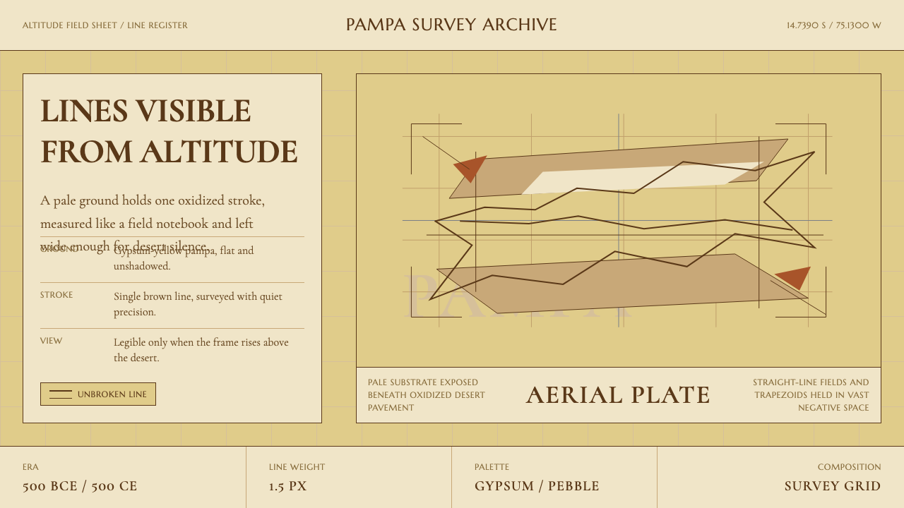 Peruvian Nazca Lines (Geoglyph)Vastness holds the line. Gypsum ground, pebble-brown strokes, and survey-grid…
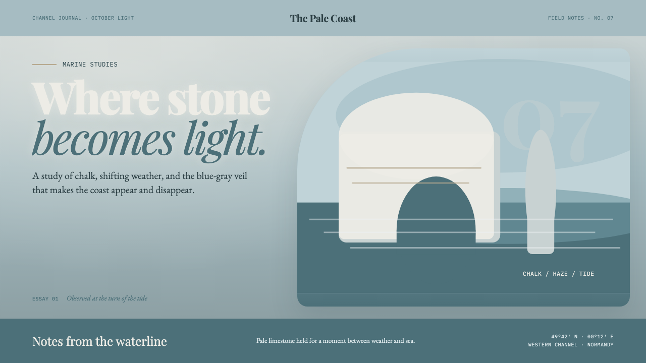 Étretat Chalk CliffsStone becomes light. Chalk-white forms dissolve through blue-gray mist and li…
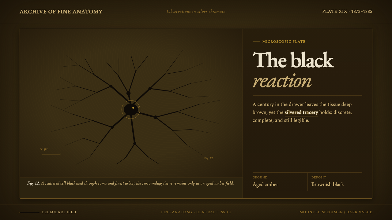 Golgi Neuron Silver StainA century-darkened specimen. Near-black dendrites branch across an aged amber…
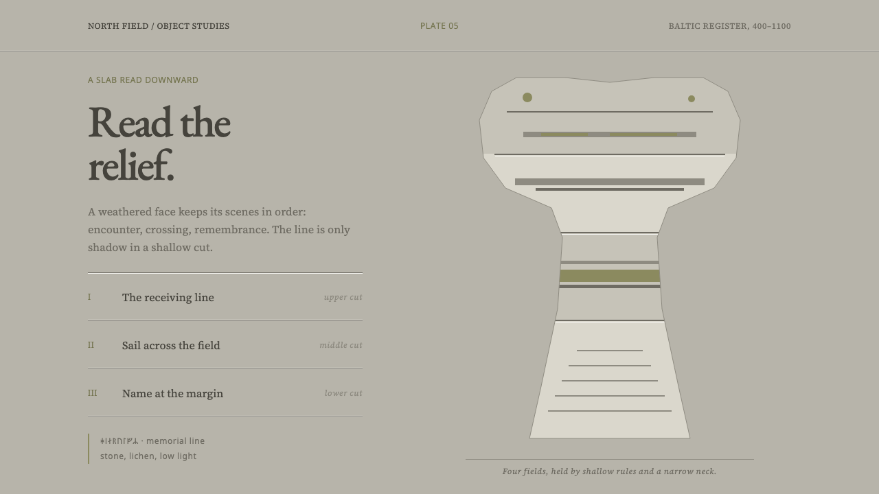 Gotland Picture StoneMeaning emerges slowly. Weathered limestone greys divide a story into shallow…
 Anglerfish Lure BioluminescenceLight is scarce. Old serifs and hairline rules frame one cold green-cyan lure.
 Bamboo GroveQuiet goes vertical. Fir green, Mincho type, and dappled culm rules create de…