What is Inuit Igloo?
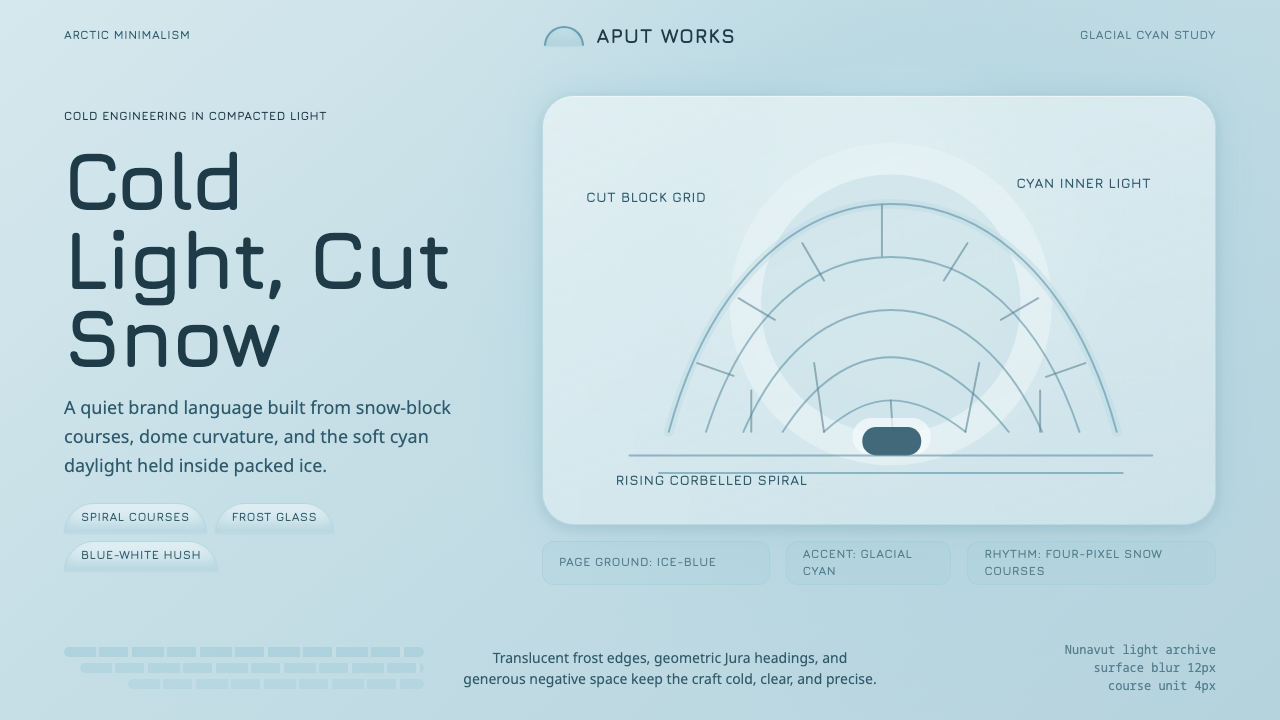
The igloo turned a survival problem into an optical one — how do you keep a home warm when its walls are made of snow — and answered it with a glow that later became a design language of glacial cyan and cut-block geometry.
Inuit Igloo in brief
Inuit Igloo is a design system drawn from the *iglu*, the domed snow-house built across the Canadian Arctic and Greenland as a temporary winter shelter. Its visual language is Arctic minimalism: a cool ice-blue ground, a glacial-cyan accent, spiral-block curvature, and a restraint that reads as clarity rather than emptiness.
The system's central idea is translated light. Packed snow is not opaque — it transmits blue wavelengths and absorbs red ones, so daylight filtered through a snow wall arrives inside as a soft cyan glow rather than a harsh white glare. Every color decision traces back to that single physical fact: warmth is expressed as light, never as saturation.
Visually, the style favors curvature over rectilinear structure — the rising, self-closing spiral of a corbelled dome, built up course by course from blocks each cut with a single tool. It is a style with almost no ornament, because the source material had none: every mark on an igloo's surface is either structural (a block seam) or accidental (a frost pattern), never decorative.

Where does Inuit Igloo come from?
The igloo belongs to a much older and broader tradition of Inuit winter architecture, but the snow-block dome most people picture when they hear the word is a specific engineering solution developed for the Central Arctic, particularly across what is now Nunavut, and used in related forms by Inuit and Iñupiat builders across the wider circumpolar north. It predates any written record; the technique was refined and passed down entirely through practice, generation to generation, long before the nineteenth century, which is simply when outside observers began documenting it in detail.
The construction method is itself the design. A builder uses a long snow-knife — the *pana* — to cut rectangular blocks directly from wind-packed snowdrift, chosen because wind compaction gives it a structural density fresh, loose snowfall lacks. The blocks are laid not in flat horizontal rings but in a continuous rising spiral, each course leaning slightly further inward than the one beneath it, so the structure is self-supporting at every stage — no scaffolding, no temporary support, no moment where the shelter is not already holding its own weight. The dome closes itself when the spiral reaches its apex, and a small block is fitted to seal the crown.
What makes the igloo remarkable as a survival technology is its thermal behavior, and this is the fact from which the entire design system descends. Packed snow is riddled with tiny trapped air pockets, making it an effective insulator — the interior can be raised tens of degrees warmer than the outside air using nothing more than body heat and a small lamp. Snow is also translucent in a particular way: it scatters blue-toned light while absorbing longer, red-toned wavelengths. Daylight reaching the interior through the packed walls arrives already shifted toward cyan — an ambient, even, shadowless glow unlike the light of an open sky.
This is vernacular architecture in the fullest sense: anonymous, functional, refined by generations of builders rather than any single named architect, and inseparable from the climate and materials that produced it. It sits alongside other Arctic survival crafts — skin-boat construction, snow-goggle carving, cold-weather clothing engineering — as design driven entirely by necessity, where every form has a reason and nothing exists to be merely looked at.
What defines the Inuit Igloo look?
Color
The palette is built around a single relationship: a cool, pale ice-blue ground paired with a more saturated glacial-cyan accent. There is no warm color anywhere in the system — no amber, no cream, no red — because the source phenomenon itself contains none. Where a conventional palette might reserve its brightest note for a warm highlight, this system reserves its brightest note for the coolest one, using the cyan accent the way a flame might be used elsewhere: as the single point the eye is drawn to.
Typography
Type in this system is geometric and cool in disposition — letterforms should feel cut rather than drawn, echoing the way a snow-knife produces a clean, decisive edge. Contrast in scale carries the hierarchy: a small number of size steps, spaced generously, rather than a dense ladder of intermediate weights. The overall impression should be legibility under harsh, even light — nothing fussy, nothing that would blur at a glance across open snow.
Dome Curvature
Where a Bauhaus-style system builds from the circle, square, and triangle, this system builds from a single recurring curve: the rising arc of a corbelled dome. Panels, cards, and containers lean toward the rounded rather than the rectilinear, and where a corner does appear, it is softened rather than sharp. This is not decoration — it is the geometry of a structure that had to hold its own weight without a single straight supporting wall, and that structural memory carries through into anything derived from it.
Spiral-Block Rhythm
A secondary visual motif comes from the courses of cut blocks themselves, laid in a continuous ascending spiral rather than stacked rings. Translated into design, this becomes a preference for staggered, seam-like dividers over straight horizontal rules — a row of cards or list items that steps subtly rather than lining up in rigid ranks. The rhythm should feel continuous and climbing, the way each course of an igloo leans a little further inward than the one below it.
Translucent Glow
Surfaces in this system should suggest light passing through a dense, semi-opaque material rather than light bouncing off a flat, opaque one. In practice this favors soft, even luminance over hard directional highlights — a panel might appear to be gently lit from within rather than lit from a fixed external source. This is the single most distinctive quality of the style and the hardest to fake: it is glow, not gloss.
Frost-Edged Surfaces
Where an edge or border does appear, it should read as frost-touched rather than hard-ruled — a faint, cool line rather than a crisp black stroke. This softens the boundary between elements without erasing it entirely, the way rime frost traces the seam of a snow block without erasing the seam itself. Borders in this system are present but quiet; they mark structure without asserting themselves.
Generous Negative Space
The interior of an igloo is a single continuous volume of open air beneath a curved ceiling — there are no interior walls, no partitions, no clutter competing with the dome itself. This system carries that spatial generosity forward: layouts should feel roomy and uncluttered, with negative space treated as a full participant in the composition rather than leftover area to be filled. Density is the enemy of this style; when in doubt, remove an element rather than add one.

Who shaped Inuit Igloo?
The igloo has no single inventor; it is the product of generations of anonymous builders across the Central and Eastern Arctic who refined the corbelled spiral technique through direct, repeated practice in life-or-death conditions. Knowledge of how to read wind-packed snow for the right density, how to angle each block so the dome closes cleanly, and how to cut a doorway low enough to trap rising warm air was passed down as embodied craft rather than written instruction, making the igloo one of the purest examples of vernacular design — refined entirely by use, with no signature attached to any single course of blocks.
Across Alaska's North Slope and the wider Iñupiat homeland, related snow-shelter techniques developed in parallel with those of the Central Arctic, adapted to local snow conditions and travel needs. Iñupiat builders contributed to the broader circumpolar knowledge base around snow as a structural and thermal material, reinforcing that the igloo is not an isolated invention but part of a shared, continent-spanning Arctic engineering tradition developed independently and in parallel by related Indigenous peoples facing the same climate.
The igloo sits within a wider body of Arctic material culture — skin-boat (kayak and umiak) construction, snow-goggle carving to prevent snow blindness, layered cold-weather clothing systems — all of which share the same design ethic: extreme material efficiency, zero tolerance for non-functional ornament, and forms perfected through survival necessity rather than aesthetic preference. Understanding the igloo as one node in this broader tradition clarifies why its visual language reads as disciplined rather than merely sparse.
How do you use Inuit Igloo today?
Inuit Igloo works best wherever a product wants to communicate cold clarity — calm, precise, unfussy — without resorting to sterile corporate minimalism. It reads as considered rather than empty, because every element in the source material had a structural reason to exist, and that discipline translates well into interfaces that need to feel trustworthy and uncluttered rather than decorative.
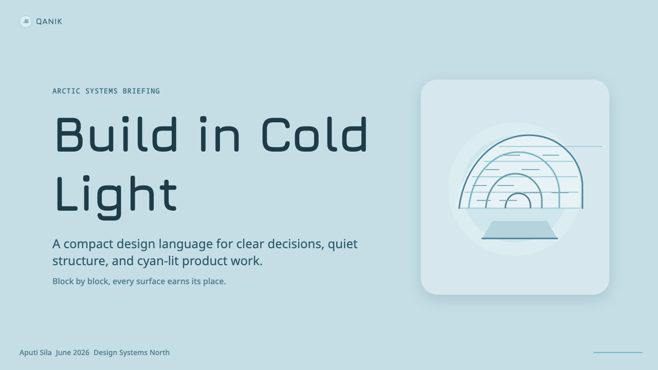
For presentation slides, the style suits a cover built around a single glowing focal shape against an ice-blue field — a rounded, dome-like form in the corner or center, lit from within rather than sharply spotlit, with the title set in cool, geometric type. Content and data slides should lean into generous whitespace and staggered, spiral-like alignment for bullet groups or chart series rather than rigid horizontal rows; a bar chart rendered in this style should feel like it is stepping upward, each bar's edge softened rather than razor-sharp, with the cyan accent reserved for the single most important data series.
For web interfaces, the style is a natural fit for dashboards and pricing pages that want to feel calm rather than aggressive. Cards and panels should carry soft, rounded corners and a gentle internal luminance rather than hard drop shadows; the ice-blue ground should dominate by area, with the glacial-cyan reserved for primary actions, active states, or the recommended pricing tier, used sparingly, the way daylight through snow only ever shows up as a single even glow rather than a spotlight. Navigation and dividers should favor a frosted, soft-edged line over a stark black rule.
For editorial and marketing work, the style supports a quiet, confident tone — long-form articles benefit from a narrow, breathable text column against the ice-blue ground, with pull-quotes or section breaks marked by the spiral-block rhythm rather than a bold divider. Marketing pages can lean on the dome-glow motif as a hero visual: a single large, rounded, luminous shape as the emotional center of the page, with supporting copy kept short and cool in tone to match the restraint of the source material.
A common mistake when applying this style is warming it up — adding cream, amber, or soft neutrals to make it feel more approachable. That undoes the entire premise: the appeal of Inuit Igloo is that its warmth comes through craft and glow, not hue. Another frequent error is over-sharpening it into a generic "ice" theme of hard blue gradients and glassy bevels; the style is at its best kept soft, matte, and evenly lit rather than glassy or specular.
Inuit Igloo — FAQ
Is Inuit Igloo just a blue color scheme, or is there more structure to it?
It is considerably more than a color scheme. The palette is only the most visible surface of a system whose real structure comes from the dome's architecture: the rising spiral curvature, the staggered rhythm of block courses, the softened frost-edged boundaries, and the generous open volume of the interior. A layout that simply applies ice-blue and cyan to a rectilinear, hard-shadowed grid is missing the geometry that makes the style recognizable — the curve and the glow have to be present together.
Why does this style avoid warm colors entirely?
Because the physical phenomenon it is modeled on contains no warm color. Packed snow transmits blue-toned light and absorbs red-toned light, so the interior of an igloo never glows amber or gold — it glows cyan. Introducing warm hues into this system breaks the link between the visual language and the physical fact that gives it meaning. Where a fireplace-lit interior might legitimately use amber warmth, an igloo's warmth is thermal, not chromatic — it is felt in temperature, not seen in color — and the design system respects that distinction strictly.
How is the spiral-block motif different from a generic rounded-corner design trend?
A generic rounded-corner trend softens corners uniformly and stops there. The spiral-block motif is directional and cumulative — it implies a continuous ascending line, each element leaning slightly relative to the one before it, the way each course of snow blocks leans a little further inward than the course beneath it. Applied well, this shows up as staggered alignment or a subtle stepping rhythm across a series of elements, not just softened corners on an otherwise static grid. The curve should feel like it is climbing toward a close, not just relaxed.
What kind of products or brands should avoid this style?
Brands built on warmth, heat, or sensory richness — food and beverage, hospitality, anything positioning itself as cozy or indulgent — will find this style works against them; its entire appeal rests on being cool rather than warm. It is also a poor fit for products that need to feel maximalist, playful, or densely informational, since the style depends on generous negative space and restraint. It suits products where calm precision is the desired feeling: analytical tools, cold-chain or climate-tech dashboards, minimalist consumer apps, or any brand deliberately positioning itself as clear-headed rather than emotionally warm.
Does the igloo's curvature mean this style can't use any straight lines?
No — the blocks themselves are cut as clean rectangular units before being laid into the curving spiral, so straight-edged geometry is present at the component level even as the overall composition curves. The style works well when small units (cards, buttons, list rows) stay relatively crisp and rectilinear while the larger composition — the overall silhouette, the grouping rhythm, the hero shape — carries the dome's curvature. The mistake is applying curvature uniformly to every element, which flattens the contrast that makes the dome motif read clearly against its component parts.
Related design styles
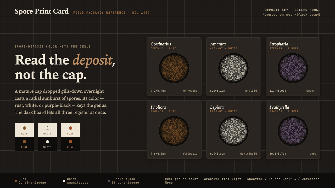 Spore Print CardRead the deposit, not the cap. Radial spore prints in rust, white, purple-bla…
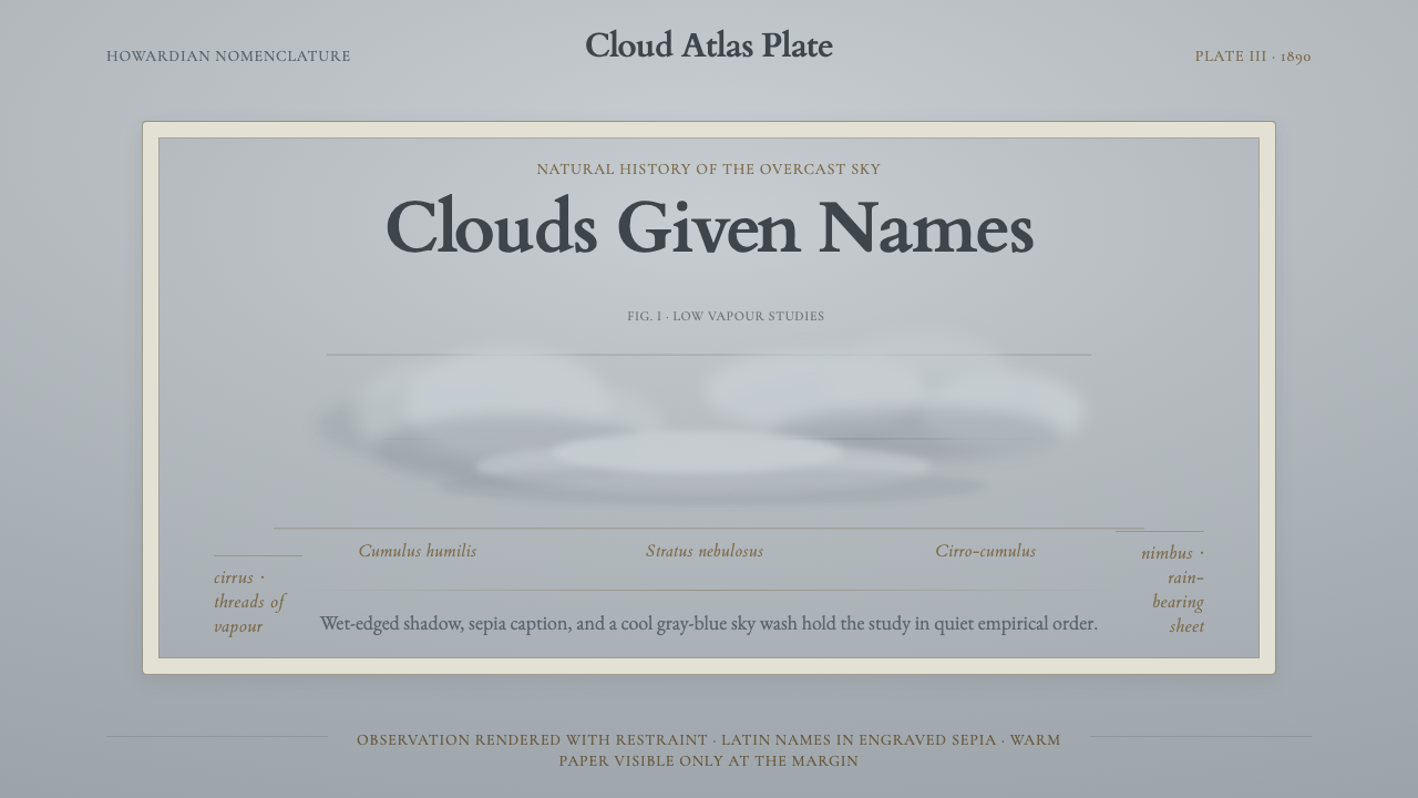 Cloud Atlas PlateObservation becomes atmosphere. Gray-blue wash, soft clouds, and sepia Latin…
 Doctor's Clinical Lab CoatSterile by design. Cool clinical white, teal signals, and seam-line grids enf…
 Microfiche ArchiveRecords as lit frames in a matrix. Cyan-blue back-lit panel, glowing mono typ…
 Mohs Hardness ScaleRanked by what scratches what. Ten mineral-gray chips on cool chart-white, en…
 Sumerian Cuneiform TabletData began as pressure. A clay ledger uses scored grids and shadowed Noto Ser…