What is Cyanotype Blueprint?
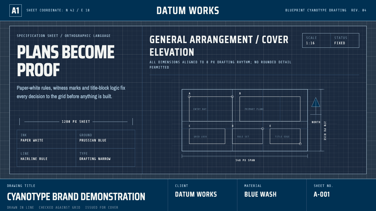
The blueprint is not a design style that borrowed engineering aesthetics — it is engineering aesthetics, lifted whole from the cyanotype reprographic process that built the modern world. Deep Prussian blue, paper-white hairlines, title blocks, witness lines, and revision clouds: a visual language invented for precision and pressed into design service exactly as it arrived from the drafting table.
Cyanotype Blueprint in brief
Architectural Blueprint is a design system that faithfully reproduces the visual grammar of cyanotype technical drawings — the reprographic standard for engineering and architectural documentation from the 1880s through the mid-twentieth century. Its defining feature is a high-contrast reversal: white linework, callouts, and text against a saturated Prussian-blue ground, the same relationship produced when a ferric-sensitized sheet was exposed to ultraviolet light and fixed in water.
The system treats the entire vocabulary of drafting as design material: dimension lines terminated by arrowheads or tick marks, witness lines extending beyond reference points, title blocks arranged as ruled tables in the lower-right corner, revision clouds marking changes with their irregular looping borders, section arrows showing cut-plane direction. None of these elements are decorative additions — they are the artifacts of the original reprographic process, preserved intact.
Typography within the system follows the conventions of manual drafting: narrow grotesque letterforms in the tradition of single-stroke gothic lettering guides, supplemented by technical monospace for dimension callouts and table entries. The result is a design language defined entirely by its original production constraints — a camera-ready artifact of a specific photochemical moment, now read as a rigorous aesthetic in its own right.
Where does Cyanotype Blueprint come from?
The cyanotype process was invented in 1842 by Sir John Herschel, the English scientist and polymath who also coined the words 'photography', 'negative', and 'positive' for the emerging field of light-fixed images. Herschel discovered that a mixture of ferric ammonium citrate and potassium ferricyanide, when coated on paper and exposed to ultraviolet light, would undergo a photochemical reaction that fixed a deep, stable Prussian blue — iron blue, the pigment long used in painting and printing. The unexposed areas, when washed in water, were removed, leaving the paper white.
The application to technical drawing came almost immediately. Architects and engineers of the late nineteenth century faced a pressing reproduction problem: a single handmade drawing could not be duplicated quickly or cheaply. The cyanotype process offered a solution. A draftsman would produce a master drawing in opaque ink or graphite on a translucent medium — initially tracing linen, later drafting vellum or polyester film. This master was then placed in contact with ferric-coated paper and exposed to sunlight or an arc lamp. The lines of the drawing, being opaque, shielded the paper beneath them from exposure; the background areas were fully exposed and turned blue. After washing, the result was a precise negative: white lines on a Prussian-blue ground. From a single master, a draftsman could produce dozens of copies in an afternoon.
By the 1890s, blueprint reproduction had become the standard method for distributing architectural and engineering drawings across construction sites, government offices, and manufacturing floors. The language of the drawings themselves evolved accordingly: dimension callouts, title blocks, revision clouds, north arrows, and scale indicators became standardized conventions, printed into official drafting manuals and taught in technical schools. The blueprint was not just a reproduction method — it was a communication protocol, with its own grammar of marks, tables, and symbolic conventions that any trained draftsman could read without instruction.
The cyanotype blueprint was progressively replaced from the 1940s onward by diazo whiteprint processes — which produced dark lines on a white background — and later by electrostatic copying and digital plotting. By the 1980s, the blue blueprint had largely disappeared from working practice. Its visual language survived, however, first in the cultural memory attached to the word 'blueprint' itself, then in design contexts where its legibility, precision, and deep chromatic identity made it a powerful reference for anything requiring the signaling of technical authority, engineering rigor, or systematic thinking.
What defines the Cyanotype Blueprint look?
Color Field
The color relationship is binary and absolute: a saturated blue ground and paper white for all linework, text, and callouts. The blue is not decorative — it is the chemically fixed photographic field, the iron-blue that Herschel's reaction produced and that engineers recognized as the sign of an authentic reprographic original. There are no secondary hues, no gradients, and no warm neutrals. Accent colors, when used at modern adaptations of the system, are typically limited to a single annotation color — a red or yellow — used sparingly to mark warnings or priority callouts, as a draftsman might add a hand-written correction in red pencil to an otherwise complete drawing.
Linework
The line is the primary formal element, and the system maintains a strict hierarchy of line weights inherited from drafting standards. Outlines and object boundaries are the heaviest; dimension lines, leader lines, and centerlines are medium weight; hidden lines use a standardized dash pattern; break lines and construction lines are the lightest. This hierarchy is not aesthetic — it conveys which surfaces exist in three-dimensional space, which are implied, and which are reference geometry. Applying the line vocabulary without understanding the hierarchy produces drawings that look like blueprints but communicate nothing — a common failure mode when the style is treated as surface decoration.
Typography
Manual drafting before digital tools was done with lettering guides — thin templates that standardized single-stroke gothic characters across all technical drawings in a discipline. The resulting letterforms are narrow, upright or slightly inclined, with consistent stroke width throughout each character. No thick-thin contrast, no calligraphic influence, no serifs. This style of lettering was designed to be reproducible by a draftsman under time pressure, legible when reduced, and unambiguous at any angle. Technical monospace accompanies it for numerical entries, dimension values, and coordinate data. Both faces read as instruments, not as personalities.
Information Architecture
Blueprints carry a conventional page architecture that predates modern information design by decades. The title block — a ruled table occupying the lower-right quadrant — contains project name, drawing number, scale, date, revision history, and the signatures of drafter, checker, and approver. Sheet borders delimit the drawing area with a defined margin. North arrows, scale bars, section cut indicators, and detail bubble callouts each occupy prescribed positions. This architecture is not decorative organization — it is a contractual document format, legally standardized so that any party reading the drawing could locate critical metadata without searching. Translating this into UI design produces interfaces of unusual legibility, where the user always knows where they are in the information hierarchy.
Absence of Decoration
A working blueprint contains nothing that is not structurally required. The photochemical process that produced it had no room for ornamental additions: everything present was either drawn by the draftsman or an artifact of the process itself. Rounded corners, decorative borders, illustrative headers, graduated fills — none of these things exist in the reference object. When design work imports the blueprint aesthetic, this documentary restraint is what distinguishes authentic use from superficial imitation. The blue-and-white palette is easily replicated; the discipline of removing every mark that does not carry information is harder to sustain.
Precision as Ornament
The aesthetic satisfaction of a well-executed blueprint comes entirely from precision: consistent line weights, perfectly aligned dimension chains, title blocks whose internal ruling is exact, lettering whose cap height never varies. The beauty is the evidence of rigor. In design applications, this means that visual polish is not achieved by adding elements but by executing the existing elements with absolute consistency. A callout leader that bends at an arbitrary angle, a dimension line that ends short of its extension lines, or a title block whose columns are approximate rather than exact — these are not minor imprecisions, they are violations of the contract the aesthetic makes with its source material.
Scale and Notation
Technical drawings operate at defined scales, and the explicit notation of scale is itself a formal element of the composition. A drawing marked 1:50 or 1:100 declares its relationship to physical reality; the scale bar drawn alongside provides a visual check on reproduction accuracy. In design work that borrows blueprint conventions, scale notation — even when no physical scale is implied — functions as a compositional element that signals technical seriousness. Numerical annotation, dimension callouts, and grid coordinates reinforce the sense that every element has a defined, measurable position in the system.
Who shaped Cyanotype Blueprint?
Herschel invented the cyanotype process in 1842 as a scientific method for reproducing his own astronomical notes, not as a reprographic tool for industry. His background was in chemistry and optics — he had already made foundational contributions to the understanding of light-sensitive silver salts that underpinned early photography. The cyanotype was a side discovery, one he published but never commercialized. Its application to architectural and engineering drawing was developed by others in the decades after his publication, but the chemistry he worked out — ferric ammonium citrate plus potassium ferricyanide, fixed by washing — remained unchanged throughout the blueprint era.
Anna Atkins, a British botanist and contemporary of Herschel, became the first person to produce a book illustrated entirely with photographs when she used the cyanotype process to document British algae, beginning in 1843. Her cyanotypes — white botanical silhouettes on deep blue grounds — are among the earliest examples of the medium's aesthetic potential being recognized and exploited deliberately. While her work was scientific rather than architectural, it established a template for reading blue-and-white photograms as composed objects rather than mere documents, a reframing that later design applications of the blueprint aesthetic would unconsciously inherit.
No single figure dominates the engineering drawing tradition — its visual grammar emerged collectively from the drafting rooms of railroad companies, civil engineering firms, and government agencies across the United States and Europe from the 1870s through the 1940s. The standardization of line weights, title block formats, dimension notation, and projection methods was the work of professional organizations: the American Society of Mechanical Engineers (ASME) and the American National Standards Institute (ANSI) codified drawing standards that were then taught in technical schools across the country. The visual consistency of blueprints that survives into design culture is not the invention of any individual — it is the accumulated convention of a profession.
The diazo whiteprint process — producing dark lines on a white ground using diazonium compounds — began displacing the cyanotype blueprint from the 1940s. Whiteprints were cheaper to produce, easier to annotate, and more legible in strong light. By the 1960s they had largely replaced blue blueprints in professional practice. The disappearance of the blue original is what transformed it from a working document into an aesthetic reference: once the blueprint ceased to be the current standard, its distinctive deep blue became available as a cultural signifier — the color of plans, of systems thinking, of deliberate precision — rather than simply the color of what a photochemical process happened to produce.
How do you use Cyanotype Blueprint today?
Blueprint is a style of considerable specificity: it signals precision, systems thinking, technical authority, and the kind of deliberate, documented work that goes into something built to last. Applying it well means understanding what that signal implies and putting it in contexts where those implied values align with what the product actually delivers. A construction management platform, a technical documentation site, a data infrastructure dashboard, an engineering SaaS — these are natural hosts. A social app, a wellness brand, or a children's product is almost certainly the wrong container.
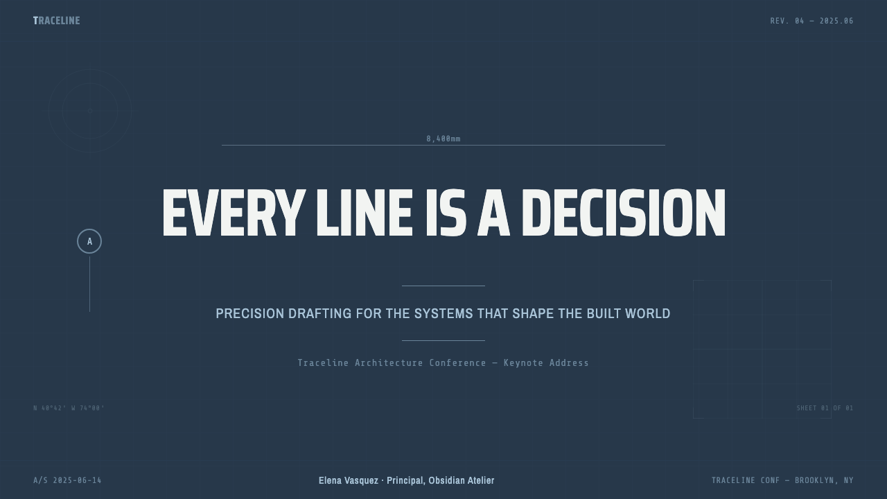
For presentation slides, the blueprint system works best when the content is itself technical or architectural in nature — project proposals, engineering reviews, system architecture presentations, technical pitch decks. A cover slide benefits from treating the title as a drawing title block: project name in a ruled box at lower right, drawing number and date, the rest of the field given over to a large schematic or linework diagram as the visual anchor. Content slides should treat text as annotation rather than prose — short callout labels pointing to elements, dimension-style leaders, numbered lists that evoke specification sheets. Data slides are particularly well-served: bar and line charts rendered in white on blue with dimension-style axis callouts read as instrumentation rather than marketing.
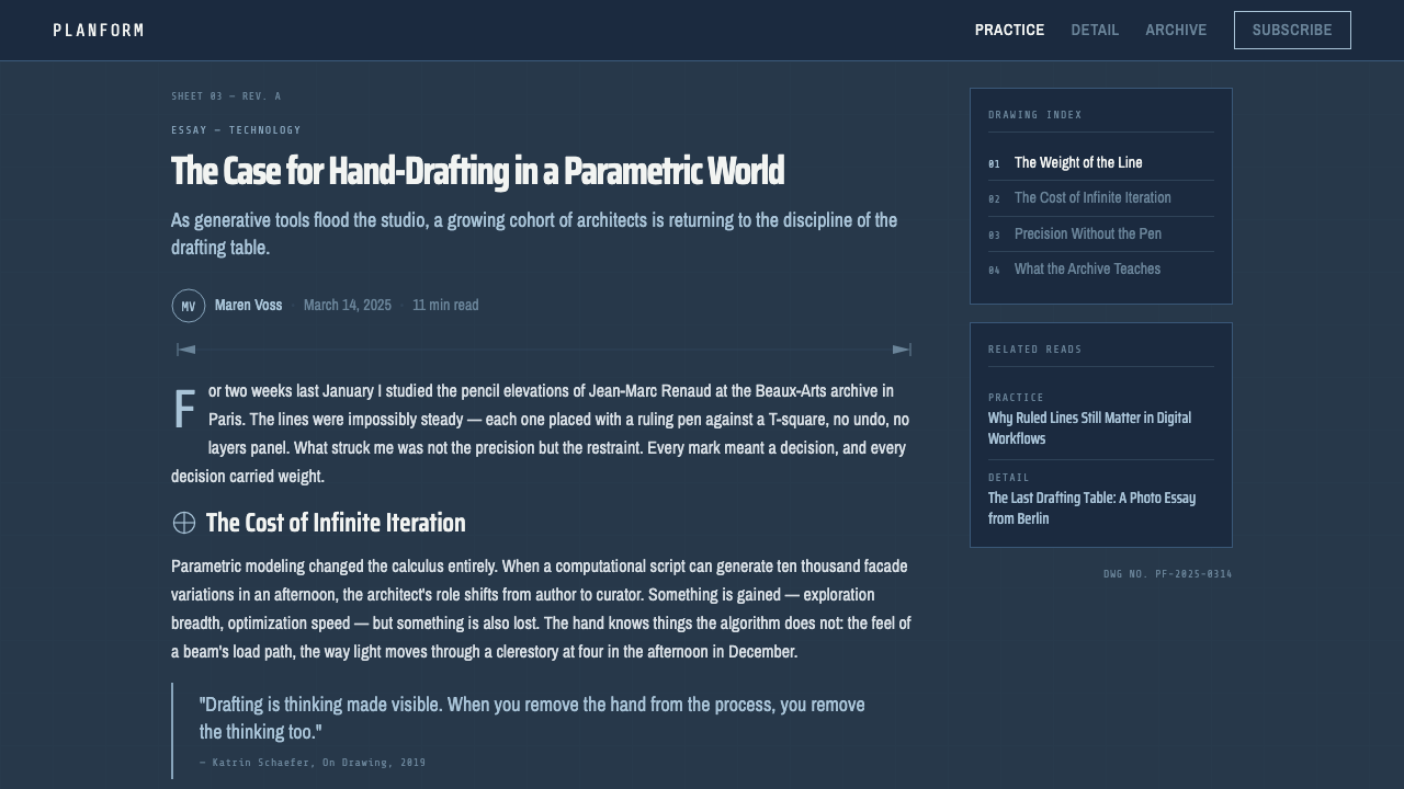
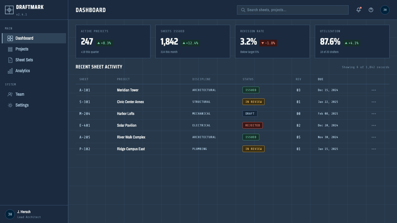
For web interfaces, the style is well-matched to technical tooling, developer platforms, and API documentation. The visual grammar supports density without clutter: a grid of fine blue rules organizes content into zones the way a drawing sheet is divided by a title block and border. Navigation should be functional and precise — no icons unless they serve a literal wayfinding purpose, type-led with clear hierarchy. Interactive elements use the line-weight convention: primary actions are heavy-bordered, secondary actions lighter, disabled states approximate the drawn construction line. Error states and warnings translate naturally into the red annotation pencil convention — a single bright annotation color against the blue-and-white field.
For editorial and marketing work, blueprint's strongest application is in contexts where technical credibility is the brand positioning. Hero sections with large schematic linework, detail callouts pointing to product features, specification-table layouts for pricing or comparison pages, and footer areas organized like a drawing's title block — all of these translate the drafting-room reference without pastiche. The style requires commitment: mixing blueprint elements with soft photography, rounded cards, or warm color families creates a tonal conflict that reads as confused rather than layered.
The most common mistake in applying the blueprint aesthetic is treating the blue-and-white color relationship as the entire system. The color is the most immediately recognizable element, but the style's authority comes from the underlying discipline: consistent line weights, explicit information hierarchy, annotation precision, and the total absence of decorative marks that carry no informational load. Designers who add the blue ground but keep soft shadows, rounded corners, and decorative dividers produce work that looks like a blueprint costume rather than a blueprint logic. The test is whether every mark on the page can be justified by the information it carries — if it cannot, it should not exist.
Cyanotype Blueprint — FAQ
Is the blueprint style only appropriate for technical or engineering contexts?
Not exclusively, but its most natural applications are in contexts where the signal of technical precision is itself a value proposition. Outside of technical tooling, the style has been successfully used in brand identity for industries that want to communicate deliberate process and rigorous thinking: architecture firms, manufacturing companies, infrastructure businesses, and research organizations. It has also appeared in editorial design for publications covering science, technology, and urban planning. Where it consistently struggles is in contexts requiring warmth, approachability, or sensory appeal — food, wellness, fashion, children's products. The style's restraint, which is a virtue in engineering contexts, can read as cold or clinical when the product's promise is human and organic.
How does the blueprint style relate to other technical or monochromatic design systems?
Blueprint shares a family resemblance with several other precision-oriented design systems — Swiss International Style's grid rigor, early terminal and command-line interface aesthetics, technical manual and specification sheet design — but it is distinct from all of them. Swiss Style is typographically systematic and uses a wide color range; blueprint is chromatically binary and notation-driven rather than typographically refined. Terminal aesthetics use green or amber on black, draw from computing culture, and prioritize text over diagram; blueprint is diagrammatic first and uses a photochemical blue that carries different cultural associations. The shared thread is the use of constraint as a compositional principle — in each case, what appears to be limitation is actually a system that produces clarity through discipline.
Can the blueprint style work in a light or inverted color scheme?
The original cyanotype produced white lines on blue — the inverted relationship was the process itself, not a design choice. A light inversion — dark lines on white or light gray — removes the photographic specificity of the style and produces something closer to a technical illustration or specification sheet. This can be effective in print contexts where the blue background would be cost-prohibitive, or in interfaces where the dark environment of a standard blueprint would be inappropriate. What the light version loses is the visual impact and cultural association that the saturated blue ground carries. It is a functional choice, not an aesthetic equivalent.
Why do blueprints feel authoritative even when the viewer has no engineering training?
Because the visual grammar of precision is legible without being decoded. A viewer does not need to understand what a witness line or a revision cloud means to recognize that the document they are looking at was produced by a system — that every mark has a rule, every position has a reason, and nothing present is accidental. This is the same mechanism that makes a well-organized spreadsheet or a meticulously formatted legal document feel authoritative: density plus consistency signals rigor even before content is read. The blueprint takes this further by adding photographic evidence of its own production — the blue field is the chemically fixed record of a precise exposure process, and even viewers who do not know this history perceive its weight.
What is the single most important rule when working in the blueprint style?
Every mark must justify itself through the information it carries. This is not minimalism as a trend — it is documentary discipline. A drafting room blueprint carried no element that the draftsman did not put there for a structural or communicative reason, because the process of producing it was costly and deliberate. Translating this into design work means that the justification test must be applied to every element: not 'does this look like a blueprint' but 'does this carry information that could not be conveyed by removing it'. When applied consistently, this discipline is what produces the style's authority — not the blue color, not the linework, but the sense that every element present is there because it earns its place.
Related design styles
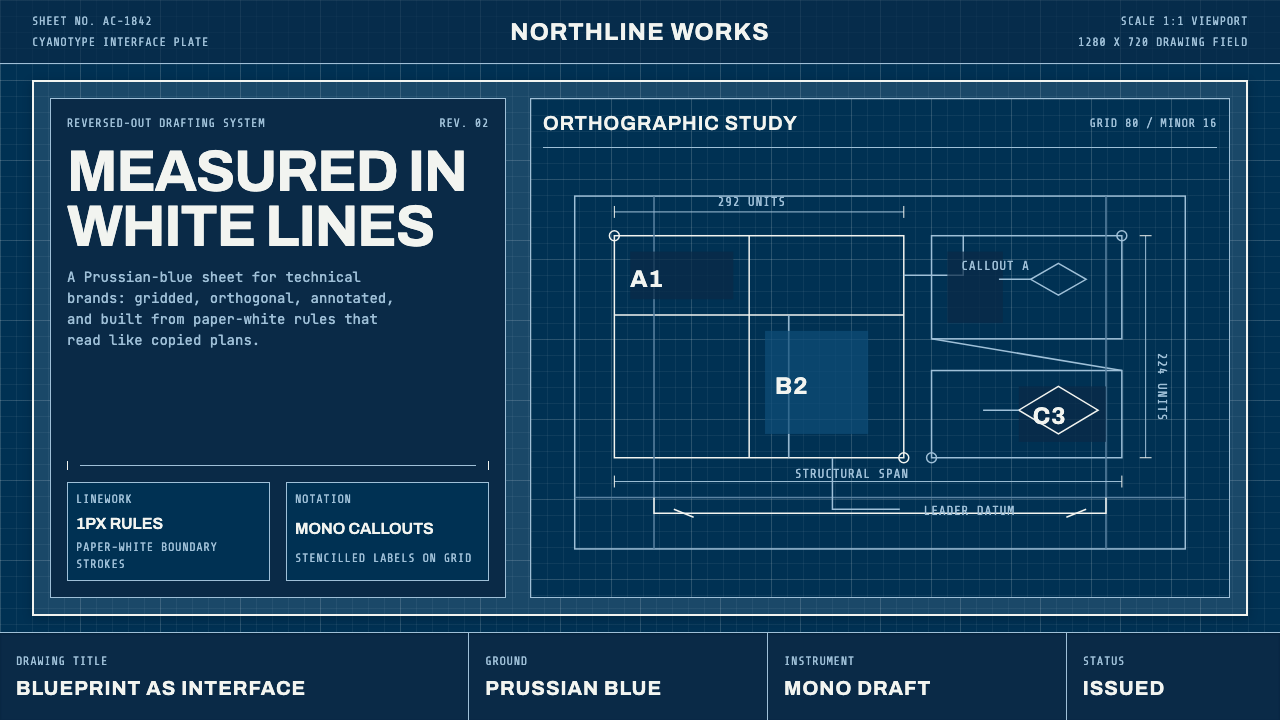 Architect CyanotypePrecision in negative. Prussian blue ground, paper-white grid, mono dimension…
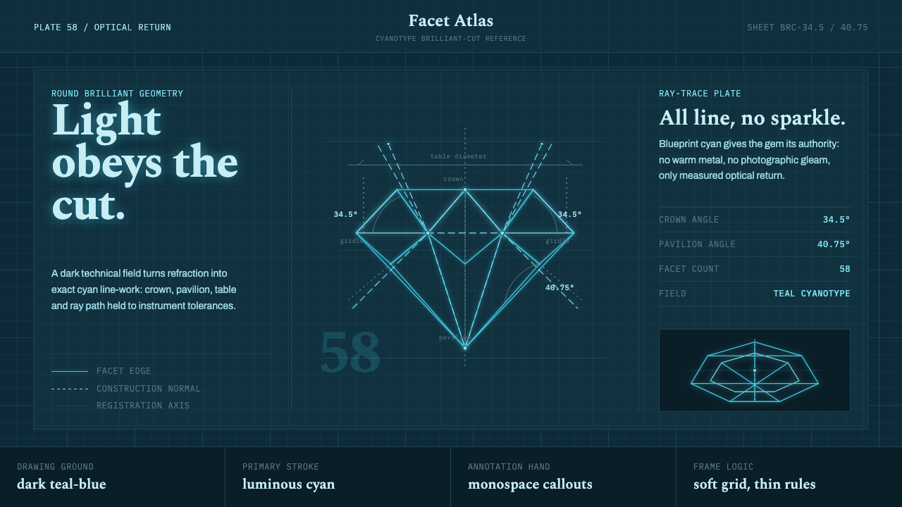 Brilliant Cut Facet DiagramOptics becomes blueprint. Cyan facet lines and ray paths glow on dark teal.
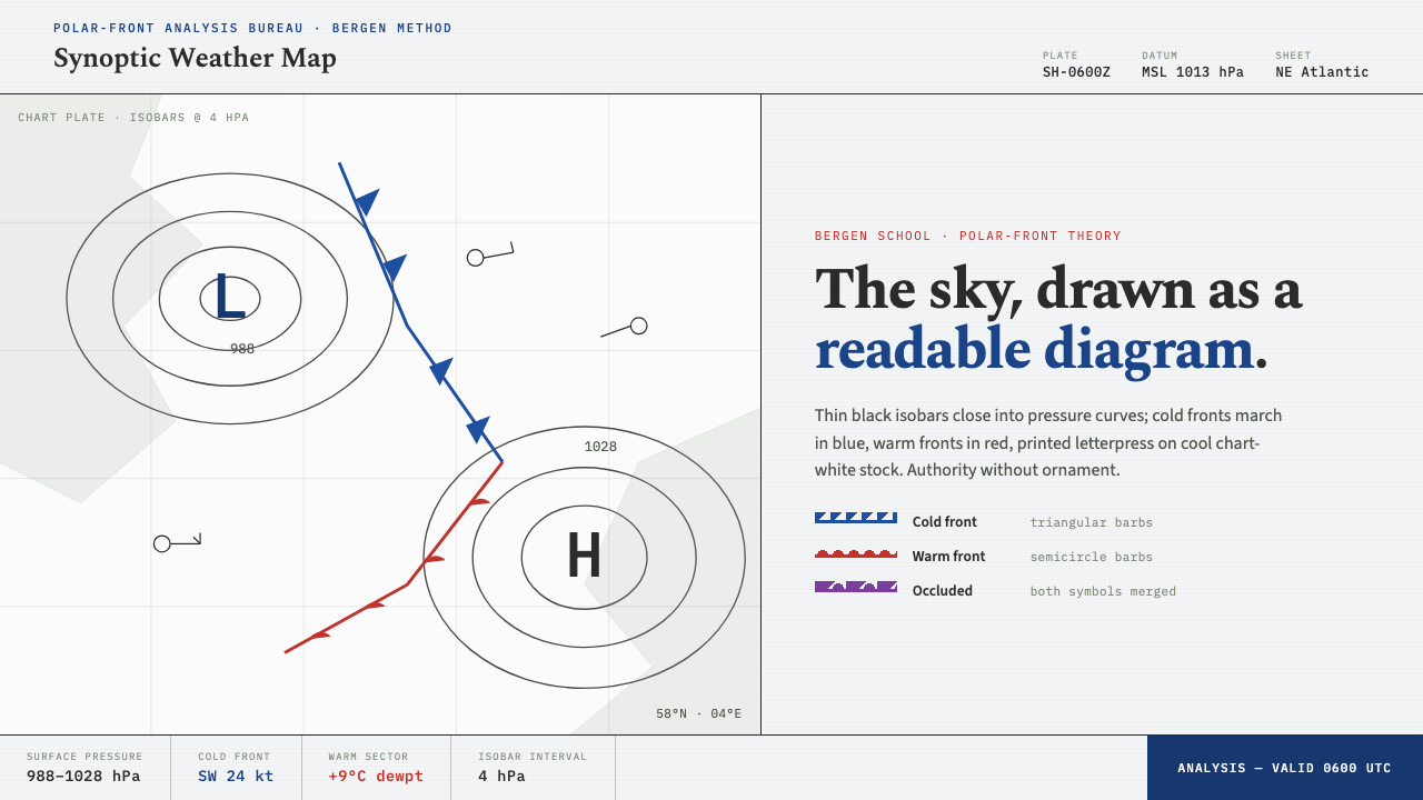 Synoptic Weather MapThe sky as a readable diagram. Black isobars, blue cold fronts, red warm fron…
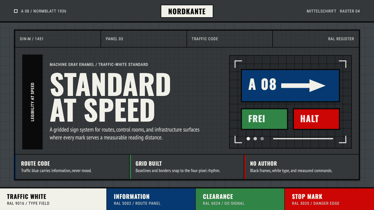 DIN 1451 SignageAuthorless and exact. Enamel gray grid, traffic-white DIN type, and RAL signa…
 Dragonfly Wing VenationPrecision, nearly weightless. Cyan-grey veins rule a foxed paper taxonomy pla…
 Hydrogen Airship FreightSlow freight is a capability. Matte aluminium grey, DIN grids, and a measured…