What is DIN 1451 Signage?
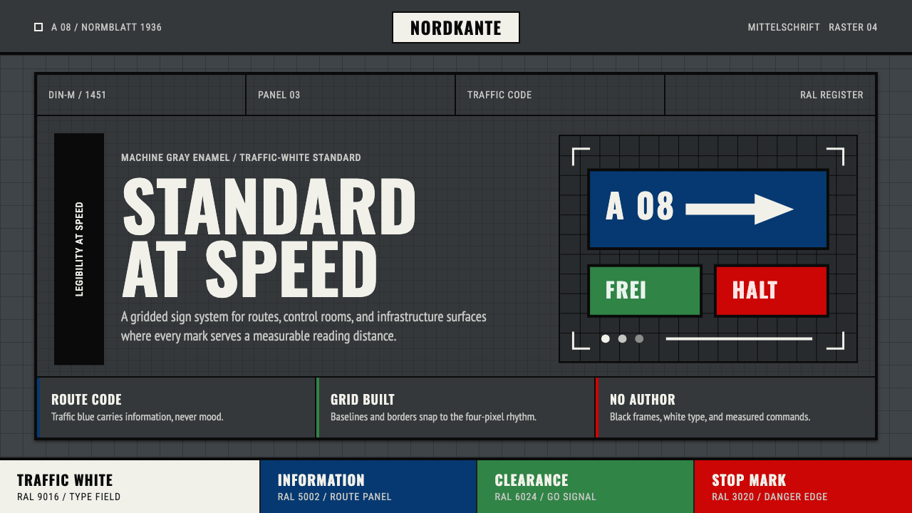
DIN 1451 is design without an author — a typeface drawn by committee rule and compass, standardized for the German road system in 1936, and so thoroughly engineered for legibility that it outlasted every aesthetic era that tried to replace it.
DIN 1451 Signage in brief
DIN 1451 is a typeface and visual system developed by the Deutsches Institut für Normung — Germany's national standards body — for use on road signs, license plates, technical drawings, and industrial nameplates. Its letterforms are not the product of a single designer's vision but of a standardization process: each character was defined by geometric rules that could be reproduced with a drawing compass, a ruling pen, and a fixed grid, by any draftsman anywhere in Germany.
The wider aesthetic system built around DIN 1451 combines the typeface with a small, carefully constrained palette of industrial colors — matte enamel panel grays, traffic white for lettering, and the high-chroma signal colors of the RAL system for directional bars and background fields. The result is a visual world that is simultaneously cold and precise: every panel is a module, every color a specification, every letter a technical drawing rather than a calligraphic act.
The style's authority comes from its function. DIN 1451 exists to be read at speed, in peripheral vision, under variable lighting, by drivers with no time to interpret ambiguity. Its letterforms are deliberately wide, its strokes consistently weighted, its spacing calibrated rather than optically adjusted. There is no expression in the marks — only information. This radical anonymity is also its most distinctive aesthetic quality.
Where does DIN 1451 Signage come from?
German industrial standardization has its roots in the late nineteenth century, when the rapid expansion of manufacturing created pressing demand for interchangeable parts, consistent specifications, and shared technical languages. The Normenausschuss der Deutschen Industrie — founded in 1917 and later renamed the Deutsches Institut für Normung — was the institutional response to this demand. DIN norms covered everything from screw thread dimensions to paper formats; the typeface was simply one entry in a vast catalog of shared standards.
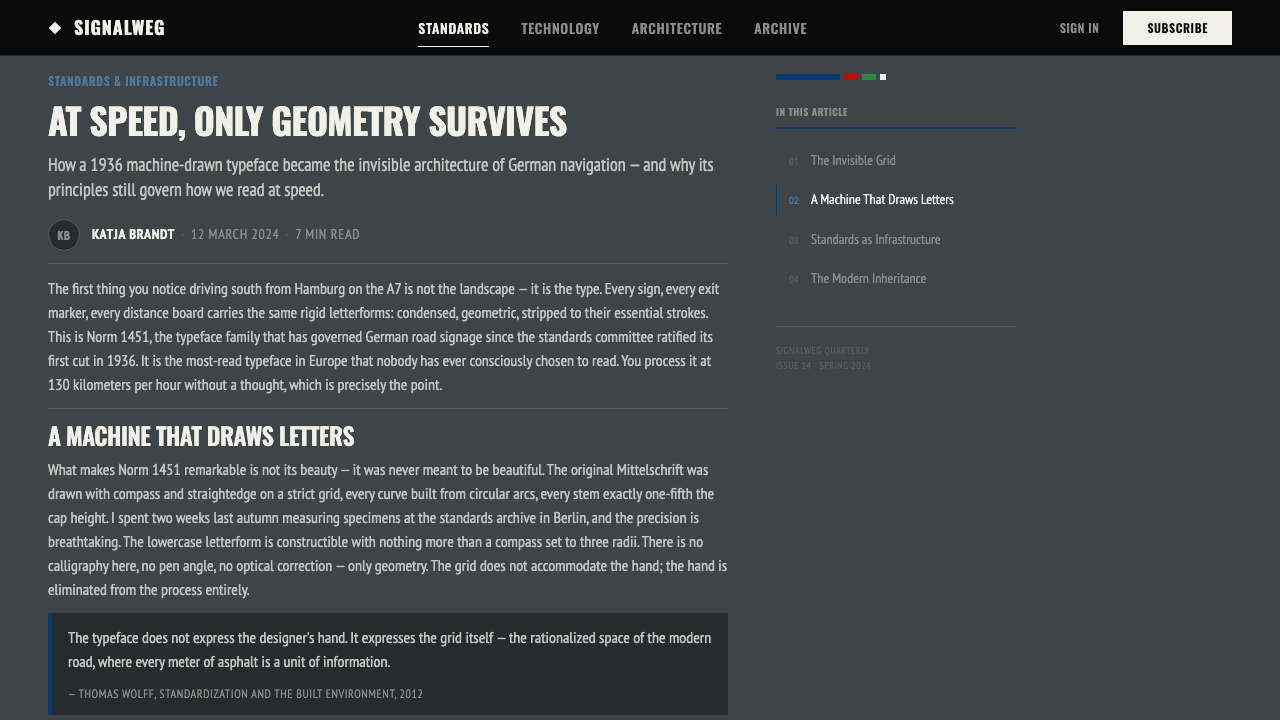
DIN 1451 was first published in 1931 and revised to its most familiar form in 1936. The original specification by Ludwig Goller defined two weights — Mittelschrift (medium) and Engschrift (condensed) — along with precise construction rules: each letter was built on a modular grid, with specified stroke widths, arc radii, and proportional relationships. The goal was not beauty but reproducibility — a draftsman with minimal typographic training should be able to draw any character correctly by following the grid.
The typeface's deployment on the German autobahn network, which expanded dramatically through the 1930s, embedded it into the visual fabric of the nation. Road signs, milestones, bridge identification plates, and administrative panels all carried DIN 1451. By mid-century it had spread to East and West Germany alike, to railways, post offices, and municipal signage — so ubiquitous that it became perceptually invisible to German citizens, the visual equivalent of ambient infrastructure noise.
The 1990s brought a digital revival that introduced DIN 1451 to a new generation of designers. When font foundries converted the original specification into digital typefaces — most notably FF DIN by Albert-Jan Pool in 1995 — they made the system's structural logic available to screen and print designers worldwide. The DIN aesthetic subsequently became one of the defining visual signatures of late 1990s and early 2000s design, particularly in technology and automotive contexts, precisely because its authority and neutrality read as contemporary rather than historical.
What defines the DIN 1451 Signage look?
Color System
The DIN 1451 visual system draws from two industrial color standards. The background and structural panels use the matte, low-reflectance grays associated with enamel signboard production — a cool, machine-gray that eliminates glare without softening the field. Lettering is rendered in traffic white, chosen for maximum contrast against the gray ground in daylight and under artificial light. Directional and categorical information is carried by the saturated signal colors of the RAL Classic system: the distinctive autobahn green, warning yellow, and border blue that identify sign type rather than decorate it. No color in this system is chosen for warmth or aesthetic pleasure; every choice is a specification.
Letterform Construction
DIN 1451's letterforms are built on a modular grid rather than drawn freehand or optically refined. Strokes maintain consistent weight throughout — there is no contrast between thick and thin, no tapering at terminals, no calligraphic axis. Curves are circular arcs derived from compass work, not humanist ellipses. The characters are deliberately wide and open: apertures are generous, counters are large, and the overall proportions favor legibility at a distance over elegance at close reading range. Each letter is, in the most literal sense, a technical drawing.
Grid and Panel Structure
DIN 1451 signage is organized around a strict modular grid in which text, arrows, symbols, and color fields all occupy defined cells. Panels are framed with consistent border widths; internal margins follow fixed ratios relative to character height. Arrows are standardized geometric forms — not stylized illustrations but defined shapes with specified proportions. Registration marks and alignment guides, visible in technical drawings of the standards, make the grid explicit. In designed applications, this grid logic produces layouts that feel authoritative precisely because they look calibrated rather than composed.
Typographic Hierarchy
Hierarchy in the DIN system is achieved through scale alone. Primary destination names appear at the largest size; secondary information — junction numbers, distances, route codes — steps down in a consistent ratio. Weight contrast is minimal because the typeface itself offers limited variation. All typographic organization is additive rather than decorative: information layers are separated by spatial gaps and scale shifts, not by ruled lines or ornamental dividers. The system demonstrates that hierarchy does not require visual complexity — it requires disciplined proportion.
Zero Ornamentation
The DIN signage system contains no decorative elements in any sense. There are no flourishes, no illustrative devices, no background textures, no gradient fills, no rounded corners chosen for softness rather than specification. Even the few symbols that appear — the arrow, the border stripe — are functional rather than aesthetic decisions encoded in the standard. This is not minimalism as a stylistic choice but the total absence of ornament as a practical requirement: every non-informational element is visual noise that costs the driver reading time.
Material Context
The original DIN 1451 aesthetic is inseparable from its production material: oven-baked enamel fused onto steel panels. Enamel gives the surface its matte opacity, its resistance to weathering, and its characteristic flatness — it does not shine or shimmer, it does not age gracefully into patina, it presents information without self-expression. This material neutrality is part of the style's visual identity. In digital and print applications, the appropriate translation is a flat, matte rendering that resists all surface effects — no gradients, no gloss, no simulated texture.
Impersonality as Aesthetic
Perhaps the most unusual quality of the DIN system is that its anonymity is not incidental but structural. The typeface was designed by committee, revised by committee, and deployed without credit. No signature, no individual authorship, no house style variation — the same letter drawn in Hamburg must be identical to the same letter drawn in Munich. This designed-out individuality produces a visual tone unlike any commercial type design: austere, institutional, and paradoxically compelling precisely because nothing in it is trying to be compelling.
Who shaped DIN 1451 Signage?
The German standards body founded in 1917 as the Normenausschuss der Deutschen Industrie, DIN is the institutional author of the entire DIN 1451 system. Operating through technical committees rather than individual designers, DIN produced specifications that prioritized measurability and reproducibility over aesthetic intention. The organization's approach — defining visual form through constraint rather than expression — produced what may be the most widely deployed anonymously authored typeface in history, present on every German road and in every German technical document for nearly a century.
Goller is the engineer-draughtsman credited with producing the original geometric construction rules for DIN 1451 in the early 1930s. His contribution was technical rather than artistic: he translated the requirement for a legible, reproducible, standardized grotesque into precise grid-based construction instructions. The fact that his name is largely absent from design history — in contrast to the near-mythological status of individual type designers — is itself an accurate reflection of the DIN system's values. The standard mattered; the person behind it did not.
The Dutch type designer who digitized and expanded the DIN 1451 specification into FF DIN, released through FontFont in 1995. Pool's work was not a faithful historical reconstruction but a systematic expansion: he added missing weights, corrected inconsistencies in the original specification, and designed an italic — something the original standard never required. FF DIN became one of the best-selling typefaces of the late 1990s and early 2000s, responsible for the style's adoption in technology branding, automotive design communication, and information graphics far beyond Germany. Pool's digitization is what made the DIN aesthetic internationally available.
The RAL (Reichs-Ausschuß für Lieferbedingungen) color standard, established in Germany in 1927, is the palette partner to DIN 1451 in the signage system. Where DIN defines letterform, RAL defines the precise signal colors — the autobahn green, the warning yellow, the border blue, the road-marking white — that carry categorical meaning across the German road network. RAL colors are defined industrially rather than perceptually: each color has a reference number and a physical chip, not a subjective description. The combination of DIN letterforms and RAL signal colors produces the unified industrial coherence that makes the DIN 1451 visual system immediately recognizable.
The autobahn system, expanded aggressively from the 1930s through the postwar decades, is the primary context in which DIN 1451 reached its canonical form and national scale. The road network's signage requirements — legibility at high speed, consistency across thousands of kilometers, maintenance by many different contractors — drove the specification's insistence on geometric reproducibility over individual craftsmanship. In this sense, the road network is not merely a deployment context but a co-author of the style: its operational demands shaped every formal decision in the standard.
How do you use DIN 1451 Signage today?
Applying the DIN 1451 system to designed work requires understanding that its authority comes from constraint, not from decoration. The visual power of an autobahn sign arises because every element — color, type, spacing, arrow — is held to a specification. When translating this into presentation slides, web UI, or editorial design, the operative principle is the same: set strict rules for yourself and follow them without exception. A DIN-derived layout that makes ad hoc decisions about spacing or hierarchy will not feel authoritative; it will feel merely gray.
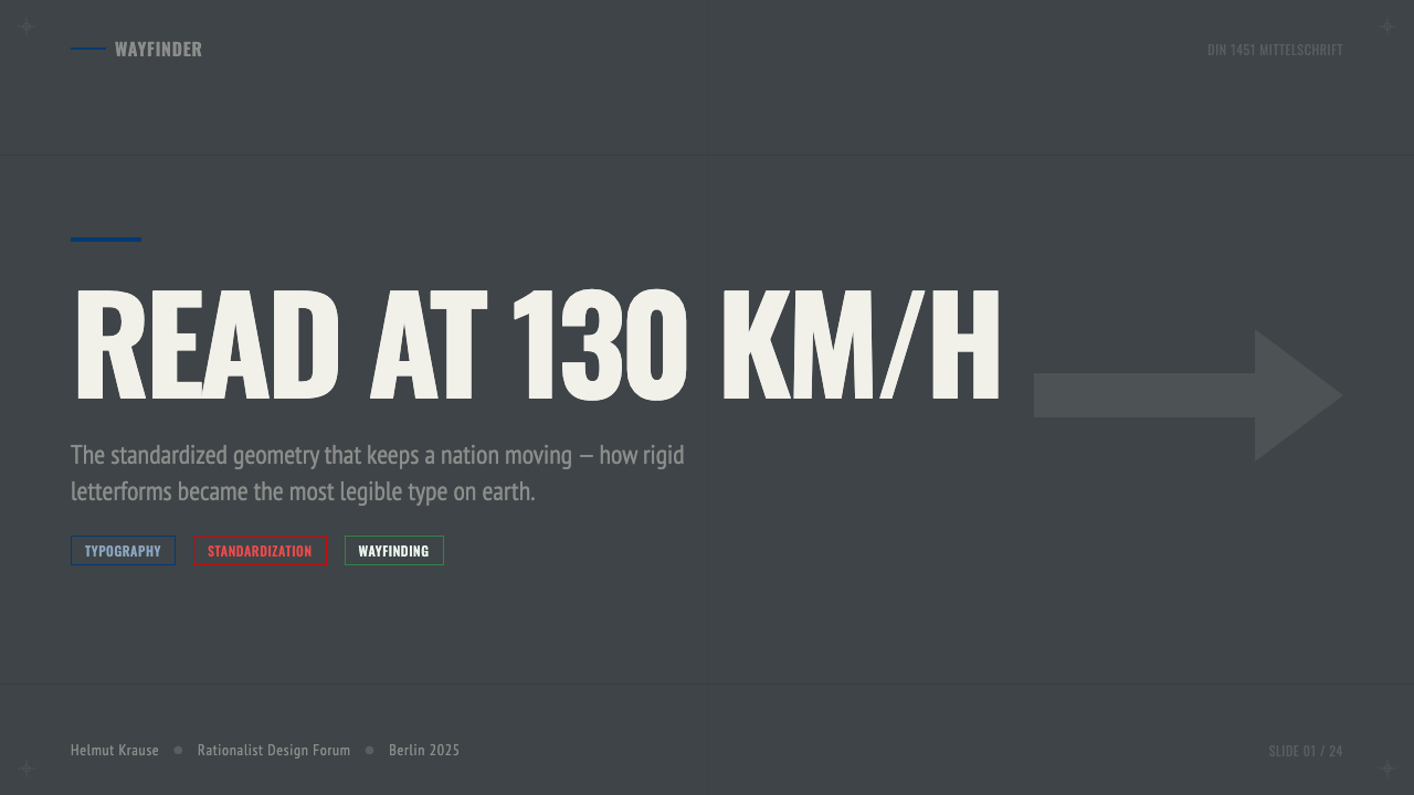
For presentation slides, the DIN aesthetic works best for technical briefings, engineering presentations, and institutional reporting where precision and clarity outweigh persuasion. Cover slides should anchor the title in a single weight of a geometric grotesque, set flush left against a matte mid-gray or near-black ground, with a single RAL-adjacent signal color used as the only accent — a horizontal band across the lower third or a color block behind the organization mark. Content slides should be typographic only: no illustrative decoration, no background textures, no rounded-corner boxes. Data slides translate naturally: bar charts and line graphs become engineering diagrams, with axes clearly labeled and color used only to distinguish series, not to make the chart attractive.
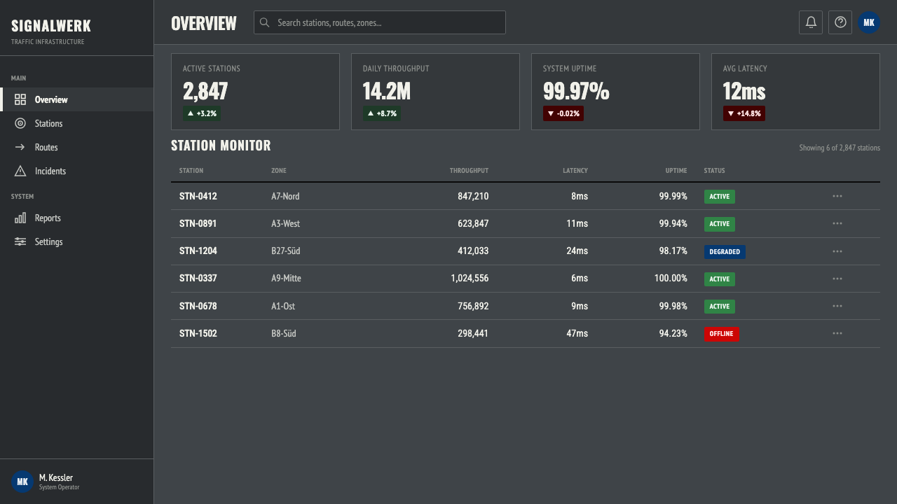
For web interfaces and dashboards, the DIN system suggests a UI vocabulary of hard edges, flat surfaces, and monochrome structure with narrow color application. Navigation bars and sidebars should read as panels — defined by border lines or background fills — rather than floating elements. Interactive states use the signal palette: an active state might shift a panel background to the characteristic autobahn green or warning yellow, while the neutral state remains gray and white. Avoid rounded corners, ambient shadows, and hover animations that soften or liquify the interface. The DIN aesthetic rewards interfaces that feel like instruments rather than experiences.
In editorial and print contexts, DIN 1451-derived design suits annual reports, technical manuals, wayfinding systems, and information graphics where hierarchy must be unambiguous and navigation efficient. A DIN-influenced layout uses flush-left alignment throughout, minimal leading variations, and section breaks marked by horizontal rules of specified weight rather than ornamental devices. Color is rationed: one signal color per document, used only for navigation anchors, alerts, or the most critical data points.
The most common mistake when working with the DIN aesthetic is softening it — rounding corners, adding subtle gradients to panel backgrounds, choosing an off-white that reads as warm rather than neutral, or using a geometric sans with humanist details that undermine the mechanical quality. The style's authority depends entirely on its refusal to accommodate. A DIN-inspired design that makes one concession to approachability loses something essential; make two concessions and you have ordinary corporate design. The discipline is the point.
DIN 1451 Signage — FAQ
Is DIN 1451 the same as Swiss International Style?
They share a family resemblance — both use geometric sans-serif type, both reject ornament, both are built on grid logic — but they come from completely different traditions and have different temperaments. Swiss International Style (emerging in the 1950s and 1960s) was an art-school movement concerned with typographic refinement, optical adjustment, and the communication of ideas. DIN 1451 is an engineering standard concerned with legibility, reproducibility, and the communication of location data. Swiss work is typographically sophisticated and compositionally considered; DIN work is metrically calibrated and institutionally anonymous. The Swiss style feels designed; DIN feels specified.
How does the DIN aesthetic handle photography and imagery?
In the original signage context, photography does not exist — the system contains only type, color fields, and geometric symbols. In contemporary applications that reference the DIN aesthetic, photography is a problem: it imports organic texture, tonal variation, and human warmth into a system that depends on flatness and specification. When imagery is necessary, the appropriate treatment is high-contrast or duotone reproduction that reduces the image to a graphic value rather than a naturalistic window. Silhouetting against a flat color field, or treating photographs as solid-color panels when viewed at the relevant scale, preserves the system's mechanical integrity.
Why did the DIN typeface become popular in technology and automotive branding?
Because the DIN typeface embodies values that technology and automotive companies want to communicate: precision, reliability, engineering competence, and a certain deliberately maintained neutrality. A DIN-influenced identity says nothing about personality or warmth; it says everything about specification and performance. In the late 1990s, when many technology companies were moving away from the handcrafted visual identities of the early personal computing era, the DIN aesthetic provided a model of type that felt contemporary without being fashionable — rigorous without being cold in the way that pure Swiss minimalism can feel. The automotive parallel is even more direct: the typeface literally appeared on the instruments and nameplates of German engineering excellence for decades before anyone thought to use it as a brand asset.
Can the DIN 1451 visual system work for consumer-facing products, or is it too institutional?
It depends on what the product is selling. DIN works exceptionally well when the product's core value proposition involves reliability, precision, or engineering quality — navigation apps, fitness trackers, financial tools, diagnostic software, or any context where the user wants to feel that the system is measuring rather than performing. It struggles in contexts that require sensory pleasure, emotional warmth, or cultural playfulness. A DIN-influenced food delivery app will feel transactional and cold; a DIN-influenced heart-rate monitor will feel trustworthy. The honest question is whether your product's users are reassured or alienated by the feeling that the thing they are using was specified rather than designed.
What is the difference between DIN 1451 and the many 'DIN-inspired' typefaces now available?
The original DIN 1451 specification defines letterforms for a specific production context — engraving, stenciling, and manual drafting — with tolerances and geometric rules calibrated to that context. Digital revivals and DIN-inspired typefaces take those proportions and construction principles and reinterpret them with optical corrections, additional weights, and refined spacing — changes that improve typographic performance at screen and print sizes but move the design away from its engineering origins. Some revivals, like FF DIN, stay close to the original character; others, like Aktiv Grotesk or Brandon Grotesque, borrow the DIN skeleton but add humanist warmth that the original standard explicitly refused. Knowing which you are using matters: the original specification's mechanical quality comes from its engineering constraints, not from its proportions alone.
Related design styles
 Architect CyanotypePrecision in negative. Prussian blue ground, paper-white grid, mono dimension…
 Brilliant Cut Facet DiagramOptics becomes blueprint. Cyan facet lines and ray paths glow on dark teal.
 Dessau GrayscaleAustere monochrome authority. Darkroom black, glazing gray, and a steel-windo…
 Hydrogen Airship FreightSlow freight is a capability. Matte aluminium grey, DIN grids, and a measured…
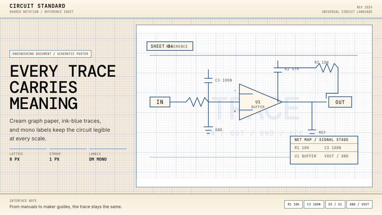 Electrical Schematic WiringAustere and exact. Cream graph paper, ink-blue traces, and mono labels make e…
 Frutiger CDG AirportLegibility at runway scale. Navy panels, white humanist sans, arrow-led grids.