What is Ulm School (HfG Ulm)?什么是 Ulm School (HfG Ulm)?
Where Bauhaus idealism met scientific method — the Ulm School distilled postwar functionalism into the most disciplined design language of the twentieth century.当包豪斯理想主义遭遇科学方法论,乌尔姆造型学院将战后功能主义提炼为二十世纪最严谨的设计语言。
Ulm School (HfG Ulm) in briefUlm School (HfG Ulm) 速览
The Hochschule für Gestaltung Ulm — known in English as the Ulm School of Design, or simply HfG Ulm — was a West German design institution that operated from 1953 to 1968. In those fifteen years it reshaped industrial design, visual communication, and corporate identity in ways still legible in the interfaces, signage systems, and product families that surround us today. Its visual language is defined by absolute constraint: pure black type on white ground, rigorous mathematical grids, hairline rules as the primary organizational device, and a single red accent used with the precision of a surgical instrument.乌尔姆造型学院(Hochschule für Gestaltung Ulm,简称 HfG Ulm)是一所活跃于1953年至1968年的西德设计学府。在短短十五年间,它重塑了工业设计、视觉传达与企业识别的面貌,其影响至今仍清晰可辨于我们身边的界面、标识系统与产品家族之中。它的视觉语言由绝对的约束所定义:纯黑字体置于白色底面,严格的数学化网格,细线规则作为主要组织手段,唯一的红色强调色以手术般的精准运用。
Where the Bauhaus had been a school of artistic experimentation grounded in craft, the Ulm School was a school of systematic design grounded in science, semiotics, and information theory. Its faculty did not simply teach students how to make things look a certain way; they developed theoretical frameworks for why designed objects communicate what they communicate, and how those communication structures could be optimized. Design was treated not as the application of taste but as the application of method.包豪斯是一所以手工艺为根基的艺术实验学校,而乌尔姆造型学院则是一所以科学、符号学与信息论为根基的系统性设计学校。其教师不仅仅教授学生如何让事物呈现某种外观,更发展出理论框架,探讨被设计的物体为何传达其所传达的内容,以及这些传达结构如何得以优化。设计被视为方法的应用,而非品味的施展。
The Ulm aesthetic is instantly recognizable: no gradients, no rounded corners, no decorative gestures of any kind. Structure is visible and intentional. Every line, every weight, every interval of space answers to a logic that can be articulated and defended. The result is a visual system that feels less like a style than like an argument — one that remains as persuasive today as it was when Otl Aicher designed the Lufthansa identity or Hans Gugelot shaped the Braun product line.乌尔姆美学一眼可辨:没有渐变,没有圆角,没有任何形式的装饰性姿态。结构是可见的,是有意图的。每一条线、每一种字重、每一段空间间距都对应着一套可以被清晰表述与辩护的逻辑。其结果是一套视觉系统,感觉上与其说是一种风格,不如说是一个论点——一个在奥托·艾舍尔设计汉莎航空识别系统、汉斯·古格洛特塑造百灵产品线之后数十年间依然同样有说服力的论点。
See the Ulm School (HfG Ulm) design system查看 Ulm School (HfG Ulm) 完整设计系统
Where does Ulm School (HfG Ulm) come from?Ulm School (HfG Ulm) 从何而来?
The Ulm School was founded in 1953 in the city of Ulm, West Germany, by Inge Aicher-Scholl, Otl Aicher, and Max Bill. The school's founding was inseparable from the political and moral context of postwar Germany. Inge Aicher-Scholl was the sister of Hans and Sophie Scholl, who had been executed by the Nazi regime in 1943 for their role in the White Rose resistance movement. The school was conceived in part as a memorial to their legacy and as a practical institution for rebuilding German civic culture on democratic principles. This moral seriousness — the belief that design carried ethical weight and not merely aesthetic preference — would shape the Ulm program from its first semester.乌尔姆造型学院于1953年由英格·艾希尔-肖尔、奥托·艾舍尔与马克斯·比尔在西德乌尔姆市创立。学校的建立与战后德国的政治与道德背景密不可分。英格·艾希尔-肖尔是汉斯·肖尔与苏菲·肖尔的姐姐——后两者因参与」白玫瑰」抵抗运动而于1943年被纳粹政权处决。学校的创立,一方面是对他们遗产的纪念,另一方面也是在民主原则基础上重建德国公民文化的实践机构。这种道德严肃性——相信设计承载的是伦理分量而非仅仅审美偏好——从第一学期起就塑造了乌尔姆的教育纲领。
Max Bill, a Swiss architect and designer who had studied at the Dessau Bauhaus under Walter Gropius, served as the first rector. He brought with him the Bauhaus conviction that form and function were inseparable, and that well-designed objects could improve the quality of everyday life. But Ulm quickly moved beyond the Bauhaus in methodological rigor. When Tomás Maldonado, an Argentine designer and theorist, joined the faculty and eventually succeeded Bill as rector in 1954, the school shifted decisively toward a scientific model. Maldonado introduced semiotics, information theory, and systems thinking into the curriculum, arguing that design problems were not fundamentally different from engineering problems and should be approached with the same analytical discipline.曾在德绍包豪斯师从瓦尔特·格罗皮乌斯的瑞士建筑师与设计师马克斯·比尔担任首任校长。他带来了包豪斯关于形式与功能不可分离、设计良好的物体能够改善日常生活品质的信念。但乌尔姆很快在方法论的严格程度上超越了包豪斯。当阿根廷设计师与理论家托马斯·马尔多纳多加入教师队伍并于1954年接替比尔出任校长时,学校果断转向科学模式。马尔多纳多将符号学、信息论与系统思维引入课程,主张设计问题在本质上与工程问题并无不同,应以同等的分析性纪律加以处理。
The school's relationship with industry was central to its identity and output. A formal collaboration with the electronics company Braun, begun in the mid-1950s, produced some of the most celebrated objects of the century: the SK 4 phonograph, designed with Hans Gugelot, and the series of radio and audio products that established Braun's visual language for decades. Otl Aicher's work for Lufthansa, begun in 1962, created one of the first fully systematic corporate identity programs — a unified visual language applied consistently across aircraft livery, signage, printed materials, and uniforms. These were not exercises in style; they were systematic design programs in which every visual decision was grounded in functional and communicative criteria.学校与工业界的关系是其身份认同与产出成果的核心。与电子公司百灵(Braun)始于1950年代中期的正式合作,产出了本世纪最为人称道的若干产品:与汉斯·古格洛特共同设计的SK 4留声机,以及确立百灵数十年视觉语言的一系列收音机与音响产品。奥托·艾舍尔1962年起为汉莎航空开展的工作,创造了最早的全系统企业识别方案之一——一套统一的视觉语言,被一致应用于飞机涂装、标识、印刷品与制服。这些不是风格练习,而是系统性设计纲领,其中每一个视觉决定都以功能与传达标准为依据。
The Munich 1972 Olympic Games represented the apex of HfG Ulm's influence on public culture. Otl Aicher, leading the visual design team, developed a comprehensive visual identity that included the now-iconic pictogram system — a set of rigorously geometric, gender-neutral athlete silhouettes that communicated across language barriers to an international audience. The pictograms reduced the human figure to its essential geometric action and became the template for virtually every subsequent Olympic and public information symbol system. The Ulm School closed in 1968, a victim of political disputes with the state government of Baden-Württemberg over funding and ideological direction. But by then, its graduates and their work had already established a design methodology that would define the look of postwar modernity.1972年慕尼黑奥运会代表了HfG Ulm对公共文化影响力的顶峰。主导视觉设计团队的奥托·艾舍尔开发了一套综合视觉识别体系,其中包括如今已成为图标的象形图系统——一套以严格几何构建、性别中立的运动员剪影,向国际观众跨越语言障碍传达信息。这套象形图将人体简化为其本质的几何动作,成为此后几乎所有奥运会及公共信息符号系统的模板。1968年,乌尔姆造型学院因与巴登-符腾堡州政府在资金与意识形态方向上的政治争议而关闭。但彼时,其毕业生及其作品已确立了一套设计方法论,将定义战后现代性的整体面貌。
What defines the Ulm School (HfG Ulm) look?Ulm School (HfG Ulm) 的视觉特征是什么?
Black-and-White Primacy黑白主导
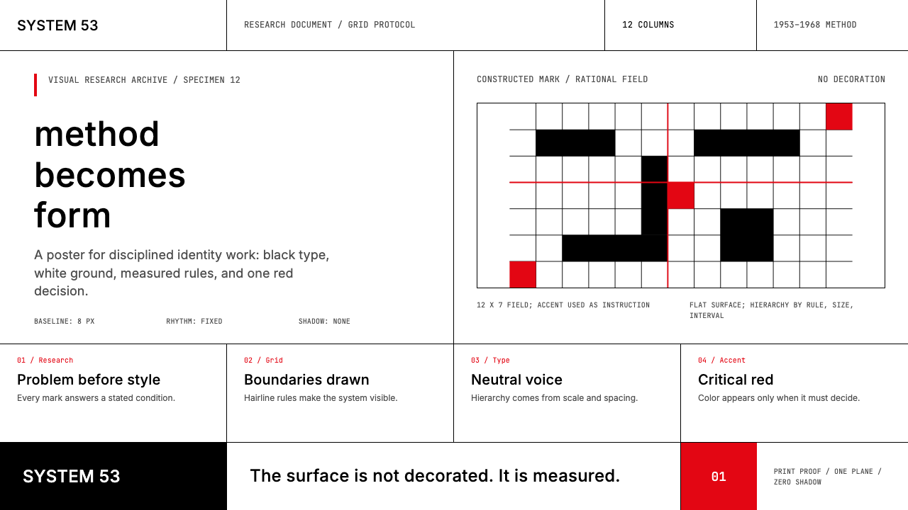
The Ulm School operates from a near-absolute chromatic restriction: black type and rules on white ground constitute the default visual state. This is not minimalism in a decorative sense but a principled commitment to contrast as the primary carrier of information. The white field is active, not empty — it is the ground against which every element is precisely measured. Any introduction of color is a deliberate act carrying communicative intent, not an aesthetic preference.乌尔姆造型学院从近乎绝对的色彩约束出发:白色底面上的黑色字体与线规构成默认的视觉状态。这不是装饰意义上的极简主义,而是对对比度作为信息主要载体的原则性承诺。白色底面是主动的而非空洞的——它是精确衡量每一个元素的背景。任何色彩的引入都是一种有意识的行为,承载传达意图,而非审美偏好。
Mathematical Grid数学化网格
Every layout element at HfG Ulm answers to a rigorous underlying grid — one derived from proportional systems and modular arithmetic rather than visual intuition. Columns, rows, gutters, and margins are not approximated but calculated. The grid is invisible in the final composition but evident in the precision of alignment: every text block, every ruled line, every white space interval corresponds to a specific position in the module system. This makes the Ulm grid feel different from looser grid systems — it has an internal consistency that the eye registers as authority.在HfG Ulm,每一个版面元素都从属于一套严格的底层网格——这套网格源自比例系统与模块运算,而非视觉直觉。列、行、栏间距与页边距不是近似的,而是经过计算的。网格在最终构图中不可见,但从对齐的精确度中清晰可辨:每个文本块、每条线规、每段留白间距都对应模块系统中的特定位置。这使得乌尔姆网格与更宽松的网格系统感觉截然不同——它拥有一种内在一致性,令眼睛将其注册为权威。
Hairline Rules as Structure细线规则作为结构
Where most design systems use weight, color, or spatial separation to divide content zones, Ulm School work uses the hairline rule — a thin, precise horizontal or vertical line — as the primary organizing device. These lines are not decorative borders; they are structural articulations of the grid. They separate, they align, they create visual rhythm. Used consistently, they give a page or screen the quality of a precision instrument: everything in its place, every boundary declared.大多数设计系统使用字重、色彩或空间分隔来划分内容区域,而乌尔姆造型学院的作品则以细线规则——精确的细水平线或垂直线——作为主要的组织手段。这些线不是装饰性边框,而是网格的结构性表达。它们分割、对齐、创造视觉节奏。一致运用之下,它们赋予页面或屏幕一种精密仪器的品质:一切各就其位,每一条边界都被明确宣示。
Single Accent Color单一强调色
The Ulm School permits one accent color — typically a clear, saturated red — and deploys it with surgical economy. It appears where maximum attention is required: a critical label, a primary call to action, a data point that demands isolation from its context. The red is not decorative warmth; it is a signal. Its power depends entirely on restraint. If it appears too often, or in areas of secondary importance, the signal degrades into noise. The discipline of a single accent, used rarely and with intent, is one of the Ulm system's most transferable principles.乌尔姆造型学院允许一种强调色——通常是清澈、饱和的红色——并以手术般的经济性加以运用。它出现在需要最高关注度之处:关键标签、主要行动号召、需要从上下文中突出隔离的数据点。这种红色不是装饰性的暖意;它是一个信号。其力量完全依赖于克制。如果它出现得过于频繁,或出现在次要位置,信号便会降解为噪音。单一强调色、罕用而有意图——这是乌尔姆系统最具可移植性的原则之一。
Typographic Hierarchy by Scale以尺度建立的字体层级
Ulm typography is built on grotesque sans-serif letterforms — clean, upright, with no calligraphic trace — and organizes hierarchy through scale and weight rather than decorative variation. A headline may be many times the size of body text; a label may be set in the same typeface at a fraction of that size with additional letter-spacing. There are no ornamental capitals, no italic inflections used decoratively, no mixing of contrasting typeface families. The entire hierarchy is produced by a single typeface doing its work at different scales.乌尔姆的排版建立在无饰线几何无衬线字体之上——干净、直立、无任何书法痕迹——并通过尺度与字重而非装饰变化来组织层级。标题可能是正文的数倍大小;标签可能以同一字体以极小尺寸配合更宽的字距排设。没有装饰性大写,没有以装饰目的使用的斜体,没有对比字体家族的混用。整套层级由单一字体以不同尺度完成其工作。
Functional Semiotics功能符号学
Unique among historical design movements, the Ulm School grounded its visual practice in semiotic theory — the study of signs and their meanings. Designers were expected to understand not only how to make an icon recognizable but why certain visual structures communicate certain meanings more efficiently than others. This produced a distinctive approach to pictogram and symbol design: forms are reduced to the minimum number of elements required for unambiguous reading, with no decorative residue. The Munich Olympic pictograms are the canonical example: each athlete figure is the geometric minimum necessary to convey its sport.在历史上的设计运动中独树一帜,乌尔姆造型学院将其视觉实践根植于符号学理论——符号及其意义的研究。设计师不仅需要理解如何让图标可辨识,更需要理解为何某些视觉结构比其他结构更高效地传达某些意义。这产生了一种独特的象形图与符号设计方法:形态被简化为无歧义读取所需的最少元素,不留任何装饰性残余。慕尼黑奥运象形图是其典范:每个运动员形态都是传达其运动项目所必需的几何最简形式。
Zero Decorative Gesture零装饰姿态
The Ulm School inherited from the Bauhaus the principle that ornament without function is waste, but it carried this further than the Bauhaus had. Where Bauhaus work sometimes permitted bold geometric shapes used expressively, Ulm design subordinates even geometric form to communicative necessity. There are no purely decorative shapes, no visual flourishes that exist for compositional pleasure, no rounded corners softening the severity of the system. Every element is what it is because it must be there. This absolute discipline is what distinguishes authentic Ulm-derived work from contemporary designs that adopt the aesthetic without the underlying logic.乌尔姆造型学院从包豪斯继承了」无功能的装饰即浪费」的原则,并将其推进得比包豪斯更彻底。包豪斯作品有时允许具有表现性的大胆几何形态,而乌尔姆设计则将几何形态本身也置于传达必要性的从属之下。没有纯粹装饰性的形态,没有为构图愉悦而存在的视觉花饰,没有柔化系统严格性的圆角。每一个元素之所以存在,是因为它必须在那里。这种绝对的纪律,正是真正源自乌尔姆的作品与那些采纳其美学却缺乏底层逻辑的当代设计之间的本质区别。

See the Ulm School (HfG Ulm) design system查看 Ulm School (HfG Ulm) 完整设计系统
Who shaped Ulm School (HfG Ulm)?谁塑造了 Ulm School (HfG Ulm)?
Otl Aicher was co-founder of HfG Ulm and the designer most responsible for translating its systematic principles into landmark public work. His corporate identity program for Lufthansa, begun in 1962, established a new standard for systematic visual communication: every element of the airline's public face — from aircraft livery to timetable typography — was governed by a unified visual grammar. His design team for the Munich 1972 Olympic Games produced the pictogram system that became the global template for public information iconography. Aicher also developed a comprehensive theory of visual language and typography, arguing that design was a form of ethics — that clarity and honesty in visual communication were moral commitments, not merely aesthetic ones.奥托·艾舍尔是HfG Ulm的联合创始人,也是最终将其系统性原则转化为具有里程碑意义的公共作品的设计师。他1962年起为汉莎航空开展的企业识别项目,为系统性视觉传达确立了新标准:从飞机涂装到时刻表排版,航空公司公众形象的每一个元素都受到统一视觉语法的支配。他为1972年慕尼黑奥运会领导的设计团队创造了象形图系统,成为全球公共信息图标的模板。艾舍尔还发展了一套关于视觉语言与排版的综合理论,主张设计是一种伦理形式——视觉传达中的清晰与诚实是道德承诺,而非仅仅是审美选择。
Max Bill brought the direct link to Bauhaus pedagogy to the Ulm School: he had studied at Dessau under Walter Gropius, Marcel Breuer, and Paul Klee. As the school's first rector, he established the core curriculum and the principle that design should be rooted in concrete, mathematical relationships rather than subjective aesthetic judgment. A practicing architect, graphic designer, and sculptor, Bill embodied the Bauhaus ideal of the unified creative practitioner. His concept of 'concrete art' — art governed entirely by formal and mathematical rules with no representational or symbolic content — influenced the school's approach to form generation and its suspicion of any visual element that could not be rationally justified.马克斯·比尔将与包豪斯教学法的直接连接带入了乌尔姆造型学院:他曾在德绍师从瓦尔特·格罗皮乌斯、马塞尔·布劳耶与保罗·克利。作为学校首任校长,他建立了核心课程,以及设计应根植于具体的数学关系而非主观审美判断的原则。作为执业建筑师、平面设计师与雕塑家,比尔体现了包豪斯关于统一创意实践者的理想。他的」具体艺术」概念——完全受形式与数学规则支配、不含任何再现性或象征性内容的艺术——影响了学校对形态生成的处理方式,以及对任何无法以理性为之辩护的视觉元素的警惕。
Tomás Maldonado, an Argentine designer and theorist, joined HfG Ulm in 1954 and became its rector, steering the school away from the Bauhaus's craft-and-art model toward a rigorous, science-based curriculum. He introduced semiotics, information theory, and systems thinking as foundational disciplines, arguing that the designer's task was to optimize communication structures rather than to express individual vision. Maldonado's influence turned Ulm into a research institution as much as a design school — a place where the theory of visual communication was developed alongside its practice. His writings on design theory, semiotics, and technology continued to shape design discourse long after the school closed.阿根廷设计师与理论家托马斯·马尔多纳多于1954年加入HfG Ulm并出任校长,将学校从包豪斯的工艺与艺术模式引向严格的科学化课程体系。他将符号学、信息论与系统思维引入作为基础学科,主张设计师的任务是优化传达结构,而非表达个人视野。马尔多纳多的影响使乌尔姆同时成为研究机构与设计学校——一个视觉传达理论与实践并行发展之地。他关于设计理论、符号学与技术的著述,在学校关闭后长期塑造着设计话语。
Hans Gugelot was the head of product design at HfG Ulm and the principal architect of the Braun collaboration. Working with Dieter Rams and the Braun team, he designed the SK 4 phonograph — nicknamed 'Snow White's Coffin' for its austere white housing and flush glass lid — and established the product language that made Braun synonymous with rational, functional design. Gugelot's approach to product form was entirely consistent with the Ulm program: every surface, every detail, every proportion was determined by function and material logic, with no vestige of decorative styling. His work demonstrated that systematic design methodology could produce products of profound aesthetic quality — not despite the constraints, but because of them.汉斯·古格洛特是HfG Ulm产品设计系主任,也是百灵合作项目的主要负责人。与迪特·拉姆斯及百灵团队合作,他设计了SK 4留声机——因其朴素的白色外壳与齐平玻璃盖板而得绰号」白雪公主的棺材」——并确立了使百灵成为理性功能设计代名词的产品语言。古格洛特对产品形态的处理方式与乌尔姆纲领完全一致:每一个表面、每一处细节、每一个比例都由功能与材料逻辑决定,没有任何装饰性造型的痕迹。他的工作证明,系统性设计方法论能够产出具有深刻美学品质的产品——不是尽管有约束,而是正是因为这些约束。
Inge Aicher-Scholl was the co-founder and first director of the Ulm School, and the person without whom it would not have existed. Her siblings Hans and Sophie Scholl had been executed by the Nazi regime in 1943 for their resistance activities, and Inge channeled the grief and conviction of that experience into building an institution dedicated to democratic education and the rebuilding of German public culture. She secured the political support and international funding — including from the American High Commission for Germany — that made the school possible. Though not herself a designer, her insistence that design carried moral and civic responsibility shaped the Ulm program's character as profoundly as any formal curriculum decision.英格·艾希尔-肖尔是乌尔姆造型学院的联合创始人与首任院长,没有她就不会有这所学校。她的兄弟汉斯与苏菲·肖尔因抵抗活动于1943年被纳粹政权处决,英格将那段经历中的悲痛与信念转化为建设一所致力于民主教育与重建德国公民文化的机构。她争取到了使学校成为可能的政治支持与国际资金——包括来自美国驻德高级专员公署的资助。尽管本人并非设计师,她对设计承载道德与公民责任的坚持,与任何正式的课程决定同等深刻地塑造了乌尔姆纲领的性格。
How do you use Ulm School (HfG Ulm) today?今天怎么用 Ulm School (HfG Ulm)?
The Ulm School aesthetic is among the most intellectually rigorous and transferable visual systems available to contemporary designers, but it rewards deep understanding rather than surface imitation. Applying it correctly means grasping its underlying logic — that every visual decision is a communicative act, that structure is the primary aesthetic medium, and that restraint is not a lack of expression but its highest form. Designers who absorb this logic can apply it to any medium; those who simply borrow its surface characteristics produce work that looks sparse without being principled.乌尔姆造型学院美学是当代设计师可用的最具智识严格性与可移植性的视觉系统之一,但它回报的是深刻理解而非表面模仿。正确应用它意味着把握其底层逻辑——每一个视觉决定都是一种传达行为,结构是主要的审美媒介,克制不是表达的缺失而是其最高形式。吸收了这套逻辑的设计师能够将其应用于任何媒介;仅仅借用其表面特征的设计师产出的作品看起来稀疏,却缺乏原则。
For presentation slides, the Ulm approach excels on both cover and content pages. A cover should be treated as a systematic object, not a designed moment: title and subtitle in a single grotesque sans-serif at sharply contrasting scales, positioned on a strict grid, with a single hairline rule as the only graphic element beyond type. One small red accent — a geometric mark, a categorization label — may appear if there is a genuine communicative reason for it. Content slides should follow the same grid as the cover, using size and weight to establish two or three levels of hierarchy, and hairline rules to separate content zones. Data slides become diagrammatic: charts are treated as geometric objects in a white field, with the accent color used only to isolate the single most important value. Every other element is black on white.在演示文稿中,乌尔姆方法在封面页与内容页上均表现卓越。封面应被当作系统性对象而非设计时刻来处理:以单一无饰线几何无衬线字体排设标题与副标题,尺寸形成鲜明对比,置于严格网格上,唯一的图形元素是一条细线规则。若有真实的传达理由,一处小红色强调——几何标记或分类标签——可以出现。内容页应遵循与封面相同的网格,以尺寸与字重建立两到三级层级,以细线规则分隔内容区域。数据页变得图示化:图表在白色底面中被当作几何对象,强调色仅用于隔离最重要的单一数值;其他一切元素为白底黑字。
For web user interfaces — particularly dashboards, analytics tools, and pricing pages — the Ulm system provides a scaffold of unusual clarity. Define a strict column grid and hold to it without exception. Keep backgrounds near-white or pure white; use black for all body text and secondary labels; reserve the accent color for the single most important interactive state or metric on any given view. Navigation should be purely typographic, with no icon decoration beyond a minimal geometric indicator for active states. Card components should have hard, precise borders rather than soft shadows — a card edge is a structural line, not a depth illusion. Form elements should be bordered and rectilinear; ghost inputs and pill-shaped buttons belong to a different visual logic entirely.对于网页用户界面——尤其是仪表板、分析工具与定价页面——乌尔姆系统提供了一个清晰度非凡的骨架。定义严格的列网格并无例外地坚守。保持背景接近白色或纯白;所有正文与次要标签用黑色;将强调色保留给任一视图中单一最重要的交互状态或指标。导航应纯粹是字体性的,除了激活状态的最小几何指示符外无图标装饰。卡片组件应有精确的硬边框而非柔和阴影——卡片边缘是结构性线条,而非深度幻觉。表单元素应有边框且为直角;幽灵输入框与胶囊形按钮属于完全不同的视觉逻辑。
For editorial and marketing applications, the style supports powerful information hierarchy and memorable visual impact. An editorial layout in the Ulm tradition uses a narrow text measure for maximum readability, with wide margins reserved for annotations, cross-references, or section labels set small and light. Section breaks are marked by a bold horizontal rule, not decorative ornaments or whitespace alone. Marketing pages work well with the poster logic that underlies the style: large type at the scale of a command, alternating grounds — white type on near-black, black type on white — and the accent color used once, in the position of highest strategic importance, for the primary call to action. The system resists clutter not by being empty but by being exact.对于编辑与营销应用,这种风格支持强劲的信息层级与令人难忘的视觉冲击。乌尔姆传统中的编辑版面为正文使用窄行宽以保证最佳可读性,宽阔的页边距留给注释、交叉引用或以小号轻量排设的章节标签。段落分隔以粗水平线规则标记,而非装饰性饰物或单独的留白。营销页面适合这种风格底层的海报逻辑:命令式尺度的大字,交替的底色——近黑底白字与白底黑字——强调色使用一次,置于战略重要性最高的位置,用于主要行动号召。这套系统抵制杂乱,不是通过空洞,而是通过精确。
A common and revealing mistake when applying the Ulm aesthetic is confusing systematic restraint with simple sparsity. Empty space is not the same as disciplined space: an authentic Ulm-derived layout is full of decisions — about grid intervals, about the precise weight of a hairline, about whether the accent color appears at all. Designers who remove elements without understanding why they should be removed produce work that reads as sterile rather than rigorous. A related error is introducing visual softness — rounded corners, ambient shadows, gradient fills — as a concession to contemporary taste. Each of these elements imports a logic incompatible with the Ulm system; even one rounded corner signals that the discipline has been compromised. The style is all or nothing: either every element answers to the same structural logic, or the argument collapses.应用乌尔姆美学时一个常见而具有揭示性的错误,是将系统性克制与简单的稀疏混为一谈。空洞的空间不等于有纪律的空间:真正源自乌尔姆的版面充满了决定——关于网格间距,关于细线规则的精确字重,关于强调色是否出现。不理解为何要去除某个元素就去除它的设计师,产出的作品读起来是无菌的,而非严格的。一个相关的错误是引入视觉柔软性——圆角、环境投影、渐变填充——作为对当代品味的让步。这些元素中的每一个都带入了与乌尔姆系统不相容的逻辑;哪怕一个圆角也表明纪律已被妥协。这种风格是全有或全无:要么每一个元素都从属于同一套结构逻辑,要么这个论点就崩溃了。
See the Ulm School (HfG Ulm) design system查看 Ulm School (HfG Ulm) 完整设计系统
Ulm School (HfG Ulm) — FAQUlm School (HfG Ulm) · 常见问题
How does the Ulm School differ from the Bauhaus it grew from?乌尔姆造型学院与它所源出的包豪斯有何不同?
The Bauhaus was fundamentally a school of artistic practice grounded in craft: students made things with their hands, explored materials, and developed visual intuitions through studio work. The Ulm School absorbed the Bauhaus's formal vocabulary — the primacy of function, the rejection of ornament, the grid — but replaced its craft orientation with a scientific one. Where Bauhaus designers relied on developed aesthetic judgment, Ulm designers were expected to ground every decision in articulable criteria drawn from semiotics, information theory, or systems analysis. Ulm work tends to be cooler, more systematic, and less expressively bold than Bauhaus work — more precise where Bauhaus was vigorous.包豪斯从根本上是一所以手工艺为根基的艺术实践学校:学生用双手制作物品,探索材料,通过工坊工作发展视觉直觉。乌尔姆造型学院吸收了包豪斯的形式语汇——功能的首要性、对装饰的拒绝、网格——但以科学取向替代了手工艺取向。包豪斯设计师依赖于发展成熟的审美判断,而乌尔姆设计师被要求将每一个决定根植于来自符号学、信息论或系统分析的可表述标准。乌尔姆作品倾向于比包豪斯作品更冷静、更系统、表现力上更为收敛——在包豪斯充满活力之处,乌尔姆更为精确。
Is the Ulm School the same as Swiss International Style?乌尔姆造型学院与瑞士国际主义风格是同一回事吗?
They are close relatives that developed in parallel and influenced each other, but they are distinct. Swiss International Style, emerging in Zurich and Basel in the 1950s, prioritized the mathematical grid, neutral photography, and typographic precision — it is a visual language optimized for legibility at scale across multiple languages and media. The Ulm School shared these commitments but went further into design theory, semiotics, and the systematic grounding of every visual decision. Swiss Style tends to be warmer and more visually generous; Ulm work is more austere, more theoretically self-conscious, and more insistent that the design argument be fully articulated. In practice, the two often look similar — but the reasoning behind the choices is different.两者是在平行发展中相互影响的近亲,但有所区别。瑞士国际主义风格兴起于1950年代的苏黎世与巴塞尔,优先考虑数学化网格、中性摄影与排版精确性——它是一套针对跨语言、跨媒介大规模可读性优化的视觉语言。乌尔姆造型学院共享这些承诺,但在设计理论、符号学以及每一个视觉决定的系统性根基方面走得更深。瑞士风格倾向于更温暖、视觉上更为慷慨;乌尔姆作品更为朴素,更具理论自觉性,更坚持设计论点必须被完整表述。在实践中,两者外观常常相似——但选择背后的推理是不同的。
Why does the Ulm system use only one accent color?为何乌尔姆系统只使用一种强调色?
Because a signal has value in proportion to its rarity. In a system where black on white does all the structural work, the introduction of any color is an extraordinary event — it means something specific has been designated as requiring maximum attention. If two or three colors are used, this hierarchy of attention collapses: the viewer has to decode which color means what, and the automatic priority-reading that a single accent enables is lost. The Ulm logic here is semiotic: color in this system is not decoration but syntax, and a syntax that multiplies its high-priority markers degrades its own ability to signal priority. One accent, used rarely, communicates more than three used freely.因为信号的价值与其稀缺性成正比。在一套以白底黑字完成所有结构性工作的系统中,任何色彩的引入都是一个非凡事件——它意味着某个特定内容被指定为需要最高关注度。如果使用两三种颜色,这种注意力层级就会崩溃:观看者必须解码每种颜色意味着什么,单一强调色所能实现的自动优先级读取就会丧失。乌尔姆在此的逻辑是符号学性质的:色彩在这套系统中不是装饰,而是语法,而一套将其高优先级标记倍增的语法会降解其自身传达优先级的能力。一种强调色,罕用,传达的多于三种自由使用的颜色。
Can the Ulm style work for consumer-facing products or is it only suited to professional tools?乌尔姆风格能用于面向消费者的产品,还是仅适合专业工具?
The Ulm system's values — authority, clarity, rational structure, precision — align naturally with professional and analytical contexts: enterprise dashboards, financial platforms, scientific and medical tools, institutional communications. In these contexts, its severity reads as competence and trustworthiness. Consumer products require more care. The style can work beautifully for consumer products where the user expects sophistication and values functional clarity over warmth — premium audio, precision instruments, architectural software, high-end publishing tools. It becomes a poor fit where the user experience depends on emotional warmth, organic texture, or cultural familiarity: food, wellness, children's products, social platforms. The question to ask is whether the product's core value proposition includes rationality and precision as user-facing qualities; if so, Ulm will amplify them.乌尔姆系统的价值观——权威性、清晰度、理性结构、精确性——天然契合专业与分析性场景:企业仪表板、金融平台、科学与医疗工具、机构传播。在这些场景中,其严格性被读解为能力与可信度。消费者产品则需要更多谨慎。这种风格在用户期望精致感并重视功能清晰度胜过温暖感的消费品中可以表现精彩——高端音响、精密仪器、建筑软件、高端出版工具。而在用户体验依赖情感温度、有机质感或文化亲切感的场景中,它就不适合了:食品、健康、儿童产品、社交平台。应当提问的是:该产品的核心价值主张是否将理性与精确作为面向用户的品质;如果是,乌尔姆将放大它们。
How do the Munich 1972 Olympic pictograms embody Ulm School principles?1972年慕尼黑奥运象形图如何体现乌尔姆造型学院的原则?
The Munich pictograms are perhaps the clearest demonstration of Ulm semiotic design methodology applied to a real-world communication problem at scale. The design team, led by Otl Aicher, faced the task of communicating dozens of sporting events to an international audience with no shared language. The solution was to reduce each athletic action to the minimum set of geometric elements that would allow unambiguous identification — no more, no less. Each figure is constructed from a constrained set of oval and linear elements, positioned on a grid, with no decorative detail that does not carry information. The result is a system rather than a collection: every pictogram obeys the same formal rules, making the set read as a coherent language. This is the Ulm method in its purest application — design as the optimization of a communication problem.慕尼黑象形图也许是乌尔姆符号学设计方法论应用于真实世界大规模传达问题的最清晰示范。由奥托·艾舍尔领导的设计团队面对的任务是,向没有共同语言的国际观众传达数十个运动项目的信息。解决方案是将每一个运动动作简化为能够实现无歧义识别的最少几何元素——不多不少。每个形态由一套受限的椭圆与线性元素构成,置于网格上,没有任何不携带信息的装饰细节。结果是一套系统而非一个集合:每个象形图遵循相同的形式规则,使整套图符被读解为一套连贯的语言。这是乌尔姆方法的最纯粹应用——设计作为对传达问题的优化。
Related design styles相关设计风格
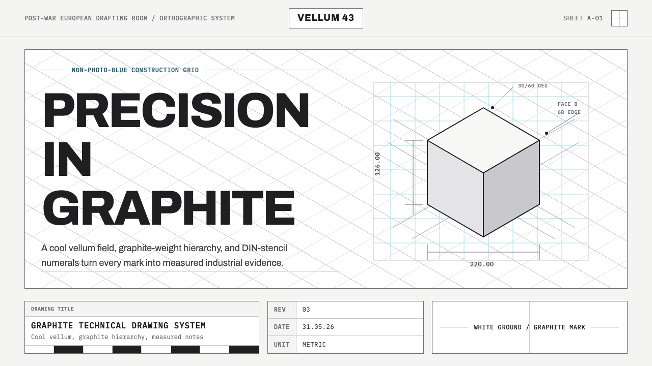 Graphite Technical DrawingDrafting-room precision. Non-photo-blue grid and graphite DIN lettering do th…制图室般精确:淡蓝网格与石墨DIN字母构成秩序。
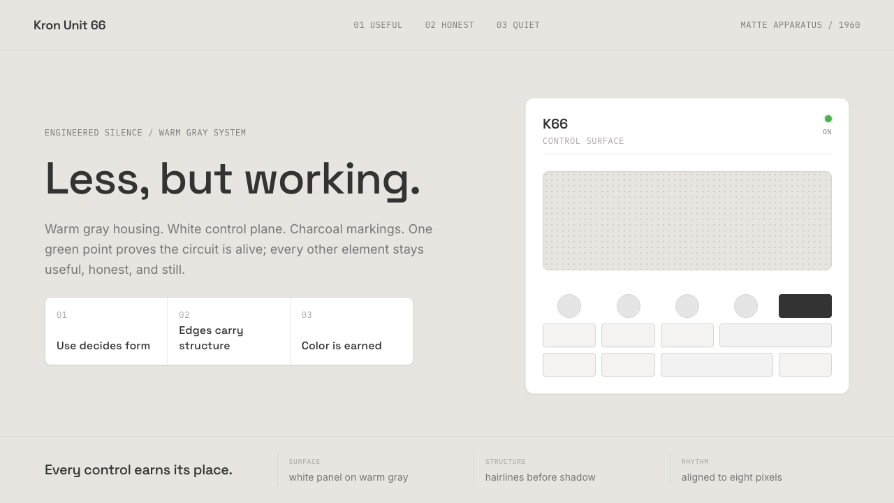 Dieter Rams / BraunQuiet by design. Warm gray, white panels, hairline grids, and one earned gree…安静即设计:暖灰、白面板、细网格,只留一枚绿色指示点。
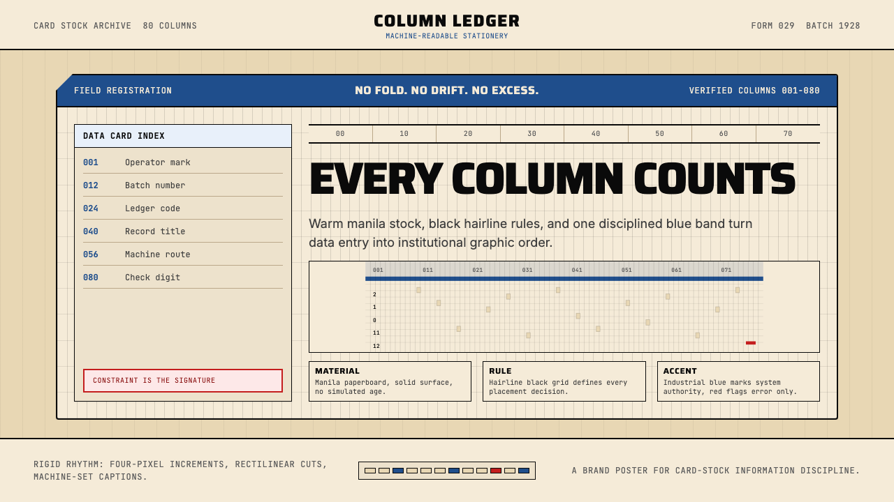 IBM Punchcard 029 (1928)Constraint becomes authority. Manila stock, hairline grid, industrial blue.约束即权威。米黄色卡纸、发丝网格与工业蓝。
 NYC Transit HelveticaOrder made visible. White type, black enamel, route discs, and a grid that ne…秩序一眼可见:黑底白字、线路圆盘与永不弯折的网格。
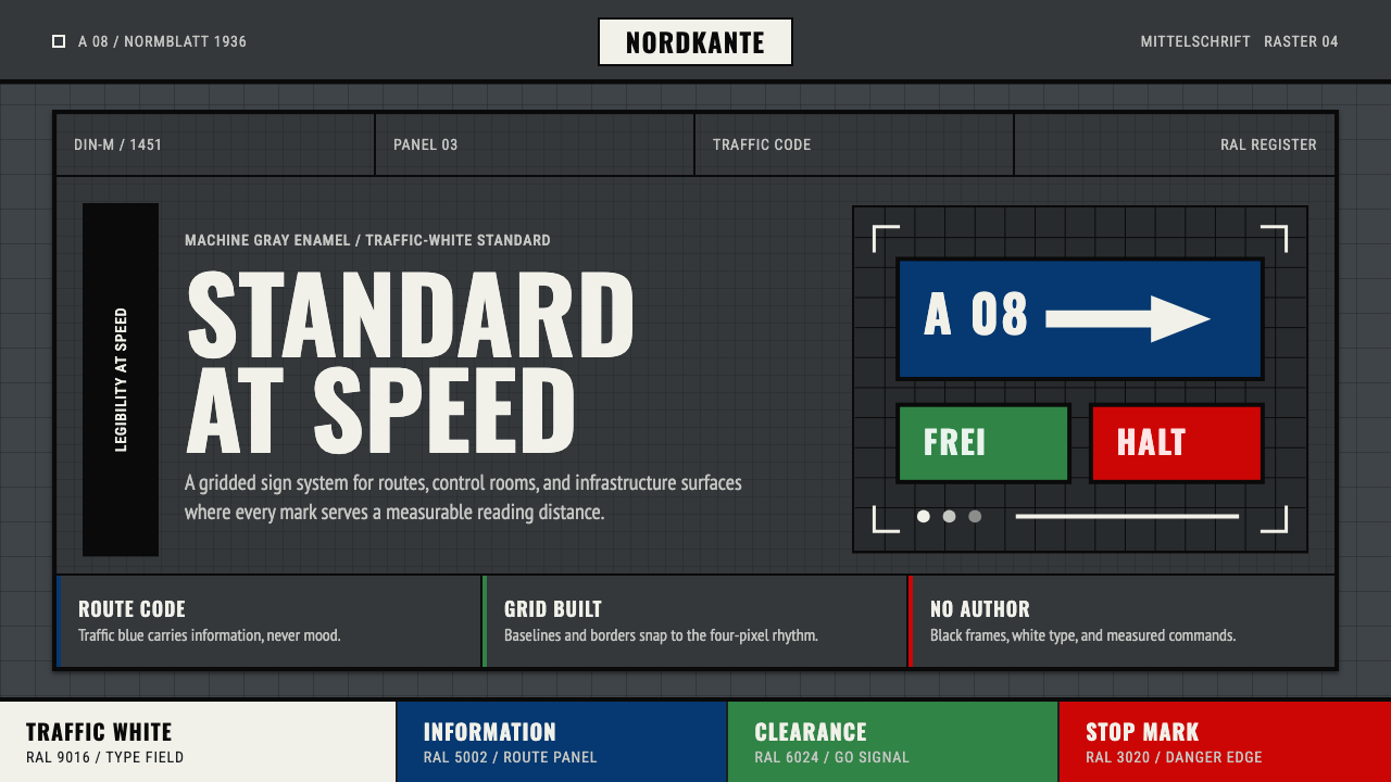 DIN 1451 SignageAuthorless and exact. Enamel gray grid, traffic-white DIN type, and RAL signa…无作者的精确感:珐琅灰网格、交通白字与RAL色条。
 Laboratory GlasswareClarity is the system. Pale glass cyan, volume marks, and bordered bench grid…清澈即系统:浅玻璃青、刻度数字与细边框台面网格。