What is NYC Transit Helvetica?
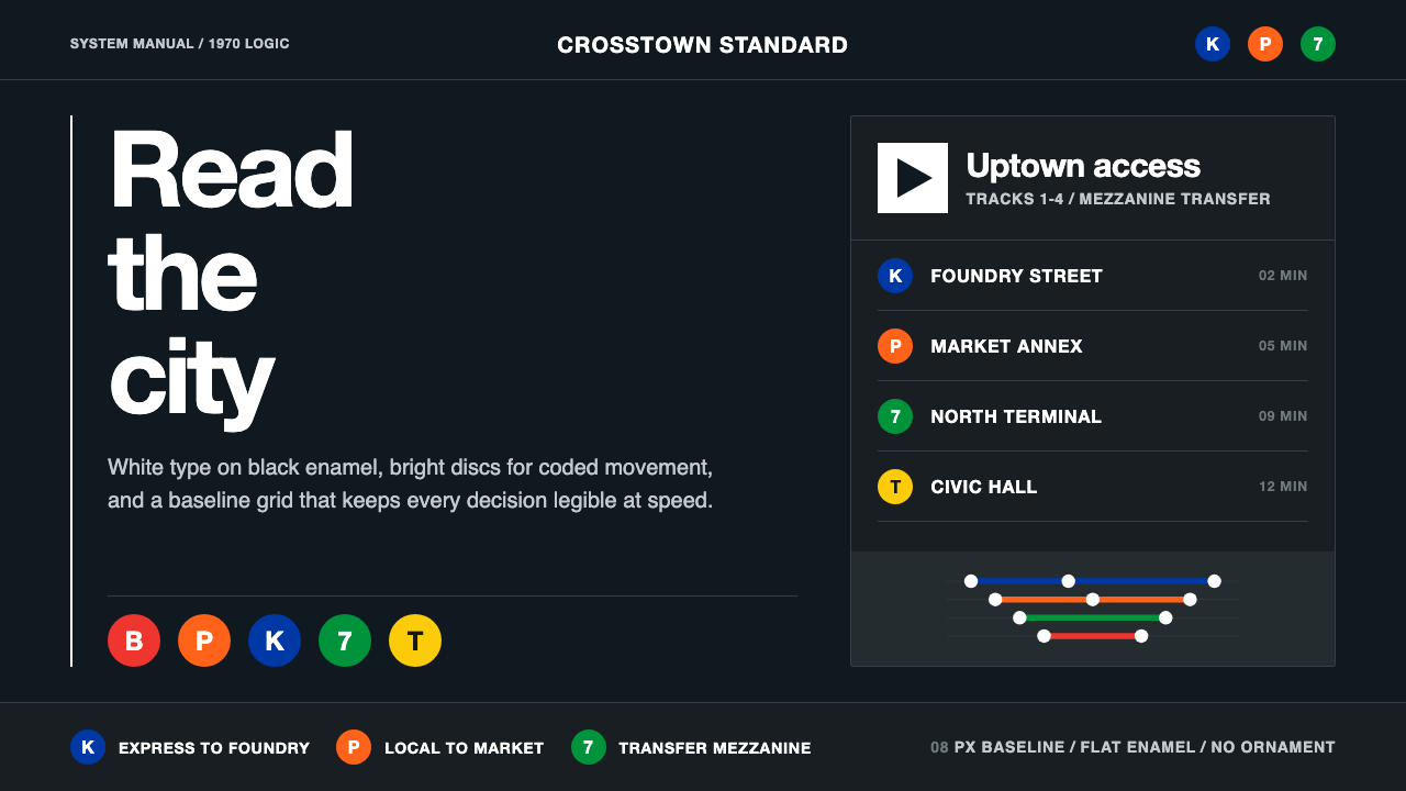
A single black binder handed to the New York City Transit Authority in 1970 turned a century of clashing subway signs into one system so disciplined it still governs the network today.
NYC Transit Helvetica in brief
NYC Transit Helvetica is the visual language of the 1970 New York City Transit Authority Graphics Standards Manual, produced by the design firm Unimark International. It reduces subway wayfinding to a small, rigorously controlled set of elements: white Helvetica type on black enamel panels, bright color-coded circular discs identifying each route, directional arrows, and a baseline grid that governs every sign regardless of where in the system it appears.
The style exists to solve a specific, unglamorous problem — a century of accumulated, inconsistent, hand-made signage across a subway system that had grown by merging several formerly independent private companies, leaving riders to navigate a visual patchwork with no shared logic. The solution was total standardization: one typeface, one grid, one set of rules for color, spacing, and arrow direction, applied without exception across every station.
Visually, the language reads as cool, authoritative, and utterly without ornament. Black enamel backgrounds carry white type set in Helvetica, chosen specifically because its neutrality carries no cultural or historical connotation — it does not evoke an era or a mood, it simply reads. Route identity is carried entirely by color-coded discs rather than illustration or symbol, and every element sits on an invisible baseline grid that never bends to accommodate a particular space.

Where does NYC Transit Helvetica come from?
By the late 1960s, the New York City subway was the product of more than half a century of consolidation — the Interborough Rapid Transit Company, the Brooklyn-Manhattan Transit Corporation, and the city-built Independent Subway System had each built their own stations with their own sign-making conventions before being merged under public ownership. The result was a system where a rider might encounter a dozen different lettering styles, sign shapes, and color logics within a single trip, with no consistent way to tell which direction a train was heading or which line stopped where.
In 1966, the Transit Authority commissioned Unimark International, a design consultancy founded on principles of corporate identity systems and Swiss-influenced modernist rigor, to solve the problem. The lead designers were Massimo Vignelli, an Italian-born designer already known for applying International Typographic Style discipline to corporate identity work, and Bob Noorda, a Dutch-Italian designer with a background in exhibition and transit signage who had already redesigned Milan's metro system along similar lines.
Vignelli and Noorda's solution, delivered in 1970 as the Graphics Standards Manual, was radical in its restraint: a single typeface family (Standard/Helvetica-family sans-serif, later substituted in practice with Helvetica itself), a strict rule that each subway line be assigned one consistent color used identically on every disc, map, and sign referencing that line, and a modular grid dictating exact proportions, spacing, and placement for every sign type the system might need — entrance signs, platform signs, directional arrows, station name plates. The manual specified not just what signs should say but precisely how, down to letter-spacing and disc diameter.
The manual's influence extended well beyond the subway itself. It became a canonical case study in corporate and public identity design, cited alongside contemporaneous Swiss International Typographic Style work as proof that a strict, impersonal system of rules could produce something more genuinely legible and more lastingly authoritative than decades of individually well-intentioned but uncoordinated signage. Vignelli's related 1972 subway map, which applied the same schematic-diagram logic used in transit maps worldwide, became a design object in its own right, still referenced and periodically revived decades after its original release.
What defines the NYC Transit Helvetica look?
Color
The ground is black enamel and the primary type color is white, providing maximum, unambiguous contrast under variable subway lighting. Color beyond black and white is reserved entirely for route-identifying discs — each subway line gets one consistent, saturated hue used identically everywhere that line is referenced, and never for decoration.
Typography
Type is a neutral grotesque sans-serif in the Helvetica family, chosen precisely because it carries no historical, cultural, or emotional connotation — it does not evoke an era or a feeling, it simply reads clearly at a distance and under motion. Letter-spacing, weight, and case follow strict, repeatable rules rather than being adjusted case by case for individual signs.
Color-Coded Route Discs
Each subway line is identified by a solid-colored circular disc bearing its letter or number in white, used consistently across maps, platform signs, and train cars alike. This system lets a rider identify a route by color and shape alone, without needing to read text, and it is one of the manual's most enduring and widely recognized contributions.
The Baseline Grid
Every sign, regardless of its physical size or location, is built on an invisible modular grid that dictates exact spacing, proportion, and alignment. The grid never bends to accommodate an awkward wall or an unusual space — instead, the system is designed with enough discipline that it can be applied consistently across hundreds of physically different stations without visual drift.
Directional Arrows
A small, consistent set of arrow forms indicates direction of travel or the location of an exit, drawn with the same geometric restraint as the typography — no decorative flourish, no variation in angle or weight from one sign to the next. The arrow vocabulary is deliberately minimal so it can be learned once and recognized instantly anywhere in the system.
Total Absence of Ornament
No illustration, no decorative border, no historical reference, no regional flavor appears anywhere in the system. Every element that exists has a stated functional purpose — identifying a route, indicating a direction, naming a station — and nothing is included for visual interest alone.
Modular Repeatability
Because the whole system is defined by a written manual rather than by individual designers making case-by-case decisions, every sign type can be reproduced identically by any fabricator following the specification, at any station, at any time. This repeatability, rather than any single striking visual element, is the manual's core achievement.

Who shaped NYC Transit Helvetica?
An Italian-born designer and co-founder of Unimark International, Vignelli led the design of the 1970 Graphics Standards Manual alongside Bob Noorda, bringing a Swiss International Typographic Style discipline to American public wayfinding. He also designed the associated 1972 schematic subway map, which applied the same rigorous, ornament-free logic to route diagramming and became a landmark of information design in its own right.
A Dutch-Italian designer with a background in exhibition design and transit signage, Noorda had already redesigned the Milan metro's wayfinding system before co-leading the New York project. His practical experience with real station environments — awkward corners, variable lighting, high foot traffic — shaped the manual's insistence on a grid robust enough to survive contact with the messiness of an actual, aging subway system.
The design consultancy that produced the manual, Unimark was built around the principle that corporate and public identity should be governed by strict, written systems rather than individual designer discretion — the same philosophy the firm applied to commercial branding work for clients across industries, here scaled up to govern an entire public transit network.
How do you use NYC Transit Helvetica today?
NYC Transit Helvetica transfers well anywhere the goal is unambiguous navigation and institutional authority rather than warmth or personality — its entire discipline is built around solving the specific problem of legibility across many variable contexts using one rigid rule set.
For presentation slides, the style suits cover pages that want to project authority and system-level thinking: a black ground, a single white Helvetica-set title, and one accent-colored disc-like mark reads immediately confident. Content slides work best as strict grids — one consistent left margin, consistent type sizes for each hierarchy level, and directional cues (arrows, numbered steps) drawn with the same geometric restraint as the source material. Data slides benefit from the route-disc logic directly: assign one consistent color per category across every chart in the deck, never varying it slide to slide.
For web interfaces, the aesthetic is a natural fit for dashboards, developer documentation, and enterprise software where users need to navigate complex information quickly and repeatedly — black-ground navigation bars, white type, and color-coded status indicators (borrowed directly from the disc logic) let users learn the system once and never relearn it. Pricing pages can use a black-ground, white-type treatment for a stark, confident presentation, with a single accent color reserved for the recommended tier.
For editorial and marketing work, the style suits any content that wants to communicate rigor, precision, or systems-level competence — technical documentation, engineering-focused brand content, or infrastructure marketing. A strict baseline grid applied to an editorial layout, with section markers styled as route discs, borrows the vocabulary convincingly.
The most common mistake is treating this as simply 'black background plus Helvetica' without the underlying grid discipline and consistent color-coding rules that give the system its real authority. Randomly varying type sizes, spacing, or accent colors between sections undermines the entire point — the style's power comes from total, unwavering consistency, not from the specific typeface or color choice alone.

NYC Transit Helvetica — FAQ
Why was Helvetica specifically chosen for this system?
Helvetica was chosen for its neutrality — it was designed to have minimal inherent character, meaning it does not carry the historical or cultural associations of, say, a Victorian display face or an Art Deco letterform. For a wayfinding system meant to serve millions of riders from every possible background without favoring any particular aesthetic sensibility, that neutrality was precisely the point: the typeface should disappear into pure legibility.
What problem was the 1970 manual actually solving?
The New York City subway was built by merging several previously separate private companies, each of which had developed its own sign-making conventions over decades. By the late 1960s a rider could encounter a dozen incompatible lettering styles, sign shapes, and color schemes within a single trip, with no consistent logic for identifying train direction or line identity. The manual replaced this accumulated chaos with one exhaustively specified rule set applied without exception system-wide.
How is the color-coded disc system different from just using colorful signage?
The key difference is absolute consistency: a given subway line's color is identical on every map, every platform sign, and every train car referencing it, with no exceptions and no local variation. This turns color from decoration into a reliable identification code — a rider who has never seen a particular station can still recognize their line the moment they see the matching disc color, because the system guarantees that color always means the same thing everywhere.
Is this the same style as the Swiss International Typographic Style?
They are closely related but not identical. NYC Transit Helvetica is a direct, specific application of Swiss International Typographic Style principles — grid-based structure, sans-serif type, functional restraint — to the particular problem of subway wayfinding. The broader Swiss style covers a wider range of applications including editorial design, corporate identity, and poster work, while this style is specifically shaped by the constraints of physical signage: enamel panels, variable lighting, and the need for instant legibility at a glance from a moving position.
Where does this style struggle or feel out of place?
It struggles wherever warmth, personality, or cultural specificity is the goal — hospitality brands, children's products, or anything meant to feel handmade or emotionally rich will find the style's coldness and total absence of ornament work against the desired tone. It can also feel excessive when applied to genuinely simple content: the style's rigor is built to manage complexity across hundreds of variable contexts, and applying its full grid discipline to a single simple page can feel like over-engineering a problem that never needed it.
Related design styles
 Doctor's Clinical Lab CoatSterile by design. Cool clinical white, teal signals, and seam-line grids enf…
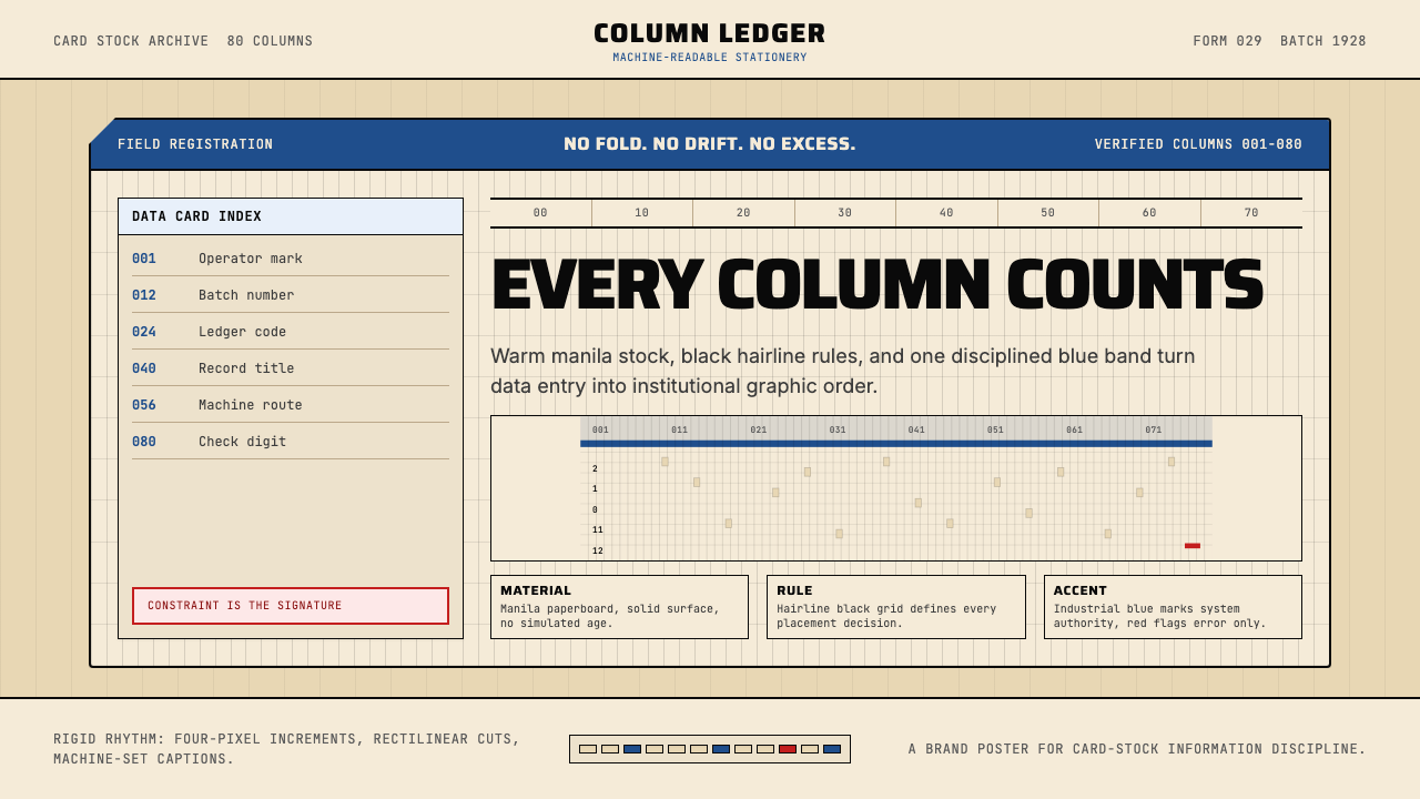 IBM Punchcard 029 (1928)Constraint becomes authority. Manila stock, hairline grid, industrial blue.
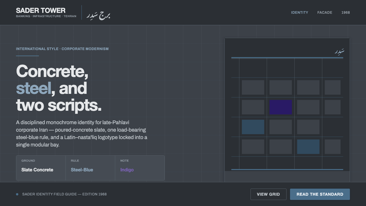 Tehran Bank ModernismLate-Pahlavi corporate cool. Slate concrete ground, one steel-blue rule, a La…
 Frutiger CDG AirportLegibility at runway scale. Navy panels, white humanist sans, arrow-led grids.
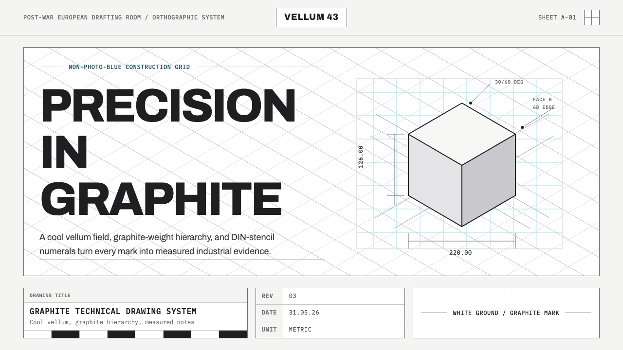 Graphite Technical DrawingDrafting-room precision. Non-photo-blue grid and graphite DIN lettering do th…
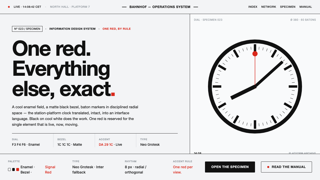 Hilfiker Railway ClockEverything exact, one thing live. Black hands on cool enamel white — one red…