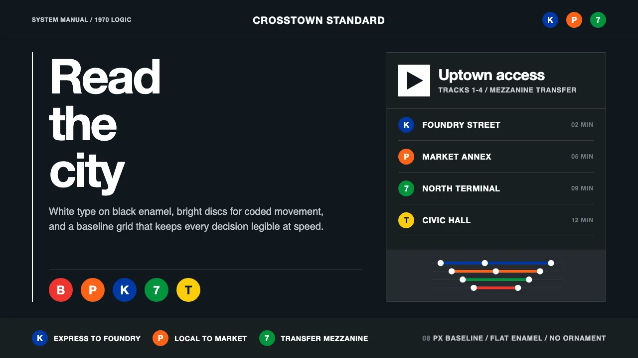
About NYC Transit Helvetica
In 1970 Unimark International handed the New York City Transit Authority a slim black binder that would outlive every subway car of its era: the Graphics Standards Manual. Massimo Vignelli and Bob Noorda reduced the chaos of a century of competing signs to one disciplined system — white Helvetica on black enamel, bright color-coded route discs, directional arrows, and a baseline grid that never bends. This theme is that manual rendered as an interface: rationalist, legible, and free of ornament.
- Origin
- New York City, USA
- Era
- 1950–1990 (NYCTA Graphics Standards Manual, 1970)
- Key figures
- Massimo Vignelli · Bob Noorda · Unimark International · MTA / NYCTA
- Movements
- Swiss/International Typographic Style · Transit wayfinding · Modernist systems design
NYC Transit Helvetica design spec
Colors
Background
Surface
Primary
Secondary
Accent
Text
Typography
Helvetica NeueHeadings
HelveticaBody
Unlock for 1 credit
The other 11 sections — buttons, cards, spacing, motion, techniques and more — open once you unlock. Download the DESIGN.md or send it to your AI in one click. Unlock once, yours forever.
Sign up nowHave an account? Sign in
Styles similar to NYC Transit Helvetica
Also inspired by architecture & places, with a close feel.
 Icelandic Basalt VolcanoCold geology, engineered. Basalt black, Sora type, and one magma fissure hold the grid.
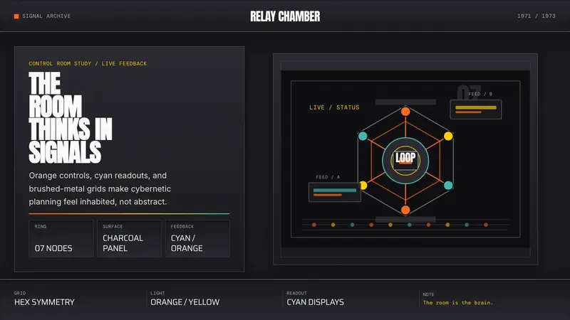 Cybernetic 1968 (Stafford Beer)Mission-control severity. Charcoal panels, orange buttons, cyan readouts, hex symmetry.
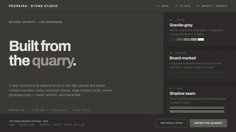 Souto de Moura GraniteArchitecture as raw matter. Dark Portuguese granite ground, board-marked concrete, deep shadow joints, severe Archivo grotesque.
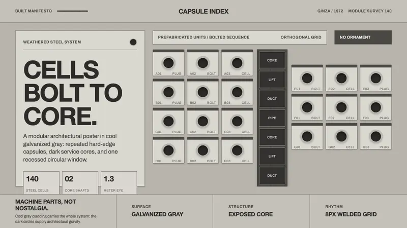 Nakagin Capsule TowerArchitecture as cells. Cool gray modules, dark cores, and porthole circles lock into grid.