What is Graphite Technical Drawing?
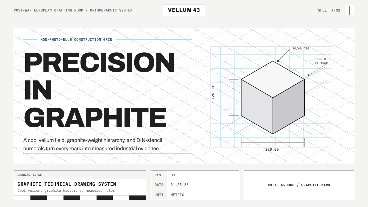
Graphite Technical Drawing rebuilds the drafting room in pixels — a cool white sheet, a faint blue grid, and every mark laid down as if a pencil, not a mouse, made it.
Graphite Technical Drawing in brief
Graphite Technical Drawing is a style built entirely around the discipline of pre-CAD industrial drafting: the isometric and orthographic construction work that engineers and draftsmen produced by hand for most of the twentieth century. Its ground is a bright, cool-white sheet meant to read as vellum or drafting paper, never cream and never warm. Onto that ground goes a hierarchy of graphite marks — construction lines, dimension lines, hairline notation — rendered with the tonal range of real pencil leads, from a light, silvery H grade up to a dense, almost-black 6B.
The style's second load-bearing element is the non-photo-blue grid: a faint, cool blue lattice that organizes the page the way a technical pad's printed grid organized a draftsman's hand. That particular blue is not decorative. It is the color print shops once used precisely because process cameras and blueprint reproduction couldn't see it — it guided the hand but vanished when the drawing was copied. Reviving it as a visible design element is a small historical wink: the guide line that was never supposed to survive is now the thing that signals 'this was drafted, not designed on a screen.'
Lettering follows ISO and DIN stencil convention rather than expressive type design — the blocky, mechanically consistent letterforms that appeared on machine drawings and technical manuals because they had to be legible after being traced, blueprinted, and microfilmed. Dimensions and callouts are set in a monospaced hand, reinforcing the sense that every number on the page is a measurement, not a caption. Nothing about the style is loose or gestural; every line is a deliberate hairline, placed with the same care a draftsman gave a load-bearing edge.
Where does Graphite Technical Drawing come from?
Technical drawing as a discipline long predates the mid-century period this style evokes — orthographic projection was formalized by the French mathematician Gaspard Monge in the late eighteenth century, and engineering schools had taught rigorous drafting conventions for a century before the era Graphite Technical Drawing draws from. But the specific visual culture this style reconstructs belongs to the mature industrial drafting rooms of Western Europe roughly between 1950 and 1990 — the decades in which mechanical and civil engineering firms operated large drafting departments as a matter of course, before computer-aided design displaced the drafting table.
In that drafting room, standardization was not a style choice but an operational necessity. A drawing produced by one engineer in Stuttgart had to be read correctly by a machinist in Turin or a contractor in Rotterdam, which is precisely why lettering conventions were codified by international and national standards bodies rather than left to individual hands. ISO's technical drawing standards and Germany's DIN 1451 committee — the same body responsible for the road-sign lettering still used across German-speaking Europe — set out exact rules for letterform proportion, stroke width, and spacing so that a drawing's notation was as unambiguous as its geometry.
The non-photo-blue grid belongs to this same culture of reproducibility. Drafting pads printed with a faint blue grid let a draftsman keep lines straight and proportions consistent by eye, while the blue itself was formulated to fall outside the sensitivity range of the orthochromatic film used in process cameras and blueprint machines — meaning the grid guided the human hand but was invisible to the reproduction process, leaving a clean final print. The practice persisted for decades precisely because it solved a real production problem: consistency during drafting, invisibility during copying.
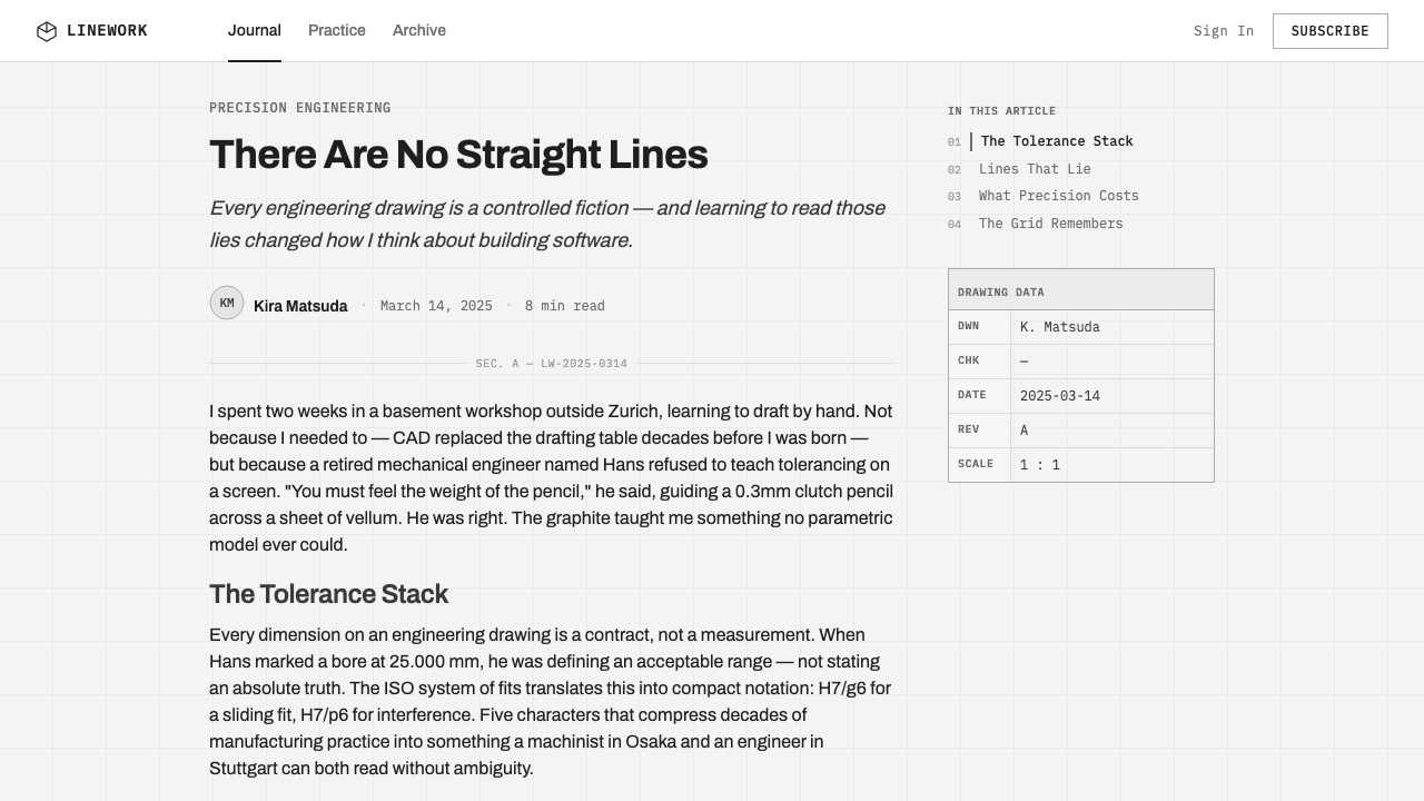
The pencil itself carried this culture's full expressive range. The graphite grading scale — from hard, light H grades used for construction and guide lines to soft, dense B grades used for final outlines and emphasis — let a single tool produce an entire visual hierarchy without switching instruments. A drafted sheet from this period reads, in effect, as a record of decision-making: faint guide geometry underneath, confident final lines on top, dimensions and titles lettered by hand according to a shared national or international code. It is this layered, disciplined record — not any single designer's signature — that Graphite Technical Drawing revives.
What defines the Graphite Technical Drawing look?
Ground
The page is always a bright, cool white, meant to read as fresh vellum or drafting film rather than aged paper. Warmth of any kind — cream tones, yellowed paper, sepia toning — is off-limits; the whole point is a sheet that looks clean, current, and ready for the next revision, not archival or nostalgic.
Mark-making
Every mark reads as graphite on paper rather than ink or vector line work. The tonal range runs from a faint, silvery near-invisible touch for construction geometry to a dense, near-black weight for finished outlines and titles, mirroring the way a draftsman would press harder for a final line than for a guide. Marks are hairline-thin and precise; nothing is thick, brushy, or textured for its own sake.
The blue grid
A faint, cool, non-photo-blue lattice sits underneath the graphite content and organizes the page the way a printed technical pad once organized a draftsman's hand. It is always secondary to the graphite marks in visual weight — present enough to read as structure, faint enough to disappear at a glance, echoing a color that historically was designed to vanish under reproduction.
Lettering
Titles, labels, and callouts follow the blocky, mechanically even proportions of ISO and DIN stencil lettering rather than any expressive or humanist type style. Letterforms are built from consistent stroke widths and geometric proportion, designed originally for legibility after tracing and reproduction rather than for personality. Dimension figures and technical notes are set in a monospaced hand, distinguishing measurement from label at a glance.
Construction logic
Compositions read as isometric or orthographic construction work — objects are built up from projection lines, guide geometry, and dimension callouts, the same way an engineer would rough in a part before finishing it. This gives even a simple layout a sense of underlying structure: nothing merely sits on the page, everything appears to have been constructed onto it, line by line.
Restraint
The style has no room for gesture, texture, or decorative flourish. There is no hand-drawn wobble, no sketchy looseness, no ornamental border. Precision is the entire aesthetic argument — the discipline of the drafting room, where a wavering line meant an inaccurate part, translates directly into a design system that treats every mark as a considered decision rather than an expressive gesture.
Reproduction aesthetic
The whole system reads as a document meant to be copied and understood by someone other than its author — the visual logic of a drawing built for a machinist or contractor to interpret without ambiguity, not for a gallery wall. This gives the style a quietly technical, almost institutional authority: it looks like it was produced to a specification, not to a mood.

Who shaped Graphite Technical Drawing?
Monge, a French mathematician working in the late eighteenth century, formalized descriptive and orthographic projection — the geometric method of representing three-dimensional objects through multiple flat, related views. His work turned technical drawing from an artisan's craft into a rigorous, teachable geometric discipline, and it remains the mathematical foundation underneath every orthographic and isometric drawing produced in the drafting rooms this style evokes.
The German standards body responsible for DIN 1451, the lettering specification originally developed for technical drawings and later adapted for road signage across German-speaking Europe. Its blocky, evenly weighted letterforms were designed to remain legible after tracing, blueprinting, and microfilming — the same practical demands that shape the lettering convention this style borrows for titles and callouts.
The uncredited generations of mechanical and civil engineers who staffed Western European drafting departments roughly between 1950 and 1990, producing hand-drafted technical drawings as their default working method before CAD software displaced the drafting table. Their collective, standardized practice — not any individual signature — is the direct visual source this style reconstructs.
The International Organization for Standardization's committee responsible for technical product documentation, including lettering, line types, and dimensioning conventions used on engineering drawings worldwide. Its standards are the reason a drafted sheet from one country could be read unambiguously by an engineer or machinist in another — the same cross-border legibility this style's notation system is built to evoke.
How do you use Graphite Technical Drawing today?
Graphite Technical Drawing translates unusually well into digital layouts because its logic was never about texture for its own sake — it is a notation system, and notation systems are inherently structural. Applying it well means treating every layout element as if it were being constructed and measured, not merely arranged: guide geometry beneath, confident marks on top, and a consistent lettering register for anything that names or measures something.
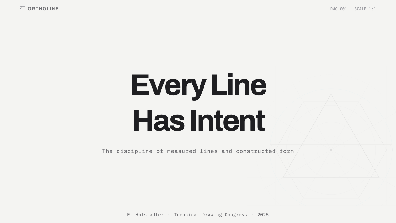
For presentation cover slides, the style rewards restraint and construction logic: a title built up from thin projection or guide lines rather than dropped onto a flat background, with the non-photo-blue grid faintly visible beneath the white ground to signal 'this was drafted.' Content and data slides suit the style even better — bar charts and diagrams read naturally as technical callouts, dimension-style annotations can label data points the way a drafted part gets measured, and a bullet hierarchy can be expressed through the same graphite tonal range used elsewhere: lighter marks for supporting detail, denser marks for the point that matters.
In web UI work, the style is a strong match for dashboards and pricing pages that want to project precision and engineering credibility rather than warmth. A dashboard built this way keeps its ground bright white, uses the faint blue grid as a genuine layout aid rather than mere decoration, and reserves the darkest graphite weight for the numbers or labels that matter most — turning the visual hierarchy of a data screen into the same light-to-dark logic a draftsman used to separate a guideline from a finished edge. Pricing tables benefit from the same discipline: plans read like specification sheets, with monospaced figures and stencil-style plan names reinforcing the sense that the numbers are exact.
For editorial and marketing work, the style is most persuasive when it commits to a genuine drafting metaphor rather than a surface texture — a product diagram rendered as if it were an engineering callout sheet, a headline built from projection lines, a hero image treated as a labeled technical illustration. It communicates precision, engineering rigor, and quiet confidence, which makes it a strong fit for hardware, tools, technical products, or any brand that wants to say 'this was built carefully' without saying it in words.
The most common mistake is treating this as a generic 'blueprint' theme and reaching for a dark navy background with white or yellow linework — that inverted blueprint palette is a different, more decorative cliché, and it undoes the entire premise here, which depends on a bright white ground with graphite marks upon it. A second common error is letting the blue grid dominate rather than recede: the grid is meant to be a faint structural whisper, not a bold visible pattern, and pushing its contrast up turns a quiet drafting-room reference into a loud technical wallpaper.
Graphite Technical Drawing — FAQ
Is Graphite Technical Drawing the same as a 'blueprint' style?
No, and the distinction matters. The popular 'blueprint' aesthetic inverts the historical drafting sheet — dark navy or blue background with white or light linework — which is actually a decorative echo of the reproduction process, the blueprint copy itself, rather than the original drafting sheet. Graphite Technical Drawing reconstructs the original: a bright white drafting ground with graphite pencil marks and a faint blue grid used only as a guide, never as the dominant background color.
Why does the style avoid warm or aged paper tones?
Because warmth and age signal a different story — an archival document, a historical artifact, something nostalgic. This style is trying to say the opposite: that the drawing is current, precise, and ready for the next revision, the way a drafting sheet on an active engineer's table would look, not a drawing pulled from an archive box. A cool, bright white ground keeps the graphite marks and the blue grid as the only sources of color and warmth stays out of the system entirely.
Can this style use color beyond graphite gray and non-photo-blue?
Sparingly, and only when it serves the notation logic rather than decoration. A drafted sheet historically might carry a single additional color for a critical callout or revision mark — a small, functional signal rather than a palette expansion. Introducing warm accent colors, saturated brand colors across large areas, or multiple competing hues breaks the drafting-room premise, which depends on graphite tone doing almost all of the expressive work.
Does the isometric/construction-line logic mean every layout has to look like a 3D drawing?
No — the construction logic can be applied to flat, two-dimensional layouts just as well as to literal isometric objects. What matters is that elements look built up from guide lines and projection geometry rather than simply placed, whether that means an actual isometric diagram or a headline and grid whose faint underlying structure is still visible. The principle is procedural, not literal: show the construction, not necessarily the three-dimensional object.
What kinds of products or brands does this style suit, and where does it fall short?
It suits products and brands that want to project precision, engineering rigor, and quiet technical authority — hardware, developer tools, industrial or technical products, analytics dashboards, anything positioning itself as exact rather than expressive. It falls short wherever warmth, playfulness, or emotional intimacy is the goal: consumer lifestyle brands, food and hospitality, children's products, or any context where a cold, mechanical precision would read as distancing rather than trustworthy. The style earns credibility through restraint, and that same restraint can feel unwelcoming in the wrong context.
Related design styles
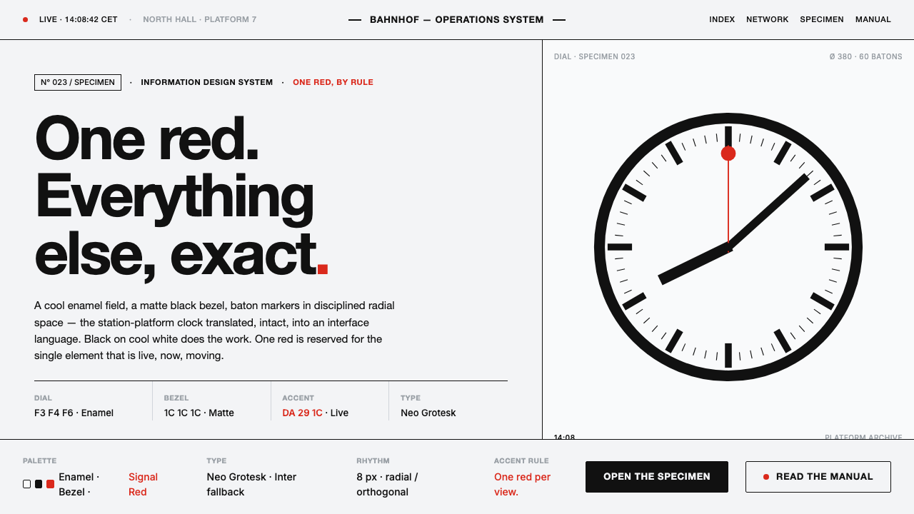 Hilfiker Railway ClockEverything exact, one thing live. Black hands on cool enamel white — one red…
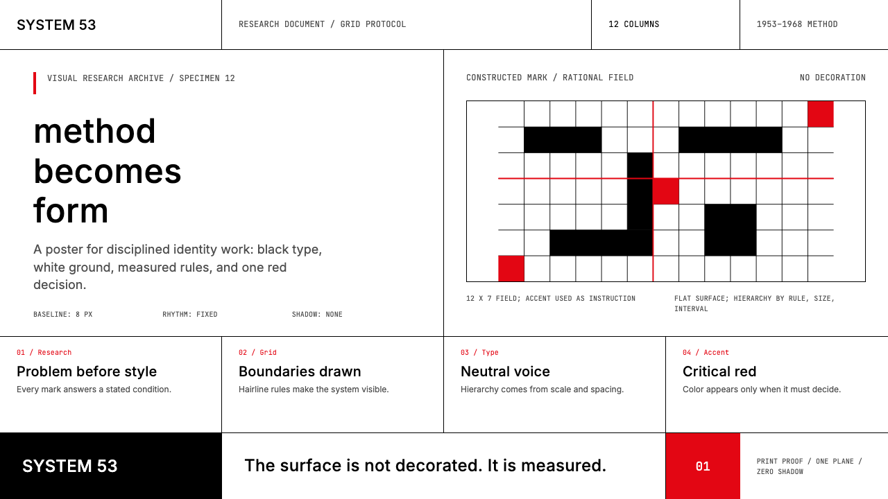 Ulm School (HfG Ulm)Clarity becomes discipline. Black-white grid, Inter grotesk, and one surgical…
 Frutiger CDG AirportLegibility at runway scale. Navy panels, white humanist sans, arrow-led grids.
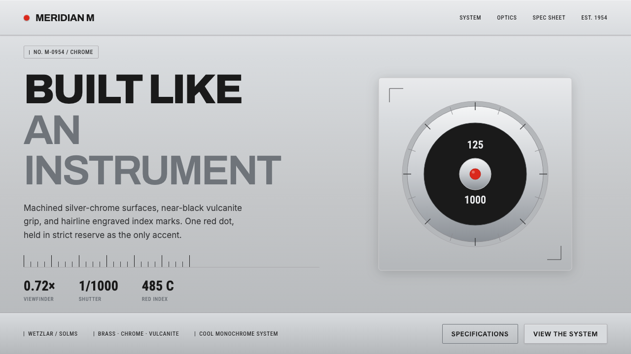 Leica M Silver ChromeBuilt like an instrument. Brushed silver-chrome on near-black vulcanite, one…
 Transport UK Road SignsClarity at seventy. White mixed-case lettering advances across recessive moto…
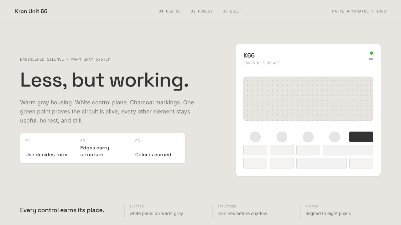 Dieter Rams / BraunQuiet by design. Warm gray, white panels, hairline grids, and one earned gree…