What is Land Rover Defender?
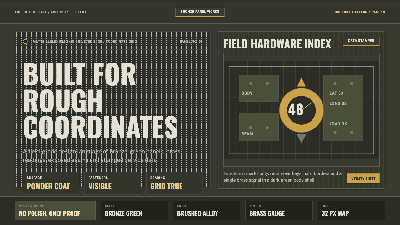
Land Rover Defender utility strips design down to the working vehicle — bronze-green panels, exposed rivets, and stencilled data-plate lettering that refuse to pretend they are anything but tools.
Land Rover Defender in brief
Land Rover Defender utility is an aesthetic built from the language of British off-road engineering: boxy rectilinear forms, bronze-green and olive surfaces, brushed-alloy fittings, brass instrument accents, and lettering that reads like it was stencilled onto a data plate rather than typeset. It is a design system that treats every surface as load-bearing hardware, not as a canvas for decoration.
The style holds a single governing conviction: a well-made tool announces its function through its construction, not through applied ornament. A rivet row is not decoration — it is where two pieces of aluminium are actually joined. A grid overlay is not pattern — it is a coordinate system for finding your position in unmarked terrain. Nothing on the surface exists unless it is also doing structural or informational work.
Visually, the system is instantly legible against almost any other automotive or industrial aesthetic. Where luxury design curves and polishes, this one stays flat, square, and matte. Where consumer electronics soften edges into pleasant rounded corners, this one keeps every corner a right angle. Color is dictated by military and agricultural paint stock rather than by trend — bronze-green, drab olive, brass — and typography borrows directly from stencil plates and embossed data tags, never from a display serif chosen for elegance.
Where does Land Rover Defender come from?
The story begins in 1947 on Red Wharf Bay, a beach on Anglesey in North Wales, where Rover's chief designer Maurice Wilks was farming in his spare time and driving a war-surplus Willys Jeep across his land. When the Jeep wore out, Wilks reportedly sketched the outline of its successor in the sand — a simple, boxy utility vehicle that a struggling postwar Britain, short on steel and long on aluminium stock left over from aircraft production, could actually build. His brother Spencer Wilks, Rover's managing director, saw the commercial opening: a company facing steel rationing and a saturated car market could instead build a rugged farm-and-field vehicle from surplus aircraft-grade aluminium alloy, exempt from the same shortages.
The first Land Rover appeared at the 1948 Amsterdam Motor Show as a stopgap — a vehicle Rover expected to sell for a few years before returning to conventional passenger cars. It was conceived as agricultural equipment first and a road vehicle second: a flat, tractor-like chassis with a power take-off for farm machinery, and body panels chosen in bronze-green paint simply because it was available in bulk from wartime aircraft-cockpit stock. That accident of postwar supply became the vehicle's signature color for decades.
What was meant as a stopgap became the template for go-anywhere utility design for the rest of the century. The vehicle evolved through Series I, II, and III production from the 1950s through the 1980s, and the name Defender was formally applied in 1990. Through all of these changes, the visual identity stayed remarkably constant: flat aluminium panels riveted rather than welded (Rover's postwar tooling budget could not stretch to compound-curve stamping dies), a boxy silhouette with almost no aerodynamic concession, and functional hardware — hinges, hood catches, tow points — left visibly exposed rather than hidden behind trim.
The vehicle's reputation was built as much by expedition and military use as by farm work: it became the standard-issue vehicle of choice for the British Army, colonial administrations, and overland expeditions across the Sahara, the Americas, and Asia. Every one of those contexts reinforced the same design logic — nothing decorative survives a desert crossing, so nothing decorative was ever added in the first place.
What defines the Land Rover Defender look?
Color
The palette centers on bronze-green and drab olive body tones, offset by the warm metallic notes of brass instrument fittings and the cool neutral of brushed alloy. These are not colors chosen for mood or branding; they descend directly from military paint stock and aircraft-aluminium surplus, which gives the palette an inherited, almost accidental authority. Black is used for structural framing and stencilled text, never for gradient or shading. Bright or saturated hues are absent entirely — anything that reads as vivid or trend-driven immediately breaks the illusion of hardware built for survival rather than display.
Typography
Lettering follows the logic of a stencilled data plate or an embossed serial tag: letterforms are blocky, evenly weighted, and slightly mechanical, as though cut from a template rather than drawn by hand. Labels read like part numbers and specification codes — terse, capitalized, spaced for legibility from a distance rather than for elegance up close. There is no room here for a refined display serif or a delicate script; any typeface that suggests craft or luxury undermines the premise that this is equipment, not a product line.
Geometry and Form
Every shape is rectilinear. Panels are flat planes joined at right angles; there are no compound curves, no swept lines, no rounded corners softening a silhouette. This boxiness is not a stylistic affectation — it descends directly from the constraint that shaped the original vehicle, where flat aluminium sheet could be cut and bent on simple tooling but could not be stamped into complex curves. Applied to a screen, the same logic produces rectangular frames, square-cornered containers, and layouts built from stacked and abutted boxes rather than overlapping or floating elements.
Rivets and Visible Assembly
The rivet row is the single most recognizable motif in this system: a repeating line of small circular fasteners tracing the seam where two panels meet. On the original vehicle this was purely functional — riveting required far less capital tooling than welding — but visually it became a signature, a literal demonstration that the object in front of you was assembled from parts rather than molded as a seamless whole. In interface terms, this translates into visible seams and boundary markers between sections: dividers, tab edges, and card borders are treated as assembly lines to be shown, not hidden.
Grid and Coordinate Overlays
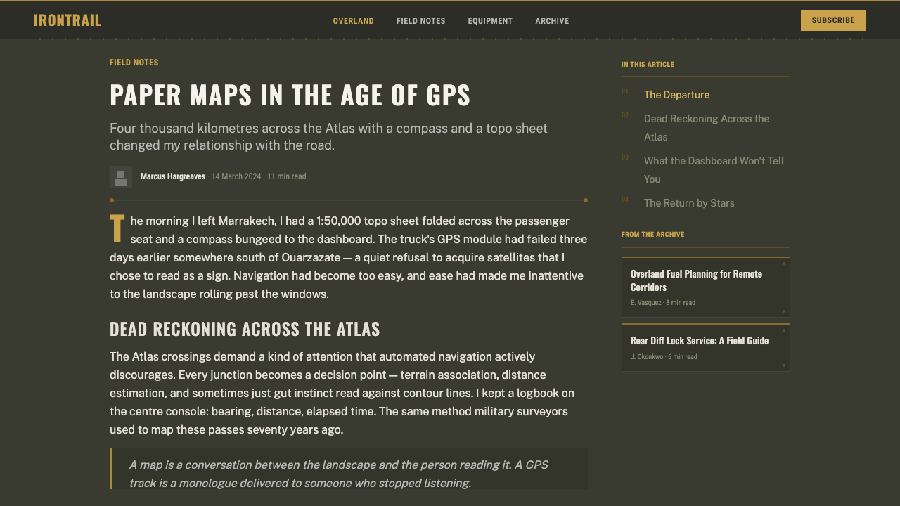
Grid-aligned coordinate lines run through this system the way contour lines run through a topographic map: a way of imposing a navigable structure onto otherwise open terrain. These overlays are not decorative graph paper — they are meant to evoke a map grid reference or an instrument reticle, something you would use to find a position rather than something you would simply look at. Layouts built on this system favor visible ruled lines over invisible whitespace-only structure, because the grid itself is part of the story being told.
Brass and Alloy Accents
Where the system needs a moment of emphasis — a key instrument, a critical control, a primary action — it reaches for brass and brushed alloy rather than color. A brass-toned needle on a gauge, a metallic border around a critical readout, an alloy-finish edge on a primary control: these accents carry weight because they are used sparingly, standing in for the physical materials of an actual instrument panel. This is a system where emphasis is achieved through material implication, not through brightness or scale alone.
Absence of Luxury Cues
Perhaps the most disciplined characteristic of this style is what it refuses. There is no gloss, no chrome-for-chrome's-sake, no soft gradient suggesting a premium material, no rounded pill-shaped button suggesting consumer comfort. Every cue that consumer product design typically uses to signal quality — polish, softness, warmth of touch — is deliberately withheld, because in this world quality is signaled by evidence of function under load: scuffed edges, visible fasteners, stencilled rather than embossed labels. A designer applying this style has to resist every instinct toward making things look expensive, because looking expensive is precisely what this aesthetic is not about.
Who shaped Land Rover Defender?
Wilks was Rover's chief engineer and the vehicle's originator, credited with sketching the first concept in the sand of a Welsh beach while looking for a replacement for his worn-out war-surplus Jeep. His starting brief was agricultural rather than automotive: a vehicle that could power farm equipment through a mechanical power take-off, cross unimproved fields, and be built from whatever materials postwar Britain actually had on hand. That practical, materials-first thinking is the direct ancestor of the style's refusal of ornament.
As Rover's managing director and Maurice's brother, Spencer Wilks turned a farm-tool sketch into a commercial program. He recognized that a rugged, low-cost utility vehicle built from surplus aircraft-grade aluminium could sidestep the steel shortages constraining conventional car production in postwar Britain. His commercial instinct is why the vehicle exists as a mass-produced object at all, rather than remaining a one-off farm tool.
Rather than a single named designer, the visual identity was shaped cumulatively across the Series I (1948), Series II (1958), and Series III (1971) production runs, each of which refined the manufacturing process while deliberately preserving the flat-panel, riveted-seam, boxy silhouette. This multi-decade continuity — refinement without redesign — is precisely why the aesthetic reads as inevitable rather than trendy: it was never restyled to chase fashion, only adjusted to meet production and regulatory needs.
Military adoption was as influential on the visual identity as the factory itself. Standard-issue use by the British Army — and subsequently by numerous allied and former-colonial forces — reinforced a design logic in which every visible feature had to survive field conditions and justify its presence functionally. Camouflage-adjacent bronze-green and olive tones, robust exposed hardware, and stencilled rather than printed markings all trace back to this military procurement context as much as to the factory floor.
Decades of use in Sahara crossings, transcontinental expeditions, and colonial-era exploration built the vehicle's reputation as much as any factory decision did. Expedition photography — sand-scoured panels, mud-caked wheel arches, brass instruments fogged with dust — became the reference imagery that later design work draws on. The aesthetic's credibility rests partly on this documented history of use in extreme conditions, which is why any application of the style benefits from evoking evidence of real use rather than pristine showroom condition.
How do you use Land Rover Defender today?
Applying Land Rover Defender utility correctly means resisting the urge to make anything look expensive, sleek, or curved. The style rewards visible structure — seams, rivets, coordinate grids, stencilled labels — over smooth surfaces and hidden mechanisms. Every design decision should be defensible on the grounds of 'this is how you would actually build the thing,' not on the grounds of visual appeal alone.
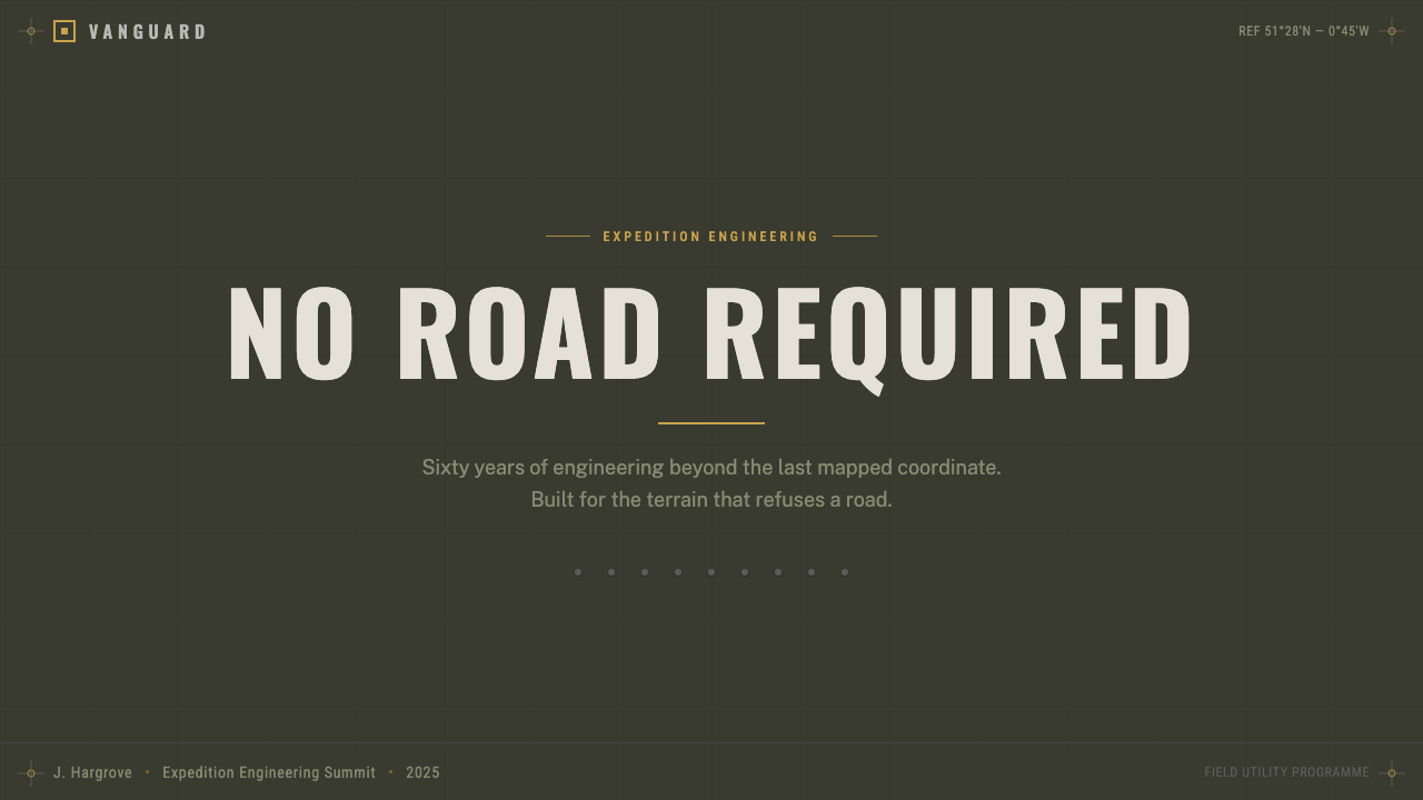
For presentation slides, the style is strongest on cover and content-heavy slides that benefit from a rugged, briefing-room register. A cover slide can use a bronze-green field with a stencilled title treatment and a corner rivet motif, evoking a field-manual cover rather than a corporate title card. Content slides with data work particularly well: numeric readouts framed like instrument gauges, tables ruled with the same coordinate-grid logic as a map overlay, and callouts treated as data-plate labels rather than soft rounded tooltip bubbles.
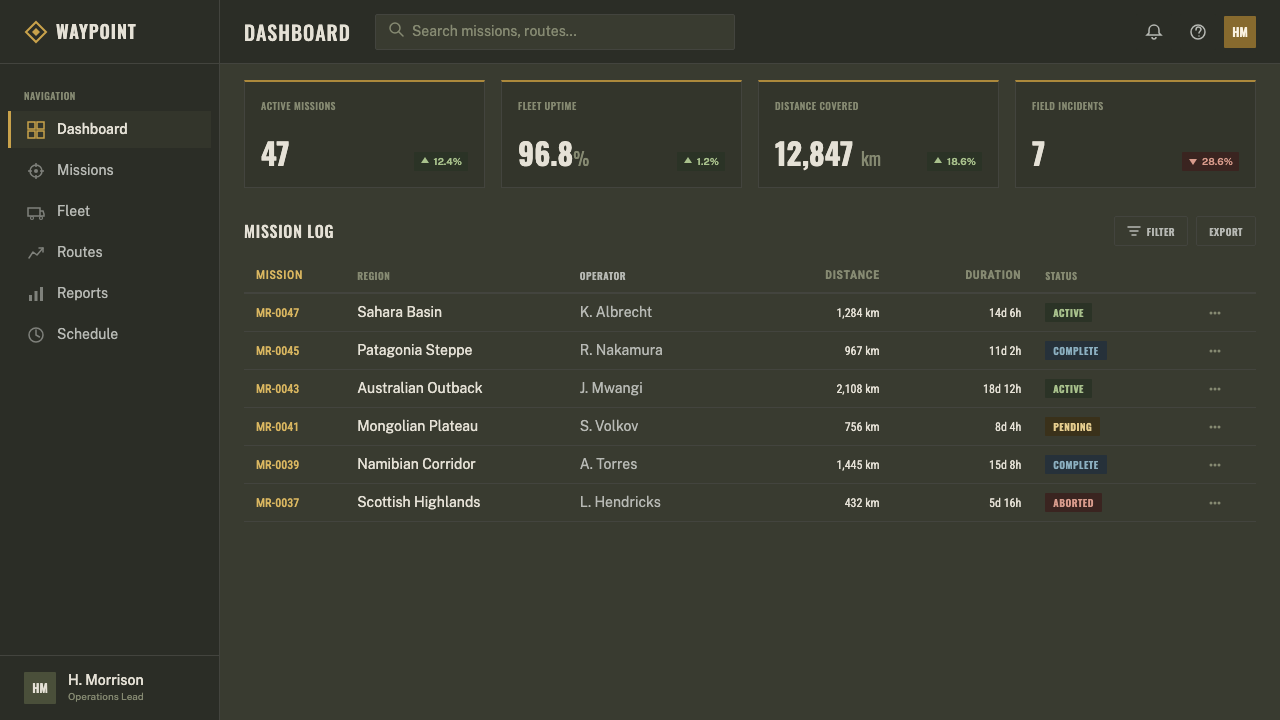
For web interfaces, the style suits dashboards more naturally than almost any other application, because a dashboard is already conceptually an instrument panel. Metrics can be presented in gauge-like containers with brass-toned accent borders, navigation can be treated as a control panel with square-cornered buttons and stencilled labels, and status indicators can borrow the visual grammar of a warning light or toggle switch rather than a soft badge. Pricing pages can work too, if tiers are framed as equipment classes or load ratings rather than as soft consumer-style cards — but this requires restraint, since pricing pages usually want warmth and this style resists warmth by design.
For editorial and marketing contexts, the style is well suited to adventure, outdoor, heritage, and field-equipment narratives: a long-form article can use a coordinate-grid rule as a section divider, quote pull-outs treated as data-plate stencils, and photography cropped and toned to emphasize texture — scratched metal, dust, weathering — over polish. Marketing pages selling rugged or heritage-adjacent products can lean hard into the bronze-green and brass palette as an immediate signal of durability and honesty, provided the rest of the page commits to the same restraint rather than mixing in soft gradients or rounded consumer-electronics chrome.
The most common mistake is treating this as simply 'olive green plus a grunge texture.' Authentic application requires the structural logic — visible seams, rectilinear geometry, brass used only as functional emphasis — not just the color story. A layout that uses the bronze-green palette but keeps soft shadows, rounded corners, and gradient fills has borrowed the costume without the substance, and the result reads as a themed skin rather than a genuine expression of utilitarian design logic.
Land Rover Defender — FAQ
Is this style the same as generic 'military' or 'camo' design?
No, and the distinction matters. Generic military or camo design usually leans on pattern — camouflage textures, stenciled typefaces, dog-tag motifs — applied as surface decoration. Land Rover Defender utility is narrower and more disciplined: it is specifically about a single vehicle lineage's construction logic — flat riveted aluminium panels, a bronze-green and brass palette, coordinate-grid overlays — rather than a general military mood board. Where camo design often piles on texture for atmosphere, this style stays flat, rectilinear, and sparse, closer to an instrument panel than a battlefield poster.
Can this style work in a light, non-dark layout?
The historic reference material is predominantly dark and mid-toned — bronze-green and olive body panels photographed against sand, mud, or overcast skies — which is why this system is typically expressed as a dark theme. A lighter variant is possible but requires care: the bronze-green and brass accents need to remain the dominant identity markers even against a paler ground, and the rectilinear, riveted-seam structure has to stay intact. Simply flipping to a white background without preserving the visible-assembly logic will drain the style of its authority and make it read as generic outdoor branding rather than genuine utility design.
Why does the system avoid soft shadows, gradients, and rounded corners so strictly?
Because those effects are visual shorthand for softness, comfort, and manufactured luxury — qualities that are the direct opposite of what this aesthetic communicates. A rounded corner suggests something designed to be pleasant to hold; this style's objects are designed to survive being dropped. A soft gradient suggests a polished, lit surface; this style's surfaces are flat aluminium that reflects light unevenly and shows wear. Every rounded corner or soft shadow that creeps into an otherwise faithful application quietly undermines the premise that what you are looking at is genuine equipment rather than a lifestyle accessory.
How should imagery and photography be treated within this style?
Imagery should read as documentary evidence of use, not as staged product photography. The reference tradition is expedition and field photography — vehicles shot in motion across open terrain, panels scoured by sand or spattered with mud, brass instruments dulled by dust rather than polished for a catalog shot. When photography appears in a layout built on this system, it should be cropped tightly, toned toward the same bronze-green and neutral-alloy register as the rest of the palette, and allowed to show texture and wear rather than being retouched into a pristine showroom finish.
Does this style suit every kind of product, or are there contexts where it struggles?
This style is not universally suited. It works well for products where ruggedness, honesty, and functional credibility are the desired message: outdoor and expedition gear, field tools, engineering and industrial platforms, heritage-brand storytelling, and dashboards where an instrument-panel metaphor is genuinely useful. It struggles in contexts that call for warmth, softness, or approachability — consumer wellness products, children's brands, hospitality, or anything where the user's emotional experience depends on feeling inviting rather than field-tested. Its severity can also feel like overkill on a product with no genuine connection to the outdoors or heavy equipment, where the aesthetic will read as costume rather than substance.
Related design styles
 Frutiger CDG AirportLegibility at runway scale. Navy panels, white humanist sans, arrow-led grids.
 Graphite Technical DrawingDrafting-room precision. Non-photo-blue grid and graphite DIN lettering do th…
 Helsinki Metro OrangeOne orange does the work. Archivo signage cuts across an 8px concrete tile gr…
 Hilfiker Railway ClockEverything exact, one thing live. Black hands on cool enamel white — one red…
 Hospital Wayfinding 1970Colour removes hesitation. Enamel green rails and open grotesque plates lead…
 Transport UK Road SignsClarity at seventy. White mixed-case lettering advances across recessive moto…