What is Massimo Vignelli NYC?什么是 Massimo Vignelli NYC?
One typeface, five route colors, and an unshakeable grid gave New York City a visual identity that still shapes how we read urban systems today.一款字体、五条路线色带与坚定不移的网格,赋予纽约市一套视觉身份,至今仍左右着我们阅读城市系统的方式。
Massimo Vignelli NYC in briefMassimo Vignelli NYC 速览
The Massimo Vignelli NYC system is a design language rooted in Modernist orthodoxy and refined through the specific demands of navigating a metropolis at scale. Its visual grammar is anchored by a single neutral sans-serif typeface, a small palette of high-saturation route colors set against white or off-white grounds, and a grid so strict it functions more like infrastructure than composition. Nothing is decorative. Every element — color, rule, label — is load-bearing.马西莫·维涅利纽约体系是一套植根于现代主义正统、经由大都市尺度导向需求精炼而成的设计语言。其视觉语法由三要素锚定:一款中性无衬线字体、一组高饱和度路线色彩(铺于白色或近白底面之上),以及一套严格到堪称基础设施而非构图的网格。没有任何装饰性元素——每个元素,无论是色彩、线条还是标签,都承担着结构功能。
This style descends directly from what Vignelli called the Vignelli Canon: the conviction that design must serve communication through semantic clarity, visual power, and intellectual elegance. Ornament that cannot be justified by function is not merely unnecessary — it is a failure of discipline. What survives that discipline is a system of almost diagrammatic precision: sharp right angles, no radius on any corner, no gradient on any surface, no shadow that blurs what should be a decision.这套风格直接源自维涅利所称的《维涅利准则》:设计必须通过语义清晰、视觉力量与理性优雅来服务于传达的信念。无法以功能为正当理由的装饰,不仅是多余的,更是纪律的失败。经过这种纪律筛选后留存下来的,是一套几乎具有示意图精度的系统:锐利的直角,任何角落都没有圆弧,任何表面都没有渐变,任何阴影都不会模糊本应是决定的事物。
The result is a visual language that reads simultaneously as civic and corporate, urgent and calm. Its authority comes not from complexity but from the relentless consistency of its rules. A Vignelli-derived layout looks the same at the scale of a wall-mounted map and at the scale of a ticket stub — because the same grid, the same type, and the same color logic govern both.结果是一套同时读起来既市政又企业、既紧迫又平静的视觉语言。它的权威感不来自复杂性,而来自规则毫不妥协的一致性。一个源自维涅利的版面在挂墙地图的尺度和车票存根的尺度上看起来完全相同——因为同样的网格、同样的字体和同样的色彩逻辑统治着两者。
See the Massimo Vignelli NYC design system查看 Massimo Vignelli NYC 完整设计系统
Where does Massimo Vignelli NYC come from?Massimo Vignelli NYC 从何而来?
Massimo Vignelli was born in Milan in 1931 and trained at the Politecnico di Milano and later at the Venice Istituto Universitario di Architettura. His formation was classical Milanese Modernism — a tradition that valued rigor, craft, and the belief that good design was a form of civic responsibility. In 1957 he founded Vignelli Associati in Milan with his wife and creative partner Lella Vignelli, an architect whose spatial thinking would shape every aspect of their shared practice. They moved to New York in 1966 to open the American office of Unimark International, a design firm whose explicit mission was to bring systematic, rule-governed visual communication to corporate and institutional clients.马西莫·维涅利1931年生于米兰,先后就读于米兰理工大学和威尼斯建筑大学。他的养成根植于经典的米兰现代主义传统——一种重视严谨、工艺与将优秀设计视为公民责任的信仰。1957年,他与妻子、创意伙伴莱拉·维涅利(一位建筑师,其空间思维将塑造他们共同实践的每一个层面)在米兰共同创立了维涅利事务所。1966年,他们迁往纽约,开设了国际设计公司Unimark International的美国办公室——这家公司的明确使命是将系统性、规则驱动的视觉传达带给企业和机构客户。
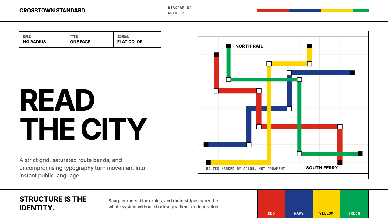
The commission that defined Vignelli's public legacy came in 1970, when the New York City Transit Authority hired Unimark to redesign the subway signage and map system. The existing signage was a chaos of competing typefaces, improvised color patches, and inconsistent station identifiers accumulated over decades of independent line expansions. Vignelli and Bob Noorda — the Dutch designer who led the signage portion of the project — replaced this chaos with a single typeface, a fixed palette of route colors, and a strictly maintained grid of sign panels. The typeface chosen was Helvetica, then newly arrived in the United States and associated with the Swiss International Style that Vignelli admired. The subway map that accompanied the signage — designed by Vignelli himself in 1972 — was a diagrammatic masterpiece: it distorted geography to prioritize legibility, representing the subway network as a geometric diagram rather than a geographically accurate rendering. It was controversial precisely because it was correct: clarity had been chosen over comfort.1970年,纽约市交通局委托Unimark重新设计地铁标识与线路图系统,这一委托定义了维涅利的公共遗产。既有标识系统是数十年独立线路扩张积累下来的混乱:竞争性字体、即兴色块、不一致的站名标识。维涅利与领导标识部分的荷兰设计师鲍勃·诺尔达,以一款字体、一套固定的路线色彩和一套严格维护的标识面板网格取而代之。所选字体是Helvetica——当时刚刚进入美国市场,与维涅利所推崇的瑞士国际主义风格相关联。1972年随标识系统发布的地铁线路图——由维涅利本人设计——是一幅示意图杰作:它通过扭曲地理来优先保证可读性,将地铁网络呈现为几何图解而非地理精确图示。它因为正确而饱受争议:清晰被选择凌驾于舒适之上。
The American Airlines identity, developed by Vignelli for Massimo's firm Vignelli Associates beginning in 1967 and lasting until 2013, applied the same discipline to corporate identity at national scale. The wordmark used a single typeface at a fixed weight; the livery used a restricted color scheme applied consistently across aircraft, ticketing, signage, and printed matter. The system demonstrated that Vignelli's principles were not a solution specific to transit but a method applicable wherever institutional clarity was the primary design objective.美国航空的视觉识别系统从1967年起由维涅利的事务所维涅利联合公司开发,延续至2013年,将同样的纪律应用于国家尺度的企业识别。字标使用单一字体以固定字重呈现;涂装方案使用有限的色彩体系,一致地应用于飞机、机票、标识和印刷品。这套系统证明了维涅利的原则并非专为交通导向量身定制的解决方案,而是一种适用于任何以机构清晰度为首要设计目标之场景的方法。
Vignelli articulated his design philosophy formally in The Vignelli Canon, self-published in 2010 and made freely available as a download. The Canon is a short, direct document that lists the values he believed every designer should internalize: semantics (design must communicate something true), syntactics (elements must relate to each other by rule, not accident), and pragmatics (the solution must work in the real world). He also listed what he considered the acceptable typefaces — a short list dominated by Helvetica, Futura, Garamond, Bodoni, and Century Schoolbook — and argued that a designer who mastered three or four typefaces deeply would always outperform a designer who used dozens superficially. Vignelli died in New York in 2014. His system lives on wherever a transit map chooses geometry over geography, or wherever a corporate identity chooses discipline over expression.维涅利于2010年正式阐述了他的设计哲学,以《维涅利准则》自行出版并免费提供下载。这是一份简短直接的文件,列举了他认为每位设计师都应内化的价值观:语义(设计必须传达真实的内容)、句法(元素必须依规则而非偶然相互关联)以及语用(解决方案必须在现实世界中有效运作)。他还列出了他认为可接受的字体——一份以Helvetica、Futura、Garamond、Bodoni和Century Schoolbook为主的短名单——并主张,深度掌握三四款字体的设计师将永远胜过浅尝数十款的设计师。维涅利于2014年在纽约辞世。他的体系在每一张以几何代替地理的交通线路图上延续,在每一套以纪律代替表达的企业识别中延续。
What defines the Massimo Vignelli NYC look?Massimo Vignelli NYC 的视觉特征是什么?
Typographic Singularity字体单一性
The system commits to a single neutral sans-serif typeface used across every element — headlines, body text, labels, captions — at varying weights and scales. This singularity is not poverty but discipline: all hierarchy is communicated through size and weight alone, never through typeface switching. The typeface sits flush, tight, and geometric, with no tracking added for decoration and no italic used for emphasis when weight contrast can serve the same purpose.该系统只使用一款中性无衬线字体,以不同字重和尺寸贯穿所有元素——标题、正文、标签、图注。这种单一性不是匮乏,而是纪律:所有层级仅通过尺寸与字重传达,而非字体切换。字体紧凑、几何化排布,不为装饰而增加字距,也不在字重对比已能起到同样效果时使用斜体做强调。
Route-Color Logic路线色彩逻辑
Color in this system is semantic, not aesthetic. Each hue is assigned to a category — a transit line, a service tier, a data series — and used consistently and exhaustively for that category alone. The palette is small: a handful of high-saturation primaries and secondaries, each distinct enough to remain readable when reproduced small or under artificial light. Color never appears as background wash or ambient decoration; it appears as signal.这套系统中的色彩是语义性的,而非审美性的。每种色调被分配给一个类别——一条交通线路、一个服务等级、一个数据系列——并仅为该类别一致而彻底地使用。色板很小:几种高饱和度的原色与间色,每种都足够鲜明,以便在小尺寸或人工光线下复制时仍可辨读。色彩从不作为背景底色或环境装饰出现,它只作为信号出现。
Hard-Rule Grid硬线网格
The organizing structure is a rigid grid of columns and baselines, treated not as a suggestion but as law. Elements snap to the grid without exception; no element floats freely or bleeds at an arbitrary angle. Alignment is the primary visual argument: every flush edge between elements communicates that they belong to the same system. The grid is invisible in the final artifact but present in every spacing decision, making the whole feel engineered rather than composed.组织结构是一套刚性的列与基线网格,被视为法律而非建议。元素无一例外地对齐网格;没有元素自由漂浮,也没有元素以任意角度出血。对齐是主要的视觉论点:元素之间每一条齐整的边缘都在传达它们同属一套系统。网格在最终成品中不可见,但存在于每一个间距决定之中,使整体感觉像是被工程化而非构图出来的。
Zero Radius, Zero Ornament零圆角,零装饰
Every corner in this system is a right angle. There are no rounded rectangles, no pill-shaped buttons, no softened card edges. This is not a stylistic preference but a philosophical position: the corner is a structural decision, not an opportunity for comfort. Similarly, there are no decorative borders, no flourishes on letterforms, no gradient fills, no ambient shadows. The page is a surface for information, and every mark on it must justify its presence by carrying meaning.这套系统中每一个角都是直角。没有圆角矩形,没有胶囊形按钮,没有被柔化的卡片边缘。这不是风格偏好,而是哲学立场:角落是一个结构性决定,而非制造舒适感的机会。同样地,没有装饰性边框,字形上没有花饰,没有渐变填充,没有环境阴影。页面是承载信息的表面,其上每一个标记都必须以承载意义来证明自身存在的正当性。
Ruled Lines as Structure直线作为结构
The hairline rule and the bold rule are both primary design elements. A thin rule separates columns without wasting space; a thick rule announces a section break with the authority of a headline. Rules are always horizontal or vertical — never diagonal, never curved. Their weight is consistent within a document tier: all dividers of the same function share the same rule weight. This regularity makes the structure of a document readable before a single word is processed.细线与粗线都是主要设计元素。细线分隔各列而不浪费空间;粗线以标题的权威感宣告章节分隔。线条始终是水平或垂直的——从不倾斜,从不弯曲。在同一文档层级内,线条的粗细是一致的:所有具有相同功能的分隔线共享相同的线条粗细。这种规律性使文档结构在读者处理任何文字之前就已可辨读。
Diagrammatic Imagery示意图式图像
When imagery enters the system, it is treated as a diagram rather than an illustration. Maps are geometric schematics, not photographic or painterly renderings. Charts and graphs adopt the same palette as the typographic system and are drawn with the same rule weights as structural dividers. Photography, when used, is cropped aggressively to isolate a shape or object against a clean field. There is no atmospheric photography, no soft-focus imagery, no visual element that introduces ambiguity of purpose.当图像进入这套系统时,它被当作示意图而非插图处理。地图是几何图解,而非摄影或绘画式渲染。图表和统计图采用与排印系统相同的色板,并以与结构分隔线相同的线条粗细绘制。摄影图像在使用时被激进裁切,以在干净的底面上隔离一个形状或对象。没有氛围摄影,没有柔焦图像,没有任何引入目的模糊性的视觉元素。
Systematic Scalability系统性可扩展性
Perhaps the most important property of the Vignelli system is that it scales without degradation. A layout built on its rules looks as coherent on a wall-mounted transit map as on a folded pocket guide, and as coherent in a full-page advertisement as in a two-column data table. This scalability is a direct consequence of the system's reliance on proportion and rule rather than fixed size: no element is designed at a specific scale, only at a specific ratio to the grid.维涅利体系最重要的特性,或许是它能够在不降质的情况下扩展。依其规则构建的版面,在挂墙交通地图上与在对折口袋指南上同样连贯,在整版广告中与在双栏数据表格中同样连贯。这种可扩展性是该系统依赖比例与规则而非固定尺寸的直接结果:没有元素是在特定尺寸下设计的,而只是在相对于网格的特定比例下设计的。
See the Massimo Vignelli NYC design system查看 Massimo Vignelli NYC 完整设计系统
Who shaped Massimo Vignelli NYC?谁塑造了 Massimo Vignelli NYC?
Vignelli (1931–2014) was the primary architect of the system that bears his name. Trained in Milan and Venice, he developed a design philosophy rooted in Modernist discipline and European craft tradition. His most visible public work — the 1972 New York City subway map and the 1967 American Airlines identity — demonstrated that systematic design could function as civic infrastructure. Late in his career he codified his principles in The Vignelli Canon (2010), a freely distributed document that argued for the primacy of a small number of typefaces and the rejection of design as self-expression. He was equally rigorous in his criticism of what he called the 'visual pollution' produced by undisciplined design.维涅利(1931—2014年)是这套以他命名之体系的主要建构者。在米兰和威尼斯接受训练后,他发展出一套植根于现代主义纪律与欧洲工艺传统的设计哲学。他最具公众能见度的作品——1972年纽约市地铁线路图和1967年美国航空标识——证明了系统性设计可以作为市政基础设施运作。职业生涯晚期,他在《维涅利准则》(2010年)中系统阐述了自己的原则,这份免费发布的文件主张少数几款字体的优先性,并拒绝将设计视为自我表达。他对自己所称的无纪律设计所产生的「视觉污染」同样严苛批判。
Lella Vignelli (1934–2016) was an architect and the co-founder of Vignelli Associates. While Massimo's name is most often cited in discussions of the graphic and typographic work, Lella's architectural training was foundational to the practice's spatial and three-dimensional output — furniture, exhibition design, and the systematic organization of physical environments. The two worked as a single creative unit for over five decades, and the system's characteristic precision in three-dimensional space — the way physical wayfinding elements relate to each other in a station environment — reflects her contribution as much as his.莱拉·维涅利(1934—2016年)是一位建筑师,也是维涅利联合公司的联合创始人。虽然在有关平面和排印工作的讨论中马西莫的名字被引用得最为频繁,但莱拉的建筑训练是该事务所空间和三维产出的基础——家具、展览设计,以及实体环境的系统性组织。两人作为单一创作单元合作了逾五十年,这套体系在三维空间中标志性的精确性——实体导向元素在站点环境中相互关联的方式——同样体现了她的贡献。
Bob Noorda (1927–2010) was a Dutch graphic designer who joined Unimark International and led the signage design for the New York City subway project. Where Vignelli designed the map, Noorda designed the physical sign system — the placement logic, the panel formats, the reading-distance hierarchy. Noorda's contribution was particularly concerned with the experience of information in motion: how a commuter moving at speed through a station could extract the information needed to make a routing decision before the relevant sign passed out of view. His approach to sign placement — positioning critical information at decision points rather than distributing it evenly — became a foundational principle of transit wayfinding.鲍勃·诺尔达(1927—2010年)是一位荷兰平面设计师,加入Unimark International后主导了纽约市地铁项目的标识设计。维涅利设计了线路图,诺尔达则设计了实体标识系统——安置逻辑、面板格式、阅读距离层级。诺尔达的贡献尤其关注运动中的信息体验:一位以一定速度穿行于站台的通勤者,如何能在相关标识离开视野之前提取做出路线决定所需的信息。他在决策节点(而非均匀分布)放置关键信息的标识安置方法,成为交通导向设计的基础性原则。
Unimark International was a design firm founded in Chicago in 1965 with the explicit mission of applying the Swiss International Style to American corporate and institutional clients at scale. At its peak it had offices in over a dozen countries. Vignelli served as its vice-president of design. The firm's methodology — standardized systems, strict typographic rules, centrally defined color palettes — produced identity programs for Ford, Knoll, and the American Institute of Architects, among many others, in addition to the subway work. Unimark's approach was deliberately anti-expressive: the designer's personality was to be subordinated to the needs of the system. The firm dissolved in 1979, but its output defined what 'corporate identity' meant to a generation of American designers.Unimark International是1965年在芝加哥创立的设计公司,其明确使命是将瑞士国际主义风格大规模应用于美国企业和机构客户。鼎盛时期,它在十余个国家设有办公室,维涅利担任其设计副总裁。公司的方法论——标准化系统、严格的排印规则、集中定义的色板——除地铁项目外,还为福特、诺尔和美国建筑师学会等众多客户制作了标识方案。Unimark的方式刻意反表达:设计师的个性应从属于系统的需求。公司于1979年解散,但其作品为一代美国设计师定义了「企业识别」的含义。
Not a person but an instrument: Helvetica was designed by Max Miedinger and Eduard Hoffmann at the Haas type foundry in Switzerland in 1957 and quickly became the typeface Vignelli treated as the closest available approximation of a neutral communications vehicle. Its strokes are nearly even in weight, its letterforms are compact and upright, its spacing is regular without being mechanical. Vignelli's use of Helvetica in the New York subway system effectively canonized the typeface as the default voice of public institutional communication in the United States. The 2007 documentary film 'Helvetica' — named for the typeface — uses Vignelli's subway work as one of its central case studies.这不是一个人名,而是一件工具:Helvetica由马克斯·米丁格和爱德华·霍夫曼于1957年在瑞士Haas铸字厂设计,很快成为维涅利视为最接近中性传达载体的字体。其笔画粗细近乎均一,字形紧凑直立,字距规律而不显机械。维涅利在纽约地铁系统中对Helvetica的使用,实际上将这款字体确立为美国公共机构传达的默认声音。2007年纪录片《Helvetica》——以该字体命名——将维涅利的地铁工作作为核心案例研究之一。
How do you use Massimo Vignelli NYC today?今天怎么用 Massimo Vignelli NYC?
The Vignelli NYC system transfers well to contemporary design work precisely because its underlying logic is structural and semantic rather than ornamental. Applying it correctly means internalizing the rule system — one typeface, semantic color, strict grid, no radius, no gradient — rather than borrowing its surface characteristics. A presentation deck that uses a bold sans-serif and a route-colored stripe on every slide without committing to the grid and the typographic discipline will look themed rather than systematic.维涅利纽约体系能很好地迁移至当代设计实践,恰恰是因为其底层逻辑是结构性和语义性的,而非装饰性的。正确应用它意味着内化这套规则体系——一款字体、语义色彩、严格网格、无圆角、无渐变——而非借用其表面特征。一套在每张幻灯片上使用粗无衬线字体和路线色条却不遵守网格与排印纪律的演示文稿,看起来像是在套用主题,而非在运行系统。
For presentation slides, the system excels at both cover and content formats. A cover slide benefits from the poster-like authority of the original transit work: a single bold route-color stripe, a headline in the system's typeface at a large scale, and nothing else on a white field. Content slides should be treated as strict grids: text hierarchy communicated entirely through size and weight, no decorative dividers, no soft-shadow card elements. Data slides become diagrammatic objects in their own right — bar charts and line graphs inherit the route-color palette directly, and the chart itself should be drawn with rule weights that match the surrounding typographic structure. Every data visualization is also a layout.在演示文稿中,这套系统在封面与内容格式上都表现出色。封面幻灯片受益于原始交通作品的海报式权威感:一条单一的粗路线色条,一个大尺寸系统字体标题,白色底面上别无他物。内容幻灯片应作为严格网格处理:文字层级完全通过尺寸和字重传达,没有装饰性分隔线,没有软阴影卡片元素。数据幻灯片本身成为示意图式对象——柱状图和折线图直接继承路线色板,图表本身应以与周围排印结构匹配的线条粗细绘制。每一个数据可视化同时也是一个版面。
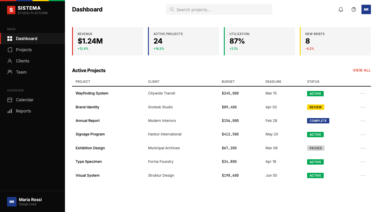
For web interfaces, this system is best suited to contexts where hierarchy and rapid information retrieval are paramount: dashboards, admin panels, pricing pages, and data-heavy product pages. The approach requires defining a strict column grid and committing to it without exception. Body text is always near-black on near-white; the route-color palette is reserved for interactive states, status indicators, and category labels. There are no soft shadows, no rounded cards, no ambient blurs — components have borders, not drop shadows, and inputs have visible strokes. Navigation is typographic: text labels organized at consistent scale, no icon-only navigation that requires learned visual vocabulary. The result is a UI that reads before it is used.对于网页界面,这套系统最适合层级与快速信息检索至关重要的场景:仪表板、管理面板、定价页面以及数据密集型产品页面。这种方法需要定义严格的列网格并无一例外地遵守。正文始终是近白底面上的近黑色;路线色板保留给交互状态、状态指示器和类别标签。没有软阴影,没有圆角卡片,没有环境模糊——组件有边框而非投影,输入框有可见描边。导航是字体性的:以一致尺寸组织的文字标签,不使用需要学习视觉词汇的纯图标导航。结果是一套在被使用之前就已可阅读的界面。
For editorial and marketing applications, the style supports strong information hierarchy with a clarity that is unusual in commercial contexts. An editorial layout in this system uses tight column control, a large-measure headline at the top of a page, and body text in a narrow column with a wide margin available for pull quotes or navigational metadata. Section breaks are announced by a bold horizontal rule — never by a decorative flourish or an icon. Marketing pages work well with the system's inherent poster quality: alternating full-width blocks of light-on-dark and dark-on-light type, with route-color accents deployed exclusively for calls to action. The visual rhythm of these alternating blocks creates structure without requiring additional graphic elements.对于编辑与营销应用,这种风格支持强劲的信息层级,具备在商业语境中罕见的清晰度。采用这套系统的编辑版面使用紧凑的列控制,页面顶部有大行宽标题,正文置于窄列中,留有宽阔页边供引用语或导航元数据使用。段落分隔由粗水平线宣告——绝不使用装饰性花饰或图标。营销页面适合这套系统固有的海报感:浅色底深色字与深色底浅色字的全宽区块交替出现,路线色调强调色专门用于行动召唤。这些交替区块的视觉节奏在不需要额外图形元素的情况下创造了结构。
A common mistake when applying this system is treating its color palette as permission to use multiple saturated colors simultaneously. In Vignelli's original subway work, each color belongs to a specific line — colors do not appear together except to differentiate parallel choices. In a web or presentation context, this means picking one accent color as the system's primary signal and using the others only to mark distinctly different categories, never for visual enrichment. A second frequent error is softening the grid through compromised alignment — an element that breaks from the column grid by even a small margin dissolves the system's authority immediately. The grid only works when it is absolute.应用这套系统时最常见的错误,是将色板理解为同时使用多种饱和色的许可。在维涅利的原始地铁作品中,每种颜色归属于一条特定线路——色彩只在区分并行选择时才同时出现,而不是为了视觉丰富性。在网页或演示语境中,这意味着选择一种强调色作为系统的主要信号,其他色彩仅用于标记截然不同的类别,绝不用于视觉装饰。第二个常见错误是通过对齐妥协来软化网格——哪怕只有微小偏差的元素脱离列网格,就会立即瓦解系统的权威性。网格只有在绝对时才有效。
See the Massimo Vignelli NYC design system查看 Massimo Vignelli NYC 完整设计系统
Massimo Vignelli NYC — FAQMassimo Vignelli NYC · 常见问题
How is Vignelli NYC different from Swiss International Style?维涅利纽约风格与瑞士国际主义风格有何不同?
The two are closely related — Vignelli was explicitly influenced by Swiss Style and shared its commitment to the grid, sans-serif type, and systematic thinking. The differences are contextual and tonal. Swiss Style, as codified by Armin Hofmann and Josef Müller-Brockmann in the 1950s and 1960s, emerged from the needs of global corporate communication and tends toward cool neutrality: photography is used extensively, color appears in a broader range, and the grid is mathematically rationalized to a fine degree. Vignelli's New York work emerged from a specific civic challenge — unifying a chaotic public transit system — and has a harder, more assertive character: the color is bolder and more semantic, the typography is less refined at small sizes and more authoritative at large ones, and the overall register is closer to infrastructure than to publication design.两者关系密切——维涅利明确受到瑞士风格的影响,并与其对网格、无衬线字体和系统性思维的承诺相共鸣。差异在于语境和语调。瑞士风格由阿明·霍夫曼和约瑟夫·穆勒-布罗克曼在1950至60年代系统化,源于全球企业传达的需求,倾向于冷静中性:摄影被广泛使用,色彩范围更宽,网格被数学化精算至精细程度。维涅利的纽约工作源于特定的市政挑战——统一一套混乱的公共交通系统——具有更硬朗、更强势的性格:色彩更大胆、更具语义性,排印在小尺寸时不那么精致但在大尺寸时更具权威感,整体基调更接近基础设施而非出版物设计。
Why did people reject the 1972 subway map if it was so well designed?如果1972年的地铁图设计得如此出色,为何当时的人们会反对它?
The 1972 map was rejected — and eventually replaced in 1979 with a geographically accurate version — primarily because it prioritized abstract legibility over familiar representation. Vignelli's map distorted the geography of New York significantly: Central Park was drawn as a small rectangle rather than its actual elongated shape, and distances between stations were equalized for clarity rather than reflecting real travel time or physical distance. For experienced New Yorkers, who navigated by geographic intuition and street knowledge, the map was disorienting. For tourists or new arrivals, it was actually clearer. The controversy was less about design quality and more about who the map was designed for. Vignelli maintained until his death that the 1972 map was the correct solution. The debate remains one of the most instructive case studies in the tension between design logic and user familiarity.1972年的地图遭到反对——并最终于1979年被地理精确版本取代——主要是因为它将抽象可读性置于熟悉的表现形式之上。维涅利的地图对纽约的地理进行了显著扭曲:中央公园被画成一个小矩形而非其实际的细长形状,站点之间的距离被均一化以保证清晰度,而非反映真实的行程时间或物理距离。对于依赖地理直觉和街道知识导航的老纽约客来说,这张地图令人迷失方向;但对游客或新移民而言,它实际上更为清晰。争议与其说是关于设计质量,不如说是关于这张地图是为谁设计的。维涅利直至辞世都坚持认为1972年的地图是正确的解决方案。这场辩论至今仍是设计逻辑与用户习惯之间张力最具启发性的案例研究之一。
Can this style work for products outside transit and corporate identity?这种风格能用于交通和企业识别以外的产品吗?
Yes, but with awareness of where its values align with the product's values. The system's core properties — precision, authority, semantic color, typographic clarity — are assets in any context where users need to parse complex information quickly and trust the source implicitly: financial dashboards, medical information systems, analytical tools, educational platforms, legal documents, and government services. The style struggles in contexts that call for emotional warmth, tactile richness, or cultural specificity. A wellness app, a children's educational product, a food brand, or any product where the user relationship is primarily emotional rather than informational will find the system too severe. Knowing this boundary is not a limitation — it is the condition of the system's coherence. A Vignelli-derived layout that tries to soften itself with rounded corners and pastel accents is not a Vignelli layout; it is a contradiction.可以,但需要清醒认识这种风格的价值观与产品价值观在哪里对齐。该系统的核心特性——精确性、权威感、语义色彩、排印清晰度——在任何需要用户快速解析复杂信息并隐式信任信息来源的语境中都是资产:金融仪表板、医疗信息系统、分析工具、教育平台、法律文件和政府服务。这种风格在需要情感温暖、触觉丰富性或文化特殊性的场景中则力不从心。健康应用、儿童教育产品、食品品牌,或任何用户关系主要是情感性而非信息性的产品,都会发现这套系统过于严苛。了解这个边界不是局限——它是系统连贯性的条件。一个试图用圆角和柔和色调软化自己的维涅利式版面不是维涅利式版面,而是一个自相矛盾。
What does 'semantic color' mean in practice?「语义色彩」在实践中意味着什么?
Semantic color means that each hue in the palette carries a fixed meaning and is used consistently and exclusively for that meaning. In the subway context, red means one specific transit line; orange means another. The colors do not float across the system picking up decorative or hierarchical assignments depending on context — they are dedicated. In a web or presentation application, this means assigning each color in the palette to a specific category or function at the outset — primary action, warning state, category A, category B — and never reassigning it. A button that is route-orange in one context and route-orange in another for a completely different reason breaks the semantic logic and forces users to re-interpret the color each time. The discipline requires treating your palette like a legend: every color on screen should be traceable to a specific entry in an explicit key.语义色彩意味着色板中的每种色调承载固定的含义,并为该含义一致而专一地使用。在地铁语境中,红色代表一条特定的交通线路;橙色代表另一条。色彩不会在系统中漂浮,根据语境承担装饰性或层级性的任务——它们是专属的。在网页或演示应用中,这意味着从一开始就将色板中的每种颜色分配给特定类别或功能——主要行动、警告状态、类别甲、类别乙——并且绝不重新分配。在一个语境中是路线橙色、在另一个语境中出于完全不同的原因还是路线橙色的按钮,破坏了语义逻辑,迫使用户每次都重新解读这种颜色。这种纪律要求将色板当作图例来对待:屏幕上的每种颜色都应该可以追溯到显式图例中的特定条目。
Is there a Vignelli-approved way to handle dark-mode or inverted layouts?维涅利风格有处理深色模式或反转版面的标准方式吗?
Vignelli's historical work was predominantly light-ground — white or near-white backgrounds with dark type and saturated accent colors. He did work with dark backgrounds in specific contexts, particularly in exhibition and environmental design, where inverted contrast can improve readability in low-ambient-light conditions. The principles transfer cleanly to an inverted scheme: the background becomes near-black or a very deep saturated color, the type becomes near-white, and the route-color palette remains in place but may need its saturations adjusted so that lighter hues (particularly yellows) do not dominate aggressively against a dark field. What does not change is the structural logic — no radius, no gradient, no soft shadow, one typeface. A dark Vignelli layout that softens itself with blurs or gradients in the name of making the darkness more comfortable has abandoned the system. The discomfort, where it exists, is the point.维涅利的历史作品以浅色底面为主——白色或近白背景配深色文字和饱和强调色。他确实在特定语境中使用深色背景,特别是在展览和环境设计中,在低环境光条件下反转对比度可以提高可读性。这些原则可以清晰地迁移至反转方案:背景变为近黑或极深的饱和色,文字变为近白,路线色板保持不变,但可能需要调整饱和度,以免较浅的色调(尤其是黄色)在深色底面上过于强势地主导视觉。不变的是结构逻辑——无圆角、无渐变、无软阴影、一款字体。一个以模糊或渐变软化自身——以使深色更舒适为名——的深色维涅利版面,已经放弃了这套系统。不适感,在其存在之处,正是重点所在。
Related design styles相关设计风格
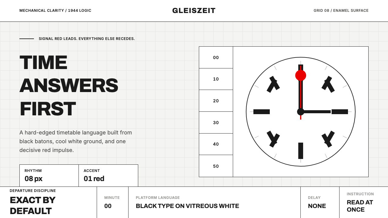 Swiss Railway ClockPrecision refuses decoration. Black batons and one red hand cut through ename…精准拒绝装饰:白珐琅底、黑色刻度,一根红秒针定向。
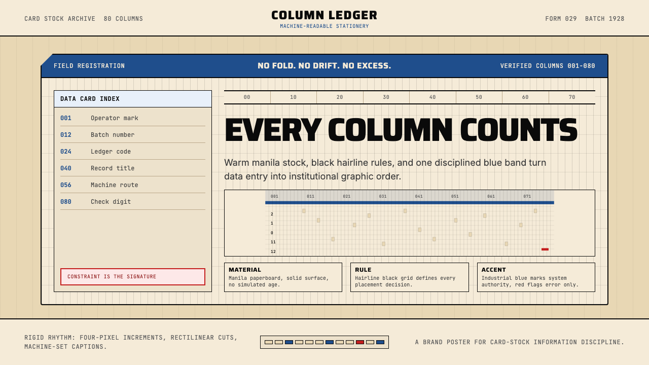 IBM Punchcard 029 (1928)Constraint becomes authority. Manila stock, hairline grid, industrial blue.约束即权威。米黄色卡纸、发丝网格与工业蓝。
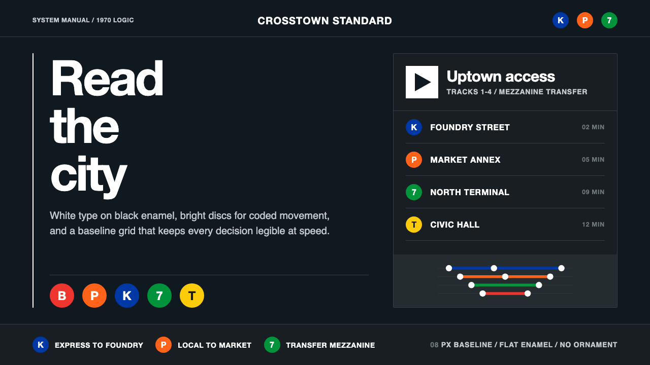 NYC Transit HelveticaOrder made visible. White type, black enamel, route discs, and a grid that ne…秩序一眼可见:黑底白字、线路圆盘与永不弯折的网格。
 2001 — A Space OdysseyAbsolute restraint. Black void, white monolith geometry, one HAL-red signal.绝对克制:黑色虚空、白色巨石几何、唯一的 HAL 红信号。
 Cloudflare Orange EdgeOperational clarity wins. Orange accents, hairline grids, and mono metrics ma…运维清晰取胜。橙色强调、发丝网格与等宽指标让边缘数据利落。
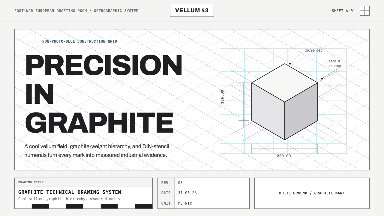 Graphite Technical DrawingDrafting-room precision. Non-photo-blue grid and graphite DIN lettering do th…制图室般精确:淡蓝网格与石墨DIN字母构成秩序。