What is Swiss Railway Clock?
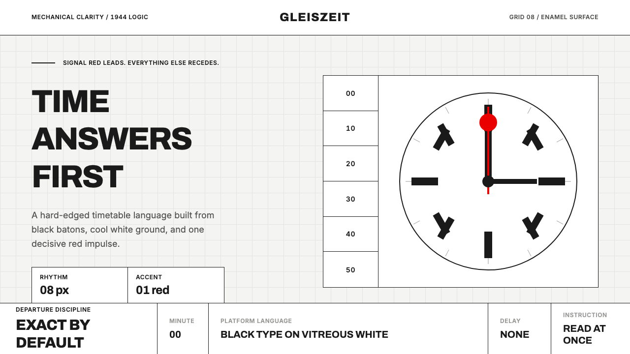
A single red second hand, sweeping over black batons on white enamel, turned the question of platform time into a national instrument of trust.
Swiss Railway Clock in brief
The Swiss Railway Clock is the station timepiece designed in 1944 by engineer Hans Hilfiker for the Swiss Federal Railways (SBB), and it remains one of the most recognized instances of functionalist design ever produced. Its face is white vitreous enamel, its hour and minute markers are solid black batons rather than numerals, and its single red second hand carries a round, paddle-like disc at its tip that mimics the signal discs railway staff once used to dispatch trains. Every element answers one question and nothing else: what time is it, right now, precisely.
What distinguishes this style from other minimalist or functionalist design traditions is the completeness of its restraint. There are no numerals at all — only batons, whose length and thickness alone communicate hour position. There is no secondary color beyond the single red accent. There is no branding, no ornament, no typographic flourish anywhere on the face. The clock's entire visual vocabulary exists to answer a single, urgent, repeatedly asked question with zero ambiguity and zero delay in comprehension.
As a reference for screen design, the Swiss Railway Clock demonstrates a principle that is easy to state and hard to execute: total legibility requires total restraint. Every degree of visual richness that could be added — color variety, numeral labels, decorative framing — would slow down the one thing the object exists to do, which is communicate a precise value at a glance from a distance, in motion, in poor light, to someone who has seconds to spare.

Where does Swiss Railway Clock come from?
In the years following the Second World War, Swiss Federal Railways faced a practical problem with cultural stakes: station clocks across the network were inconsistent in design and, more critically, in synchronization. A country whose entire national identity was built on precision — watchmaking, banking, punctual trains — could not tolerate a public-facing clock system that looked improvised or ran even slightly out of sync between stations. SBB engineer Hans Hilfiker, tasked with designing a new standard clock in 1944, approached the problem not as a stylistic exercise but as an engineering one: the clock had to be legible from a moving train platform at a glance, robust enough for outdoor exposure across the Alps, and mechanically capable of perfect network-wide synchronization.
Hilfiker's most consequential design decision was the red second hand's paddle-shaped tip, modeled directly on the circular signal discs that station guards used to flag a train's departure. This was not a decorative flourish; it was a direct visual quotation of railway operational apparatus, chosen so that the clock's second hand would feel like an extension of the dispatching system itself rather than an ordinary timepiece grafted onto a station wall. The hand's mechanism also carried a functional innovation: it would sweep to the twelve-o'clock position and pause there for a beat of just under two seconds before the minute hand advanced — a mechanical synchronization trick, driven by a master clock signal, that ensured every clock on the network agreed on the exact second a train should depart.
The design remained a purely functional railway instrument for decades, largely unknown outside Switzerland, until the Swiss watch company Mondaine licensed the design in the 1980s and adapted it into wristwatches and wall clocks for consumer sale. This licensing relationship — still active today — is what carried the SBB clock's visual language beyond railway platforms into airports, offices, and private homes worldwide, making it one of the rare instances of a purely functional, engineering-driven institutional design becoming a globally recognized consumer aesthetic.
The clock's continued use across the Swiss rail network into the twenty-first century, essentially unchanged in its core visual grammar, is itself part of its cultural argument: a design solved so completely for its function that seventy-plus years of technological change — analog to digital, mechanical to electronic movement — have not required altering its face.
What defines the Swiss Railway Clock look?
Color
The palette is reduced to three elements: white enamel ground, black for hour and minute markers and the hour/minute hands, and a single red used exclusively for the second hand. No other color appears anywhere on the face. Red is never used for structural or informational elements — only for the one moving component that demands continuous attention.
Markers Instead of Numerals
Hour positions are indicated entirely by solid black rectangular batons of varying length and weight rather than printed numerals. This removes any dependency on language or numeral literacy and allows the eye to register hour position through shape and position alone, a design choice that trades explicit information for near-instant peripheral legibility.
The Signal-Disc Second Hand
The red second hand's circular paddle tip is a direct visual quotation of the railway dispatch signal disc, giving the clock's most prominent moving element a functional history rather than an invented decorative form. This single detail carries the entire cultural narrative of the object and is the one place where the design departs from pure abstraction into referential meaning.
Hard Edges, No Gradient
Every element — markers, hands, the disc tip — is a flat, hard-edged shape with no shading, gradient, or simulated dimensionality. This flatness ensures the face remains equally legible under harsh outdoor light, from an angle, or at a distance, conditions under which subtle gradients or soft shadows would simply disappear.
Radial Symmetry, Single Center
The clock face is organized around perfect radial symmetry with a single fixed center point, the most conservative and universally legible layout structure a time-telling instrument can use. There is no asymmetric composition here — unlike Bauhaus or other modernist traditions, this style's restraint expresses itself through absolute regularity rather than tension-based balance.
The Two-Second Pause
A mechanical detail invisible in static imagery but central to the object's function: the second hand sweeps to twelve and pauses briefly before the minute hand advances, a synchronization behavior driven by a master clock signal. As a design principle this translates into interface motion: a deliberate, meaningful pause at a key state transition communicates precision and control far more than continuous, unbroken animation.

Who shaped Swiss Railway Clock?
Hilfiker, an engineer at Swiss Federal Railways, designed the station clock in 1944 as a solution to network-wide synchronization and legibility problems rather than as a stylistic exercise. His decision to model the second hand's tip on a railway dispatch signal disc, and to engineer a mechanical two-second pause for network synchronization, made the clock as much an engineering instrument as a visual design.
SBB commissioned and continues to operate the clock across its national station network, maintaining its core visual grammar essentially unchanged since 1944 as part of the railway's broader identity of national punctuality and precision.
The Swiss watch company Mondaine licensed the SBB clock design starting in the 1980s and adapted it into wristwatches and wall clocks for global consumer sale, the licensing relationship that carried the design beyond railway platforms into international recognition.
How do you use Swiss Railway Clock today?
For presentation slides, this style is best applied to any content whose central message is precision, punctuality, or trustworthy measurement — a status dashboard summary slide, a project timeline cover, a metrics report opener. A cover slide should use a near-white ground, black type set with mechanical evenness, and exactly one small red accent — a single highlighted number, a status dot — placed where it draws the eye without competing with anything else. Content slides work well as literal timelines or schedules, where the baton-marker logic translates directly into evenly spaced tick marks along an axis.
For web interfaces, the style is unusually well suited to real-time status displays, uptime dashboards, live data monitors, and scheduling tools — any product where the user's dominant need is to answer 'what is the current, precise state of this system' at a glance. The approach: white or near-white background, black for all structural and label text, and red reserved exclusively for the single most time-sensitive live indicator on the screen — a countdown, a live status dot, an active alert. Never use red for a static or decorative element; its entire value depends on signaling 'this is moving, right now.'
In editorial and marketing contexts, the style supports content about precision engineering, transportation, punctuality, or Swiss design heritage. A magazine-style layout can use the baton-marker logic as a literal design device — numbered lists rendered as tick marks rather than numerals, section breaks marked by a single red rule. Marketing pages for productivity or scheduling products benefit from the style's implicit promise: an interface that looks this restrained must be telling the truth about the time.
The style also transfers cleanly to loading states and progress indicators, where a single moving red element against a static black-and-white field communicates 'something is happening, precisely, right now' more convincingly than a colorful spinner would.
The most common mistake is treating the second hand's red as a general accent color and applying it to multiple elements simultaneously — buttons, links, and headers all in red dilutes the exact quality that makes the original object work, which is that red means exactly one thing: the single moving, time-critical element. A second common mistake is adding numerals back onto a baton-marker layout for 'clarity'; the original design's legibility comes precisely from the absence of numerals, and reintroducing them undoes the visual economy that makes the style distinctive.

Swiss Railway Clock — FAQ
Why does the clock use batons instead of numerals for hour markers?
Batons of varying length and weight let a viewer register the hour by shape and position at a glance, without needing to read or process a numeral first. This matters enormously for a clock meant to be read from a moving train platform in a fraction of a second — numerals require a small extra cognitive step that batons bypass entirely. The trade-off is that batons carry less explicit information than numerals, but for a repeatedly glanced-at instrument, that trade favors speed over precision-of-detail.
Is the red second hand purely decorative, or does it serve a function?
It is entirely functional. The paddle-shaped tip is modeled directly on the circular signal disc railway staff historically used to flag a train's departure, and the hand's mechanism includes a brief pause at twelve o'clock driven by a master clock signal that keeps every clock on the network synchronized to the exact second. The red color exists to make this one moving, time-critical element instantly distinguishable from the static black markers and hands.
How does this style differ from Swiss International Style (Swiss grotesque graphic design)?
Swiss International Style is a broad typographic and grid-based tradition developed for print, corporate identity, and posters, using disciplined sans-serif type and mathematical grids across a wide range of color and imagery. The Swiss Railway Clock is a single, specific functional object whose visual grammar predates and sits alongside that tradition, sharing its commitment to precision and restraint but applying it to an instrument rather than a communication system — there is no typography at all on the clock face, only markers, hands, and a disc.
Can this style work with any accent color other than red?
It is possible, but red carries specific cultural weight from the railway signal disc origin and from decades of association with the object. Substituting another color is safe when the product context has its own established meaning for that color — for instance, a live status indicator that already uses a brand color for 'active' states. What must be preserved regardless of hue is the rule of one: exactly one accent color, used for exactly one live, time-sensitive element, and nowhere else.
Does this style suit products aimed at a broad consumer audience, or only technical/enterprise tools?
Mondaine's decades of consumer wristwatch and wall-clock sales prove the style translates well to broad consumer audiences, particularly for products where the underlying promise is precision, reliability, or Swiss-adjacent craftsmanship. It is less suited to products whose brand identity depends on warmth, playfulness, or visual richness, since the style's severe restraint reads as clinical rather than approachable in those contexts.
Related design styles
 Helsinki Metro OrangeOne orange does the work. Archivo signage cuts across an 8px concrete tile gr…
 Airport Wayfinding GeometricLegibility becomes command. Signal yellow, black sans, and green route bands…
 Massimo Vignelli NYCClarity becomes infrastructure. Black rules and route stripes lock the white…
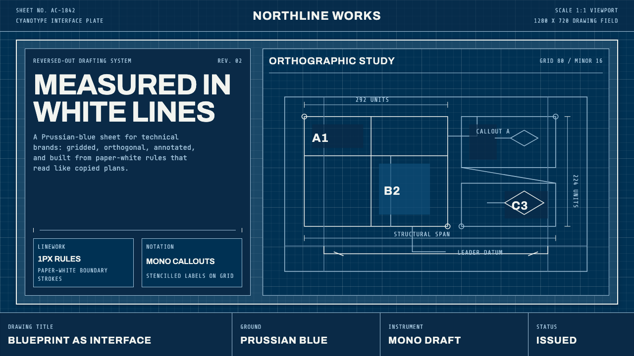 Architect CyanotypePrecision in negative. Prussian blue ground, paper-white grid, mono dimension…
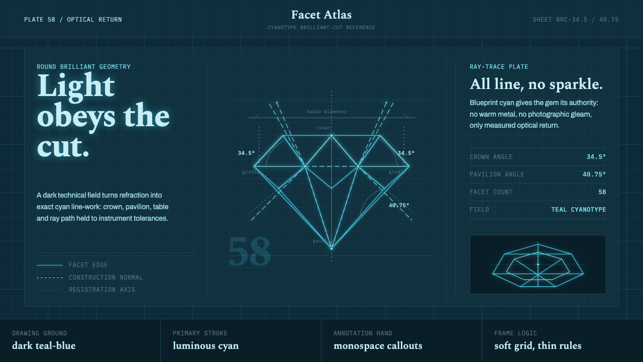 Brilliant Cut Facet DiagramOptics becomes blueprint. Cyan facet lines and ray paths glow on dark teal.
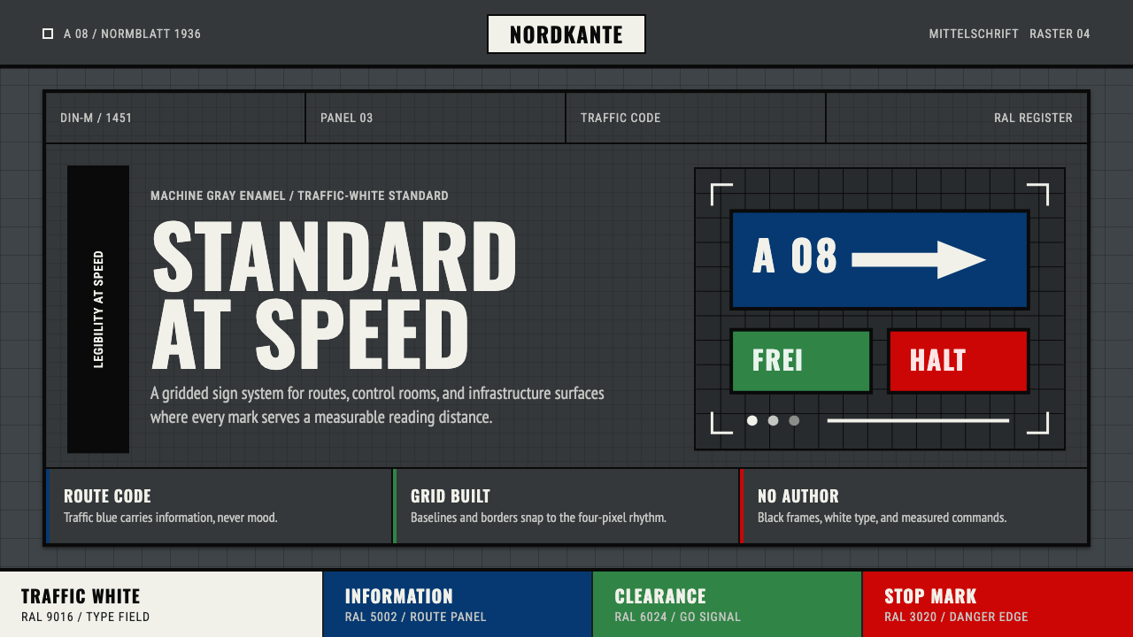 DIN 1451 SignageAuthorless and exact. Enamel gray grid, traffic-white DIN type, and RAL signa…