What is Architect Cyanotype?
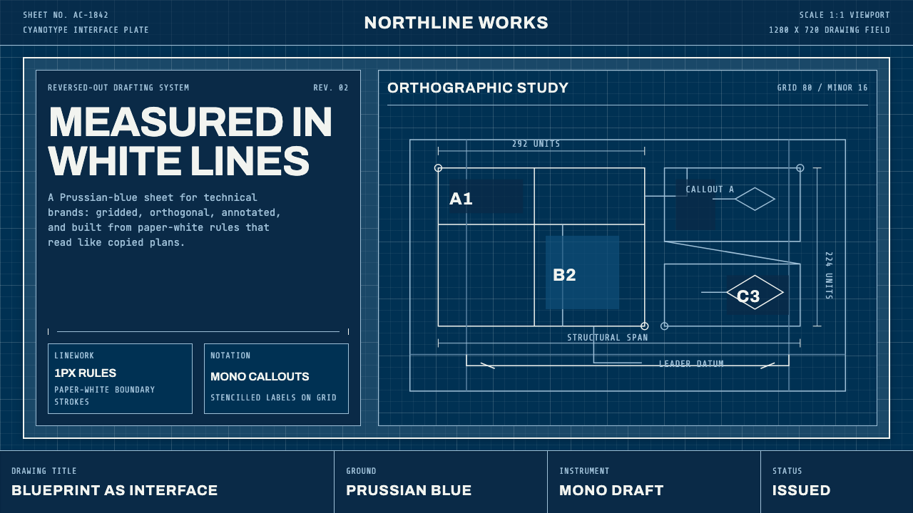
Architect Cyanotype takes the nineteenth-century blueprint — a technical drawing reproduced in reverse, white lines glowing out of a field of deep blue — and rebuilds it as a complete interface language of grids, hairlines, and stencilled callouts.
Architect Cyanotype in brief
Architect Cyanotype is a design system built on the visual logic of the architectural blueprint: a technical drawing reproduced not in black ink on white paper, but as a negative — white lines, grids, and lettering emerging from a saturated, near-uniform field of blue. The style is named for cyanotype, the photographic printing process that made this reversal possible, and it borrows the blueprint's entire working vocabulary: orthogonal lines, dimension marks, section callouts, and a discipline that treats every mark on the page as information rather than decoration.
The visual grammar is severe by design. Because the original blueprint process could only render two tones — the deep chemical blue where light struck the coated paper, and untouched white where the original drawing's lines had blocked it — the aesthetic leaves no room for gradients, tints, or soft transitions. Everything is drawn at a single, consistent stroke weight; labels are set in monospaced, stencil-like lettering that recalls hand lettering at a drafting table rather than typeset prose; and a faint grid runs beneath every surface, the way a draftsman's guideline grid ran beneath tracing paper on a drawing board.
What separates this from a generic dark mode or a neon tech aesthetic is intent. A blueprint was never meant to look moody — it was meant to be read accurately at a glance, reproduced cheaply in quantity, and filed away for decades in a plan chest. Architect Cyanotype carries that intent into interface design: the blue is not a backdrop chosen for atmosphere, it is the page itself, and everything drawn on it exists because a draftsman needed to communicate a measurement, a boundary, or an instruction — never because it looked good.
Where does Architect Cyanotype come from?
The process behind this style was invented in 1842 by Sir John Herschel, the English astronomer, chemist, and polymath who was already a central figure in the earliest years of photography — it was Herschel who coined the terms photography, negative, and positive for the emerging medium. Herschel discovered that paper coated with iron salts, when exposed to sunlight under a translucent original and then rinsed in water, turned a deep, permanent Prussian blue wherever light had reached it, while the shielded areas washed away to plain white. He called the process cyanotype, and treated it largely as a scientific curiosity for copying notes and diagrams.
The first person to put cyanotype to serious use was the British botanist Anna Atkins, a friend of Herschel's who recognized that the process could record the delicate, hard-to-draw silhouettes of seaweed and ferns with total fidelity. Beginning in 1843 she self-published Photographs of British Algae: Cyanotype Impressions, generally regarded as the first book ever illustrated with photographic images — and quite possibly the first photobook produced by a woman. Atkins's work is the aesthetic root of cyanotype's white-on-blue signature, even though her subject was botanical rather than architectural.
Cyanotype only became an industrial tool, rather than a scientific and artistic one, after the French chemist Alphonse Louis Poitevin patented an improved ferroprussiate printing process in 1861. Poitevin's refinement made the chemistry stable, fast, and durable enough to reproduce large-format engineering and architectural drawings reliably and in volume — turning what had been a laboratory technique into the drafting office's standard method for copying. From roughly 1900 to 1950, the blueprint was the dominant way architects and engineers duplicated technical drawings: an original was inked or penciled onto translucent linen or vellum, then contact-printed onto blueprint paper under strong light, producing an exact, tamper-evident copy that could be rolled, shipped to a job site, and read in the field.
That century of drafting-room use is also where the style's supporting conventions come from — the disciplined, single-stroke lettering used for titles and dimensions, the standardized system of dimension lines, extension lines, and section marks that let any trained reader interpret a drawing without ambiguity. In the United States, engineering educator Thomas E. French did more than almost anyone to codify this visual language: his influential manual on engineering drawing and lettering, first published in the early twentieth century and revised for generations afterward, taught successive cohorts of drafters the exact stroke discipline this style still evokes. Blueprinting itself was eventually displaced by faster diazo whiteprint machines and later by photocopying, but the word 'blueprint' survives in everyday language as a synonym for any precise, authoritative plan — a small linguistic monument to how completely this reprographic process once defined technical communication.
What defines the Architect Cyanotype look?
Color
The palette is reduced to a single dominant field of deep, saturated blue with white as its only counterpart, plus black reserved for occasional body text. There is no secondary hue to relieve it — the entire emotional and structural range of the system is carried by the contrast between the blue ground and the white marks that sit on top of it, echoing the two-tone chemistry of the original photographic process, which physically could not produce a third color.
Typography
Lettering favors an even, mechanical stroke over any calligraphic flourish, evoking the disciplined single-stroke lettering drafters were trained to produce by hand at the drawing board. Labels read as if stencilled or ruled rather than typeset, and letterforms lean toward a monospaced, all-capitals feel for callouts and dimension text, while longer passages step back into a plainer, quieter register so the drawing itself stays the loudest thing on the page.
Line work
Every stroke — card borders, dividers, underlines, chart outlines — is drawn hairline-thin and held to a single, consistent weight, the way a technical pen holds one nib size across an entire sheet. Curves are rare; the vocabulary is almost entirely orthogonal, built from straight verticals and horizontals meeting at clean right angles, because a draftsman's tools were the T-square and the triangle, not the compass.
Grid and measurement
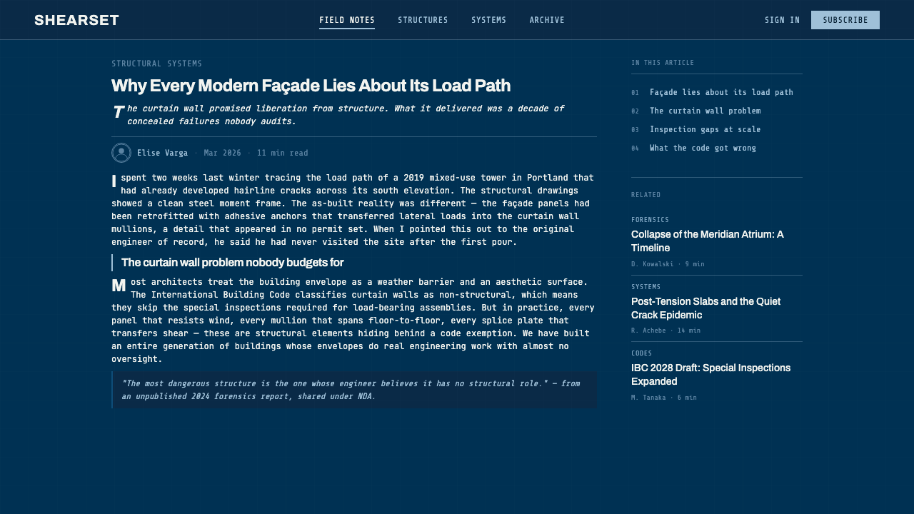
A faint grid sits beneath every surface, unifying panels, cards, and text blocks the way non-repro guidelines once unified a sheet of tracing paper. Alignment reads as intentional and measured rather than merely tidy, and recurring dimension-line motifs — small arrows and tick marks bracketing a distance — appear as a visual signature even where nothing is literally being measured.
Annotation and iconography
Small marks do the work that icons or illustrations would do elsewhere: reference numbers, cross-hairs, section-cut symbols, and stencilled tags that look lifted straight from the margin of a drawing sheet. These marks are treated as part of the drawing itself rather than as separate UI chrome, so a label and the thing it labels feel like they belong to the same document.
Flatness
There is no simulated lighting anywhere in the system — no soft drop shadow, no gradient fill suggesting depth. Elements are separated purely by line weight, fill, and position, exactly as a blueprint has no way to render a shadow: light either reached the paper or it didn't, and that binary logic still governs how surfaces are told apart.
Surface texture
A restrained hint of print grain and uneven edge quality runs through large blue fields, a quiet nod to the chemical unevenness of a hand-coated, sun-exposed sheet. It is used sparingly, as atmosphere rather than noise, so the system still reads as crisp and legible rather than distressed or vintage.

Who shaped Architect Cyanotype?
The English astronomer and chemist invented the cyanotype process in 1842 while investigating light-sensitive iron compounds, and separately coined the words photography, negative, and positive for the new medium as a whole. He viewed cyanotype mainly as a convenient way to duplicate his own notes and astronomical diagrams, not as an art form — but the two-tone, white-on-blue chemistry he discovered is the direct technical ancestor of every blueprint made in the century that followed.
A British botanist and friend of Herschel's, Atkins was the first person to put cyanotype to serious documentary use, publishing Photographs of British Algae: Cyanotype Impressions beginning in 1843 — widely credited as the first book illustrated with photographic images. Her white-on-blue plates of seaweed established the aesthetic signature that the architectural blueprint would later inherit for an entirely different, technical purpose.
The French chemist patented an improved ferroprussiate printing process in 1861 that made cyanotype chemistry stable and durable enough for industrial-scale reproduction of large technical drawings. His refinement is the reason cyanotype left the laboratory and the naturalist's studio and became the drafting office's everyday copying method for the better part of a century.
An American engineering-drawing educator whose influential manual on engineering drawing and lettering, first published in the early twentieth century and revised across generations, codified the disciplined single-stroke lettering and dimensioning conventions this style still evokes. His textbook trained cohorts of American drafters in exactly the stroke consistency and annotation grammar that defines the aesthetic today.
How do you use Architect Cyanotype today?
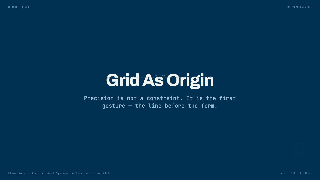
On a presentation cover, Architect Cyanotype reads as a drawing sheet rather than a marketing slide: a full blue field with a modest, off-center title block set in the mono, stencil-like lettering, closed off by a single hairline rule, exactly where a real drawing's title block would sit. Content slides let the underlying grid surface as faint ruled lines, and bullet points behave like annotations rather than a bulleted list — each point can carry its own small reference mark, the way a callout points to a detail on a drawing. Data slides are where the style earns its keep: charts render as outlined, white-on-blue line and bar diagrams with dimension-style value labels rather than filled color blocks, so even a bar chart reads as something measured rather than something merely colored in.
In web interfaces, the style's affinity for precision makes it a natural fit for dashboards, technical documentation, and any product that wants to feel instrumented rather than casual. Metrics present well as 'dimensions' — a number bracketed by small tick marks rather than sitting inside a colored pill — and tables rule cleanly with the same hairline weight used throughout the system, with row states signaled by a filled white sliver rather than a shift in hue. Pricing pages benefit from being laid out like plan sheets: tiers as side-by-side panels with a shared grid, feature lists rendered as a checklist of small ticks rather than icon graphics, so the whole page keeps the feel of a specification rather than a sales pitch.
For editorial and marketing pages, the discipline works best when it stays disciplined. Long-form body text sits inside a column bounded by margin marks reminiscent of a drawing's border, and pull-quotes behave as callouts — a short leader line connecting the quoted text to its place in the body, rather than a decorative blockquote. Marketing hero sections work well as a single full 'sheet': one dominant blue field, one white headline set with restraint, and a call-to-action treated like a stamped rectangle — white type reversed out of a solid block — evoking the look of an approval stamp on a finished drawing.
Photography and illustration need careful handling, because realistic imagery breaks the fiction that everything on the page was drawn by hand. When a photograph is unavoidable, converting it toward a flat, high-contrast duotone that only uses the system's blue and white keeps it inside the drawing's logic; full-color photography dropped directly into this system looks like an error, not a deliberate contrast, because nothing else on the page ever earns a third color.
The most common mistake is treating this as a generic 'tech noir' or cyberpunk dark theme and reaching for gradients, glows, or a second accent color to make it feel more 'futuristic.' That instinct works against the style's entire premise. Architect Cyanotype is convincing exactly because it refuses everything a blueprint's own chemistry could not physically produce — no gradient, no third hue, no soft shadow — and any addition of those effects reads immediately as a costume rather than the real thing.
Architect Cyanotype — FAQ
Is this the same thing as a generic dark-mode or cyberpunk tech aesthetic?
No. A dark cyberpunk theme is usually built around glow, neon accent colors, and atmosphere. Architect Cyanotype has none of that — it is built around the physical limits of a nineteenth-century photographic process that could only produce two tones, blue and white, with no gradient possible. The restraint is not a mood choice, it is a rule inherited from chemistry, and it should be respected as strictly as a real drafting standard would be.
How did the original blueprint process actually work?
Paper was coated with light-sensitive iron compounds and left to dry in the dark. A finished technical drawing, inked or penciled onto translucent linen or vellum, was laid on top and the two sheets were exposed together to strong light — usually sunlight. Wherever light passed through the translucent original and reached the coated paper, a chemical reaction turned that spot a deep, permanent blue; wherever the original drawing's own lines blocked the light, the coating stayed unreacted and washed away in water, leaving plain white. The result was an exact negative copy: white lines on a blue ground, reproducing the original drawing precisely.
Does the style only work as a dark theme, or can it be inverted to a light background?
The canonical form is dark: a deep blue ground with white marks, because that reversal is the entire point of a blueprint — it is literally what the chemical process produces. Inverting it to a white background with blue lines produces something that looks more like a normal architectural drawing or a whiteprint (the diazo process that eventually replaced true blueprints), which is a related but visually different tradition. If a lighter surface is required, it reads more faithfully as this later whiteprint lineage than as a cyanotype blueprint proper.
How is this different from Anna Atkins's cyanotype botanical prints?
They share the identical underlying chemistry — the same 1842 process invented by Herschel — but different subject matter and purpose. Atkins used cyanotype to record organic, irregular silhouettes of seaweed and ferns for scientific illustration; the resulting plates have a naturalist's softness to their edges. Architect Cyanotype instead descends from the process's other, industrial branch: the rigid, orthogonal, ruled drafting tradition that Poitevin's improved process enabled for architecture and engineering from around 1900 onward. Same chemistry, two very different visual lineages.
Why did blueprints eventually disappear from real drafting offices?
Blueprinting required a wet chemical process and strong light exposure, which was slow and cumbersome compared to what followed it. From the mid-twentieth century onward, faster diazo whiteprint machines — producing dark lines on white paper instead — took over most drafting offices, and photocopying later replaced diazo in turn. By the late twentieth century, digital CAD drawings made the entire physical reproduction chain obsolete. What survives is the word 'blueprint' itself, still used generically for any detailed plan, long after the actual blue paper disappeared from practice.
Related design styles
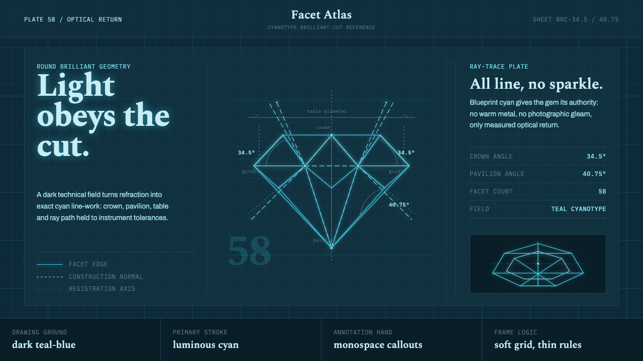 Brilliant Cut Facet DiagramOptics becomes blueprint. Cyan facet lines and ray paths glow on dark teal.
 DIN 1451 SignageAuthorless and exact. Enamel gray grid, traffic-white DIN type, and RAL signa…
 Dessau GrayscaleAustere monochrome authority. Darkroom black, glazing gray, and a steel-windo…
 Frutiger CDG AirportLegibility at runway scale. Navy panels, white humanist sans, arrow-led grids.
 Transport UK Road SignsClarity at seventy. White mixed-case lettering advances across recessive moto…
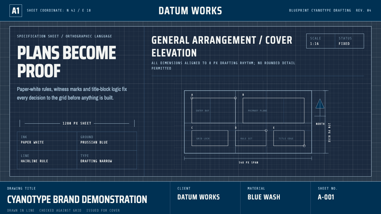 Cyanotype BlueprintPrecision is the ornament. Prussian blue grid, paper-white hairlines, and tit…