What is Dessau Grayscale?
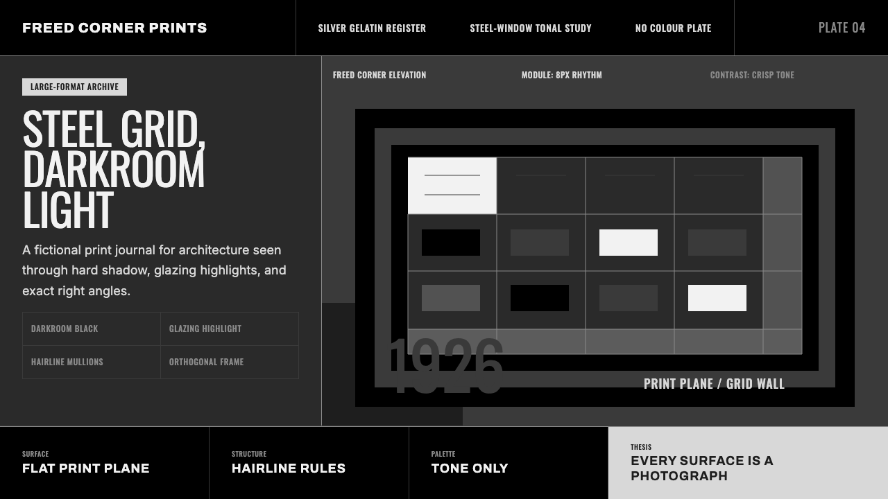
Before the world ever saw Bauhaus in color, it saw Bauhaus in silver gelatin — this system renders the school the way its own camera first showed it to everyone else.
Dessau Grayscale in brief
This system is not the familiar red-blue-yellow Bauhaus graphic language; it is the Bauhaus as architecture, seen the way it was actually first transmitted to the world — through black-and-white photography. Its subject is a single building: the school's purpose-built campus in Dessau, Germany, designed by founder Walter Gropius and completed in 1926, and specifically the way that building was documented in a series of large-format photographs taken shortly after construction.
Those photographs — deep darkroom black, bright glazing highlights where glass caught the light, and the crisp orthogonal geometry of a steel-and-glass curtain wall rendered in stark tonal contrast — became, for most of the world outside Germany, the actual image of what Bauhaus looked like, reproduced in magazines and books for years before color reproduction was widely affordable. This system works entirely in that photographic register: no color, only tone.
The visual result feels less like a graphic design system and more like a printed photograph brought to life as an interface — hard-edged shadow blocks standing in for the building's cast shadows, hairline rules standing in for window mullions, and panels divided the way a photographic contact sheet divides its frames. It is austere, architectural, and deliberately unglamorous, favoring the authority of a documentary image over the playfulness of Bauhaus graphic design proper.
Where does Dessau Grayscale come from?
When Walter Gropius relocated the Bauhaus from Weimar to Dessau in 1925, the move gave him the chance to design the school's first purpose-built home rather than adapting an existing structure. Completed in 1926, the Dessau building organized workshops, classrooms, a bridge housing administrative offices, and a student dormitory wing around an asymmetric, pinwheel-shaped plan, connected by covered walkways so that no part of the complex needed a conventional formal facade.
Its most influential single feature was the workshop wing's glass curtain wall — a continuous skin of steel-framed glazing hung on the building's structural frame rather than bearing any load itself, wrapping around the building's corner without a supporting column interrupting the glass. This 'freed corner,' as it came to be called, demonstrated something genuinely new: that a wall could be pure enclosure, with structure handled entirely elsewhere, an idea that would go on to define the glass-box logic of modernist and later corporate architecture for the rest of the century.
The building's global reputation was built almost entirely on photography, and the photographer most responsible was Lucia Moholy. Working with a large-format camera in the years immediately after the building's completion, Moholy produced a series of meticulously composed black-and-white images — long exposures capturing the glazing's transparency, careful attention to the angle of natural light against the steel grid — that Gropius and the school then used extensively in publications, exhibitions, and promotional material to establish the Bauhaus's international reputation.
Moholy's negatives had a difficult afterlife. When she fled Germany in 1933 as the Nazi regime closed the school, she was forced to leave her glass-plate negatives behind; Walter Gropius took possession of them, and for decades her photographs continued to circulate as the definitive images of Bauhaus Dessau, often reproduced without proper credit to the woman who made them. Moholy spent years afterward seeking recognition of her authorship and the return of her negatives, an episode of the Bauhaus story only widely acknowledged well after her death in 1989. This system's title deliberately foregrounds her role: it is not simply 'the Bauhaus building' but the Bauhaus building as her camera and darkroom rendered it.
What defines the Dessau Grayscale look?
Darkroom Black
The system's deepest tone functions the way unexposed silver-gelatin paper does in a darkroom print — a true, dense black reserved for the areas of greatest shadow or contrast, never diluted into a washed-out gray. This gives compositions the same tonal punch a well-printed architectural photograph has, where black anchors the image rather than merely filling background space.
Glazing Highlight
Where the historic curtain wall caught direct light, the photographic prints show near-white highlight with almost no midtone transition — glass photographs as pure brightness rather than a graduated reflection. This system uses that same abrupt jump from deep tone to bright highlight, avoiding soft gradients that would make the glazing read as an ordinary surface rather than transparent glass caught by a camera.
Steel-Window Grid
The building's steel glazing bars, repeating at regular intervals across the curtain wall, give the system its underlying structure: a strict, evenly spaced grid of thin lines dividing larger panels into smaller rectangular units. This grid is treated as load-bearing for the composition even where nothing is literally being held up — every element aligns to it.
The Freed Corner
The Dessau building's most radical architectural move — a glass curtain wall wrapping around a corner with no visible supporting column — becomes, in this system, a preference for compositions that carry a panel or a plane confidently around a corner or edge rather than stopping it abruptly at a frame boundary, echoing the sense of structural weightlessness the original detail achieved.
Orthogonal Panel Division
Surfaces are divided purely by horizontal and vertical lines, never diagonal or curved, reflecting both the building's steel-and-glass construction and the flat, orthogonal geometry that large-format architectural photography naturally emphasizes when a camera is squared precisely to a facade. This produces a calm, grid-locked rhythm across every panel and division.
Hairline Rules
Fine, thin dividing lines stand in for the building's window mullions and the crisp edges photography renders when a lens resolves fine steel framing at a distance. These hairlines carry structural meaning rather than acting as decoration — every one of them corresponds to something that would, in the original building, actually hold something up or divide one pane of glass from the next.

Who shaped Dessau Grayscale?
As founder and director of the Bauhaus, Gropius designed the Dessau building himself, completed in 1926, giving the school its first purpose-built home. The building's glass curtain wall and asymmetric pinwheel plan translated the school's teaching philosophy directly into architecture, and Gropius relied heavily on photographic documentation of the building to spread the school's reputation internationally.
A trained photographer, Moholy produced the series of large-format black-and-white images of the Dessau building that became, for most of the world, the definitive visual record of Bauhaus architecture. Forced to leave her negatives behind when she fled Nazi Germany in 1933, she spent decades seeking recognition as their author before her contribution was more fully acknowledged.
Lucia Moholy's husband during the Dessau years, László Moholy-Nagy taught the school's foundational course and championed photography as a legitimate design discipline in its own right rather than a mere documentation tool. His broader advocacy for the medium at the Bauhaus created the intellectual environment in which Lucia Moholy's architectural photography could be taken seriously as design work.
A Bauhaus student who became a workshop master at Dessau, Breuer designed the tubular steel furniture that filled the building's interiors, most famously the Wassily Chair, and those pieces appear throughout the era's photographic documentation, their hard geometric lines and reflective steel tubing echoing the building's own glass-and-steel logic.
How do you use Dessau Grayscale today?
This system suits any product built around architecture, photography, design history, archives, or portfolio work where a documentary, almost archival tone is an asset rather than a limitation. Because it works entirely in tone rather than color, it also serves technical or engineering-adjacent products that want visual seriousness without borrowing an obviously corporate palette.
On slides, a cover works well as a near-black field with a single bright glazing-style highlight positioned off-center, echoing how a photograph of the Dessau building lets one bright reflection carry the entire frame's energy. Content slides should use the steel-window grid as a literal layout device — a repeating set of thin vertical or horizontal rules dividing the frame into consistent modules — with text and imagery placed inside those modules rather than floating freely. Data visualization suits high-contrast bar and line treatments especially well, since the darkroom-black-to-highlight tonal range naturally reads as strong data contrast without needing color coding.
In web interfaces, the system is well suited to portfolios, case-study pages, and any content-heavy site where large photography needs a frame that supports rather than competes with the images. Dashboards can use the orthogonal grid to organize dense data cleanly, with the glazing-highlight tone reserved for the single most important number or call to action on a screen. Pricing pages work best kept extremely restrained — thin hairline dividers between tiers, no color differentiation, letting typographic hierarchy alone signal which tier matters most.
For editorial and marketing content, the register suits long-form design writing, architecture journalism, and premium documentary-style brand storytelling. A full-bleed photograph treated in the same darkroom-black tonal range as the rest of the system reads as continuous with the interface rather than as an inserted image, which is particularly effective for brands whose own photography is a core asset.
The most common mistake is treating this as a plain dark-mode theme and populating it with saturated accent colors for buttons or links — doing so breaks the photographic illusion the entire system depends on. A second common mistake is softening the hairline grid lines or blurring the transition between shadow and highlight; both moves erase the crisp, large-format-camera sharpness that is this system's entire reason for existing.

Dessau Grayscale — FAQ
Is this the same system as the classic red-blue-yellow Bauhaus style?
No, and the difference is deliberate. The classic Bauhaus graphic language — primary colors, Kandinsky-derived color symbolism, bold geometric shapes — comes from the school's print and typography workshops. This system instead comes from architecture and photography: it renders the physical Dessau building the way it was actually documented and transmitted to the world in black-and-white photographs, before most people ever saw the school's colorful graphic output at all. Think of this as the Bauhaus that traveled through magazines and books in monochrome, rather than the Bauhaus that traveled through posters in color.
Who was Lucia Moholy and why does her name attach so strongly to this particular rendering?
Lucia Moholy was the photographer who produced the large-format black-and-white images of the Dessau building that circulated internationally and effectively became the world's mental picture of what Bauhaus architecture looked like. Her authorship was obscured for decades after she was forced to leave her negatives behind fleeing Nazi Germany in 1933, and Walter Gropius continued using her photographs extensively without full credit. This system's grayscale approach is named in her honor because the images it draws its tonal logic from are, quite literally, hers.
Why does the design avoid gradients if photography itself has natural tonal gradation?
Silver-gelatin printing from this era, especially in reproduction for magazines and books, tended to compress subtlety into stronger contrast — deep blacks, bright highlights, and a narrower middle range than a modern digital photograph would show. This system follows that print-reproduction character rather than the full tonal range a camera sensor captures today, because it is specifically evoking how these images were actually seen by their original audience: reproduced, often in low-quality print, with contrast doing most of the communicative work.
Does this system work for anything other than architecture-related content?
It generalizes well beyond architecture specifically, because its core logic — strong tonal contrast, a strict grid, and photographic rather than illustrative imagery — is a structural approach rather than a subject-specific one. It works particularly well anywhere a product wants to feel documented and credible rather than illustrated and promotional: technical documentation, engineering case studies, investigative journalism, and premium hardware or manufacturing brands that photograph their own products rather than illustrating them.
Related design styles
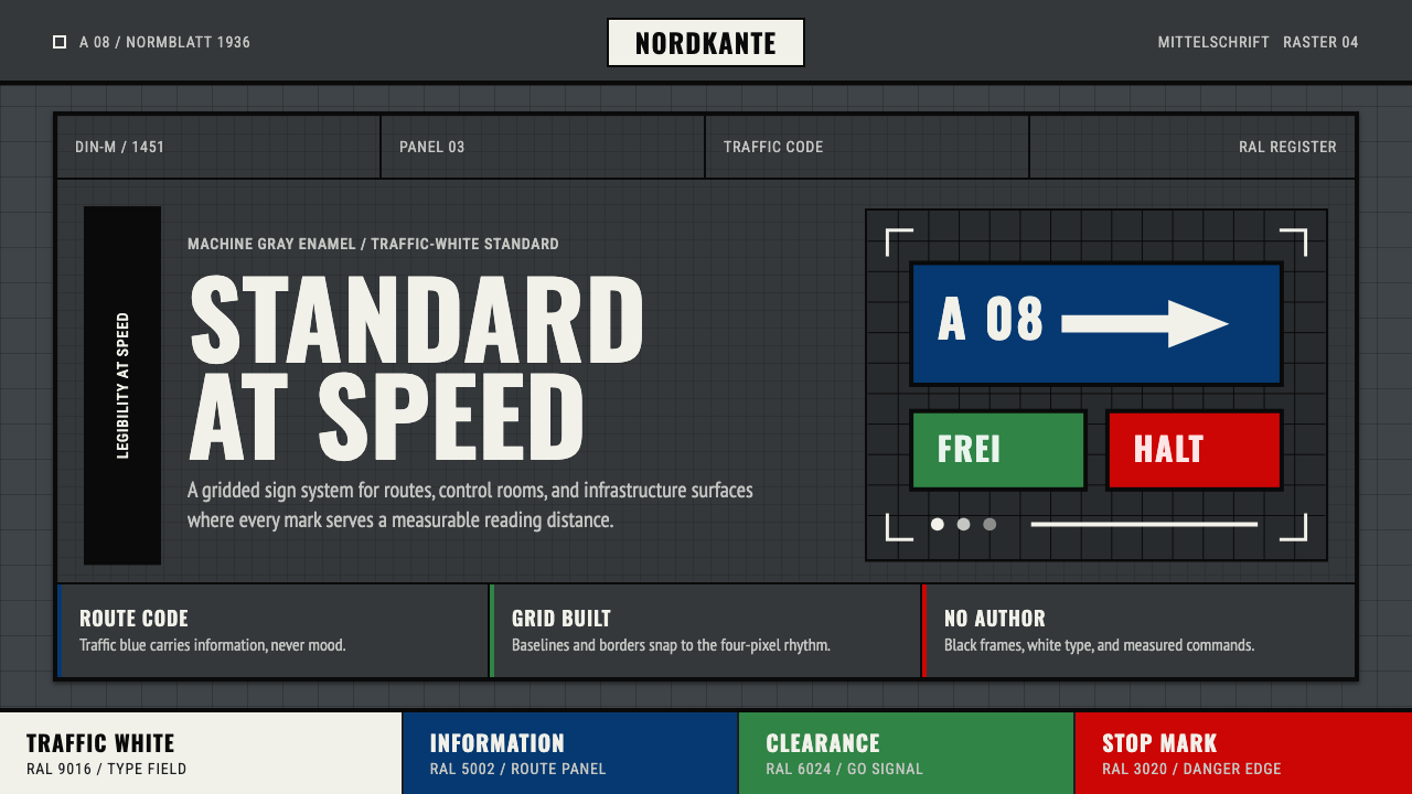 DIN 1451 SignageAuthorless and exact. Enamel gray grid, traffic-white DIN type, and RAL signa…
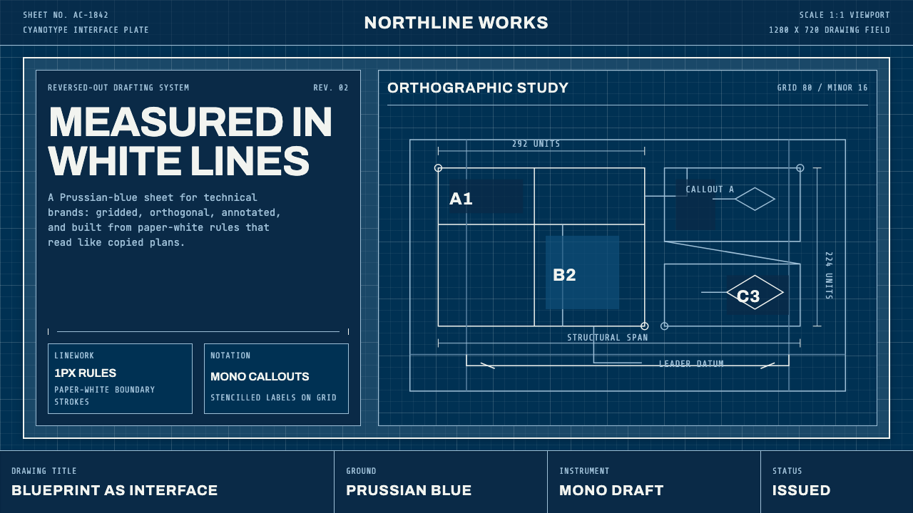 Architect CyanotypePrecision in negative. Prussian blue ground, paper-white grid, mono dimension…
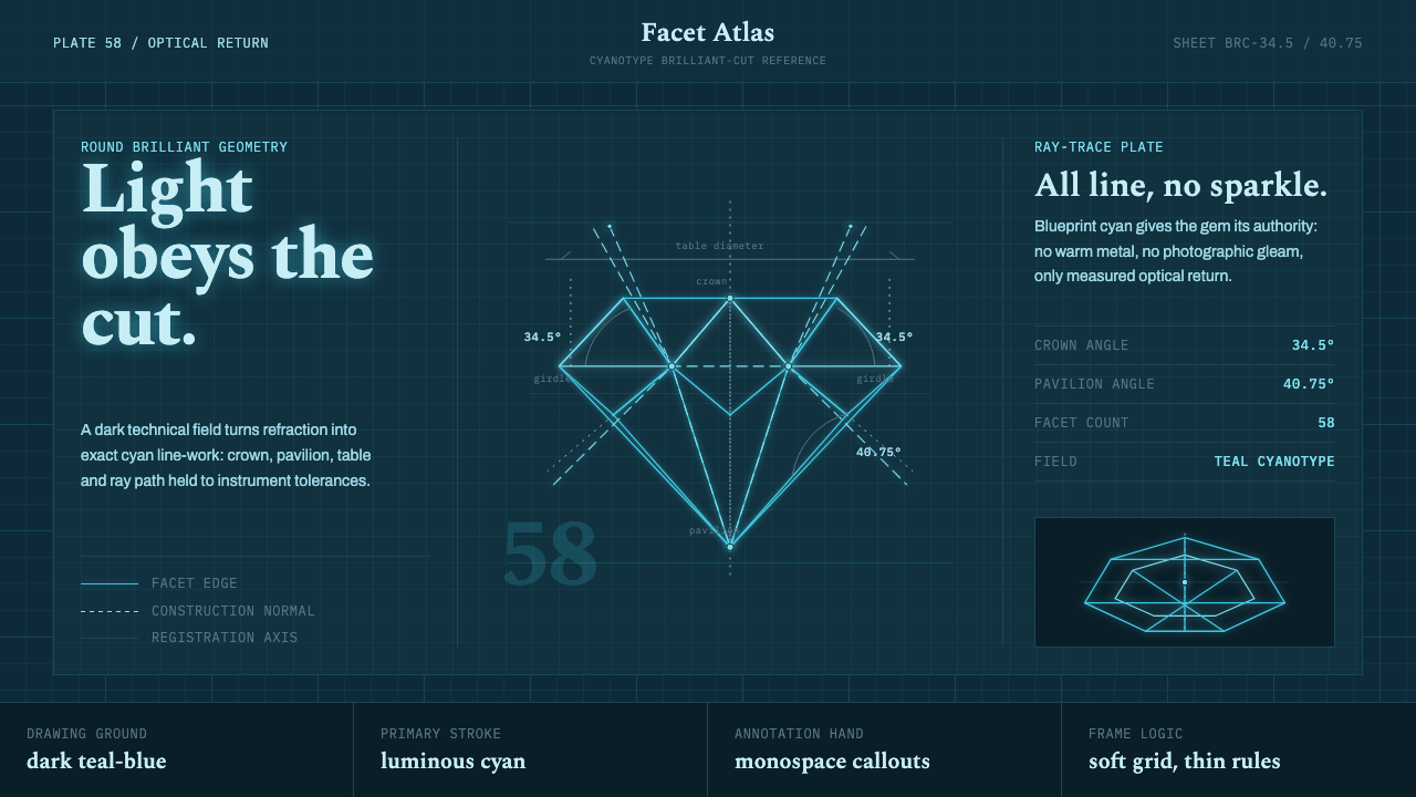 Brilliant Cut Facet DiagramOptics becomes blueprint. Cyan facet lines and ray paths glow on dark teal.
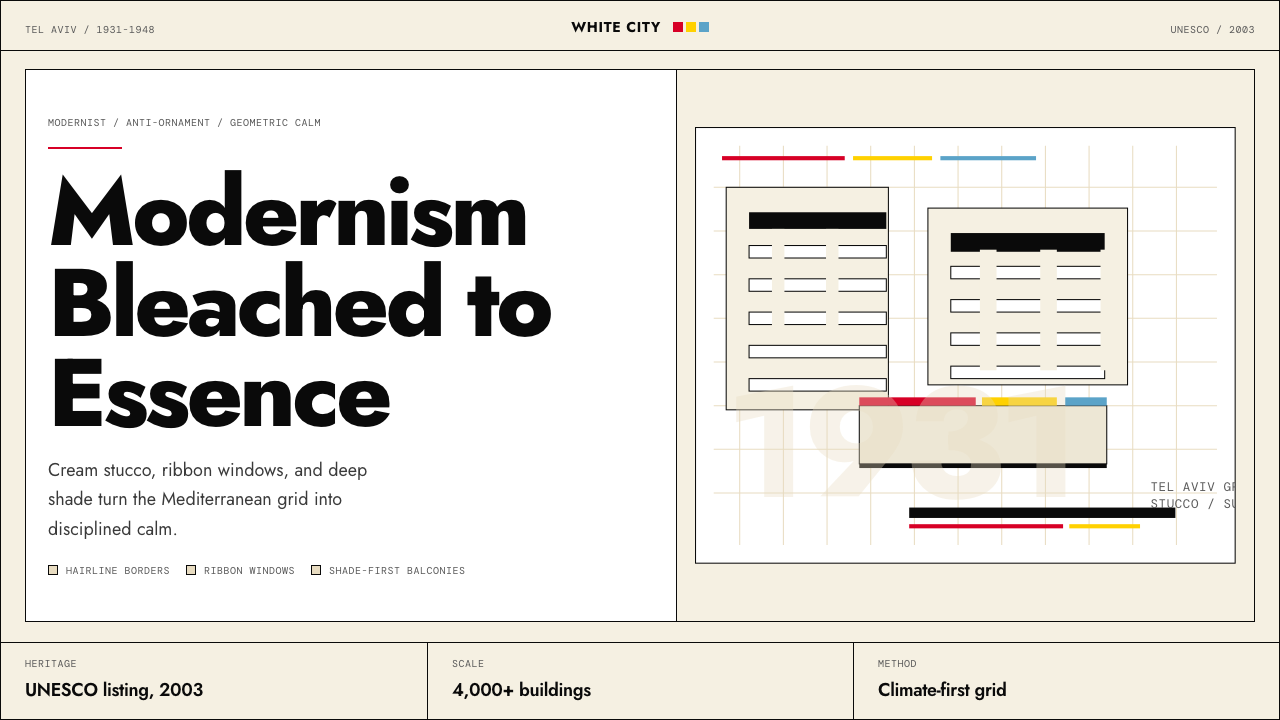 Israeli Bauhaus Tel Aviv (White City)Austere urban modernism. Stucco-white grid, Jost type, hairline borders, and…
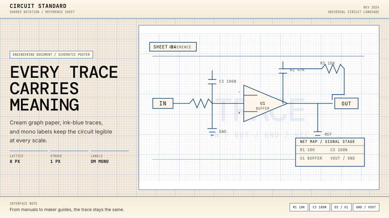 Electrical Schematic WiringAustere and exact. Cream graph paper, ink-blue traces, and mono labels make e…
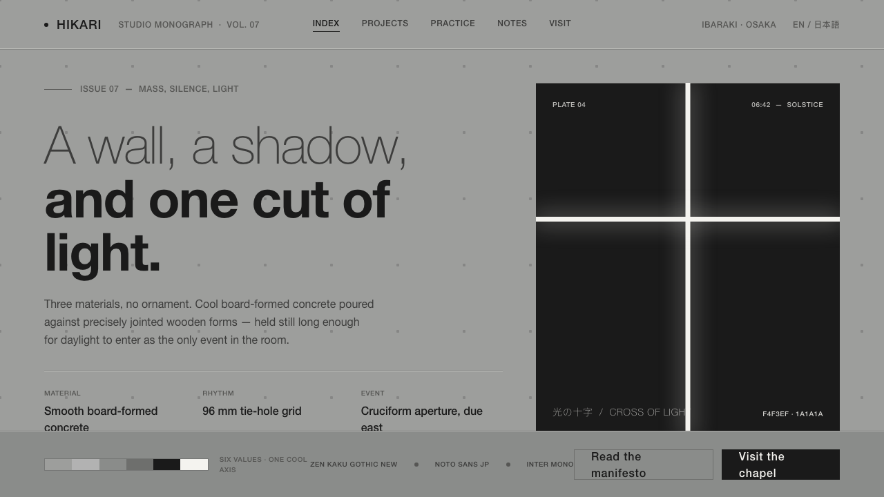 Tadao Ando ConcreteSilence as material. Cool board-formed grey, tie-hole grid, one sliver of lig…