What is Israeli Bauhaus Tel Aviv (White City)?什么是 Israeli Bauhaus Tel Aviv (White City)?
Tel Aviv's White City is where Bauhaus discipline met Mediterranean sun — four thousand cream-white buildings that turned a European exile into a world heritage.特拉维夫白城是包豪斯纪律与地中海阳光的相遇之地——四千余栋奶油白建筑,将一段欧洲流亡史化为世界遗产。
Israeli Bauhaus Tel Aviv (White City) in briefIsraeli Bauhaus Tel Aviv (White City) 速览
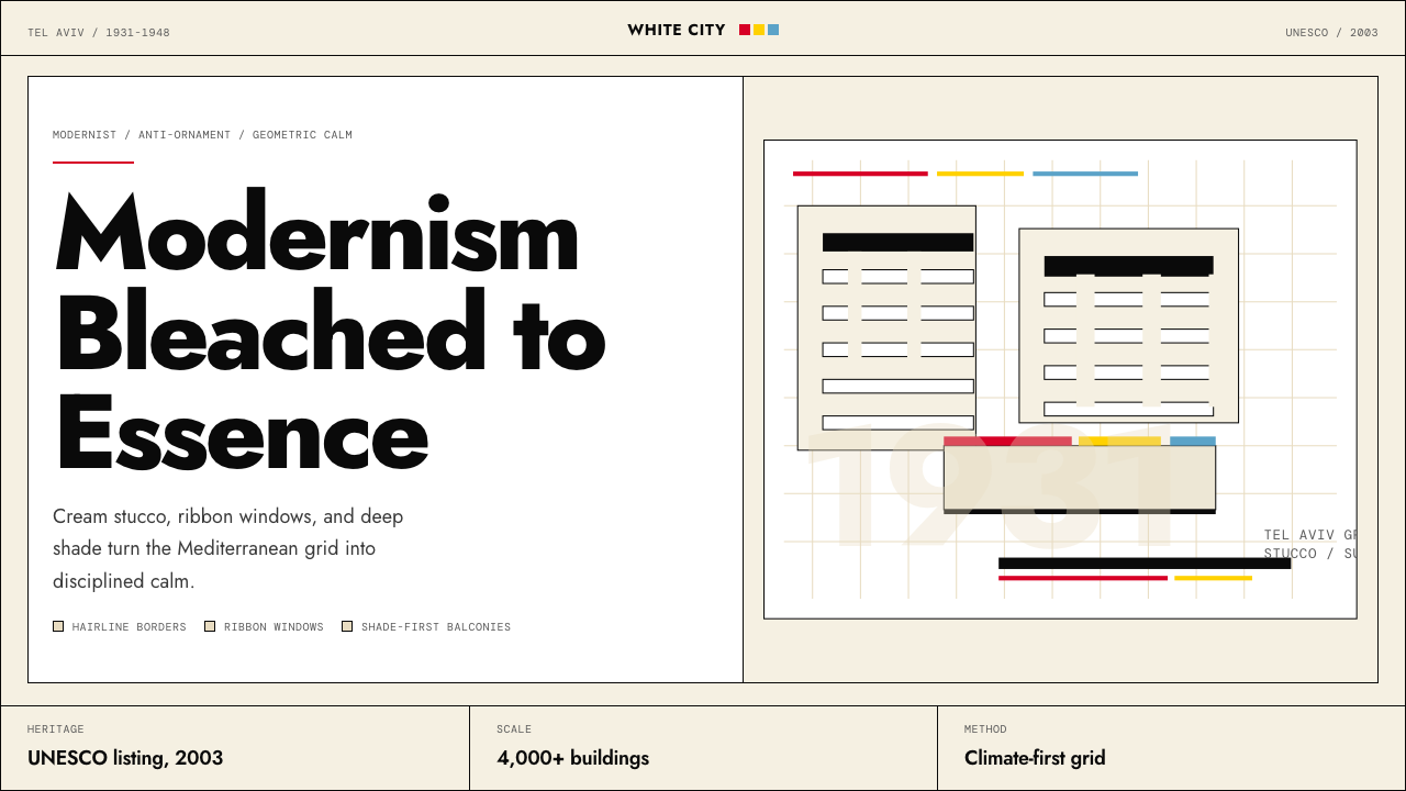
Israeli Bauhaus — the design system born from Tel Aviv's White City — is a regional inflection of the International Style: strict geometric modernism softened by warm stucco-white grounds, horizontal ribbon windows adapted to shade interiors from intense sunlight, and a palette of restrained primary accents used only for structural emphasis. It is not merely Bauhaus transplanted; it is Bauhaus evolved under a different climate, a different politics, and a different cultural memory.以色列包豪斯——源自特拉维夫白城的设计系统——是国际风格的一种地域变体:严格的几何现代主义,被温暖的灰泥白底色所柔化,带状窗户经过调整以遮蔽强烈阳光,三原色点缀克制地仅用于结构性强调。这并非简单移植的包豪斯,而是在不同气候、不同政治与不同文化记忆下进化了的包豪斯。
Where original Weimar or Dessau Bauhaus often operated in an atmosphere of revolutionary urgency, the White City variant carries a quieter confidence. The buildings its architects left behind are functional, durable, and visually coherent at the scale of an entire city quarter — a grid of pale facades, cantilevered balconies casting hard geometric shadows, and pilotis lifting ground floors above the dusty street level. The style prizes clarity over drama, legibility over spectacle.魏玛或德绍时期的原版包豪斯常在革命紧迫感中运作,而白城变体则带有一种更为沉静的自信。建筑师们留下的建筑功能扎实、经久耐用,在整个城区尺度上呈现出视觉连贯性——浅色立面的网格、悬挑阳台投下的硬边几何阴影、将底层架空于尘埃地面之上的支柱。这种风格重清晰而非戏剧,重可读而非奇观。
As a contemporary design system, Israeli Bauhaus translates this architectural vocabulary into two-dimensional and interface work: warm off-white as the primary ground, rigorous geometric sans-serif type, hairline borders that echo balcony railings, and primary colors used with the same restraint as a single painted balcony door on an otherwise white facade. Decoration that cannot be justified by structure simply does not appear.作为当代设计系统,以色列包豪斯将这套建筑词汇转化为二维与界面作品:温暖的近白色作为主底色,严谨的几何无衬线字体,呼应阳台栏杆的细线边框,以及像白色立面上一扇彩色阳台门那样克制运用的三原色。无法以结构为正当理由的装饰,简单地不会出现。
Where does Israeli Bauhaus Tel Aviv (White City) come from?Israeli Bauhaus Tel Aviv (White City) 从何而来?
The White City's origins are inseparable from the catastrophe of Nazi Germany. From 1931 onward, hundreds of German-Jewish architects and designers fled Europe, many of them graduates or faculty of the Bauhaus school in Dessau or its earlier Weimar incarnation. Palestine under the British Mandate was receiving waves of Jewish immigration, and Tel Aviv — incorporated as a city only in 1909 — was expanding at extraordinary speed. The convergence of desperate emigrant talent and urgent urban need produced one of the most concentrated examples of modernist building in history.白城的起源与纳粹德国的灾难密不可分。从1931年起,数百名德裔犹太建筑师和设计师逃离欧洲,其中许多人曾就读于德绍包豪斯或更早的魏玛校园,或曾在那里执教。英国托管下的巴勒斯坦正在接纳一波又一波的犹太移民浪潮,而特拉维夫——直到1909年才正式建市——以惊人速度向外扩展。流亡者的才华与紧迫的城市需求相遇,催生了历史上最为密集的现代主义建筑群之一。
The architects who arrived brought the complete Bauhaus toolkit: flat roofs that doubled as outdoor terraces, continuous ribbon windows that maximized ventilation, pilotis raising structures off the ground to allow air circulation, and facades free of applied ornament. But they adapted these principles to the Levantine climate with deliberate pragmatism. Deep-set windows and projecting balconies created self-shading surfaces. Rounded corners — rarer in northern European Bauhaus buildings — softened the harsh midday light and gave the streetscape a more fluid silhouette. Stucco finishes in cream and pale ochre replaced the steel and glass that would have overheated under the Mediterranean sun.抵达的建筑师带来了完整的包豪斯工具箱:兼作户外露台的平屋顶、最大化通风的连续带状窗户、将建筑抬离地面以促进空气流通的支柱,以及不施加任何表面装饰的立面。但他们以务实的态度将这些原则调适于黎凡特气候。深陷的窗洞与外挑阳台形成自遮阳界面;圆角处理——在北欧包豪斯建筑中较为少见——柔化了正午的强烈光线,赋予街景以更流动的轮廓。奶油色与浅赭色的灰泥饰面,取代了在地中海阳光下会过热的钢铁与玻璃。
Patrick Geddes, the Scottish urban planner, had drawn up a master plan for Tel Aviv in 1925 that organized the city on a grid of wide, tree-lined boulevards punctuated by small garden squares. This plan gave the immigrant architects a rational urban armature — an already-modern framework — onto which they could project their modernist buildings without the friction of adapting to a medieval or baroque street pattern. The result was a rare alignment: modernist urbanism at the city scale and modernist architecture at the building scale, mutually reinforcing.苏格兰城市规划师帕特里克·格迪斯于1925年为特拉维夫绘制了总体规划,以宽阔的林荫大道网格为骨架,间以小型花园广场。这份规划给移民建筑师提供了一套理性的城市骨架——一个已然现代的框架——使他们能够在其上投射现代主义建筑,而无需与中世纪或巴洛克街道格局周旋。结果形成了一种罕见的对位:城市尺度的现代主义规划与建筑尺度的现代主义建筑相互强化。
Key architects of the movement included Arieh Sharon, who had trained directly under Hannes Meyer at the Dessau Bauhaus before immigrating to Palestine in 1931; Zeev Rechter, whose work introduced the pilotis system to Tel Aviv; and Genia Averbuch, among the first women architects practicing in the region. UNESCO recognized the White City as a World Heritage Site in 2003, citing its outstanding universal value as the world's largest and most intact concentration of International Style buildings. Conservation efforts since then have restored hundreds of buildings and codified the design language that this system now makes available as a contemporary idiom.这一运动的代表建筑师包括:阿里耶·沙龙,他曾在德绍包豪斯直接师从汉内斯·迈耶,1931年移居巴勒斯坦;泽耶夫·莱希特,其作品将支柱体系引入特拉维夫;以及吉妮亚·阿韦尔布赫,该地区最早执业的女建筑师之一。联合国教科文组织于2003年将白城列为世界遗产,理由是其作为全球规模最大、保存最完整的国际风格建筑群,具有突出的普世价值。此后的保育工作修复了数百栋建筑,也将这套设计语言编纂成文——本设计系统正是将其作为当代设计惯用语加以呈现。
What defines the Israeli Bauhaus Tel Aviv (White City) look?Israeli Bauhaus Tel Aviv (White City) 的视觉特征是什么?
Stucco-White Ground灰泥白底色
The foundational tone is a warm off-white — not the cold clinical white of a hospital, but the cream of sun-bleached lime plaster, slightly yellowed by decades of Mediterranean light. This ground is never neutral in the way a pure white is; it carries warmth without softness, brightness without glare. Against it, even a thin black hairline reads with full authority, and a small primary-color accent acquires the visual weight of a much larger form.基础色调是一种温暖的近白——不是医院般冷漠的临床白,而是经年地中海阳光漂白的石灰砂浆之色,略带岁月的米黄。这种底色的中性并非纯白那样的冷漠;它携有温度却不失硬朗,有亮度却无刺眼的眩光。在其衬托下,即便是一条细黑线也能发出完整的视觉权威,一小块三原色点缀也能获得远大于其实际面积的视觉分量。
Restrained Primary Accents克制的三原色点缀
Primary red, blue, and yellow appear in the White City style as accents rather than fields — the painted door of an otherwise white balcony, the colored tile inlay of a single entrance surround. In design application, this means primary colors are reserved for the single most important signal on any given surface: a call-to-action button, a data series that demands attention, a section label that anchors navigation. Using two primaries simultaneously at equivalent weight is almost always a mistake; the style's restraint is what gives each accent its power.在白城风格中,红、蓝、黄三原色以点缀而非色域的形式出现——一扇白色阳台上被涂成彩色的门,一处入口边框镶嵌的彩色瓷砖。在设计实践中,这意味着三原色被保留给任何界面上最重要的那一个信号:行动号召按钮、需要关注的数据序列、锚定导航的章节标签。同时以同等分量使用两种原色几乎总是一个错误;这种风格的克制,正是每一处点缀获得力量的原因。
Geometric Sans Typography几何无衬线字体排印
Type in this system is governed by geometric construction: letterforms built from circles, straight lines, and arcs, with consistent stroke width and no calligraphic variation. The effect is authoritative and slightly impersonal — legible at any size, unambiguous in hierarchy when scaled dramatically between heading and body. Small capitals and tight letter-spacing are characteristic of the style's formal register; loose, organic tracking is foreign to it. Hierarchy is established entirely through size and weight contrast, never through decorative variation.本系统中的字体排印以几何构造为法则:字形由圆弧、直线组合而成,笔划粗细一致,无书法式粗细变化。效果权威而略带非人格化——在任何尺寸下均可读,在标题与正文之间剧烈缩放时层级毫不含混。小型大写字母与紧凑字间距是这种风格正式语域的特征;松散的有机字距与其格格不入。层级完全通过尺寸与字重的对比来建立,而非依赖装饰性变化。
Hairline Borders and Hard Geometry细线边框与硬边几何
The White City's most characteristic architectural detail is the horizontal ribbon — balcony slabs, window bands, and brise-soleil elements that score the facade into a precise horizontal grammar. In two-dimensional work, this translates to hairline rules that divide sections, single-pixel or near-single-pixel borders that define cards and fields, and a strict preference for rectangles and circles over any organic or irregular form. Rounded corners are permissible — the architecture itself has them — but they are subtle, not the large soft radii of contemporary card design.白城最具特色的建筑细部是水平条带——阳台板、窗带与遮阳构件将立面切割成精确的水平语法。在二维作品中,这转化为划分章节的细线规则、定义卡片与字段的极细边框,以及对矩形与圆形的严格偏好,而非任何有机或不规则形态。圆角是被允许的——建筑本身就有圆角——但它们是含蓄的,不是当代卡片设计中那种大弧度柔软圆角。
Hard Shadow as Structural Element作为结构元素的硬边阴影
The cantilevered balconies and projecting volumes of White City architecture cast shadows that are among the most architecturally expressive in the modernist canon — sharp-edged, geometrically precise, shifting with the sun's angle through the day. In design, this principle becomes a preference for offset hard shadows on interactive components: a card or button that casts a defined rectangular shadow at a fixed angle reads as solid and physical, grounded rather than floating. Soft, diffused shadows are incompatible with the style's commitment to geometric clarity.白城建筑的悬挑阳台与外凸体量投下的阴影,是现代主义建筑经典中最具表现力的之一——边缘锐利、几何精确,随太阳角度在一天中移动变化。在设计中,这一原则转化为对交互组件使用偏移硬边阴影的偏好:一个以固定角度投下清晰矩形阴影的卡片或按钮,读起来是实体而有物质感的,是扎根的而非漂浮的。柔和漫射阴影与这种风格对几何清晰度的承诺不相容。
Horizontal Rhythm and Grid Discipline水平节奏与网格纪律
The White City streetscape is organized around a strong horizontal datum: all buildings share approximately the same cornice height, and the ribbon windows of adjacent structures align in continuous bands. This horizontal emphasis translates into layouts where baseline grids are rigorously observed, text columns align across breakpoints, and visual weight sits low and stable rather than climbing vertically. Wide margins and breathing room between elements are not luxury — they are structural, giving each element the separation it needs to be read independently.白城街景围绕强烈的水平基准组织:所有建筑共享大致相同的檐口高度,相邻建筑的带状窗户连续对齐成水平条带。这种水平强调转化为版面设计中严格遵守的基线网格、跨断点对齐的文字栏,以及低沉稳定而非垂直攀升的视觉重心。宽阔的页边距与元素间的呼吸空间并非奢侈——它们是结构性的,给予每个元素独立可读所需的间距。
Zero Superfluous Ornament零多余装饰
The White City architects arrived from a tradition that had consciously rejected the ornamental historicism of the nineteenth century, and their buildings are stripped to structure and function. No decorative cornices, no carved keystones, no applied pilasters — only the forms that load-bearing and weathering logic demand. In design, this principle means that every visual element must earn its place by doing structural or communicative work. A decorative border that does not signal a boundary, a gradient that does not encode a value — these are failures of discipline, not stylistic choices.白城的建筑师来自一个有意识拒绝了十九世纪装饰历史主义的传统,他们的建筑被剥除至结构与功能:没有装饰性挑檐,没有雕刻的拱顶石,没有贴附的壁柱——只有承重与气候逻辑所要求的形式。在设计中,这一原则意味着每一个视觉元素都必须通过承担结构性或传达性工作来证明自身存在的合理性。一条不标示边界的装饰性边框,一个不编码数值的渐变——这些是纪律的失败,而非风格的选择。
Who shaped Israeli Bauhaus Tel Aviv (White City)?谁塑造了 Israeli Bauhaus Tel Aviv (White City)?
Arieh Sharon studied directly under Hannes Meyer at the Dessau Bauhaus, graduating in 1929 before immigrating to Palestine in 1931. He became one of the most prolific architects of the White City period, designing public buildings, workers' housing cooperatives, and urban infrastructure that brought rigorous Bauhaus planning principles into direct confrontation with the social project of a new society. His later work as State Architect of Israel, including the national master plan of 1951, scaled those principles to the entire country, making him perhaps the single figure most responsible for the Bauhaus character of Israeli modernism.阿里耶·沙龙曾在德绍包豪斯直接师从汉内斯·迈耶,1929年毕业后于1931年移居巴勒斯坦。他成为白城时期最多产的建筑师之一,设计了公共建筑、工人住房合作社及城市基础设施,将严格的包豪斯规划原则与一个新社会的社会实践直接对接。他后来担任以色列国家建筑师期间,包括主持1951年国家总体规划,将这些原则推广至整个国家,使他成为以色列现代主义包豪斯特性最重要的塑造者之一。
Zeev Rechter was among the first architects to introduce the pilotis — the load-bearing columns that raise a building's ground floor to allow air and pedestrian flow beneath — into Tel Aviv construction. This device, associated with Le Corbusier's Five Points of Architecture and deeply aligned with Bauhaus functional logic, became a signature element of the White City streetscape. Rechter's Engel House of 1933 is often cited as the first building in Tel Aviv to employ the full vocabulary of the International Style at residential scale, setting a precedent that hundreds of subsequent projects followed.泽耶夫·莱希特是最早将支柱引入特拉维夫建设的建筑师之一——这种承重柱将建筑底层架空,允许空气与行人在其下流通。这一装置与勒·柯布西耶的建筑五点紧密相关,也与包豪斯的功能逻辑高度契合,成为白城街景的标志性元素。莱希特于1933年设计的恩格尔公寓常被引用为特拉维夫第一栋在住宅尺度上完整运用国际风格全部词汇的建筑,为此后数百个项目树立了先例。
Genia Averbuch was among the first women to practice architecture professionally in the region and one of the early adopters of International Style principles in her residential and public building work during the 1930s and 1940s. Her practice demonstrated that the Bauhaus commitment to functional design was not ideologically restricted to a single cultural origin — it could be adapted, claimed, and practiced by emigrant communities across the social spectrum. Her buildings contributed to the cohesion of the White City's visual language across the Dizengoff Circle area and adjacent neighborhoods.吉妮亚·阿韦尔布赫是该地区最早专业执业的女建筑师之一,在其1930至40年代的住宅与公共建筑作品中,她是国际风格原则的早期践行者。她的实践证明,包豪斯对功能设计的承诺并非意识形态上束缚于单一文化起源——它可以被不同社会阶层的移民社群所吸纳、认领与实践。她的建筑为迪曾戈夫广场地区及周边街区白城视觉语言的连贯性做出了贡献。
Patrick Geddes was a Scottish biologist and urban planner whose 1925 master plan for Tel Aviv established the urban armature onto which the White City's Bauhaus buildings were projected. His garden-city influenced grid of wide boulevards and small green squares gave the immigrant architects a rationally organized framework that was already sympathetic to modernist ideas of light, air, and circulation. Geddes himself was not a Bauhaus figure, but his plan's spatial logic — prioritizing movement, ventilation, and human-scale public space — made the White City's characteristic streetscape possible.帕特里克·格迪斯是苏格兰生物学家与城市规划师,他1925年的特拉维夫总体规划建立了白城包豪斯建筑得以投射其上的城市骨架。他受花园城市影响的宽阔林荫大道与小型绿色广场网格,给移民建筑师提供了一套已然与现代主义的光线、空气与流通理念相契合的理性组织框架。格迪斯本人并非包豪斯人物,但他规划的空间逻辑——优先考虑运动、通风与人性尺度公共空间——使白城标志性街景成为可能。
How do you use Israeli Bauhaus Tel Aviv (White City) today?今天怎么用 Israeli Bauhaus Tel Aviv (White City)?
Israeli Bauhaus is among the most practically useful historical design systems available for contemporary work, because its adaptations to climate and human scale have already solved problems that purely theoretical modernism left open. The stucco-white ground is warmer and more inviting than pure Bauhaus white without sacrificing structural authority. The restrained use of primary color as accent rather than field means the system works across a wide range of content types without reading as aggressively branded. Understanding these distinctions — warmth within rigor, accent rather than field — is the key to applying the system well.以色列包豪斯是当代工作中实际可用性最强的历史设计系统之一,因为它对气候与人性尺度的调适,已经解决了纯粹理论性现代主义留下的开放问题。灰泥白底色比纯粹的包豪斯白更温暖、更具亲近感,同时不牺牲结构性权威。将三原色作为点缀而非色域的克制用法,意味着这套系统可以跨越广泛的内容类型而不显得过度品牌化。理解这些区别——纪律内的温度,点缀而非色域——是良好应用本系统的关键。
For presentation slides, Israeli Bauhaus works at every level of a deck. A cover slide benefits from the system's poster logic: a warm off-white ground, the title in large geometric sans-serif type occupying the upper or lower third, and a single primary-color horizontal rule or geometric element providing the sole accent. Content slides should be treated as facades — organized horizontally, with clear alignment across columns and text levels defined by size contrast alone, no decorative dividers. Data slides take on the quality of architectural drawings: bar charts and timeline elements become geometric forms in their own right, with the primary color palette used selectively to highlight the single most important data series rather than coloring every element differently.在演示文稿中,以色列包豪斯在幻灯片的每个层次上都能发挥作用。封面页受益于本系统的海报逻辑:温暖的近白底色,大字号几何无衬线字体的标题占据上三分之一或下三分之一,以及单一原色水平线条或几何元素作为唯一点缀。内容页应被当作立面处理——水平组织,各列与文字层级保持清晰对齐,仅以尺寸对比定义层级,无装饰性分割线。数据页呈现出建筑图纸的品质:柱状图与时间线元素本身成为几何形态,三原色色板被有选择地用于突出最重要的单一数据序列,而非给每个元素赋予不同颜色。
For web UI — particularly dashboards, pricing pages, and analytical tools — the system's strength is its combination of clarity and warmth. Establish a twelve-column grid and commit to it across all breakpoints. Use a warm off-white as the page ground and near-black for all body text. Reserve primary red for error states or primary calls to action, primary blue for informational or secondary actions, and primary yellow for warnings or highlighted values. Card components should use hard offset shadows rather than soft drop shadows; input fields should have visible borders rather than ghost outlines. Navigation should be typographic and minimal, with no decorative iconography beyond simple geometric indicators.对于网页界面——尤其是仪表板、定价页面与分析工具——本系统的优势在于清晰度与温度感的结合。建立十二列网格并跨所有断点坚守它。以温暖的近白色作为页面底色,近黑色用于所有正文。将原色红保留给错误状态或主要行动号召,原色蓝用于信息性或次要操作,原色黄用于警告或高亮数值。卡片组件应使用硬边偏移阴影而非柔和投影;输入字段应有可见边框而非幽灵轮廓。导航应是字体性的、极简的,除简单几何指示符外无装饰性图标。
For editorial layouts and marketing pages, the style's Mediterranean confidence translates into a strong sense of visual rhythm. Article layouts benefit from a clear two-zone structure: a narrow primary column for body text and a wider margin zone for pull quotes, captions, or metadata — echoing the horizontal banding of White City facades. Marketing pages work well with the system's alternating logic: full-width blocks that swap between warm-white-on-near-black and near-black-on-warm-white, with a single primary color used consistently for section-anchoring elements and calls to action. The style's restraint makes it particularly effective for brands positioning around reliability, clarity, or principled design.对于编辑版面与营销页面,这种风格的地中海自信转化为强烈的视觉节奏感。文章版面受益于清晰的双区结构:用于正文的窄主列,与用于引用、图注或元数据的宽页边区——呼应白城立面的水平条带。营销页面适合本系统的交替逻辑:全宽区块在近黑底温白字与温白底近黑字之间交替,以单一原色一致地用于章节锚定元素与行动号召。这种风格的克制使其对于以可靠性、清晰度或原则性设计为定位的品牌格外有效。
A common mistake when working with Israeli Bauhaus is softening it past the point of identity — adding rounded corners to every element, swapping the warm white for a beige that reads as casual, or introducing gradients into backgrounds in an attempt to add depth. Each of these moves undermines the structural logic the style depends on. A related error is using all three primary colors at equal weight on the same page; authentic work in this system leads with one primary, uses a second as a meaningful secondary accent, and allows the third to appear only when a third distinct hierarchy level genuinely requires it. The restraint is the system — remove it and you have generic flat design, not Israeli Bauhaus.使用以色列包豪斯时最常见的错误,是将其柔化至失去身份认同的程度——给每个元素都加上大圆角,将温暖的近白换成显得随意的米色,或在背景中引入渐变以试图增添深度。每一个这样的举动都会削弱本风格所依赖的结构逻辑。另一个相关错误是在同一页面以等同分量使用全部三种原色;在本系统中真实有效的做法是以一种原色为主导,以第二种作为有意义的次要点缀,仅当第三个不同层级真正需要时才允许第三种原色出现。克制本身就是这套系统——去除它,你得到的是泛化的平面设计,而不是以色列包豪斯。
Israeli Bauhaus Tel Aviv (White City) — FAQIsraeli Bauhaus Tel Aviv (White City) · 常见问题
How is Israeli Bauhaus different from the original Bauhaus of Weimar and Dessau?以色列包豪斯与魏玛、德绍的原版包豪斯有何不同?
The original Bauhaus operated in a German industrial context and carried a strong political urgency — its visual language was in part a rejection of bourgeois historicism and a statement about the designed future of industrial society. The Israeli variant, built by emigrant architects in a Mediterranean climate under completely different social pressures, retained the formal vocabulary but transformed its mood. The warm stucco-white replaces the colder industrial white; rounded corners appear alongside the hard-edged rectangles; the buildings are sized for human comfort in intense heat rather than northern European conditions. The political urgency is replaced by a quiet civic confidence. As a design system, Israeli Bauhaus is consequently somewhat more approachable than strict Weimar or Dessau Bauhaus — it is rigorous without being confrontational.原版包豪斯在德国工业语境中运作,带有强烈的政治紧迫感——其视觉语言部分是对资产阶级历史主义的拒绝,以及对工业社会被设计之未来的宣言。以色列变体由移民建筑师在地中海气候下、在完全不同的社会压力中建造,保留了形式词汇但改变了情绪基调。温暖的灰泥白取代了更冷峻的工业白;圆角与硬边矩形并存;建筑尺度为强烈热带气候下的人体舒适而设,而非北欧条件。政治紧迫感被沉静的公民自信所取代。作为设计系统,以色列包豪斯因此比严格的魏玛或德绍包豪斯更具亲近感——它是严谨的,但不具对抗性。
Can this style work for products that need warmth or emotional appeal, not just rational clarity?这种风格能用于需要温暖感或情感吸引力、而非单纯理性清晰的产品吗?
More so than the original Bauhaus. The stucco-white ground, the subtle rounded corners, and the Mediterranean sensibility of the White City give this system a warmer emotional register than its Weimar or Dessau cousins. It works well for cultural institutions, civic organizations, educational platforms, and any brand that wants to feel principled and modern without feeling cold or corporate. It still struggles with contexts that demand organic warmth — food, wellness, children's products — where the system's geometric discipline reads as clinical rather than caring. The key test is whether the product's values include clarity and considered design: if yes, the system likely fits; if the product primarily needs to feel cozy or playful, look elsewhere.比原版包豪斯更能做到。灰泥白底色、含蓄的圆角,以及白城的地中海感性,赋予本系统比魏玛或德绍同类更温暖的情感语域。它适用于文化机构、公民组织、教育平台,以及任何想要显得有原则、有现代感而不冷漠、不企业化的品牌。它在需要有机温暖感的场景中仍然力不从心——食品、健康、儿童产品——在那里,本系统的几何纪律会被读作临床感而非关怀感。关键测试是:产品的价值观是否包含清晰度与经过考量的设计?如果是,本系统很可能合适;如果产品首要需要的是舒适或嬉乐感,则应另寻他处。
What is the right way to use primary colors in this system?在本系统中使用三原色的正确方式是什么?
Think of primary colors in this system the way the White City architects thought about color on their buildings: an accent that announces the most important threshold or element, not a field that defines large surfaces. On any given screen or page, choose one primary as your lead accent — the color that carries the most important interactive or informational signal. A second primary can appear as a meaningful secondary signal, distinctly different in hierarchy. The third primary should be reserved for a third hierarchy level that genuinely exists and cannot be served by size or weight contrast alone. If you cannot articulate why each primary color is present and what hierarchy level it signals, you are using too many. Restraint in accent is what separates White City from generic colorful modernism.以白城建筑师思考建筑用色的方式来思考本系统中的三原色:点缀,用于宣示最重要的门槛或元素,而非定义大面积表面的色域。在任何给定屏幕或页面上,选择一种原色作为主导点缀——承载最重要交互或信息信号的颜色。第二种原色可以作为有意义的次要信号出现,在层级上明显有别于主导色。第三种原色应被保留给真正存在且无法仅靠尺寸或字重对比来呈现的第三层级。如果你无法阐明每种原色为何出现以及它标示的是哪个层级,则意味着你使用了太多原色。点缀的克制,正是白城与泛化彩色现代主义之间的分野。
Is the White City style appropriate for dark-mode interfaces?白城风格适合深色模式界面吗?
The style's canonical form is light-ground — the warm off-white is not incidental but central to the system's identity. A dark inversion is possible but requires reinterpreting rather than simply inverting. A near-black that retains some warmth (leaning toward dark charcoal rather than pure black) better preserves the Mediterranean character. On dark grounds, primary yellow tends to dominate aggressively and primary blue can disappear — calibrate accordingly, typically by leading with a single primary and allowing the others to appear only as typographic or structural elements. The hard-shadow logic, horizontal rhythm, and geometric type discipline translate well to dark contexts; the warmth of the ground does not, and you must compensate for its absence through careful tone selection.本风格的经典形态是浅色底面——温暖的近白并非偶然,而是本系统身份认同的核心。深色反转是可行的,但需要重新诠释,而非简单地反转颜色。保留一定温度的近黑色(偏向深炭灰而非纯黑)能更好地保持地中海特质。在深色底面上,原色黄往往会攻击性地主导,原色蓝则可能消失——需相应调整,通常的做法是以单一原色为主导,让其他两种仅以字体性或结构性元素出现。硬边阴影逻辑、水平节奏与几何字体纪律在深色语境中转化良好;底色的温度则不然,你必须通过审慎的色调选择来弥补其缺失。
How does Israeli Bauhaus handle photography and imagery?以色列包豪斯如何处理摄影与图像?
Photography in this system is treated as a geometric element, not a naturalistic window. Images are cropped to strong rectangular or occasionally circular forms, positioned within the grid with the same discipline as a type column or a horizontal rule. Color photography can be used, but it should be high-contrast and compositionally simple — ideally containing elements that echo the system's own geometric vocabulary. Full-bleed photography used as a background undermines the system's structural logic; if a photo must span the full width, it works best converted to high-contrast duotone using one of the primary colors against near-black or near-white. Representational illustration is largely foreign to the style; geometric or diagrammatic graphics are fully at home.本系统中的摄影被当作几何元素而非自然主义窗口处理。图像被裁切为强烈的矩形或偶尔的圆形,以与文字栏或水平线条相同的纪律置于网格之内。彩色摄影可以使用,但应当是高对比度且构成简洁的——理想情况下包含与本系统自身几何词汇相呼应的元素。用作背景的全出血摄影会破坏本系统的结构逻辑;如果照片必须横跨全宽,最好将其转换为使用某一原色与近黑或近白配对的高对比度双色调。具象插图在很大程度上与本风格格格不入;几何性或图示性图形则完全与之契合。
Related design styles相关设计风格
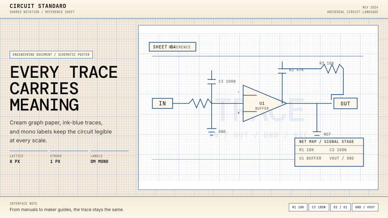 Electrical Schematic WiringAustere and exact. Cream graph paper, ink-blue traces, and mono labels make e…克制而精确。奶油方格纸与墨蓝细线,让每个标签都准确发声。
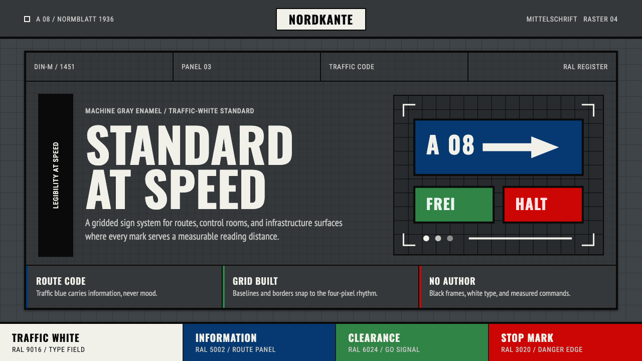 DIN 1451 SignageAuthorless and exact. Enamel gray grid, traffic-white DIN type, and RAL signa…无作者的精确感:珐琅灰网格、交通白字与RAL色条。
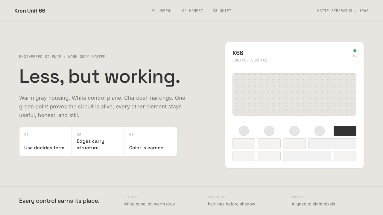 Dieter Rams / BraunQuiet by design. Warm gray, white panels, hairline grids, and one earned gree…安静即设计:暖灰、白面板、细网格,只留一枚绿色指示点。
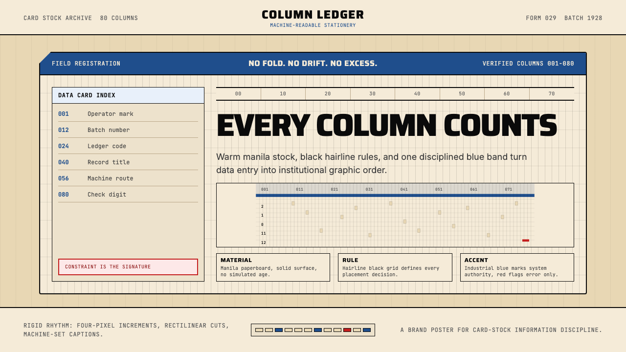 IBM Punchcard 029 (1928)Constraint becomes authority. Manila stock, hairline grid, industrial blue.约束即权威。米黄色卡纸、发丝网格与工业蓝。
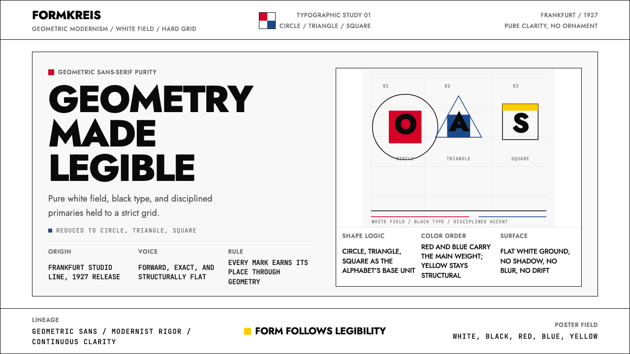 Futura Typeface (Renner, 1927)Geometry is legible. Black type and white fields, with red-blue-yellow anchor…几何即可读。黑白主版,红蓝黄点缀于网格。
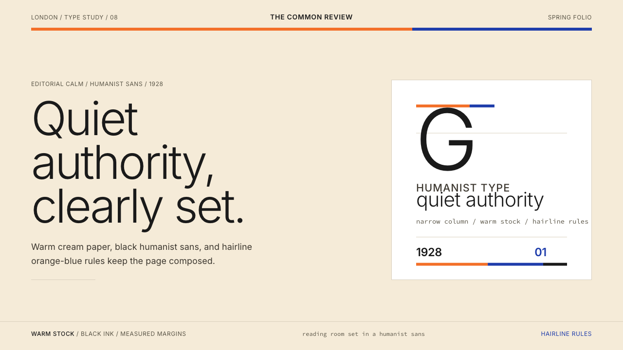 Gill Sans (BBC, 1928)Quiet authority, clearly set. Warm cream, black humanist sans, and hairline o…安静而权威。奶油底、黑色人文无衬线与橙蓝细线。