What is Futura Typeface (Renner, 1927)?什么是 Futura Typeface (Renner, 1927)?
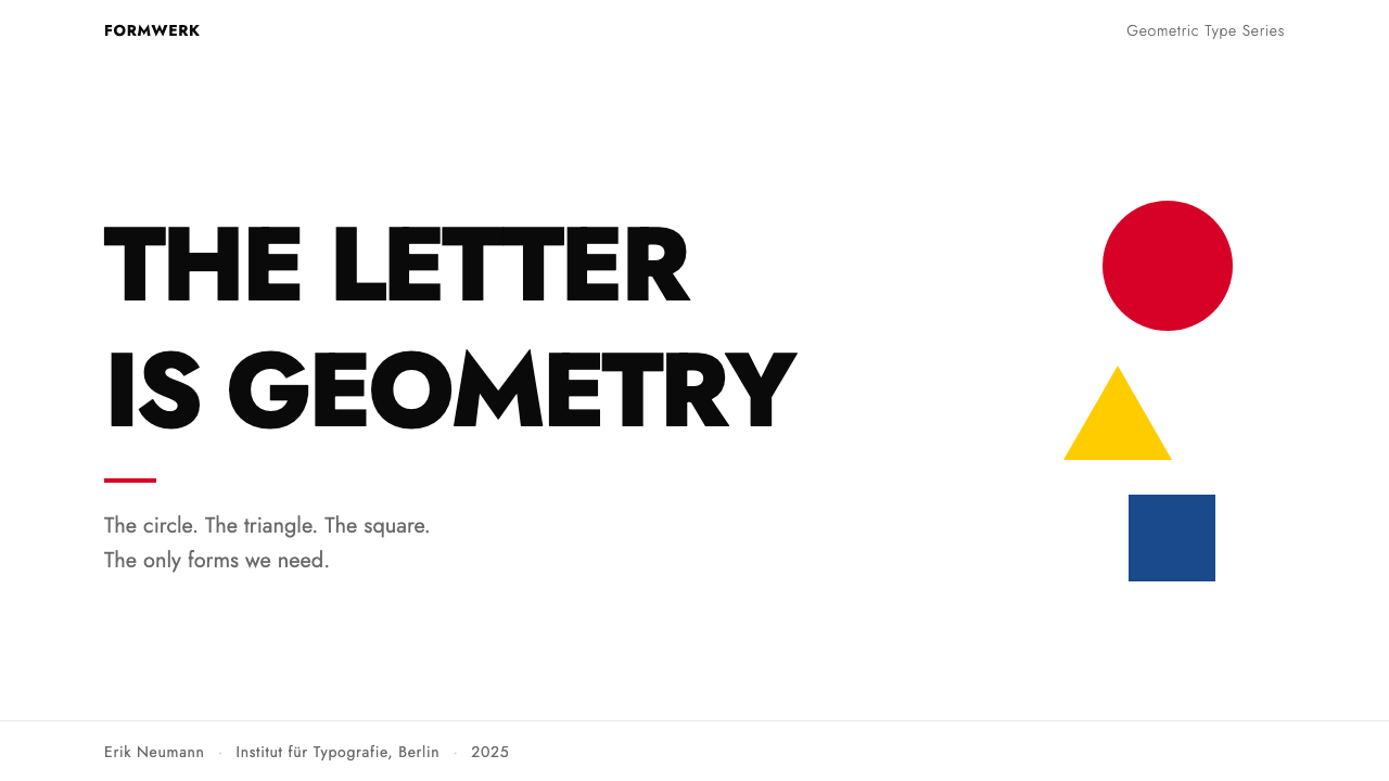
Paul Renner's 1927 typeface reduced the Latin alphabet to circles, triangles, and squares — and the result traveled to the Moon.保罗·伦纳1927年设计的字体将拉丁字母还原为圆形、三角形与正方形——而这一成果随阿波罗登月舱抵达了月球。
Futura Typeface (Renner, 1927) in briefFutura Typeface (Renner, 1927) 速览
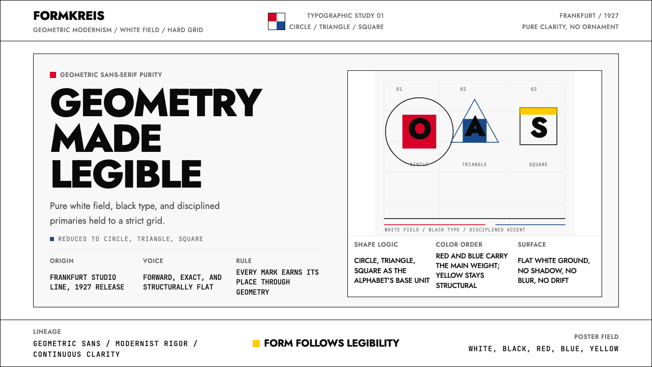
Futura is a geometric sans-serif typeface designed by Paul Renner and released by the Bauer Type Foundry in Frankfurt in 1927. It belongs to the tradition of German New Typography and the Bauhaus movement's broader conviction that pure geometric form is the most rational and universal basis for visual communication. Where earlier typefaces accumulated historical character — serifs, stroke contrast, calligraphic heritage — Futura stripped the letter back to its Platonic skeleton: the circle, the equilateral triangle, and the square.Futura是一款由保罗·伦纳设计、法兰克福鲍尔铸字厂于1927年发行的几何无衬线字体。它属于德国新字体运动与包豪斯运动更广泛信念的传统——纯几何形态是视觉传达最理性、最普遍的基础。早期字体积累了历史特征:衬线、笔画对比、书法遗产;而Futura将字母还原至其柏拉图式骨架:圆形、等边三角形与正方形。
What makes Futura visually distinctive is not simplicity alone but geometric consistency. The lowercase 'o' is a near-perfect circle. The 'a' is a single-story form — a circle with a straight stem — rather than the two-story construction used in most serif and many sans-serif faces. The capital 'A' is a triangle with a crossbar; the capital 'M' and 'N' carry strokes of nearly uniform weight. Across all these characters, optical refinements are suppressed in favor of an almost mechanical regularity. The result reads as designed rather than evolved.使Futura在视觉上独树一帜的,不仅仅是简洁,而是几何一致性。小写字母「o」接近完美的圆形;「a」是单层结构——一个圆加一条直立茎干——而非大多数衬线体和许多无衬线体所用的双层构造。大写字母「A」是带横梁的三角形;大写「M」和「N」的笔画粗细近乎均匀。在所有这些字符中,视觉修正被压制,以换取近乎机械的规整性。最终效果读起来像是设计出来的,而非演化而成的。
Futura is not a Bauhaus typeface in the institutional sense — Renner was not a Bauhaus faculty member — but it is the most successful typographic expression of Bauhaus ideas. It embodies the movement's argument that the alphabet, like any designed system, can be rationalized: rebuilt from first principles, stripped of ornament, and made to serve communication without apology or nostalgia. It has remained in continuous use since its release, appearing on corporate identities, film titles, wayfinding systems, book covers, and the commemorative plaque left on the lunar surface by the Apollo 11 mission.Futura在体制意义上并非包豪斯字体——伦纳不是包豪斯的教职人员——但它是包豪斯理念最成功的字体表达。它体现了该运动的论点:字母表和任何设计系统一样,可以被理性化——从基本原则重建,剥去装饰,使其毫无歉意、毫无怀旧地服务于传达。自发行以来,它一直被持续使用,出现在企业识别、电影片头、导视系统、书籍封面,乃至阿波罗11号任务在月球表面留下的纪念牌匾上。
See the Futura Typeface (Renner, 1927) design system查看 Futura Typeface (Renner, 1927) 完整设计系统
Where does Futura Typeface (Renner, 1927) come from?Futura Typeface (Renner, 1927) 从何而来?
Paul Renner began developing Futura around 1924, working in the cultural environment of Weimar Germany — a moment of intense intellectual ferment in which the Bauhaus, De Stijl, Russian Constructivism, and the New Typography of Jan Tschichold were all arguing, in different ways, that the inherited forms of art and design needed to be rebuilt from rational foundations. Renner was a typographer, painter, and teacher who had published the book 'Typografie als Kunst' (Typography as Art) in 1922. He was sympathetic to modernist ideas but not doctrinaire; his contribution was to apply geometric rationalism specifically to type design rather than to print layout or visual identity.保罗·伦纳大约从1924年开始开发Futura,在魏玛德国的文化环境中工作——那是一个剧烈的智识发酵时刻,包豪斯、风格派、俄国构成主义以及扬·奇肖尔德的新字体运动,都以各自的方式论证艺术与设计的传承形式需要从理性基础重建。伦纳是一位字体设计师、画家和教师,曾于1922年出版《作为艺术的字体排印》一书。他对现代主义理念持同情态度,但并不教条;他的贡献在于将几何理性主义专门应用于字体设计,而非印刷版面或视觉识别。
The Bauer Type Foundry, one of the leading type foundries in Germany, supported and funded the development of Futura. Heinrich Jost, the foundry's art director, played a significant role in refining Renner's original drawings into commercially viable and technically reproducible letterforms. Renner's early sketches had been even more radically geometric than the released version — some characters approached pure construction from circles and line segments — but Jost and the foundry's technical staff introduced subtle optical corrections that made the face more readable at smaller sizes without abandoning its geometric character. The released Futura represents a negotiation between Renner's theoretical ambition and the practical demands of printing technology and legibility.鲍尔铸字厂是德国领先的铸字厂之一,为Futura的开发提供了支持与资金。铸字厂艺术总监海因里希·约斯特在将伦纳的原始图稿打磨为商业可行、技术上可复制的字形方面发挥了重要作用。伦纳早期的草图比发行版更为激进的几何化——某些字符接近从圆形和线段纯粹构建的形态——但约斯特和铸字厂的技术人员引入了微妙的视觉修正,使字体在较小字号下更易读,同时不失去其几何特质。发行版Futura代表了伦纳的理论抱负与印刷技术及易读性实际需求之间的协商。
Futura entered a competitive market but distinguished itself quickly. In 1927, the same year Futura was released, the American Type Founders company released a rival geometric sans-serif called Tempo, and other German foundries responded with their own entries. But Futura's proportions, the elegance of its stroke relationships, and the coherence of its full character set gave it a stability that competitors struggled to match. By the early 1930s it had been adopted by major German publishers and advertisers, and its international distribution through Bauer's network ensured that it reached designers in Britain, the United States, and the Netherlands almost immediately.Futura进入了一个竞争激烈的市场,但很快脱颖而出。1927年,即Futura发行的同年,美国铸字厂公司发行了名为Tempo的竞争性几何无衬线字体,其他德国铸字厂也推出了各自的作品。但Futura的字母比例、笔画关系的优雅,以及完整字符集的连贯性,赋予了它竞争者难以企及的稳定性。到1930年代初,它已被德国主要出版商和广告商采用,鲍尔铸字厂的国际发行网络确保它几乎立即触达了英国、美国和荷兰的设计师。
The typeface's historical resilience owes much to the breadth of its original design program. Renner and Bauer released Futura in multiple weights — from a spare, almost hairline light to a commanding extra-bold — and in both roman and oblique cuts. This range meant that a single typographic system built around Futura could handle everything from a book text to a display headline to a poster title, without importing a second typeface family. Later in the twentieth century, type designers including Tobias Frere-Jones studied Futura's geometry when developing their own work, and the face has been digitized, licensed, and extended by multiple foundries, ensuring its continued availability in contemporary design practice.这款字体历史上的坚韧,很大程度上归功于其原始设计方案的宽度。伦纳和鲍尔以多种字重发行Futura——从近乎发丝般细的Light到气势十足的Extra Bold——并同时提供正体与斜体版本。这一范围意味着围绕Futura构建的单一字体系统,可以在不引入第二个字体家族的情况下,处理从书籍正文到展示性标题再到海报大字的一切需求。二十世纪后期,包括托拜厄斯·弗里-琼斯在内的字体设计师在开发自身作品时研究了Futura的几何学,这款字体被多家铸字厂数字化、授权和扩展,确保了它在当代设计实践中的持续可用性。
What defines the Futura Typeface (Renner, 1927) look?Futura Typeface (Renner, 1927) 的视觉特征是什么?
Geometric Letterforms几何字形
Every character in Futura is derived from a small vocabulary of geometric primitives. The circle dominates the lowercase — in the 'o', 'c', 'e', 'b', 'd', 'p', and 'q' — and its diameter sets the proportional standard against which other characters are measured. The triangle appears explicitly in the capital 'A' and implicitly in the diagonal strokes of 'v', 'w', and 'x'. The square establishes the modular rhythm of characters like 'H', 'I', and 'E'. This derivation from a shared geometric vocabulary gives the face its internal coherence: every character feels as though it belongs to the same system rather than having been drawn independently.Futura的每个字符都源自一套小型几何原语词汇。圆形主导了小写字母——「o」「c」「e」「b」「d」「p」和「q」——其直径设定了衡量其他字符的比例标准。三角形在大写字母「A」中明确出现,在「v」「w」「x」的对角笔画中隐性呈现。正方形确立了「H」「I」「E」等字符的模块化节奏。这种源自共同几何词汇的衍生,赋予了字体内在连贯性:每个字符感觉像是属于同一系统,而非独立绘制而成。
Monolinear Stroke Weight单线笔画粗细
Traditional typefaces modulate stroke width to reflect the pressure variations of a broad-nib pen held at a consistent angle. Futura rejects this calligraphic inheritance entirely: strokes are optically uniform in weight throughout each character, with no thick-thin contrast. This uniformity is not absolute — microscopic optical adjustments prevent the junctions of strokes from appearing heavier than the strokes themselves — but to the naked eye Futura reads as mechanically consistent. The effect is authority without warmth: type that feels engineered rather than written.传统字体调节笔画宽度,以反映以固定角度持宽尖笔书写时的压力变化。Futura完全拒绝了这种书法传承:笔画在每个字符中视觉上粗细均匀,没有粗细对比。这种均匀性并非绝对——微观的视觉调整防止笔画交汇处看起来比笔画本身更重——但肉眼看来,Futura读起来具有机械般的一致性。效果是没有温度的权威:感觉像是被工程设计出来,而非书写而成的字体。
Single-Story Lowercase Forms单层小写字形
The most immediately recognizable feature of Futura to typographically informed readers is its single-story lowercase 'a' and 'g'. Conventional typefaces use a two-story 'a' — a form with a bowl and a separate upper counter — and a two-story 'g' with a closed lower loop. Futura replaces these with their single-story geometric equivalents: the 'a' becomes a circle with a straight stem, the 'g' an open descending tail. These forms are geometrically simpler and visually distinctive, but they slightly reduce the differentiation between characters that aids rapid reading at small sizes — a considered trade-off for geometric consistency.对于具有字体知识的读者而言,Futura最直接可识别的特征是其单层小写字母「a」和「g」。传统字体使用双层「a」——一种带有碗形和独立上部内白的形态——以及带封闭下环的双层「g」。Futura用其单层几何等价物替换了这些形态:「a」变成带直茎干的圆形,「g」变成开放式下行尾巴。这些形态在几何上更简单,视觉上更独特,但它们略微降低了在小字号下辅助快速阅读的字符区分度——这是为几何一致性做出的经过考量的权衡。
Optical Tension Between Circle and Line圆形与直线之间的视觉张力
One of the subtler visual qualities of Futura is the way curved strokes meet vertical stems. In characters like 'b', 'd', 'p', and 'q', a near-perfect circle attaches to a straight vertical stroke. The junction point is a moment of visual tension — the curve does not taper into the stem but meets it more abruptly, creating a slight crispness that distinguishes Futura from more fluid humanist or transitional sans-serifs. This crispness is part of the face's character: it reads as decisive and uncompromising rather than organic and accommodating.Futura一个更微妙的视觉品质,是弧形笔画与垂直茎干相交的方式。在「b」「d」「p」「q」等字符中,一个近乎完美的圆形附接到直立的垂直笔画上。交汇点是视觉张力的时刻——弧线不是逐渐收细地融入茎干,而是更为突然地与之相接,产生一种轻微的爽脆感,使Futura区别于更流畅的人文主义或过渡性无衬线字体。这种爽脆感是字体特质的一部分:读起来是果断而毫不妥协的,而非有机且顺应性的。
Proportional Range and Weight Spectrum比例范围与字重谱系
Futura was designed as a complete typographic system rather than a single-weight novelty. The light weights have an airy delicacy in which the geometric structure is most visible, because the strokes are so thin that the forms are almost skeletal. The bold and extra-bold weights fill the interior of the letterforms with mass, creating a very different texture on the page — dense and impactful — while maintaining the same underlying geometry. This weight range allows designers to use Futura across an entire document hierarchy, from footnotes to chapter titles, without tonal inconsistency.Futura被设计为一套完整的字体排印系统,而非单一字重的新奇之物。细字重具有空灵的精致感,几何结构在此最为清晰可见,因为笔画如此之细,以至于字形近乎骨骼状。粗体和超粗体字重用质量填充了字母形态的内部,在页面上创造出截然不同的肌理——密实而富有冲击力——同时保持相同的底层几何。这种字重范围允许设计师在整个文档层级中使用Futura,从脚注到章节标题,而不产生调性上的不一致。
Absence of Calligraphic Memory缺失书法记忆
Most typefaces, even very clean modern ones, carry some residual memory of the pen or brush that first drew their letterforms — a slight axis of stress, a suggestion of entry and exit strokes, a modulation in curve quality that echoes hand movement. Futura has almost none of this. Its curves do not remember a tool; they remember a compass. Its terminals are cut horizontally or diagonally in ways that refer to construction geometry rather than to the writer's wrist. This absence of human trace is central to what Futura communicates: a claim that rational design can be fully systematic, that the alphabet need not remember how it was first made.大多数字体,即使是非常干净的现代字体,也带有最初绘制其字形的钢笔或画笔的某种残留记忆——轻微的应力轴线、笔画入口与出口的暗示、弧线质量中呼应手部运动的调制。Futura几乎没有这些。它的弧线不记得工具;它们记得圆规。它的笔画末端以水平或斜角方式截切,参照的是构造几何而非书写者的手腕。这种人类痕迹的缺失,是Futura所传达的核心:一个宣言——理性设计可以完全系统化,字母表无需记住它最初是如何被制造的。
Versatility Across Scale跨尺度的通用性
Because Futura's design is built on geometric consistency rather than optical tricks tuned for a specific size range, it scales with unusual composure. At very large sizes — a poster headline, a building sign, a film title card — the geometric structure becomes the subject: viewers see the circles and angles as forms in their own right. At text sizes, the monolinear weight and open apertures maintain legibility. This performance across scales explains why Futura has been used successfully in contexts as varied as wayfinding systems (which demand clarity at distance), book typography (which demands legibility in sustained reading), and display advertising (which demands immediate visual impact).因为Futura的设计建立在几何一致性而非针对特定字号范围调整的视觉技巧上,它能以不寻常的从容跨越尺度。在非常大的尺寸——海报标题、建筑标识、电影片名卡——几何结构本身成为主体:观者将圆形和角度视为独立存在的形态。在正文字号下,单线字重和开放的字腔维持可读性。这种跨尺度的表现解释了为何Futura被成功地用于如此多样的场景:导视系统(要求远距离清晰度)、书籍排版(要求持续阅读的易读性)以及展示性广告(要求即时的视觉冲击力)。
See the Futura Typeface (Renner, 1927) design system查看 Futura Typeface (Renner, 1927) 完整设计系统
Who shaped Futura Typeface (Renner, 1927)?谁塑造了 Futura Typeface (Renner, 1927)?
Paul Renner (1878–1956) was a German typographer, painter, and educator whose career spanned the transition from nineteenth-century craft printing to twentieth-century industrial typography. He was the director of the Munich School of Design (Meisterschule für Deutschlands Buchdrucker) from 1926, where he ran the institution during the same years he completed and saw Futura through its release. He was not a Bauhaus faculty member but shared the movement's conviction that aesthetic form could be rationalized without destroying it. Renner was later dismissed from his directorship by the Nazi government in 1933, partly because of his association with modernist ideas. Despite this, Futura survived and flourished under various owners of the Bauer foundry's rights, and Renner is remembered as the designer who most successfully translated the geometric idealism of the 1920s into a commercially durable typeface.保罗·伦纳(1878—1956年)是德国字体排印师、画家和教育家,其职业生涯跨越了从十九世纪手工印刷到二十世纪工业字体排印的过渡期。他从1926年起担任慕尼黑设计学校校长,在完成Futura并见证其发行的同年主持该机构。他不是包豪斯的教职人员,但与该运动共享这样的信念:审美形式可以被理性化,而不会被摧毁。1933年,伦纳因与现代主义理念相关联而被纳粹政府解除校长职务。尽管如此,Futura在鲍尔铸字厂权利的各继承者手中存续并繁荣,伦纳被铭记为最成功地将1920年代几何理想主义转化为商业上持久字体的设计师。
Heinrich Jost served as art director at the Bauer Type Foundry during the period of Futura's development and release. His role was the essential bridge between Renner's theoretical drawings and a typeface that could actually be manufactured in metal and reproduced reliably across printing conditions. Renner's early sketches included letterforms of extreme geometric purity that proved optically awkward or technically difficult to produce in the punch-cutting process. Jost's refinements — introducing slight stroke adjustments at junctions, moderating the most radical experimental characters — brought Futura to a point where it was both coherent as a system and practical as a commercial product. His contribution is often underacknowledged in accounts that treat Futura as a pure expression of Renner's individual vision.海因里希·约斯特在Futura开发和发行期间担任鲍尔铸字厂艺术总监。他的角色是伦纳理论性图稿与一款实际可以铸造成金属活字、在各种印刷条件下可靠再现的字体之间不可或缺的桥梁。伦纳早期的草图包含极端几何纯粹性的字形,这些字形在视觉上显得笨拙,或在冲压切割过程中技术上难以生产。约斯特的改进——在笔画交汇处引入轻微调整、缓和最激进的实验性字符——将Futura带到一个既作为系统连贯、又作为商业产品实用的位置。在那些将Futura视为伦纳个人愿景纯粹表达的叙述中,他的贡献常常被低估。
Jan Tschichold was not directly involved in Futura's design, but his 1928 manifesto 'Die Neue Typographie' (The New Typography) created the intellectual and commercial environment in which Futura thrived. Tschichold argued that geometric sans-serif typefaces were the only legitimate choice for modern printing — they alone expressed the rationalism and functional directness that the modern world required. Futura, released a year before Tschichold's manifesto but perfectly aligned with its principles, benefited enormously from the theoretical legitimation Tschichold provided. Designers who read 'Die Neue Typographie' frequently turned to Futura as their preferred geometric sans-serif, and Tschichold himself used it in several significant commissions. The two — typeface and manifesto — became mutually reinforcing in establishing geometric sans-serif as the typographic voice of modernism.扬·奇肖尔德并未直接参与Futura的设计,但他1928年的宣言《新字体排印》为Futura的繁荣创造了智识和商业环境。奇肖尔德论证,几何无衬线字体是现代印刷的唯一合法选择——只有它们才表达了现代世界所要求的理性主义和功能性直接性。Futura在奇肖尔德宣言发表前一年发行,但与其原则完美契合,从奇肖尔德提供的理论合法性中获益巨大。阅读《新字体排印》的设计师们常常转向Futura作为其首选几何无衬线字体,奇肖尔德本人也在若干重要委托项目中使用了它。字体与宣言相互强化,共同确立了几何无衬线字体作为现代主义字体语音的地位。
Tobias Frere-Jones is a contemporary American type designer whose study of Futura's geometric structure informed several of his own typefaces. His engagement with Futura represents the face's continuing relevance as a model and reference point in professional type design, long after the mechanical constraints that shaped its original production had been replaced by digital tools. Frere-Jones's work illustrates a broader pattern: Futura functions not only as a typeface for use, but as a pedagogical object — a case study in how far geometric rationalism can be pushed in letter design before legibility breaks down. The question Renner posed in 1924 remains productive for type designers today.托拜厄斯·弗里-琼斯是美国当代字体设计师,他对Futura几何结构的研究影响了他自己的若干字体设计。他对Futura的关注代表了这款字体作为专业字体设计模型和参照点的持续相关性,这发生在塑造其原始生产的机械限制早已被数字工具取代之后。弗里-琼斯的工作体现了一个更广泛的模式:Futura不仅作为使用中的字体运作,也作为教学对象存在——一个关于几何理性主义在字母设计中能被推进多远、直到可读性崩溃的案例研究。伦纳在1924年提出的问题,对今天的字体设计师而言仍具有启发性。
How do you use Futura Typeface (Renner, 1927) today?今天怎么用 Futura Typeface (Renner, 1927)?
Futura is one of the most instructive historical typefaces to apply in contemporary design precisely because its geometry is so legible as a system: you can see what it is doing and trace the decisions. Applying it well means understanding that its visual authority comes from consistency — from allowing the geometric logic to operate without interruption across every text element in a composition. Introducing a contrasting face, softening the geometry with a rounded companion, or mixing it with a heavily calligraphic script breaks the internal argument the typeface is making.Futura是当代设计中最具教学意义的历史字体之一,正是因为其几何结构作为系统是如此清晰可辨:你能看到它在做什么,能追溯其决策。良好地应用它,意味着理解其视觉权威来自一致性——来自允许几何逻辑在构图中每一个文字元素上无中断地运作。引入对比字体、以圆润的配合字体软化几何感,或与书法性强的手写体混用,都会打破字体内部正在表达的论点。
For presentation slides — both cover and content pages — Futura rewards sparse composition. A cover built around Futura works best when the title is set at large scale in a heavier weight, positioned asymmetrically against a near-white or deep neutral ground, with minimal secondary text and no decorative framing. The title should do all the work. Content slides should establish a clear typographic hierarchy using weight and scale rather than color or borders: a bold display weight for the section label, a regular or book weight for body points, no underlines or italics unless the face's oblique cut is used deliberately. Data slides benefit from letting charts and diagrams take on the same geometric character as the type — bars and segments that feel angular and precise, with labels in Futura maintaining visual consistency between data and text layers.对于演示文稿——无论封面页还是内容页——Futura奖励稀疏的构图。以Futura为中心构建的封面,最好是将标题以较重字重大尺寸呈现,非对称地定位在近白色或深度中性底面上,辅助文字极少,无装饰性框架。标题应承担所有工作。内容页应以字重和尺寸而非色彩或边框建立清晰的字体层级:粗体展示字重用于段落标签,正常或书本字重用于正文要点,除非刻意使用字体的斜体版本,否则不加下划线或斜体。数据页面受益于让图表和示意图呈现出与文字相同的几何特质——感觉棱角分明、精确的柱条和扇区,以及标签上的Futura,在数据层与文字层之间保持视觉一致性。
For web interfaces — dashboards, pricing pages, product landing pages — Futura's monolinear geometry creates an immediately modern, considered aesthetic. The key discipline is maintaining the clean structure the typeface implies: a clear grid, generous whitespace, and a restrained secondary palette. Navigation labels in Futura carry authority without requiring weight or decoration. Headings in a heavier weight can carry an entire hero section without a supporting image. A common structural decision is pairing Futura display headings with a more neutral or slightly humanist face for long-form body text, where Futura's geometric consistency — which is an asset in display use — can feel slightly mechanical in extended reading.对于网页界面——仪表板、定价页面、产品落地页——Futura的单线几何感创造了一种即刻现代、经过考量的美学。关键纪律是维护字体所暗示的干净结构:清晰的网格、充裕的留白,以及克制的次要色板。Futura中的导航标签无需字重或装饰即可传达权威。较重字重的标题可以在没有配图的情况下承载整个英雄区域。一个常见的结构性决策是将Futura展示标题与更中性或略带人文主义特质的字体配合,用于长篇正文——在展示用途中是资产的几何一致性,在延续阅读中可能会略显机械。
For editorial and marketing work, Futura's historical association with modernist publishing and advertising makes it a natural choice for any project that wants to signal seriousness, precision, or forward-thinking intent. In editorial layouts, it works well as a titling face paired with a text-optimized serif for body content — the contrast between the geometric headline and the humanist text creates a productive visual dialogue. In marketing applications, Futura's poster sensibility translates directly: a single short message at very large scale in a bold weight, minimal competing elements, and a color accent used once with confidence. The style's strength is in what it omits rather than what it adds.对于编辑和营销工作,Futura与现代主义出版和广告的历史关联,使其成为任何希望传达严肃、精准或前瞻意图的项目的自然选择。在编辑版面中,它作为标题字体与为正文内容优化的衬线字体配合效果出色——几何标题与人文主义正文之间的对比,创造了富有成效的视觉对话。在营销应用中,Futura的海报感直接转化:在非常大的尺寸以粗体呈现单一简短信息,竞争元素极少,以一种色彩点缀自信而克制地使用一次。这种风格的力量在于它省略了什么,而非添加了什么。
A common mistake when applying Futura is overloading the composition with geometric variety in an attempt to match the typeface's visual energy. Because Futura itself is so visually assertive, it rarely needs support from complex background treatments, elaborate icon systems, or highly saturated color fields. The discipline the face requires is restraint everywhere else: if the type is doing its work, the rest of the composition should step back. A second mistake is using Futura at small text sizes in contexts demanding long reading — its geometric forms are slower to scan than humanist alternatives in continuous prose, and its single-story 'a' and 'g' contribute less character differentiation. Reserve it for display use and short text blocks; choose a more neutral face when the primary demand is sustained readability.应用Futura时一个常见的错误是用大量几何变化来过载构图,试图配合字体的视觉张力。因为Futura本身在视觉上如此强势,它很少需要复杂的背景处理、精心设计的图标系统或高饱和度色域来支撑。这款字体所要求的纪律是其他一切的克制:如果文字在发挥其作用,构图的其余部分应该退后。第二个错误是在需要长时间阅读的场景中以小号正文字号使用Futura——在连续散文中,其几何字形比人文主义替代品更难快速扫读,其单层「a」和「g」提供的字符区分度也更少。将其保留用于展示和短文本块;当主要需求是持续可读性时,选择更中性的字体。
See the Futura Typeface (Renner, 1927) design system查看 Futura Typeface (Renner, 1927) 完整设计系统
Futura Typeface (Renner, 1927) — FAQFutura Typeface (Renner, 1927) · 常见问题
Is Futura a Bauhaus typeface?Futura是包豪斯字体吗?
Not in the institutional sense. Paul Renner was never a Bauhaus faculty member, and Futura was developed and released by the Bauer Type Foundry in Frankfurt, not by the Bauhaus school. However, Futura is the most fully realized typographic expression of Bauhaus principles in the sense that it reduces letterforms to geometric primitives and rejects any historical or calligraphic inheritance. Herbert Bayer's Universal typeface — actually designed at the Bauhaus — is more doctrinaire but less refined; Futura is the version of the idea that worked well enough to survive commercially. The distinction matters historically but is less important to designers applying the style: for visual purposes, Futura and Bauhaus typography are effectively synonymous.在体制意义上并非如此。保罗·伦纳从未是包豪斯的教职人员,Futura是由法兰克福鲍尔铸字厂开发和发行的,而非包豪斯学校。然而,Futura是包豪斯原则最完整实现的字体排印表达,因为它将字形还原为几何原语,拒绝任何历史或书法传承。赫伯特·拜耶的通用字体——实际上在包豪斯设计——更为教条但精炼度不足;Futura是这一理念中精炼到足以在商业上存活的版本。这一区别在历史上重要,但对应用这种风格的设计师而言不那么重要:在视觉目的上,Futura与包豪斯字体排印实际上是同义词。
What makes Futura different from other geometric sans-serifs like Avenir or Gill Sans?Futura与Avenir或Gill Sans等其他几何无衬线字体有何不同?
The key differences are in how much humanist compromise each face accepts. Futura is the most purely geometric of the major geometric sans-serifs: it suppresses optical corrections in favor of mechanical consistency, and its single-story lowercase forms are the most direct expression of geometric rationalism. Avenir, designed by Adrian Frutiger in 1988, modulates its stroke weight more subtly and introduces a slight humanist axis in some characters — the result is warmer and more legible in extended text. Gill Sans, designed by Eric Gill in 1928, openly references classical Roman proportions in its uppercase and has much more visible humanist trace in its stroke modulation. Futura is the coldest and most systematic; Gill Sans is the most historical; Avenir sits between them.关键区别在于每款字体接受多少人文主义妥协。Futura是主要几何无衬线字体中最纯粹几何的:它压制视觉修正以换取机械一致性,其单层小写字形是几何理性主义最直接的表达。由阿德里安·弗鲁提格于1988年设计的Avenir,更微妙地调节笔画粗细,并在某些字符中引入轻微的人文主义轴线——结果在延续文本中更温暖、更易读。由埃里克·吉尔于1928年设计的Gill Sans,在大写字母中公开参照古典罗马比例,在笔画调制中有更明显的人文主义痕迹。Futura是最冷峻、最系统化的;Gill Sans是最具历史感的;Avenir介于两者之间。
How should Futura be used with color — does it have a natural palette?Futura如何与色彩搭配使用?它有自然的色板吗?
Futura does not dictate a specific palette, but its geometric rationalism aligns most naturally with color approaches that share the same systematic clarity. The historical context of Futura's release — the Bauhaus primary palette of red, blue, and yellow on white grounds — remains the most frequently cited reference, and for good reason: the geometric simplicity of the type and the symbolic clarity of the primary colors reinforce each other. In contemporary practice, Futura is also used effectively with monochromatic systems — black type on white, or white type reversed out of a deep neutral — where the geometry of the letterforms alone carries the visual weight. What tends to work poorly is using Futura alongside color palettes that are soft, gradated, or atmospheric: the type's hard geometry and the colors' organic quality produce a contradiction rather than a complement.Futura并不规定特定色板,但其几何理性主义与共享相同系统清晰度的色彩方案最为自然地契合。Futura发行的历史背景——白色底面上的包豪斯三原色红、蓝、黄——仍然是最常被引用的参照,这是有充分理由的:字体的几何简洁性与三原色的象征清晰度相互强化。在当代实践中,Futura也在单色系统中被有效使用——白底黑字,或在深度中性底色上反白——在这些场景中,字形的几何感独自承载视觉重量。与Futura配合效果欠佳的,是柔和、渐变或氛围性的色板:字体的硬朗几何与色彩的有机品质产生矛盾而非互补。
Why is Futura associated with science, technology, and space in popular culture?为什么Futura在大众文化中与科学、技术和太空相关联?
The association is partly historical accident and partly genuine typographic logic. The historical accident was NASA's use of Futura — most famously on the commemorative plaque that accompanied the Apollo 11 mission to the Moon in 1969, which read in Futura type: 'Here men from the planet Earth first set foot upon the Moon.' This gave the typeface a literal connection to humanity's furthest technological reach. The typographic logic is that Futura's elimination of historical and calligraphic trace reads as ahistorical and therefore future-oriented. It does not carry the cultural memory of hand-lettering, academic publishing, or traditional authority. Its geometric precision suggests engineering rather than tradition. These qualities made it the preferred typeface for a range of science and technology communications throughout the second half of the twentieth century, and popular culture subsequently coded the association.这种关联一部分是历史偶然,一部分是真实的字体逻辑。历史偶然是NASA对Futura的使用——最著名的是1969年随阿波罗11号任务登月的纪念牌匾,牌匾上以Futura字体写道:「来自地球的人类在此首次踏上月球」。这赋予了字体与人类最远科技成就的字面联系。字体逻辑是,Futura对历史和书法痕迹的消除被解读为非历史性的,因而指向未来。它不携带手写体、学术出版或传统权威的文化记忆。其几何精确性暗示工程学而非传统。这些品质使其在二十世纪下半叶成为科学和技术传播的首选字体,大众文化随后将这种关联固化为编码。
Can Futura work for body text, or should it only be used for headlines and display?Futura适合用于正文吗?还是应该只用于标题和展示用途?
Futura can be used for body text, and historically it has been — particularly in modernist book and magazine design of the 1920s through 1950s, where designers used it as a pointed ideological statement about rejecting traditional bookface conventions. In practice, however, the face presents challenges in extended reading. Its monolinear weight reduces the stroke contrast that helps readers differentiate letterforms quickly. Its single-story 'a' and 'g' remove familiar shapes that readers use for rapid word recognition. And its geometric precision creates a texture on the page that, over long passages, can feel effortful rather than transparent. For sustained text, these limitations are real. Futura is at its strongest in display applications — headlines, titles, callouts, labels, short interface copy — where its geometric authority is an asset rather than a friction point.Futura可以用于正文,历史上也曾如此——特别是在1920至1950年代的现代主义书籍和杂志设计中,设计师将其作为拒绝传统书籍字体规范的尖锐意识形态宣言。然而在实践中,这款字体在延续阅读中存在挑战。其单线字重降低了帮助读者快速区分字形的笔画对比。其单层「a」和「g」去除了读者用于快速单词识别的熟悉形状。其几何精确性在页面上创造的肌理,在长篇段落中可能感觉费力而非透明。对于持续文本,这些局限性是真实的。Futura在展示应用中最为有力——标题、片名、引用语、标签、简短界面文案——在这些场景中,其几何权威是资产而非摩擦点。
Related design styles相关设计风格
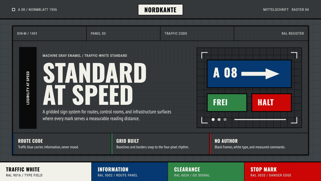 DIN 1451 SignageAuthorless and exact. Enamel gray grid, traffic-white DIN type, and RAL signa…无作者的精确感:珐琅灰网格、交通白字与RAL色条。
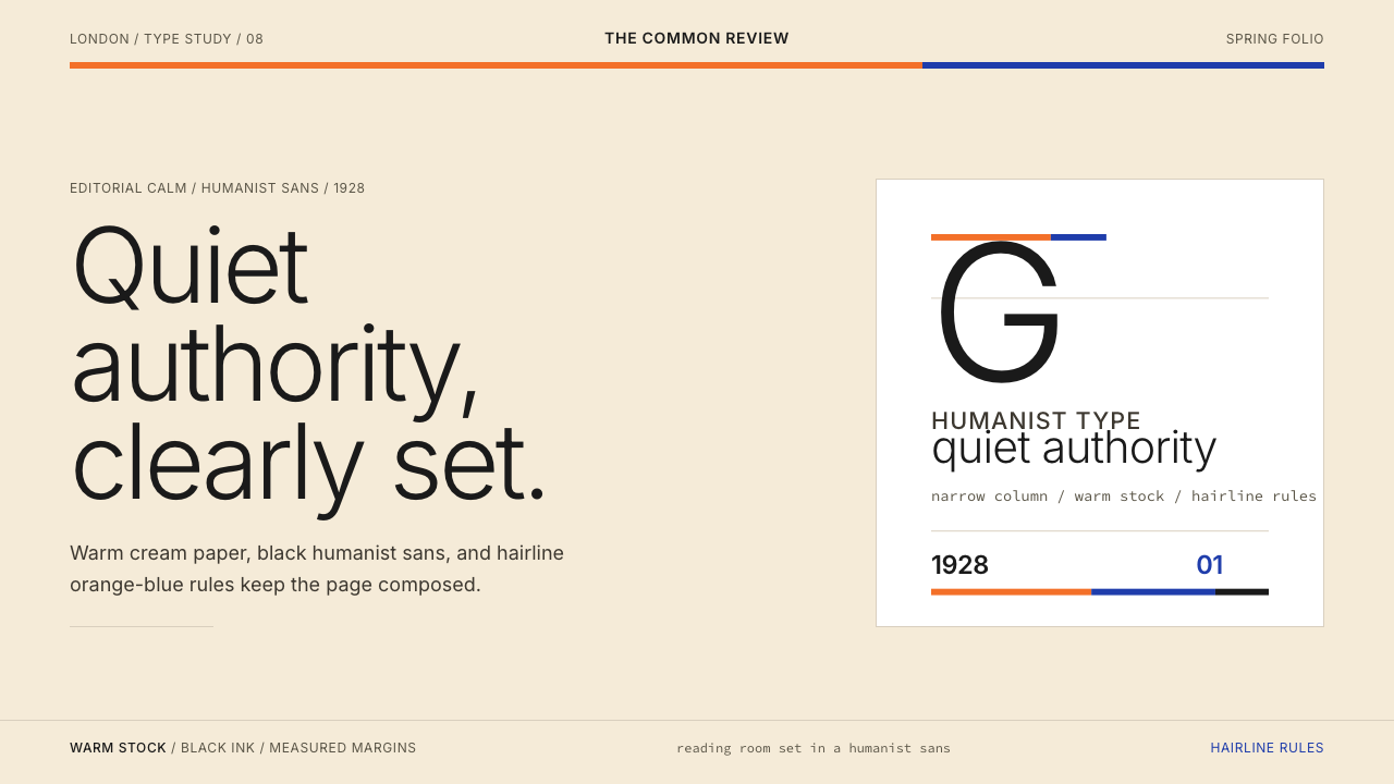 Gill Sans (BBC, 1928)Quiet authority, clearly set. Warm cream, black humanist sans, and hairline o…安静而权威。奶油底、黑色人文无衬线与橙蓝细线。
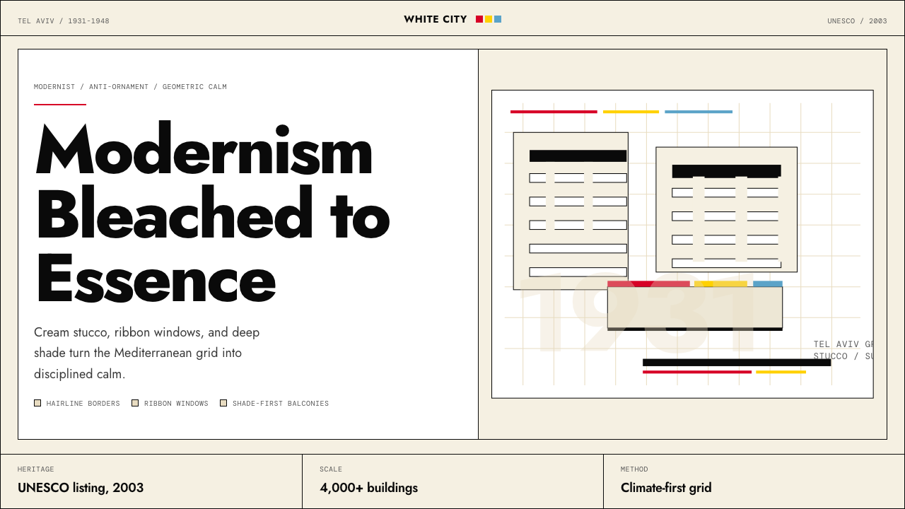 Israeli Bauhaus Tel Aviv (White City)Austere urban modernism. Stucco-white grid, Jost type, hairline borders, and…克制都市现代主义。灰泥白网格、Jost 字体、细黑线与三原色点睛。
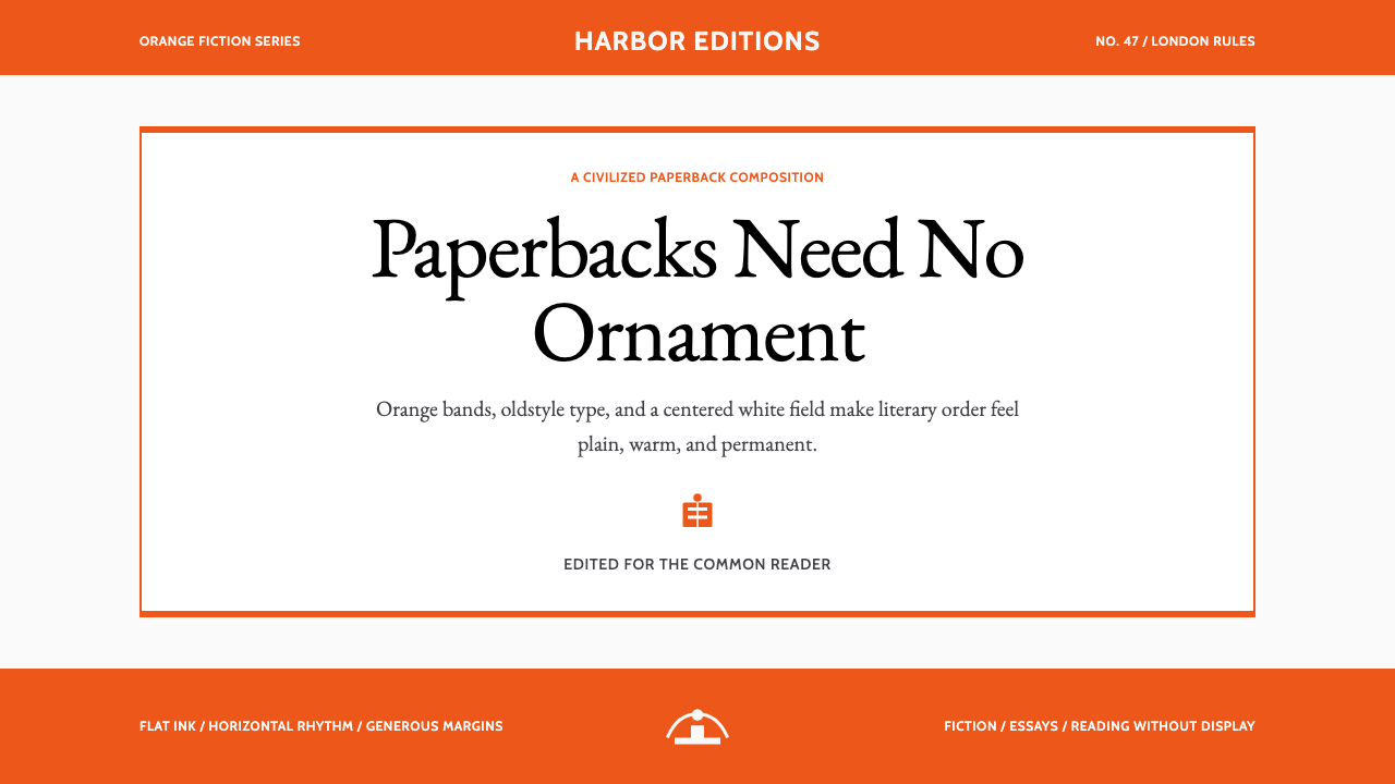 Penguin Classics OrangePaperback authority. Orange tri-bands, serif title panel, and flat ink enforc…平装书的权威感:橙色三段、衬线标题与平面油墨建立克制秩序。
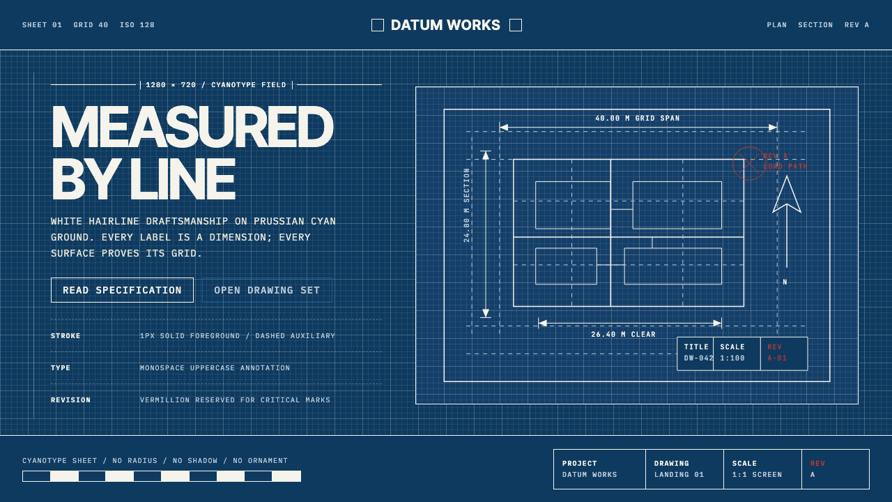 Architectural BlueprintMeasurement, not mood. Prussian cyan grid with white hairlines and vermillion…测量,不造情绪。普鲁士青网格、白色发丝线与朱砂修订标记。
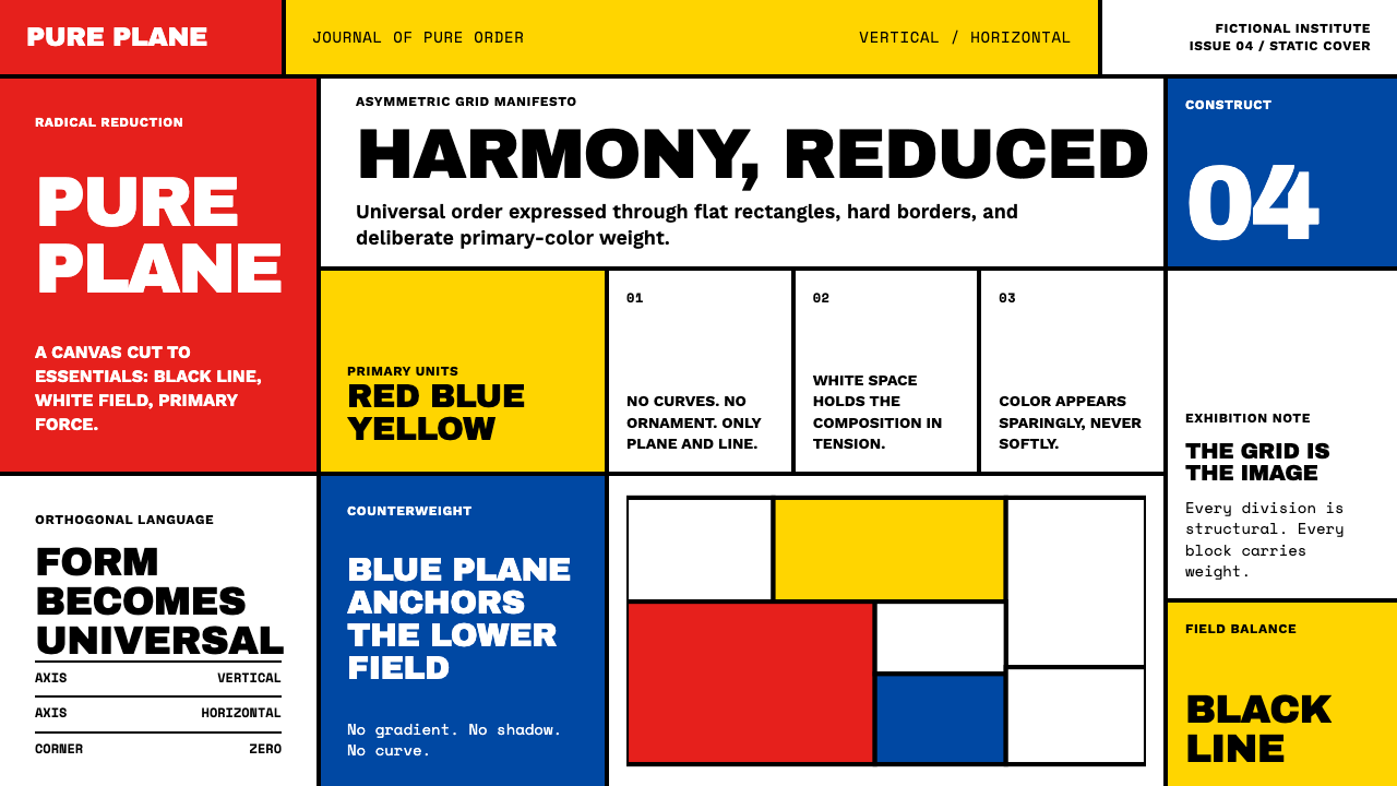 De StijlPrimary colors, locked in a black grid. Mondrian's compositions, in thick bor…蒙德里安的构成系列译为界面:黑色粗线划分白底、纯红蓝黄填充、零圆角——新造型主…