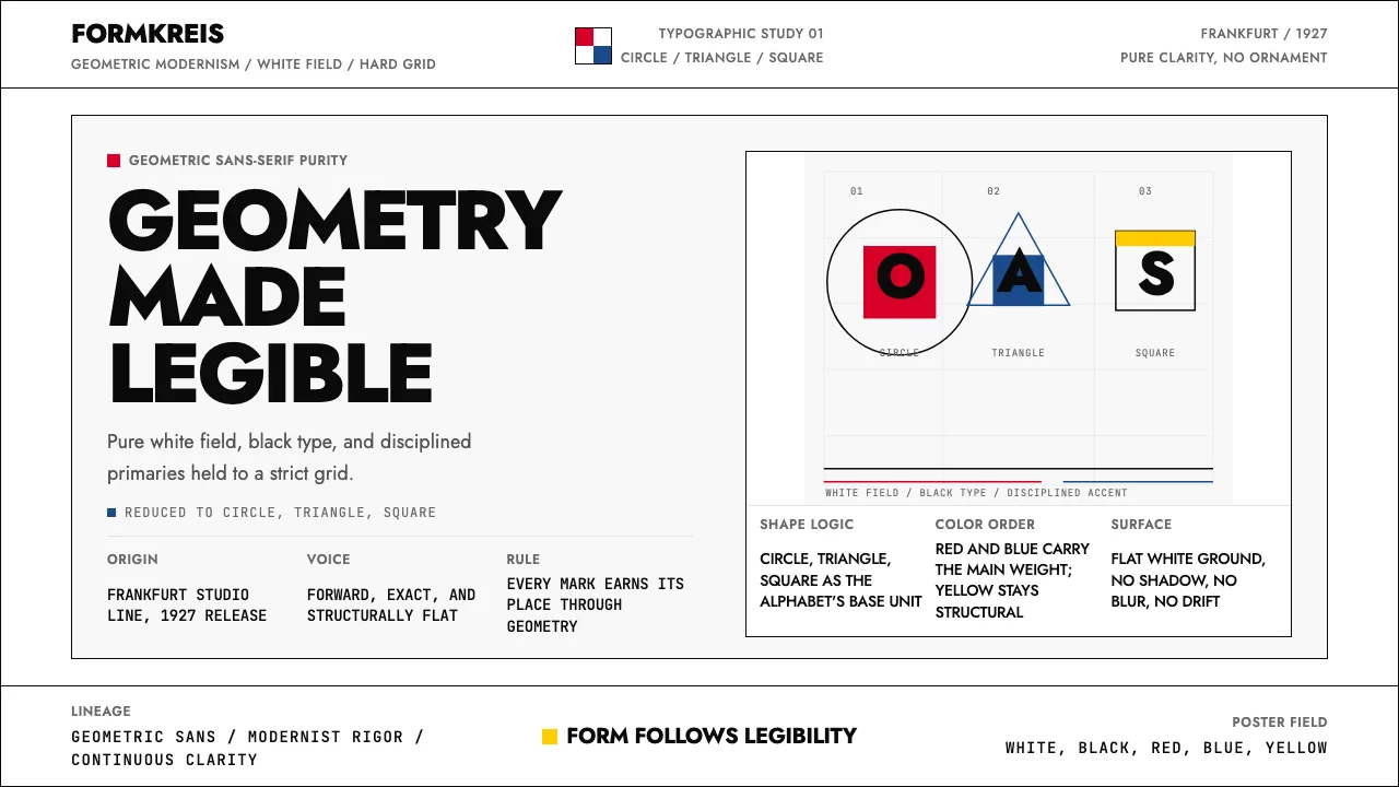
About Futura Typeface (Renner, 1927)
Futura is geometry made legible. Paul Renner's 1927 masterpiece for the Bauer Type Foundry reduced the Latin alphabet to its Platonic essentials — the circle, the equilateral triangle, the square — producing a typeface so forward-looking it traveled to the Moon on the Apollo 11 plaque.
This system channels that radical clarity: pure white fields, black geometric type, and strategic Bauhaus primary-color accents deployed with the discipline Renner demanded. Every element earns its place through geometric logic, not decoration.
- Origin
- Frankfurt, Germany
- Era
- 1924–1927 design; 1927 commercial release; continuous adoption through 2024
- Key figures
- Paul Renner · Heinrich Jost · Edwin Jost · Tobias Frere-Jones
- Movements
- Bauhaus typography · German New Typography · Geometric sans-serif tradition
Futura Typeface (Renner, 1927) design spec
Colors
Typography
The other 11 sections — buttons, cards, spacing, motion, techniques and more — open once you unlock. Download the DESIGN.md or send it to your AI in one click. Unlock once, yours forever.
Sign up nowStyles similar to Futura Typeface (Renner, 1927)
Also inspired by print & type, with a close feel.
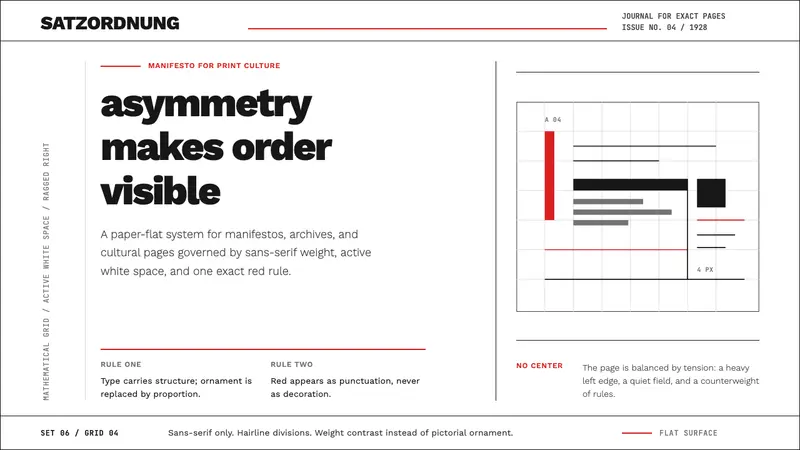 New Typography (Tschichold 1928)Tschichold's 1928 doctrine in CSS. Asymmetric grid, hairline rules, red-and-black as only ornament.
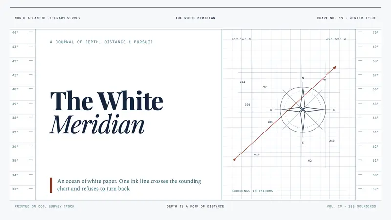 Moby-Dick (1851)White space becomes open sea. Ink-navy rules and oxblood bearings pull across a cold chart.
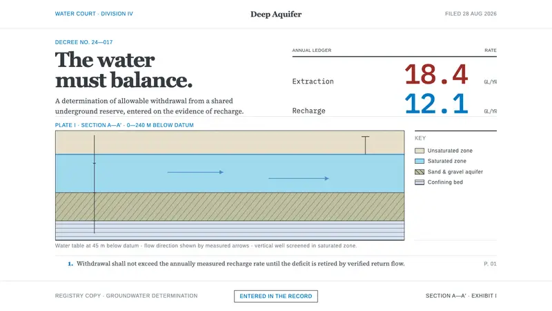 Deep Aquifer Water CourtRestraint makes the deficit undeniable. White bond, book serif, and a keyed aquifer section frame two rates.
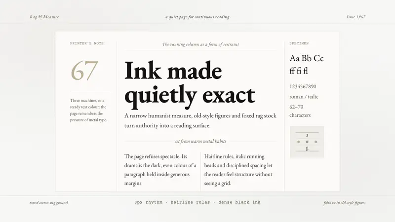 Sabon by Jan TschicholdQuiet authority in print. Dense black Garamond rests on foxed grey-tan rag paper.