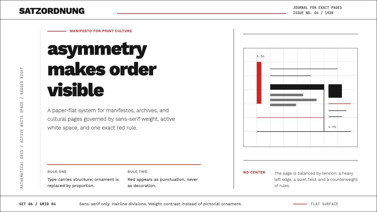
About New Typography (Tschichold 1928)
Jan Tschichold's 1928 manifesto "Die neue Typographie" codified the rules of modern asymmetric layout: sans-serif as default, mathematical grids over centered classical balance, and red-and-black rule lines as the only ornament needed. Published when Tschichold was just 26, it became the bedrock of Swiss International Style.
This design system distills Tschichold's doctrine into digital tokens: Work Sans in contrasting weights for crisp hierarchy, constructivist red (#d92020) used sparingly on hairline rules and accent elements, zero border-radius, zero shadows, and generous whitespace governed by a rigorous asymmetric grid.
- Origin
- Munich, Leipzig, later Basel and London
- Era
- 1928 (Die neue Typographie published) — influence persists through Swiss Style to current
- Key figures
- Jan Tschichold · László Moholy-Nagy · Herbert Bayer · Paul Renner
- Movements
- New Typography · Constructivism · Swiss International Style
New Typography (Tschichold 1928) design spec
Colors
Typography
The other 11 sections — buttons, cards, spacing, motion, techniques and more — open once you unlock. Download the DESIGN.md or send it to your AI in one click. Unlock once, yours forever.
Sign up nowStyles similar to New Typography (Tschichold 1928)
Also inspired by print & type, with a close feel.
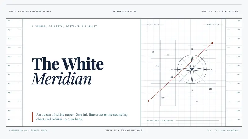 Moby-Dick (1851)White space becomes open sea. Ink-navy rules and oxblood bearings pull across a cold chart.
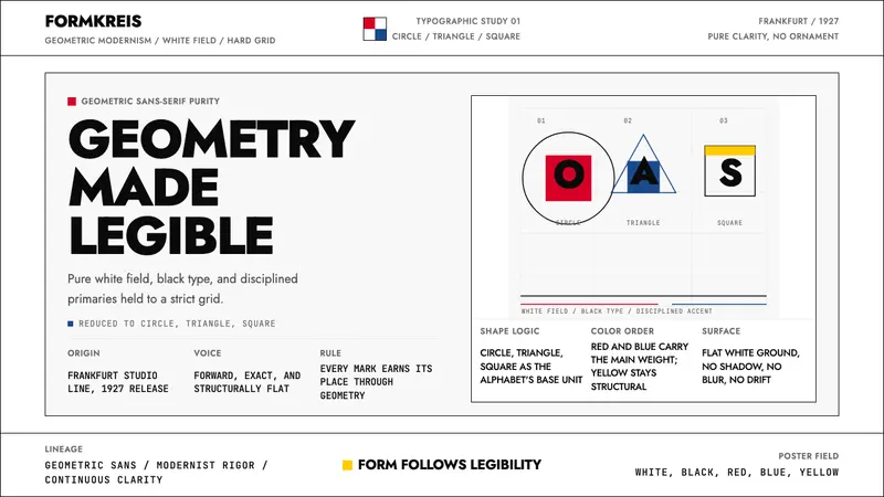 Futura Typeface (Renner, 1927)Geometry is legible. Black type and white fields, with red-blue-yellow anchors on grid.
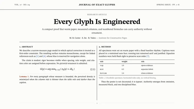 TeX Academic PaperRigor without ornament. Warm paper, Computer Modern text, hairline columns, one blue link.
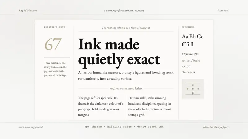 Sabon by Jan TschicholdQuiet authority in print. Dense black Garamond rests on foxed grey-tan rag paper.