What is New Typography (Tschichold 1928)?什么是 New Typography (Tschichold 1928)?
Jan Tschichold's 1928 manifesto declared war on centered symmetry and gave modern design its most rigorous set of rules: asymmetric grids, sans-serif type, and red-and-black rule lines as the only ornament permitted.扬·奇肖尔德1928年的宣言向居中对称宣战,并为现代设计确立了最严格的一套规则:非对称网格、无衬线字体、红黑线条作为唯一被允许的装饰。
New Typography (Tschichold 1928) in briefNew Typography (Tschichold 1928) 速览
New Typography is the design doctrine Jan Tschichold codified in his 1928 book 'Die neue Typographie,' published in Berlin. At its core, the system rejects the centuries-old convention of centered, symmetrical page composition and replaces it with asymmetric grid layouts governed by mathematical logic. Every element — type, rule lines, white space — is assigned a position that serves communication rather than classical decorum.新版式是扬·奇肖尔德在1928年出版于柏林的著作《新版式设计》(Die neue Typographie)中所归纳的设计体系。其核心在于拒绝数百年来以居中、对称为原则的版面构图传统,转而以数学逻辑支配的非对称网格取而代之。每一个元素——文字、线条、留白——所处的位置都服务于信息传达,而非古典礼仪规范。
The visual vocabulary is deliberately sparse. Sans-serif letterforms carry all typographic weight; serifs are treated as historical residue with no functional value. Red and black are the only colors admitted, and red appears almost exclusively as a hairline rule or a single accent element, not as a field of color. The paper or screen ground — always light, typically pure white — is an active compositional element, not a neutral backdrop.其视觉词汇刻意保持稀疏。无衬线字体承担所有排印重量;衬线被视为无任何功能价值的历史遗留物。红色与黑色是唯一被准许的颜色,而红色几乎专门以发丝般的细线或单一强调元素出现,而非大面积色块。纸张或屏幕的底面——始终为浅色,通常是纯白——是积极的构图元素,而非中性的背景。
What distinguishes New Typography from mere minimalism is its ideological precision. Tschichold was not advocating restraint for aesthetic reasons alone; he was articulating a theory of reading. Asymmetric composition creates a natural directional flow. Hierarchies built through contrasts of type scale rather than decorative flourishes allow the eye to move through information without being led astray. The style is an argument about how visual order should be produced.将新版式与单纯极简主义区别开来的,是其意识形态上的精确性。奇肖尔德倡导克制,并非只出于美学理由;他在阐述一套关于阅读的理论。非对称构图创造自然的方向性流动。通过字号对比而非装饰花饰建立的层级,使目光得以在信息中流动而不被引偏。这种风格是一个关于视觉秩序应当如何生产的论点。
See the New Typography (Tschichold 1928) design system查看 New Typography (Tschichold 1928) 完整设计系统
Where does New Typography (Tschichold 1928) come from?New Typography (Tschichold 1928) 从何而来?
Jan Tschichold was born in Leipzig in 1902, the son of a sign painter. His early exposure to lettering and commercial print gave him an unusually practical understanding of type as a production craft rather than an academic exercise. In 1923, at the age of twenty-one, he attended the Bauhaus exhibition in Weimar and encountered the work of László Moholy-Nagy, El Lissitzky, and the Russian Constructivists for the first time. The encounter was transformative. Within a year he had published 'elementare typographie,' a special issue of the printers' journal Typographische Mitteilungen, laying out the principles that would become the foundation of New Typography.扬·奇肖尔德1902年生于莱比锡,父亲是一位招牌画师。这段早年经历赋予他对字体的异常务实理解——将其视为生产技艺而非学术训练。1923年,二十一岁的他前往魏玛参观包豪斯展览,首次接触到拉兹洛·莫霍利-纳吉、埃尔·利西茨基以及俄国构成主义者的作品。这次相遇是一次转变的契机。不到一年后,他在印刷业杂志《排印通报》(Typographische Mitteilungen)上出版了特刊《基础排印》(elementare typographie),阐述了后来成为新版式基础的若干原则。
The Russian Constructivist influence was decisive. Artists such as El Lissitzky, Alexander Rodchenko, and Varvara Stepanova had pioneered the use of diagonal tension, rule lines as structural elements, and the deliberate contrast of black type against white space for political posters and book design in the Soviet Union during the early 1920s. Tschichold absorbed their formal innovations and stripped them of explicit political content, transforming a revolutionary visual language into a systematic doctrine applicable to any commercial or institutional print context — advertisements, catalogs, business stationery, timetables.俄国构成主义的影响是决定性的。埃尔·利西茨基、亚历山大·罗德钦科、瓦尔瓦拉·斯捷潘诺娃等艺术家在1920年代初期苏联的政治海报与书籍设计中,率先运用对角张力、线条作为结构元素,以及黑色文字与白色空间的强烈对比。奇肖尔德吸收了他们的形式创新,剥去其明确的政治内容,将这套革命性视觉语言转化为可系统应用于任何商业或机构印刷场景的成文体系——广告、目录、商务文具、时刻表。
When Tschichold published 'Die neue Typographie' in 1928, he was twenty-six years old and working as a teacher at the Munich Master Printers' School. The book was addressed not to art directors or gallery audiences but to practicing printers and compositors — people who set type daily. It was a manual as much as a manifesto, offering diagrams, case studies, and specimen pages that showed exactly how asymmetric grid layouts could be constructed using the metal type and rule lines that printers already had in their composing rooms. This pragmatic orientation gave the work an influence that purely theoretical manifestos rarely achieve.1928年出版《新版式设计》时,奇肖尔德二十六岁,在慕尼黑印刷师学校任教。这本书的读者对象不是艺术总监或画廊受众,而是日常从事排版工作的印刷师和排字工。它既是宣言,也是手册,提供图解、案例研究与样张,具体展示如何利用印刷车间中现有的铅字与线条构建非对称网格版面。这种务实取向赋予了该书纯粹理论性宣言极少能达到的影响力。
The Nazis' rise to power in Germany brought the movement to an abrupt halt domestically. In 1933, Tschichold was briefly arrested by the Gestapo in Munich on charges of creating 'un-German' and Bolshevist typography. He emigrated to Basel, Switzerland, where a separate tradition of rigorous typographic rationalism was already developing. From Basel, New Typography's principles diffused into what would become Swiss International Style in the 1950s and 1960s — a global design language still visible in corporate identity systems, wayfinding, and digital interfaces today. Tschichold himself later repudiated the strict dogmatism of his 1928 position, arguing that it had become a new form of orthodoxy, but the doctrine he established outlived his own revision of it.纳粹的崛起使这一运动在德国境内戛然而止。1933年,奇肖尔德在慕尼黑遭盖世太保短暂逮捕,罪名是从事「非德意志」的布尔什维克式排印。他随即流亡瑞士巴塞尔,那里已有一套独立的严格排印理性主义传统在发展。新版式的原则从巴塞尔出发,扩散演变为1950至60年代的瑞士国际主义风格——一套至今仍可在企业视觉识别、导视系统和数字界面中看到的全球设计语言。奇肖尔德本人后来撤回了他1928年立场中的严格教条主义,认为它已成为一种新的正统;但他确立的体系已超越了他自己的修正,自行延续下去。
What defines the New Typography (Tschichold 1928) look?New Typography (Tschichold 1928) 的视觉特征是什么?
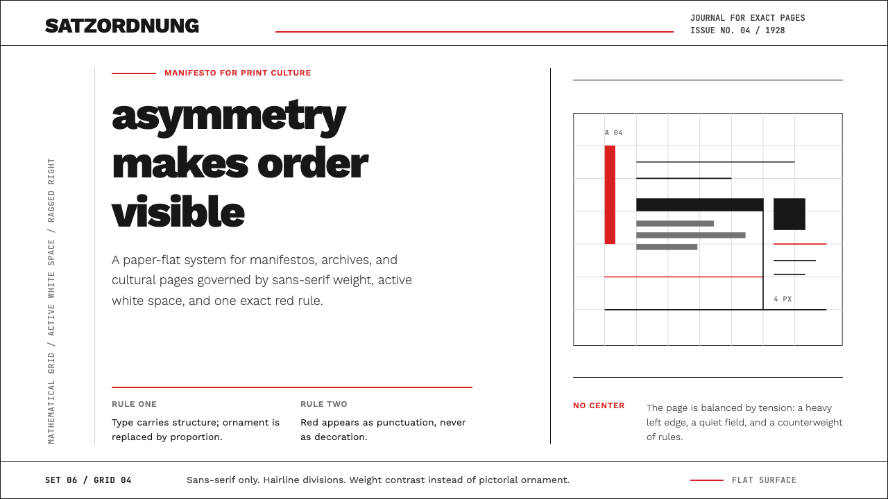
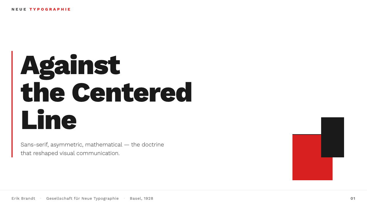
Asymmetric Grid非对称网格
The foundational principle of New Typography is the deliberate rejection of centered, bilateral symmetry in favor of layouts organized by a rigorous but non-mirrored grid. Elements are placed according to reading direction and visual weight rather than geometric reflection. A heavy typographic block on one side of a page may be balanced by a single hairline rule or an expanse of white space on the other — tension replaces mirror-image balance. This asymmetry is not arbitrary; it follows the natural left-to-right scanning movement of the eye and creates an implicit sense of direction that symmetric layouts cannot produce.新版式的基础原则是刻意拒绝居中的双边对称,转而采用严格但非镜像的网格组织版面。元素的位置由阅读方向与视觉重量决定,而非几何反射。页面一侧厚重的排印区块,可以被另一侧的单根发丝线或大片留白所平衡——张力取代了镜像式均衡。这种非对称性并非任意为之;它遵循眼睛从左至右的自然扫描运动,产生对称版面无法制造的内在方向感。
Sans-Serif as Default无衬线字体为默认
Tschichold mandated sans-serif type as the only form suitable for modern communication. His argument was functional: serifs developed as artifacts of hand-carved stone inscriptions and calligraphic tradition, and carry no communicative benefit in print. Sans-serif letterforms, by contrast, reduce the character to its essential readable structure. In practice, New Typography uses sharp contrasts of weight and scale — a very large, bold heading against a compact, lighter body — to establish hierarchy without relying on decorative variation between typeface families.奇肖尔德将无衬线字体规定为唯一适合现代传播的字体形式。他的论据是功能性的:衬线是手刻石碑铭文与书法传统的遗留产物,在印刷中不具任何传达上的优势。无衬线字形则相反,将字符还原为其本质的可读结构。在实践中,新版式以字重与字号的强烈对比——极大的粗体标题对比紧凑的浅色正文——建立层级,而不依赖字体家族之间的装饰性变化。
Red and Black as the Only Palette红黑为唯一色板
New Typography admits exactly two colors: black and a single saturated red, used against a white or light ground. Black handles all typographic matter and structural rules. Red appears as a hairline rule separating sections, a short accent line beneath a heading, or a single word or numeral pulled out for emphasis — never as a background field or decorative fill. This extreme restraint gives red an intensity it could not achieve in a broader palette; each red element carries disproportionate visual weight precisely because it is the only color present.新版式只承认两种颜色:黑色与单一的高饱和红色,置于白色或浅色底面之上。黑色处理所有排印内容与结构线条。红色以发丝般的细线分隔章节、标题下方的短强调线,或被单独提出强调的单词或数字呈现——绝不作为背景色块或装饰性填充。这种极度克制赋予红色在更宽色板中无法达到的强度;每一个红色元素承载着与其面积不成比例的视觉重量,恰恰因为它是画面中唯一的颜色。
Hairline Rule Lines as Structure发丝线条作为结构
Rule lines — thin horizontal or vertical printed lines — are used as active compositional elements rather than passive decorators. In New Typography a hairline rule is not a border around content; it is a structural joint between compositional zones, a guide for the eye across white space, or a device that gives a page its dominant reading axis. Rules may appear in red or black. Their thinness is essential — they carry weight through contrast with surrounding white space, not through their own mass.线条——印刷中细薄的横向或纵向直线——被用作积极的构图元素,而非被动的装饰。在新版式中,发丝线不是包围内容的边框;它是构图区域之间的结构接缝,引导眼睛跨越留白的向导,或赋予版面主要阅读轴线的装置。线条可以是红色或黑色。其纤细至关重要——它们通过与周围留白的对比而获得重量,而非依靠自身的质量。
White Space as Active Silence留白作为积极的沉默
Generous, controlled white space is not emptiness in New Typography — it is one of the primary compositional instruments. Tschichold argued that a page's unprinted areas should be as carefully considered as its printed ones. Wide margins, large gaps between sections, and deliberate open zones around individual type elements allow each element to carry maximum legibility and visual authority. The tendency to fill every corner of a layout with content is exactly what New Typography disciplines out of design practice.慷慨而有控制的留白在新版式中不是空白——它是主要构图手段之一。奇肖尔德认为,版面中未印刷的区域应当与已印刷的区域同样精心考量。宽阔的页边距、章节之间的大间距、单个排印元素周围刻意留出的开放区域,使每个元素能够承载最大的可读性与视觉权威。将版面每个角落都填满内容的倾向,恰恰是新版式从设计实践中规训出去的习惯。
Functional Hierarchy over Decoration功能性层级优先于装饰
Information hierarchy in New Typography is produced entirely through typographic contrast — differences in scale, weight, and spatial relationship — never through decorative devices such as ornamental borders, illustrative vignettes, or color fields. A headline is recognizable as a headline because it is substantially larger and heavier than the text beneath it, not because it sits inside a decorative cartouche. This approach produces hierarchies that are immediately readable even when elements are radically simplified.新版式中的信息层级完全通过排印对比产生——尺寸、字重与空间关系的差异——而非通过装饰性手段,如装饰边框、插图小品或色彩区块。标题之所以被识别为标题,是因为它比其下方的文字大得多、重得多,而不是因为它坐落于装饰性框格之内。这种方式产生的层级,即使在元素被激进简化时依然一目了然。
Zero Ornament零装饰
Any visual element that cannot be justified by a communicative or structural function should not exist. New Typography extends this principle even to typographic ornament — flourishes, swash characters, decorative initials, and printer's flowers are all excluded. What remains is not coldness but clarity: when every element earns its place, the reader's attention is never divided between the message and its decoration. This is perhaps the principle most frequently violated in contemporary interpretations of the style, which often add gestural marks or textural elements in the name of visual interest.任何无法以传达或结构功能为正当理由的视觉元素都不应存在。新版式将这一原则延伸至排印装饰本身——花饰、花体字符、装饰性首字母、印刷花边,一概排除在外。余下的不是冷漠,而是清晰:当每个元素都凭实力占据位置时,读者的注意力就不会在信息与其装饰之间分散。这或许是当代对该风格的诠释中最常被违反的原则——人们往往以增添视觉趣味为由加入姿态性笔触或质感元素。

See the New Typography (Tschichold 1928) design system查看 New Typography (Tschichold 1928) 完整设计系统
Who shaped New Typography (Tschichold 1928)?谁塑造了 New Typography (Tschichold 1928)?
Tschichold authored 'Die neue Typographie' in 1928 and 'elementare typographie' in 1925, establishing the codified rules of asymmetric layout, sans-serif primacy, and functional hierarchy that defined the movement. Born in Leipzig to a sign-painting father, he came to typography through practice before theory. After fleeing Nazi Germany in 1933 he settled in Basel, where his influence helped seed what would become Swiss International Style. In a celebrated late-career reversal, he redesigned Penguin Books' entire paperback range in the late 1940s using classical proportional principles — the same principles he had attacked in 1928 — arguing that dogmatic modernism was itself a tyranny. The tension between his two positions remains generative for typographic thought today.奇肖尔德于1925年发表《基础排印》、1928年出版《新版式设计》,确立了非对称版面、无衬线字体优先与功能性层级的成文规则,定义了这一运动。生于莱比锡招牌画师之家,他经由实践而非理论走入排印学。1933年逃离纳粹德国后,他定居巴塞尔,其影响力有助于催生后来的瑞士国际主义风格。在职业生涯晚期一次著名的立场逆转中,他于1940年代末以古典比例原则——即他1928年所攻击的那些原则——重新设计了企鹅出版社的全系列平装书,并指出教条式现代主义本身亦是一种专制。他两种立场之间的张力,至今仍是排印学思想的生产性来源。
The Russian artist and designer El Lissitzky (born Lazar Markovich Lissitzky, 1890) was among the most direct influences on Tschichold's visual system. His 'Proun' compositions — abstract paintings and prints that used diagonal tension, compressed perspective, and geometric forms in dynamic asymmetric arrangement — gave Tschichold a formal vocabulary to work from. Lissitzky also designed the landmark book 'Pro dva kvadrata' (About Two Squares, 1922) and collaborated on the typographic design of Mayakovsky's poetry, demonstrating that avant-garde visual logic could be applied to mass-produced printed matter. His work formed a bridge between revolutionary Soviet art and the rationalist German typography Tschichold would systematize.俄国艺术家与设计师埃尔·利西茨基(本名拉扎尔·马科维奇·利西茨基,1890年生)是对奇肖尔德视觉系统影响最直接的人物之一。他的「普鲁恩」(Proun)构成——以对角张力、压缩透视与几何形在动态非对称排列中组合的抽象画与版画——为奇肖尔德提供了可以借鉴的形式词汇。利西茨基还设计了里程碑式书籍《关于两个正方形》(Pro dva kvadrata,1922年),并参与马雅可夫斯基诗集的排印设计,证明先锋视觉逻辑可以应用于大批量印刷品。他的工作在苏联革命艺术与奇肖尔德后来系统化的德国理性主义排印之间架起了桥梁。
Moholy-Nagy's role in shaping the visual environment that produced Tschichold was substantial. As a Bauhaus master from 1923, he edited the influential 'Bauhausbücher' series with Gropius, wrote 'Malerei Fotografie Film' (1925), and championed the idea that typography and photography should be integrated into a unified visual communication system rather than treated as separate disciplines. His slogan 'typography is communication made visible' captured an idea central to Tschichold's project. Moholy-Nagy also introduced the constructivist red-and-black contrast into Bauhaus print work, providing one of the most direct visual antecedents for the New Typography palette.莫霍利-纳吉在塑造产生奇肖尔德的视觉环境方面贡献巨大。作为1923年起的包豪斯大师,他与格罗皮乌斯共同主编了颇具影响力的《包豪斯丛书》,撰写了《绘画·摄影·电影》(1925年),并力主将排印与摄影整合为统一的视觉传播系统,而非视之为分立的学科。他的名言「排印是使传播可见」,捕捉了奇肖尔德项目的核心理念。莫霍利-纳吉还将构成主义的红黑对比引入包豪斯印刷工作,为新版式色板提供了最直接的视觉先例之一。
Paul Renner designed Futura in 1927 — a typeface whose geometric sans-serif letterforms were so closely aligned with New Typography's principles that it became one of the movement's most used type tools in practice, even though Tschichold did not formally endorse a single typeface. Renner was a contemporary and sometime collaborator of Tschichold in Munich, and both were arrested by the Nazis in 1933: Renner for a pamphlet critical of National Socialism, Tschichold for his typography. Futura's reduction of letterforms to their geometric essentials — the circular 'o,' the perfectly straight stems — made it the most visible typographic embodiment of New Typography's rejection of historical ornament.保罗·伦纳于1927年设计了未来体(Futura)——这款字体的几何无衬线字形与新版式原则高度契合,使其成为该运动在实践中最常用的排印工具之一,尽管奇肖尔德并未正式认可任何单一字体。伦纳是奇肖尔德在慕尼黑的同代人,两人有时有所合作,并同于1933年遭纳粹逮捕:伦纳因批评国家社会主义的小册子,奇肖尔德因其排印风格。未来体将字母形态还原为几何本质——圆形的「o」,完全垂直的字干——使其成为新版式拒绝历史装饰这一理念在排印上最可见的体现。
As the director of the Bauhaus printing and advertising workshop from 1925, Herbert Bayer produced some of the most direct precedents for Tschichold's applied system. Bayer's design for Bauhaus exhibition catalogues, stationery, and the Dessau campus signage system demonstrated that asymmetric composition, rule lines, and limited color could be extended into a coherent identity system — not just applied to individual posters. His 'Universal' typeface experiment, which attempted to eliminate capital letters and reduce letterforms to purely geometric constructions, was the most radical typographic proposal of the era and influenced Tschichold's theoretical position even where Tschichold's practical advice differed.作为1925年起的包豪斯印刷与广告工坊主任,赫伯特·拜耶为奇肖尔德的应用体系提供了最直接的先例。拜耶为包豪斯展览目录、文具及德绍校园标识系统所做的设计,证明非对称构图、线条与有限色彩可以延伸为连贯的视觉识别系统,而非仅应用于单张海报。他试图取消大写字母、将字母形态还原为纯几何结构的「通用」字体实验,是那个时代最激进的排印学提案,影响了奇肖尔德的理论立场——即便奇肖尔德的实践建议与之有所不同。
How do you use New Typography (Tschichold 1928) today?今天怎么用 New Typography (Tschichold 1928)?
New Typography transfers well to contemporary design work because its principles operate at the level of structure rather than surface. Applying it correctly means internalizing what the visual system is actually doing: using asymmetric tension to create reading direction, using type scale to produce hierarchy without decoration, and treating white space as a compositional element with as much deliberateness as any printed element. The most common failure mode is to borrow the visual surface — a red rule line here, a bold sans-serif headline there — without adopting the underlying discipline that makes those elements work.新版式能很好地移植到当代设计工作中,因为它的原则运作于结构层面而非表面。正确应用它意味着内化这套视觉系统实际上在做的事:用非对称张力创造阅读方向,用字号建立无需装饰的层级,以及以与任何印刷元素同等的用心将留白作为构图元素处理。最常见的失败模式是借用视觉表面——这里一根红色线条,那里一个粗无衬线标题——而不吸收使这些元素得以运作的底层纪律。
For presentation slides, New Typography is among the most powerful style systems available for both cover and content pages. A cover slide benefits from the bold asymmetric logic: the title in heavy sans-serif type anchors to the left margin while a single red horizontal rule runs beneath it, and the remaining space is held open rather than filled. Content slides should be treated as grids: one dominant type size for the heading, one for body text, and no decorative separators — only deliberate white space between zones. Data slides are particularly strong in this style because charts and tables already have an inherent geometric quality; treating bar charts as flat geometric objects and aligning them to the same grid as surrounding type creates a unified diagram-like page.对于演示文稿,新版式是封面与内容页可用的最强大风格体系之一。封面页得益于大胆的非对称逻辑:标题以粗重无衬线字体锚定左边距,其下方一根红色水平线贯穿,其余空间保持开放而非填满。内容页应当被当作网格处理:一个主导字号用于标题,一个用于正文,没有装饰性分割符——各区域之间只有刻意留出的空白。数据页在这种风格下尤为出色,因为图表本已具备内在的几何品质;将柱状图当作平面几何对象处理,并将其与周围文字对齐于同一网格,可以创造出统一的示意图式版面。
For web interfaces and dashboards, New Typography's principles map cleanly onto component-based design systems. Define a strict column grid — an odd number of columns often enforces the asymmetric logic more naturally than an even number — and keep the background at or close to pure white. Body text and structural elements should be black; reserve any red-family accent for interactive states, warnings, or primary calls to action, and use it sparingly enough that it retains its intensity. Card components should have hard, visible borders rather than soft shadows; input fields should be clearly bounded. Navigation and wayfinding should be handled typographically, with scale and weight doing the organizational work rather than icons or color coding.对于网页界面与仪表板,新版式的原则能干净地映射到基于组件的设计系统上。定义严格的列网格——奇数列往往比偶数列更自然地强制非对称逻辑——并保持背景接近或等于纯白。正文与结构性元素应为黑色;将红色系强调色保留给交互状态、警示或主要行动号召,并足够克制地使用它以保持其强度。卡片组件应具有清晰可见的硬边边框而非柔和阴影;输入框应有明确边界。导航与导视应以排印方式处理,以字号与字重承担组织工作,而非图标或色彩编码。
For editorial layouts, marketing pages, and printed materials, the style supports exceptionally strong information hierarchy at any reading speed. An article layout in this system gives body text a narrow, well-set measure with generous leading, uses a wide outer margin for pull quotes or metadata, and marks section breaks with a bold horizontal rule in black or red rather than any ornament. Marketing pages benefit from the style's poster-like structural confidence: full-width feature blocks that alternate typographic treatments — light type on dark ground, dark type on light ground — create rhythm and momentum without decorative filler. The red accent, used on a single call-to-action element per section, achieves a click-directing intensity that softer palettes rarely match.对于编辑版面、营销页面与印刷材料,这种风格在任何阅读速度下都能支持异常强劲的信息层级。采用此体系的文章版面为正文设置窄而精良的行宽、慷慨的行距,以宽阔的外侧页边距容纳引用语或元数据,并以黑色或红色的粗水平线而非任何装饰物标记段落分隔。营销页面受益于这种风格海报式的结构自信:交替变换排印处理方式的全宽特性区块——深色底面浅色文字与浅色底面深色文字交替——创造出节奏与动势,无需任何装饰性填充。每个区段中用于单一行动号召元素的红色强调,能达到更柔和色板难以企及的点击引导强度。
A persistent mistake when working in this style is treating the red-and-black restriction as too severe and quietly introducing additional colors — muted neutrals, secondary blues, warm grays — to soften the severity. This choice almost always dissolves the system's logic. The intensity that makes New Typography immediately legible and visually authoritative comes precisely from the restriction: two colors in strong contrast against a white ground, with hierarchy produced entirely by typographic means. A second common error is centering headlines or section titles, which reintroduces the classical symmetry the style is specifically defined against. Every time centering appears, it signals a failure of confidence in the asymmetric grid rather than a harmless stylistic choice.在运用这种风格时,一个持续出现的错误是将红黑限制视为过于严苛,悄悄引入额外颜色——低饱和中性色、次要蓝色、暖灰——以软化其严肃感。这种选择几乎总是瓦解系统的逻辑。使新版式具有即时可读性和视觉权威性的强度,恰恰来自这种限制:两种颜色在白色底面上形成强烈对比,层级完全由排印手段产生。第二个常见错误是将标题或段落题目居中,这重新引入了该风格所明确反对的古典对称性。每当居中出现,它就表明对非对称网格缺乏信心,而非一个无害的风格选择。
See the New Typography (Tschichold 1928) design system查看 New Typography (Tschichold 1928) 完整设计系统
New Typography (Tschichold 1928) — FAQNew Typography (Tschichold 1928) · 常见问题
How is New Typography different from Swiss International Style?新版式与瑞士国际主义风格有何不同?
New Typography (1928) is the ideological parent; Swiss International Style (1950s–1960s) is its methodical descendant. Tschichold's system was polemical, asymmetric, and built around just two colors. Swiss Style — as developed by designers such as Josef Müller-Brockmann, Emil Ruder, and Armin Hofmann — systematized those principles into a more rigorous mathematical grid framework, introduced photography as a primary design element, opened the palette to include a broader range of colors, and removed the explicitly political edge. Swiss Style is calmer, more corporate, and more widely applicable across large identity systems. New Typography is more confrontational and more visually urgent. Think of Swiss Style as New Typography with its polemical heat brought down to a productive institutional temperature.新版式(1928年)是意识形态上的源头;瑞士国际主义风格(1950至60年代)是其方法论上的后裔。奇肖尔德的体系是论战性的、非对称的,仅以两种颜色为基础构建。瑞士风格——由约瑟夫·米勒-布罗克曼、埃米尔·鲁德、阿明·霍夫曼等设计师发展——将这些原则系统化为更严格的数学网格框架,引入摄影作为主要设计元素,将色板扩展至更广范围,并去除了明确的政治锋芒。瑞士风格更为平静、更具企业性,更广泛适用于大型视觉识别系统。新版式则更具对抗性、视觉上更为紧迫。可以这样理解:瑞士风格是将论战热度降至具有生产力的机构温度后的新版式。
Can this style work with color photography or illustration?这种风格能与彩色摄影或插图配合使用吗?
With significant care, yes — but the photography must be subordinated to the typographic structure rather than allowed to dominate. In historically authentic New Typography, photography appears cropped to a rectangle or silhouetted against white, treated as a flat geometric element rather than a representational window. In contemporary adaptation, a single black-and-white or heavily desaturated photograph can work within a New Typography layout if it is strictly cropped, flush with a grid column edge, and given no special treatment — no vignette, no shadow, no caption in a decorative box. Color photography is more problematic because it introduces hues that compete with the red accent; if used, it should be converted to near-monochrome or treated as a background texture that recedes behind typographic elements.经过充分谨慎的处理,可以——但摄影必须从属于排印结构,而非主导版面。在历史上真实的新版式中,摄影以裁切为矩形或在白底上做轮廓剪影的方式出现,被当作平面几何元素而非具象窗口处理。在当代改编中,单张黑白或高度去饱和的照片可以在新版式版面中起到作用,前提是严格裁切、与网格列边齐平,且不作任何特殊处理——无暗角,无阴影,无装饰性框格内的图说。彩色摄影则更为棘手,因为它引入了与红色强调相竞争的色相;若使用,应将其转换为接近单色,或以退居排印元素之后的背景质感方式处理。
What makes the red accent work — and what makes it fail?红色强调的有效与失效各自因何而起?
The red accent works when it is rare, structural, and directional. A single red rule beneath the main heading, one red numeral in a data table, a short red bar separating the header from the body — in each case the red is answering a specific compositional question rather than decorating. It fails when it becomes generous: a red background block behind a callout, red used for more than one distinct element per spread, or red applied to text that runs more than a word or two. The moment red stops being a structural joint and becomes a color field, it loses the intensity that makes it function. The underlying principle is that the accent should appear rare enough that the viewer's eye is always drawn to it — red should arrive as information, not as atmosphere.红色强调在稀少、结构性、具有方向性时有效。主标题下方的单根红色线条、数据表中的一个红色数字、将页眉与正文分隔开的短红条——在每种情况下,红色都在回答一个具体的构图问题,而非装饰。当它变得慷慨时则失效:引用语后方的红色背景块,每个跨页使用超过一个独立元素的红色,或应用于多于一两个词的文字的红色。一旦红色不再是结构性接缝而变成色彩区域,它就失去了使其发挥功能的强度。背后的原则是:强调色出现的频率应低到足以让观者的目光始终被吸引——红色应当作为信息到达,而非作为氛围存在。
Tschichold later rejected his own rules. Does that undermine the style?奇肖尔德后来否定了自己的规则,这是否削弱了这种风格的可信度?
It complicates it productively. In the late 1940s and 1950s, Tschichold publicly argued that the rigidity of New Typography's rules had become a new kind of dogma, as totalitarian in its way as the classical symmetry it had displaced. He returned to classical proportional typography for his Penguin Books redesign and wrote essays criticizing the movement he had founded. This reversal is sometimes used to dismiss the style, but it is more accurately understood as a refinement of the underlying principle: that typography should serve communication rather than ideology. The 1928 system was built for a specific historical moment — the mechanized print industry, the need to rationalize an overcrowded decorative tradition — and it is entirely coherent to apply its formal logic to contemporary work without treating it as an eternal law. The useful inheritance is the discipline, not the dogma.这以一种有生产力的方式使问题复杂化了。在1940年代末至50年代,奇肖尔德公开争辩说,新版式规则的刚性已成为一种新的教条,在某种程度上与它所取代的古典对称同样具有极权性质。他在企鹅出版社改版项目中回归了古典比例排印,并撰文批评他所创立的运动。这一逆转有时被用来否定这种风格,但更准确地理解是:它是对底层原则的一次精炼——排印应服务于传达而非意识形态。1928年的体系是为特定历史时刻而建立的——机械化印刷工业、理性化过度装饰传统的必要性——完全合乎逻辑的做法是将其形式逻辑应用于当代工作,而不将其视为永恒法则。有价值的遗产是纪律,而非教条。
Where does this style struggle in digital products?这种风格在数字产品中有哪些局限?
New Typography struggles most in contexts that require warmth, approachability, or cultural softness. Consumer-facing e-commerce, wellness applications, social platforms oriented around personal expression, and any product where the primary emotional register is comfort or playfulness will resist the style's severity. The style also becomes genuinely difficult to apply to very dense interactive interfaces — complex forms, multi-panel dashboards, or data-heavy tables — because the two-color palette and strict typographic hierarchy can create ambiguity when dozens of interactive states need to be visually distinguished. In those contexts, the discipline needs to be relaxed selectively: introducing a secondary accent or a wider range of typographic weights, while preserving the asymmetric grid logic and the avoidance of decorative ornament. The core rule of thumb is that the style fits products where authority, precision, and intellectual seriousness are the values the brand needs to project.新版式在需要温暖感、亲近感或文化柔性的语境中最显局限。面向消费者的电子商务、健康应用、以个人表达为导向的社交平台,以及任何主要情感基调为舒适或玩趣的产品,都会抵触这种风格的严肃性。这种风格在非常密集的交互界面中也确实难以应用——复杂表单、多面板仪表板或数据密集型表格——因为当需要视觉区分数十种交互状态时,两色色板与严格的排印层级可能制造歧义。在这些情境中,纪律需要有选择地放宽:引入次要强调色或更宽泛的字重范围,同时保留非对称网格逻辑与回避装饰性元素的原则。核心经验法则是:这种风格适合那些品牌需要传达权威性、精确性与智识严肃性的产品。
Related design styles相关设计风格
 Vogue DidoneCold authority. Black-on-white Didone, red accent, and vast editorial whitesp…冷峻权威:黑白迪多尼、红色落点与大片留白。
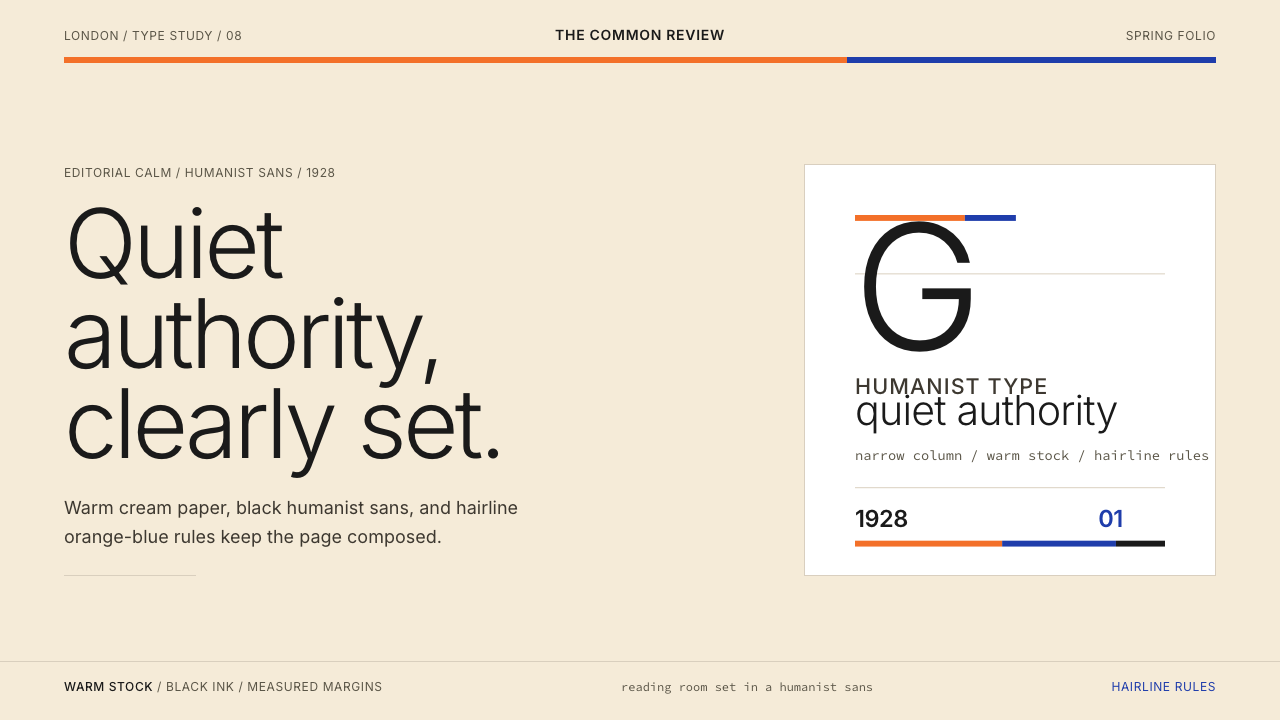 Gill Sans (BBC, 1928)Quiet authority, clearly set. Warm cream, black humanist sans, and hairline o…安静而权威。奶油底、黑色人文无衬线与橙蓝细线。
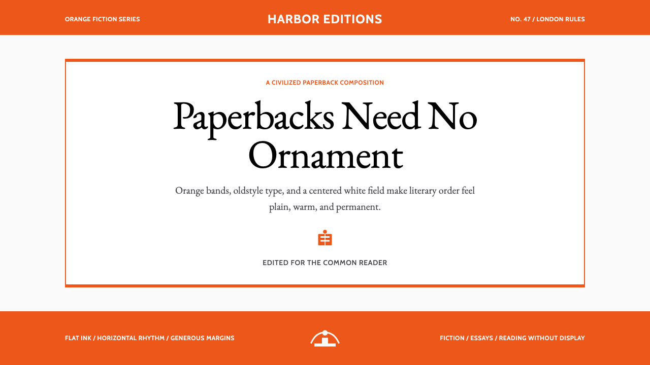 Penguin Classics OrangePaperback authority. Orange tri-bands, serif title panel, and flat ink enforc…平装书的权威感:橙色三段、衬线标题与平面油墨建立克制秩序。
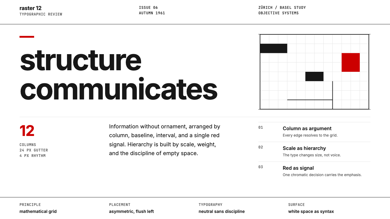 Swiss International StyleObjectivity made visible. Inter scale, white space, and one red block expose…客观性可见:Inter 尺度、留白与单一红块显露网格。
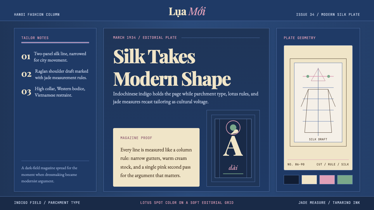 Vietnamese Áo Dài 1934 (Cát Tường)Indigo editorial poise. Parchment serif columns and lotus-pink rules frame th…靛蓝编辑气质。羊皮纸衬线栏与莲粉细线,框住1934服饰转折。
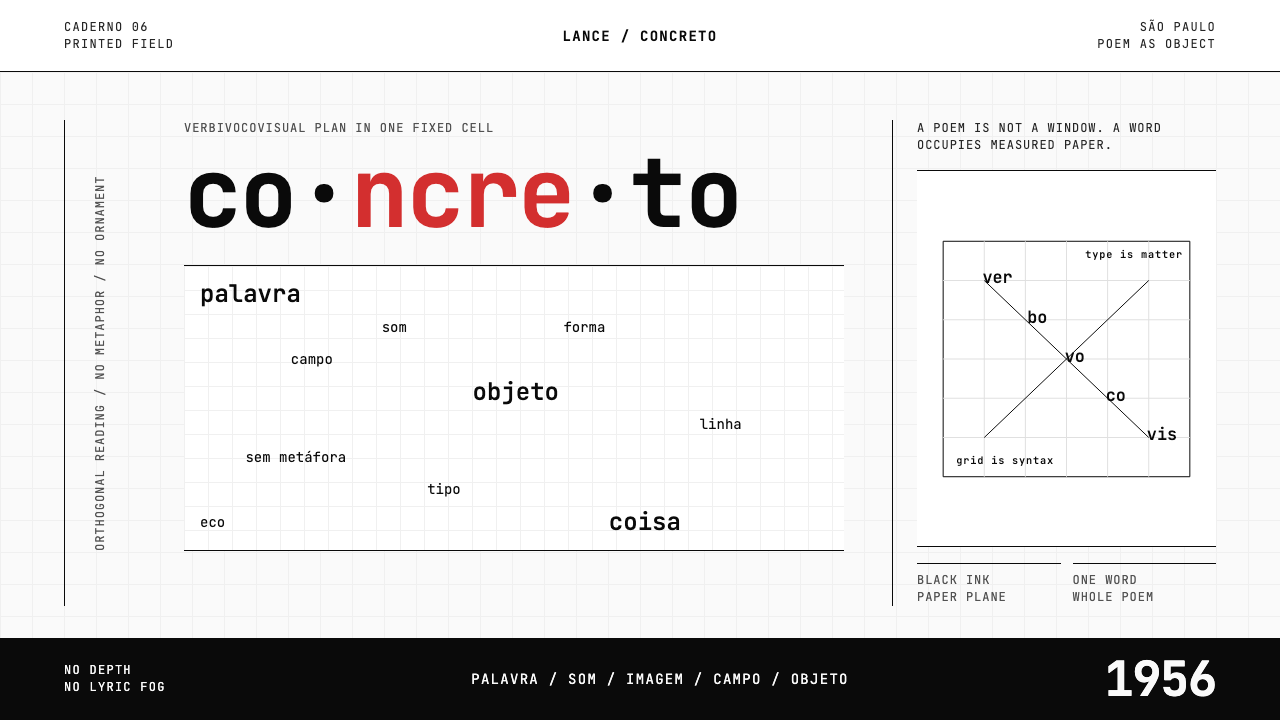 Brazilian Concrete PoetryWords become objects. Monospace cells, black-white paper, one cadmium red rup…字成为物。等宽格、黑白纸面,一处镉红断裂。