What is Vietnamese Áo Dài 1934 (Cát Tường)?
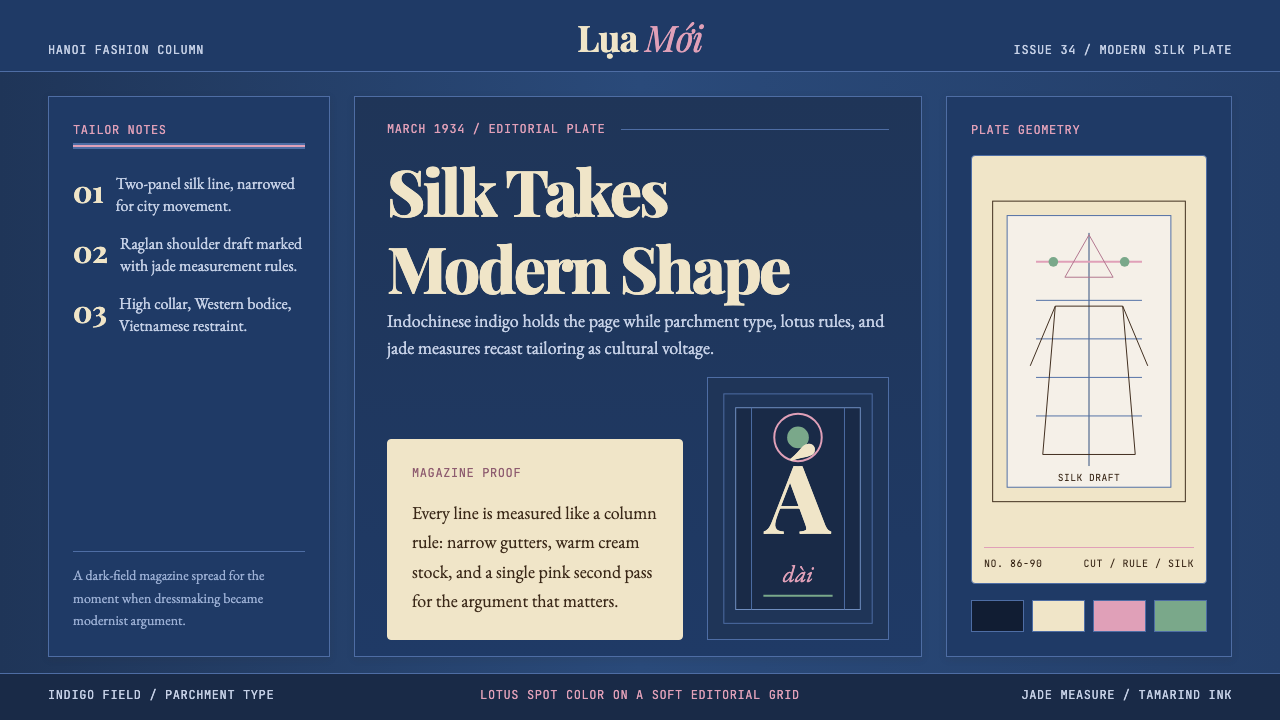
In a single March 1934 issue of Phong Hóa magazine, painter Nguyễn Cát Tường published tailor-plates that transformed Vietnam's national dress forever — and gave the world a visual language of colonial-modernist elegance: deep indigo fields, warm parchment type, deco-condensed serifs, and lotus-silk accents that hold a moment of cultural negotiation in exquisite tension.
Vietnamese Áo Dài 1934 (Cát Tường) in brief
The Vietnamese Áo Dài 1934 (Cát Tường) design system draws its visual logic from the original magazine pages on which Nguyễn Cát Tường — known by his pen name Cát Tường, meaning 'auspicious' — published his reformed dress designs in Phong Hóa, the satirical literary weekly of the Tự Lực Văn Đoàn (Self-Reliance Literary Group). The system is named for the year and the man: 1934 is the precise cultural hinge, Cát Tường its architect.
Visually, the system is built on an editorial confrontation between old and new. Deep indochinese indigo — the hue of traditional Vietnamese dyed silk — forms the primary field, anchoring warmth and historical weight. Against it, parchment-cream type in deco-condensed serifs carries both the Vietnamese diacritical marks and the Western proportions introduced by French colonial typography. Spot colors drawn from lotus pink and pale jade break the restraint with deliberate luxury. Nothing in the palette is purely modern or purely traditional; everything is held in negotiated balance.
The system belongs to a specific historical node: 1930s Hanoi, where the colonial grid of French Indochina pressed against a Vietnamese literary renaissance. The visual tension is not nostalgic — it is forensic. Each design decision references the actual artifacts of that moment: the masthead typography of Phong Hóa, the raglan-sleeved áo dài silhouette, the imported deco ornament adapted to carry Vietnamese letterforms. It is a fashion archive rendered as design language.
Where does Vietnamese Áo Dài 1934 (Cát Tường) come from?
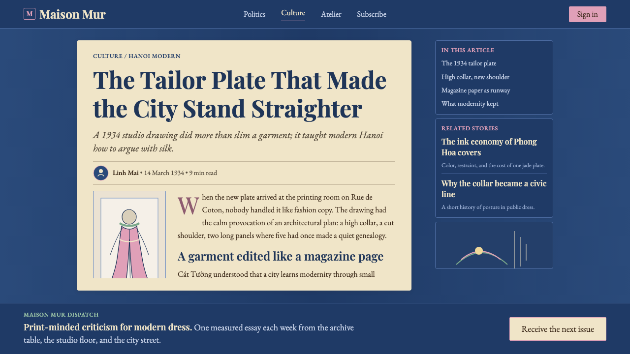
Vietnam's áo dài has earlier roots — the áo ngũ thân, a five-panel robe worn since the Nguyễn dynasty — but the modern silhouette owes its form entirely to Nguyễn Cát Tường's 1934 intervention. Cát Tường had trained at the École des Beaux-Arts de l'Indochine in Hanoi, the French colonial fine arts school established in 1925, where Vietnamese students encountered Western academic painting, deco illustration, and European fashion-plate draftsmanship. He returned from his studies not to mimic European dress but to synthesize: trimming the five panels to two, reshaping the bodice with a Western-style bust line, and introducing raglan sleeves that allowed easier movement while preserving the high collar and side-slitted skirt that marked the garment as distinctly Vietnamese.
The publication platform was as important as the design itself. Phong Hóa (literally 'Wind and Customs') was founded in 1932 by Nhất Linh, the pen name of writer Nguyễn Tường Tam, who was also Cát Tường's elder brother. The magazine was the organ of the Tự Lực Văn Đoàn, a reformist literary movement that advocated modernizing Vietnamese society along lines that were simultaneously nationalist and Westernized — opposing Confucian hierarchy, arranged marriage, and social conservatism while championing individual expression and women's emancipation. Cát Tường's fashion plates appeared in this explicitly ideological context: the reformed áo dài was not merely a garment but a political proposition.
The immediate reception was divided. Conservative critics condemned the design as a degradation of Vietnamese tradition, too influenced by French fashion and insufficiently modest. Younger urban women — particularly in Hanoi — adopted it rapidly, and within five years it had become the dominant form of Vietnamese women's dress. The name 'Áo dài Cát Tường' attached to the style from the beginning; today, though the garment has evolved through many subsequent reform episodes (the fitted Saigon versions of the 1950s and 1960s, the wartime austerity adaptations, the diaspora revivals), the 1934 Cát Tường form remains the canonical origin point.
The broader Tự Lực Văn Đoàn context shapes what the design system draws from. The group's aesthetic was characterized by careful attention to Vietnamese cultural particularity alongside openness to modernist international currents — they read French Romantic novels and Vietnamese folk poetry with equal seriousness. The visual language of their publications reflected this: deco-influenced illustration standards, condensed serifs adapted to carry Vietnamese tone marks, editorial layouts that quoted French magazine formats while incorporating Vietnamese woodblock sensibilities. It is this editorial surface — rather than the garment itself — that the design system primarily translates into a digital visual vocabulary.
What defines the Vietnamese Áo Dài 1934 (Cát Tường) look?
Color Field
The primary ground is a deep indochinese indigo — not the navy of Western suits nor the electric blue of digital interfaces, but the specific warm-dark hue of natural Vietnamese silk dye, carrying simultaneous associations of tradition, formal ceremony, and visual weight. Against this field, parchment cream replaces pure white for text and secondary surfaces, softening what would otherwise be a stark modern contrast into something with manuscript warmth. Lotus pink and pale jade serve as deliberate interruptions: small areas of saturated botanical color that reference the natural silk palette of Vietnamese ao dài production. The system avoids both the austerity of a purely monochromatic scheme and the festivity of a fully chromatic one.
Typography
The type palette centers on deco-condensed serifs — high-contrast letterforms with pronounced vertical stress and tight letter-spacing that echo the compressed masthead typography of 1930s Vietnamese periodicals. The condensed proportion is functionally important: Vietnamese uses a large number of stacked diacritical marks (tone indicators, vowel modifiers), and condensed serifs accommodate these marks more elegantly than wide or round letterforms. Headlines are set with commanding scale, leaning into the editorial poster sensibility of Phong Hóa's front pages. Body text uses the same serif family at a lighter weight, creating an optical relationship between display and text sizes without requiring a type-family switch.
Ornamental Restraint
The system uses deco-derived ornament, but in a strictly rationed way: thin horizontal rules, discrete fleuron-like accents, and the occasional geometric border that recalls both French Art Deco periodical design and traditional Vietnamese woodblock border patterns. These elements are never layered or combined into decorative excess; each one earns its place by performing a structural or separating function in the layout. The ornament vocabulary is small — three or four recurring motifs — deployed with editorial discipline rather than expressive abandon. Lotus motifs appear at most once per composition, as a focal accent rather than a repeating pattern.
Grid and Column Logic
The underlying grid is derived from the multi-column periodical format of early twentieth-century Vietnamese publishing, where dense text columns were interspersed with illustration plates and advertisement blocks. In contemporary application, this translates to a layout that favors narrow text columns with generous inter-column gutters — creating breathing space without sacrificing information density. The composition is asymmetric in the French editorial tradition: a primary text block anchors one side while a secondary element (illustration, pull quote, or ornamental rule) activates the opposite margin. The feeling is of organized richness rather than sparse minimalism.
Silhouette as Motif
The áo dài silhouette — the high collar, the long fitted panel, the side slit — recurs in the system as a visual motif rather than literal illustration. It appears abstracted into geometric block shapes that carry the garment's proportions without depicting it literally. This approach keeps the system from becoming nostalgic costume illustration while maintaining the cultural reference as a structural underpinning. The silhouette logic also influences how figure-like shapes are treated in general: tall, narrow, vertically oriented forms are preferred over wide horizontal bands.
Texture and Surface
Unlike purely geometric modernist systems, the Cát Tường system admits subtle texture — not as skeuomorphic simulation but as a reference to the physical media of its origins. A very fine paper grain quality in large color fields recalls the newsprint and rice paper of Phong Hóa's original pages. This textural suggestion is light and purposeful: it registers as warmth rather than as an effect, and it prevents the deep indigo grounds from reading as flat digital fills. The system does not use photographic texture or material simulation; the grain is geometric in character, more like a fine halftone screen than a photograph of paper.
Diacritical Sensitivity
A technical characteristic that distinguishes this system from most Western-origin design languages: it is built to accommodate Vietnamese diacritical marks as first-class typographic citizens rather than as an afterthought. Vietnamese uses tone marks and vowel modification marks that stack above and sometimes below base characters, and poorly chosen typefaces cause these marks to collide or overflow. The system's typeface choices and letterspacing defaults are calibrated to give tone marks adequate vertical clearance. This concern with multilingual typographic fidelity extends to how Chinese characters and Latin characters are mixed when the system is applied to bilingual contexts.

Who shaped Vietnamese Áo Dài 1934 (Cát Tường)?
Painter, illustrator, and fashion designer trained at the École des Beaux-Arts de l'Indochine in Hanoi. Cát Tường published his reformed áo dài designs in Phong Hóa magazine in 1934, blending Western tailoring methods with Vietnamese dress conventions to create a garment that became the national dress of Vietnam. His work synthesized colonial-era academic training with cultural nationalist purpose in a way that proved more durable than either pure Western imitation or pure traditionalism.
Writer, publisher, and elder brother of Cát Tường, who founded Phong Hóa magazine in 1932 and led the Tự Lực Văn Đoàn literary movement. Nhất Linh provided the ideological and publishing infrastructure within which Cát Tường's fashion work appeared. His vision of a modernized Vietnamese identity — engaged with Western thought but rooted in Vietnamese cultural distinctiveness — gave the áo dài reform its broader social meaning and its platform.
Fellow graduate of the École des Beaux-Arts de l'Indochine and close contemporary of Cát Tường who continued developing the áo dài silhouette in subsequent years, particularly during his time in Paris. Lê Phổ's paintings — which depicted Vietnamese women in áo dài in a style that merged French Impressionism with Vietnamese lacquer painting aesthetics — helped circulate the reformed garment's image internationally and gave it an artistic legitimacy beyond the pages of Phong Hóa.
The literary and cultural reform movement, founded 1933, that provided the intellectual framework for the áo dài's modernization. Though a collective rather than an individual, the group's aesthetic commitments — deco-inflected illustration, condensed Vietnamese typography, editorial layouts that quoted French periodical formats — form the visual substrate of the design system. Their publications remain primary historical sources for understanding what 1930s Vietnamese modernist editorial design actually looked like.
The French colonial fine arts school established in Hanoi in 1925, which trained the generation of Vietnamese artists and designers — including Cát Tường and Lê Phổ — who would produce the colonial-modernist synthesis the design system reflects. The school's curriculum combined European academic training with Vietnamese traditional crafts and visual culture, producing graduates fluent in both formal vocabularies and capable of genuine synthesis rather than simple imitation.
How do you use Vietnamese Áo Dài 1934 (Cát Tường) today?
The Cát Tường system rewards careful reading before application. Its richness — indigo grounds, parchment type, lotus accents, deco ornament — means that the temptation to use all its elements simultaneously is high, and doing so produces clutter rather than elegance. The key is to select two or three elements from the system and allow them to work fully before introducing more. In most layouts, this means committing to the deep indigo as the primary ground, the parchment cream as the primary text surface, and reserving lotus pink or jade for a single focal use per composition.
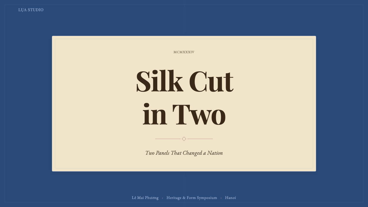
For presentation slides, the system works best in editorial contexts — an annual report, a cultural institution's pitch deck, a fashion or lifestyle brand seeking historical depth. Cover slides should deploy the full indigo field with a single deco-condensed serif headline in parchment cream, using a thin horizontal rule below the title as the only ornament. Content slides are more restrained: light parchment background, dark type, with the indigo appearing only in headers or section markers. The deco ornament (lotus accent or geometric border) marks the end of a section or the beginning of a key argument — used once per slide, not repeatedly.
For web interfaces, the system is most at home in editorial, cultural, and fashion contexts — lookbooks, cultural publication websites, portfolio pages for brands with historical or craft narratives. Navigation should be typographically dominant, using the condensed serif at a size that reads as authoritative without being aggressive. The indigo should appear as the primary accent color for active states, focused inputs, or featured content blocks — not as a full-page background in interactive contexts, where it can feel overwhelming on screen for extended reading.
For marketing and editorial work — long-form articles, brand identity systems, print publications — the system's periodical heritage comes into its own. Use the narrow column format with generous gutters. Reserve the lotus pink for pull quotes or bylines: single lines of warm color in an otherwise deep and cream composition. Deco ornament belongs at section transitions. The vertical silhouette logic suggests tall imagery crops and portrait orientations over landscape.
The most common mistake is treating the lotus pink and pale jade as coequal to the indigo and parchment, using all four at similar saturation throughout a piece. In authentic Cát Tường-derived work, the accent colors are present but deliberately minor — appearing perhaps twice per spread in a print piece, once per section in a digital one. Their scarcity is what makes them feel like silk and jade rather than just additional colors. A second common error is choosing a wide or geometrically round serif in place of the condensed form: without the condensed proportion, the diacritical accommodation and the editorial poster sensibility both collapse.
Vietnamese Áo Dài 1934 (Cát Tường) — FAQ
Is this system appropriate for Vietnamese brand identity work, or does it risk being exoticizing?
The system is grounded in specific historical artifacts — the actual publications, typography, and visual culture of 1930s Hanoi — rather than in generalized 'Vietnamese aesthetic' signifiers. Applied with that specificity, it works well for Vietnamese brands seeking to invoke the Tự Lực Văn Đoàn reform generation or the 1930s Hanoi cultural milieu. It becomes exoticizing when the specific historical reference is diluted into generic Southeast Asian ornament — lotus patterns used as wallpaper rather than as sparse editorial accents, or the indigo field deployed without the typographic structure that gives it editorial weight. The system demands historical literacy from its users.
How does the system handle dark-mode or light-mode variants?
The canonical form of the system is dark-ground: the deep indigo is the primary field, and the parchment cream is the text color. A light-mode inversion is possible — parchment or off-white ground with deep indigo type and ornament — and it reads as a newspaper or archival document aesthetic, slightly more historically austere than the dark canonical version. In the light variant, lotus pink and jade appear as headline accents rather than interruptions in a dark field. The light variant is better suited to long-form reading; the dark canonical version works better for visual impact and marketing contexts. Switching between them should be a considered decision, not a default toggle.
Can the system work in contexts unrelated to Vietnam or fashion?
Yes, though it requires a clear rationale. The system's core strengths — editorial grid discipline, controlled ornament, and the indigo-parchment palette — are transferable to any context that values historical depth, cultural specificity, and editorial authority: a publication about craft traditions, an academic institution in Southeast Asia, a luxury goods brand seeking non-European historical references. What the system resists is generic application to contexts where neither its historical reference nor its editorial sensibility is relevant — in those cases, the ornamental vocabulary reads as costume rather than as design logic, and the result is decorative appropriation rather than meaningful visual language.
How does the Cát Tường system relate to other Art Deco-influenced Asian design traditions?
The 1930s saw a wave of Art Deco absorption across colonial Asia — Shanghai's art deco architecture and Liangyou magazine cover design, Bombay's deco cinema posters, Manila's Commonwealth-era graphic ephemera. The Cát Tường system belongs to this regional moment but is distinguished by its specific typographic challenge (Vietnamese diacritical complexity) and by the explicit cultural-nationalist purpose it served. Where Shanghai deco tended toward luxuriant surface and Bombay deco toward kinetic spectacle, the Hanoi literary tradition was more restrained and editorially disciplined — closer in spirit to the Swiss-influenced sobriety of 1930s Dutch periodical design than to the decorative exuberance of its nearest regional neighbors.
What makes this system difficult to use incorrectly without it being obvious?
Two things work in the careless user's favor. First, the deep indigo is a forgiving ground — it reads as sophisticated even when the typographic system placed on top of it is inconsistent or poorly proportioned. Second, deco ornament has a self-justifying quality: a single well-placed lotus accent looks intentional regardless of whether the rest of the composition is coherent. The tells for poor application are consistent: ornament used more than twice per composition, lotus pink appearing in more than one location per layout, wide-proportion serifs replacing the condensed ones, and the parchment cream used at full white rather than at the slightly warm off-white that gives it its manuscript quality. A layout that avoids these four errors will read as competent Cát Tường even if the underlying grid is loose.
Related design styles
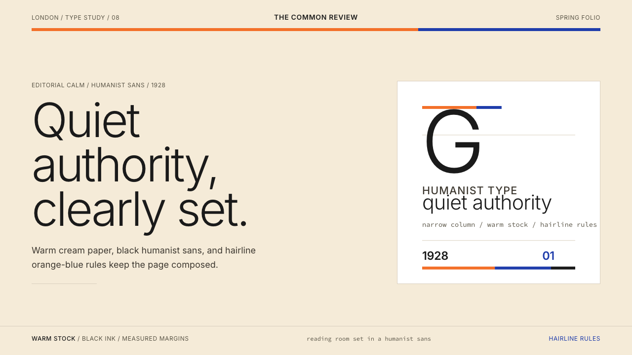 Gill Sans (BBC, 1928)Quiet authority, clearly set. Warm cream, black humanist sans, and hairline o…
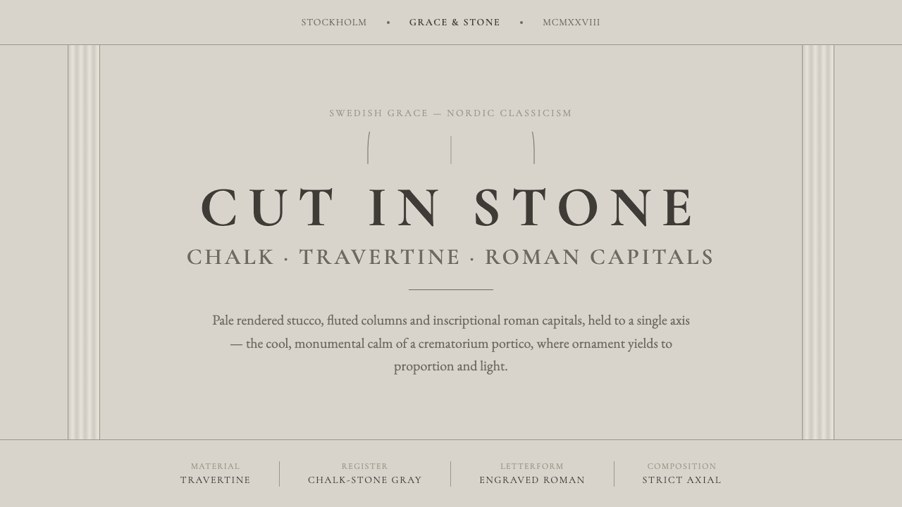 Nordic Classicism AsplundStone, not cream. Engraved Trajan capitals on cool chalk stucco, fluted colum…
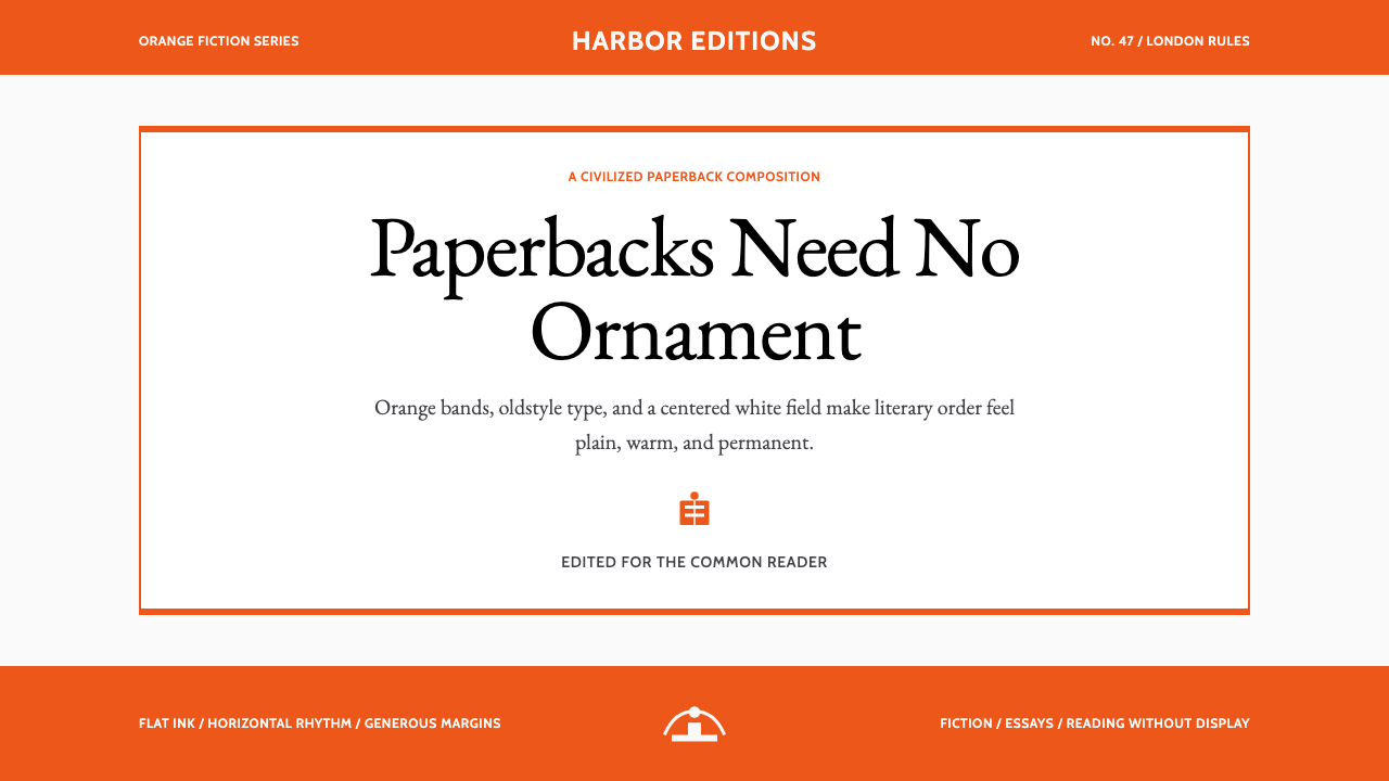 Penguin Classics OrangePaperback authority. Orange tri-bands, serif title panel, and flat ink enforc…
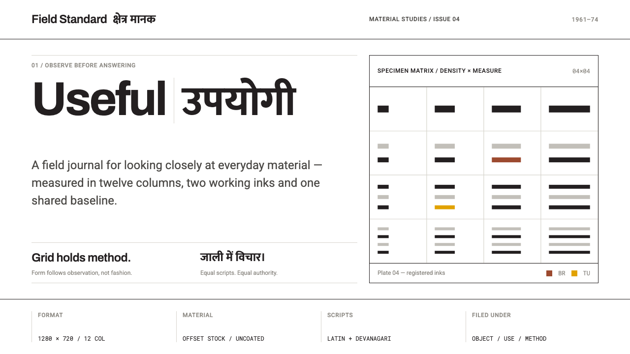 NID Ahmedabad ModernismStructure earns trust. Black rules and equal-weight scripts hold craft color…
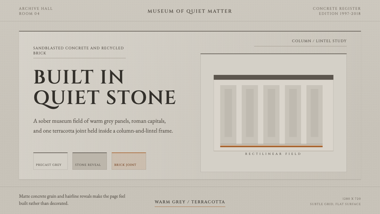 Chipperfield Museum GrayMuseum gravity, rendered quietly. Warm concrete grey, roman capitals, one ter…
 Emil Ruder TypografieDiscipline makes type visible. Near-white grotesque and measured space cut th…