Design style guide设计风格指南
What is Panama Canal Deco 1914?什么是 Panama Canal Deco 1914?
When the Panama Canal opened in 1914, it brought with it a visual language as precise and powerful as its locks — blueprint navy, zinc rulework, and the vermillion authority of an engineering civilization at its apex.1914年巴拿马运河通航,随之而来的不只是工程奇迹,还有一套视觉语言——海军蓝底图、锌灰线框、朱红基准线,精密而强势,是工业文明自信心的凝固。
Panama Canal Deco 1914 in briefPanama Canal Deco 1914 速览
Panama Canal Deco 1914 is a design style rooted in the visual culture of the American-built Panama Canal — a system that melded engineering blueprints, colonial-industrial signage, and the restrained material palette of steel, concrete, and deep tropical water. The aesthetic is severe by intention: navy-ground technical drawings, zinc-grey mechanical schematics, and vermillion datum lines combined to produce documents and signage that communicated absolute authority with zero ornamental concession.巴拿马运河装饰主义1914是一种植根于美国建造巴拿马运河视觉文化的设计风格——一套融合工程蓝图、殖民工业标牌与克制材料色板(钢铁、混凝土、热带深水)的美学体系。这种风格的严峻是有意为之:以海军蓝为底色的技术图纸、锌灰色机械示意图与朱红色基准线相互叠合,制造出一种毫无装饰妥协、却传递着绝对权威的文件与标识。
Where most decorative design styles of the early twentieth century reached for beauty through embellishment, the Canal Zone's visual culture achieved presence through precision. Orthographic construction lines, tight measurement grids, and the geometric discipline of the engineering draughtsman replaced flourish with function. The result was a body of visual material — annual reports, lock-keeper logbooks, USGS survey plates, official signage — whose authority derived entirely from formal rigor rather than artistic gesture.二十世纪初,大多数装饰性设计风格以繁复装饰追求美感,而运河区的视觉文化则以精密赢得存在感。正交工程构造线、精密测量网格、工程制图员的几何纪律——这一切以功能取代了一切花饰。由此诞生的视觉材料体系——年报、船闸日志、美国地质调查局测量图版、官方标识——其权威性完全来自形式严格性,而非艺术姿态。
As a contemporary design system, Panama Canal Deco 1914 channels that blueprint authority into digital and print contexts. It is not nostalgia for a colonial project but a translation of its most formal visual logic: the confidence of a system that knew exactly what it was measuring, what it was building, and how it intended to be read.作为当代设计系统,巴拿马运河装饰主义1914将那种蓝图式权威引入数字与印刷语境。它不是对某一殖民项目的怀旧,而是对其最正式视觉逻辑的转译:一个确切知道自己在测量什么、在建造什么、以及打算如何被阅读的系统所具有的那种笃定。
See the Panama Canal Deco 1914 design system →查看 Panama Canal Deco 1914 完整设计系统 →
Where does Panama Canal Deco 1914 come from?Panama Canal Deco 1914 从何而来?
The Panama Canal took a decade to build. Construction by the United States began in earnest in 1904 under chief engineer John Frank Stevens, who reorganized the labour force and the railroad logistics that made large-scale excavation possible, before handing responsibility to George Washington Goethals in 1907. Goethals, an Army Corps of Engineers colonel, ran the Canal Zone with military administrative discipline — and that discipline expressed itself visually. Every engineering decision was documented in technical drawings whose graphic conventions became the zone's unofficial design language: thick navy ground-lines, zinc-white notational text, vermillion depth indicators at lock chambers and spillways.巴拿马运河耗时十年建成。美国于1904年在总工程师约翰·弗兰克·史蒂文斯的主持下正式启动施工——史蒂文斯重组了劳动力与铁路物流体系,使大规模开挖成为可能——随后于1907年将指挥权移交给乔治·华盛顿·戈塔尔斯。戈塔尔斯,这位陆军工兵团上校,以军事行政纪律管理运河区,而这种纪律在视觉上也有所表达。每一个工程决策都被记录在技术图纸中,其图形惯例逐渐成为运河区非正式的设计语言:粗重的海军蓝底线、锌白色注释文字、船闸与溢洪道处的朱红色深度标识。
The Canal opened on August 15, 1914 — the same month the First World War began in Europe. The timing framed the project as a monument to American industrial capability precisely at the moment European civilization was demonstrating its capacity for self-destruction. American newspapers, the Canal Zone's own publications, and the commemorative atlases and survey plates produced by the United States Geological Survey all trafficked in the same visual idiom: an orthographic, blueprint-derived aesthetic that equated engineering exactitude with civilizational authority. This was not incidental. The visual system was propaganda as much as documentation.运河于1914年8月15日开通——同月,第一次世界大战在欧洲爆发。这一时间节点使该项目成为美国工业实力的纪念碑,恰好是在欧洲文明正展示其自我毁灭能力的时刻。美国报纸、运河区自身出版物,以及美国地质调查局制作的纪念地图集与测量图版,都流通着同一套视觉惯用语:一种正交、蓝图派生的美学,将工程精确性等同于文明权威。这绝非偶然。这套视觉系统与其说是记录,不如说是宣传。
Key figures gave the Canal Zone its visual character. Joseph Pennell, the American illustrator and printmaker, produced a series of drawings of the Culebra Cut excavation in 1912 that were widely reproduced — his images rendered the scale of mechanical dredging with a draughtsman's precision that influenced how the project was visualised internationally. Ernest 'Red' Hallen, the Canal's official photographer from 1904 onwards, worked in high-contrast documentary mode, his compositions emphasizing the geometry of lock gates, spillways, and machinery in ways that aligned closely with the engineering drawing aesthetic. Goethals himself oversaw annual reports whose layout — dark-ground technical diagrams, minimal typography, vermillion emphasis marks — set a visual standard that persisted in Canal Zone official communications for decades.几位关键人物赋予了运河区独特的视觉气质。美国插图画家与版画家约瑟夫·彭内尔于1912年为库莱布拉切割段开挖工程创作了一批素描,这些图像被广泛复制——他以制图员的精密描绘了机械挖掘的宏大尺度,影响了这个项目在国际上被视觉化的方式。自1904年起担任运河官方摄影师的欧内斯特·“红毛”伦,以高对比度纪实风格工作,他的构图着重表现船闸门、溢洪道与机械设备的几何特质,与工程制图的美学高度吻合。戈塔尔斯本人监制的年报——深色底面技术示意图、极简排印、朱红强调标记——确立了一套视觉标准,在此后数十年的运河区官方通讯中持续沿用。
The visual legacy of the 1914 opening extended well beyond the immediate moment. Canal Zone official signage, installed in the purpose-built American towns of Cristóbal, Balboa, and Gamboa, maintained the blueprint aesthetic through stencilled sans-serif lettering, steel construction, and a limited palette derived from engineering materials rather than decorative convention. USGS survey plates produced throughout the 1910s and 1920s formalized the grid-and-datum graphic language into a reproducible visual system. By the time the Panama Canal's visual culture faded from prominence — displaced by mid-century modernism — it had left a distinct imprint on the graphic language of industrial authority, one that contemporary designers can access as a coherent historical vocabulary.1914年开通所留下的视觉遗产远超即时时刻。在克里斯托瓦尔、巴尔博亚、加博纳等专为美国人建造的城镇中安装的运河区官方标识,通过模板印制的无衬线字体、钢铁结构,以及源自工程材料而非装饰惯例的有限色板,延续着蓝图美学。整个1910至20年代制作的美国地质调查局测量图版,将网格与基准图形语言系统化为可复制的视觉体系。当巴拿马运河的视觉文化最终被中世纪现代主义所取代、渐渐淡出主流视野时,它已在工业权威的图形语言上留下了鲜明印记——一套当代设计师可以作为连贯历史词汇加以取用的体系。
What defines the Panama Canal Deco 1914 look?Panama Canal Deco 1914 的视觉特征是什么?
Color色彩
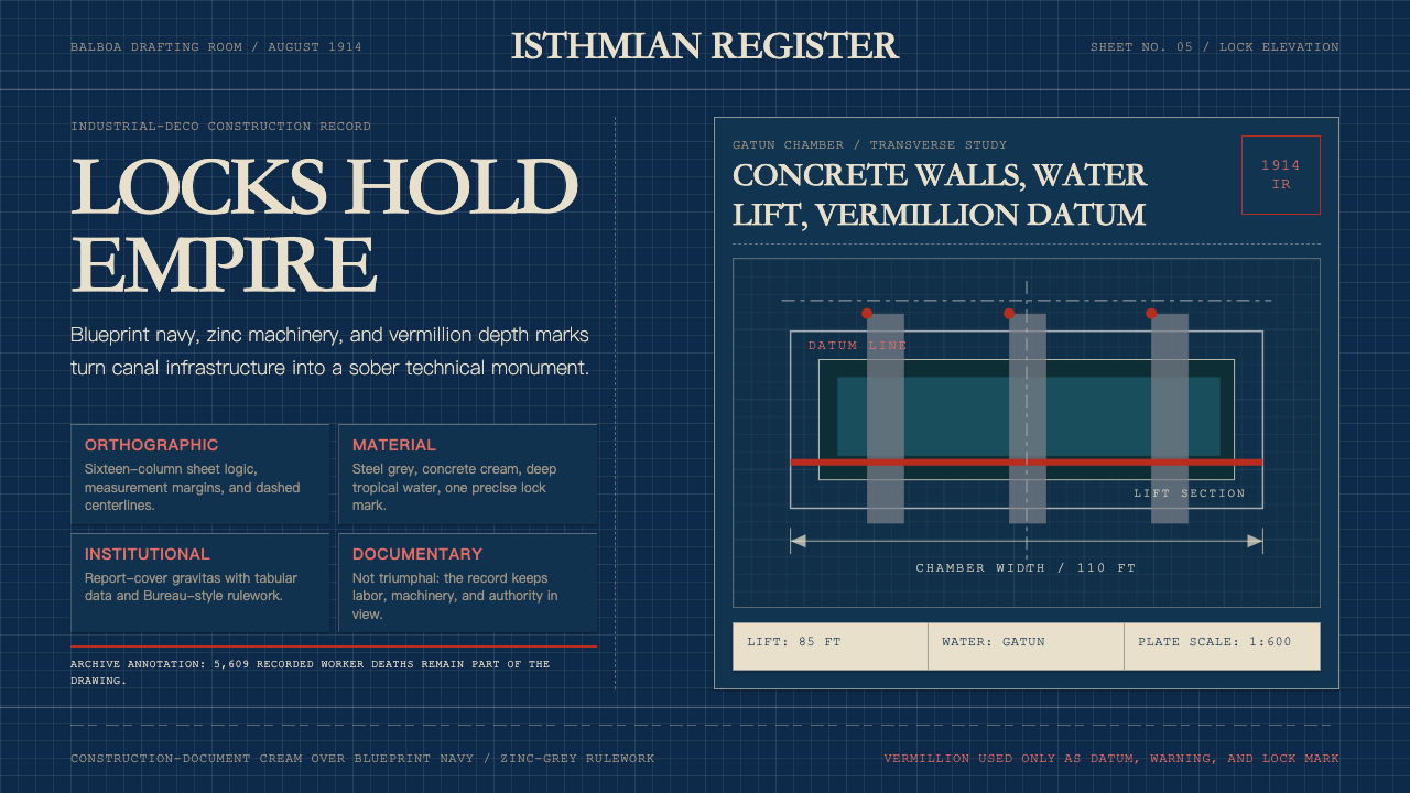
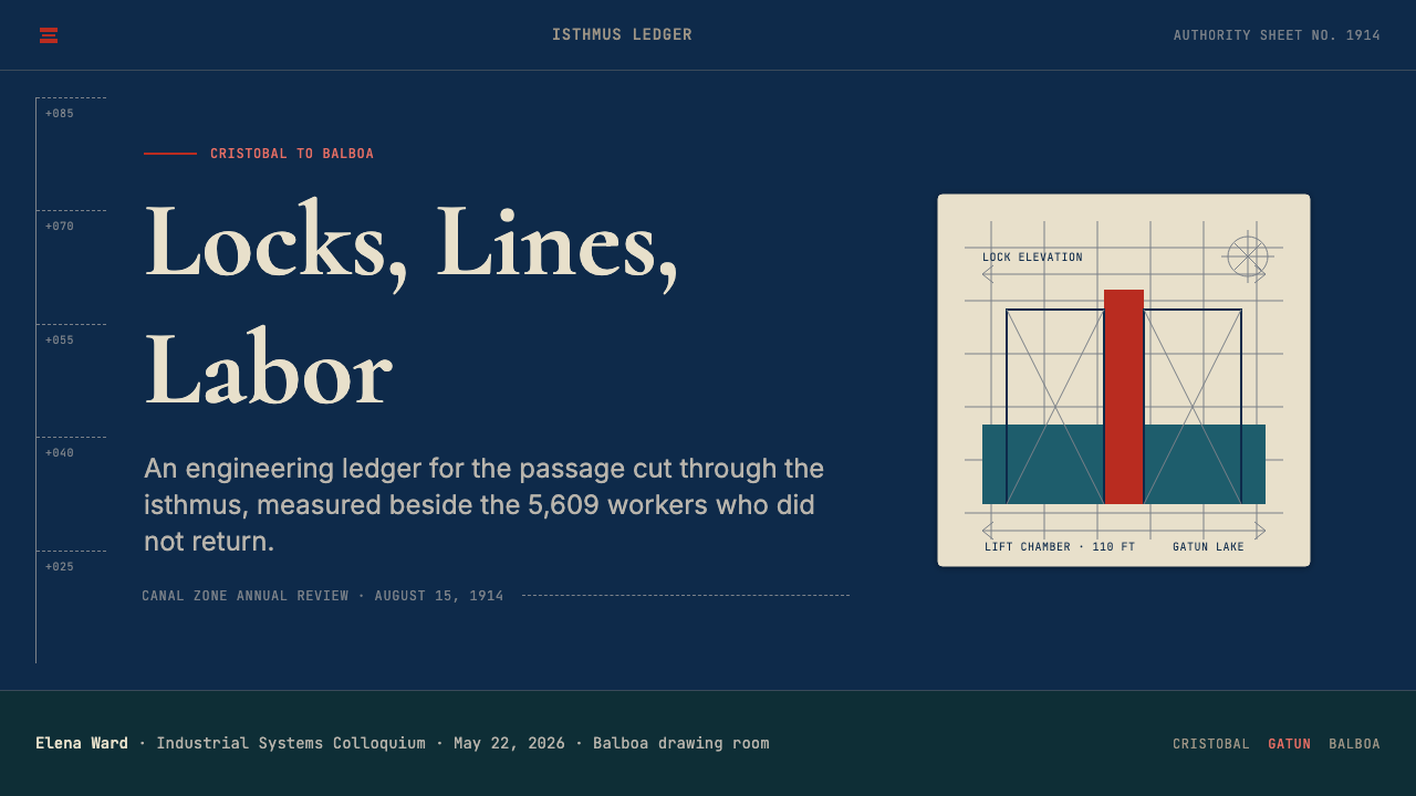
The palette is built from three dominant registers: a deep navy blue that functions as the primary ground — the color of engineer's tracing cloth and technical blueprints; a zinc or steel grey that reads as the tone of machine housings, concrete lock walls, and galvanized hardware; and a sharp vermillion used exclusively as a datum or emphasis mark, never as a field color. Against this cold industrial triad, the deep blue-green of tropical water — Gatun Lake, the approach channels — appears as the only color with natural warmth, and it is used sparingly, as an environmental anchor rather than a decorative choice. The resulting palette has no warmth, no softness, and no ambiguity about hierarchy: navy commands, zinc supports, vermillion signals.色板由三个主导音域构成:深海军蓝作为首要底色——这是工程描图布与技术蓝图的颜色;锌灰或钢铁灰读作机器外壳、混凝土船闸墙壁与镀锌硬件的色调;以及一种鲜锐的朱红,仅用作基准线或强调标记,从不用于色块填充。在这一冰冷的工业三色对照中,热带水域的深蓝绿——加通湖、进入航道——是唯一具有自然温度的色彩,且被节制使用,作为环境锚点而非装饰选择。这套色板没有温暖,没有柔和,对层级关系也没有丝毫模糊:海军蓝主导,锌灰支撑,朱红发出信号。
Typography字体排印
Letterforms are drawn from the tradition of engineering stencil lettering: geometric, single-weight sans-serif characters with open apertures and consistent stroke thickness. This is not the humanist sans-serif of advertising or editorial design — it is the lettering of the draughtsman, optimized for legibility at a range of reproduction scales, reproducible without skill by anyone with a stencil set. Labels, callouts, and captions run in tight all-caps or upper-lower mixed settings at measured intervals. Headlines function as title-block entries rather than expressive typographic statements. Text is never decorative; it is always instrumental.字形源自工程模板字母的传统:几何形态、等线无衬线字符,字腔开阔、笔画粗细一致。这不是广告或编辑设计的人文主义无衬线字体——它是制图员的字体,为在各种复制尺寸下保持可读性而优化,任何拥有模板套装的人都能无需技巧地复制。标签、标注与说明文字以紧凑的全大写或大小写混合方式排列,间距经过测量。标题功能如同图签栏目的条目,而非表现性的排印陈述。文字从不是装饰性的;它永远是工具性的。
Grid and Orthographic Order网格与正交秩序
All composition is organized on an explicit orthographic grid — horizontal and vertical axes are primary, diagonal elements appear only as measurement indicators or construction lines, never as dynamic compositional devices. The grid is not invisible or implied; it is often literally present as a visible ruling, a datum line, or a measurement scale along the edge of a composition. This makes layouts read as technical documents even when the content is not technical: the structural framework of the engineering drawing is so strongly present that it overrides any other associative context.所有构图都组织在明确的正交网格上——水平轴与垂直轴是主轴,对角线元素仅作为测量指示符或构造线出现,从不用作动态构图手段。这个网格不是隐形的或暗示性的;它往往以可见的划线、基准线或构图边缘的测量刻度的形式实际呈现。这使得版面即使在内容并不技术性时也读作技术文件:工程图纸的结构框架存在感如此之强,以至于覆盖了任何其他联想语境。
Material Texture and Surface材料质感与表面
Surfaces in this system reference industrial materials rather than organic or decorative ones: the flat matte of dried ink on tracing cloth, the slight tonal variation of blueprint reproduction, the mottled grey of cured concrete, the deep uniform tone of deep water. These are not simulated textures applied for warmth — they are structural references that anchor the aesthetic in its source material. In digital applications, this typically manifests as slight grain or tonal depth on background fields, and as the deliberate use of flat, non-glossy surface treatments for UI components.这个系统中的表面引用的是工业材料而非有机或装饰性材料:描图布上干涸油墨的哑光平面、蓝图复制过程中轻微的色调变化、凝固混凝土的斑驳灰调、深水的均匀深色调。这些不是为温度而施加的模拟质感——它们是将美学锚定于其源头材料的结构性引用。在数字应用中,这通常表现为背景底面上轻微的颗粒感或色调深度,以及对界面组件刻意采用的平面、非光泽表面处理。
Datum Lines and Callouts基准线与标注
Vermillion datum lines — the engineering notation for reference elevations and depth measurements — function as the system's primary accent device. They appear as thin horizontal or vertical rules that interrupt the navy and grey field, carrying immediate visual priority without disrupting the underlying grid. Callout annotations, leader lines, and measurement brackets are drawn from the same vocabulary: precise, minimal, and functionally redundant with the information they label. Nothing is pointed at speculatively; everything that has a callout has a reason for it.朱红基准线——这是参考高程与深度测量的工程标注符号——作为这套系统的首要强调手段发挥作用。它们以细水平或垂直直线的形式出现,打断海军蓝与灰色底面,在不破坏底层网格的前提下获得即时的视觉优先级。标注说明、引导线与测量括号都来自同一词汇:精准、简约,在功能上与其所标注的信息互为冗余。没有任何东西被推测性地指向;凡有标注之处,皆有其理由。
Scale and Proportion尺度与比例
The visual system is calibrated to communicate at the scale of infrastructure. Elements are proportioned to be read from distance, under varying light conditions, and across large format reproduction. This means generous spacing between all elements, high contrast between figure and ground, and a deliberate avoidance of fine detail that would not survive reproduction. In contemporary applications, this translates to compositions that feel spacious and authoritative rather than dense and decorative — a quality that reads as confidence rather than emptiness.这套视觉系统针对基础设施规模的传达进行了校准。各元素的比例被设计为能在远距离、变化光线条件下、以及在大幅面复制中被阅读。这意味着所有元素之间留有充裕间距,图形与底面之间保持高对比度,并刻意回避在复制过程中无法存活的精细细节。在当代应用中,这转化为感觉宽阔而权威、而非紧密而装饰性的构图——一种读来像是笃定而非空洞的品质。
Zero Decoration零装饰
Nothing in the Canal Zone's visual output was decorative in the art-nouveau or Beaux-Arts sense that was simultaneously prevalent in early twentieth-century American design. There are no floral borders, no historicist ornament, no decorative initial capitals, no festive color. What exists instead is the graphic vocabulary of measurement and certification: title blocks, revision marks, approval stamps, scale indicators. Every element justifies its presence by performing an informational function. In contemporary application, this principle operates as a hard constraint: any element that cannot be justified by structure or content should not exist.运河区的视觉产出在任何意义上都没有装饰性——没有新艺术运动或布扎式的装饰,尽管这两者在二十世纪初的美国设计中同时盛行。没有花卉边框,没有历史主义装饰,没有装饰性首字母,没有节日色彩。取而代之的是测量与认证的图形词汇:图签栏、修订标记、审批印章、比例指示符。每个元素都通过执行信息功能来证明其存在的合理性。在当代应用中,这一原则作为硬性约束运作:任何无法以结构或内容为正当理由的元素都不应存在。

See the Panama Canal Deco 1914 design system →查看 Panama Canal Deco 1914 完整设计系统 →
Who shaped Panama Canal Deco 1914?谁塑造了 Panama Canal Deco 1914?
As Chief Engineer and governor of the Canal Zone from 1907 until the Canal's opening, Goethals imposed the military administrative discipline that shaped the project's entire documentary culture. His insistence on rigorous technical recording — every decision logged, every survey plate filed, every specification drawn to engineering standards — produced the visual archive from which the Canal Zone's design language derives. The annual reports he oversaw, with their dark-ground technical diagrams and minimal typography, set a graphic standard that persisted in Canal Zone official communications for decades after the 1914 opening.作为1907年至运河开通期间的总工程师兼运河区总督,戈塔尔斯推行了军事行政纪律,塑造了整个项目的文献文化。他对严格技术记录的坚持——每一个决策均有日志、每一张测量图版均已存档、每一份规格说明均按工程标准绘制——产生了运河区设计语言所由来的视觉档案。他监制的年报,以深色底面技术示意图与极简排印为特征,确立了在1914年开通后数十年间持续影响运河区官方通讯的图形标准。
Stevens served as Chief Engineer from 1905 to 1907 and was responsible for the organizational infrastructure that made the Canal buildable — including the rail logistics and labor systems that Goethals later inherited. His practical engineering sensibility established the Canal Zone's pragmatic, function-first approach to all documentation and signage. Stevens had no interest in ornament; everything he built or documented was oriented toward operational clarity. That orientation embedded itself in the visual culture of the project before the zone's full administrative apparatus was in place.史蒂文斯于1905至1907年间担任总工程师,负责建立使运河建设成为可能的组织基础设施——包括戈塔尔斯后来继承的铁路物流与劳工体系。他务实的工程思维确立了运河区对所有文献与标识的实用主义、功能优先的处理方式。史蒂文斯对装饰毫无兴趣;他建造或记录的一切都以运营清晰度为导向。这种导向在运河区完整行政体制建立之前,就已将自身嵌入了项目的视觉文化。
Pennell was the American illustrator and printmaker who produced the most widely circulated visual documents of the Canal's construction period. His 1912 series depicting the Culebra Cut excavation — rendered in his characteristic hatched line technique — achieved international distribution and shaped how the project was visualized in the press. Pennell's compositions emphasized the geometry of the machinery and earthworks over the human figures working within them, reinforcing the Canal's identity as a project of mechanical and organizational intelligence rather than human labor.彭内尔是美国插图画家与版画家,创作了运河建设时期流传最广的视觉文献。他于1912年创作的库莱布拉切割段开挖系列——以其特有的交叉线描技法呈现——获得了国际范围的传播,塑造了媒体对这个项目的视觉化方式。彭内尔的构图着重表现机械与土方工程的几何特质,而非其中劳作的人物,强化了运河作为机械与组织智慧而非人工劳动之项目的身份认同。
Hallen served as the Canal's official photographer from 1904, building one of the most comprehensive documentary photographic archives of a twentieth-century construction project. His high-contrast, formally composed photographs of lock chambers, machinery, and infrastructure emphasized orthogonal geometry and tonal extremity in ways that aligned closely with the engineering drawing aesthetic. Hallen's images were reproduced in annual reports, commemorative publications, and the international press, making his photographic style a significant carrier of the Canal Zone's visual identity beyond the Zone itself.哈伦自1904年起担任运河官方摄影师,建立了二十世纪工程建设项目中最为完整的纪实摄影档案之一。他对船闸室、机械设备与基础设施所拍摄的高对比度、形式严谨的照片,着重表现正交几何与色调极端性,与工程制图的美学高度契合。哈伦的图像被刊登于年报、纪念出版物与国际媒体,使他的摄影风格成为将运河区视觉身份传播至运河区以外的重要载体。
As the institutional body responsible for Canal construction and Zone administration, the Army Corps of Engineers brought its standardized graphic conventions — developed for military engineering documentation — directly into Canal Zone visual culture. The Corps's technical drawing standards, notation systems, and document formatting protocols became the de facto design system of the entire project. This institutional authorship, rather than any individual designer, explains why the Canal Zone's visual language has such internal consistency: it was not designed, it was specified.作为负责运河建设与运河区管理的机构主体,美国陆军工兵团将其标准化图形惯例——为军事工程文献而开发的那套——直接引入了运河区视觉文化。工兵团的技术制图标准、标注体系与文件格式规范成为整个项目事实上的设计系统。正是这种机构化的作者身份,而非任何个体设计师,解释了为何运河区的视觉语言具有如此高度的内在一致性:它不是被设计出来的,而是被规定出来的。
How do you use Panama Canal Deco 1914 today?今天怎么用 Panama Canal Deco 1914?
Panama Canal Deco 1914 is well suited to contexts where measured authority, technical precision, and the visual language of institutional confidence are desired values. It does not pretend to warmth or approachability — it communicates from a position of competence and control. Applied correctly, it reads as the design language of a system that knows what it is doing and does not need to persuade you of that fact: it simply shows you the documentation.巴拿马运河装饰主义1914适合那些以有度的权威感、技术精密与机构自信的视觉语言为期望价值的场景。它不假装温暖或平易——它从一种能力与掌控的位置发出传达。正确应用时,它读作一套知道自己在做什么、且不需要向你论证这一事实的系统的设计语言:它只是向你展示文件。
For presentation slides, the style performs best when the content is data-dense, technical, or authoritative in nature — engineering briefings, infrastructure proposals, institutional annual reviews, financial dashboards. Cover slides should use the navy-ground convention: a near-black or deep blue field with white or zinc-grey type, and a single vermillion line as the only accent. Content slides should be treated as technical document pages: a strict grid, left-aligned type hierarchies defined by scale rather than decoration, and data visualizations treated as engineering diagrams — precise, labeled, stripped of gratuitous color.对于演示文稿,这种风格在内容密集、技术性强或本质上具有权威性的场景中表现最佳——工程简报、基础设施提案、机构年度回顾、财务仪表板。封面页应采用海军蓝底色惯例:接近黑色或深蓝色底面,搭配白色或锌灰色字体,以单条朱红线作为唯一强调元素。内容页应当被当作技术文件页面处理:严格的网格,以尺度而非装饰定义的左对齐字体层级,以及被视作工程示意图处理的数据可视化——精准、有标注、剥离多余色彩。
For web interfaces, the system is particularly effective for dashboards, analytics tools, infrastructure management platforms, and enterprise products where density and legibility under sustained use are more important than visual warmth. The approach: dark navy or near-black backgrounds for primary surfaces, zinc-grey for secondary panels and separators, vermillion reserved exclusively for alerts, active states, or critical data points. Type should be consistent in weight and geometric in character. Component borders, if present, should be ruled lines at engineering weight rather than soft-shadow separations.对于网页界面,这套系统在仪表板、分析工具、基础设施管理平台,以及密度与持续使用中的可读性比视觉温度更为重要的企业产品中尤为有效。方法:主要表面采用深海军蓝或接近黑色的背景,次要面板与分隔符采用锌灰色,朱红专属保留给警示、激活状态或关键数据点。字体在字重上应保持一致,在风格上应保持几何特性。组件边框若有,应是工程线重的直线,而非柔和阴影的分隔。
For editorial and marketing contexts, the style's poster-like authority makes it effective for institutional communications, technical case studies, and brand materials that position a product or organization as rigorous and expert. Full-width feature blocks at navy-ground work well as section breaks or hero areas. Typography should lead: large-scale stencil-register headlines over minimal subtext, with vermillion callouts pointing to the critical claim in each section. The style is less suited to consumer-facing emotional content, lifestyle imagery, or any context where approachability and sensory richness are the primary communication goals.对于编辑与营销场景,这种风格的海报式权威使其在机构传播、技术案例研究,以及将产品或组织定位为严谨而专业的品牌材料中卓有成效。全宽海军蓝底面的特性区块适合用作版块间的分隔或主视觉区域。字体应当主导:大尺度模板风格的标题统领极简的副文本,朱红标注指向每个版块的关键论点。这种风格较不适合面向消费者的情感内容、生活方式图像,或任何平易近人与感官丰富性是主要传达目标的场景。
A common mistake when applying this system is treating the vermillion as a general-purpose accent that can appear at high frequency throughout a layout. In the source material, datum lines and depth marks appear precisely where measurement occurs — not everywhere a designer wants to add visual interest. Contemporary application should follow the same logic: vermillion appears at the moment of critical information, not as a decorative rhythm. A second common error is softening the palette to make it more approachable — introducing warm greys, muted blues, or ambient shadows. The system's authority depends on the coldness and precision of its color relationships; soften them and the blueprint logic collapses into generic dark-mode aesthetics.应用这套系统时最常见的错误,是把朱红色当作可以在整个版面高频出现的通用强调色。在源头材料中,基准线与深度标记恰好出现在测量发生之处——而非设计师想要增添视觉趣味的任何地方。当代应用应遵循同样的逻辑:朱红出现在关键信息的时刻,而非作为装饰性韵律。第二个常见错误是软化色板以使其更平易近人——引入暖灰色、柔和蓝色或环境阴影。这套系统的权威性依赖于其色彩关系的冰冷与精准;软化它们,蓝图式逻辑便会塌陷成泛泛的深色模式美学。
See the Panama Canal Deco 1914 design system →查看 Panama Canal Deco 1914 完整设计系统 →
Panama Canal Deco 1914 — FAQPanama Canal Deco 1914 · 常见问题
How is Panama Canal Deco 1914 different from generic 'dark industrial' design?巴拿马运河装饰主义1914与泛泛的“深色工业”设计有何不同?
Generic dark industrial design borrows surface qualities — dark backgrounds, metallic textures, grid lines — without the underlying visual logic that makes them work together. Panama Canal Deco 1914 is specific: it derives from a real documentary tradition with precise graphic conventions, a limited and purposeful color palette, and a strict separation between structural elements and communicative marks. The difference is most visible in how the vermillion accent is used: in generic industrial design it appears wherever emphasis is needed; in the Canal Zone tradition it appears specifically where measurement or certification occurs. That precision is what distinguishes the system from pastiche.泛泛的深色工业设计只是借用了表面品质——深色背景、金属质感、网格线——而没有使它们协同运作的底层视觉逻辑。巴拿马运河装饰主义1914是具体的:它源自一个真实的文献传统,拥有精确的图形惯例、有限且有目的的色板,以及在结构性元素与传达性标记之间的严格分隔。这种差异在朱红强调色的使用方式上最为明显:在泛泛的工业设计中,它出现在任何需要强调的地方;在运河区传统中,它特定地出现在测量或认证发生之处。正是这种精准性,将这套系统与仿制品区别开来。
Can this style work in a light-background layout?这种风格能用在浅色背景版面上吗?
The canonical application is dark-ground — navy or near-black backgrounds are central to the blueprint heritage of the style. A light inversion is possible, shifting to a pale blue-grey or off-white ground with dark navy type and vermillion accents, but it reads as a derivative rather than an authentic expression of the system. Think of light-ground applications as the printed report version of a blueprint: technically legible, but without the authoritative presence of the original dark ground. If light background is required by context, the vermillion-on-light combination should be used even more sparingly, as it can read as warning or error in contemporary UI conventions.标准应用是深色底面——海军蓝或接近黑色的背景是这种风格蓝图传承的核心。浅色反转是可能的,转向浅蓝灰或米白色底面搭配深海军蓝字体与朱红强调,但它读来更像是对这套系统的派生,而非真实表达。可以这样理解浅色底面的应用:它是蓝图的印刷报告版本——技术上可读,但没有原始深色底面的权威存在感。若场景要求浅色背景,朱红色在浅底面上的使用应更加节制,因为在当代界面惯例中,它可能被读作警告或错误信号。
Is this style appropriate for consumer-facing products?这种风格适合面向消费者的产品吗?
With significant modifications, and only in specific categories. The style's severity and institutional coldness make it poorly suited to products that depend on warmth, invitation, or sensory pleasure — food and beverage, lifestyle, wellness, entertainment. It performs better in consumer contexts where authority and trust are the primary desired emotions: financial services, cybersecurity products, precision tools, serious productivity software, or health tracking platforms where clinical accuracy matters more than approachability. Even in these contexts, direct application of the full system is likely to feel alienating to general consumers; the more successful approach is to borrow the system's structural logic — orthographic grid, datum-line accents, measured typography — while softening the palette slightly toward human legibility.需要重大调整,且仅在特定品类中适用。这种风格的严峻与机构冷峻使其不适合依赖温暖感、邀约感或感官愉悦的产品——食品饮料、生活方式、健康养生、娱乐。在权威感与信任感是首要期望情感的消费者场景中,它表现更好:金融服务、网络安全产品、精密工具、严肃的生产力软件,或临床精确性比平易近人更重要的健康追踪平台。即便在这些场景中,直接应用完整系统也可能令普通消费者感到疏离;更为成功的做法是借用这套系统的结构逻辑——正交网格、基准线强调、经过测量的排印——同时将色板略微软化,以提升面向人的可读性。
How should data visualizations be approached in this system?在这套系统中应如何处理数据可视化?
Data visualizations should be treated as engineering diagrams, not as infographics. This means: axes are ruled, labeled, and scaled with engineering precision; grid lines are visible and part of the composition rather than hidden in the background; data series use the navy-zinc-vermillion palette, with vermillion reserved for the single most critical series or threshold; annotations are in stencil-register type with leader lines that function like callouts on a technical drawing. Charts should not use rounded corners, gradient fills, ambient shadows, or decorative background colors. The goal is that a chart in this system should be legible to an engineer as a technical document — which means it should also be extremely legible to any viewer, because engineering conventions prioritize readability over aesthetics.数据可视化应被视作工程示意图,而非信息图形。这意味着:坐标轴应经过规线、标注,并以工程精度定刻度;网格线应可见,是构图的一部分,而非隐藏于背景中;数据系列使用海军蓝-锌灰-朱红色板,朱红仅保留给最关键的单一数据系列或阈值线;注释采用模板风格字体,引导线的功能如同技术图纸上的标注。图表不应使用圆角、渐变填充、环境阴影或装饰性背景色。目标是:这套系统中的一张图表应当对工程师来说作为技术文件是可读的——这同时也意味着它对任何观看者都应极为清晰,因为工程惯例将可读性置于美学之上。
What is the historical relationship between this style and Art Deco?这种风格与装饰艺术(Art Deco)在历史上有何关联?
Despite the name, Panama Canal Deco 1914 predates the Art Deco movement proper — Art Deco emerged and was named in the mid-1920s, peaking in the 1930s. The Canal Zone's visual culture developed independently, from engineering and military documentation traditions rather than from the decorative arts. The 'Deco' in the style name refers to the structural qualities that the Canal Zone aesthetic shares with early industrial-deco production — geometric rigor, sans-serif lettering, abstracted ornament — rather than to historical influence. The Canal Zone's visual language is what Art Deco looked like when an institution had no interest in decoration: the geometry remains, but stripped of luxury and applied strictly to the function of measurement and certification.尽管名称中含有“装饰主义”,巴拿马运河装饰主义1914实际上早于装饰艺术(Art Deco)运动本身——Art Deco在1920年代中期兴起并得名,于1930年代达到顶峰。运河区的视觉文化独立发展,来源于工程与军事文献传统,而非装饰艺术。这一风格名称中的“装饰主义”指的是运河区美学与早期工业装饰主义生产所共享的结构品质——几何严谨性、无衬线字体、抽象化装饰——而非历史影响关系。运河区的视觉语言呈现了当一个机构对装饰毫无兴趣时Art Deco的样貌:几何留存下来,但被剥离了奢华感,被严格应用于测量与认证的功能。
Related design styles相关设计风格
 Gill Sans (BBC, 1928)Quiet authority, clearly set. Warm cream, black humanist sans, and hairline o…安静而权威。奶油底、黑色人文无衬线与橙蓝细线。
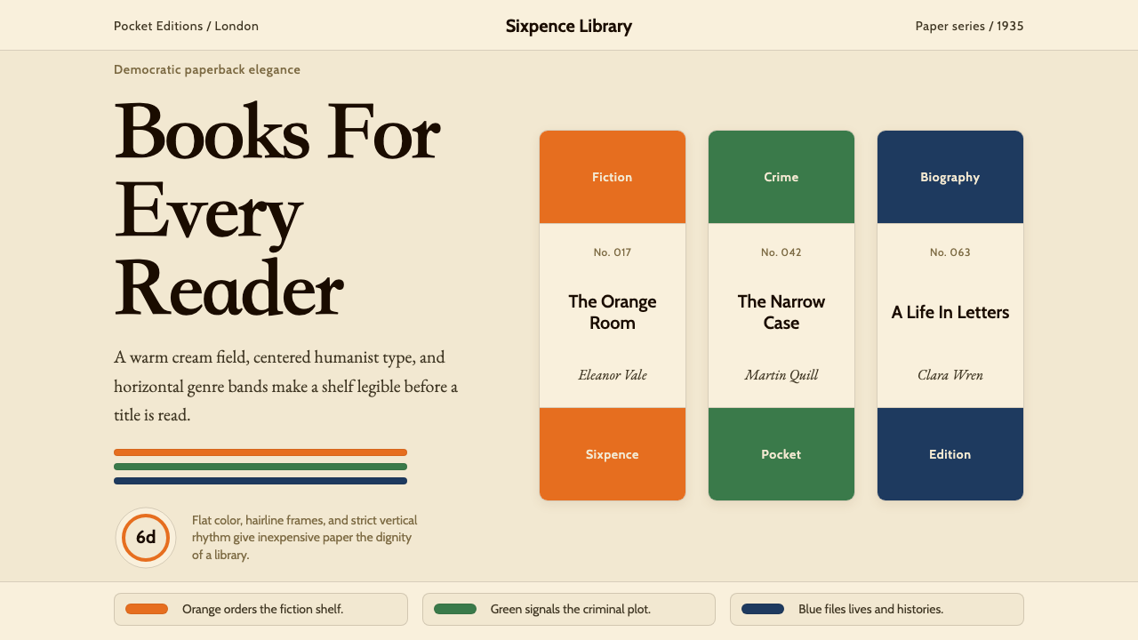 Penguin Books (1935)Paperback democracy. Cream stock, Cabin type, and orange-green-blue bands mak…平装书的民主美学:奶油纸、Cabin 字体与橙绿蓝横带让秩序成标识。
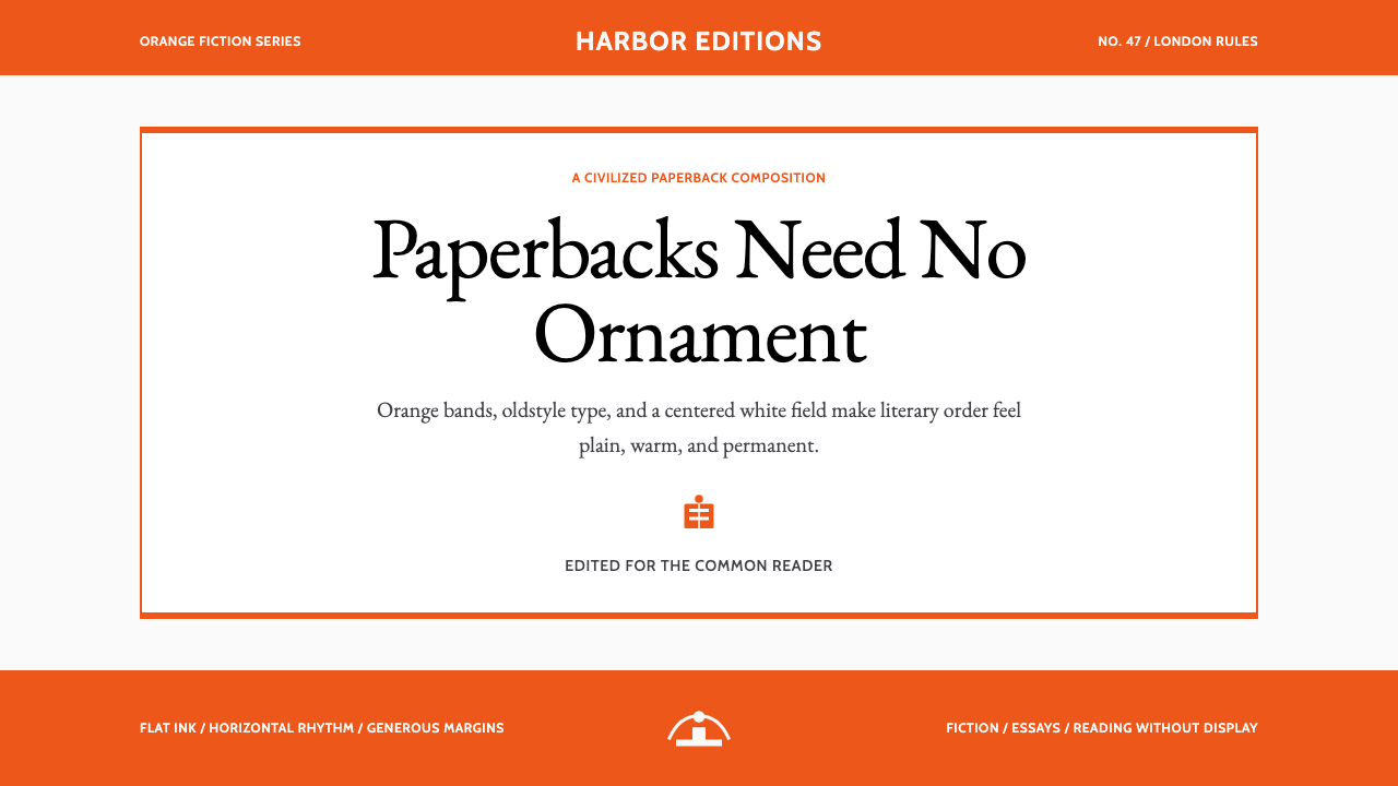 Penguin Classics OrangePaperback authority. Orange tri-bands, serif title panel, and flat ink enforc…平装书的权威感:橙色三段、衬线标题与平面油墨建立克制秩序。
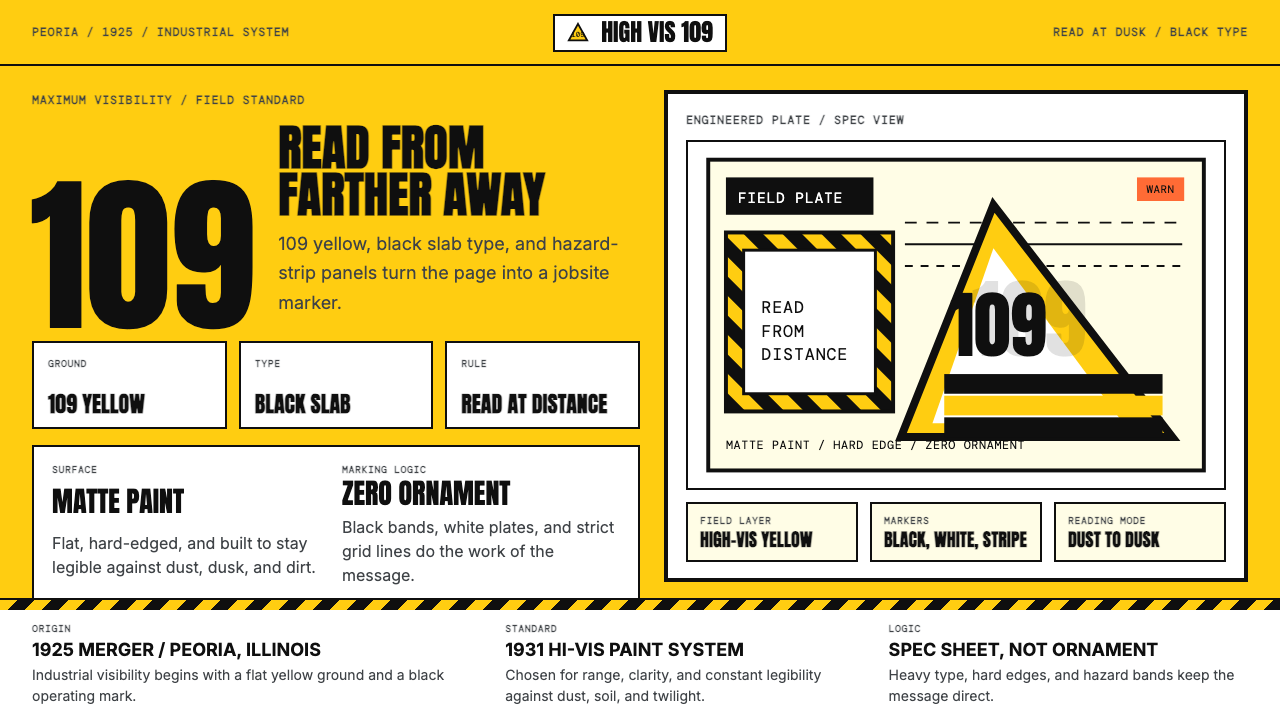 Caterpillar Construction Yellow (1925)Maximum visibility, zero softness. 109 yellow ground and black slab type.高可见度,零柔和。109 黄底配黑色粗体。
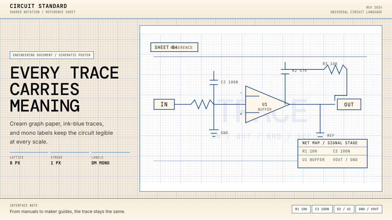 Electrical Schematic WiringAustere and exact. Cream graph paper, ink-blue traces, and mono labels make e…克制而精确。奶油方格纸与墨蓝细线,让每个标签都准确发声。
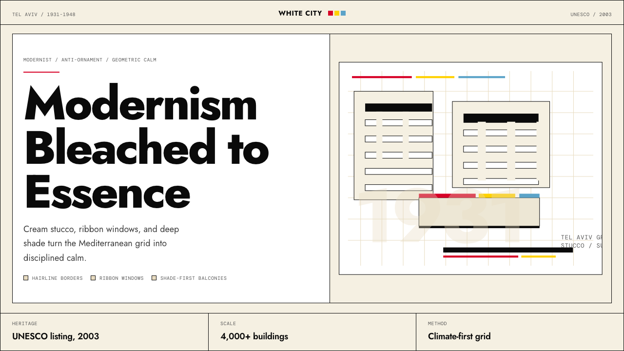 Israeli Bauhaus Tel Aviv (White City)Austere urban modernism. Stucco-white grid, Jost type, hairline borders, and…克制都市现代主义。灰泥白网格、Jost 字体、细黑线与三原色点睛。