What is Caterpillar Construction Yellow (1925)?什么是 Caterpillar Construction Yellow (1925)?
Born on the jobsite and built to be seen from a mile away, Caterpillar Construction Yellow turned the most saturated hue in heavy industry into a complete typographic system.诞生于工地、为一公里外的能见度而生,卡特彼勒建筑黄将重工业中饱和度最高的色彩锻造成了一套完整的排印体系。
Caterpillar Construction Yellow (1925) in briefCaterpillar Construction Yellow (1925) 速览
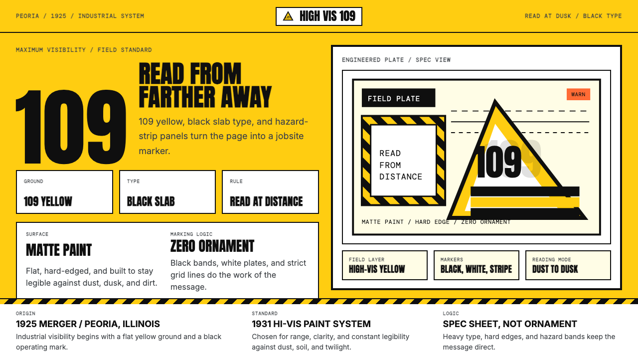
Caterpillar Construction Yellow is a design system rooted in the identity of one of the world's most recognizable industrial brands. Its foundation is a single, uncompromising saturated yellow — the same shade that coats every bulldozer, excavator, and motor grader bearing the CAT name — paired with the stark contrast of pure black type and the crisp relief of white specification panels. There is no softness, no gradation, and no decorative intent. The palette exists entirely to serve visibility and directness.卡特彼勒建筑黄是一套植根于全球最具辨识度工业品牌之一的设计体系。其基础是单一、毫不妥协的高饱和黄色——与每一台印有CAT标志的推土机、挖掘机和平地机上所用的色调相同——搭配纯黑色文字的强烈对比,以及白色规格面板的干净分隔。没有柔和,没有渐变,没有任何装饰意图。这套色板的存在完全服务于可见性与直接性。
What distinguishes this system from ordinary high-visibility color use is its elevation into a full graphic language. The yellow is not merely a brand color applied to a surface — it becomes the page itself, the ground on which all communication sits. Black slab-style letterforms deliver information with the authority of an engineering schematic. White panels cut through the yellow field to isolate data, specifications, or secondary content. Hazard stripe motifs, drawn from the physical safety markings on machinery, translate into compositional devices that signal urgency and structure simultaneously.将这套体系与普通高可见度色彩运用区别开来的,是其升华为完整图形语言的方式。黄色不仅仅是涂抹于表面的品牌色——它成为页面本身,成为所有传达内容赖以存在的底面。黑色粗板式字形以工程示意图的权威感传递信息。白色面板切入黄色底面,用于隔离数据、规格或次要内容。源自机械实体安全标识的危险条纹母题,被转化为同时传递紧迫感与结构感的构图装置。
The aesthetic sensibility is industrial without apology. It does not borrow the warmth of craftwork or the elegance of luxury. It draws its legitimacy from function: every bulldozer painted in this yellow is a safety decision made visible. Bringing that logic into print and screen design means treating visibility and legibility as the highest values — not as constraints, but as the entire brief.这套审美感性毫不掩饰其工业属性。它不借用手工艺的温度,也不追求奢侈品的优雅。它的合法性来自功能本身:每一台涂成这种黄色的推土机,都是一个以可见方式做出的安全决策。将这一逻辑引入平面与屏幕设计,意味着将可见性与易读性视为最高价值——不是作为约束条件,而是作为整个设计任务本身。
Where does Caterpillar Construction Yellow (1925) come from?Caterpillar Construction Yellow (1925) 从何而来?
The story of Caterpillar's yellow begins not with a brand manager but with a practical problem on a road construction site. In the late 1920s and early 1930s, as mechanized earthmoving equipment became heavier and more numerous on American infrastructure projects, the risk of collision between machines — and between machines and workers — grew severe. Equipment needed to be visible. The solution was color: a chrome-rich, cadmium-influenced saturated yellow that could be spotted against dirt, dust, gravel, and the flat gray light of overcast skies. Caterpillar formally adopted Hi-Way Yellow — a color that maps closely to Pantone 109 — in 1931 for exactly this reason.卡特彼勒黄色的故事,起点不是品牌经理的决策,而是道路施工现场的一个实际问题。1920至30年代初,随着机械化土方工程设备在美国基础设施项目中变得越来越重型且数量庞大,机器之间以及机器与工人之间的碰撞风险日益严峻。设备需要能够被看见。解决方案是色彩:一种富含铬黄成分、接近镉黄的高饱和黄色,能在尘土、砂砾和阴天的平淡灰色天光中被一眼捕捉。卡特彼勒于1931年正式采用“公路黄”——一种与Pantone 109高度对应的色调——正是出于这一原因。
The company itself had formed six years earlier, in 1925, from the merger of two California-based competitors: the Holt Manufacturing Company and the C. L. Best Tractor Co. Benjamin Holt had pioneered the tracked crawler tractor, famously testing it in the soft peat soils of the San Joaquin Valley where wheeled machines sank. C. L. Best had refined similar technology independently. Their merger in Peoria, Illinois, created what would become the dominant force in global construction and mining equipment. The 1925 founding date carried forward by this design system marks that origin — the moment the identity's industrial lineage begins.公司本身成立于五年前的1925年,由两家加州竞争对手合并而成:霍尔特制造公司与C·L·贝斯特拖拉机公司。本杰明·霍尔特是履带式拖拉机的先驱,曾在圣华金河谷松软的泥炭土地上测试样机——轮式机器在那里会深陷其中。C·L·贝斯特则独立完善了类似技术。两家公司在伊利诺伊州皮奥里亚合并,创造了后来主导全球建筑与采矿设备行业的巨头。这套设计体系所承载的1925年创始年份,正标志着那个起点——这一工业传承开始的时刻。
The visual identity evolved across decades. For much of the mid-twentieth century, the brand used varied wordmarks and logotype treatments alongside the yellow. The decisive modern form emerged in 1989, when the branding firm Lippincott redesigned the corporate identity around three elements: the saturated yellow, a bold condensed black wordmark, and the yellow triangle that forms the negative-space letter 'A' in the CAT logotype. This triangle — a piece of geometric precision that doubles as a hazard signal — gave the system its most memorable compositional device and cemented the relationship between the brand's color and its typographic DNA.视觉识别经过数十年演变。二十世纪中叶的大部分时间里,品牌在黄色之外使用了多种字标与标识处理方式。决定性的现代形态出现在1989年:品牌公司Lippincott围绕三个元素重新设计了企业视觉识别——高饱和黄色、粗壮紧缩的黑色字标,以及在CAT字标中形成负形字母「A」的黄色三角形。这个三角形——一个兼具危险信号感的精密几何形——赋予了整套体系最令人难忘的构图装置,也巩固了品牌色彩与其排印基因之间的内在联系。
The industrial context gave the color a semantic weight that few brand colors carry. Yellow had long been associated with caution and warning in the Western regulatory tradition — traffic signals, hazard tape, and safety vests all draw from the same chromatic convention. Caterpillar's yellow is not cautionary in the passive sense; it is assertive, occupying space aggressively and demanding acknowledgment. When translated into a design system for print and screen, that assertiveness becomes a structural principle: the yellow does not recede, it commands.工业语境赋予了这种色彩大多数品牌色所不具备的语义重量。在西方监管传统中,黄色长期与警示和注意相关联——交通信号灯、危险胶带和安全背心都源自同一套色彩惯例。卡特彼勒的黄不是被动意义上的警示色;它是主动进取的,大面积占据空间,强势要求被看见。将这种主动性转化为平面与屏幕设计系统时,它成为一种结构性原则:黄色不退让,它发号施令。
What defines the Caterpillar Construction Yellow (1925) look?Caterpillar Construction Yellow (1925) 的视觉特征是什么?
The Yellow Ground黄色底面
Unlike most design systems where color is applied to a neutral ground, Caterpillar Construction Yellow inverts the hierarchy: the saturated yellow is the ground, and everything else is placed upon it. This means the yellow is never a highlight or an accent — it is the totality of the visual field from which black type and white panels are carved. The saturation level is uncompromising; any movement toward a lighter or more muted yellow breaks the system's industrial authority.与大多数将色彩施加于中性底面的设计体系不同,卡特彼勒建筑黄颠覆了这一层级:高饱和黄色本身就是底面,其他一切都置于其上。这意味着黄色从不充当强调色或点缀色——它是整个视觉场域的全部,黑色文字与白色面板从中被凿刻而出。饱和度是毫不妥协的;任何向更浅或更哑光黄色的偏移,都会瓦解这套体系的工业权威感。
Black Type as Structure黑色文字即结构
The black used in this system is not merely typographic — it is structural. Letterforms are heavy and condensed, echoing the slab-serif tradition of industrial signage and machine nameplates. Headlines carry the weight of cast iron; they do not hint, they announce. Body text is set with tight spacing to maximize information density, in keeping with the spec-sheet logic that underpins the aesthetic. The contrast between the luminous yellow ground and the absolute black type is one of the most legible pairings achievable in print or on screen.这套体系中使用的黑色不仅仅是排印元素——它是结构本身。字形粗壮紧缩,呼应了工业标牌与机械铭牌的粗衬线传统。标题有铸铁般的分量;它们不是暗示,而是宣告。正文以紧凑的间距排列,最大化信息密度,契合支撑这套美学的规格说明书逻辑。发光黄色底面与纯粹黑色文字之间的对比,是平面或屏幕上可实现的最高易读性配对之一。
White as Relief白色作为间歇
White panels serve as controlled interruptions within the yellow field — zones of technical information, data tables, or secondary content that require a neutral reading environment. These panels are never decorative; they are functional enclosures. Their edges are crisp and deliberate. The white does not blend into the yellow or soften against it; it asserts its boundary with the same directness as a painted specification box on the side of a piece of equipment.白色面板作为黄色场域中受控的间歇而存在——技术信息、数据表格或次要内容的区域,这些内容需要中性阅读环境。这些面板从无装饰功能;它们是功能性的围合结构。其边缘清晰而刻意。白色不融入黄色也不柔和其边界;它以与机械侧面喷涂的规格框同等的直接性,声明自己的边界。
Hazard Stripe Logic危险条纹逻辑
Diagonal stripes alternating between deep black and the base yellow — drawn directly from the physical hazard markings painted on construction machinery and safety barriers — function as both a decorative and semantic device. As a border or divider, they signal transition, urgency, or restricted zones within a composition. They should be used sparingly and with intention: a hazard stripe deployed carelessly becomes visual noise, but one placed at a critical boundary reinforces the system's industrial authority.以深黑与底色黄交替出现的斜纹条——直接源自建筑机械和安全隔离设施上实际喷涂的危险标识——在构图中同时承担装饰与语义功能。作为边框或分隔线,它们传递过渡、紧迫或受限区域的信号。应谨慎而有意图地使用:随意部署的危险条纹会成为视觉噪音,而置于关键边界处的条纹则会强化整套体系的工业权威感。
Geometric Precision几何精确性
Every compositional element is governed by angles and right relationships rather than organic or intuitive placement. The triangle — codified in the CAT logotype — is the system's most distinctive geometric unit, appearing as a directional indicator, a structural anchor, or a negative-space cut. Rectangles are used to define information zones with the same discipline as a technical drawing. There are no rounded corners softening the system's authority, no curves introducing warmth. The geometry is declarative.每一个构图元素都受角度与直角关系支配,而非有机或直觉式的摆放。三角形——在CAT字标中被系统化——是整套体系最具特色的几何单元,作为方向指示符、结构锚点或负形切割出现。矩形以与技术图纸同等的严格性定义信息区域。没有圆角柔化体系的权威感,没有曲线引入温度。这种几何形是宣告式的。
Zero Atmospheric Softness零大气柔和度
Gradients, soft shadows, glows, blurs, and any visual technique that simulates natural light or atmospheric depth are entirely absent from this system. Where shadows appear at all, they are hard-edged and offset — geometric decisions, not lighting simulations. This is not minimalism in the contemporary wellness-influenced sense; it is the visual logic of a machine manual, where ambiguity costs lives and clarity is non-negotiable.渐变、柔和阴影、光晕、模糊,以及任何模拟自然光照或大气深度的视觉技法,在这套体系中完全缺席。若出现阴影,也必定是硬边偏移的——是几何决定,而非光照模拟。这不是当代健康美学意义上的极简主义;这是机械操作手册的视觉逻辑,在那里,歧义可能致命,清晰是不可谈判的前提。
Information Density信息密度
The system is engineered for high-density information delivery. Unlike lifestyle or luxury design systems that use generous whitespace as a signifier of quality, Caterpillar Construction Yellow treats space as a resource to be used, not wasted. Type is set tightly, white panels are packed with structured data, and every zone of the composition is expected to carry communicative load. The model is the equipment specification sheet: every square centimeter earns its place.这套体系是为高密度信息传递而设计的。与以大量留白作为品质信号的生活方式或奢侈品设计体系不同,卡特彼勒建筑黄将空间视为需要被使用而非被浪费的资源。文字排布紧凑,白色面板满载结构化数据,构图的每个区域都被期望承载传达负荷。参照模型是设备规格说明书:每一平方厘米都必须证明自己的价值。

Who shaped Caterpillar Construction Yellow (1925)?谁塑造了 Caterpillar Construction Yellow (1925)?
Benjamin Holt was the engineering entrepreneur whose tracked crawler tractor — tested in the San Joaquin Valley in 1904 — solved the fundamental problem of moving heavy loads across soft ground. His company, Holt Manufacturing, became half of the 1925 merger that created Caterpillar. Holt's core insight — that a machine's contact with the ground determined its usefulness — is the same principle that drives the brand's visual identity: contact with the viewer's eye, through maximum visibility, determines whether the machine is safe.本杰明·霍尔特是工程实业家,其履带式拖拉机——1904年在圣华金河谷试验——解决了在松软地面上移动重载的根本性问题。他的公司霍尔特制造成为1925年合并、创建卡特彼勒的两家企业之一。霍尔特的核心洞见——机器与地面的接触决定其实用性——与驱动品牌视觉识别的原则如出一辙:通过最大可见性与观察者视线的接触,决定机器是否安全。
Clarence Leo Best developed his own line of crawler tractors independently of Holt, driven by the same California agricultural and construction market demands. The competitive intensity between Best and Holt — two companies solving the same problem in parallel — ultimately produced better machines than either might have built alone. Their 1925 merger created not just a larger company but a consolidated industrial identity that needed a visual language equal to its market authority. Best's pragmatic engineering culture became part of the combined company's DNA.克拉伦斯·利奥·贝斯特独立于霍尔特开发了自己的履带式拖拉机产品线,受同一加州农业与建筑市场需求驱动。贝斯特与霍尔特之间的竞争强度——两家公司平行解决同一问题——最终催生了比任何一家单独完成都更出色的机器。1925年的合并不仅创造了一家更大的公司,也整合出一个需要与其市场权威相匹配的视觉语言的工业身份。贝斯特务实的工程文化成为合并后公司基因的一部分。
The New York brand consultancy Lippincott conducted the 1989 redesign that gave Caterpillar its current visual identity. Their key decisions — consolidating the wordmark to the bold condensed CAT abbreviation, formalizing the yellow triangle as the negative-space 'A,' and standardizing the Hi-Way Yellow across all applications — transformed a regional equipment manufacturer's accumulated visual habits into a coherent global system. The triangle in particular shows sophisticated typographic thinking: a single geometric form that simultaneously acts as a letter, a hazard indicator, and a brand symbol.纽约品牌咨询公司Lippincott主导了1989年的重新设计,赋予卡特彼勒其当前视觉识别。他们的关键决策——将字标整合为粗壮紧缩的CAT缩写、将黄色三角形正式确立为负形字母「A」、并在所有应用场景中标准化公路黄——将一家地区性设备制造商积累的视觉习惯转化为连贯的全球体系。三角形尤其体现了精深的排印思考:单一几何形同时充当字母、危险指示符与品牌符号。
Caterpillar's color system belongs to a broader American tradition of functional industrial identity that runs parallel to — and largely independent of — European modernism. Where Bauhaus sought to elevate everyday objects through art-school formal principles, American heavy-equipment design arrived at similar clarity through purely functional pressure: machines needed to be identifiable, safe, and authoritative. This tradition produced color codes and graphic conventions for railroads, mining equipment, and construction machinery that prioritized legibility and durability above aesthetic theory.卡特彼勒的色彩体系属于更广泛的美国功能性工业识别传统,这一传统与欧洲现代主义平行发展,且在很大程度上独立于后者。包豪斯试图通过艺术学院的形式原则提升日常物件,而美国重型设备设计则通过纯粹的功能压力抵达了相似的清晰性:机器需要可被识别、安全、且具权威性。这一传统为铁路、矿山设备和建筑机械产生了以易读性和耐久性而非美学理论为优先的色彩规范与图形惯例。
How do you use Caterpillar Construction Yellow (1925) today?今天怎么用 Caterpillar Construction Yellow (1925)?
Caterpillar Construction Yellow is one of the most transfer-ready industrial aesthetics for contemporary design work, precisely because its rules are derived from functional imperatives rather than stylistic preference. Applying it correctly requires internalizing the system's core premise: visibility and directness are not features — they are the only values the design serves. Every decision about color, type, spacing, and composition should be evaluated against that standard.卡特彼勒建筑黄是当代设计实践中可移植性最强的工业美学之一,恰恰因为它的规则源自功能必要性,而非风格偏好。正确应用它,需要内化这套体系的核心前提:可见性与直接性不是功能特性——它们是设计服务的唯一价值。关于色彩、文字、间距与构图的每一个决策,都应以此标准衡量。
For presentation slides, the system's logic divides naturally across cover and content pages. A cover built in this style uses the saturated yellow as a full-bleed background, with the presentation title set in heavy condensed type at large scale. A diagonal hazard stripe, positioned as a banner or corner accent, signals urgency and establishes the visual register. Content slides treat the white panel as the primary information zone: specifications, bullet points, and data tables sit in white fields against the yellow surround, bordered crisply. Data visualizations — bar charts, progress indicators, comparison tables — inherit the system's color hierarchy: primary information in black, comparative or secondary data in white-on-yellow, alerts or threshold violations in the yellow itself against a white ground.对于演示文稿,这套体系的逻辑在封面页与内容页之间自然分配。以这种风格制作的封面使用高饱和黄色作为满版背景,演示标题以大号粗壮紧缩字体排设。斜向危险条纹作为横幅或角落点缀,传递紧迫感并确立视觉基调。内容页将白色面板视为主要信息区域:规格说明、要点列表和数据表格置于黄色围合中的白色区域内,边缘清晰利落。数据可视化——柱状图、进度指示器、对比表格——继承体系的色彩层级:主要信息用黑色,对比或次要数据用白底黄字,警示或阈值超标则用白底黄色本身呈现。
For web interfaces, this system is particularly well-matched to dashboards, industrial SaaS platforms, pricing pages, and any context where authority and scannability are primary objectives. The approach calls for a strict grid with generously sized type, a background that defaults to deep black or white rather than yellow — reserving the saturated yellow for interactive states, primary actions, status indicators, and tier-differentiating highlights. Navigation bars can carry the full yellow ground with black wordmarks. Cards and data panels use hard-edged borders rather than soft shadows. Hover states and selected states flip from black-on-white to black-on-yellow, reinforcing the system's central contrast logic without introducing additional colors.对于网页界面,这套体系尤其适合仪表板、工业SaaS平台、定价页面,以及任何以权威性与可扫描性为主要目标的场景。方法如下:采用严格网格与充裕的字号,背景默认为深黑或白色而非黄色——将高饱和黄保留给交互状态、主要操作、状态指示符和等级区分高亮。导航栏可承载完整黄色底面搭配黑色文字标识。卡片与数据面板使用硬边边框而非柔和阴影。悬停与选中状态从白底黑字翻转为黄底黑字,在不引入额外色彩的情况下强化体系的核心对比逻辑。
For editorial and marketing applications, the style operates in two registers: the bold poster mode and the technical specification mode. In poster mode, a full-field yellow spread carries a single large headline — stark, declarative, leaving no ambiguity about the message. In specification mode, white panels on a yellow carrier organize dense comparative information, product features, or technical data with the discipline of a product datasheet. Marketing pages benefit from alternating between yellow-ground and white-ground sections: a yellow hero with black type, followed by a white content section with black type and yellow call-to-action buttons, creates rhythm without introducing additional hues. The hazard stripe motif works well as a section divider or page-edge accent, marking transitions with controlled drama.对于编辑与营销应用,这种风格在两种模式下运作:大胆的海报模式与技术规格模式。海报模式下,满版黄色展开页面承载单一大号标题——简洁、宣告式,对信息毫无歧义。规格模式下,黄色底面上的白色面板以产品数据表的严格性组织密集的对比信息、产品特性或技术数据。营销页面在黄色底面与白色底面区块之间交替排布效果良好:黄底黑字的主视觉区,接以白底黑字并配有黄色行动号召按钮的内容区,在不引入额外色相的情况下制造节奏韵律。危险条纹母题作为区块分隔线或页面边缘点缀表现出色,以可控的戏剧感标记过渡。
A common mistake when working with this system is mistaking the yellow for a secondary color. Designers familiar with traditional brand systems often instinctively treat yellow as an accent applied to a white or neutral ground, reserving it for highlights and calls to action only. In Caterpillar Construction Yellow, this inverts the system's logic entirely — the yellow is primary and environmental, the white is the accent. The second frequent error is softening the type: introducing lighter weights, looser spacing, or rounded typefaces to make the system feel more approachable. This works directly against the system's authority. The heaviness and tightness of the typography is not aggressive — it is structural. Lightening it produces neither warmth nor elegance, only ambiguity.使用这套体系时最常见的错误,是将黄色误认为次要色。熟悉传统品牌体系的设计师往往本能地将黄色视为施加于白色或中性底面上的强调色,仅保留其用于高亮和行动号召。在卡特彼勒建筑黄中,这完全颠倒了体系的逻辑——黄色是主色和环境色,白色才是强调色。第二个常见错误是柔化文字:引入更轻的字重、更松散的间距或圆润的字形,试图让体系看起来更平易近人。这与体系的权威性背道而驰。排印的厚重与紧凑不是攻击性——而是结构性。将其轻化既不产生温度也不带来优雅,只会制造歧义。
Caterpillar Construction Yellow (1925) — FAQCaterpillar Construction Yellow (1925) · 常见问题
Can this system work on a dark or black background?这套体系能在深色或黑色背景上使用吗?
Yes, and it works powerfully — but the logic must be inverted deliberately. In the canonical form, yellow is the ground and black is the type. On a black ground, yellow becomes the type, headline element, or primary accent. This inversion is authentic to the system's industrial roots: think of equipment warning labels, which flip between yellow-on-black and black-on-yellow depending on the surface they are applied to. The key constraint is that white should then serve as a tertiary structural element rather than a prominent panel, since three high-contrast values on a dark ground can quickly become visually aggressive. Commit to yellow as the singular luminous accent and use white sparingly for supporting data.可以,且效果强烈——但逻辑必须被刻意倒置。在经典形态中,黄色是底面,黑色是文字。在黑色底面上,黄色成为文字、标题元素或主要强调色。这种倒置对体系的工业根源是忠实的:想想设备警告标签,它们根据所贴表面在黄底黑字与黑底黄字之间切换。关键约束是:白色此时应作为第三层级的结构性元素,而非突出的面板,因为深色底面上三种高对比度值很快会变得视觉上过于激进。将黄色确立为唯一发光的强调色,白色仅用于支撑性数据。
How does Caterpillar Construction Yellow differ from generic safety yellow?卡特彼勒建筑黄与普通的安全黄有何不同?
The color is related but the system is entirely different. Generic safety yellow — as used on traffic signs, hi-vis vests, and caution tape — is a signaling device within a larger visual environment, designed to interrupt and attract attention. Caterpillar Construction Yellow treats the saturated yellow not as an interruption but as the entire environment itself. The difference in application is the difference between a single warning sign on a wall and walking into a room where every surface is that yellow. The system uses the color's maximum density as a ground, which paradoxically produces not chaos but authority — because everything placed on it is subordinated to a clear visual hierarchy.色彩相关,但体系完全不同。普通安全黄——如交通标志、高可见度背心和警示胶带上使用的——是更大视觉环境中的信号装置,旨在打断并吸引注意。卡特彼勒建筑黄将高饱和黄不视为打断,而视为整个环境本身。应用上的差异,相当于墙上的单个警告标志与走进一个所有表面都是那种黄色的房间之间的差异。这套体系将色彩的最大密度用作底面,这反而不会产生混乱,而是产生权威——因为置于其上的一切都服从于清晰的视觉层级。
Is this system suitable for consumer-facing products?这套体系适合面向消费者的产品吗?
It suits a narrow but defined consumer category: products where authority, toughness, and unambiguous functionality are brand values the consumer is actively seeking. Workwear brands, power tool lines, outdoor gear marketed to tradespeople, and automotive accessories all fall within this territory. Where it struggles is in contexts requiring warmth, approachability, or sensory pleasure — food, wellness, children's products, or any experience where the user expects softness as a signal of care. The system reads as demanding and assertive; whether that is an asset or a liability depends entirely on whether the product's promise aligns with those qualities.它适合一个范围窄但明确的消费者品类:权威性、坚韧性与毫不含糊的功能性是消费者主动寻求的品牌价值的产品。工装品牌、电动工具产品线、面向技工的户外装备和汽车配件都在这一范畴之内。它力不从心的地方是需要温暖感、平易近人或感官愉悦的场景——食品、健康、儿童产品,或任何用户期待以柔和感作为关怀信号的体验。这套体系读来要求严苛、主动进取;这是优势还是劣势,完全取决于产品的承诺是否与这些品质对齐。
How should typography be chosen to stay true to this system?如何选择字体才能忠实于这套体系?
The typographic register should echo the visual weight of the industrial equipment this color belongs to: heavy, condensed, and purposeful. Extended or light-weight type families undermine the system immediately. The ideal approach is a single typeface family with a broad weight range, used at strongly contrasting scales — a bold or black condensed weight for headlines and labels, a medium or regular weight for body text and data, with size doing the heavy lifting of hierarchy. Geometric or grotesque sans-serifs align best with the system's industrial precision; slab-serifs are also appropriate given their historical association with engineering signage. Scripts, display faces with personality, and humanist sans-serifs all conflict with the system's declarative authority.排印基调应呼应这种色彩所属的工业设备的视觉重量:厚重、紧缩、目的明确。扩展型或细字重字体家族会立即削弱整套体系。理想方案是单一字体家族配合宽泛的字重范围,以强烈对比的尺度使用——标题与标签用粗壮或超黑紧缩字重,正文与数据用中等或常规字重,以尺度承担层级分化的主要工作。几何或格罗泰斯克无衬线字体与体系的工业精确性最为契合;粗衬线字体因其与工程标牌的历史关联也同样适用。手写体、带有个性的展示字体,以及人文主义无衬线字体,都与体系的宣告式权威相冲突。
Can this system be combined with other design styles?这套体系能与其他设计风格结合使用吗?
Hybridization is possible but demands care about which systems share enough structural logic to coexist. Caterpillar Construction Yellow is most compatible with other functionally-derived industrial aesthetics: Swiss International Style's mathematical grid discipline reinforces rather than conflicts with the system's structural logic, and the hard-edge geometric tradition of American industrial graphic design shares its directness. It is largely incompatible with decorative historical styles — Art Nouveau, Art Deco, Victorian ornament — where the yellow would read as aggressive rather than authoritative. Contemporary minimalism is a partial match: if the minimalist system is genuinely structural rather than simply sparse, the two can share compositional logic. The key test is whether the partner system treats negative space as earned discipline or as decoration in its own right.混合使用是可行的,但需要审慎判断哪些体系共享足够的结构逻辑以共存。卡特彼勒建筑黄与其他功能性衍生工业美学最具兼容性:瑞士国际主义风格的数学网格严格性与这套体系的结构逻辑相互强化而非冲突,美国工业平面设计的硬边几何传统与其直接性一脉相承。它与装饰性历史风格基本不兼容——新艺术运动、装饰艺术、维多利亚时代装饰——在那些语境中,黄色会被读为攻击性而非权威性。当代极简主义是部分匹配:如果极简体系真正是结构性的而非仅仅是稀疏的,两者可以共享构图逻辑。关键检验是:伙伴体系是否将负空间视为经过努力赢得的自律,还是将其本身作为一种装饰。
Related design styles相关设计风格
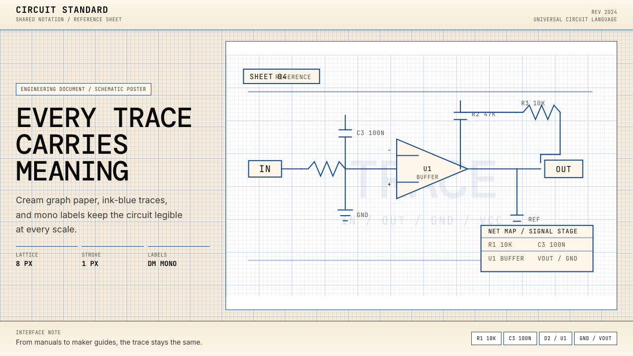 Electrical Schematic WiringAustere and exact. Cream graph paper, ink-blue traces, and mono labels make e…克制而精确。奶油方格纸与墨蓝细线,让每个标签都准确发声。
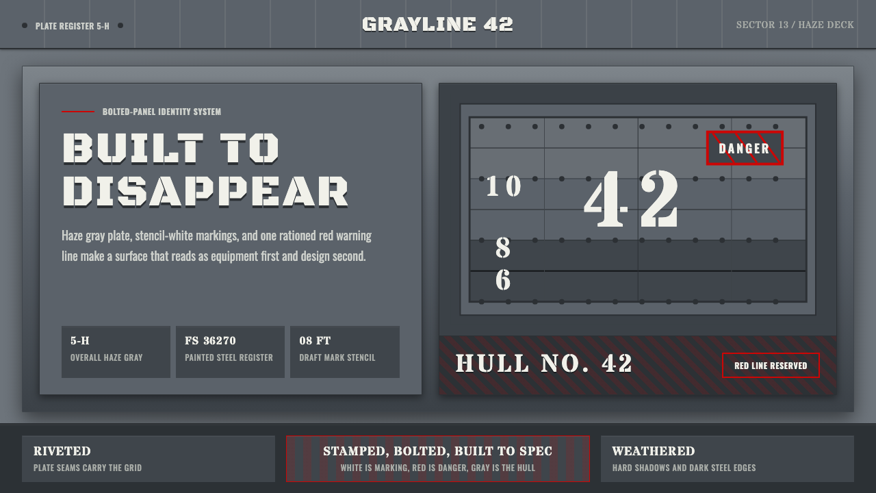 Battleship Naval GrayBuilt to spec. Haze gray steel, rivet grids, stencil white, and one danger-re…严格按规格制造:雾灰钢板、铆钉网格、喷印白字与一道危险红线。
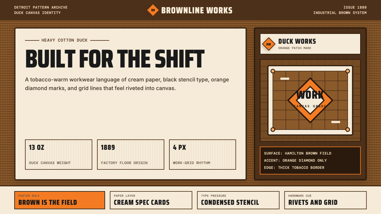 Carhartt Work Jacket Brown (1889)Built like work. Hamilton brown, orange diamond, and condensed type carry can…像工装一样坚固:汉密尔顿棕、橙色菱形与压缩字体撑起帆布重量。
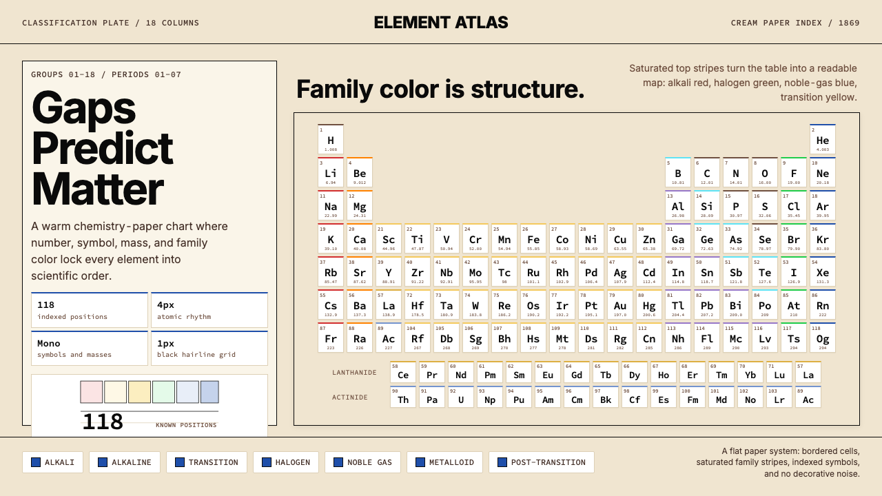 Mendeleev Periodic TableScientific order, saturated. Cream grid, mono symbols, and family color bands.科学秩序饱和呈现:米黄网格、等宽符号与族系色带。
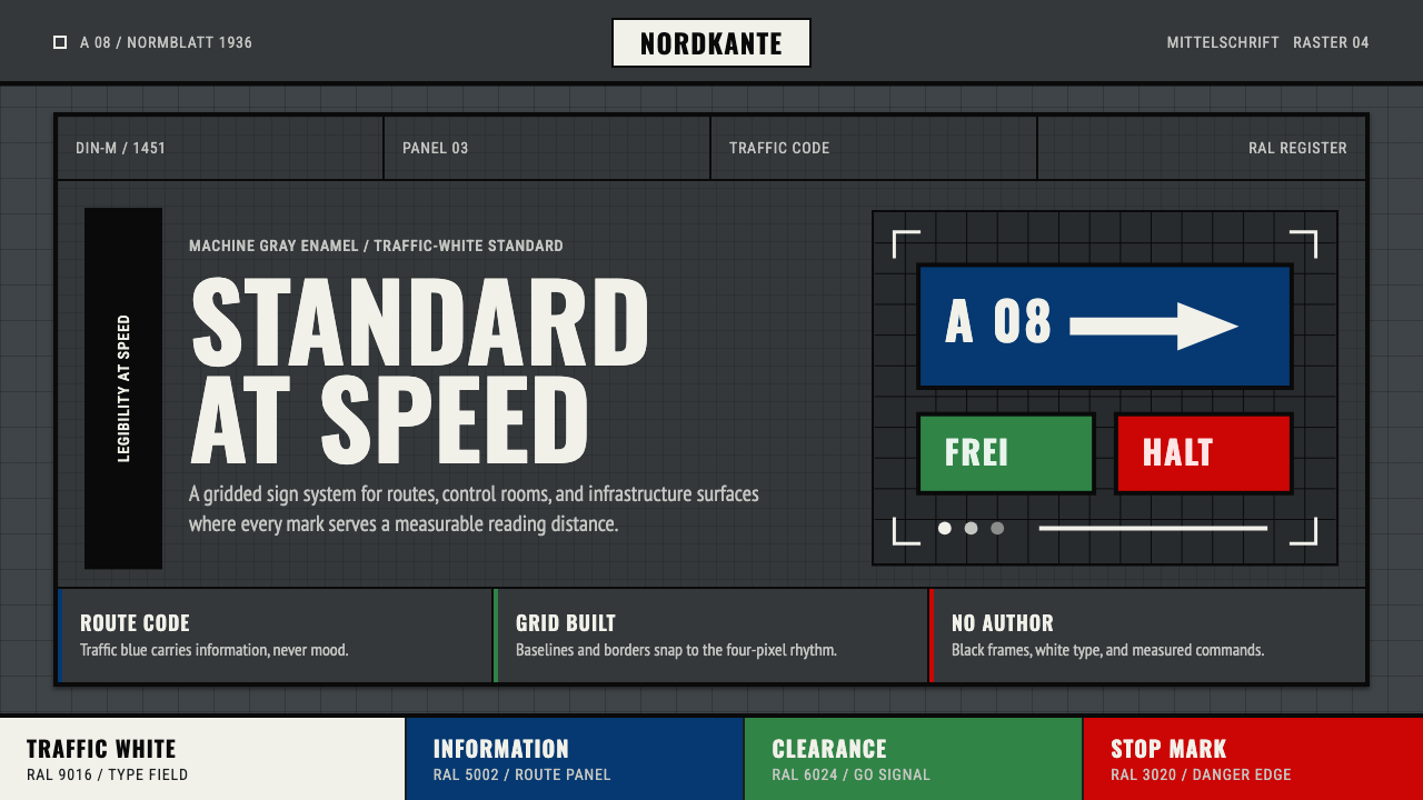 DIN 1451 SignageAuthorless and exact. Enamel gray grid, traffic-white DIN type, and RAL signa…无作者的精确感:珐琅灰网格、交通白字与RAL色条。
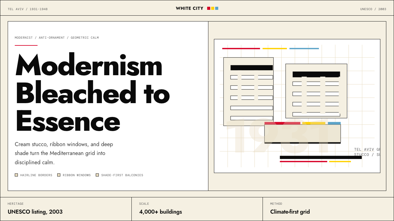 Israeli Bauhaus Tel Aviv (White City)Austere urban modernism. Stucco-white grid, Jost type, hairline borders, and…克制都市现代主义。灰泥白网格、Jost 字体、细黑线与三原色点睛。