What is Battleship Naval Gray?
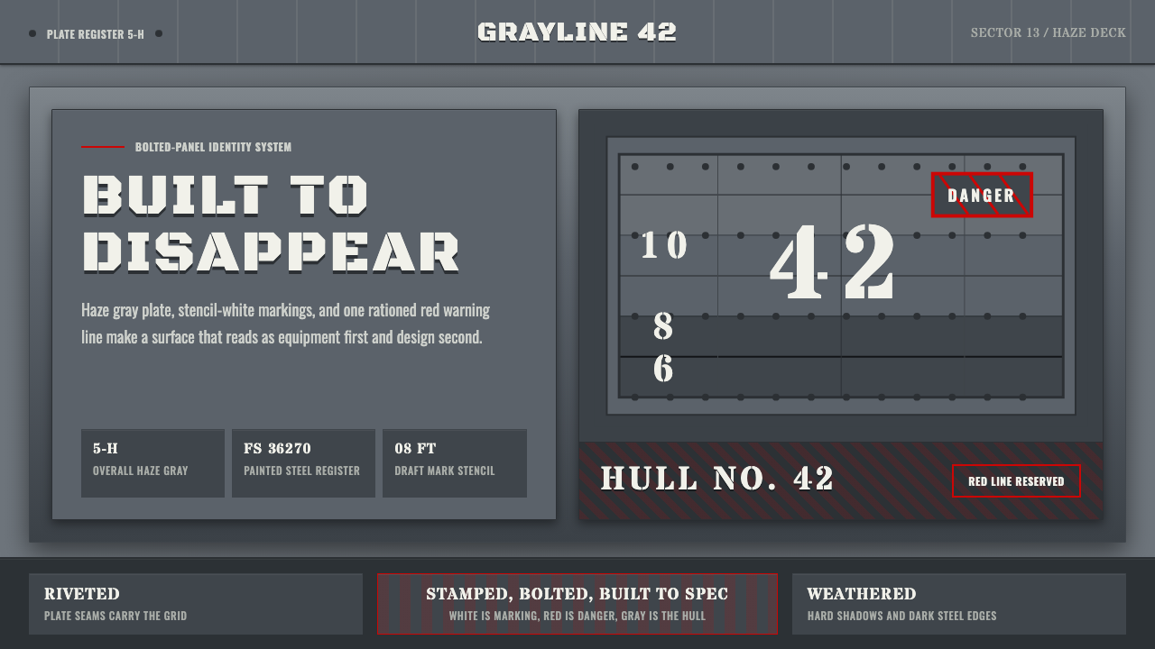
Battleship Naval Gray treats a 1942 warship's riveted steel hull as a design surface — graded grays, stenciled white lettering, and a single danger-red rule, built to spec and built to survive.
Battleship Naval Gray in brief
Battleship Naval Gray is a design system drawn from the exterior of a mid-twentieth-century warship: the graded gray steel plating, stenciled identification lettering, and rare functional red markings that covered a US Navy vessel during the Second World War. It is an aesthetic with no decorative intent whatsoever in its source material — every mark on a real battleship hull existed to serve visibility at sea, camouflage against enemy detection, or safety signaling, and the design system inherits that discipline rather than a decorative motif.
Visually, the system is built almost entirely from value, not hue. The dominant colors are neutral grays ranging from a lighter haze tone toward darker, near-black plating below the waterline, arranged so that a ship's silhouette would blur into the horizon and sky under varying light conditions rather than stand out. White appears only as high-contrast stenciled information — draft marks, hull numbers, unit lettering — never as a background or decorative field. Red is rarer still, reserved almost exclusively for hazard boundaries and warning markings.
The overall effect is industrial and severe: flat painted steel plates divided by visible rivet lines and welded seams, letterforms that look stamped or stenciled rather than typeset, and a complete absence of ornament. Nothing in the system exists to be beautiful. It exists to be legible, durable, and inconspicuous, and its visual authority comes precisely from that restraint.
Where does Battleship Naval Gray come from?
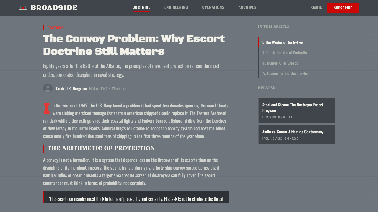
The color scheme this system draws from is rooted in naval camouflage doctrine developed by the United States Navy's Bureau of Ships in the years leading up to and during the Second World War. Warship camouflage in this era fell broadly into two strategies: 'low visibility' schemes, which used graded grays to make a ship blend into sea and sky at typical viewing distances, and 'dazzle' schemes, which used bold contrasting patterns to confuse an observer's estimate of a ship's speed, heading, and range rather than hide it outright. The system this article describes draws from the low-visibility family — a disciplined, graded gray palette rather than a disruptive pattern.
By 1942, the standardized 'Haze Gray' family of paints, along with related graded 'Measure' camouflage schemes, had become common across the US Atlantic and Pacific fleets. The logic was straightforward: lighter grays on upper surfaces and superstructure helped a ship blend into a pale sky at long range, while darker grays toward the waterline and hull bottom reduced visibility against dark water and matched the natural shadowing a ship's own hull cast on itself. This was applied science as much as visual design — informed by observation of how ship silhouettes actually appeared to lookouts and periscope operators at sea under real Pacific and Atlantic lighting conditions.
Against this muted gray field, the only high-contrast markings permitted were functional. Draft marks — numerals painted near the bow and stern indicating how deep the hull sat in the water — were stenciled in white for crews to read during loading and docking. Hull identification numbers, unit badges, and other administrative lettering followed the same stenciled, unadorned convention: legible, standardized, and utilitarian. Red, where it appeared at all, marked genuine hazards — waterline danger zones, restricted areas, warning boundaries near machinery or ordnance — never as an accent color chosen for visual interest.
This visual language did not exist in isolation from the ship's engineering. Warships of this era were built from riveted and welded steel plate, and the physical texture of that construction — visible seams, rows of rivet heads, plate joints — was inseparable from how the paint scheme read up close. A hull was never a smooth, continuous surface the way a modern minimalist product might present color; it was a grid of discrete plates, each weathered and worn slightly differently, giving the graded gray field its characteristic industrial texture rather than a flat, uniform tone.
What defines the Battleship Naval Gray look?
Graded Gray Palette
The core of the system is not one gray but a graded family — a lighter, cooler tone toward the upper hull and superstructure, deepening toward a near-black tone at the waterline and below. The gradient is not smooth or airbrushed; it moves in discrete bands that correspond to structural zones of the ship rather than a continuous blend, which is what separates it from a generic monochrome scheme.
Stenciled White Lettering
All identifying text — draft numerals, hull numbers, unit designations — is rendered in a stenciled, block-letterform style with slightly irregular edges consistent with paint applied through a physical template rather than printed. Letterforms are wide, geometric, and unadorned, prioritizing raw legibility over any typographic refinement.
Sparse Danger Red
Red is the rarest color in the system and is used exclusively to mark genuine hazard boundaries — never as a decorative accent, call-to-action color, or brand highlight. Its scarcity is what gives it force: because the eye almost never encounters red elsewhere in the field, any red mark reads immediately as a warning worth stopping for.
Visible Rivet and Plate Structure
The surface is never treated as a single continuous plane. Rivet rows, welded seams, and plate boundaries are visible throughout, breaking large color fields into a grid of discrete panels. This gives even a flat gray surface a sense of physical construction and weight, distinguishing it from a smooth digital or minimalist gray field.
Weathering
Surfaces show uneven wear — streaking, salt staining, and subtle tonal variation from panel to panel — consistent with a working vessel exposed to sea air rather than a freshly painted showroom object. This weathering is deliberate rather than accidental grime; it signals durability and lived use as a positive value rather than a flaw to be hidden.
Zero Ornament, All Function
Every mark on the surface — color boundary, letter, line — exists because it serves a navigational, administrative, or safety purpose. There is no equivalent of a logo placed for branding's sake or a color chosen for mood; the system's entire visual vocabulary can be traced back to a functional requirement, which is the discipline that gives it authority.
Restrained Contrast
Contrast in this system is used sparingly and always with intent: gray-on-gray for the majority of the surface, punctuated only by the white of stenciled lettering and the rare red hazard mark. This restraint is the opposite of a maximalist decal-covered surface; every high-contrast element is a deliberate exception, not a recurring pattern.

Who shaped Battleship Naval Gray?
The Bureau of Ships was the US Navy administrative body responsible for developing and standardizing warship camouflage doctrine during the Second World War, including the graded low-visibility gray schemes this system draws from. Its work formalized what had previously been ad hoc ship painting into a systematic, tested set of measures applied fleet-wide.
Working alongside naval architects and artists, wartime researchers studied how ship silhouettes actually appeared to lookouts and periscope operators under varying light and sea conditions, treating camouflage as an empirical, testable problem rather than a purely artistic one. Their graded-gray findings underpin the low-visibility scheme this system reflects.
The crews responsible for applying camouflage schemes and stenciled lettering to warships worked from standardized templates and paint specifications rather than freehand artistic choice, which is precisely why the lettering and markings this system draws from carry a uniform, reproducible, unadorned character across different ships and even different fleets.
How do you use Battleship Naval Gray today?
Battleship Naval Gray suits any project that wants to project engineered authority, durability, and restraint rather than warmth or playfulness. It works because every visual decision in the source material was justified by function, and that discipline transfers cleanly to contexts where a product wants to feel serious, precise, and built to last rather than decorative.
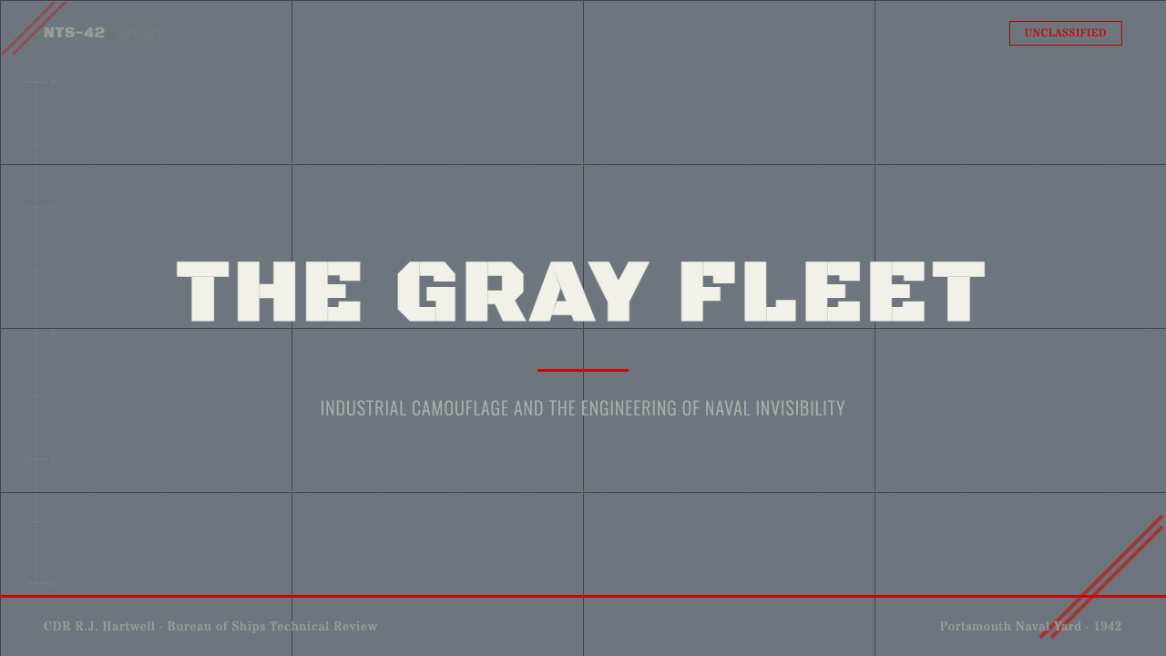
On presentation slides, the system produces strong cover pages built around a single graded-gray field with one stenciled-style title treatment and, if needed, a single sparing use of red for a critical callout — never more than one red element per slide. Content slides should favor a clean grid with visible dividing rules standing in for the plate-seam structure, keeping body text in a plain, unadorned block letterform. Data slides benefit from treating a single critical figure the way a hazard mark is treated — the one red or high-contrast element on an otherwise gray page.
For web interfaces, this palette and discipline fit dashboards and enterprise or infrastructure products where trust, reliability, and precision are the desired brand values — monitoring tools, security products, logistics and fleet software, or anything positioning itself as mission-critical rather than consumer-playful. Interface chrome should stay in the graded gray range with white reserved for data and labels, and red reserved exclusively for genuine alerts or errors so its meaning stays sharp. Pricing pages can use the stencil-lettering discipline for plan names, keeping ornamentation at zero.
In editorial and marketing work, the style supports content about engineering, military history, infrastructure, heavy industry, or any brand wanting a serious, unglamorous authority. A feature layout can use the graded-gray-to-dark structure as a background field with stenciled-style headline treatment, reserving any red accent for a single critical pull-quote or callout rather than scattering it throughout.
The most common mistake is treating this as simply 'gray minimalism' and losing the plate structure and weathering that make it read as a built object rather than a flat neutral background. Without visible seams, stenciled (not typeset) lettering, and a genuinely restrained use of red, the system collapses into generic corporate gray rather than the disciplined, functional aesthetic of a warship hull.
Battleship Naval Gray — FAQ
Why is the gray graded rather than a single flat tone?
The gradient reflects real naval camouflage doctrine: lighter tones toward the upper hull helped a ship blend into a pale sky at long range, while darker tones near the waterline and below reduced visibility against dark water and matched the ship's own natural shadow. It was an empirically tested visibility solution, not a stylistic gradient, which is why it moves in discrete structural bands rather than a smooth blend.
Why does red appear so rarely in this system?
On the original warship, red was reserved for genuine hazard markings — danger zones, restricted areas, warning boundaries — never used decoratively. The design system preserves that scarcity deliberately: because red almost never appears elsewhere in the palette, any red mark retains its original force as a signal worth stopping for rather than becoming just another accent color.
Does this style require actual rivets and seams to look authentic?
Some visible plate-boundary structure is essential — without it, the system reads as generic gray rather than a built steel surface. It does not need to be literal photorealistic rivets; a disciplined grid of dividing lines that breaks large color fields into discrete panels, echoing how a hull is actually plated, is enough to carry the reference.
How does the stenciled lettering differ from a normal typeface?
Stenciled lettering was applied through a physical template rather than set with type, which gives it wide, blocky, geometric forms with slightly irregular edges and no refined kerning or optical adjustment. Choosing a raw, unadorned block letterform over a polished typeface is what keeps the reference to functional military marking rather than modern branding.
Can this system work for a consumer-facing, friendly brand?
It works against that goal more often than for it. The system's entire visual vocabulary is built on restraint, severity, and function over warmth, so it tends to read as cold, industrial, or intimidating in a context that wants approachability. It is far better suited to products built around trust through precision — infrastructure, security, logistics, or engineering-adjacent brands — than to anything wanting to feel warm or playful.
Related design styles
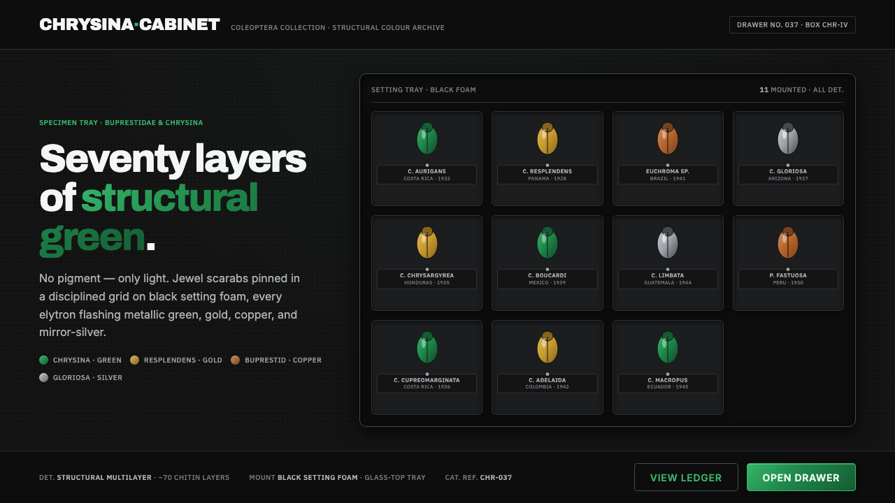 Iridescent Scarab DrawerOrder makes the shimmer read. Jewel scarabs pinned in a grid on black foam, m…
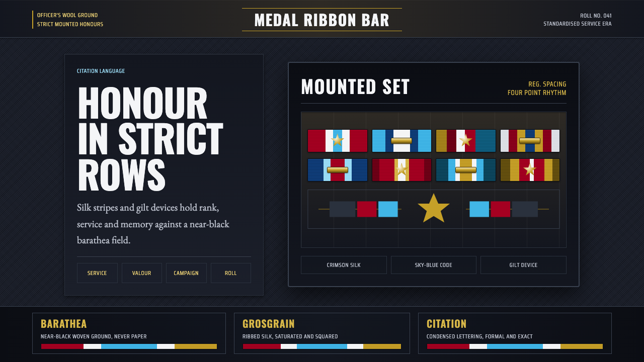 Medal Ribbon BarDiscipline worn as color. Crimson, sky-blue and gilt bars lock onto black woo…
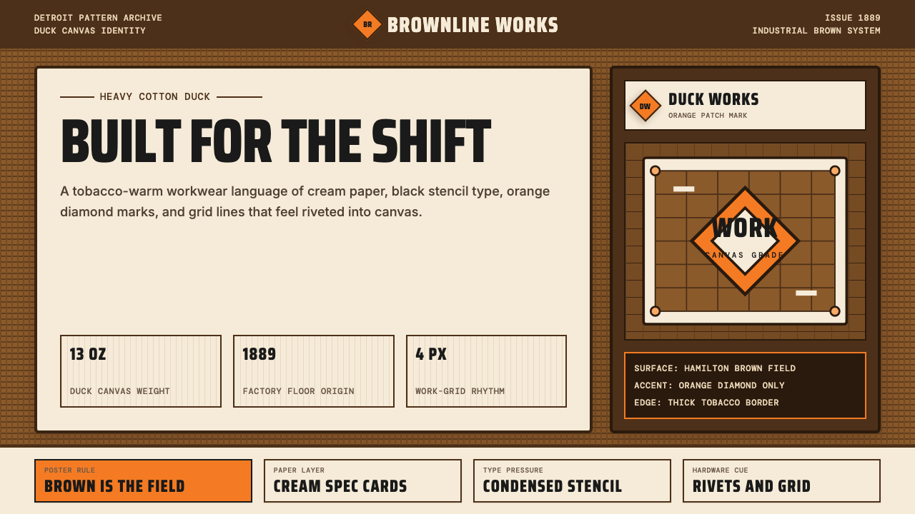 Carhartt Work Jacket Brown (1889)Built like work. Hamilton brown, orange diamond, and condensed type carry can…
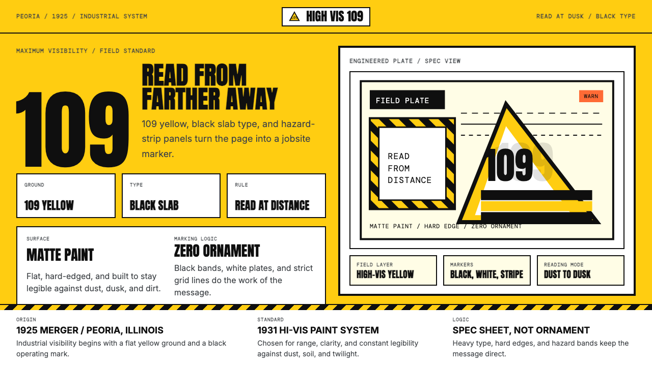 Caterpillar Construction Yellow (1925)Maximum visibility, zero softness. 109 yellow ground and black slab type.
 Lunar RoverBuilt for the vacuum. Kapton-gold foil and stencil part-numbers against void-…
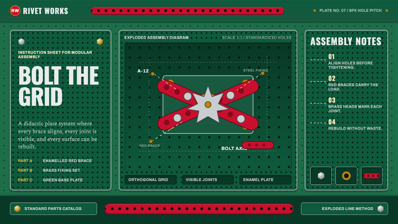 Meccano Erector SetEngineering becomes tactile. Red perforations and brass bolts lock to a green…