What is Medal Ribbon Bar?
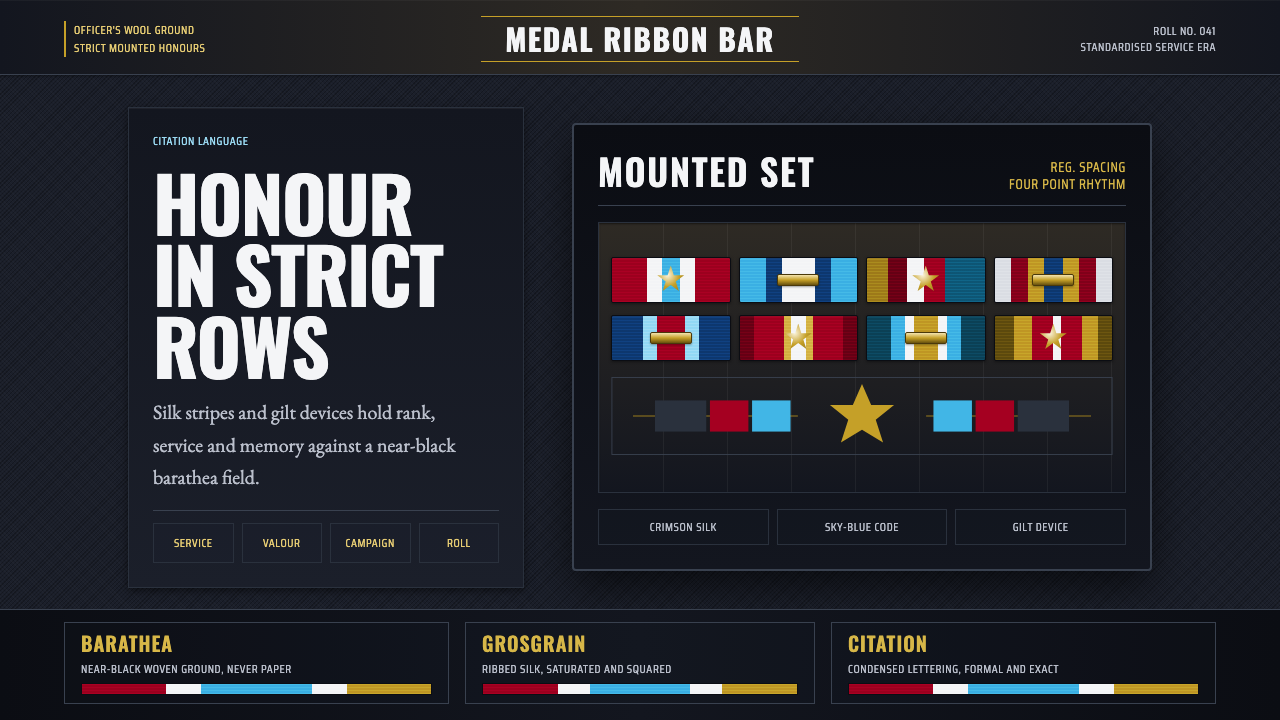
Medal Ribbon Bar turns military discipline into color — saturated silk-ribbon stripes and gilt stars mounted on near-black wool, honour rendered as a rigid, engraved system rather than free decoration.
Medal Ribbon Bar in brief
This style reproduces the visual grammar of the honours system worn on a military dress uniform: horizontal bars of silk grosgrain ribbon and gilt five-point stars mounted on the near-black barathea wool of a formal tunic. It is not a decorative pattern invented for beauty's sake — it is a system built for order, rank, and legibility at a glance, where every stripe and color combination has a specific, non-negotiable meaning attached to a specific honour.
The defining tension is between saturated, jewel-bright color — crimson, sky-blue, crisp white — and an almost total absence of color everywhere else. The serge or barathea wool ground is dark, dense, and matte; against it, ribbon stripes read as small, intensely saturated blocks, and the gilt stars catch hard metallic highlights. Nothing about the color use is casual: stripes are arranged in tight, exact rectangular modules, mounted in strict rows, following a grid as rigid as any military formation.
Applied as a general design language, the style keeps this same logic of earned, systematic color against disciplined dark cloth. It favors woven or fabric-like texture over flat digital color, condensed engraved lettering over casual type, and a strict rectangular modularity over free composition — every element behaves as though it had been awarded and mounted rather than merely placed.
Where does Medal Ribbon Bar come from?
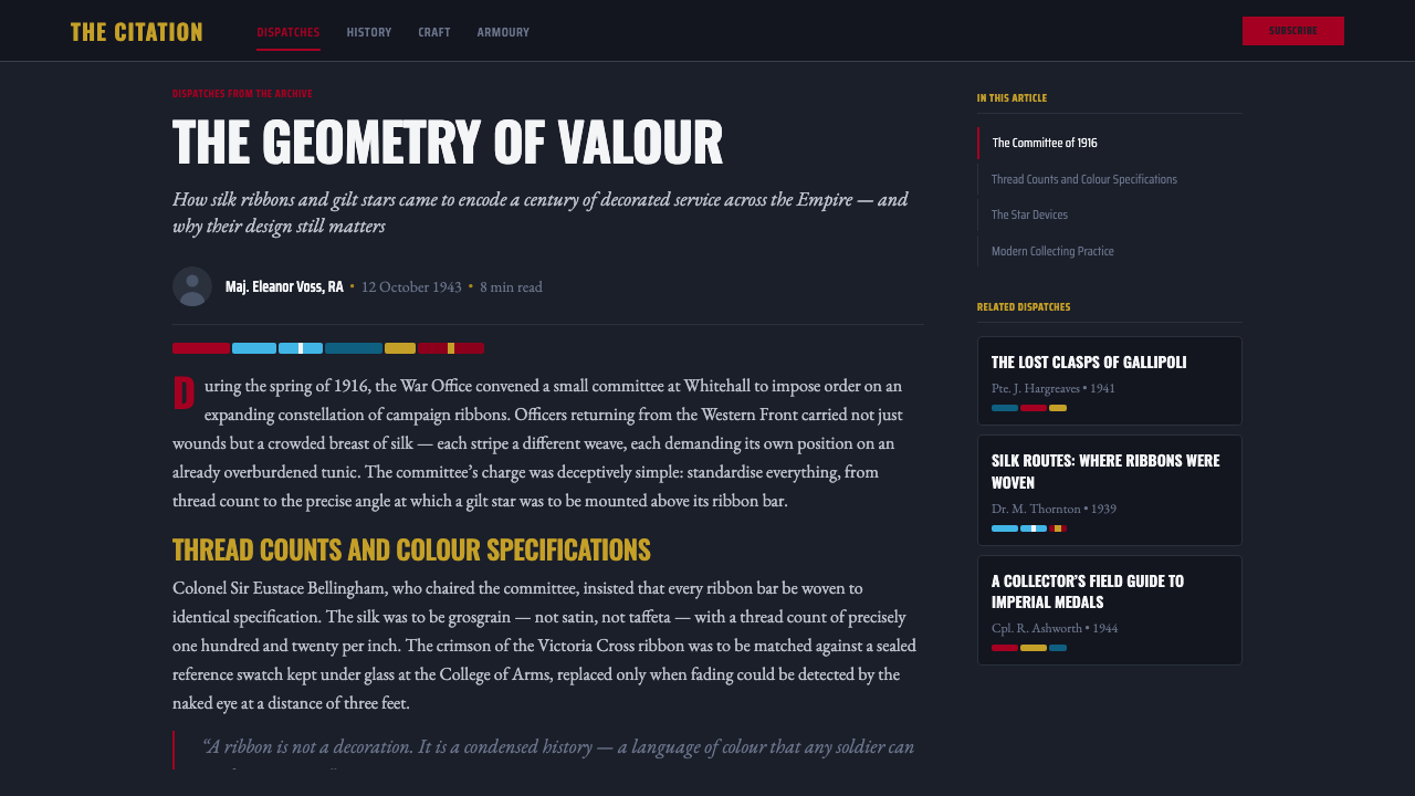
The wearing of ribbon bars — small rectangular strips of ribbon representing full medals, worn in place of the bulkier medals themselves on everyday dress uniform — developed as military honours systems standardized across the world's armed forces roughly between 1900 and 1950. As the number of campaigns, decorations, and service medals a single career officer might earn grew, armies needed a compact, at-a-glance way to display an individual's full record of honours without the weight and clutter of mounting every full medal.
Western Europe's various national honour systems, most visibly Britain's, developed alongside the transatlantic reference point of the United States' Medal of Honor system — each nation's ribbons following strict, codified color combinations that could not be altered, since the stripe pattern itself was the identifying signal of which specific honour was being represented. A soldier or officer's ribbon bar became a compressed visual biography, readable by anyone trained in the code, of exactly which campaigns, acts, or years of service had been recognized.
The physical construction reinforced the system's seriousness: ribbons were cut from silk grosgrain, a ribbed weave prized for its slight sheen and durability, and mounted with precision onto the dense, near-black barathea or serge wool of the dress tunic — a fabric chosen for its formal weight and matte depth rather than for pattern or decoration. Gilt five-point stars, worn to indicate additional honours or bars earned within a single award, added a metallic, engraved quality to the otherwise fabric-based system.
Service tailors and medal mounters — specialists whose job was to correctly cut, align, and stitch ribbon bars onto a uniform according to exact regulation order — turned this into a genuine craft discipline. The correct sequencing of ribbons (by precedence, not by color or preference), the precise spacing between rows, and the exact positioning of stars all followed regulation to the smallest detail, giving the finished ribbon bar the feel of an engraved roll of honour rendered in cloth and thread rather than of a freely composed piece of decoration.
What defines the Medal Ribbon Bar look?
Color
The palette is dominated by an almost totally dark, near-black wool ground, against which a small set of saturated, jewel-toned colors appear — crimson, sky-blue, and crisp white being the most emblematic combination, drawn from honour systems such as the Victoria Cross and the Medal of Honor. These colors never blend or gradient; they appear as flat, precise, fully saturated stripes, each one reading as a distinct and deliberate signal rather than a decorative wash.
Texture
The style depends on a strong material contrast: the ground reads as woven, dense, matte wool — barathea or serge — with real fabric weight rather than a flat printed surface, while the ribbons themselves carry the ribbed sheen characteristic of grosgrain silk. Nothing in this system reads as paper or gloss; the entire visual world is cloth, thread, and cast or stamped metal.
Typography
Lettering, where it appears, is condensed and engraved in character — narrow, upright, precise letterforms reminiscent of citation text stamped or engraved onto a medal or a roll of honour. It avoids any decorative flourish, script quality, or wide, casual spacing; the register is formal and official, meant to record rather than to charm.
Rectangular Modularity
Composition follows a strict grid of small rectangular modules, each representing a single ribbon or honour, arranged in tight rows with consistent spacing — never overlapping, never freely angled. This modularity mirrors the actual regulated construction of a ribbon bar, where precedence order and row alignment are matters of regulation rather than aesthetic preference.
Metallic Accent
Gilt five-point stars provide the system's only three-dimensional, reflective quality, catching hard, precise highlights against the flat ribbon stripes and matte wool. These metallic accents are small and sparingly placed — they mark an additional distinction earned within an honour, never a decorative flourish scattered freely across the composition.
Engraved Precision
Every line, edge, and boundary in the system reads as cut or stamped rather than drawn freehand — ribbon edges are crisp, star points are sharp and even, and any lettering follows the exact, unwavering register of official engraving. This precision is what separates the style from casual military or camouflage-adjacent aesthetics; it is a system of records, not a battlefield texture.
Density of Meaning
Unlike purely decorative patterns, every stripe combination in the original system carries a specific, fixed meaning — a particular campaign, honour, or period of service. Applied as a design language, this translates into a compositional principle: color and placement should feel earned and specific to what they represent, not applied as arbitrary decoration.
Who shaped Medal Ribbon Bar?
Britain's highest military decoration for valour established a ribbon color and precedence structure that became a reference point across Commonwealth and allied honour systems, exemplifying the principle that a specific stripe combination must always signify one, and only one, specific honour.
The United States' highest military honour, offered as the transatlantic reference point alongside British systems, reinforced the broader Western convention of strict, non-interchangeable ribbon color codes tied to specific acts of valour and service.
These specialist craftspeople were responsible for correctly cutting, sequencing by precedence, and stitching ribbon bars onto dress uniforms according to exact regulation, turning a system of abstract honour codes into a precise, physically mounted object worn on the chest.
How do you use Medal Ribbon Bar today?
This style carries a mood of earned authority, discipline, and precision, which makes it most effective wherever a product wants to communicate rank, achievement, or systematic order rather than casual approachability. It rewards structure over spontaneity — every color and placement should feel like it means something specific, echoing the original system's logic that nothing is arbitrary.
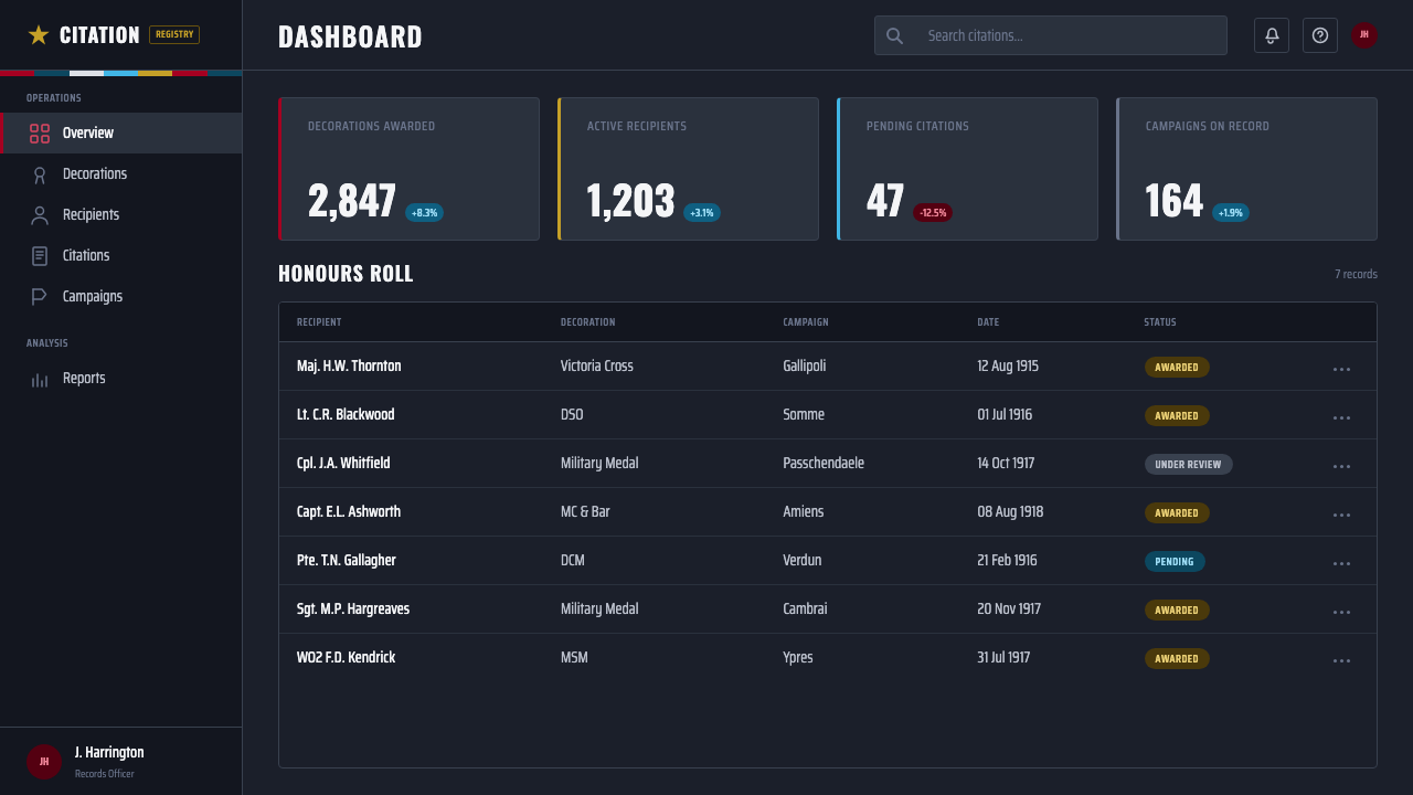
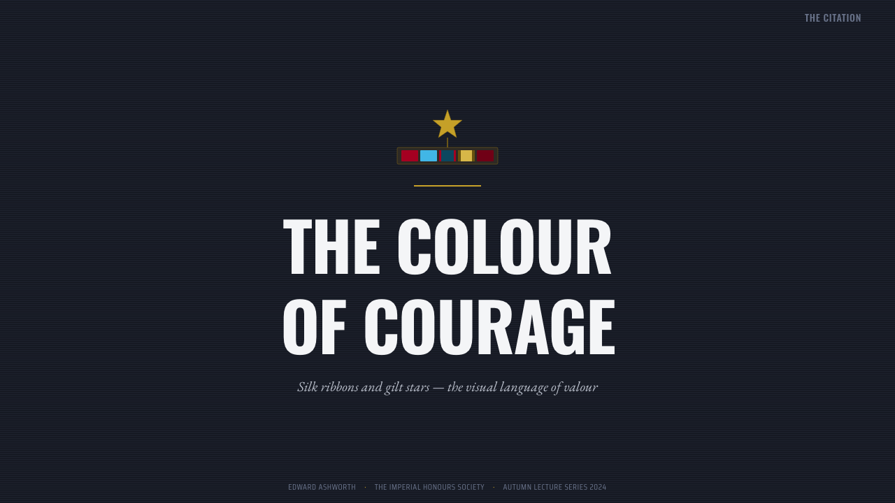
For presentation slides, the style suits cover pages and achievement or milestone sections especially well: a near-black ground with a tight row of saturated color blocks reads immediately as a record of accomplishment. Content slides should use the rectangular modularity literally — small color-coded blocks or bars to represent categories, milestones, or comparative data, arranged in disciplined rows rather than free-form charts.
For web interfaces, the style is well suited to achievement systems, gamified progress tracking, certification platforms, or professional credentialing products, where a badge, tier, or rank genuinely needs to feel earned rather than decorative. A dashboard might use small saturated rectangular modules against a dark ground to represent completed milestones, with gilt-toned metallic accents reserved for the highest tier of achievement.
For editorial and marketing work, the style pairs naturally with content about heritage, achievement, institutional history, or recognition — award announcements, veteran or alumni recognition, formal ceremony branding. A masthead using tight rows of saturated color blocks against dark, textured cloth-like ground reproduces the gravity of the original system without needing any literal military imagery.
The most common mistake is using the saturated stripe colors loosely as generic bright accents scattered across a layout, which strips away the sense of coded meaning that defines the style. A second common mistake is softening the ground to a lighter neutral tone — the near-black, dense wool ground is essential to the contrast that makes the color stripes read as precious and official rather than merely colorful.
Medal Ribbon Bar — FAQ
Does this style require literal military imagery like medals or insignia icons?
No. The style transfers most effectively as an abstract structural language — dark, dense ground; tight rows of saturated rectangular color blocks; gilt metallic accents used sparingly — without needing any literal medal, insignia, or uniform imagery. Applying it to non-military contexts works best when the underlying logic (earned, coded color against disciplined dark ground) is preserved rather than the literal iconography.
How should color be assigned if this style is used for a non-military achievement system?
The principle to preserve is that each color or stripe combination should map to one specific, fixed meaning — a tier, category, or milestone — rather than being chosen for visual variety. Consistency matters more than the specific hues chosen: once a color is assigned to a meaning, it should never be reused for something unrelated within the same system.
Can this style work with a lighter background instead of the near-black wool ground?
It loses much of its impact on a light background. The near-black ground is what makes the saturated stripe colors read as precious and precisely rationed rather than merely bright; on white or pale backgrounds, the same colors tend to read as generic bright accents rather than an earned, coded system. If a lighter theme is required, concentrating the style's dark ground within a smaller module — a badge or card — while keeping the surrounding interface light can preserve some of the effect.
What distinguishes this style from generic camouflage or 'military' patterns?
Camouflage and battlefield-adjacent patterns are organic, irregular, and designed to disrupt visual recognition. This style is the opposite: it is a formal, ceremonial, highly regulated system meant for maximum legibility and precision at a glance, built from crisp rectangular modules and engraved-quality lettering rather than organic irregular shapes. It belongs to the world of dress uniforms and honours ceremonies, not combat gear.
Is metallic gilt detail essential, or can the style work with color stripes alone?
The color stripes and dark ground alone carry most of the style's identity and can work without any metallic element, particularly in flatter digital contexts. Gilt accents add a layer of dimensional prestige best reserved for marking a genuinely highest tier or most significant distinction — using them everywhere reduces their meaning and their visual impact.
Related design styles
 Iridescent Scarab DrawerOrder makes the shimmer read. Jewel scarabs pinned in a grid on black foam, m…
 NASA Artemis ProgramCrewed return, engineered. Mission black, crescent-blue arc, flame orange, ri…
 Battleship Naval GrayBuilt to spec. Haze gray steel, rivet grids, stencil white, and one danger-re…
 Meccano Erector SetEngineering becomes tactile. Red perforations and brass bolts lock to a green…
 Tour de France (Yellow Jersey)Yellow owns the finish. Bungee type, polka dots, and navy tickers snap to an…
 Olympic Poster Berlin (1936)Monumental and legible. Green-gray, cream, and gold turn type into architectu…