What is Olympics Five Rings (1912)?什么是 Olympics Five Rings (1912)?
Five interlocking rings on pure white — the Olympic emblem drawn by Pierre de Coubertin in 1912 fused diplomatic symbolism, geometric precision, and saturated civic color into the world's most universally recognized sporting identity.纯白之上五环相扣——皮埃尔·德·顾拜旦于1912年绘制的奥运标志,将外交象征、几何精度与饱和的公民色彩熔铸为世界上辨识度最高的体育视觉身份。
Olympics Five Rings (1912) in briefOlympics Five Rings (1912) 速览
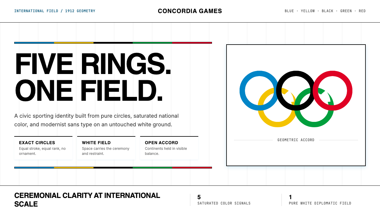
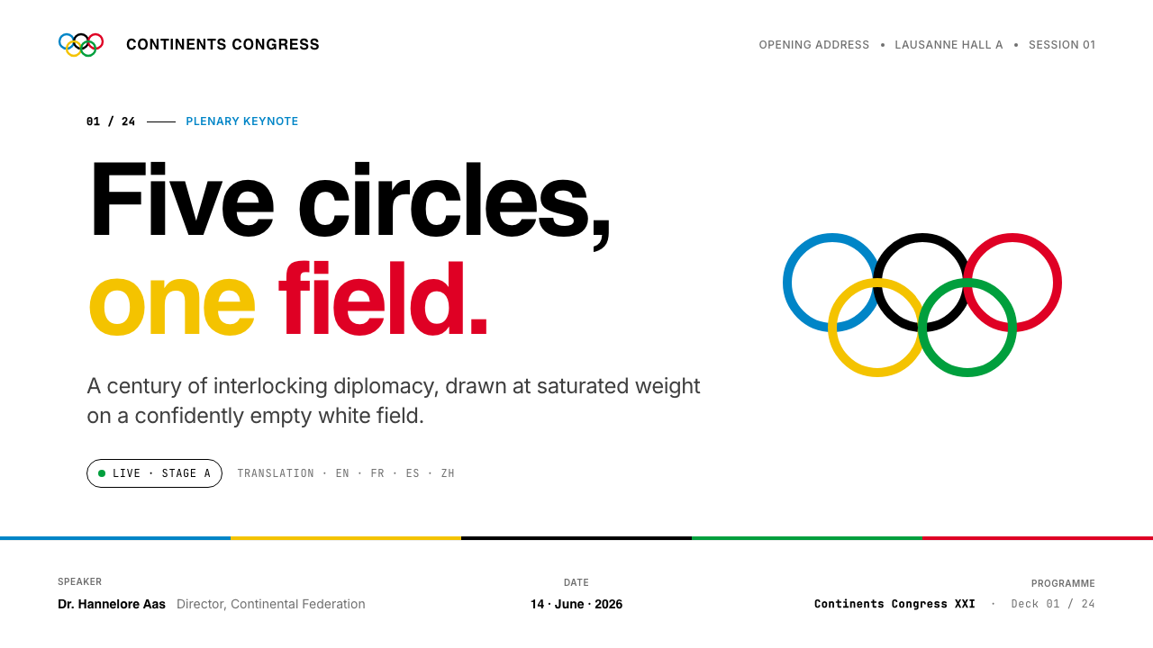
The Olympic Five Rings design is one of the most constrained and consequential visual systems in history: five equally-sized rings in blue, yellow, black, green, and red, interlocking in a single horizontal chain on a field of pure white. Every element is fixed — the proportion of ring diameter to gap, the sequence of hues, the relationship of figure to ground. This rigidity is not accident but doctrine. The emblem must remain legible whether stamped on a podium medal or projected across a stadium facade.奥运五环设计是历史上限定最严苛、影响最深远的视觉系统之一:蓝、黄、黑、绿、红五个等大圆环,以单条水平链式相扣,置于纯白场域之上。每一个元素都是固定的——环径与间距之比、色相的排列顺序、图形与底面的关系。这种严格性不是偶然,而是教义。无论是压印于领奖台奖牌,还是投影于体育场外墙,这枚徽志都必须保持清晰可辨。
As a design language, the Five Rings aesthetic borrows from the same modernist current that produced the Bauhaus: saturated flat color against generous white space, hard geometric forms with no surface ornament, and a civic gravity that communicates authority without aggression. It is the visual register of the opening ceremony — precise, ceremonial, internationalist. Where Bauhaus work carries a political urgency, the Olympic idiom carries ritual solemnity: the composition is not dynamic but monumental.作为一套设计语言,五环美学借鉴了与包豪斯同源的现代主义潮流:饱和的平面色彩映衬于慷慨的留白,无表面装饰的硬朗几何形态,以及一种传达权威而不带攻击性的公民庄重感。这是开幕式的视觉语调——精确、仪式感十足、国际主义的。包豪斯作品承载政治紧迫感,奥运图语则承载仪式肃穆:构图不是动态的,而是纪念碑式的。
The palette itself encodes meaning that has shifted over time. Coubertin's original 1912 reading held that between the five ring colors and the white ground, every national flag in the world could be composed — making the full emblem a chromatic representation of global membership rather than a map of five specific continents. The continental association came later, solidified through IOC communications across the twentieth century. Both readings coexist today, and neither diminishes the emblem's visual authority.色板本身编码着随时代演变的意义。顾拜旦在1912年的原初解读认为,五环色彩与白色底面合在一起,可以拼出世界上每一面国旗——使完整的徽志成为全球成员资格的色谱表达,而非五个特定大洲的地图。大陆对应关系是后来才形成的,在二十世纪经由国际奥委会的传播而逐步固化。今天两种解读并存,任何一种都不削减徽志的视觉权威。
See the Olympics Five Rings (1912) design system查看 Olympics Five Rings (1912) 完整设计系统
Where does Olympics Five Rings (1912) come from?Olympics Five Rings (1912) 从何而来?
The Modern Olympic Games were revived in 1896 by Pierre de Coubertin, a French educator and sports advocate who believed that international athletic competition could foster peace among nations. The early Games operated without a unified visual identity: each host city designed its own posters, programs, and insignia. By the time of the 1912 Stockholm Olympics, Coubertin — then serving as president of the International Olympic Committee — recognized that a permanent symbol was needed, one that could travel across languages, cultures, and political systems without modification.现代奥运会由法国教育家、体育倡导者皮埃尔·德·顾拜旦于1896年复兴,他相信国际体育竞赛能够促进各国之间的和平。早期奥运会没有统一的视觉形象:每座主办城市自行设计海报、节目册和徽章。到1912年斯德哥尔摩奥运会时,时任国际奥委会主席的顾拜旦意识到,必须有一个永久性的标志——一个能够跨越语言、文化和政治体系、无需更改地流通的符号。
Coubertin sketched the five-ring emblem in 1912, incorporating it first into a design for the IOC's twentieth anniversary celebration and subsequently proposing it as the official Olympic symbol. His own account stated that the design was entirely his invention, though the precise circumstances of its creation remain a subject of scholarly discussion. The rings appeared publicly for the first time at the 1914 Paris Congress celebrating the IOC's twentieth anniversary, but the Games at which the emblem was formally introduced to international audiences were the 1920 Antwerp Olympics — a choice heavy with symbolic resonance, as Antwerp was still recovering from the devastation of the First World War.顾拜旦于1912年勾勒出五环标志,最初将其融入国际奥委会二十周年庆典的设计,随后提议将其作为奥运官方标志。他本人的陈述称,这一设计完全出自他的创意,尽管其诞生的确切经过至今仍是学术讨论的议题。五环图案首次公开亮相是在1914年庆祝国际奥委会成立二十周年的巴黎大会上,但正式向国际观众引介这枚徽志的,是1920年安特卫普奥运会——这一选择具有深重的象征意义,因为安特卫普当时仍在从第一次世界大战的破坏中恢复。
The five colors were chosen with deliberate internationalism. Coubertin wrote in the Olympic Review of 1913 that the six colors combined — the five ring hues plus white — reproduced the colors of all national flags then competing. This was not a symbolic assignment of colors to continents but a claim of total chromatic inclusion. The continental interpretation — blue for Europe, yellow for Asia, black for Africa, green for Oceania, red for the Americas — entered IOC official communications gradually during the mid-twentieth century and is now the dominant public reading, though the IOC itself has at various times clarified that no official color-to-continent assignment was ever formally adopted.五种颜色的选择蕴含着刻意的国际主义立场。顾拜旦在1913年的《奥林匹克评论》中写道,这六种颜色合在一起——五种环色加上白色——再现了当时所有参赛国的国旗颜色。这不是将色彩象征性地分配给各大洲,而是对全面色谱包容性的宣示。大陆解读——蓝色代表欧洲、黄色代表亚洲、黑色代表非洲、绿色代表大洋洲、红色代表美洲——是在二十世纪中叶逐渐进入国际奥委会官方传播的,如今已成为主流的公众理解,尽管国际奥委会本身在不同时期曾多次澄清,从未正式采纳过色彩与大洲的对应关系。
The emblem's visual language was shaped by the broader graphic culture of the early twentieth century: the turn toward geometric abstraction, the influence of international exposition design, and the growing use of standardized symbols in diplomatic and organizational contexts. The five rings share formal kinship with the modernist reduction of complex ideas to simple geometric marks — a sensibility that ran from the Bauhaus workshops in Germany to the Soviet Constructivists to the emerging practice of corporate identity design. What distinguished Coubertin's emblem was its combination of geometric clarity with chromatic richness: rather than reducing to monochrome or near-monochrome, the design committed fully to five saturated hues, making it simultaneously bold and systematic.这枚徽志的视觉语言由二十世纪初更广泛的图形文化所塑造:转向几何抽象的思潮、国际博览会设计的影响,以及标准化符号在外交与组织语境中的日益普及。五环与现代主义将复杂观念简化为简洁几何标记的气质一脉相承——这种感性从德国包豪斯工坊延伸至苏联构成主义,再到新兴的企业形象设计实践。顾拜旦的徽志与众不同之处,在于它将几何清晰度与色彩丰富性结合在一起:它没有简化为单色或近单色,而是全力投入五种饱和色,使设计同时具备大胆与系统的双重品质。
What defines the Olympics Five Rings (1912) look?Olympics Five Rings (1912) 的视觉特征是什么?
Saturated Five-Color Palette饱和五色色板
The five ring colors — blue, yellow, black, green, and red — are each deployed at full saturation with no tinting, shading, or blending. The palette is neither primary in the strict Bauhaus sense nor analogous in the harmony-theory sense; it is a deliberately diverse chromatic set that reads as globally inclusive. Each color is visually distinct from its neighbors at any scale, ensuring that the interlocking geometry remains legible when reproduced small. The pure white ground provides the maximum possible contrast for all five hues simultaneously.五种环色——蓝、黄、黑、绿、红——每一种都以完全饱和度呈现,不加色调、不加深暗、不作混合。这套色板既非严格意义上包豪斯式的三原色,也非色彩和声理论意义上的类似色;它是一个刻意多样化的色谱集合,传达出全球包容性。每种颜色在任何尺寸下都与相邻色视觉分明,确保交扣的几何结构在小尺寸复制时依然清晰可辨。纯白底面同时为五种色相提供了最大可能的对比度。
Geometric Ring Form几何环形
The circle is among the most universally legible geometric forms, carrying associations of continuity, wholeness, and equality — no starting point, no hierarchy of edges. Coubertin's choice of the ring (an open circle, a circle defined by its stroke rather than its fill) adds a second layer: transparency and interconnection. Where solid circles would read as distinct colored dots, rings can interlock physically, the overlap zone demonstrating relationship rather than collision. The equal sizing of all five rings reinforces the emblem's core claim of parity among nations.圆形是最具普遍可读性的几何形之一,承载着连续、完整与平等的联想——没有起点,没有边的层级。顾拜旦选择环形(即以描边而非填充定义的圆)增添了第二层含义:透明与相连。实心圆会读作独立的彩色圆点,而环形可以实质性地交扣,重叠区域表现的是关联而非碰撞。五环尺寸完全相等,强化了徽志关于各国对等的核心主张。
Horizontal Linked Chain水平链式结构
The five rings are arranged in a single horizontal row, with rings two and four descending slightly to interlock with their neighbors — creating an alternating-height chain. This horizontal orientation carries a reading direction that suits most of the world's writing systems and produces a natural banner-like form appropriate for the ceremonial contexts where the emblem appears. The chain structure implies sequence and connection without hierarchy: no ring sits above the others in the final row.五环排列为单排水平行,第二和第四环略微下移以与相邻环交扣,形成高低交替的链条结构。这种水平朝向契合世界上大多数文字系统的阅读方向,呈现出一种自然的横幅形式,与徽志出现的典礼场景十分吻合。链条结构暗示序列与联结,而不产生层级感:在最终排列中,没有任何一环凌驾于其他环之上。
Pure White Ground纯白底面
The white ground is not neutral absence but an active sixth element. It maximizes chromatic contrast for all five ring colors simultaneously, ensures reproducibility across surfaces ranging from fabric to stone to digital display, and contributes its own symbolic reading — Coubertin included white explicitly in his original color-inclusivity argument. In practice, the white ground also functions as a visual reset: the generous space surrounding the rings prevents the emblem from appearing crowded and gives the interlocking geometry room to breathe.白色底面不是中性的缺席,而是积极的第六元素。它同时为五种环色提供最大的色彩对比,确保徽志在从织物到石材再到数字显示器等各种承载面上都能清晰再现,并贡献了自身的象征意涵——顾拜旦在最初的色彩包容性论述中明确将白色纳入其中。在实践中,白色底面还起到视觉重置的作用:环绕五环的充裕空间防止徽志显得拥挤,让交扣的几何结构得以自如呼吸。
Zero Ornament, Total Legibility零装饰,全面可读
The emblem carries no typographic accompaniment in its base form, no decorative borders, no gradients, no drop shadows, no textures. Every element that could qualify as ornament has been removed or was never considered. This discipline is not minimalism for its own sake but a function of the emblem's operational requirements: it must reproduce faithfully at the scale of a lapel pin and at the scale of a building. Any added visual complexity would degrade at small sizes and distort the emblem's neutrality as a symbol of universal membership.徽志的基础形式不附带任何文字,没有装饰性边框,没有渐变,没有投影,没有纹理。一切可被视为装饰的元素都已被去除,或从未在考虑之列。这种自律不是为了极简主义本身,而是徽志运作要求的必然结果:它必须在翻领别针的尺度和建筑立面的尺度上都能忠实再现。任何增加的视觉复杂性都会在小尺寸下降质,并扭曲这枚作为全球成员身份符号的中立性。
Civic and Ceremonial Gravity公民性与典礼感庄重
Unlike commercial brand marks, which typically aim for approachability or aspiration, the Olympic emblem is calibrated to communicate institutional authority and solemn occasion. Its symmetrical rhythm, restrained color use (each hue appears exactly once), and clean geometry produce an effect closer to a flag, a seal, or a treaty document than to a logo. When the emblem appears in design work, it imports this ceremonial register — invoking not just a sporting event but a global civic ritual that has been staged continuously since 1896.与通常追求亲切感或抱负感的商业品牌标志不同,奥运徽志被校准为传达制度权威与庄重场合的感受。它对称的节奏、克制的色彩使用(每种色相恰好出现一次)和干净的几何形态,产生的效果更接近旗帜、印章或条约文件,而非商标。当这枚徽志出现在设计作品中时,它引入了这种典礼性的语调——召唤的不仅是一项体育赛事,而是自1896年以来持续上演的全球公民仪式。
Interlocking as Meaning交扣即意义
The interlocking of the rings is not merely compositional — it is the emblem's primary semantic device. Each ring touches its neighbors but remains its own closed form: union without merger, cooperation without loss of individual identity. This structural metaphor scales remarkably well. At the level of a nation it reads as international solidarity; at the level of an athlete it reads as shared endeavor; at the level of a viewer it reads simply as elegant geometric rhythm. Few design decisions in the history of visual identity have done so much semantic work with so little formal complexity.五环的交扣不仅仅是构图上的安排——它是徽志最核心的语义装置。每一环与相邻环相接,却始终保持自身封闭的形态:联合而不合并,合作而不失去个体身份。这种结构性隐喻具有出色的可扩展性。在国家层面,它读作国际团结;在运动员层面,它读作共同努力;在观者层面,它读作优雅的几何韵律。在视觉形象史上,很少有设计决策能以如此简单的形式复杂度完成如此丰富的语义工作。

See the Olympics Five Rings (1912) design system查看 Olympics Five Rings (1912) 完整设计系统
Who shaped Olympics Five Rings (1912)?谁塑造了 Olympics Five Rings (1912)?
The French educator, historian, and sports advocate who founded the International Olympic Committee in 1894 and revived the Modern Olympic Games in Athens in 1896. Coubertin served as IOC president from 1896 to 1925 and was the sole credited designer of the Five Rings emblem, which he sketched in 1912. His stated intention was to create a symbol that would be genuinely international — not rooted in any single national tradition — and that would communicate the Olympic movement's aspirations through pure form and color rather than text or figurative imagery. His broader intellectual project linked sport to humanist education, and the design reflects this: the emblem is a diagram of a principle, not a depiction of an event.法国教育家、历史学家及体育倡导者,1894年创立国际奥委会,1896年在雅典复兴了现代奥运会。顾拜旦于1896年至1925年间担任国际奥委会主席,是五环标志唯一记名的设计者,于1912年亲手绘制。他明确表达的意图是创造一个真正国际性的符号——不根植于任何单一民族传统——通过纯粹的形式与色彩而非文字或具象图像来传达奥林匹克运动的理想。他更宏观的思想计划将体育与人文教育联结在一起,而这枚设计正反映了这一点:它是一个原则的示意图,而非一个事件的描绘。
Founded in Paris in 1894 with Coubertin as its first secretary-general and Demetrios Vikelas as its first president, the IOC became the institutional custodian of the Five Rings emblem. Over the course of the twentieth century, the IOC developed an increasingly detailed set of guidelines governing the emblem's use, proportions, color reproduction, and surrounding clear space — transforming what began as a single hand-drawn symbol into one of the most strictly protected marks in global trademark law. The IOC's management of the emblem across political disruptions, boycotts, and the transition from analog to digital reproduction has kept the Five Rings visually consistent for over a century.1894年在巴黎创立,以顾拜旦为首任秘书长、德米特里奥斯·维克拉斯为首任主席,国际奥委会成为五环标志的制度托管者。在二十世纪的历程中,国际奥委会制定了日益详尽的规范,管理徽志的使用方式、比例、色彩再现与周边空白——将一个起初手绘的符号转化为全球商标法中保护最严格的标志之一。国际奥委会在政治动荡、抵制风波以及从模拟到数字再现方式的转变中对徽志的管理,使五环在逾百年间保持了视觉一致性。
The Antwerp Olympics of 1920 marked the first formal use of the Five Rings flag at an Olympic Games. The choice of Antwerp as host — a Belgian city emerging from four years of German occupation during the First World War — was itself a political statement, and the IOC's decision to deploy the Five Rings emblem at this Games gave the symbol its inaugural public meaning: not merely a geometric device but a proclamation of international renewal after catastrophic conflict. The Antwerp Games also introduced the Olympic oath and the release of doves, cementing the ceremonial visual language with which the Five Rings became permanently associated.1920年安特卫普奥运会标志着五环旗首次在奥运会上正式使用。选择安特卫普——一座从第一次世界大战中德国四年占领下走出的比利时城市——作为主办地,本身就是一项政治表态。国际奥委会决定在这届奥运会上启用五环标志,赋予了这个符号其首次公开亮相的意义:不仅仅是一个几何装置,而是在灾难性冲突之后国际重建的宣示。安特卫普奥运会还引入了奥运誓词与放飞鸽子的仪式,将五环永久嵌入与之相关的典礼视觉语言之中。
The German graphic designer who created the complete visual identity for the 1972 Munich Olympics, widely regarded as the most systematically designed Games in history. Aicher did not redesign the Five Rings emblem — its form was fixed — but he built a comprehensive design system around it: a rigorous geometric typeface, a color palette of blues and greens that departed from the traditional primary-color heaviness, a set of pictograms for all Olympic sports that reduced athletic figures to horizontal, vertical, and forty-five degree elements. Munich 1972 demonstrated that the Five Rings could anchor a sophisticated modern identity system without being diluted or overshadowed, and Aicher's pictogram methodology became the international standard for wayfinding and sport iconography.德国平面设计师,为1972年慕尼黑奥运会创作了完整的视觉形象系统,被普遍认为是历史上设计最为系统化的一届奥运会。艾歇尔没有重新设计五环标志——其形式是固定的——但他围绕它建立了一套全面的设计系统:一套严格几何化的字体、一套有别于传统原色厚重感的蓝绿色板,以及一套将所有奥运运动项目的运动员形象简化为水平、垂直与四十五度要素的图标体系。慕尼黑1972届奥运会证明,五环可以锚定一套成熟的现代形象系统,而不被稀释或遮蔽;艾歇尔的图标方法论成为导视设计与运动图标领域的国际标准。
The Japanese designers responsible for the visual identity of the 1964 Tokyo Olympics, which is credited with bringing Japan's postwar graphic design to international attention and demonstrating that the Five Rings emblem could integrate with non-Western visual traditions. Kamekura's poster designs — bold photographic compositions using the Five Rings as a geometric focal point above precise sans-serif type — established a new register for Olympic graphic work: the emblem as anchor for photography and color fields rather than as decorative supplement. Tokyo 1964 remains a benchmark for how a national design tradition can express its own visual logic while remaining fully legible within the Olympic visual system.负责1964年东京奥运会视觉形象的日本设计师,这届奥运会因将日本战后平面设计带入国际视野,并证明五环标志能与非西方视觉传统融合而备受称赞。龟仓雄策的海报设计——以五环作为几何焦点、置于精确无衬线字体之上的大胆摄影构图——为奥运图形工作确立了一种新的语调:徽志作为摄影与色域的锚点,而非装饰性补充。东京1964届奥运会至今仍是一个基准,展示了一个民族设计传统如何在保持其自身视觉逻辑的同时,完全可读地融入奥运视觉系统之中。
How do you use Olympics Five Rings (1912) today?今天怎么用 Olympics Five Rings (1912)?
The Olympic Five Rings aesthetic — saturated flat color on white, hard geometric forms, civic gravity, zero ornament — is among the most transferable ceremonial design languages available. Applying it correctly requires understanding what the system is actually doing: using color to assert presence and differentiation without decorative purpose, using geometric precision to communicate institutional credibility, and using generous white space to give every element the visual authority it needs. The style is not casual and resists contexts that call for warmth or approachability; it is the language of the podium and the opening ceremony, not the locker room.奥运五环美学——纯白上的饱和平面色彩、硬朗几何形态、公民感庄重、零装饰——是可移植性最强的典礼性设计语言之一。正确应用它,需要理解这套系统实际上在做什么:用色彩宣示存在感与区分度,而非装饰目的;用几何精度传达制度公信力;用慷慨的留白给每个元素所需的视觉权威。这种风格并不随意,它抵制任何需要温暖感或亲切感的语境;它是颁奖台和开幕式的语言,而非更衣室的语言。
For presentation slides, the Olympic register works with exceptional force on cover and section-break pages. A cover built in this idiom typically anchors a bold geometric element — a ring form, a concentric circle, a horizontal band — in one saturated color against a white ground, with the title set in a clean geometric sans-serif at commanding scale. Section slides can use the five-color sequence as a navigational system: each section adopts one of the five hues as its dominant accent, creating an ordered progression that feels simultaneously systematic and ceremonial. Data slides should lean into the diagrammatic quality of the style: charts become geometric objects, with bars, arcs, and rings colored according to a strict palette rather than arbitrary software defaults.在演示文稿中,奥运语调在封面页和章节分隔页上具有特殊的冲击力。以这种风格构建的封面,通常将一个大胆的几何元素——环形、同心圆、水平色带——以某种饱和色锚定于白色底面,标题以干净的几何无衬线字体设定于令人印象深刻的尺度。章节页可以将五色序列用作导航系统:每个章节采用五种色相之一作为主导强调色,创造一种既感觉系统性又充满典礼感的有序推进。数据页应当充分利用这种风格的示意图品质:图表成为几何对象,柱条、弧形与环形依照严格的色板着色,而非随软件默认色。
For web interfaces, the Olympic aesthetic is well-suited to institutional, civic, and multi-stakeholder platforms where authority and universal legibility are primary concerns — organization landing pages, government portals, international conference sites, and sports data dashboards. The approach: define a clean column grid, keep the background at or near white, use black for all body text and navigation labels, and reserve the saturated colors for primary interactive states, category indicators, or status flags. Hard-bordered components replace soft-shadow cards; block-level color washes replace photographic hero sections. The style reads poorly on consumer-facing e-commerce or social products where emotional warmth is required.对于网页界面,奥运美学非常适合权威性与普遍可读性是首要考量的机构性、公民性和多利益相关方平台——组织首页、政府门户、国际会议网站和体育数据仪表板。方法:定义干净的列网格,保持背景在白色或接近白色,所有正文和导航标签用黑色,将饱和色保留给主要交互状态、类别指示符或状态标志。有硬边框的组件取代软阴影卡片;纯色块洗版取代摄影主视觉区域。这种风格在需要情感温暖的消费者导向的电商或社交产品上表现欠佳。
For editorial and marketing work, the Five Rings palette and geometric vocabulary support strong visual hierarchy and memorable poster-like impact. A campaign built in this register uses full-width color blocks — each in a single saturated hue — to separate thematic sections, with white-ground spreads for detailed content. Type is set at extreme scale contrast: a dominant headline at several times the scale of body text, with no decorative devices bridging the two. Marketing materials gain credibility by committing fully to the system: one dominant ring color per layout, a second as structural accent, the white ground always preserved as a breathing zone rather than filled.对于编辑与营销工作,五环色板与几何词汇支持强烈的视觉层级和令人难忘的海报式冲击力。以这种语调构建的活动物料,使用全宽色块——每块采用单一饱和色——来分隔主题段落,白色底面铺展用于详细内容。字体排印采用极端的尺度对比:主导标题尺度是正文的数倍,两者之间没有装饰性过渡手段。营销物料通过全力投入这套系统而获得公信力:每个版面以一种主导环色为主,以第二种作结构强调,白色底面始终作为呼吸空间保留,而非被填满。
A common mistake when working with this aesthetic is treating the five ring colors as a license to use all five simultaneously at equal weight across a composition. Authentic Olympic-register work leads with one or at most two colors; the others appear only incidentally or as a sequential system across multiple pieces. A related error is importing soft gradients, ambient shadows, or photographic textures into a design that otherwise claims the Five Rings vocabulary — these elements belong to a different design register and immediately undercut the civic authority the style depends on. The emblem's power comes precisely from what it refuses.使用这种美学时最常见的错误,是将五种环色视为在一个构图中以同等分量同时使用全部五色的许可。真正的奥运语调作品以一种,至多两种颜色为主导;其他颜色只是偶发性出现,或作为跨多件作品的序列系统。另一个相关错误是将柔和渐变、环境投影或摄影纹理引入一个原本宣称使用五环词汇的设计——这些元素属于不同的设计语调,会立即削弱这种风格所依赖的公民权威。这枚徽志的力量,恰恰来自它所拒绝的一切。
See the Olympics Five Rings (1912) design system查看 Olympics Five Rings (1912) 完整设计系统
Olympics Five Rings (1912) — FAQOlympics Five Rings (1912) · 常见问题
Does each ring color officially represent a specific continent?每种环色官方上是否代表特定的大洲?
The continental color assignments — blue for Europe, yellow for Asia, black for Africa, green for Oceania, red for the Americas — are widely repeated but were never formally adopted by the IOC as the emblem's official meaning. Coubertin's own 1913 statement described the six colors (five rings plus white) as collectively reproducing every national flag then in competition, with no continent-to-color mapping. The continental interpretation gained traction through mid-twentieth-century IOC communications and has since become the dominant public understanding. The IOC's current position acknowledges the association while noting it was not part of Coubertin's original design intent. For design purposes, this ambiguity is actually useful: the colors can be used in any order or assignment without contradicting Olympic protocol.大陆色彩对应关系——蓝色代表欧洲、黄色代表亚洲、黑色代表非洲、绿色代表大洋洲、红色代表美洲——被广泛引用,但国际奥委会从未将其正式采纳为徽志的官方含义。顾拜旦本人在1913年的表述是:六种颜色(五种环色加白色)共同再现了当时所有参赛国的国旗颜色,并无大洲与色彩的对应关系。大陆解读是在二十世纪中叶通过国际奥委会的传播而深入人心的,此后成为主流的公众理解。国际奥委会目前的立场承认这种关联,同时指出这并非顾拜旦最初的设计意图。从设计角度而言,这种模糊性实际上是有益的:色彩可以按任意顺序或任意对应关系使用,而不违反奥运规章。
Can the Five Rings aesthetic work on dark backgrounds?五环美学能用于深色背景吗?
The canonical Olympic ground is white or very near white, and this should be the default. Dark-ground versions are possible — stadium lighting, broadcast graphics, and some official Games design systems have used black or deep blue grounds effectively — but they require care. On a dark field, yellow dominates aggressively, black rings become invisible unless outlined, and the system's reliance on simultaneous contrast for legibility breaks down. A dark-ground adaptation works best when it commits to one or two ring colors as foreground accents against the dark field and treats the other ring forms as structural lines or outlines only. The white ground is not merely convention; it is part of the system's chromatic logic, and departing from it changes the emblem's perceived register from civic ceremony to entertainment spectacle.奥运的典范底面是白色或非常接近白色的色调,这应当是默认选择。深色底面版本是可行的——体育场照明、广播图形以及部分奥运会官方设计系统已经有效地使用了黑色或深蓝色底面——但需要谨慎处理。在深色场域上,黄色会攻击性地主导画面,黑色环形若不加轮廓线则会隐没不见,而这套系统赖以实现可读性的同时对比关系也会瓦解。深色底面的改编方案效果最佳的情形是:以一两种环色作为深色场域上的前景强调色,其余环形仅作结构线或轮廓线处理。白色底面不只是惯例;它是这套系统色彩逻辑的组成部分,偏离它会将徽志的感知语调从公民典礼转变为娱乐奇观。
How does the Olympic design language differ from Bauhaus?奥运设计语言与包豪斯有何不同?
Both systems share a commitment to geometric form, saturated flat color, and the rejection of surface ornament. But their cultural registers are distinct. Bauhaus work carries a modernist-political urgency — it is design as argument, as ideological position. The Olympic emblem carries ritual solemnity — it is design as covenant, as institutional promise. Bauhaus compositions are typically asymmetric and dynamic, built on tension and reading direction. The Five Rings composition is symmetric in rhythm and monumental in feeling: it does not move the eye through a layout but commands a centered gaze. In practical terms, Bauhaus is more suited to complex information design where hierarchy and flow matter; the Olympic idiom is more suited to identity, ceremony, and moments where a single bold statement is required.两套系统都致力于几何形态、饱和平面色彩和拒绝表面装饰。但它们的文化语调截然不同。包豪斯作品承载着现代主义-政治的紧迫感——设计是论辩,是意识形态立场。奥运标志承载着仪式肃穆感——设计是契约,是制度承诺。包豪斯构图通常是非对称且动态的,建立在张力与阅读方向之上。五环构图在节奏上是对称的,在感受上是纪念碑式的:它不引导视线穿越版面,而是命令一种居中凝视。在实践层面,包豪斯更适合层级与流向至关重要的复杂信息设计;奥运语调更适合形象、典礼,以及需要一个单一有力陈述的时刻。
Is the Olympic emblem considered a trademark, and does that affect design use?奥运标志是否属于注册商标,这对设计使用有何影响?
Yes, the Five Rings emblem is one of the most comprehensively protected marks in international trademark law, protected under both national laws and the Nairobi Treaty of 1981, which requires signatory nations to protect the symbol against commercial use without authorization. For design work, this means the actual Five Rings emblem cannot be incorporated into commercial work without IOC licensing. However, the aesthetic language of the emblem — its use of saturated ring forms on white, its civic palette, its geometric vocabulary — is not ownable. Designing in a style inspired by the Olympic visual register, without reproducing the emblem itself, occupies different legal and ethical territory. The practical distinction: replicate the specific rings-and-colors configuration and you are in trademark territory; work with rings, saturated flat color, and ceremonial geometry as a design vocabulary and you are working with a visual idiom.是的,五环标志是国际商标法中保护最全面的标志之一,受国家法律和1981年《内罗毕条约》的双重保护,该条约要求签约国保护这一符号免遭未经授权的商业使用。对于设计工作而言,这意味着实际的五环标志未经国际奥委会许可不能被纳入商业作品。然而,徽志的美学语言——在白色上使用饱和环形、公民色板、几何词汇——是无法被拥有的。以奥运视觉语调为灵感进行设计,而不复制徽志本身,处于不同的法律和伦理领域。实际区别在于:复制特定的环形加色彩配置,你进入了商标领域;以环形、饱和平面色彩和典礼性几何作为设计词汇进行工作,你使用的是一种视觉语调。
What kinds of projects suit this aesthetic, and where does it struggle?这种美学适合哪类项目?在哪些场景表现欠佳?
The Olympic Five Rings aesthetic performs well in contexts where institutional authority, universal legibility, and ceremonial gravitas are desired: annual reports, international organization identity systems, sports federation materials, multi-stakeholder conference design, and public-interest information campaigns. It also works for educational and cultural institutions that want to project credibility across diverse audiences. It struggles in contexts requiring warmth, informality, or cultural specificity: consumer products, food and hospitality brands, children's education, wellness and lifestyle applications, and any context where the user experience depends on organic texture, human warmth, or playful irreverence. The emblem's civic solemnity, which is its greatest strength in appropriate contexts, becomes a liability when the product's essential promise is intimacy or delight.奥运五环美学在需要制度权威、普遍可读性和典礼庄重感的场景中表现出色:年度报告、国际组织形象系统、体育联合会物料、多利益相关方会议设计,以及公共利益信息推广活动。它同样适用于希望向多元受众传达公信力的教育和文化机构。它在需要温暖感、非正式感或文化特殊性的场景中则力不从心:消费品、食品与餐饮品牌、儿童教育、健康与生活方式应用,以及任何用户体验依赖有机质感、人文温度或轻松调侃的场景。徽志的公民肃穆感——在适当语境下是其最大优势——在产品的核心承诺是亲密感或愉悦感时,反而成为一种负担。
Related design styles相关设计风格
 Olympic Poster Berlin (1936)Monumental and legible. Green-gray, cream, and gold turn type into architectu…纪念碑感十足。绿灰、奶油纸与金色把字体变成建筑。
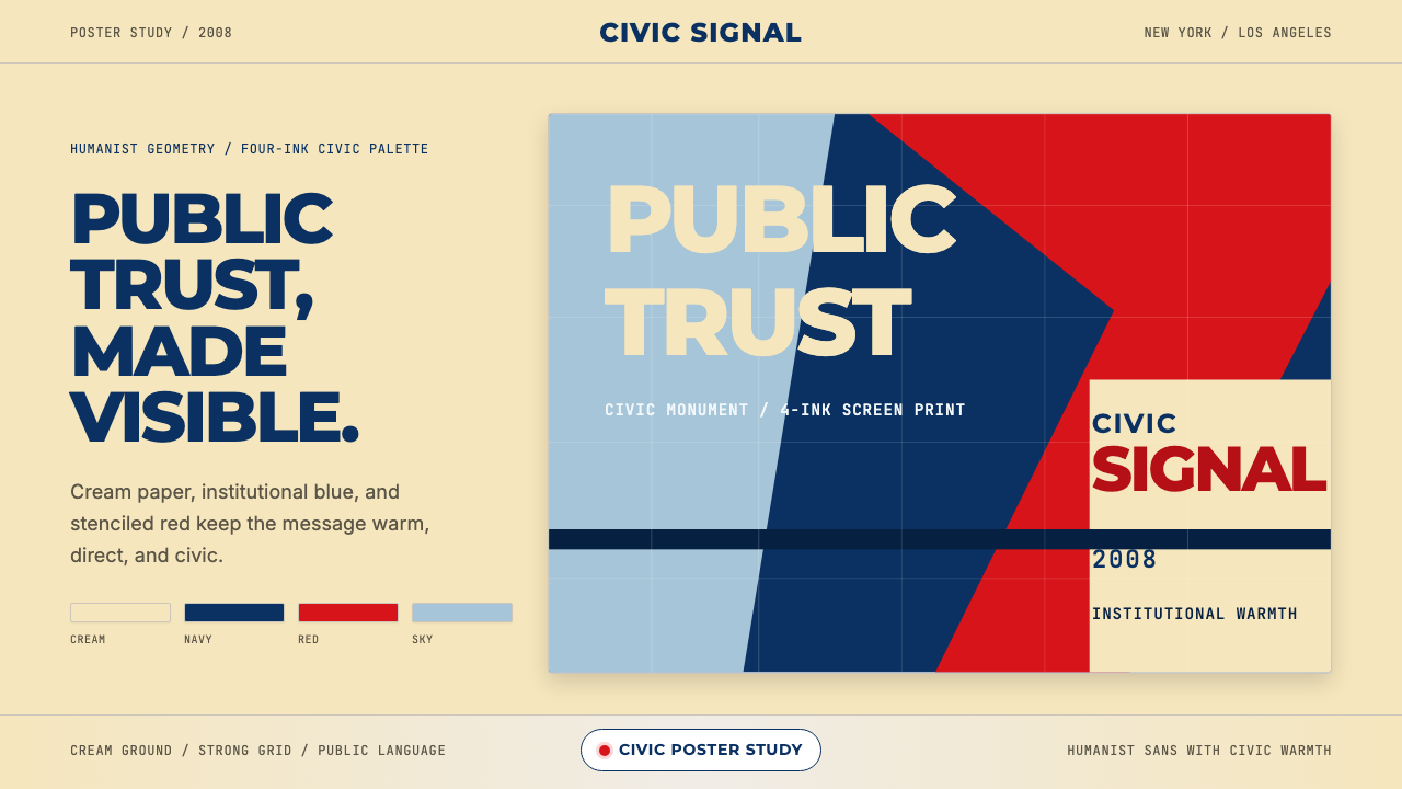 Gotham / Obama Hope Poster (2008)Public trust, made visible. Cream, navy, and red grid the poster.公共信任,清晰可见。奶油底、海军蓝和红色网格构成海报。
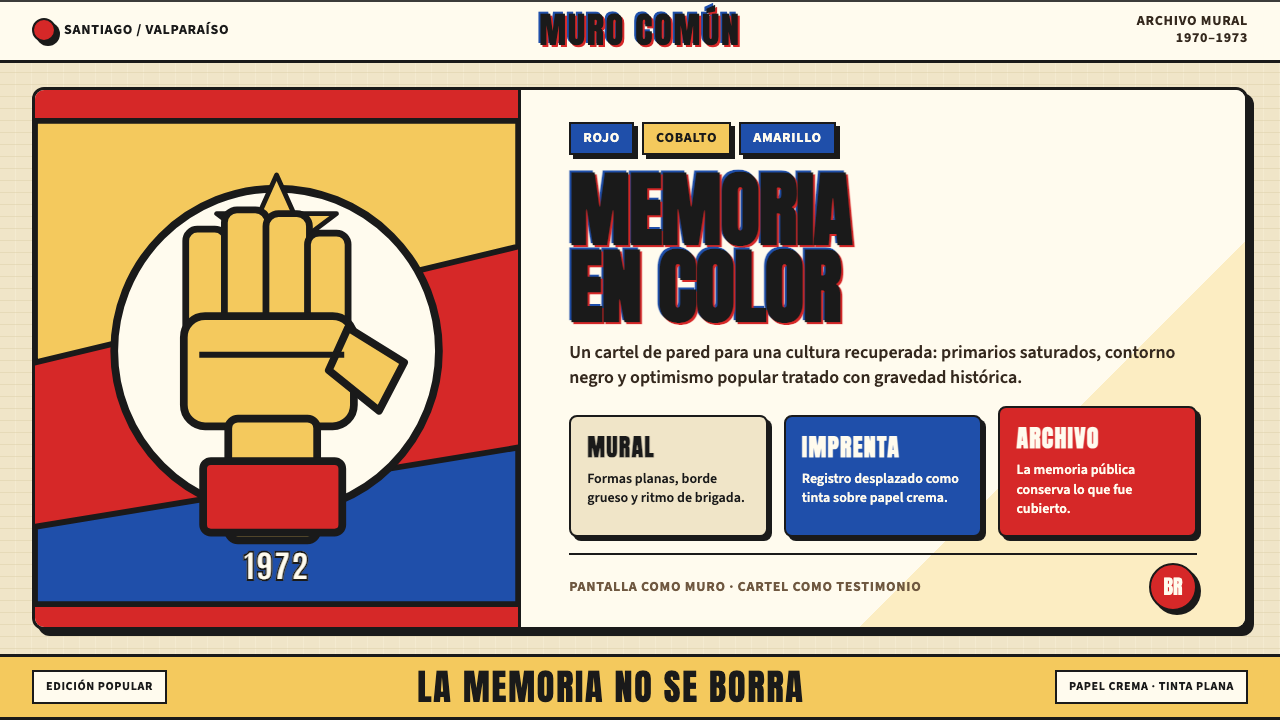 Chilean Allende-Era Propaganda (1972)Solemn revolution. Red, cobalt and yellow lock into thick black mural geometr…庄重的革命感:红、钴蓝与黄被黑色粗线锁进壁画几何。
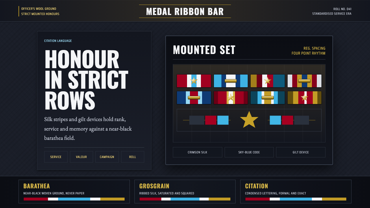 Medal Ribbon BarDiscipline worn as color. Crimson, sky-blue and gilt bars lock onto black woo…军规化为色彩:绯红、天蓝与鎏金绶带钉在黑呢上。
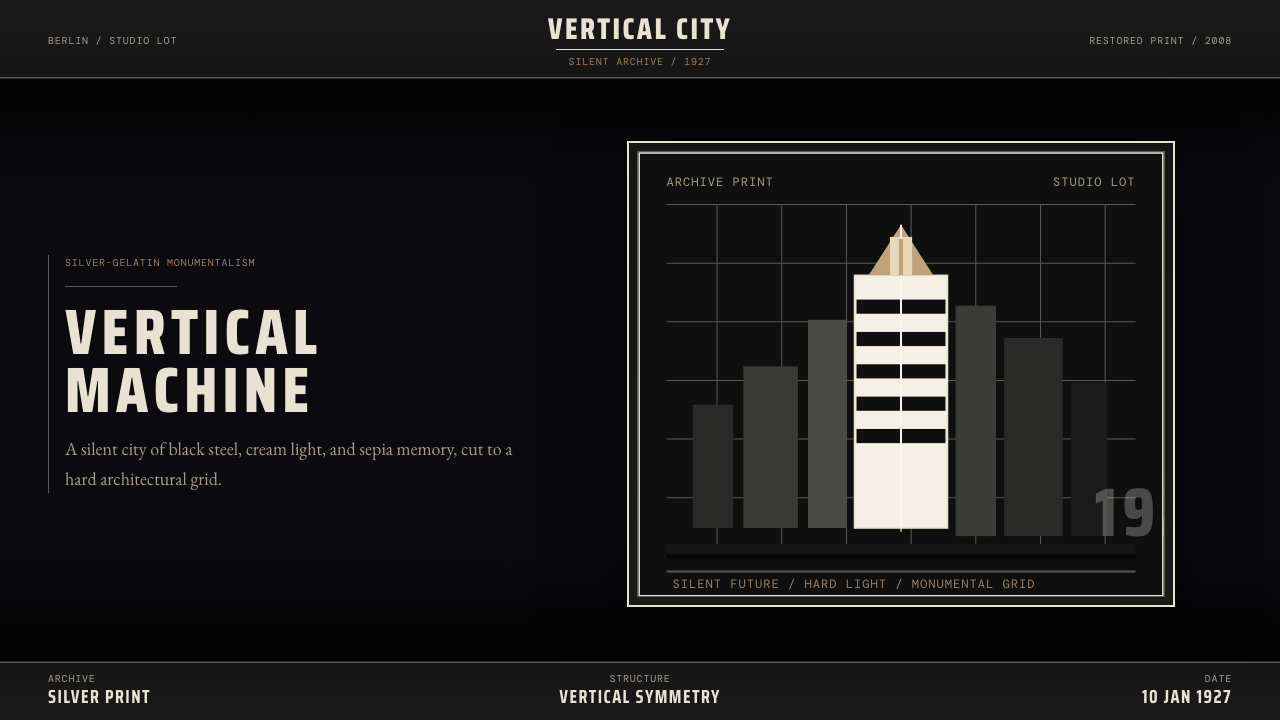 Metropolis (Fritz Lang, 1927)Monumental and severe. Black grid, cream type, sepia shadows.庄严而冷峻。黑底网格、奶白字与赭色阴影。
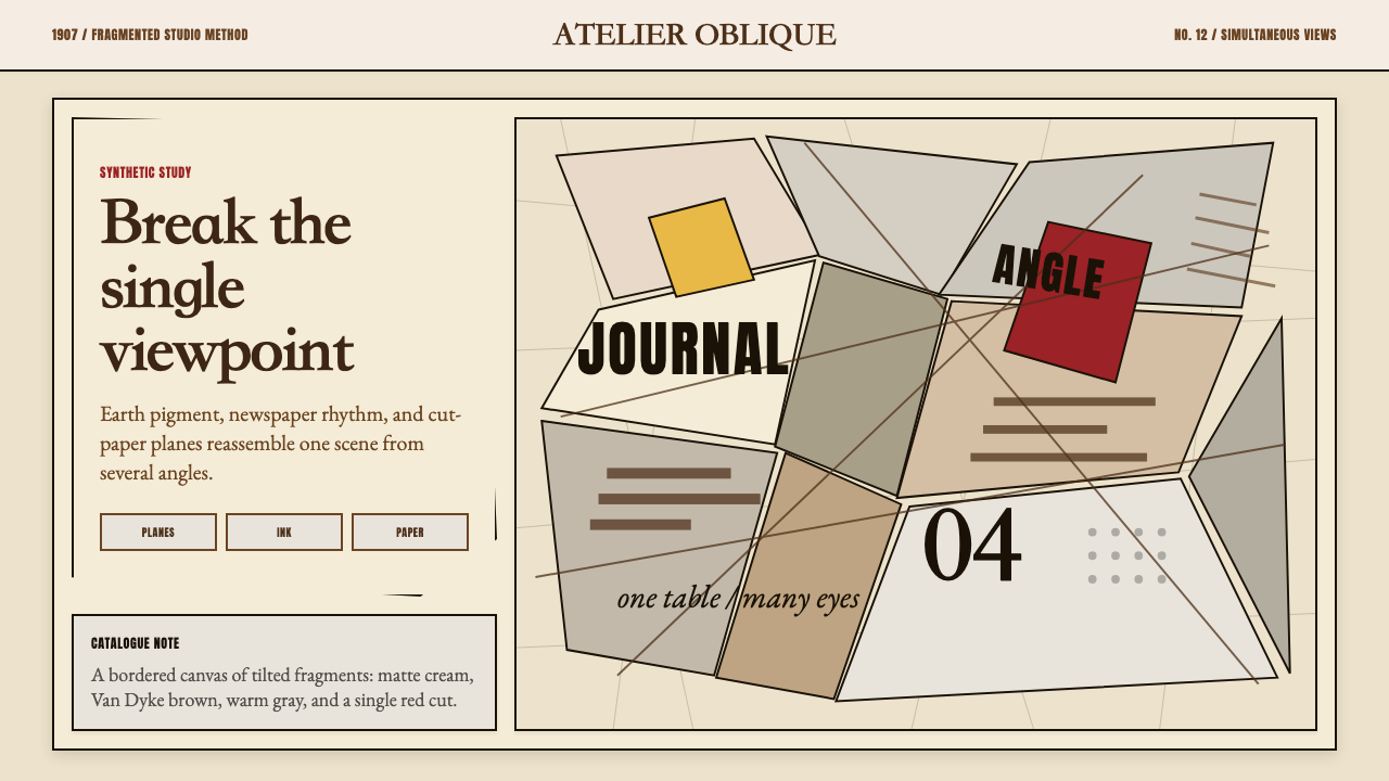 Picasso CubismSingle sight is shattered. Cream collage paper fractures brown-gray planes wi…单一视角被击碎:奶油拼贴纸上,褐灰棱面被一刀红色刺穿。