What is Gotham / Obama Hope Poster (2008)?什么是 Gotham / Obama Hope Poster (2008)?
A typeface born from New York bus-terminal signage and a four-color stenciled portrait together redefined what American civic authority looks like on a page.一款源自纽约巴士总站标识的字体,与一张四色模板肖像共同重新定义了美国公民权威在页面上的面貌。
Gotham / Obama Hope Poster (2008) in briefGotham / Obama Hope Poster (2008) 速览
The Gotham / Obama HOPE Poster design system draws from two convergent sources: a typeface commissioned in 2000 to capture the workaday lettering of mid-century New York, and a political poster created in 2008 that became one of the most widely reproduced graphic images in American history. Together they constitute a visual language of civic monumentalism — formal enough to convey institutional weight, warm enough to feel human.Gotham / Obama HOPE 海报设计系统融汇了两个汇聚的源流:一款受托于2000年、用于捕捉纽约市中世纪日常标识气质的字体,以及一张创作于2008年、成为美国历史上流传最广的图形图像之一的政治海报。两者共同构成了一套公民纪念碑式的视觉语言——正式到足以传递制度分量,温暖到足以令人感到亲切。
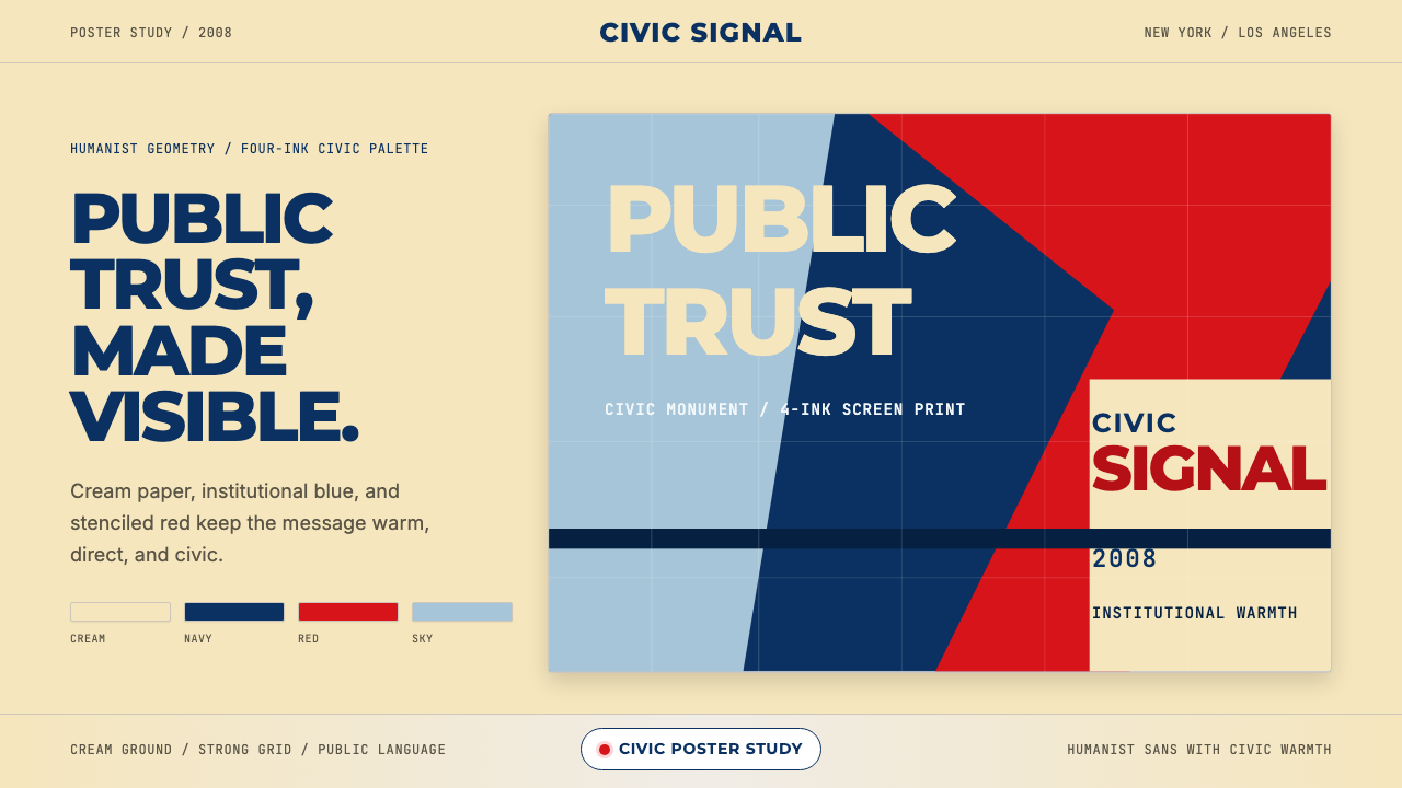
Visually, the system is built on a palette of cream, deep institutional blue, and a warm assertive red, with typography that is simultaneously geometric and humane. Where purely geometric sans-serifs feel mechanical, and purely humanist ones feel casual, Gotham occupies the productive middle ground: letters whose proportions derive from hand-painted vernacular signage rather than the drafting table, yet whose overall texture reads as authoritative and stable. The HOPE poster's stenciled portrait introduced a second visual grammar — flat planes of color describing a face in four tonal zones — that extended the typographic palette into image-making.从视觉上看,这套系统建立在奶油色、深沉的制度蓝与温暖而坚定的红色调色板之上,配以兼具几何性与人文性的字体排印。纯粹几何无衬线字体显得机械,纯粹人文主义字体又流于随意,而 Gotham 恰好占据那块富有成效的中间地带:字母比例源自手绘招牌而非制图桌,整体质感却读起来权威而稳定。HOPE 海报的模板肖像引入了第二套视觉语法——以四个色调区域描绘面孔的平面色块——将字体排印的调色板延伸至图像制作领域。
The resulting aesthetic is monumental without being cold. Cream grounds instead of stark white soften the contrast. The red is neither fire-engine nor corporate; it carries warmth and urgency simultaneously. The blue anchors without dominating. Together these choices produce a tone that political designers describe as accessible authority — credibility extended to an audience rather than asserted over it.由此形成的美学纪念碑式而不失温度。奶油色底面代替刺目的纯白,柔化了对比。那抹红色既非消防车红也非企业标准红,它同时承载温度与紧迫感。蓝色稳定而不压迫。这些选择共同营造出政治设计师所称的「可及性权威」——向受众延伸的可信度,而非凌驾其上的宣示。
See the Gotham / Obama Hope Poster (2008) design system查看 Gotham / Obama Hope Poster (2008) 完整设计系统
Where does Gotham / Obama Hope Poster (2008) come from?Gotham / Obama Hope Poster (2008) 从何而来?
In 1999, GQ magazine commissioned type designers Tobias Frere-Jones and Jonathan Hoefler to create a typeface that could evoke the vernacular lettering found across New York City — the hand-painted address plates, the cast-iron signs on the Port Authority Bus Terminal, the incised numerals on old bank facades. The brief was deceptively simple: make something that felt American and civic without resorting to the clichés of slab serifs or patriotic scripts. Frere-Jones spent months photographing New York signage, cataloguing the informal geometric letterforms that had accumulated on the city's surfaces over decades. The result, completed and released around 2000, was Gotham — a humanist geometric sans-serif that felt simultaneously timeless and specifically American.1999年,《GQ》杂志委托字体设计师托拜厄斯·弗雷-琼斯与乔纳森·霍夫勒,创作一款能够唤起纽约市各处日常标识气质的字体——手绘门牌号、港务局巴士总站的铸铁招牌、旧银行立面上的凿刻数字。委托要求看似简单:做出一种美国感、公民感,却不落入衬线体或爱国主义草书俗套的字体。弗雷-琼斯花费数月时间拍摄纽约街头标识,记录那些在城市表面积累了数十年的非正式几何字母。成果于约2000年完成并发布,这便是 Gotham——一款人文几何无衬线字体,同时感觉超越时代又鲜明地属于美国。
Gotham's adoption was swift and wide. Within a few years it had appeared in corporate identities, magazine mastheads, architectural signage, and television titles. Its legibility at large sizes and its warmth at text sizes made it unusually versatile. But its cultural moment came in 2008, when the Obama presidential campaign, led by design director Scott Thomas, selected Gotham as the campaign's primary typeface. Thomas recognized that Gotham occupied a visual register that was neither the stiff formality of traditional government typefaces nor the casual approachability of contemporary digital sans-serifs — it occupied the precise tonal position the campaign needed: hopeful, serious, trustworthy.Gotham 的被采用迅速而广泛。数年之内它便出现在企业视觉识别、杂志刊头、建筑标识与电视字幕之中。它在大尺寸下的高辨识度与在正文尺寸下的温度感,使其具有罕见的通用性。但它的文化时刻到来于2008年,彼时奥巴马总统竞选团队在设计总监斯科特·托马斯的主导下,选定 Gotham 作为竞选的主体字体。托马斯意识到,Gotham 占据的视觉音域既非传统政府字体的刻板正式,也非当代数字无衬线字体的随意亲切——它正好处在那场竞选所需要的精准音调位置:充满希望、严肃认真、值得信赖。
Simultaneous with the campaign's typographic choices, street artist Shepard Fairey created what would become the defining graphic artifact of the 2008 election. Working from a photograph, Fairey hand-traced a portrait of Barack Obama and reduced it to four flat color zones — a deep blue-green shadow, a medium blue midtone, a warm red, and a cream highlight — applied with the visual logic of a stencil. The word HOPE, set in Gotham Bold, anchored the bottom of the composition. Fairey initially distributed the poster as a grassroots image, but it was rapidly adopted and reprinted until it reached ubiquity. The Library of Congress later acquired an original for its permanent collection.与竞选排版选择同步,街头艺术家谢帕德·费尔雷创作了2008年大选中最具决定性意义的图形物件。费尔雷以一张照片为基础,手描奥巴马肖像,将其简化为四个平面色调区域——深蓝绿阴影、中调蓝色、暖红色与奶油色高光——以模板印刷的视觉逻辑呈现。以 Gotham Bold 排印的单词「HOPE」锚定构图底部。费尔雷最初将这张海报作为草根图像分发,它却被迅速采用与翻印,直至无处不在。美国国会图书馆后来将一件原版纳入永久馆藏。
The poster's power derived from the combination of stencil flatness with institutional typographic weight. Fairey's color reduction technique had precedents in propaganda poster traditions from the early twentieth century — Soviet constructivist graphics, World War II recruitment posters — but fused with Gotham's civic warmth, the result felt neither propagandistic nor purely commercial. It occupied a new register: monumental optimism rendered in the graphic grammar of a democratic vernacular. The HOPE poster became, alongside the Obama campaign's broader identity system, a case study in how design choices construct political meaning — and how a typeface can carry ideological freight without declaring it explicitly.这张海报的力量源自模板的平面性与制度字体分量的结合。费尔雷的色彩简化技法在二十世纪初的宣传海报传统中有所先例——苏联构成主义图形、二战征兵海报——但与 Gotham 的公民温度融合之后,结果既不像宣传品,也不像纯粹的商业作品。它占据了一个新的音域:以民主日常图形语法呈现的纪念碑式乐观主义。HOPE 海报与奥巴马竞选的整体视觉识别系统一道,成为设计选择如何建构政治意义的经典案例——以及一款字体如何在不明说的情况下承载意识形态分量的范本。
What defines the Gotham / Obama Hope Poster (2008) look?Gotham / Obama Hope Poster (2008) 的视觉特征是什么?
Color色彩
The palette is anchored by three tones: cream, deep institutional blue, and a warm assertive red. Cream grounds the composition with openness and approachability, avoiding the sterility of stark white. The blue carries the weight of civic authority — neither the cold navy of old government forms nor the bright cobalt of contemporary tech — but something in between that reads as trustworthy and stable. The red is warm rather than aggressive, carrying urgency and optimism in equal measure. These three tones are used at high saturation but moderate contrast, avoiding the visual harshness of four-color boldness while retaining monumental impact.调色板由三种色调支撑:奶油色、深沉的制度蓝与温暖而坚定的红色。奶油色以开放与亲切感奠定构图基调,避免了纯白色的无菌感。蓝色承载公民权威的分量——既非旧式政府表格的冷峻海军蓝,也非当代科技品牌的明艳钴蓝——而是介于两者之间、读起来值得信赖且稳定的色调。红色温暖而非咄咄逼人,紧迫感与乐观情绪各占一半。这三种色调以高饱和度、适中对比度使用,在保留纪念碑式冲击力的同时,避免了四色粗壮所带来的视觉刺眼感。
Typography字体排印
The defining typographic choice is a humanist geometric sans-serif drawn from vernacular sources rather than the drafting table. Letters have slightly irregular proportions that give them warmth — stroke endings that echo hand-lettering, apertures that feel open rather than constructed. Weight contrast within words is used at headline scale to assert hierarchy: a bold word against a lighter supporting line creates rhythm without ornament. At large display sizes, the letterforms carry sufficient presence to function as visual anchors for an entire composition, not merely as labels.关键字体选择是一款源自日常标识而非制图桌的人文几何无衬线体。字母具有略微不规则的比例,赋予其温度——笔画收尾呼应手写标识,开口感觉敞开而非被构造。在标题尺度上,字母间的字重对比用于建立层级:粗重文字搭配轻盈辅助行,无需装饰即可制造韵律。在大号展示尺寸下,字母形态具有足够的存在感,可以作为整个构图的视觉锚点,而不仅仅是标签。
Stencil Tonality模板色调
The HOPE poster introduced a tonal system derived from stencil-printing logic: a face or figure is rendered not with continuous gradation but in four discrete flat color zones, each corresponding to a shadow, midtone, light midtone, and highlight. This approach treats portraiture and illustration as a form of graphic architecture — the face becomes a composition of flat planes rather than a naturalistic rendering. When extended to the broader design system, this stencil tonality means that photographic imagery is always reduced to flat zones rather than reproduced with full gradation.HOPE 海报引入了一套源自模板印刷逻辑的色调系统:面孔或人物不以连续渐变呈现,而是以四个离散的平面色调区域描绘,分别对应阴影、中调、亮中调与高光。这种方式将肖像与插图视为一种图形建筑——面孔成为平面的构图,而非自然主义的描绘。当延伸至整个设计系统时,这种模板色调意味着摄影图像总是被简化为平面色区,而非以完整渐变复现。
Composition构图
Compositions are centered and frontally stable — a deliberate contrast with the asymmetric dynamism favored by many modernist traditions. The HOPE poster is nearly perfectly symmetrical along its vertical axis, with the portrait occupying the upper three-quarters and the word HOPE filling the lower quarter. This frontality is a political decision: it positions the subject as an object of direct address rather than dynamic motion. In applications beyond the poster itself, this vertical anchoring principle translates to layouts that are grounded and deliberate rather than restless.构图居中且正面稳定——这是与许多现代主义传统所偏爱的非对称动态感的刻意对照。HOPE 海报沿垂直轴近乎完全对称,肖像占据上方四分之三,单词「HOPE」填满下方四分之一。这种正面性是一个政治决定:它将主体定位为直接对话的对象,而非动态运动中的形象。在超越海报本身的应用中,这一垂直锚定原则转化为沉稳而深思熟虑的版面,而非躁动不安的布局。
Scale and Hierarchy尺度与层级
Typographic hierarchy operates primarily through scale — a single dominant word or short phrase set at a size that dwarfs any supporting text. Secondary information is reduced to a register that almost disappears against the dominant element, making the primary message impossible to miss. This extreme scale contrast is characteristic of poster logic: the image and headline must read at distance before any detail is legible. In contemporary digital applications, this translates to hero sections where the primary message is unmistakable and all supporting context is visually subordinate.字体层级主要通过尺度运作——一个主导词或短语以远超辅助文字的尺寸呈现。次要信息被压缩至几乎在主导元素旁隐形的量级,使主要信息无从忽视。这种极端的尺度对比是海报逻辑的特征:图像与标题必须在任何细节可读之前就能从远处被辨识。在当代数字应用中,这转化为主视觉区块中主要信息无可置疑、所有辅助上下文在视觉上居于从属地位的设计方式。
Civic Warmth公民温度
Unlike design systems that derive authority from coldness or precision, this system builds trust through warmth. The cream ground, the slightly irregular letterforms, and the warm-weighted red all contribute to an emotional register that is formal without being forbidding. This quality is described by design historians as vernacular institutionalism — the visual language of buildings and organizations that people actually trust, accumulated over decades of public contact, distilled into a reproducible aesthetic. It is the opposite of the clean corporate minimalism that signals efficiency; it signals reliability.与那些从冷峻或精确中获取权威感的设计系统不同,这套系统通过温度建立信任。奶油色底面、略显不规则的字母形态,以及偏暖的红色,共同营造出一种正式而不令人生畏的情感音域。设计史学家将这种品质描述为「日常制度主义」——人们在数十年公共接触中真正信任的建筑与机构的视觉语言,被提炼为一种可复现的美学。它与传递效率感的简洁企业极简主义恰恰相对——它传递的是可靠性。
Flatness平面性
All elements — whether typographic or pictorial — are resolved as flat shapes with hard edges. There are no soft gradients, no ambient shadows suggesting three-dimensional depth, and no photographic texture applied to surfaces. The stencil portrait technique enforces this flatness on imagery; the typographic tradition enforces it on letterforms. The result is a visual world that is fully two-dimensional but never feels sparse — the warmth of the palette and the density of the tonal zones fill the flatness with presence.所有元素——无论是字体性的还是图像性的——都以硬边平面形态呈现。没有柔和渐变,没有暗示三维深度的环境投影,也没有施加于表面的摄影质感。模板肖像技法为图像强制执行这种平面性;字体排印传统为字母形态强制执行同样的原则。结果是一个完全二维的视觉世界,却从不感到稀疏——调色板的温度与色调区域的密度以存在感填满了平面性。
See the Gotham / Obama Hope Poster (2008) design system查看 Gotham / Obama Hope Poster (2008) 完整设计系统
Who shaped Gotham / Obama Hope Poster (2008)?谁塑造了 Gotham / Obama Hope Poster (2008)?
Frere-Jones is the primary designer of Gotham, which he developed while still a partner at Hoefler & Frere-Jones. His research methodology — walking New York streets and photographing vernacular lettering on buildings, transit infrastructure, and storefronts — gave Gotham its documentary authenticity. Rather than designing from abstract geometric principles, he reverse-engineered the visual proportions of letterforms that had been trusted by everyday Americans for decades. After a widely publicized legal dispute, Frere-Jones now operates his own independent type foundry, where he continues to expand the Gotham family and other typefaces in the humanist-geometric tradition.弗雷-琼斯是 Gotham 字体的主要设计师,该字体在他仍是霍夫勒与弗雷-琼斯合伙公司成员时开发完成。他的研究方法——走遍纽约街头,拍摄建筑、交通基础设施与店面上的日常标识——赋予了 Gotham 其纪实性的真实感。他不是从抽象几何原则出发进行设计,而是逆向工程了那些数十年来被美国普通民众所信赖的字母比例。经历了一场广为人知的法律纠纷之后,弗雷-琼斯现在经营自己独立的字体铸造工坊,继续扩展 Gotham 家族及其他人文几何传统字体。
Fairey is a street artist and graphic designer who rose to prominence through his OBEY Giant campaign, a long-running guerrilla art project. His 2008 HOPE poster began as a grassroots gesture — he printed and distributed copies himself before any formal affiliation with the Obama campaign — and grew into a phenomenon that appeared on magazine covers, in museum collections, and replicated millions of times worldwide. The poster's creation was not without controversy: Fairey later faced legal action over the source photograph he had used as a reference. Despite the dispute, the poster's design legacy is secure, and Fairey's technique of reducing photographic portraiture to flat tonal stencil planes has been widely studied and imitated.费尔雷是一位街头艺术家与平面设计师,凭借长期进行的游击艺术项目「OBEY巨人」而声名大噪。他的2008年 HOPE 海报最初是一个草根姿态——在与奥巴马竞选团队建立任何正式关联之前,他便自行印制并分发——随后演变成一种现象,出现在杂志封面、博物馆馆藏中,并在全球被复制数百万次。这张海报的创作并非没有争议:费尔雷后来因使用参考照片而面临法律诉讼。尽管如此,这张海报的设计遗产已经无可置疑,而费尔雷将摄影肖像简化为平面色调模板的技法也被广泛研究与模仿。
Thomas served as Design Director for Barack Obama's 2008 presidential campaign and was responsible for the coherent visual identity system that united campaign materials across print, digital, and environmental applications. His decision to build the campaign's typographic identity around Gotham — combined with a consistent use of the cream-blue-red palette — established the tonal register that made the campaign's materials instantly recognizable. Thomas later documented the design process in a book, providing one of the most detailed public accounts of how a modern political campaign builds and maintains a visual identity system under the constraints of a fast-moving electoral cycle.托马斯担任2008年奥巴马总统竞选团队的设计总监,负责统一竞选材料在印刷、数字与环境应用中的视觉识别系统。他选择以 Gotham 为竞选字体核心的决定——结合奶油蓝红调色板的一致运用——确立了使竞选材料一眼可辨的色调音域。托马斯后来以一本书记录了这一设计过程,提供了迄今为止对现代政治竞选如何在快节奏选举周期约束下建立并维护视觉识别系统的最详尽公开记录之一。
Hoefler co-directed the type design firm Hoefler & Frere-Jones during the period when Gotham was developed, and his institutional and editorial typography work provided the broader context for the studio's output. While Frere-Jones led the Gotham design research, Hoefler's complementary work on typefaces for editorial clients including The New York Times Magazine established the studio's reputation for typefaces that operated simultaneously as historical research and contemporary design solutions. Following the dissolution of the partnership, Hoefler now operates Hoefler&Co, which continues to license Gotham and related typefaces.霍夫勒在 Gotham 开发期间共同主持霍夫勒与弗雷-琼斯字体工作室,他在制度与编辑字体排印领域的工作为工作室的整体产出提供了更广泛的背景。尽管弗雷-琼斯主导了 Gotham 的设计研究,霍夫勒为包括《纽约时报》杂志在内的编辑客户所做的互补性字体工作,确立了工作室在历史研究与当代设计解决方案并行运作方面的声誉。合伙关系解散后,霍夫勒现在经营 Hoefler&Co,继续授权 Gotham 及相关字体系列。
How do you use Gotham / Obama Hope Poster (2008) today?今天怎么用 Gotham / Obama Hope Poster (2008)?
The Gotham / HOPE Poster design language is well suited to contexts where authority and approachability must coexist — where the design needs to feel both serious and humane. Unlike purely cold institutional aesthetics, this system carries warmth; unlike purely warm consumer aesthetics, it carries gravity. Understanding this dual register is the starting point for applying it correctly. The system works best when the product or message is genuinely civic in nature: not trying to seem governmental, but genuinely concerned with public trust.Gotham / HOPE 海报设计语言非常适合权威感与亲切感必须共存的场景——设计需要同时感觉严肃与人性化。与纯粹冷峻的制度美学不同,这套系统携带着温度;与纯粹温暖的消费品美学不同,它携带着分量。理解这种双重音域,是正确应用它的起点。这套系统在产品或信息本质上具有公民性的场合效果最佳:不是试图显得像政府机构,而是真正关切公众信任。
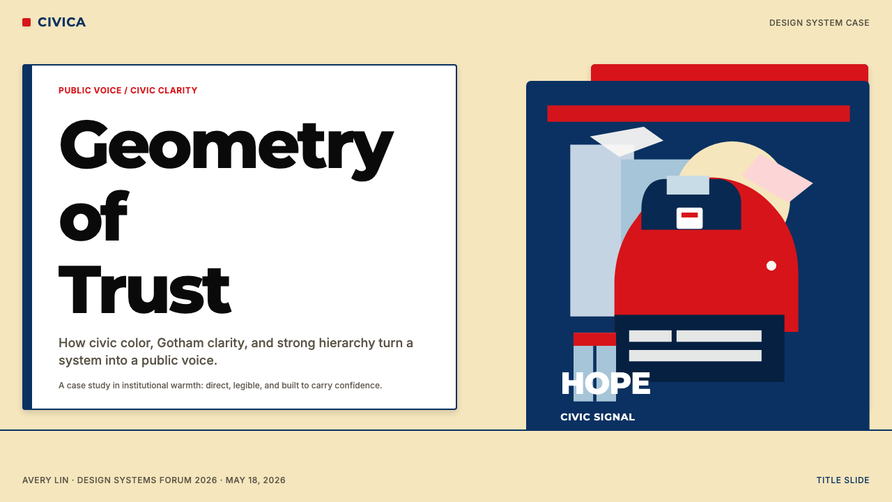
For presentation slides, the system rewards a simple vertical hierarchy. Cover slides benefit from the poster's own compositional logic: one large visual element — a portrait, an icon, a single powerful word — occupying the upper portion, with a short identifying phrase below in a weight and scale that reads as a caption to the dominant element rather than a competing headline. Content slides should limit typographic levels to two: a single lead statement at large scale and supporting text at a comfortable reading size. The cream-blue-red palette maps naturally onto slide states: cream grounds for standard content, deep blue for emphasis or section headers, red used sparingly for single critical figures or call-out data. Data visualization should follow the stencil logic — flat shapes with hard edges, bars and areas in the blue-and-red range, no gradient fills.对于演示文稿,这套系统适合简洁的垂直层级结构。封面页受益于海报本身的构图逻辑:一个大型视觉元素——肖像、图标或一个有力的单词——占据上方区域,下方是简短的识别短语,其字重与尺寸读起来是主导元素的说明文字,而非竞争性的标题。内容页的字体层级应限于两级:一句大尺寸的主要陈述,加上适宜阅读尺寸的辅助文字。奶油蓝红调色板自然映射至页面状态:标准内容用奶油底,深蓝色用于强调或章节标题,红色克制地用于单个关键数据或引用框。数据可视化应遵循模板逻辑——硬边平面形态,柱条与面积区域使用蓝红范围的颜色,不使用渐变填充。
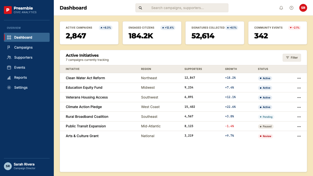
For web interfaces, the system suits dashboards, pricing pages, and institutional landing pages where hierarchy and scannable confidence matter more than sensory delight. The approach is to anchor the page with a typographic hero — a short phrase in large, bold, open letterforms — and then descend through the page in clearly differentiated tonal zones. Navigation should be spare and typographic, without decorative icons. Cards and panels work best with defined borders rather than drop shadows; if elevation is needed to distinguish interactive elements, a hard-offset shadow in a muted version of the blue reads more authentically than a soft ambient glow. Color should be used purposefully: cream or near-white for background fields, deep blue for primary interactive elements, red for single critical actions or alerts.对于网页界面,这套系统适合仪表板、定价页面与机构类落地页,在这些场合,层级与可扫描的信心感比感官享受更为重要。方法是以字体排印主视觉锚定页面——以大号、粗重、开口感强的字母形态呈现的短句——然后在清晰区分的色调区域中向下延伸页面。导航应简洁且字体化,不加装饰图标。卡片与面板以明确边框而非投影阴影呈现效果最佳;如需以高度感区分可交互元素,以蓝色的低饱和版本做硬边偏移阴影,比柔和环境光晕更具真实感。色彩应有目的地使用:奶油色或近白色用于背景区域,深蓝色用于主要交互元素,红色用于单一关键操作或警示。
For editorial and marketing applications, the style's poster heritage is an advantage. Full-bleed section dividers in deep blue with cream type create the visual impact of a monumental stamp without requiring complex illustration. Pull quotes set at generous scale in the red tone break editorial rhythm effectively. Marketing pages can alternate between cream-on-blue and blue-on-cream full-width bands to create rhythmic section differentiation. For social media cards and event graphics, the stencil portrait approach is directly applicable: reduce the central visual to flat tonal zones and let the typographic anchor hold the bottom of the frame, following the original poster's proportional logic.对于编辑与营销应用,这种风格的海报传承是一种优势。深蓝底配奶油色文字的全出血分区分隔,无需复杂插图即可创造出纪念碑式印章的视觉冲击。以红色调、宽松尺寸排印的引用语能有效打破编辑节奏。营销页面可以在奶油底蓝字与蓝底奶油字的全宽色带之间交替,以制造有韵律的章节区分。对于社交媒体卡片与活动图形,模板肖像方法可以直接应用:将核心视觉元素简化为平面色调区域,让字体排印锚点占据画面底部,遵循原版海报的比例逻辑。
A common mistake when applying this system is treating the warmth of the palette as an invitation to add softness: rounded corners, gradient fills, drop shadows, soft-focus photography. These additions directly undermine the system's authority. Gotham's warmth comes from letter proportions, not from visual texture; the HOPE palette's warmth comes from color choice, not from diffusion. Another frequent error is deploying all three palette tones simultaneously at equal weight — cream backgrounds with both deep blue type and red accents compete for attention rather than establishing clear hierarchy. Use one primary tone per section or per slide, reserving the accent color for the single most important element in the composition.应用这套系统时最常见的错误,是将调色板的温度理解为添加柔和感的邀请:圆角、渐变填充、投影阴影、柔焦摄影。这些添加直接削弱系统的权威感。Gotham 的温度来自字母比例,而非视觉质感;HOPE 调色板的温度来自色彩选择,而非扩散效果。另一个频繁出现的错误是同时以同等分量使用全部三种调色板色调——奶油底面上同时有深蓝文字与红色强调,相互争夺注意力而非建立清晰层级。每个区块或每张页面只用一种主色调,将强调色保留给构图中最重要的单一元素。
See the Gotham / Obama Hope Poster (2008) design system查看 Gotham / Obama Hope Poster (2008) 完整设计系统
Gotham / Obama Hope Poster (2008) — FAQGotham / Obama Hope Poster (2008) · 常见问题
Is this design system only appropriate for political or governmental contexts?这套设计系统是否只适合政治或政府场景?
No — the civic warmth of the system is a tone, not a category restriction. It works wherever an organization needs to project reliable competence to a broad public audience: educational institutions, public health communications, nonprofit organizations, civic technology platforms, and financial services that want to feel trustworthy rather than prestigious. The key is that the audience must be one you are serving, not one you are selling to in a purely commercial register. The moment the design starts optimizing for conversion pressure rather than public trust, the tonal authenticity breaks down.不——这套系统的公民温度是一种色调,而非类别限制。凡是需要向广大公众受众传递可靠能力感的组织,都可以使用它:教育机构、公共卫生传播、非营利组织、公民科技平台,以及希望传递可信赖感而非尊贵感的金融服务。关键在于,受众必须是你正在服务的人,而非你以纯粹商业逻辑向其推销的人。一旦设计开始优化转化压力而非公众信任,色调的真实性就会随之崩解。
How do I use the stencil portrait technique in contexts that do not involve a human subject?在不涉及人物主体的场景中,我如何应用模板肖像技法?
The stencil reduction principle is not limited to portraiture — it is a method of rendering any image in flat tonal zones rather than continuous gradation. Objects, architecture, landscapes, and diagrams can all be subjected to the same four-zone reduction: shadow, midtone shadow, midtone light, and highlight, each filled with one of the palette tones. The discipline is to resist adding intermediate tones to smooth the transitions — the hard boundary between zones is the aesthetic content, not a rendering limitation to be overcome. In practice, this means treating photographic source imagery as material to be interpreted graphically rather than reproduced faithfully.模板简化原则并不局限于肖像——它是以平面色调区域而非连续渐变呈现任何图像的方法。物体、建筑、风景与图表都可以经受同样的四区域简化:阴影、中调暗部、中调亮部与高光,每个区域以一种调色板色调填充。自律在于抵制添加中间色调来柔化过渡——区域之间的硬边界是美学内容,而非需要克服的渲染局限。在实践中,这意味着将摄影源图像视为待图形化诠释的素材,而非待忠实复现的对象。
Does the system support dark-background variants?这套系统是否支持深色背景变体?
A dark inversion is possible but requires careful adjustment. The canonical application uses cream as the primary ground, and this ground contributes significantly to the system's warmth. On a deep background — navy or near-black — the cream tones become the highlight color rather than the ground, which compresses the tonal range and risks making the composition feel darker and more austere than intended. A workable dark variant treats deep blue as the primary ground, cream and red as the two foreground tones, and reserves black for structural outlines only. The warmth must then come entirely from color temperature rather than ground tone, which is achievable but demands discipline.深色反转版本是可能的,但需要谨慎调整。经典应用以奶油色作为主要底面,而这一底面对系统的温度贡献显著。在深色底面上——海军蓝或近黑色——奶油色调成为高光色而非底面色,这压缩了色调范围,有使构图感觉比预期更暗淡、更肃穆的风险。一个可行的深色变体以深蓝色作为主要底面,以奶油色与红色作为两种前景色调,仅将黑色保留用于结构性轮廓。此时温度必须完全来自色彩温度而非底面色调,这是可以实现的,但需要严格的自律。
How does this system differ from Swiss International Style, which also uses strong sans-serif typography and flat color?这套系统与同样使用强劲无衬线字体和平面色彩的瑞士国际主义风格有何不同?
Swiss International Style, which matured in the 1950s and 1960s, prioritizes mathematical precision, strict grid adherence, and neutrality — it aims for a universal visual language that communicates across cultural contexts with minimum interference from aesthetic character. The Gotham / HOPE system, by contrast, is deliberately culturally specific: it encodes the vernacular traditions of American civic lettering, the emotional register of political poster-making, and the warm color palette of institutional trust rather than universal neutrality. Swiss Style is cooler, more systematic, and more committed to typographic purity. The HOPE system is warmer, more frontal, and more willing to deploy emotion as a design material. The technical similarities — sans-serif type, flat color, strong hierarchy — mask a fundamental philosophical difference in what the design is trying to communicate.瑞士国际主义风格在二十世纪五六十年代成熟,以数学精确性、严格网格遵守与中立性为优先——它追求一种跨越文化语境传递信息、将美学特征干扰降至最低的普世视觉语言。而 Gotham / HOPE 系统恰恰相反,是刻意具有文化特殊性的:它编码了美国公民标识的日常传统、政治海报制作的情感音域,以及机构信任感的温暖调色板,而非普世中立。瑞士风格更冷峻、更系统化、对字体纯粹性更为恪守。HOPE 系统更温暖、更正面,更愿意将情感作为设计材料加以运用。两者在技术层面的相似——无衬线字体、平面色彩、强劲层级——掩盖了设计试图传递之内容上的根本哲学分歧。
What contexts should this system avoid?这套系统应该避免用于哪些场景?
The system struggles wherever sensory richness, cultural intimacy, or commercial playfulness are the primary values. Luxury brands depend on material refinement and restraint that reads as exclusive rather than civic; this system's warmth would undercut that register. Children's products and entertainment platforms depend on visual energy and delight that requires color variety and dynamic composition beyond what the three-tone palette supports. High-fashion editorial work demands either the stark minimalism of pure photography or the decorative richness of illustrative traditions — neither of which aligns with stencil flatness and institutional typography. When in doubt, ask whether the product's emotional promise is trust and reliability, or aspiration and desire — only the former maps cleanly to this system.这套系统在感官丰富性、文化亲密性或商业趣味性是首要价值的场景中会力不从心。奢侈品牌依赖被解读为独特而非公民性的材料精致与克制感——这套系统的温度会削弱那种音域。儿童产品与娱乐平台依赖视觉活力与愉悦感,需要超越三色调色板所能支持的色彩多样性与动态构图。高端时尚编辑作品需要纯摄影的极致简洁或插图传统的装饰丰富性——两者都与模板平面性和制度字体排印不相符。当犹豫时,问问自己:这款产品的情感承诺是信任与可靠性,还是渴望与欲望——只有前者能够清晰地映射到这套系统。
Related design styles相关设计风格
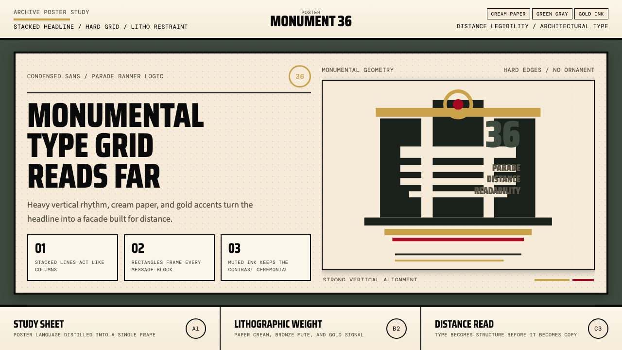 Olympic Poster Berlin (1936)Monumental and legible. Green-gray, cream, and gold turn type into architectu…纪念碑感十足。绿灰、奶油纸与金色把字体变成建筑。
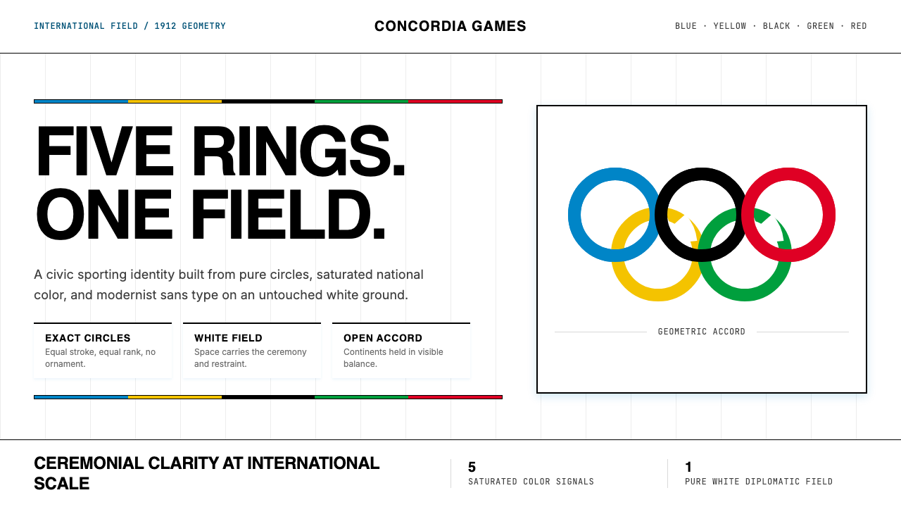 Olympics Five Rings (1912)Ceremony without noise. Saturated five-ring color on pure white, locked to a…无噪声的典礼感:纯白场域上饱和五色环,严密栅格定调。
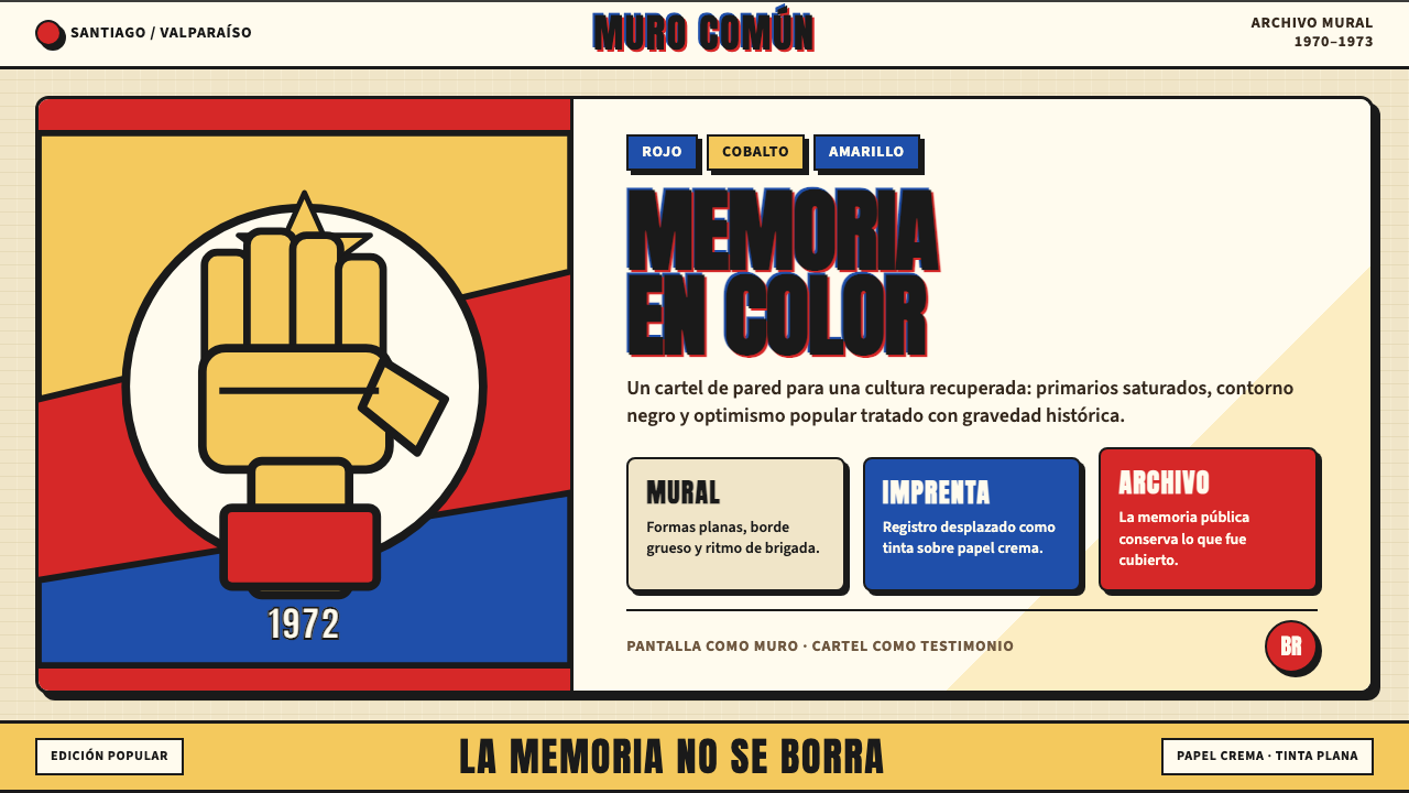 Chilean Allende-Era Propaganda (1972)Solemn revolution. Red, cobalt and yellow lock into thick black mural geometr…庄重的革命感:红、钴蓝与黄被黑色粗线锁进壁画几何。
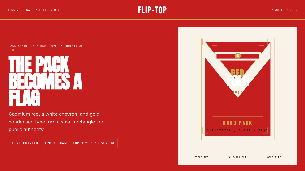 Marlboro Red Flip-Top (1955)Authority in one fold. Cadmium red, white chevron, and gold type read like a…一折成旗。镉红、白人字与金字排出强硬权威。
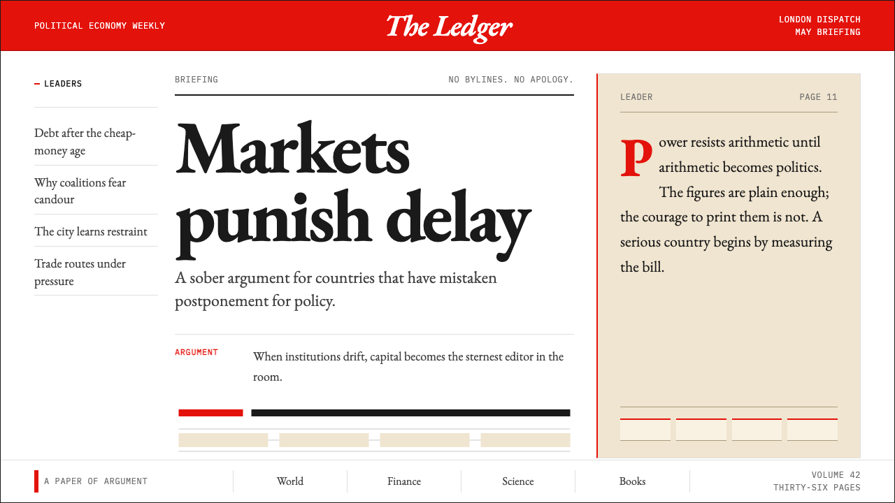 The Economist (Red-Banner)Argument made visible. Red banner, cream paper and Garamond columns enforce t…论点即版面:红刊头、米色纸面与Garamond分栏收紧栅格。