What is The Economist (Red-Banner)?什么是 The Economist (Red-Banner)?
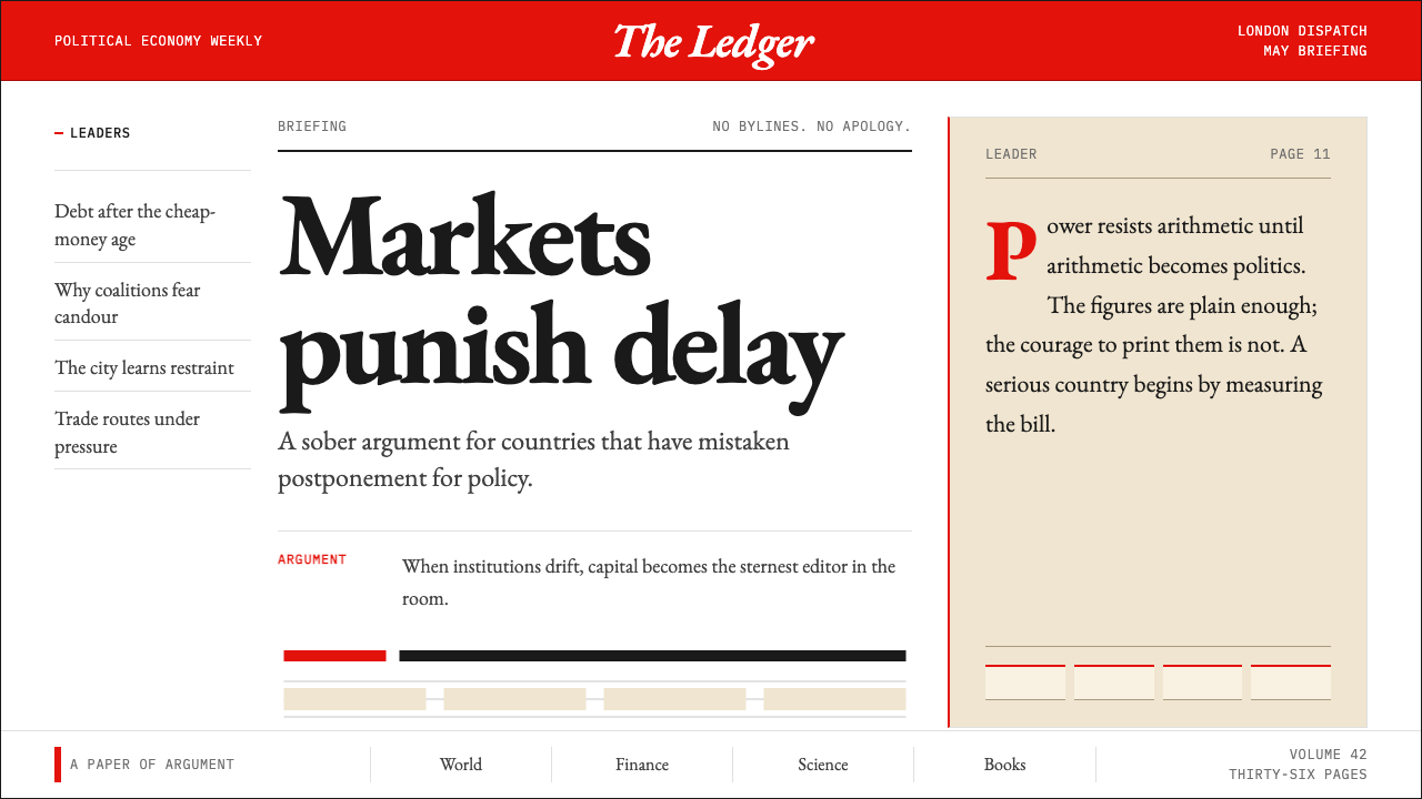
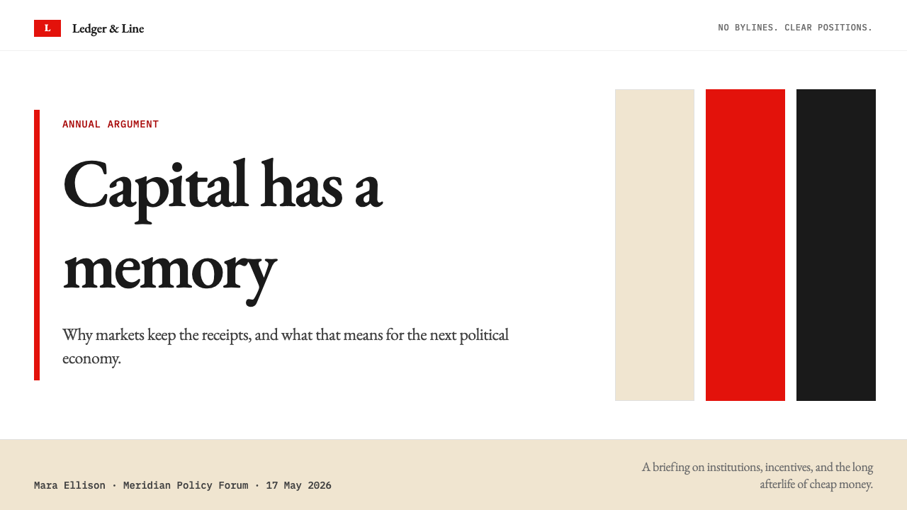
Economist Red crowns every cover like a verdict — a saturated banner that has made editorial conviction visible since 1843.「经济学人红」如同裁决横贯每一期封面——这道饱和的刊头自 1843 年起便让编辑立场成为可见之物。
The Economist (Red-Banner) in briefThe Economist (Red-Banner) 速览
The Economist visual identity is one of the most disciplined systems in global journalism. A deep, fully saturated red banner anchors the top of every cover; below it, the masthead lettering — set in a condensed serif that reads with unmistakable authority — names the publication without flourish or variation. Warm cream and deep charcoal govern the interior, where generously leaded serif columns carry long-form prose without typographic decoration of any kind. The system has no decorative motifs, no gradient fills, and no ornamental borders.《经济学人》的视觉识别体系是全球新闻出版业中最为克制的系统之一。深沉、高度饱和的红色刊头锚定每一期封面顶部;其下,以紧凑衬线字体排印的刊名在毫无花饰的情况下传递出无可置疑的权威感。暖米色与深炭灰主导内页,慷慨的行距让衬线字体栏目在不施任何排印装饰的条件下承载大量长篇文字。整个系统没有装饰图案、没有渐变填充,也没有任何装饰性边框。
What gives the identity its power is not its color alone but the relentlessness of its application. Every element — from cover illustration margins to the rule weight separating rubrics — is derived from the same underlying grid. Typography observes a strict hierarchy: the banner is bold and commanding, section headers are measured and restrained, and body text is set at a size and leading that rewards sustained reading. Nothing competes with anything else. The page enforces attention in the same way an authoritative argument does: by refusing to equivocate.赋予这套识别体系力量的,不仅仅是色彩本身,而是它被执行时的彻底性。从封面插图的留白到区隔栏目的分割线粗细,每一个元素都源自同一个底层栅格。字体排印遵循严格的层级关系:刊头粗重而命令式,版块标题内敛而克制,正文字体与行距的设定则服务于持续阅读。没有任何元素与其他元素相互竞争。版面像一个有权威的论点一样强制注意力:拒绝含混。
The overall aesthetic sits at the intersection of British editorial tradition and editorial modernism. It borrows the authority of the Victorian broadsheet — confident serif type, a controlled palette, no bylines — and strips away all the period ornament, leaving a system that feels both classic and contemporary. The red is not decorative; it is positional. It announces that an opinion follows, and that the publication stands behind it without apology.这套美学整体上处于英式编辑传统与编辑现代主义的交汇点。它借鉴了维多利亚时代大报的权威感——自信的衬线字体、克制的色板、不署作者名——并剥去所有时代性装饰,留下一套既古典又当代的系统。红色并非装饰性的;它是定位性的。它宣告:一个观点即将展开,而这份刊物将毫无歉意地为之背书。
See the The Economist (Red-Banner) design system查看 The Economist (Red-Banner) 完整设计系统
Where does The Economist (Red-Banner) come from?The Economist (Red-Banner) 从何而来?
The Economist was founded in London in September 1843 by James Wilson, a Scottish hat manufacturer turned political economist who believed that free trade, and specifically the repeal of the Corn Laws, was the most urgent question facing Britain. The publication was not conceived as a newspaper in the conventional sense but as an argument in periodical form — a weekly instrument of advocacy whose purpose was to persuade Parliament and the commercial classes that protectionist tariffs were economically irrational. This founding commitment to a single, prosecuted thesis shaped the publication's voice and, eventually, its visual character.《经济学人》由苏格兰制帽商人出身的政治经济学家詹姆斯·威尔逊于 1843 年 9 月在伦敦创立。他相信自由贸易——尤其是废除《谷物法》——是英国面临的最紧迫议题。这份刊物从一开始就不被构想为传统意义上的报纸,而是一种以期刊形式呈现的论点——一种每周出版的倡导工具,旨在说服议会与商业阶层相信保护主义关税在经济上是非理性的。这种致力于单一、持续推进的论题的创刊承诺,塑造了这份刊物的声音,并最终塑造了它的视觉性格。
For most of its first century, The Economist looked broadly similar to other British weeklies of the Victorian and Edwardian periods — dense text columns, modest illustration, a sober masthead. Its visual distinctiveness was born gradually through the twentieth century as it evolved from a specialist commercial paper into a global current-affairs weekly with international ambitions. The saturated red banner became the fixed element that unified otherwise evolving covers, and its consistency across decades created the recognition that now makes the publication identifiable at a glance from across a newsstand.在其存在的头一个世纪里,《经济学人》的外观与维多利亚及爱德华时代其他英国周刊大体相似——密集的文字栏、有限的插图、朴素的刊头。它的视觉独特性在二十世纪间逐渐诞生:刊物从一份专业商业报纸演变为具有国际抱负的全球时事周刊。那道饱和的红色刊头成为统一不断更新的封面的固定元素,数十年的一致性造就了如今在报摊上一眼可辨的识别度。
The modern typographic identity — centered on the Milo serif family, commissioned for the publication's editorial use — arrived in the early 2000s as part of a systematic effort to bring coherence to body text, headlines, and display type across print and emerging digital editions. Milo was chosen for qualities that aligned with the publication's editorial character: legibility at small sizes, authority at display scales, and a proportional system that works within narrow columns without losing rhythm. The transition from earlier type arrangements to Milo consolidated what had been a gradually evolving identity into a deliberately engineered one.现代字体识别体系——以为该刊物委托定制的 Milo 衬线字体家族为核心——于二十一世纪初作为系统性工程的一部分抵达,旨在为印刷版与新兴数字版的正文、标题和展示字体带来整体连贯性。Milo 被选中,是因为它的品质与刊物的编辑性格相契合:小号排列时的易读性、展示尺寸时的权威感,以及在窄栏中维持节奏而不失比例的内在系统。从早期字体编排到 Milo 的过渡,将一套逐渐演化的识别体系整合为一套经过刻意工程设计的系统。
The editorial decision to omit bylines — continued to the present — is not a visual choice but a philosophical one that has direct visual consequences. Without named authors, every article is presented as the considered institutional position of the publication, and the layout reflects this: no author photographs, no biographical pull-quotes, no personality-driven design elements. The page speaks for itself. This convention, rooted in Walter Bagehot's editorial stewardship in the 1860s and 1870s, created a visual field that is unusually clean by the standards of any era's journalism. The current editor, Zanny Minton Beddoes, has maintained the tradition, and the visual system has evolved without departing from it.至今延续的不署作者名的编辑决策并非视觉选择,而是具有直接视觉后果的哲学选择。没有具名作者,每篇文章都呈现为刊物经过慎重考量的机构立场,版面也相应地反映这一点:没有作者照片,没有以个人为中心的引语设计,没有任何以个性驱动的设计元素。页面为自身代言。这一惯例根植于沃尔特·白哲特在十九世纪六七十年代的编辑主持之下,创造出一个在任何时代的新闻业标准中都异常干净的视觉场域。现任主编赞尼·明顿·贝多斯延续了这一传统,而视觉系统在演化的同时从未偏离它。
What defines the The Economist (Red-Banner) look?The Economist (Red-Banner) 的视觉特征是什么?
The Red Banner红色刊头
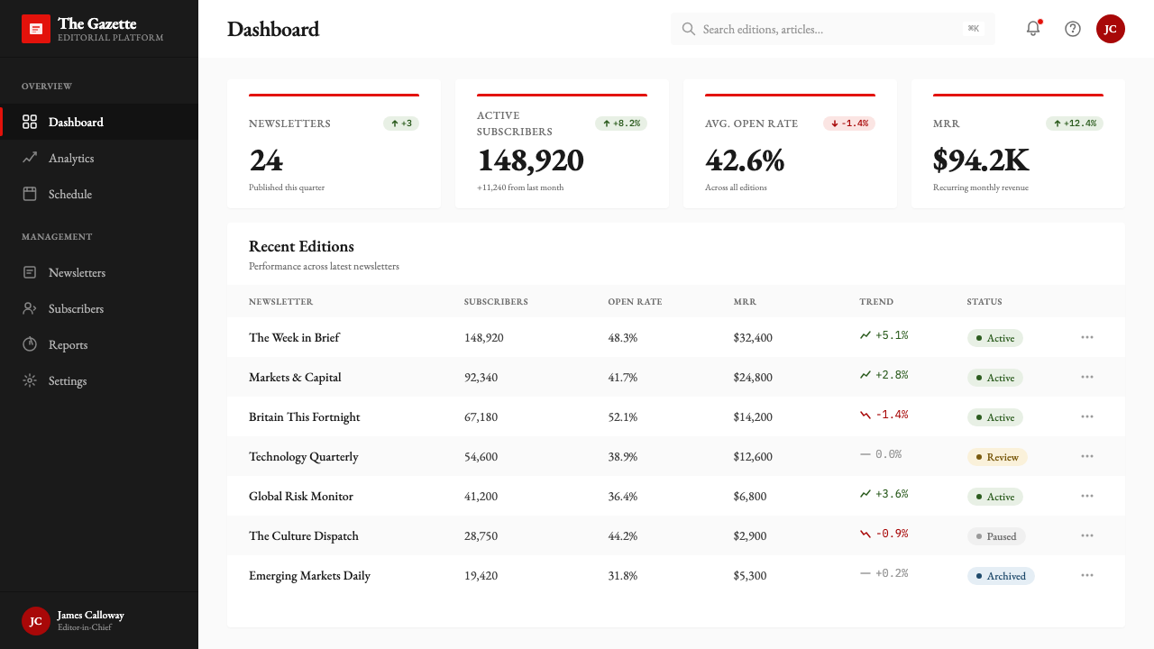
The saturated red that crowns every cover is not merely a brand color — it functions as a structural announcement. It signals that what follows is not neutral reporting but argued position, and it does so without any supporting text or symbol. The red is deployed at full saturation against white or cream lettering, creating a contrast ratio that commands attention before a single word is read. Crucially, the banner's red never migrates into the body of the publication as a tinting or accent color; its power depends entirely on its containment and its exclusivity.横贯每一期封面顶部的饱和红色,不仅仅是一种品牌色——它发挥着结构性宣告的功能。它在没有任何支撑文字或符号的情况下,宣告接下来的内容不是中立报道,而是有立场的论点。这道红色以最高饱和度叠于白色或米色字母之上,制造出一种在读者读到任何文字之前就已夺取注意力的对比强度。至关重要的是,刊头的红色从不渗入刊物内页作为色调或强调色使用;它的力量完全依赖于它的克制与排他性。
Serif Typography with Editorial Authority具有编辑权威的衬线字体
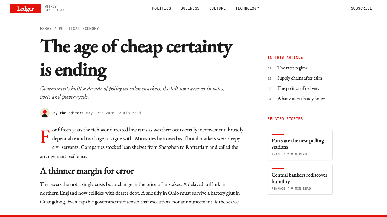
The body typeface is a purpose-designed serif whose proportions and weight distribution are tuned for newspaper-grade column widths. It is legible at small sizes, authoritative at headline scale, and designed to carry dense, argument-driven prose without fatigue. The letterforms are neither the extreme contrast of classical Didones nor the low contrast of slabs — they occupy a measured middle register that reads as serious without feeling archaic. Headlines are set at a weight and size that creates clear hierarchy without resorting to sans-serif contrast or color differentiation.正文字体是一款专为这家刊物设计的衬线字体,其比例与笔画粗细分布专为报纸级别的栏宽调校。它在小号排列时清晰易读,在标题尺寸时传递权威,并被设计为在承载密集、论证驱动的长篇文字时不令人感到疲惫。字形的对比度既非古典 Didone 体的极端对比,也非平板衬线字体的低对比——它处于一个克制的中间状态,读来严肃却不显陈旧。标题以特定字重和字号设定,在不借助无衬线对比或色彩区分的情况下建立清晰的信息层级。
Warm Cream and Charcoal Interior暖米色与炭灰内页
Inside the publication, the background shifts from pure white to a warm, slightly tinted cream that softens the reading experience without diminishing legibility. Body text runs in deep charcoal rather than absolute black, reducing the starkness of ink-on-paper contrast to something more sustained over long reading sessions. This palette choice is functional as much as aesthetic: cream ground and charcoal type reproduce consistently across different paper stocks and printing conditions, ensuring the publication looks authoritative whether printed on high-grade coated stock or on the more porous newsprint of emerging markets.进入刊物内页,底色从纯白过渡为略带温度的米色,在不损失易读性的前提下柔化了阅读体验。正文以深炭灰而非纯黑排印,将墨纸对比的刺烈感降至一个可以持续长时间阅读的程度。这套色板选择兼具功能性与美学性:米色底面与炭灰文字在不同纸张和印刷条件下都能一致再现,确保这份刊物无论印在高档铜版纸还是新兴市场较为多孔的新闻纸上,都呈现出相同的权威气质。
Rigorous Columnar Grid严格的栏式栅格
The layout system is founded on a multi-column grid that has remained essentially stable for decades. Column widths are narrow enough to enforce a short, readable line measure but consistent enough that the eye can settle into a rhythm across sections. Margins are generous: the white space surrounding text columns is not wasted space but the structural counterpart to the density of the prose. Section breaks are marked by ruled lines and typographic changes in weight rather than by images or colored bands. The grid creates coherence without monotony because the hierarchy within it is carefully calibrated — a short news brief reads as a distinct register from a lengthy briefing or leader article, even though both share the same underlying column structure.版面系统建立在数十年来基本保持稳定的多栏栅格之上。栏宽足够窄,以确保每行字数适于阅读,而各栏的一致性又使眼睛能够在不同版块间维持阅读节奏。页边距十分慷慨:围绕文字栏的空白并非浪费,而是文章密度的结构性对应物。版块间隔以分割线和字重的排印变化标记,而非以图像或色彩条带标记。栅格在避免单调的同时维持连贯性,因为其中的层级经过细心校准——一则简短新闻与一篇长篇简报或社论,尽管共享相同的底层栏式结构,读起来却处于截然不同的语境层级之中。
Restrained Use of Illustration and Data Graphics克制的插图与数据图形
The Economist's cover illustrations are among the most recognized in magazine publishing: they are typically figurative, often allegorical, and always conceptually pointed — a visual argument in miniature that parallels the cover story's thesis. Inside the publication, illustration is rare and purposeful. Data graphics, on the other hand, are a signature element: charts and maps are rendered in a house style that prioritizes readability and precision over decoration. Chart lines are clean, axes labeled economically, and a restricted set of shading patterns and accent colors is used consistently to distinguish data series without creating visual noise.《经济学人》的封面插图是杂志出版界认知度最高的之一:它们通常是具象的、常带有寓言性,且在概念上总是有所指向——一种与封面故事论点相互呼应的微型视觉论证。进入刊物内页,插图极为罕见,出现时目的明确。数据图形则是另一回事,属于这份刊物的标志性元素:图表与地图以一种将易读性和精确性置于装饰之上的内部样式呈现。图表线条干净,坐标轴标注经济,以一套有限的阴影图案和强调色一致地区分数据系列,而不制造视觉噪音。
No Bylines, No Visual Personality无署名,无个人色彩
The absence of author bylines is the invisible design principle that makes all the other principles legible. Without names attached to articles, the layout has no need for author photographs, biographical sidebars, or the personality-inflected typographic treatments common in publications where individual writers are part of the editorial product. The result is a visual field of remarkable consistency: every section, every page, every article is presented at the same institutional register. The reader's attention is directed entirely toward the content and the argument, never toward the author's persona. This restraint is not a limitation — it is the foundation of the publication's editorial voice.不署作者名是那个使所有其他设计原则清晰可读的隐形设计原则。没有具名文章,版面就无需作者照片、个人简介侧栏,或在个人作者作为编辑产品一部分的刊物中常见的个性化排印处理。结果是一个具有惊人一致性的视觉场域:每个版块、每一页、每篇文章都以相同的机构调性呈现。读者的注意力被完全导向内容与论点,而非作者的个人形象。这种克制并不是一种限制——它是这份刊物编辑声音的基础。
Consistent Cross-Media Discipline跨媒介的一致性自律
The visual system transfers with remarkable fidelity from print to digital. The Economist's app and website maintain the same typographic hierarchy, the same restrained palette, and the same grid-derived spacing that governs the print edition — not as a nostalgic gesture but as a deliberate choice to present a coherent identity regardless of medium. The red banner appears in digital contexts as a header element rather than a physical stripe, but its function — positioning the reader's relationship to the content as one of engaged argument rather than passive consumption — remains unchanged. This media-agnostic consistency is itself a design statement about the publication's values.这套视觉系统以惊人的忠实度从印刷向数字迁移。《经济学人》的应用程序与网站维持着与印刷版相同的字体层级关系、相同的克制色板,以及相同的源自栅格的间距——这不是一种怀旧姿态,而是一种有意为之的选择:无论媒介如何,都呈现连贯的身份认同。红色刊头在数字场景中以页眉元素而非实体条带的形式出现,但它的功能——将读者与内容的关系定位为积极参与的论辩而非被动消费——始终如一。这种不依赖媒介的一致性本身,就是关于这份刊物价值观的设计宣言。
See the The Economist (Red-Banner) design system查看 The Economist (Red-Banner) 完整设计系统
Who shaped The Economist (Red-Banner)?谁塑造了 The Economist (Red-Banner)?
Wilson founded The Economist in 1843 with the explicit goal of opposing the Corn Laws and advocating for free trade. A self-educated political economist who had made his fortune in the hat trade, he brought to the publication the conviction that economic argument, clearly made, could change policy. His decision to publish under a single institutional voice — with no bylines, no named editors, only 'The Economist' as author — established the editorial personality that every subsequent visual identity has served. Wilson died in 1860 while serving as Finance Minister in India, but the argumentative format he instituted survives essentially unchanged.威尔逊于 1843 年创办《经济学人》,明确目标是反对《谷物法》、倡导自由贸易。这位靠制帽业起家的自学成才政治经济学家,带来了「经济论点,清晰表达,可以改变政策」的信念。他决定以单一机构声音出版——不署作者名,不标注编辑姓名,只以「经济学人」为作者——确立了此后每一套视觉识别体系所服务的编辑人格。威尔逊于 1860 年在担任印度财政部长期间辞世,但他创立的论辩式格式基本原封不动地延续至今。
Bagehot served as editor from 1861 to 1877 and is largely responsible for developing the publication's distinctive analytical voice — confident, occasionally ironical, always willing to reach a conclusion when others hedged. His essay 'The English Constitution' and his financial journalism in 'Lombard Street' demonstrated that serious argument could be made in prose that was also pleasurable to read. The typographic restraint of the publication — no exclamation points in headlines, no bold emphasis within body text — reflects the same temperament Bagehot modeled in his prose. He is considered the intellectual architect of the publication's editorial character.白哲特于 1861 年至 1877 年间担任主编,在很大程度上塑造了这份刊物独特的分析声音——自信、偶带讽刺、总是在他人含混时敢于得出结论。他的文章《英国宪制》和金融新闻写作集《伦巴底街》证明了严肃论证可以用同样令人愉悦的文字承载。这份刊物在排印上的克制——标题不用感叹号,正文中不以粗体强调——所折射的,正是白哲特在其文字中示范的同一种气质。他被视为这份刊物编辑性格的精神建筑师。
Parker was a typographer and type director whose work at Linotype helped shape the digital type landscape of the late twentieth century, and his influence touched the typefaces available to publications including The Economist during key transitional periods in typographic technology. His advocacy for type that served reading rather than display — for faces with genuine editorial utility rather than novelty — aligned with the philosophy embedded in The Economist's body type choices. Though not exclusively associated with the publication, his broader contribution to the culture of serious editorial typography represents the tradition from which the publication's typographic decisions draw.帕克是一位字体设计师与字体总监,他在莱诺铸排公司的工作帮助塑造了二十世纪末的数字字体格局,并在字体技术关键过渡期影响了包括《经济学人》在内的出版物可用字体的选择。他对服务于阅读而非展示的字体的倡导——对具有真正编辑实用性而非新奇感的字体的主张——与《经济学人》正文字体选择所蕴含的哲学相互契合。尽管他并非专门与这份刊物相关联,但他对严肃编辑字体排印文化的广泛贡献,代表了这份刊物在字体决策上所汲取的传统。
Minton Beddoes became the first woman to serve as editor-in-chief of The Economist when she was appointed in 2015. Under her tenure, the publication has navigated the transition to digital-first journalism while preserving the visual and editorial identity that distinguishes the brand. The decision to maintain print and digital editions with consistent visual language — rather than developing separate identities for each medium — reflects a stewardship philosophy that treats the publication's visual character as inseparable from its editorial one. Her editorship demonstrates that the red-banner identity is robust enough to survive and remain relevant across profound changes in how journalism is produced and consumed.明顿·贝多斯于 2015 年被任命为《经济学人》首位女性主编。在她的任期内,这份刊物在向数字优先新闻业过渡的同时,保持了使这一品牌与众不同的视觉与编辑身份认同。选择以统一的视觉语言维系印刷版与数字版——而非为每种媒介分别发展独立的身份——折射出一种将刊物视觉性格与编辑性格视为不可分割的管理哲学。她的编辑任期证明,红色刊头识别体系足够强健,能够在新闻业生产与消费方式深刻变革的过程中存续并保持当代相关性。
How do you use The Economist (Red-Banner) today?今天怎么用 The Economist (Red-Banner)?
The Economist red-banner aesthetic is one of the most directly applicable editorial styles in contemporary design. Its principles — restrained palette, strict typographic hierarchy, grid discipline, and the total absence of decorative flourish — transfer cleanly to digital and presentation contexts because they were developed to serve argument and reading, not to decorate surfaces. Applying the style correctly requires understanding what each visual decision is doing functionally, not just replicating its surface appearance.「经济学人」红色刊头美学是当代设计中可直接应用的编辑风格之一。它的原则——克制的色板、严格的排印层级、栅格纪律,以及对装饰性花饰的彻底摒弃——能够干净地迁移到数字与演示场景中,因为这些原则是为服务论点与阅读而发展的,而非为装饰表面而设计的。正确应用这套风格,需要理解每个视觉决策在功能上所做的事,而不仅仅是复制它的表面外观。
For presentation slides, the style works with exceptional clarity on both cover and content layouts. A cover slide benefits from the full-width saturated red header band — deep and commanding — set against a cream or near-white field, with the presentation title in a confident serif at a scale that claims the space without overcrowding it. Content slides should be structured as reading grids: a single organizing column, typographic hierarchy established through weight and scale alone, and absolutely no decorative dividers, gradient panels, or icon clusters. Data slides take on the diagrammatic character the publication's charts are known for: clean lines, economically labeled axes, and a restricted set of distinguishing tones for different data series. Avoid adding shadows, glows, or three-dimensional treatments to charts — they undermine the precision the style requires.在演示文稿中,这套风格在封面与内容版面上都展现出非凡的清晰度。封面幻灯片适合使用全宽、深沉而命令式的饱和红色标题条带,衬于米色或接近白色的底面之上,演示标题以自信的衬线字体排印,字号大到足以主导空间而不显拥挤。内容幻灯片应当被构建为阅读栅格:单一的组织性栏目,仅通过字重与尺寸建立排印层级,完全不使用装饰性分割线、渐变面板或图标群组。数据幻灯片呈现出这家刊物的图表所具有的那种示意性品质:线条干净,坐标轴标注经济,以一组有限的区分性色调标示不同数据系列。避免为图表添加阴影、光晕或三维处理——这些会破坏这种风格所要求的精确性。
For web interfaces and dashboards, the red-banner system is particularly well-suited to contexts where information density is high and hierarchy must be immediately legible — analytics dashboards, research platforms, pricing pages, and editorial portals. The approach: establish a strict column grid, use cream or near-white as the primary background, reserve deep charcoal for all body text, and deploy the saturated red only for primary navigation elements, active states, or the most structurally significant calls to action. Card components should use thin borders and minimal elevation rather than soft shadows; section headers should be typographic rather than color-blocked. The result is a digital environment that feels authoritative and scannable without being cold or clinical.对于网页界面和仪表板,红色刊头系统特别适合信息密度较高、层级必须立即可读的场景——数据分析仪表板、研究平台、定价页面和编辑门户。方法如下:建立严格的栏式栅格,以米色或接近白色作为主要背景,将深炭灰保留给所有正文文字,仅将饱和红色部署于主导航元素、活跃状态,或结构上最重要的行动召唤处。卡片组件应使用细边框和极低的层次感,而非软阴影;版块标题应当是排印性的,而非色块化的。最终呈现的数字环境应当感觉权威且易于扫视,而不冷漠或临床。
For editorial and marketing work, the style supports strong information hierarchy and a recognizable voice of conviction. An editorial layout in this system uses a narrow column measure with generous outer margins — the margin is functional, used for call-outs, pull quotes marked by a single ruled line, or date and metadata that the body text need not interrupt. Section breaks are marked by a fine horizontal rule and a weight change in the section header, never by a decorative device. Marketing pages translate the style's poster-like authority into feature blocks: alternating panels with typographic headlines at a bold scale, restrained body copy, and a single red accent used consistently to mark the most important action on each page. The style works particularly well for publications, financial services, professional analytics tools, and any brand that wants to signal intellectual seriousness without sacrificing modernity.对于编辑与营销内容,这种风格支持强劲的信息层级和一种可辨认的确信声音。这套系统中的编辑版面采用窄栏宽与慷慨的外侧页边距——页边距是功能性的,用于放置引言、以单条分割线标记的摘录,或不需打断正文的日期与元数据。版块间隔以细水平线和版块标题字重的变化标记,绝不使用装饰性元素。营销页面将这种风格的海报式权威感转化为特性区块:以粗重衬线字体排印大号排版标题的交替面板、克制的正文,以及一种始终用于标记每个页面上最重要行动的单一红色强调色。这种风格尤其适合出版物、金融服务、专业分析工具,以及任何希望在不牺牲当代感的前提下传递出智识严肃性的品牌。
A common mistake when applying this style is treating the red as an accent color to be distributed liberally across the interface — used for hover states, icon fills, link underlines, chart bars, and background panels simultaneously. In the source identity, the red does one job: it is the banner. Everything else is cream, charcoal, or white. When red appears in more than one structural role at a time, its positional authority dissolves. A second common error is choosing a serif typeface that reads as decorative or period-specific rather than editorially neutral — ornate serifs, high-contrast Didones, or slab serifs with strong personality all work against the style's fundamental restraint. The typeface should feel like the prose: authoritative, readable, and entirely in service of the content.应用这套风格时最常见的错误,是将红色当作一种可以在界面中自由分布的强调色——同时用于悬停状态、图标填充、链接下划线、图表柱条和背景面板。在原始识别体系中,红色只做一件事:它是刊头。其他一切都是米色、炭灰或白色。当红色同时承担一个以上的结构性角色时,它的定位性权威就会消解。第二个常见错误,是选择一款读来具有装饰感或历史感而非编辑中性的衬线字体——华丽的衬线体、高对比度的 Didone 字体,或个性强烈的粗衬线体,都与这种风格的根本克制相悖。字体应当感觉像文章本身:权威、易读,并完全服务于内容。
See the The Economist (Red-Banner) design system查看 The Economist (Red-Banner) 完整设计系统
The Economist (Red-Banner) — FAQThe Economist (Red-Banner) · 常见问题
Can I use the red as an accent color throughout a layout, or does it need to be confined to a header?我可以将红色作为强调色贯穿整个版面使用,还是必须将其限制在标题区域?
Confinement is the principle. In the source identity, the red performs a single structural role — the banner that positions the entire publication. When you distribute red across multiple elements simultaneously (links, icons, chart bars, hover states, and a header all in red), it loses its ability to declare position and becomes decoration. The most authentic application gives the red one job per layout. In a slide, that might be the header band. In a web dashboard, it might be the primary navigation bar or the single most important action button. Everywhere else, charcoal, cream, and white carry the load.克制是这条原则的核心。在原始识别体系中,红色承担单一结构性角色——定位整个刊物立场的刊头。当你同时将红色分布在多个元素上(链接、图标、图表柱条、悬停状态和标题全部用红),它便失去了宣告立场的能力,沦为装饰。最忠实的应用方式,是在每个版面中只给红色一个任务。在幻灯片中,那可能是标题条带;在网页仪表板中,可能是主导航栏或最重要的一个行动按钮。其他所有地方,由炭灰、米色和白色承担。
What kind of serif typeface works best if I am recreating this style?如果我要再现这种风格,哪种衬线字体最为合适?
Look for a text-optimized serif with moderate stroke contrast, low-key serifs that do not draw attention to themselves, and proportions designed for narrow column widths. Avoid extremes in either direction: a high-contrast Didone reads as fashion-forward and fragile; a chunky slab reads as too muscular and editorial-casual. The target character is a face that feels like it has been in serious use for a long time — authoritative through familiarity rather than through visual novelty. Old-style and transitional serifs with generous lowercase x-heights tend to perform well in this register.寻找一款为文本优化的衬线字体,要求笔画对比度适中,衬脚低调而不引人注目,比例专为窄栏宽设计。避免走极端:高对比度的 Didone 字体读来时尚而纤细;粗壮的平板衬线字体则过于强硬、带有随意的编辑感。目标气质是一款感觉被严肃使用了很长时间的字体——通过熟悉感而非视觉新颖性传递权威。具有慷慨小写字母高度的旧式(old-style)与过渡式(transitional)衬线字体,往往在这个调性上表现出色。
Does this style work for consumer-facing products, or is it mainly suited to B2B and professional contexts?这种风格适用于面向消费者的产品吗?还是它主要适合 B2B 和专业场景?
The style is strongly associated with editorial authority and intellectual seriousness, which makes it a natural fit for professional services, financial products, research platforms, and publications targeting educated general audiences. It is less naturally suited to products where warmth, sensory pleasure, or cultural identity are primary values — food, travel, wellness, children's products, and lifestyle brands typically need more organic visual texture and more emotional palette range than the style provides. The honest question to ask is whether your product's values include the kind of conviction and directness that the red banner embodies. If they do, the style will feel genuinely aligned; if they do not, it risks reading as borrowed authority.这种风格与编辑权威性和智识严肃性密切相关,使其自然地适合专业服务、金融产品、研究平台,以及面向受过教育的普通读者的出版物。它对于温暖感、感官愉悦或文化身份认同是首要价值的产品,则不那么自然适配——食品、旅游、健康、儿童产品和生活方式品牌,通常需要比这种风格所能提供的更为有机的视觉质感和更丰富的情感性色板。诚实的问题是:你的产品价值观是否包含红色刊头所体现的那种确信与直接性?如果是,这种风格会感觉真正对位;如果不是,则有可能被读解为借来的权威。
How does this style handle data visualization differently from other editorial styles?与其他编辑风格相比,这种风格在数据可视化上有什么不同的处理方式?
The Economist's chart house style is one of the most studied in data journalism precisely because it achieves high information density without visual clutter. The key principles: every chart element that does not carry information is removed — no decorative background panels, no gradient fills on bars or areas, no three-dimensional effects. The chart itself sits on the cream or white ground of the page with no containing box; a single thin ruled line marks the top of the chart field. Labels are placed directly adjacent to their corresponding data series rather than in a separate legend box wherever layout permits. Color is used to distinguish data series but is kept to a minimal, easily distinguishable set. The result is a chart that reads as part of the argument rather than as a decoration of it.《经济学人》的图表内部样式是数据新闻领域被研究最多的之一,原因正在于它在不造成视觉杂乱的前提下实现了高信息密度。关键原则如下:所有不承载信息的图表元素一律去除——无装饰性背景面板,无柱条或面积图上的渐变填充,无三维效果。图表本身直接落于页面的米色或白色底面上,没有围合性边框;图表区域顶部由一条细分割线标记。在版面允许的情况下,标签直接置于对应数据系列旁,而非放在独立的图例框中。色彩用于区分数据系列,但保持在一组最小化、易于区分的色调范围内。最终结果是一张被读解为论点组成部分、而非论点装饰物的图表。
Is the style too serious for a startup or a younger brand?这种风格对于初创公司或更年轻的品牌来说是否过于严肃?
Serious is not the same as old or inaccessible. The red-banner system reads as confident and direct rather than stiff or bureaucratic — the difference lies in how the typographic hierarchy is managed and how much air the layout is given. Applied with generous white space, a readable type scale, and covers or heroes that use illustration in the pointed, conceptual way the publication does, the style can feel modern and even energetic. The mistake would be to adopt it ironically or superficially — the red and the cream without the underlying grid discipline and typographic restraint. In those cases the result is a costume, not a system. For startups positioning around analysis, research, financial tools, or principled argument, the style offers a powerful differentiator in a landscape dominated by rounded corners and gradient-heavy interfaces.严肃不等于陈旧或难以亲近。红色刊头系统读来是自信而直接的,而非呆板或官僚式的——区别在于排印层级如何管理,以及版面被给予了多少呼吸空间。在慷慨的留白、可读的字号层级,以及以刊物那种有指向性的概念性方式运用插图的封面或主视觉图像下,这种风格可以感觉现代,甚至富有活力。错误的做法是表面化或反讽性地套用它——只有红色和米色,而缺少底层的栅格纪律和排印克制。在那些情况下,结果是一套戏服,而非一套系统。对于围绕分析、研究、金融工具或有原则的论点定位的初创公司,这种风格在一片圆角与渐变主导的界面格局中,提供了强有力的差异化支点。
Related design styles相关设计风格
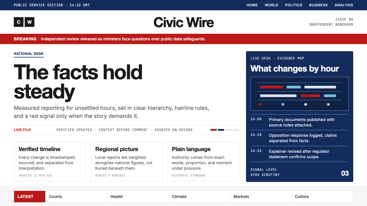 BBC NewsPublic trust, stripped bare. Red alerts, deep navy and hairline grids make ur…公共信任被剥至纯粹:红色警示、深海军蓝与发丝网格,让紧迫保持事实感。
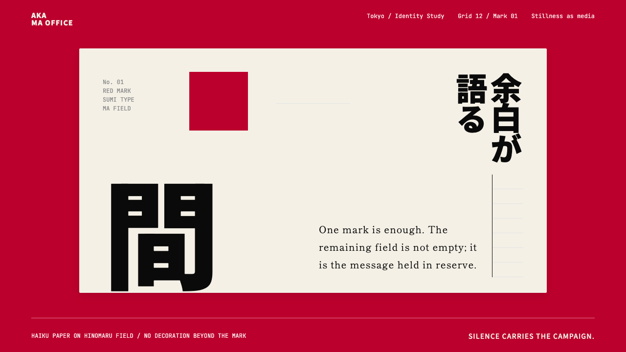 Dentsu Tokyo CreativeSilence does the selling. Hinomaru red, sumi type, and empty columns carry th…以静制胜:日之丸红、墨黑字体与空列共同承托标记。
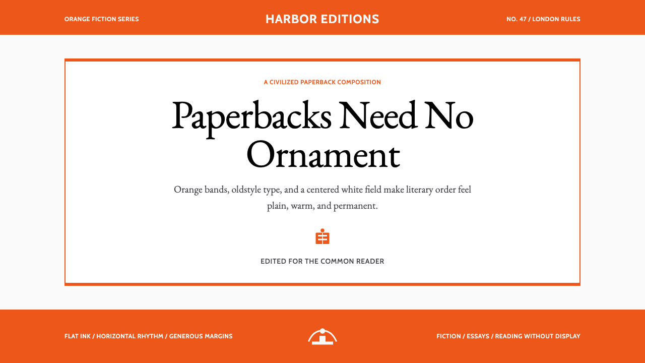 Penguin Classics OrangePaperback authority. Orange tri-bands, serif title panel, and flat ink enforc…平装书的权威感:橙色三段、衬线标题与平面油墨建立克制秩序。
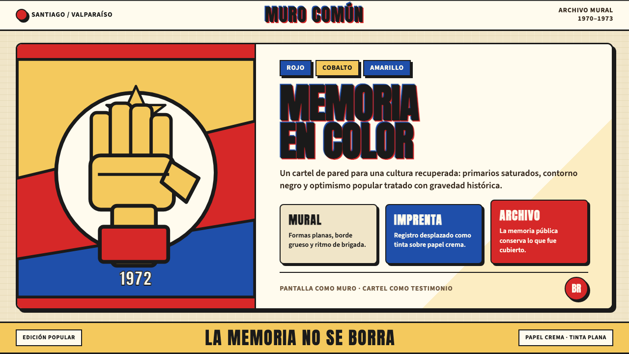 Chilean Allende-Era Propaganda (1972)Solemn revolution. Red, cobalt and yellow lock into thick black mural geometr…庄重的革命感:红、钴蓝与黄被黑色粗线锁进壁画几何。
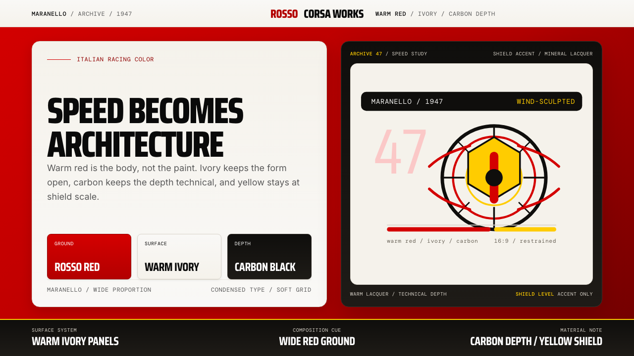 Ferrari Rosso Corsa (1947)Speed becomes architecture. Racing red, warm ivory, and carbon-black panels.速度化为建筑。赛车红、暖白面板与碳黑层次。
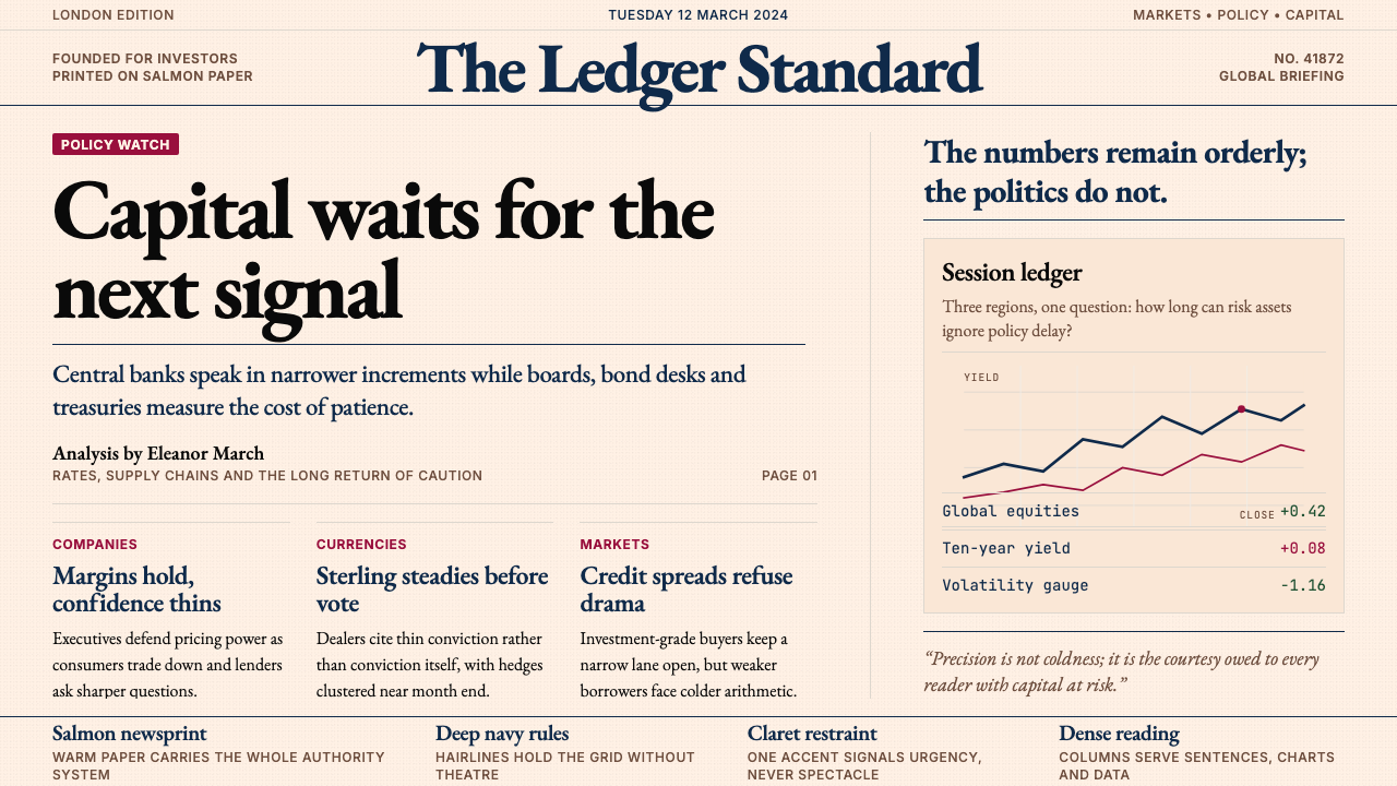 Financial Times (Pink Paper)Authority on salmon paper. Deep navy rules and claret accents discipline dens…三文鱼粉纸上的权威:深海军蓝细线与酒红点缀,约束密集衬线栏。