What is Chilean Allende-Era Propaganda (1972)?什么是 Chilean Allende-Era Propaganda (1972)?
Chile's Unidad Popular government painted revolution in saturated primary red, cobalt blue, and hot yellow — flat, bold, and cut brutally short by a coup.智利人民团结政府用饱和的原色红、钴蓝与亮黄描绘革命——平涂、粗粝,却被一场政变残忍截断。
Chilean Allende-Era Propaganda (1972) in briefChilean Allende-Era Propaganda (1972) 速览
Chilean Allende-Era Propaganda is the visual language produced between 1970 and 1973 by the Unidad Popular government of Salvador Allende and its affiliated cultural organizations. It speaks in flat saturated primary red, cobalt blue, and hot yellow, bound by thick lampblack outlines on a cream-newsprint ground. Every element — from street murals to state-published paperbacks — shares the same visual grammar: bold, confrontational, unapologetically flat.智利阿连德时代宣传美学,是1970至1973年间由萨尔瓦多·阿连德领导的人民团结政府及其附属文化组织共同塑造的视觉语言。其语汇是平涂的饱和原色——阿连德红、钴蓝、亮黄——以厚重的灯黑轮廓线收束,落在奶油色新闻纸底色之上。从街头壁画到国家出版社的平装书,每一个元素都共享同一套视觉语法:粗犷、对抗性强、毫不妥协地平面化。
The style emerged from two principal creative forces. The Brigada Ramona Parra, a muralist collective affiliated with the Chilean Communist Party, developed an outdoor visual system designed to be painted rapidly and read at speed by passersby. Editorial Quimantú, the state publishing house established in 1971, produced affordable paperback books and pamphlets that brought the same visual vocabulary indoors — into homes, schools, and factories. Together, these two channels gave the movement an unusually coherent and widely distributed visual identity.这一风格由两股核心创作力量孕育而成。拉莫娜·帕拉旅(BRP)是隶属智利共产党的壁画集体,它发展出一套专为户外设计的视觉系统——可以快速涂绘,可以被行人一眼读懂。基曼图出版社是1971年成立的国家出版机构,出版平价平装书与小册子,将同一套视觉词汇带入室内——带进家庭、学校与工厂。这两条传播渠道共同赋予了这场运动异常连贯且广泛传播的视觉身份。
The aesthetic carries a political gravity that distinguishes it from other Latin American graphic traditions. Clenched-fist motifs, diagonal worker-and-farmer compositions, and monumental sans-serif headlines express revolutionary optimism rather than mere political messaging. The style is encyclopedic in its ambition: it aimed to make culture legible to workers who had been excluded from it, using visual boldness as a form of democratic access.这一美学承载着深重的政治分量,使其有别于其他拉丁美洲平面传统。紧握的拳头、斜向构图中的工人与农民、纪念碑式的无衬线大标题——这一切表达的是革命的乐观情绪,而非单纯的政治口号。这种风格在抱负上近乎百科全书式:它试图让长期被排斥在文化门槛之外的工人看得懂文化,以视觉上的大胆作为民主接入的形式。
Where does Chilean Allende-Era Propaganda (1972) come from?Chilean Allende-Era Propaganda (1972) 从何而来?
The roots of this visual tradition lie in the broader wave of socialist graphic design that swept Latin America in the 1960s and early 1970s — a period when Cuba's ICAIC posters, Mexican muralism, and Soviet Constructivist influences all circulated freely among left-wing cultural networks across the continent. Chile had its own specific conditions: a large, organized labor movement, a literate urban working class, and a democratic political tradition that gave the left genuine electoral possibilities. When Allende's coalition won the 1970 presidential election, it inherited and accelerated a graphic culture that had already been building for years in labor newspapers, union halls, and student movements.这一视觉传统的根源,在于1960年代至1970年代初席卷拉丁美洲的社会主义平面设计浪潮——那是古巴ICAIC电影海报、墨西哥壁画主义与苏联构成主义影响力在整个大陆左翼文化网络中自由流通的年代。智利有其特定的历史条件:规模庞大、组织严密的劳工运动,受过教育的城市工人阶级,以及给予左翼真正选举可能性的民主政治传统。当阿连德联盟在1970年总统选举中获胜时,它继承并加速了一种已经在劳工报纸、工会礼堂与学生运动中酝酿多年的平面文化。
The Brigada Ramona Parra was founded in the late 1960s, named after a young Communist woman killed by police during a 1946 strike. By 1970, the BRP had developed a distinctive mural methodology: teams of painters would divide a wall into zones, with each member responsible for a specific visual element — outline, fill color, lettering — allowing large-scale works to be completed in a single night. The resulting aesthetic was shaped as much by these production constraints as by any formal theory. Thick outlines were readable from a distance and forgiving of imprecision. Flat solid fills dried faster than blended tones. The palette of red, blue, and yellow corresponded to the cheapest and most widely available exterior paints in Chile at the time.拉莫娜·帕拉旅创立于1960年代末,以一位在1946年罢工中被警察打死的年轻共产党女性命名。到1970年,BRP已经发展出一套独特的壁画创作方法:画师团队将一面墙分为若干区域,每位成员负责特定的视觉元素——轮廓、填色、字母——使大型作品得以在一夜之间完成。这种美学的形成,与生产条件的制约密不可分,甚至胜过任何形式理论的驱动。粗重的轮廓线在远处清晰可辨,且对精度要求宽松;平涂的实色填充比调和色调干得更快;红、蓝、黄的色板,恰好对应当时智利最廉价、最易购得的外墙涂料。
Editorial Quimantú — the name derives from the Mapuche words for 'sun' and 'knowledge' — was established in 1971 when the Allende government nationalized the Zig-Zag publishing house. Under director Joaquín Gutiérrez, Quimantú published over ten million books in less than three years at prices accessible to working-class readers. The design team, which included graphic artists trained in both local and international traditions, applied the same bold typographic and chromatic logic to book covers, political pamphlets, and illustrated educational materials. The visual connection between BRP murals and Quimantú publications was not formally coordinated but emerged from a shared political and aesthetic environment.基曼图出版社——其名称源自马普切语中「太阳」与「知识」的组合——于1971年阿连德政府将锡格锯出版社收归国有时宣告成立。在社长华金·古铁雷斯的主持下,基曼图在不足三年的时间里出版了逾一千万册书籍,定价令工人阶级读者负担得起。设计团队的成员兼具本土与国际训练背景,他们将同样粗犷的字体逻辑与色彩逻辑运用于书籍封面、政治小册子与图文并茂的教育材料之中。BRP壁画与基曼图出版物之间的视觉关联并非刻意协调的结果,而是共同的政治与美学环境自然孕育的产物。
The Larrea brothers — Antonio and Vicente — were among the most significant graphic designers working within this ecosystem. Their poster work for Allende's election campaigns and for cultural events under the UP government synthesized the street-mural energy of BRP with a more formally refined compositional sensibility, demonstrating that the visual language could function at multiple scales and contexts without losing its essential character. Mauricio Babarovic contributed illustration work that translated the flat-color mural aesthetic into printed editorial contexts, extending its reach further into middle-class readership. The September 11, 1973 coup led by General Augusto Pinochet ended this creative moment with sudden violence: BRP murals were whitewashed, Quimantú was shut down and its presses turned over to the junta, and many artists were killed, disappeared, or forced into exile.拉雷亚兄弟——安东尼奥与比森特——是在这一生态系中工作的最重要的平面设计师之一。他们为阿连德竞选活动及人民团结政府文化事业创作的海报,将BRP街头壁画的力量与更为精炼的构图感性熔为一炉,证明这套视觉语言能够在多种尺度与语境中运作而不失其本质特征。莫里西奥·巴巴罗维奇的插图工作则将平涂色彩的壁画美学转译为印刷编辑语境,使其触角延伸至中产阶级读者群。1973年9月11日,奥古斯托·皮诺切特将军发动政变,以骤然的暴力终结了这段创造性岁月:BRP壁画被粉刷覆盖,基曼图被关闭,其印刷机移交军政府,众多艺术家遭到杀害、强迫失踪或被迫流亡。
What defines the Chilean Allende-Era Propaganda (1972) look?Chilean Allende-Era Propaganda (1972) 的视觉特征是什么?
Color System色彩体系
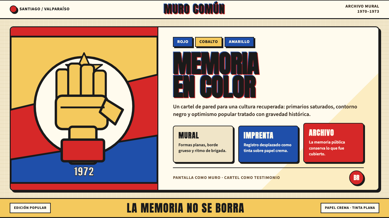
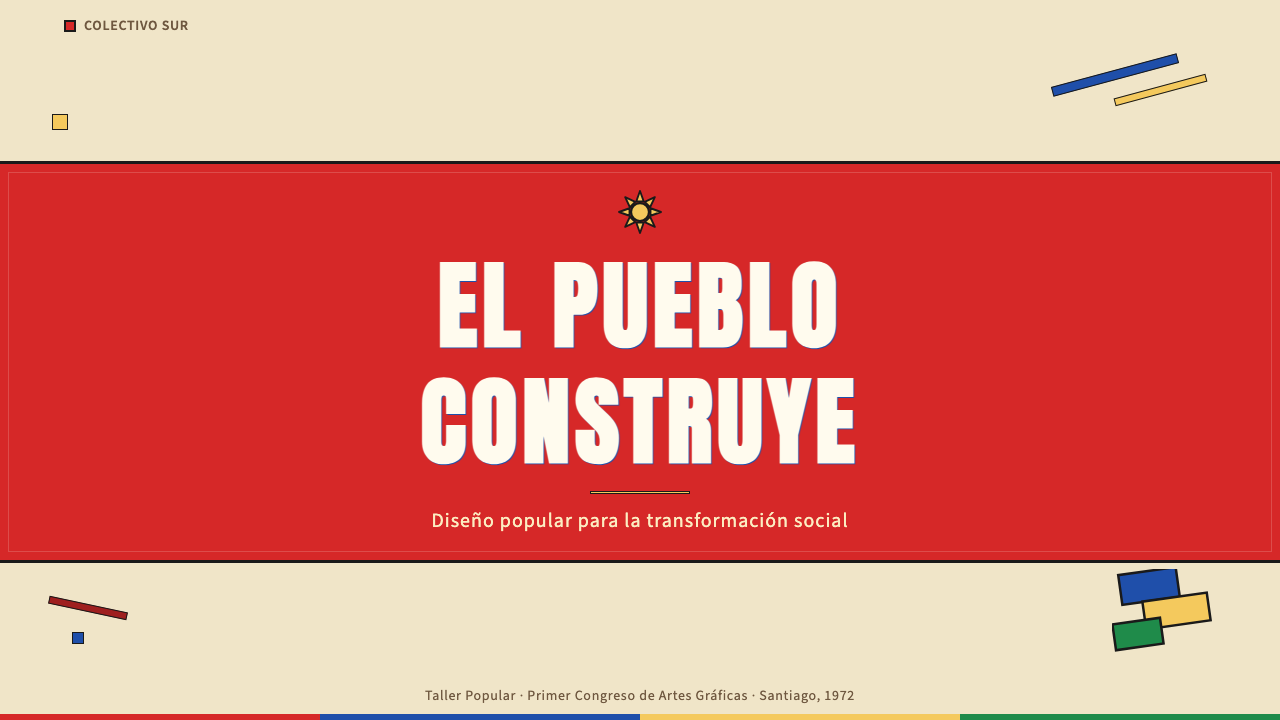
The palette is built on three primaries — a warm, insistent red, a deep cobalt blue, and a vibrating hot yellow — deployed against cream or off-white grounds that evoke the newsprint on which much of this work was originally printed. Black is reserved for heavy outlines and headline type rather than used as a background tone. The colors carry political and emotional weight: red signals urgency and solidarity, blue grounds compositions in gravity, yellow energizes. Secondary mixing is almost entirely absent — the palette's power comes from its refusal to soften.色板以三种原色构建——一种温暖而执拗的红,一种深沉的钴蓝,一种振动感强烈的亮黄——铺设于奶油色或米白色底面之上,令人联想起最初承载这批作品的新闻纸。黑色专用于粗重的轮廓线与标题字体,而非作为背景色调。三色各承其政治与情感重量:红色传递紧迫感与团结;蓝色为构图注入庄重;黄色带来活力与动能。间色调配几乎完全缺席——色板的力量恰恰来自它对柔化的拒绝。
Thick Outline and Mural Geometry粗轮廓与壁画几何
Every form — figure, letterform, symbol — is enclosed by a thick lampblack outline. This convention originated in the BRP's street-mural practice, where heavy borders ensured legibility at distance and compensated for the imprecision of rapid execution. Shapes are reduced to their essential geometry: a fist is a mass of angular wedges, a face a simplified oval with blocked shadow zones. Diagonal lines organize compositions into upward or forward momentum, visually encoding the rhetoric of progress and struggle.每一个形态——人物、字形、符号——都被一条粗重的灯黑轮廓线包裹。这一惯例起源于BRP的街头壁画实践:粗边框保证了远距离可读性,并弥补了快速绘制时的精度不足。形状被简化为其本质几何:一个拳头是一团棱角分明的楔形,一张脸是简化的椭圆加上块面化的阴影区域。斜线将构图组织为向上或向前的动势,以视觉方式编码进步与斗争的修辞。
Typography字体排印
Headlines are set in wide, bold, uppercase sans-serif letterforms that occupy the full width of their allotted space — a style influenced by both commercial signpainting traditions and the geometric sans-serifs circulating in international socialist graphic design of the era. Letter-spacing is tight to zero, maximizing density and visual weight. Body text, where it appears, uses narrower weights of the same genre, creating clear hierarchy through scale contrast alone. Text is frequently set at a slight diagonal, reinforcing the kinetic energy of the overall composition.标题采用宽幅、粗重、全大写的无衬线字体,铺满其所占空间的全部宽度——这种风格既受商业招牌书写传统的影响,也与当时国际社会主义平面设计中流行的几何无衬线字体一脉相承。字母间距收紧至零,将密度与视觉重量最大化。正文(若出现)使用同类字体较窄的字重,仅靠尺度对比建立清晰层级。文字常以微微倾斜的角度排布,强化整体构图的动态能量。
Figure and Symbol人物与符号
The human figure is the dominant subject — specifically the laboring figure: the miner with helmet, the factory worker with raised fist, the campesino with tool in hand. These figures are rendered without individuating detail, as types rather than portraits, so that the viewer projects collective identity onto them. The clenched fist, the raised arm, the dove, and the star appear as recurring symbolic vocabulary. Compositional logic places figures rising toward the upper-right corner of the frame, a visual convention encoding aspiration and futurity.人物是最主要的表现对象——特别是劳动者的形象:戴安全帽的矿工、举起拳头的工厂工人、手持农具的农民。这些形象没有个体化的细节,是「类型」而非「肖像」,让观看者将集体身份投射其上。紧握的拳头、高举的手臂、鸽子与星星,构成反复出现的象征词汇。构图逻辑将人物引向画面右上角的位置,这一视觉惯例编码着对未来与抱负的指向。
Flatness and Anti-Illusionism平面性与反幻觉主义
There are no gradients, no soft shadows, no modeled volumes suggesting three-dimensional space. Every element is flat. Depth, where it must appear, is created through overlapping flat planes rather than perspective or atmospheric haze. This flatness was both a production necessity — fast-drying solid colors applied with broad brushes — and an ideological position: the work refused bourgeois refinement in favor of proletarian directness. The result reads equally well at the scale of a building-side mural and at the scale of a book cover.没有渐变,没有柔和阴影,没有暗示三维空间的体量建模。所有元素皆为平面。深度感若有必要呈现,则通过平面的叠压而非透视或大气雾化来实现。这种平面性既是生产上的必然——用宽刷快速涂抹速干的实色——也是意识形态上的立场:作品拒绝资产阶级的精致,转而拥抱无产阶级的直接。其结果是,从建筑外墙尺度的壁画到书籍封面尺度的印刷品,这种视觉语言同样清晰有效。
Paper and Ground纸张与底色
Where print materials survive, they reveal an intentional relationship with their substrate. Quimantú publications used inexpensive newsprint and uncoated stock, and designers worked with rather than against these surfaces — allowing the warm cream or grey of the paper to function as a fourth tone in the composition alongside the three primaries. This is not poverty aesthetics accidentally preserved; it is a deliberate chromatic system in which the ground participates as an active color.在留存下来的印刷品中,可以观察到设计与承印物之间刻意为之的关系。基曼图出版物使用廉价的新闻纸与非涂布纸,设计师顺应而非对抗这些纸面——让纸张本身的奶油色或灰色充当构图中的第四个色调,与三原色并列。这不是被动保存下来的「匮乏美学」,而是一套有意为之的色彩系统,让底色作为一种主动色彩参与其中。
Political Legibility as Design Principle政治可读性作为设计原则
Every formal decision in this style subordinates itself to a single overriding objective: maximum communicative impact on a viewer who may be illiterate, passing at speed, or encountering the image at distance. This is a design system optimized for the public sphere rather than the gallery. Scale hierarchy, figure-ground contrast, symbolic vocabulary, and diagonal energy all serve legibility before they serve aesthetics. The measure of a successful piece in this tradition is whether it communicates its message before the viewer has consciously decided to read it.这一风格中的每一个形式决定,都服从于同一个压倒一切的目标:对可能文盲、行色匆匆或站在远处的观看者产生最大的传播冲击力。这是一套为公共领域而非画廊优化的设计系统。尺度层级、图底对比、象征词汇与斜向能量,皆服务于可读性,而后才服务于美学。衡量这一传统中一件作品是否成功的标准,是它能否在观看者有意识地决定「阅读」之前,就已经完成了信息传达。
Who shaped Chilean Allende-Era Propaganda (1972)?谁塑造了 Chilean Allende-Era Propaganda (1972)?
As president of Chile from 1970 until his death during the 1973 coup, Allende was the central political figure whose government created the conditions for this visual culture to flourish. His image — typically rendered in the flat portrait style of BRP murals, with clenched jaw and steady gaze — became one of the most reproduced political portraits in Latin American graphic history. The visual legacy of his government has been actively recovered and recontextualized since Chile's return to democracy in 1990, making Allende's portrait simultaneously a historical document and a living symbol of democratic resistance.作为1970年至1973年政变遇难前的智利总统,阿连德是缔造这一视觉文化繁荣条件的核心政治人物。他的肖像——通常以BRP壁画的平涂风格呈现,紧绷的下颚与坚定的目光——成为拉丁美洲平面史上被复制次数最多的政治人物肖像之一。自1990年智利恢复民主以来,其政府的视觉遗产被积极打捞与重新语境化,使阿连德的肖像同时成为历史文献与民主抵抗的活的象征。
The BRP was not a single artist but a collective — at its peak numbering in the hundreds — that operated as a coordinated visual force across Santiago and other Chilean cities. Their mural methodology, developed under the practical pressures of rapid nocturnal production, created the formal vocabulary that defined the entire era: thick outlines, flat primaries, diagonal figures. Several BRP members were killed or disappeared after the 1973 coup. The collective survived underground and in exile, and its surviving members and successors continue to produce murals in Chile today.BRP不是单一的艺术家,而是一个集体——巅峰时期成员多达数百人——作为协调一致的视觉力量活跃于圣地亚哥及智利其他城市。他们在夜间快速创作的现实压力下发展出来的壁画方法论,创造了定义整个时代的形式词汇:粗轮廓线、平涂原色、斜向人物构图。1973年政变后,数名BRP成员遭到杀害或强迫失踪。集体在地下与流亡中延续,幸存成员及其传人至今仍在智利继续创作壁画。
Vicente Larrea, working alongside his brother Antonio, produced some of the most formally accomplished graphic work of the Unidad Popular era. Their poster designs for Allende's presidential campaigns and for cultural events under the UP government showed how the visual language of political muralism could be translated into refined print design without losing its essential urgency. The Larrea brothers synthesized street graphic energy with a compositional sophistication that gave the style credibility across social contexts, from factory walls to university galleries.比森特·拉雷亚与兄弟安东尼奥共同创作了人民团结时代形式上最为精炼的平面作品。他们为阿连德总统竞选及人民团结政府文化活动设计的海报,展示了政治壁画的视觉语言如何在不失本质紧迫感的前提下转译为精炼的印刷设计。拉雷亚兄弟将街头图形的力量与构图上的成熟感熔为一体,赋予这种风格跨越社会语境的可信度——从工厂外墙到大学画廊皆然。
Quimantú functioned as an institution as much as a design identity. Established in 1971 from the nationalized Zig-Zag publishing house, it published over ten million books in under three years at prices specifically calibrated for working-class readers. Its design output — book covers, series identity systems, illustrated pamphlets — extended the chromatic and typographic logic of the BRP murals into the domestic sphere. The consistency of Quimantú's visual program across hundreds of titles made it one of the most coherent state publishing design systems in twentieth-century Latin American history.基曼图既是一套设计身份,更是一个机构。1971年从被国有化的锡格锯出版社脱胎而来,在不足三年的时间里以专为工人阶级读者校准的定价出版了逾一千万册书籍。其设计产出——书籍封面、丛书识别系统、图文并茂的小册子——将BRP壁画的色彩与字体逻辑延伸进家庭领域。基曼图视觉方案横跨数百个品种的连贯性,使其成为二十世纪拉丁美洲历史上最为系统的国家出版设计体系之一。
Babarovic contributed illustration and editorial design work that translated the flat-color aesthetic of the muralist tradition into finer-grained printed contexts. His work for Quimantú publications demonstrated that the formal language of outdoor muralism — thick outlines, flat color zones, simplified figure types — could carry intellectual and literary content without collapsing into mere propaganda. His contribution widened the style's social reach, making it credible to readers who might have dismissed purely street-political imagery as agitprop.巴巴罗维奇的插图与编辑设计工作,将壁画传统的平涂色彩美学转译为颗粒度更细的印刷语境。他为基曼图出版物所做的工作证明,户外壁画主义的形式语言——粗轮廓、平涂色区、简化的人物类型——能够承载知识性与文学性内容而不沦为单纯的宣传品。他的贡献拓宽了这种风格的社会覆盖面,使那些可能将纯粹街头政治图像视为鼓动宣传的读者,也能对它产生认同。
How do you use Chilean Allende-Era Propaganda (1972) today?今天怎么用 Chilean Allende-Era Propaganda (1972)?
Chilean Allende-era propaganda is a visually powerful but culturally loaded historical style. Applying it responsibly requires acknowledging its political weight and treating it with the same seriousness one would bring to any design language rooted in historical trauma and struggle. When used for contemporary projects — presentations, editorial design, digital interfaces — the application should draw on the formal vocabulary while remaining conscious of the cultural context it inherits.智利阿连德时代的宣传美学是一套视觉力量强大、文化负载深重的历史风格。负责任地应用它,需要承认其政治分量,并以对待任何植根于历史创伤与抗争的设计语言所应有的庄重感来对待它。当这套风格被用于当代项目——演示文稿、编辑设计、数字界面——应用者应在汲取其形式词汇的同时,保持对其所继承的文化语境的清醒认知。
For presentation slides, the style works with exceptional force on cover and title pages. A cover composition benefits from a dominant diagonal element — a figure or abstract wedge form — rendered in one heavy primary against a cream or off-white ground, with the title set in wide uppercase type that stretches nearly edge to edge. Content slides should commit to the style's hierarchical clarity: one large typographic element per slide sets the register; supporting points sit in a smaller weight of the same genre without additional decoration. Data visualizations take on a poster-like quality when bar charts and proportional diagrams are rendered in the primary palette with thick black borders on each element, turning data into graphic forms rather than neutral chart objects.在演示文稿中,这种风格在封面与标题页上具有异常强烈的视觉冲击力。封面构图适合采用一个主导性的斜向元素——一个人物或抽象楔形——以某一粗重原色渲染于奶油色或近白色底面之上,标题以宽幅大写字体设置,延伸至几乎与页面等宽。内容页应恪守这种风格的层级清晰性:每张幻灯片一个大型字体元素确立基调,支撑性内容以同类字体较小字重呈现,不附加额外装饰。当柱状图与比例图表以原色板渲染、每个元素配以粗黑边框时,数据可视化呈现出海报般的品质,将数据转化为图形形态,而非中性的图表对象。
For web interfaces, the visual system translates most naturally into contexts that benefit from bold, high-contrast information hierarchy: editorial landing pages, cause-driven organization sites, cultural event pages, and campaign microsites. The approach is to commit fully to a cream or warm off-white background, use a single dominant primary for interactive and structural accents, and reserve the other primaries for categorical distinction rather than decoration. Typography should be wide and bold in headlines, with clear scale breaks between heading and body levels. Navigation bars and section headers can use the thick-rule convention derived from the mural tradition — a heavy horizontal stroke as section delimiter rather than a hairline.在网页界面中,这套视觉系统最自然地适用于受益于粗犷高对比度信息层级的语境:编辑型落地页、使命驱动型组织网站、文化活动页面与竞选专题微站。方法是彻底投入奶油色或暖米白底色,以单一主导原色用于交互与结构性强调,将另外两种原色保留给分类区分而非装饰目的。标题字体应宽幅粗重,标题与正文之间保持清晰的尺度跳跃。导航栏与章节标题可借用源自壁画传统的粗线惯例——以粗重的水平线作为章节分隔,而非细发线。
For editorial and marketing work, this style generates immediate visual authority. Feature spreads and report covers respond well to the asymmetric diagonal composition: a large simplified figure or geometric mass occupying one half, with the title and key information locked into high-contrast type on the opposing half. Campaign materials — posters, social cards, printed pamphlets — are the most natural application because the style was originally built for exactly these formats. Marketing pages can use the alternating ground convention: a cream section followed by a red or deep blue section, each carrying the same typographic weight so that neither interrupts the reading rhythm.对于编辑与营销作品,这种风格产生即时的视觉权威感。专题跨页与报告封面适合非对称斜向构图:一个大型简化人物或几何体量占据一半,标题与关键信息以高对比度字体锁定在对侧。宣传材料——海报、社交卡片、印刷小册子——是最自然的应用场景,因为这种风格最初正是为这些格式而生。营销页面可以使用交替底色的惯例:奶油色区块紧接着红色或深蓝色区块,每个区块保持相同的字体重量,使两者之间不产生阅读节奏的断裂。
A common mistake when applying this style is treating it as a generically bold red-and-black visual system — flattening its specificity into something that reads more like a sports brand or action graphic than a historical graphic language. Authentic application requires the cream ground, the three-primary constraint, the thick outline convention, and the figure-based compositional logic to work together. A second common mistake is using photographic imagery in a naturalistic way: if photography appears, it should be treated as a flat graphic element — high-contrast, reduced to near-silhouette, with color removed or replaced by a primary tone — so that it integrates with the flat-color system rather than creating a tonal discontinuity.应用这种风格时最常见的错误,是将其当作一套通用的粗犷红黑视觉系统——抹去其特异性,使其读起来更像运动品牌或动作图形,而非一套历史平面语言。真实的应用要求奶油色底面、三原色约束、粗轮廓惯例与基于人物的构图逻辑协同运作。第二个常见错误是以自然主义方式使用摄影图像:若摄影出现,应将其作为平面图形元素处理——高对比度、简化至近乎剪影、去除色彩或以某一原色调替换——使其融入平涂色彩系统,而非制造色调上的断裂。
Chilean Allende-Era Propaganda (1972) — FAQChilean Allende-Era Propaganda (1972) · 常见问题
How does this style differ from Cuban revolutionary poster design of the same era?这种风格与同时代的古巴革命海报设计有何不同?
Cuban ICAIC posters, produced from the early 1960s onward, drew heavily on European Surrealism, optical art, and photomontage — producing a graphic tradition that was more internationally cosmopolitan and formally experimental. Chilean Allende-era design, by contrast, was shaped by the constraints of rapid mural production and cheap newsprint printing. It is rawer, more typographically frontal, and more reliant on thick-outline figure drawing than Cuban work. Both traditions share flat color and political urgency, but the Chilean aesthetic is closer to muralism and street poster practice, while Cuban graphic design engaged more directly with international fine art movements.古巴ICAIC电影海报自1960年代初起大量借鉴欧洲超现实主义、光效艺术与照片蒙太奇,形成了一种更具国际视野与形式实验性的平面传统。相比之下,智利阿连德时代的设计受制于快速壁画创作与廉价新闻纸印刷的现实条件,因此更为粗粝,在字体上更为正面直接,更依赖粗轮廓线的人物绘制。两种传统都具有平涂色彩与政治紧迫感,但智利美学更接近壁画主义与街头海报实践,而古巴平面设计则与国际纯艺术运动有更直接的对话。
Is it appropriate to use this style for commercial projects?将这种风格用于商业项目是否合适?
The question of appropriateness depends on context, intent, and transparency. The visual language was produced by and for a political movement that ended in mass violence; using it purely for commercial gain without acknowledgment risks reducing it to aesthetic decoration. Where the style is most appropriately used commercially is in contexts where its values align with the project's values: labor rights organizations, cultural institutions, publications dealing with political history, or campaigns for causes with a genuine connection to democratic or social justice themes. If a commercial project draws on this style, brief contextual acknowledgment — in a style guide note, an about page, or an artist's statement — is a meaningful way to treat the source material with respect.是否合适取决于语境、意图与透明度。这套视觉语言由一场以大规模暴力告终的政治运动所创造;若纯粹出于商业利益加以使用而不作任何说明,有将其沦为纯粹装饰的风险。这种风格最为适切的商业应用,存在于其价值观与项目价值观相契合的语境中:劳工权益组织、文化机构、涉及政治历史的出版物,或与民主主题、社会正义议题有真实关联的倡导活动。若商业项目借用这种风格,在风格指南注记、关于页面或创作说明中给予简短的背景说明,是以尊重对待源材料的有意义方式。
How should photography be integrated if imagery is needed?如果需要图像,应如何融入摄影素材?
Photography should be treated as a graphic element rather than a naturalistic document. The approach is to push contrast to near-maximum, reducing the image to strong figure-ground separation, then to apply a flat primary color tone over the midtones — a technique related to duotone printing — so that the photograph reads as part of the flat-color system rather than as a separate photographic register. Cropping should be aggressive, cutting to the essential silhouette of the subject. Photographic images treated this way integrate with the style's flatness and reinforce rather than interrupt its visual logic.摄影应被当作图形元素而非自然主义文献处理。具体方法是将对比度推至接近最大值,使图像简化为强烈的图底分离,再在中间调上叠加某一平涂原色调——这种技法与双色调印刷相关——从而使照片作为平涂色彩系统的一部分被解读,而非作为独立的摄影层次存在。裁剪应当激进,切取主体的本质剪影。经过如此处理的摄影图像能够融入这种风格的平面性,强化而非中断其视觉逻辑。
What digital contexts suit this style and which do not?哪些数字化语境适合这种风格,哪些不适合?
This style suits contexts where bold hierarchy, strong identity, and political or cultural seriousness are appropriate values: campaign sites, cultural organization pages, editorial publications, event promotion, and social advocacy materials. It is less suited to transactional contexts — e-commerce product pages, consumer app interfaces, or business software dashboards — where the style's confrontational visual weight can feel mismatched with a user experience requiring smooth, low-friction interaction. It is also unsuitable for contexts requiring warmth and intimacy, such as health applications, children's platforms, or personal service brands, where the bold palette and heavy type conventions would create tonal dissonance.这种风格适合粗犷层级、强烈身份感与政治或文化严肃性是合适价值观的语境:竞选网站、文化机构页面、编辑出版物、活动推广与社会倡导材料。它较不适合事务性语境——电商产品页面、消费者应用界面或商业软件仪表板——在这些场景中,这种风格的对抗性视觉重量与需要流畅、低摩擦交互的用户体验会产生格格不入的感觉。它同样不适合需要温暖感与亲密感的语境,例如健康类应用、儿童平台或个人服务品牌——在那里,粗重的色板与厚重的字体惯例会制造格调上的不和谐。
How does the style handle dark or inverted backgrounds?这种风格如何处理深色或反色背景?
Historically, this visual language was light-ground — cream and off-white were the canonical surfaces, derived from the newsprint and uncoated stock on which most work was produced. A dark inversion is possible but requires care. On a deep black or very dark ground, red retains its urgency but yellow becomes intensely dominant, and the cream-paper warmth that moderates the palette is lost entirely. A dark variant works best when it commits to a single primary foreground color — typically red or blue — and uses white or cream for type only, treating the dark ground as a night-mural convention rather than as a true palette inversion. Cobalt blue on a near-black ground, with cream type, comes closest to historical precedent in the tradition's nighttime street-painting practice.从历史上看,这套视觉语言以浅色底面为规范——奶油色与米白色是经典的承印面,源自大多数作品所使用的新闻纸与非涂布纸。深色反转是可能的,但需要谨慎处理。在深黑或极深的底面上,红色保持其紧迫感,但黄色会变得极为强势,而调节色板温度的奶油纸暖调则完全消失。深色变体最有效的做法是投入一种主色作为前景——通常是红色或蓝色——并将白色或奶油色仅用于字体,将深色底面视为夜间壁画的惯例而非真正的色板反转。近黑底面上的钴蓝配以奶油色字体,最接近这一传统的夜间街头绘制实践中的历史先例。
Related design styles相关设计风格
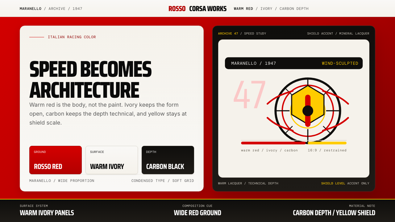 Ferrari Rosso Corsa (1947)Speed becomes architecture. Racing red, warm ivory, and carbon-black panels.速度化为建筑。赛车红、暖白面板与碳黑层次。
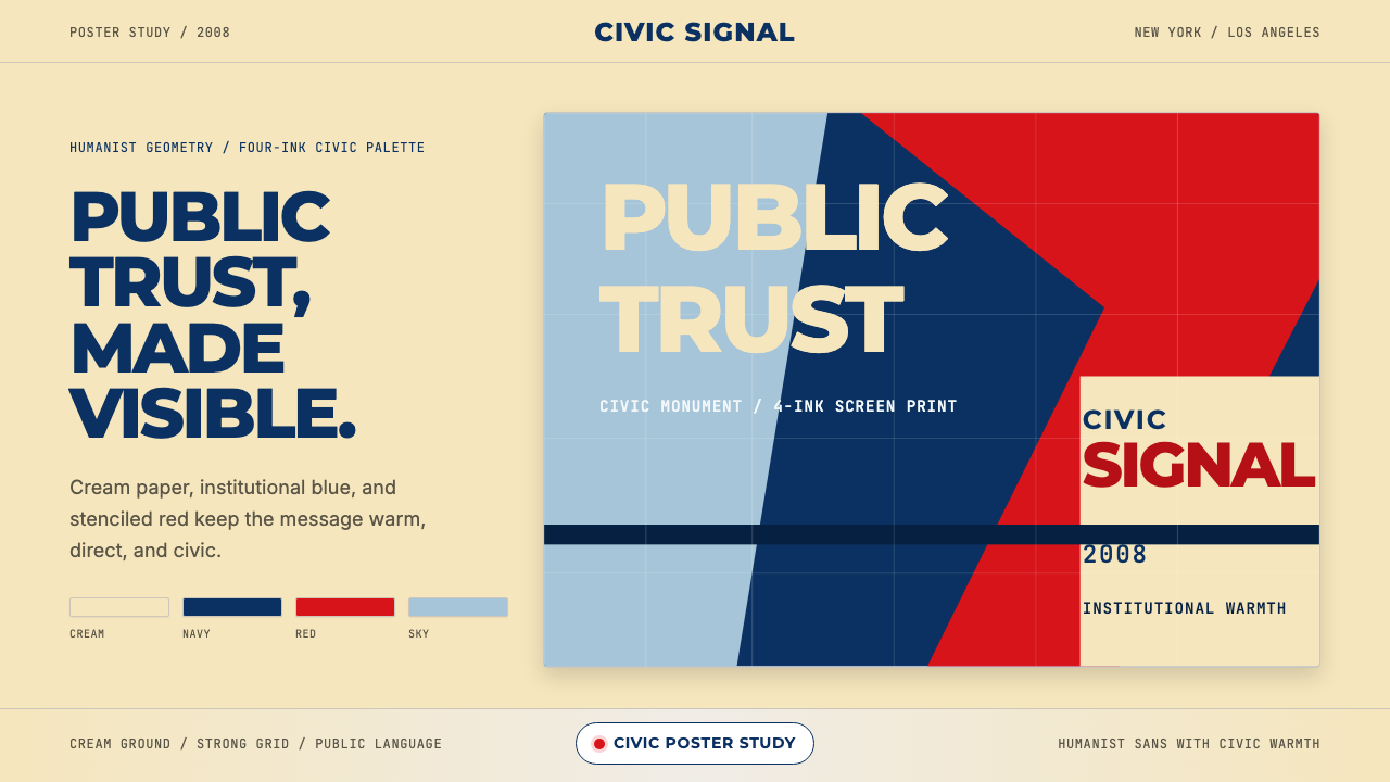 Gotham / Obama Hope Poster (2008)Public trust, made visible. Cream, navy, and red grid the poster.公共信任,清晰可见。奶油底、海军蓝和红色网格构成海报。
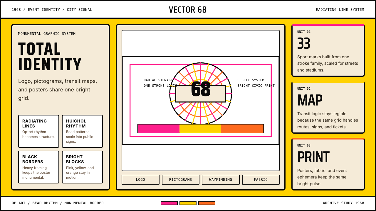 Lance Wyman Mexico Olympics (1968)Monumental and total. Radiating lines and Huichol bead rhythms lock the grid.宏大而完整。放射线与维乔尔珠纹锁住网格。
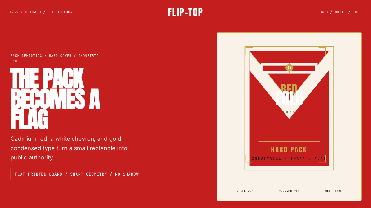 Marlboro Red Flip-Top (1955)Authority in one fold. Cadmium red, white chevron, and gold type read like a…一折成旗。镉红、白人字与金字排出强硬权威。
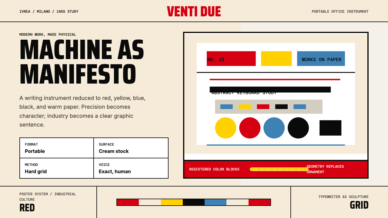 Olivetti Pintori (1955)Industry becomes poetry. Cream paper, machine red, and hard geometry abstract…工业成为诗:奶油纸、机器红与硬朗几何,将打字机抽象化。
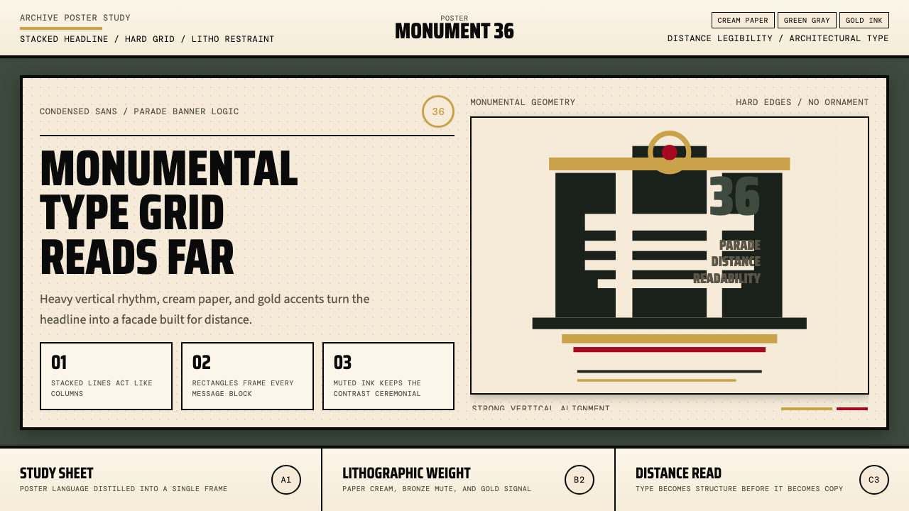 Olympic Poster Berlin (1936)Monumental and legible. Green-gray, cream, and gold turn type into architectu…纪念碑感十足。绿灰、奶油纸与金色把字体变成建筑。