What is Lance Wyman Mexico Olympics (1968)?什么是 Lance Wyman Mexico Olympics (1968)?
Lance Wyman's 1968 Mexico City Olympics identity proved that a single visual system — radiating lines fused with Huichol beadwork rhythms — could make an entire city legible to visitors speaking dozens of languages.兰斯·怀曼为1968年墨西哥城奥运会打造的视觉识别系统证明:一套融合放射线条与维乔尔珠饰节律的视觉语言,足以让整座城市对数十种语言的访客清晰可读。
Lance Wyman Mexico Olympics (1968) in briefLance Wyman Mexico Olympics (1968) 速览
The 1968 Mexico City Olympics identity is the most fully resolved example of total event graphic design ever produced. Every component — the logotype, the numbered pictograms for each sport, the wayfinding system across stadiums and transit, the color palette, the poster series, and the television graphics — was governed by a single visual logic. Nothing was left to chance or to a separate contractor with a different sensibility. The result is a body of work that still reads as a coherent, singular voice half a century after the games closed.1968年墨西哥城奥运会视觉识别系统,是迄今为止最完整实现的赛事整体平面设计案例。每一个组成部分——标志字体、各项运动的编号象形图标、跨场馆与交通线路的导视系统、色彩体系、海报系列,以及电视图形——都受同一套视觉逻辑支配。没有任何环节被留给拥有不同审美感觉的独立承包商随意处理。最终呈现的作品,在赛事结束半个世纪之后,依然以连贯而统一的声音被阅读。
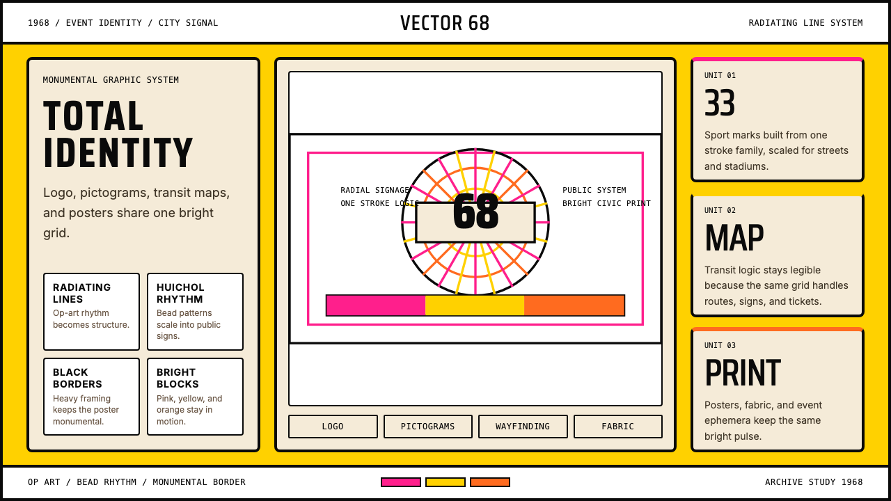
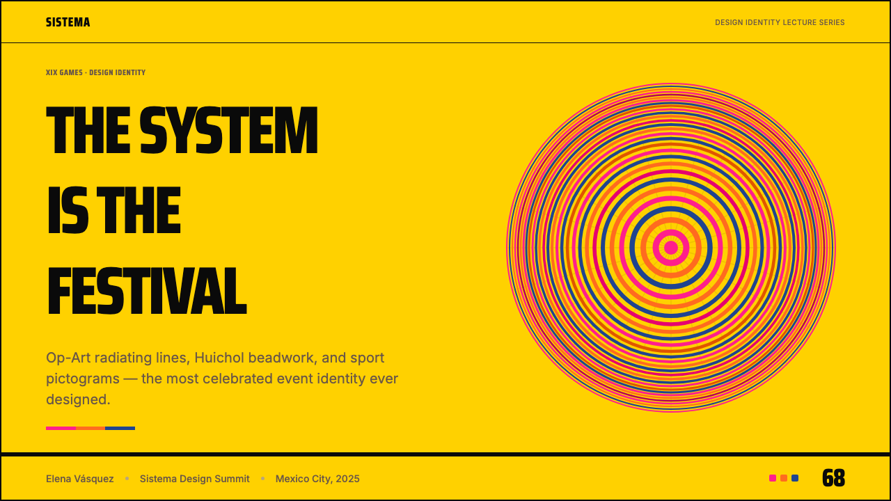
The defining motif is the radiating line: concentric rings that expand outward from a central point, creating an optical vibration associated with the Op Art movement then at its international peak. But Wyman and his collaborators did not simply import a European art-world trend. They fused the Op Art energy with the visual grammar of Huichol Indian beadwork, an indigenous Mexican tradition in which tiny glass beads are pressed into wax in concentric, spiraling patterns that similarly generate optical movement. The result was a visual system that could claim modernist internationalism and Mexican cultural specificity simultaneously — a rare achievement in Olympic branding, where generic universalism is the default.这套系统的核心图形母题是放射线:从中心点向外扩展的同心圆环,产生出与当时正处于国际巅峰的欧普艺术运动相关联的光学振动感。但怀曼及其合作者并未简单移植一种欧洲艺术世界的潮流。他们将欧普艺术的能量与维乔尔族珠饰工艺的视觉语法相融合——在那项土著墨西哥传统中,微小的玻璃珠被以同心螺旋的方式压入蜡面,同样产生光学运动感。融合的结果是一套能同时主张现代主义国际性与墨西哥文化特殊性的视觉语言——在奥运品牌历史上,泛泛的普世主义是惯例,这一成就因此弥足珍贵。
Visually, the system is warm and saturated rather than cool and minimal. The palette runs across a wide band of intense hues — sun-baked orange, deep rose, leaf green, bright turquoise, and strong magenta alongside the more neutral black and white — without ever feeling chaotic, because every color serves a coded function in the wayfinding hierarchy. Type is treated as pure form: the logotype famously locks the word MEXICO into the rings of the numerical identifier 68, making letter and number inseparable. The pictograms reduce each sport to an arrangement of geometric strokes that harmonize with the radiating ring motif at any scale.在视觉上,这套系统是温暖而饱满的,而非冷峻与极简的。色彩跨越宽广的强烈色域——日晒橙、深玫红、叶绿、明青绿、强洋红,与黑白并置——却从不显得混乱,因为每一种颜色都在导视层级中服务于编码化的功能。字体被当作纯粹的形态处理:那个著名的标志字体将「MEXICO」一词锁入数字标识「68」的圆环之中,使字母与数字不可分割。象形图标将每项运动简化为一组几何笔触的排列,在任何尺寸下都与放射环圈母题相互呼应。
See the Lance Wyman Mexico Olympics (1968) design system查看 Lance Wyman Mexico Olympics (1968) 完整设计系统
Where does Lance Wyman Mexico Olympics (1968) come from?Lance Wyman Mexico Olympics (1968) 从何而来?
The commission began in 1966, two years before the games, when Mexico City was awarded the 1968 Summer Olympics — the first time the Games had been hosted in a Latin American country and the first time in a developing nation. The organizing committee, led by architect Pedro Ramírez Vázquez, understood from the outset that the visual identity had to do double duty: serve functional wayfinding for an international audience while projecting a confident image of Mexican modernity to a world that harbored doubts about the country's organizational capacity. Ramírez Vázquez recruited Lance Wyman, a young American graphic designer then based in New York, after seeing his work in an international design competition. Wyman was not yet thirty.这项委托始于1966年,距赛事开幕整整两年,彼时墨西哥城刚刚获得1968年夏季奥运会主办权——这是奥运会首次由拉丁美洲国家承办,也是首次在发展中国家举行。由建筑师佩德罗·拉米雷斯·巴斯克斯主导的组委会从一开始就明白,视觉识别系统需要承担双重任务:为国际观众提供功能性导视,同时向对墨西哥组织能力持有疑虑的世界投射出自信的墨西哥现代性形象。拉米雷斯·巴斯克斯在一场国际设计竞赛中看到了兰斯·怀曼的作品,随即将这位当时尚在纽约的年轻美国平面设计师招入麾下。怀曼当时还不满三十岁。
Wyman traveled to Mexico City and spent time studying the country's visual culture before proposing a direction. The encounter with Huichol beadwork — and more broadly with pre-Columbian graphic traditions, including the repeating geometric patterns of Aztec and Zapotec decoration — convinced him that the Op Art tendency he was already exploring had a deep resonance with indigenous Mexican visual forms. This was not superficial cultural borrowing: the structural similarity between Op Art's optical grids and Huichol beadwork's concentric spiral logic is genuine, and Wyman's design exploits it to produce something that feels simultaneously ancient and radically contemporary. His collaborator Eduardo Terrazas, a Mexican architect and designer, was instrumental in ensuring the cultural grounding was substantive rather than decorative.怀曼来到墨西哥城,在提出设计方向之前花时间深入研究了这个国家的视觉文化。与维乔尔族珠饰工艺的相遇——以及更广泛地与前哥伦布时代图形传统的接触,包括阿兹特克与萨波特克装饰中重复出现的几何纹样——使他确信,他已在探索的欧普艺术倾向与土著墨西哥视觉形态之间存在深层共鸣。这并非浮于表面的文化借用:欧普艺术的光学网格与维乔尔珠饰同心螺旋逻辑之间的结构相似性是真实存在的,怀曼的设计正是利用这一相似性,产生出一种同时令人感受到古老与彻底当代气质的东西。他的合作者、墨西哥建筑师兼设计师爱德华多·特拉扎斯,在确保文化根基实质性而非装饰性方面发挥了关键作用。
The editorial coordinator Beatrice Trueblood played a critical role in ensuring the system extended into print and publication, overseeing the official Olympic publications that carried the visual identity into contexts far beyond stadium wayfinding. The pictogram system was developed by Wyman in close coordination with the broader team, and it set a standard that every subsequent Olympic design program has had to acknowledge. The 1972 Munich Olympics, designed by Otl Aicher, is often considered the more rigorously systematic successor — but it was Mexico 1968 that established the idea that pictograms should function as a self-contained graphic alphabet rather than merely illustrative icons.编辑协调人贝亚特丽斯·特鲁布拉德在确保这套系统向印刷与出版延伸方面起到了关键作用,她监督了将视觉识别系统带入场馆导视之外更广泛语境的官方奥运出版物。象形图标系统由怀曼与更大范围的团队紧密协作开发,并为此后每一届奥运会的设计项目树立了必须正视的标准。1972年慕尼黑奥运会——由奥托·艾歇设计——常被认为是更为系统化的后继者,但正是墨西哥1968年确立了一个理念:象形图标应当作为自足的图形字母表运作,而不仅仅是说明性图标。
The games themselves took place against a backdrop of social and political turbulence: the Tlatelolco massacre, in which Mexican security forces killed student protesters just ten days before the opening ceremony, cast a long shadow. The visual identity system, conceived in more optimistic years, was completed and deployed regardless. It has since been studied and celebrated almost entirely on its formal merits — as a landmark of graphic modernism — with the political context forming an inescapable footnote to its reception history. The identity was canonized almost immediately, appearing in design annuals and museum collections by 1969 and 1970, and it has never left the canon.赛事本身在社会与政治动荡的背景下举行:就在开幕式前十天,墨西哥安全部队在特拉特洛尔科镇压学生抗议者的事件,在整个奥运历史上投下了长久的阴影。这套视觉识别系统在更乐观的年代完成构想,最终依然如期部署落地。此后,它几乎完全以其形式成就被研究与颂扬——作为平面现代主义的里程碑——那段政治背景则作为其接受史中无法回避的注脚而存在。这套识别系统几乎立即成为经典:1969至1970年间便已出现在设计年鉴和博物馆收藏中,此后从未淡出过这一领域的视野。
What defines the Lance Wyman Mexico Olympics (1968) look?Lance Wyman Mexico Olympics (1968) 的视觉特征是什么?
Radiating Rings放射环圈
The fundamental visual unit of the entire system is the concentric ring expanding from a point — a motif that simultaneously invokes Op Art optical vibration and the spiral geometry of Huichol beadwork. These rings appear at every scale, from the master logotype down to small directional indicators. They give the system its sense of energy in stillness: the rings do not depict motion but create the sensation of it through pure optical geometry.整套系统的基本视觉单元是从某一点向外扩展的同心圆环——这一母题同时唤起欧普艺术的光学振动感和维乔尔珠饰的螺旋几何。这些圆环出现在每一个尺度上,从主标志字体到小型方向指示符皆然。它们赋予系统一种静中有动的能量感:圆环并不描绘运动,而是通过纯粹的光学几何创造运动的感觉。
Typographic Integration字体融合
The master logo fuses the word MEXICO with the numeral 68 in a way that makes neither element legible in isolation — the letters of the city name flow through and lock into the ring structure of the year digits. This is typography treated not as a label applied to a graphic but as a structural participant in the same visual system. The typeface used across the system is bold, rounded, and closely tracked, harmonizing with the curved geometry of the rings rather than working against it.主标志将「MEXICO」一词与数字「68」以一种使两者互不可分的方式融合——城市名称的字母穿流于年份数字的圆环结构之中,彼此锁定。这是将字体不作为附加标签、而是作为同一视觉系统结构参与者来处理的范例。系统中通用的字体粗重、圆润、字距紧密,与圆环的曲线几何相互呼应,而非抗衡。
Warm, Coded Palette温暖而编码化的色彩
Unlike many modernist identities that restrict themselves to a handful of colors, the Mexico 1968 system deploys a generous palette of saturated warm and cool hues. Each color is coded to a function — identifying sports categories, distinguishing venue zones, or signaling transportation modes — so the richness never becomes arbitrary. The palette reads as festive and energetic without sacrificing the legibility that wayfinding demands.与许多将色彩限制在寥寥几种的现代主义视觉识别不同,墨西哥1968年的系统部署了一套丰富的饱和暖色与冷色。每一种颜色都被编码为某种功能——标识运动类别、区分场馆分区,或指示交通方式——因此这种丰富性从不显得随意。整套色彩在不牺牲导视所需可读性的前提下,传达出节庆与能量的气质。
Pictographic Alphabet象形图标字母表
The sport pictograms are built from the same stroke logic as the radiating ring motif: each figure is composed of bold geometric arcs and lines that echo the system's master geometry. A figure skating icon does not attempt to realistically depict a skater — it reduces the essential movement and equipment to an arrangement of curved strokes that harmonizes visually with a running-track icon or a swimming icon beside it. The pictograms function as a closed family, not a collection of illustrations.运动象形图标以与放射环圈母题相同的笔触逻辑构建:每个图形由大胆的几何弧线与直线组成,呼应系统整体的母体几何。花样滑冰图标并不试图写实地描绘一位滑冰者——它将关键动作与装备简化为一组弧形笔触的排列,与旁边的田径图标或游泳图标在视觉上协调统一。这些象形图标作为一个封闭的家族运作,而非各自独立的插图集合。
Wayfinding as Total System导视作为整体系统
The identity extended beyond print and broadcast into the physical environment of Mexico City itself: signage, banners, pavement graphics, and vehicle livery all drew from the same visual grammar. A visitor arriving without any Spanish could navigate using color and pictographic form alone. This ambition — that a graphic identity should make a city fully navigable — set the precedent that every subsequent Olympics organizing committee has been measured against.这套识别系统超越了印刷与广播,延伸至墨西哥城的物理环境本身:标识、横幅、地面图形与车辆涂装全部源自同一套视觉语法。一位不懂任何西班牙语的访客,可以单凭色彩与象形形态完成导航。这一抱负——视觉识别系统应使一座城市对所有人完全可读——为此后每一届奥运会组委会的评判树立了先例。
Cultural Hybridity文化混融性
The system's deepest characteristic is its refusal of the usual choice between universal modernism and local cultural expression. The Op Art influence placed it firmly in the international avant-garde of the late 1960s; the Huichol beadwork resonance grounded it in a specific indigenous Mexican tradition. The two reference points do not coexist superficially — they share a genuine structural logic that Wyman identified and exploited. Cultural hybridity here is not decoration applied over a neutral base; it is the load-bearing logic of the entire visual architecture.这套系统最深层的特征,是它对普世现代主义与地方文化表达之间通常必须二择其一这一假设的拒绝。欧普艺术的影响将它稳固地置于六十年代末国际先锋运动中;维乔尔珠饰的共鸣则将它根植于一个具体的土著墨西哥传统。两个参照点并非浮于表面地共存——它们共享一种真实的结构逻辑,而正是怀曼识别并利用了这一逻辑。此处的文化混融性不是涂抹在中性底座上的装饰;它是整套视觉架构的承重逻辑。
Scale Invariance尺度不变性
The radiating ring motif works at every scale without modification: as a monumental stadium banner several meters wide, as a lapel pin a centimeter across, as a television graphic filling a broadcast frame for a fraction of a second. This scale invariance was not accidental — it was a deliberate criterion built into the design logic from the outset. A system that must operate simultaneously at architectural and typographic scales cannot depend on fine detail or soft gradation; it must be built from bold, simple geometry that holds its identity at any reproduction size.放射环圈母题在每一种尺寸下无需修改即可正常运作:无论是数米宽的体育场巨型横幅、一厘米见方的翻领徽章,还是在电视广播画面中仅停留数分之一秒的图形,皆是如此。这种尺度不变性并非偶然——它是从一开始就嵌入设计逻辑的刻意标准。一套必须同时在建筑尺度与排版尺度运作的系统,不能依赖精细的细节或柔和的渐变;它必须由粗犷、简洁的几何构建,使其在任何复制尺寸下都保持识别性。
See the Lance Wyman Mexico Olympics (1968) design system查看 Lance Wyman Mexico Olympics (1968) 完整设计系统
Who shaped Lance Wyman Mexico Olympics (1968)?谁塑造了 Lance Wyman Mexico Olympics (1968)?
Wyman was the creative director of the entire 1968 Mexico City Olympics visual identity program. A New Yorker who had trained in industrial design before moving into graphic practice, he was in his late twenties when the commission began. His design approach — starting from research into local cultural forms before proposing a visual direction — was less common in international sports branding at the time than it is today. After Mexico 1968, he went on to design the identity for the 1970 FIFA World Cup (also held in Mexico) and became a central figure in information design and wayfinding, eventually designing systems for the Washington D.C. Metro. He has described the Mexico project as the work that formed his understanding of what a total identity system could be.怀曼是1968年墨西哥城奥运会整个视觉识别项目的创意总监。这位纽约人在转向平面设计实践之前接受过工业设计训练,委托开始时他尚不足三十岁。他的设计方式——在提出视觉方向之前先研究当地文化形态——在当时的国际体育品牌领域比今天少见。墨西哥1968年之后,他继续设计了1970年国际足联世界杯(同样在墨西哥举行)的视觉识别,并成为信息设计与导视领域的核心人物,最终为华盛顿特区地铁设计了整套系统。他曾描述墨西哥项目是塑造了他对整体识别系统之可能性理解的那项工作。
Terrazas served as the lead Mexican collaborator on the project, working closely with Wyman on the visual identity while also contributing to the broader cultural programming of the games. An architect and designer who had studied in Los Angeles and New York, he brought an understanding of both Mexican visual tradition and international design discourse that was essential to the project's claim to cultural authenticity. Terrazas went on to become an internationally recognized artist whose own practice — particularly his use of concentric geometric patterns derived from Huichol sources — can be read in direct conversation with the 1968 identity work. He has said that the project confirmed for him that indigenous visual forms were not raw material to be refined by modernism but a fully developed visual intelligence in their own right.特拉扎斯担任项目的首席墨西哥合作者,与怀曼紧密协作完成视觉识别,同时也为赛事更广泛的文化项目作出贡献。作为曾在洛杉矶和纽约求学的建筑师兼设计师,他对墨西哥视觉传统与国际设计话语的双重理解,对项目主张文化真实性至关重要。特拉扎斯此后成为国际知名艺术家,他自身的创作实践——尤其是以维乔尔素材为来源的同心几何图案——可以被理解为与1968年识别设计作品的持续对话。他曾说,这个项目让他确信:土著视觉形态并非等待现代主义提炼的原材料,而是本身就具备完整发展的视觉智识。
As president of the Mexico 1968 organizing committee and one of Mexico's most prominent architects, Ramírez Vázquez was the institutional authority who both hired Wyman and gave the design program the organizational support it needed to become a total system rather than a logo and a few posters. His own architectural practice — including the National Museum of Anthropology in Mexico City, completed in 1964 — reflected the same interest in fusing international modernism with pre-Columbian visual heritage that Wyman's identity program embodied. His decision to treat the visual identity as a serious design commission rather than a marketing exercise was the precondition for everything the program achieved.作为墨西哥1968年组委会主席以及墨西哥最重要的建筑师之一,拉米雷斯·巴斯克斯是雇用怀曼、并为设计项目提供组织支撑——使其得以发展为整体系统而非仅是一个标志和几张海报——的机构权威。他自身的建筑实践——包括1964年落成的墨西哥城国立人类学博物馆——体现了与怀曼的识别项目相同的兴趣:将国际现代主义与前哥伦布时代视觉遗产相融合。他将视觉识别当作严肃的设计委托而非营销事务来对待的决定,是这一项目所取得一切成就的前提。
Trueblood served as editorial coordinator for the 1968 Olympics, overseeing the official publications — guides, programs, and commemorative volumes — that extended the visual identity into the printed page at a scale and quality level that matched the environmental and broadcast applications. Her role ensured that the system's coherence was not limited to signage and television but was maintained across every printed surface the games produced. The official publications from Mexico 1968 are among the most collectible artifacts of twentieth-century graphic design, and the consistency of their design owes a great deal to Trueblood's editorial oversight.特鲁布拉德担任1968年奥运会的编辑协调人,监督将视觉识别延伸至印刷页面的官方出版物——导览手册、赛事节目单与纪念册——其规模与品质与环境应用和广播应用相当。她的角色确保了系统的连贯性不局限于标识牌和电视,而是在赛事产出的每一个印刷表面上都得到维系。墨西哥1968年的官方出版物是二十世纪平面设计中最具收藏价值的制品之一,其设计的一致性在很大程度上归功于特鲁布拉德的编辑监督。
How do you use Lance Wyman Mexico Olympics (1968) today?今天怎么用 Lance Wyman Mexico Olympics (1968)?
Applying the Mexico 1968 visual language to contemporary work requires understanding what the system is actually doing structurally: it creates cohesion across radically different applications — from a stadium banner to a lapel pin to a television lower-third — by building everything from the same geometric motif and the same color-coded hierarchy. The radiating ring, the bold strokes, and the warm saturated palette are not decorative flourishes; they are the system's engineering. Any application that treats these elements as surface ornament rather than structural logic will produce pastiche rather than a coherent design.将墨西哥1968年的视觉语言应用于当代工作,需要理解这套系统在结构层面实际上做了什么:它通过将所有内容建立在同一几何母题和同一色彩编码层级之上,在截然不同的应用场景——从体育场横幅到翻领徽章再到电视字幕条——之间创造凝聚力。放射圆环、粗重笔触与温暖饱和的色彩并非装饰性的点缀;它们是系统的工程架构。任何将这些元素视为表面装饰而非结构逻辑的应用,都将产生模仿品而非连贯的设计。
For presentation slides, this system translates into a cover treatment built around a central radiating ring element that anchors the slide and pulls the eye to the title. The rings should expand outward from a point that is deliberately off-center — upper left or lower right — creating compositional tension rather than static symmetry. Content slides should be organized around a single bold structural color per slide, with subordinate information rendered in a neutral tone. Data slides benefit enormously from the pictographic logic: treat chart elements as geometric objects that belong to the same visual family as the system's icons, rather than default chart styles imported from a spreadsheet application.在演示文稿中,这套系统可转化为以一个中心放射环圈元素构建的封面处理——该元素锚定整个幻灯片并将目光引向标题。圆环应从一个刻意偏离中心的点向外扩展——左上或右下——创造构图张力而非静态对称。内容页面应每页围绕单一大胆的结构色来组织,从属信息以中性色调呈现。数据页面从象形逻辑中受益极大:将图表元素视为与系统图标同属一个视觉家族的几何对象,而非从电子表格应用导入的默认图表样式。
For web interfaces, the Mexico 1968 approach is particularly effective in navigation systems, event pages, and any interface where a large number of categories must be distinguished quickly. The color-coding logic — where each category receives a distinct saturated hue that persists across all representations of that category — is directly applicable to product taxonomy, service tier differentiation, or multi-sport scheduling interfaces. Interactive states benefit from the ring motif: a hover or selection state can be indicated by a radiating ring that expands outward from the selected element, communicating activation through the system's own visual language rather than an imported interaction pattern.对于网页界面,墨西哥1968年的方式在导航系统、活动页面,以及任何需要快速区分大量类别的界面中尤为有效。色彩编码逻辑——每个类别获得一种独特的饱和色,该色彩在这一类别的所有表现中保持一致——直接适用于产品分类体系、服务等级区分,或多项目赛程界面。交互状态从圆环母题中受益:悬停或选中状态可以通过从被选中元素向外扩展的放射圆环来表示,借助系统自身的视觉语言而非引入外部交互模式来传达激活状态。
For editorial and marketing work, the system's poster heritage is the most immediately useful reference. Full-bleed backgrounds in a single saturated hue, with the primary content element — a title, a figure, a product — treated as a bold geometric object against that field, produce work that is instantly energetic without becoming busy. The key discipline is restraint in the number of active colors per composition: the Mexico 1968 posters typically commit to one dominant hue and one or two supporting tones, never attempting to demonstrate the full palette's breadth in a single frame. Event announcements, conference materials, and seasonal campaign assets are all natural applications.对于编辑与营销工作,这套系统的海报遗产是最直接可用的参照。以单一饱和色铺满出血的背景,将主要内容元素——标题、人物、产品——作为大胆的几何对象置于该色域之上,产出的作品立即充满能量而不显繁乱。关键的自律在于控制每个构图中活跃色彩的数量:墨西哥1968年的海报通常专注于一种主导色和一两种辅助色调,从不试图在单个画面中展示完整色板的宽度。活动公告、会议材料与季节性营销资产都是自然的应用场景。
The most common mistake when working with this system is treating the radiating ring as a decorative backdrop rather than a structural element. In the original work, the rings are the architecture — they organize space, direct the eye, and create hierarchy. When applied as a texture or a background pattern behind unrelated type and imagery, they lose their structural function and become visual noise. A second frequent error is expanding the palette arbitrarily: the warmth and richness of Mexico 1968's color is achieved through careful orchestration of specific hues, not through adding more colors. Adding a pastel or a muted earth tone to approximate the 'feel' of the system typically undermines the optical energy that makes it distinctive.使用这套系统时最常见的错误,是将放射圆环当作装饰性背景而非结构性元素来处理。在原始作品中,圆环是建筑架构——它组织空间、引导目光、建立层级。当它被当作纹理或背景图案,铺设在不相关的文字和图像之后时,就失去了结构功能,沦为视觉噪音。另一个频繁出现的错误是任意扩展色彩:墨西哥1968年色彩的温暖与丰富,是通过对特定色相的精心编排实现的,而非通过增加更多颜色。为了近似这套系统的「感觉」而添加一种柔和色或哑光大地色,通常会破坏使其与众不同的光学能量。
See the Lance Wyman Mexico Olympics (1968) design system查看 Lance Wyman Mexico Olympics (1968) 完整设计系统
Lance Wyman Mexico Olympics (1968) — FAQLance Wyman Mexico Olympics (1968) · 常见问题
How closely is the Mexico 1968 identity tied to Op Art, and can I use one without the other?墨西哥1968年的视觉识别与欧普艺术的关联有多深?可以只用其中一个吗?
The Op Art connection is real but not deterministic. What Wyman took from Op Art was the radiating concentric ring as a generator of optical movement — not the full toolkit of Op Art, which includes figure-ground inversions, moiré patterns, and high-contrast black-and-white illusionism. The Mexico 1968 system is warmer, more colorful, and more symbolically organized than a pure Op Art work. You can use the radiating ring motif without the aggressive optical destabilization of classic Op Art, and the result will read as Mexico 1968 rather than Bridget Riley. Conversely, you can employ Op Art's disorienting figure-ground play without the ring motif and without any Mexican cultural reference — that is simply Op Art, not Mexico 1968.欧普艺术的关联是真实的,但并不是决定性的。怀曼从欧普艺术中借取的是作为光学运动生成器的放射同心圆环——而非欧普艺术的全套工具,后者还包括图底反转、莫尔条纹以及高对比度黑白错视主义。墨西哥1968年的系统比纯粹的欧普艺术作品更温暖、更多彩、组织上也更具象征性。你可以在不采用经典欧普艺术那种激进光学失稳感的情况下使用放射环圈母题,结果会被读作墨西哥1968年而非布里奇特·莱利。反之,你也可以运用欧普艺术迷失方向的图底游戏,而不使用圆环母题、不带任何墨西哥文化参照——那只是欧普艺术,而非墨西哥1968年。
Is it culturally appropriate to use the Huichol visual reference in non-Mexican design contexts?在非墨西哥的设计语境中使用维乔尔视觉参照,在文化上是否合适?
This is a genuine question that did not receive much scrutiny in 1968 but has become more central to design ethics since. The Mexico 1968 identity used the structural logic of Huichol beadwork — the concentric spiral geometry — rather than directly reproducing sacred iconography or specific cultural artifacts. Wyman worked alongside Eduardo Terrazas, a Mexican collaborator with deep knowledge of that tradition, and the approach was sanctioned by a Mexican state institution. Applying the resulting visual language — the radiating ring as a modernist graphic device — is several steps removed from appropriating Huichol cultural property directly. When in doubt, work at the level of structural abstraction rather than specific cultural symbol, acknowledge the source, and avoid representing the derivative work as a documentation of indigenous tradition.这是一个在1968年未受太多审视、但此后在设计伦理中变得愈加核心的真实问题。墨西哥1968年的识别使用了维乔尔珠饰工艺的结构逻辑——同心螺旋几何——而非直接复制神圣图像或具体文化器物。怀曼与对这一传统有深入了解的墨西哥合作者爱德华多·特拉扎斯共同工作,且该方式得到了一家墨西哥国家机构的认可。将由此产生的视觉语言——作为现代主义平面装置的放射圆环——应用于其他场景,距直接挪用维乔尔文化财产已有数个层级的间隔。如有疑虑,应在结构抽象层面而非具体文化符号层面工作,承认来源,并避免将衍生作品呈现为对土著传统的记录。
How does Mexico 1968 relate to later Olympic identity systems, particularly Munich 1972?墨西哥1968年与此后的奥运视觉识别系统,尤其是慕尼黑1972年,有什么关系?
Mexico 1968 and Munich 1972 are the two most studied Olympic identity systems and are often discussed as a pair, but they represent different design philosophies. Mexico 1968 is warm, culturally specific, and generates its coherence through a single dominant motif — the radiating ring — applied across all touchpoints. Munich 1972, designed by Otl Aicher and his team, is cooler, more systematically gridded, and derives its coherence from a comprehensive manual of typographic, photographic, and color rules rather than from a single visual element. Munich is more rigorous typographically and more photographically rich; Mexico is more visually immediate, more motif-driven, and more culturally legible at a distance. Both set standards that subsequent Olympic programs have struggled to match; most fall short of both.墨西哥1968年与慕尼黑1972年是研究最多的两套奥运视觉识别系统,常被并列讨论,但它们代表了不同的设计哲学。墨西哥1968年是温暖的、文化上具体的,其凝聚力通过一个单一主导母题——放射圆环——在所有触点上的应用来生成。慕尼黑1972年由奥托·艾歇及其团队设计,更冷峻、更系统化地以网格为基础,其凝聚力来自一份涵盖排版、摄影与色彩规则的综合手册,而非某个单一视觉元素。慕尼黑在排版上更严格,在摄影上更丰富;墨西哥在视觉上更直接,更以母题为驱动,在远距离上更具文化可读性。两者都树立了此后奥运项目难以企及的标准;大多数后来的尝试未能达到两者之中任何一个的高度。
Can the system work in a minimal, reduced form — just the ring motif, without the full warm palette?这套系统能否以简化形式运作——只用圆环母题,不使用完整的温暖色板?
Yes, and it has been done effectively. The radiating ring stripped back to a single color — or even rendered in black only — retains its optical energy and its identification with the Mexico 1968 tradition. A monochromatic or duotone application of the ring motif reads as a knowing, restrained reference to the system rather than a full deployment of it. This reduction is appropriate for contexts that cannot accommodate the warm palette — technical documentation, scientific publications, or products where the organizational culture prefers a cooler register. The risk is that without the color coding that gives the system its wayfinding logic, the rings become purely decorative; maintaining even a limited coded use of one accent color helps preserve the structural intent.可以,而且已经有效地实现过。放射圆环简化为单一色彩——甚至仅以黑色呈现——依然保留其光学能量以及对墨西哥1968年传统的识别性。对圆环母题的单色或双色应用,会被读作对这套系统的有意而克制的参照,而非完整部署。这种简化适合无法容纳温暖色板的场景——技术文档、科学出版物,或组织文化倾向于更冷峻基调的产品。风险在于:缺少赋予系统导视逻辑的色彩编码后,圆环会沦为纯粹的装饰性元素;维持即便有限的单一强调色的编码使用,有助于保留结构性意图。
What distinguishes an authentic Mexico 1968 application from a generic 'retro Olympics' pastiche?真正运用墨西哥1968年风格的作品,与泛泛的「复古奥运」模仿品,区别在哪里?
The distinguishing factor is structural logic versus surface quotation. An authentic application builds its composition from the radiating ring as an organizing principle — the ring determines the hierarchy, the rhythm of the layout, and the integration of type with image. A pastiche, by contrast, takes the ring as a decoration and places it behind or beside a layout that is otherwise organized on entirely different logic. You can tell the difference by asking: if you removed the ring, would the composition still work? In pastiche, it usually would — the ring is furniture. In an authentic application, removing the ring removes the composition's reason for being. The same test applies to the color palette: in a genuine application, each color has a coded function; in pastiche, the warm hues are applied for 'vibe' without systematic purpose.区别因素在于:结构逻辑还是表面引用。真正的应用以放射圆环作为组织原则来构建构图——圆环决定层级、版面节律,以及文字与图像的整合方式。模仿品则相反,将圆环作为装饰,置于一个由完全不同逻辑组织的版面之后或旁侧。判断方法是:如果去掉圆环,构图还能成立吗?在模仿品中,通常可以——圆环只是摆设。在真正的应用中,去掉圆环就去掉了构图存在的理由。同样的测试适用于色彩:在真正的应用中,每种颜色都有编码化的功能;在模仿品中,温暖色调只是为了「氛围感」而使用,没有系统性目的。
Related design styles相关设计风格
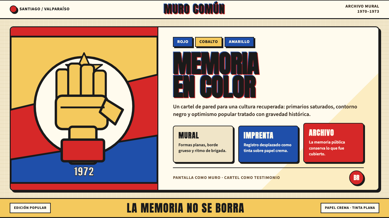 Chilean Allende-Era Propaganda (1972)Solemn revolution. Red, cobalt and yellow lock into thick black mural geometr…庄重的革命感:红、钴蓝与黄被黑色粗线锁进壁画几何。
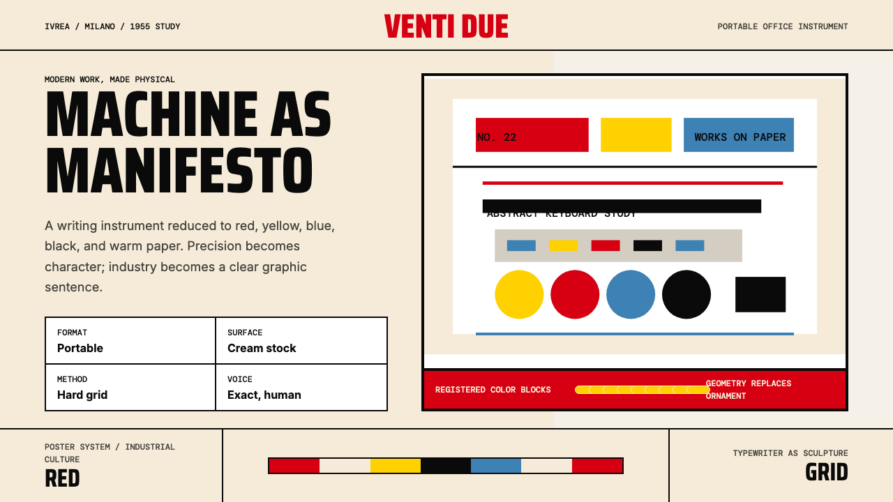 Olivetti Pintori (1955)Industry becomes poetry. Cream paper, machine red, and hard geometry abstract…工业成为诗:奶油纸、机器红与硬朗几何,将打字机抽象化。
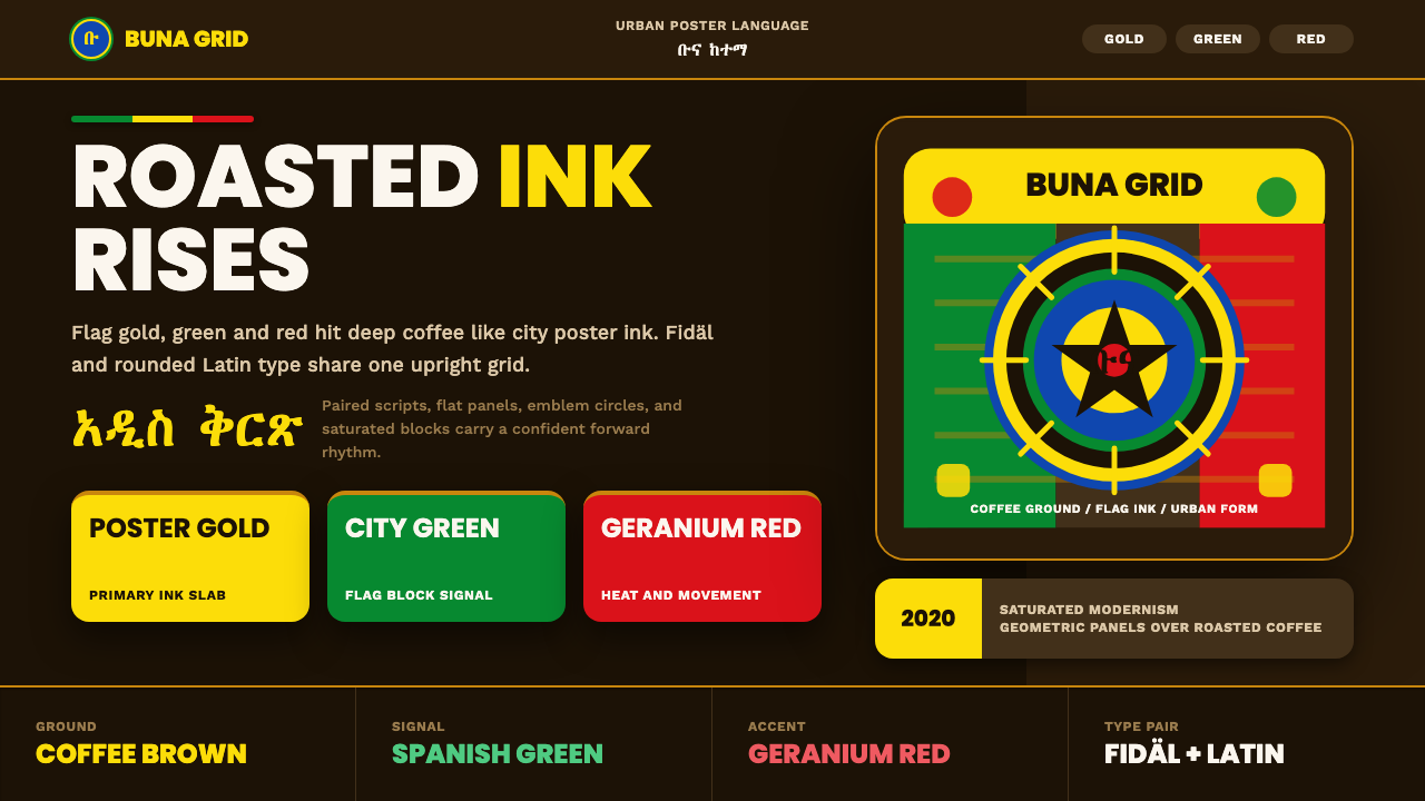 Addis Ababa ModernUrban coffee modernism. Flag gold, green and red snap from a roasted-brown gr…城市咖啡现代主义:金绿红从深咖啡网格中跃出。
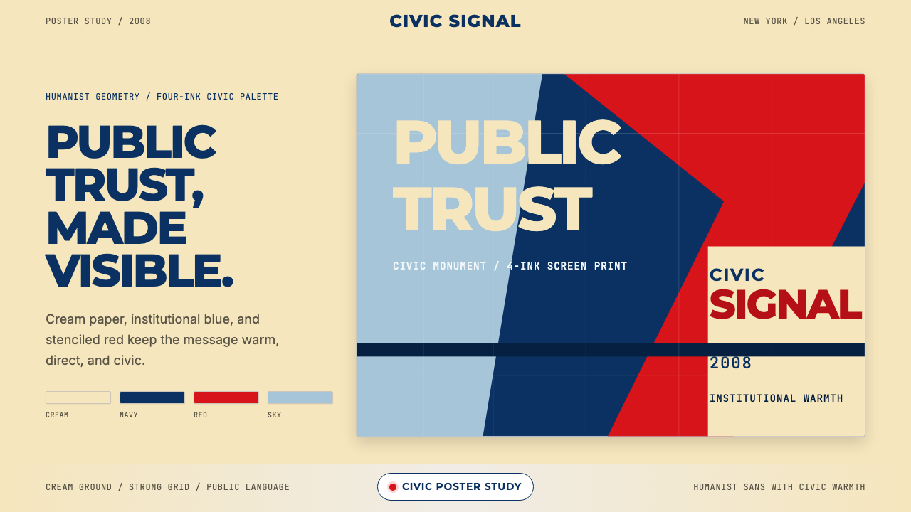 Gotham / Obama Hope Poster (2008)Public trust, made visible. Cream, navy, and red grid the poster.公共信任,清晰可见。奶油底、海军蓝和红色网格构成海报。
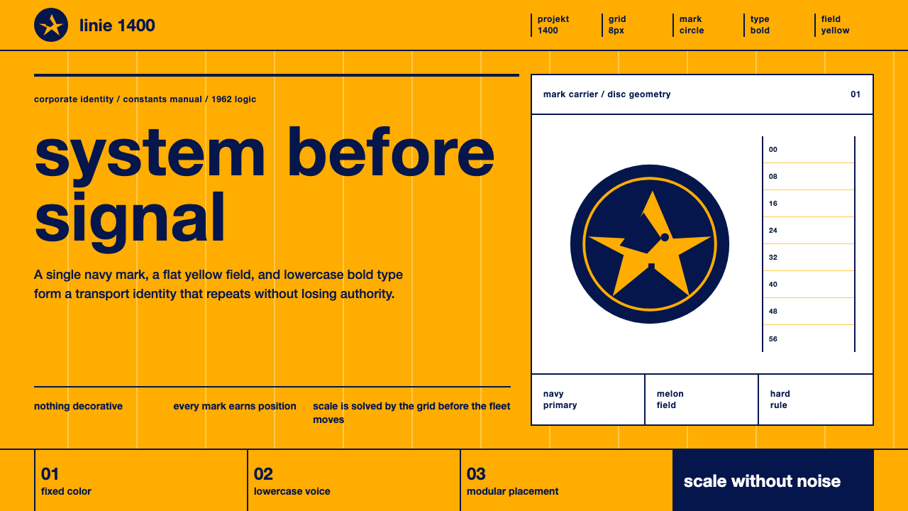 Lufthansa (Aicher)Systems speak first. Melon yellow, navy disc mark, lowercase Helvetica on a h…系统先发声:蜜瓜黄、海军蓝圆标与小写Helvetica钉在硬网格上。
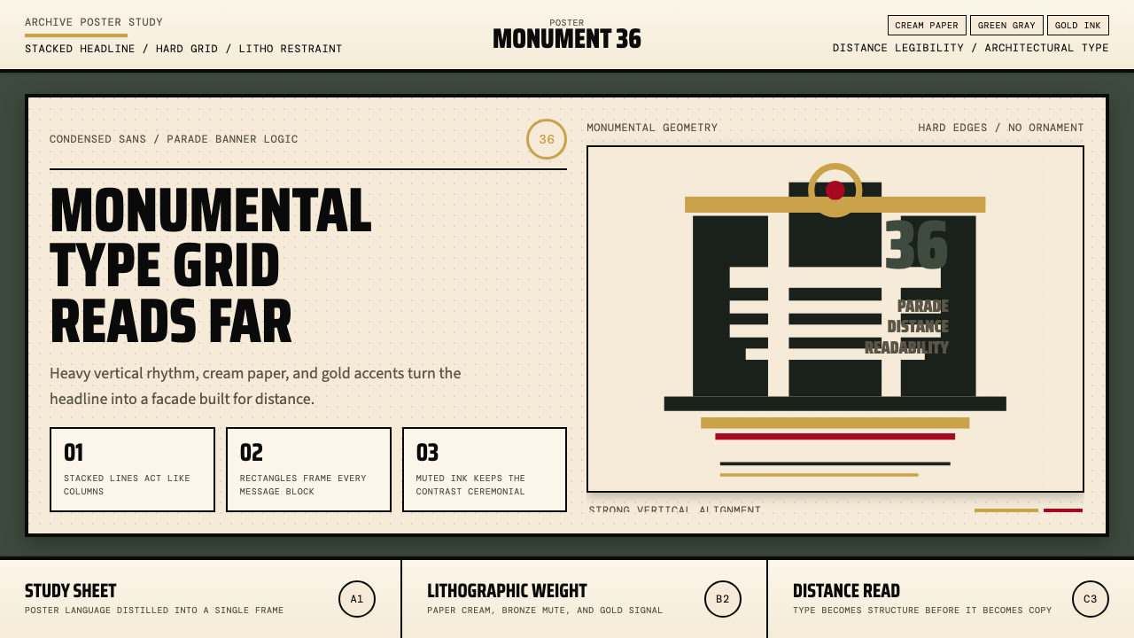 Olympic Poster Berlin (1936)Monumental and legible. Green-gray, cream, and gold turn type into architectu…纪念碑感十足。绿灰、奶油纸与金色把字体变成建筑。