What is Addis Ababa Modern?
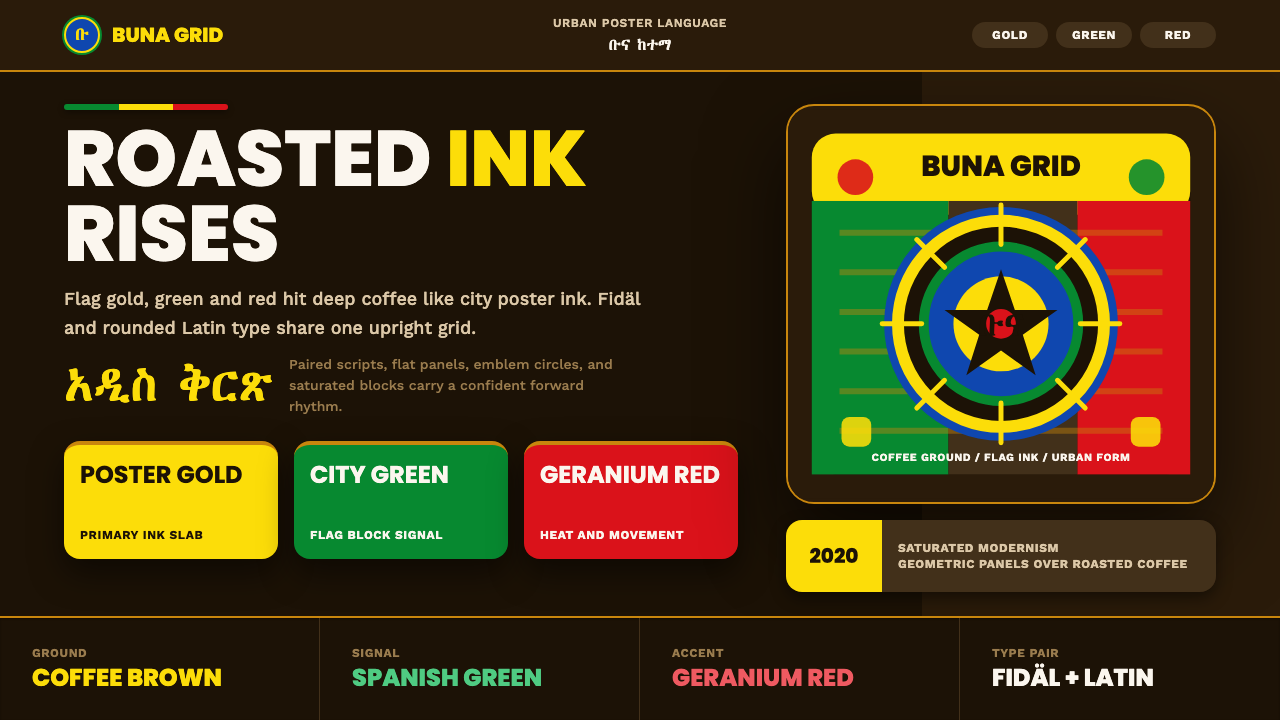
Addis Ababa Modern takes the confident, upright graphic energy of Ethiopia's contemporary design scene and grounds it in the color of roasted coffee.
Addis Ababa Modern in brief
Addis Ababa Modern is a contemporary graphic style rooted in Ethiopia's capital, built around a single, unmistakable move: the Pan-African palette of flag gold, Spanish green, and geranium red, pushed to full poster-ink saturation and set against a deep roasted-coffee brown rather than the white or cream grounds most branding systems default to. That substitution is the whole idea. Coffee is not a decorative afterthought here — it is the ground the entire palette stands on, and it signals a design language that is proud to be specific about where it comes from.
The style is urban and forward-looking rather than folkloric. It draws its confidence from Ethiopia's own graphic history — a country that was never colonized in the way its neighbors were, whose flag colors became the visual shorthand for Pan-African liberation movements, and whose ancient writing system is still in daily use. Addis Ababa Modern channels that history into something that reads as current: bold flat panels, circular emblem motifs recalling official seals and discs, and hard contrast between gold and coffee-brown standing in for the thin rules and soft neutrals of most international editorial design.
A defining feature is how it treats language. Ge'ez script — known as Fidäl, the abugida used to write Amharic and several other Ethiopian and Eritrean languages — appears alongside clean, rounded-geometric Latin type as an equal partner, not a caption or translation. The two writing systems are paired, each doing its own visual work, which gives the style a bilingual confidence that most global design systems never attempt.
Where does Addis Ababa Modern come from?
The style's palette is not invented — it is the Ethiopian national flag, formalized in its current specification in 2009 but drawing on colors and a central emblem used in Ethiopian state symbolism for generations before that. Gold, green, and red have carried particular weight across the African continent since the mid-twentieth century: as European colonial rule receded from the 1950s onward, newly independent nations from Ghana to Guinea to Mali adopted variations of this same trio deliberately, in tribute to Ethiopia, which had remained independent through the era of the Scramble for Africa (with the brief exception of Italian occupation from 1936 to 1941) and stood as a symbol of African sovereignty and resistance. That history is why designers describe this palette as Pan-African rather than simply Ethiopian.
Layered onto that political palette is a living writing system with a far older pedigree. Ge'ez script is one of the oldest alphabets still in continuous use anywhere in the world, developed for the ancient Ge'ez language and later adapted into an abugida — a writing system in which each character represents a consonant-vowel pairing — for Amharic, Tigrinya, and other languages of the Ethiopian highlands. Its letterforms are visually distinct from both Latin and other African scripts: rounded, evenly weighted, built from repeating structural elements rather than the ascenders and descenders familiar from Latin typography. Its continued everyday use, on street signage and news broadcasts as much as in religious texts, is part of what gives Addis Ababa Modern its lived-in, non-nostalgic character.
The type-technology side of the story is recent and practical. For decades, mainstream operating systems and web browsers had thin or nonexistent support for Ge'ez characters. That began changing with dedicated efforts like Google's Noto Ethiopic project, part of the broader Noto initiative to ensure no written language renders as blank boxes on a screen, and with earlier community typefaces such as Abyssinica SIL, developed for linguistic research but adopted more broadly as one of the first well-drawn, freely available Ge'ez digital fonts. These projects are why a Latin-Ge'ez paired layout is achievable at all in a modern digital product.
The result is a style at the intersection of three histories converging in one city: a coffee culture so central to Ethiopian identity that the coffee ceremony is a cornerstone of daily social life; a Pan-African color language rooted in twentieth-century decolonization; and a millennia-old writing tradition now finally rendered natively on modern screens.
What defines the Addis Ababa Modern look?
Color
The palette is drawn directly from the national flag — gold, a green closer to Spanish green than forest green, and a warm geranium red — but its signature move is the ground it sits on: a deep, roasted-coffee brown standing in for the white or cream base most branding systems default to. All three flag colors are pushed to a poster-like, fully saturated intensity rather than muted into pastel or corporate tints. Gold-on-coffee-brown is the highest-contrast, most frequently repeated pairing and functions as the style's signature combination, the way red-on-cream functions for Bauhaus.
Typography
The style pairs two distinct writing systems as equals rather than translating one into the other. Ge'ez (Fidäl) letterforms — rounded, evenly weighted, built from repeating structural strokes — sit beside a clean, rounded-geometric Latin sans-serif chosen specifically because its geometric simplicity echoes the structural regularity of Ge'ez rather than clashing with it. Neither script is treated as secondary or caption-sized; both carry headline weight where the design calls for it, which is a deliberate bilingual statement rather than a localization afterthought.
Panels and Emblems
Composition favors bold, flat rectangular or circular panels of solid color rather than thin rules, delicate borders, or layered translucency. Circular emblem-disc motifs recur throughout, echoing official seals and coins, and function as focal anchors the way a logotype mark might. These shapes are always flat and fully opaque — there is no soft gradient fill or drop shadow softening their edges, which keeps the overall impression closer to a screen-printed poster than a corporate slide deck.
Contrast and Confidence
Every relationship in the system is built on hard, high contrast rather than gradual tonal transition: saturated gold against dark coffee-brown, bold flat shape against open ground, upright Latin geometry against curved Ge'ez form. There is no attempt at a quiet, receding, editorial-neutral register anywhere in the system. The style reads as confident and a little loud by design — restraint and understatement are simply not the goal here, which is precisely what distinguishes it from more muted, minimalist-leaning contemporary branding.
No Cliché Motifs
Addis Ababa Modern deliberately avoids the visual shorthand often applied to African design by outsiders — no generic tribal-pattern textures, no savanna silhouettes, no wood-carving or basket-weave motifs standing in for an entire continent's design history. The visual vocabulary instead comes from specific, contemporary, urban Ethiopian sources: a coffee culture, a national color story with a documented Pan-African meaning, and a living writing system. Anything that reads as generic pan-African stock imagery rather than Addis-Ababa-specific is outside the style.
Composition Rhythm
Layouts tend to be built from a small number of large, decisive elements rather than many small ones — a single dominant panel of color, one emblem disc, a short line of paired bilingual type — giving each composition an uncluttered, poster-like rhythm. This is partly a legacy of how the palette behaves: at full saturation, gold and red compete for attention if used in more than a couple of places at once, so the strongest work restricts itself to a small number of high-impact moves per composition rather than distributing color evenly across many small details.

Who shaped Addis Ababa Modern?
Ethiopia's current flag law, formalized in 2009, fixed the exact form and arrangement of the gold, green, and red bands and the central emblem that Addis Ababa Modern draws its palette from. The specification is the closest thing this style has to a canonical color reference — not a single designer's invention, but a piece of state visual identity that every practitioner in the style treats as ground truth.
Ge'ez is among the oldest alphabets still in continuous daily use, adapted as an abugida to write Amharic, Tigrinya, and other Ethiopian and Eritrean languages. Its distinctly rounded, evenly weighted letterforms — visually unlike both Latin and other regional scripts — give Addis Ababa Modern its most immediately recognizable typographic signature and are the reason the style reads as specifically Ethiopian rather than generically African.
Part of Google's broader Noto initiative — whose name plays on 'no more tofu,' the blank boxes that appear when a font lacks support for a character — Noto Ethiopic is the digital typography effort that made robust, well-drawn Ge'ez rendering broadly available on modern operating systems and browsers. Its existence is a direct precondition for the confident Latin-Ge'ez pairings that define the style today.
Developed by SIL International for linguistic research and Bible-translation work, Abyssinica SIL was one of the first well-drawn, freely distributed Ge'ez digital typefaces, predating the broader mainstream support that later arrived through projects like Noto. It represents the earlier, more grassroots phase of Ethiopian digital typography that made the style's typographic ambitions technically possible in the first place.
How do you use Addis Ababa Modern today?
Addis Ababa Modern works best when the coffee-brown ground is treated as non-negotiable — swapping it for a generic white or cream background collapses the style back into a plain gold-green-red palette with none of its identity. Applying it well means starting from the brown ground and being disciplined about not letting all three flag colors compete for attention in the same small area at once.
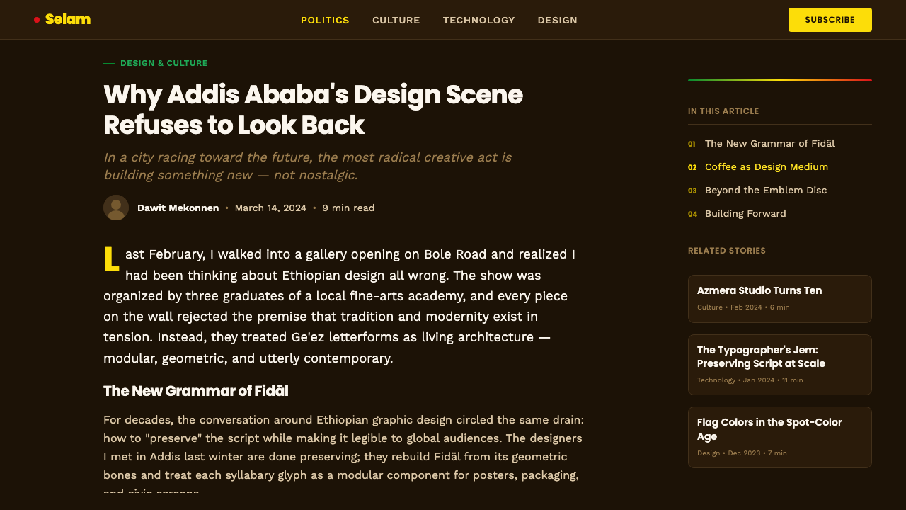
For presentation slides, the style gives cover pages an immediate, poster-like presence: a large flat gold or red panel anchored in a corner, an emblem-disc motif as a focal mark, and a bilingual title pairing Ge'ez and Latin type at equal visual weight against the coffee-brown field. Content and data slides should keep the same restraint — one or two colors per slide rather than all three flag colors together — with charts rendered as flat, opaque geometric shapes rather than soft-shaded infographics, so numbers read with the same confident clarity as the rest of the deck.
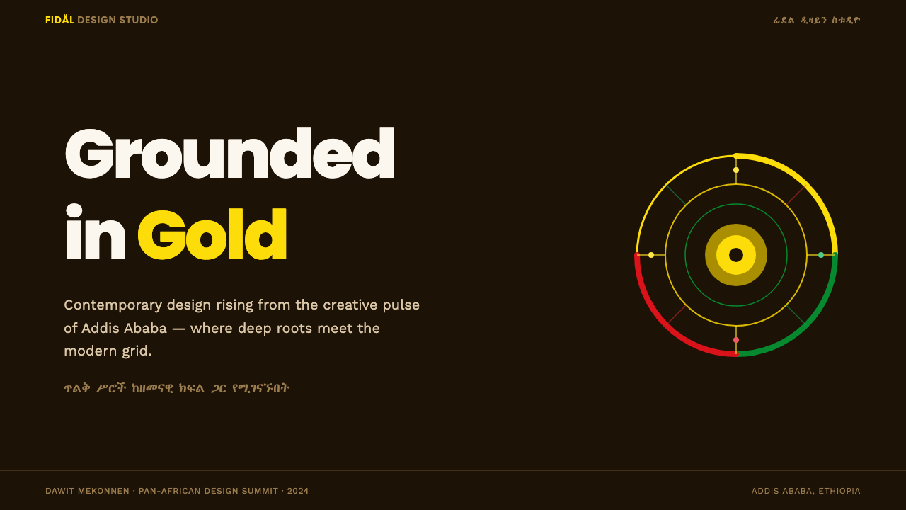
For web interfaces, the style suits dashboards and pricing pages that want to read as premium and specific rather than generic SaaS-neutral. The coffee-brown ground works well as a base for dark-mode-style interfaces, with gold reserved for primary actions and highlighted plan tiers, and the flag green used sparingly for success states. Card and panel components should stay flat and opaque; resist the temptation to soften the palette with translucency or gradient overlays, since that is exactly the kind of dilution the style is built to avoid.
For editorial and marketing work, Addis Ababa Modern rewards bold, full-bleed treatment: feature blocks that alternate gold-on-coffee-brown with coffee-brown-on-gold, pull quotes set in the paired Ge'ez-Latin treatment, and section markers built from the circular emblem motif rather than plain rules. The style photographs and screenshots well precisely because it commits fully to its palette rather than hedging with neutral gray.
The most common mistake is treating this as a generic 'African-inspired' palette rather than a specific Ethiopian one — reaching for tribal-pattern textures, savanna imagery, or basket-weave motifs to 'complete' the look. None of that belongs here; the style's identity rests on being legible as Addis Ababa specifically, through its coffee ground, its documented flag colors, and its living Ge'ez script. A second common mistake is losing the coffee-brown ground itself — dropping the palette onto white 'for readability' removes the one element that makes the system recognizable.
Addis Ababa Modern — FAQ
Is Addis Ababa Modern the same as generic 'Pan-African' design?
No, though the two overlap. Pan-African color language — gold, green, and red, adopted across many nations in tribute to Ethiopia's independence — is one ingredient of the style, but Addis Ababa Modern is specifically Ethiopian: its coffee-brown ground, its use of Ge'ez script, and its urban-contemporary sensibility are all rooted in Addis Ababa itself rather than in a continent-wide visual shorthand. Treating the style as interchangeable with 'African design' in general is exactly the kind of flattening it is designed to push back against.
Can this style work with a light background instead of coffee-brown?
Technically the flag colors can sit on a lighter ground, but doing so removes the element that gives this style its identity. The coffee-brown base is not incidental — it is the signature substitution that separates Addis Ababa Modern from a plain gold-green-red palette on white, which would read as generic Pan-African branding rather than something specifically rooted in Addis Ababa's own coffee culture. If a lighter version is unavoidable, keep the deep brown as a secondary anchor color rather than removing it entirely.
Why does the style pair Ge'ez and Latin type instead of just using one?
Because the pairing itself is the statement. Using only Latin type would erase the specifically Ethiopian dimension of the style; using only Ge'ez would limit legibility for the many audiences the design also wants to reach. Setting both at equal visual weight — rather than shrinking one to a caption or footnote — signals that this is a bilingual, confidently Ethiopian design language rather than a Western template with decorative non-Latin lettering bolted on as an afterthought.
Does the style require using every flag color in every composition?
No — in fact the strongest work in this style usually restricts itself to one or two flag colors doing the heavy lifting per composition, with the coffee-brown ground providing the constant. At full saturation, gold and red in particular compete for attention if both are given large, equal roles in the same small area. The palette is a resource to draw from selectively, not a checklist to complete in every layout.
What kinds of products or brands does this style not suit?
The style's high saturation and hard contrast make it a poor fit for products that need to project quiet neutrality, clinical trust, or a soft, calming register — medical and healthcare interfaces, certain financial or legal products, or anything where a muted, low-key visual tone is the actual functional requirement. It is also a poor fit for any brand with no genuine connection to Ethiopia or Addis Ababa's design culture, since the style's entire value depends on being read as specific and rooted rather than borrowed as a generic 'vibrant African' skin.
Related design styles
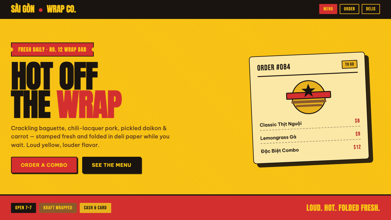 Bánh Mì Deli WrapA poster printed on a wrapper. Marigold ground, chili-red lockups, chunky Ant…
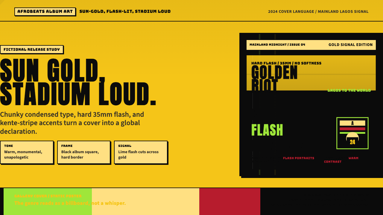 Afrobeats Album Art 2024Sun-gold and stadium loud. Anton type, kente stripes, and hard flash drive th…
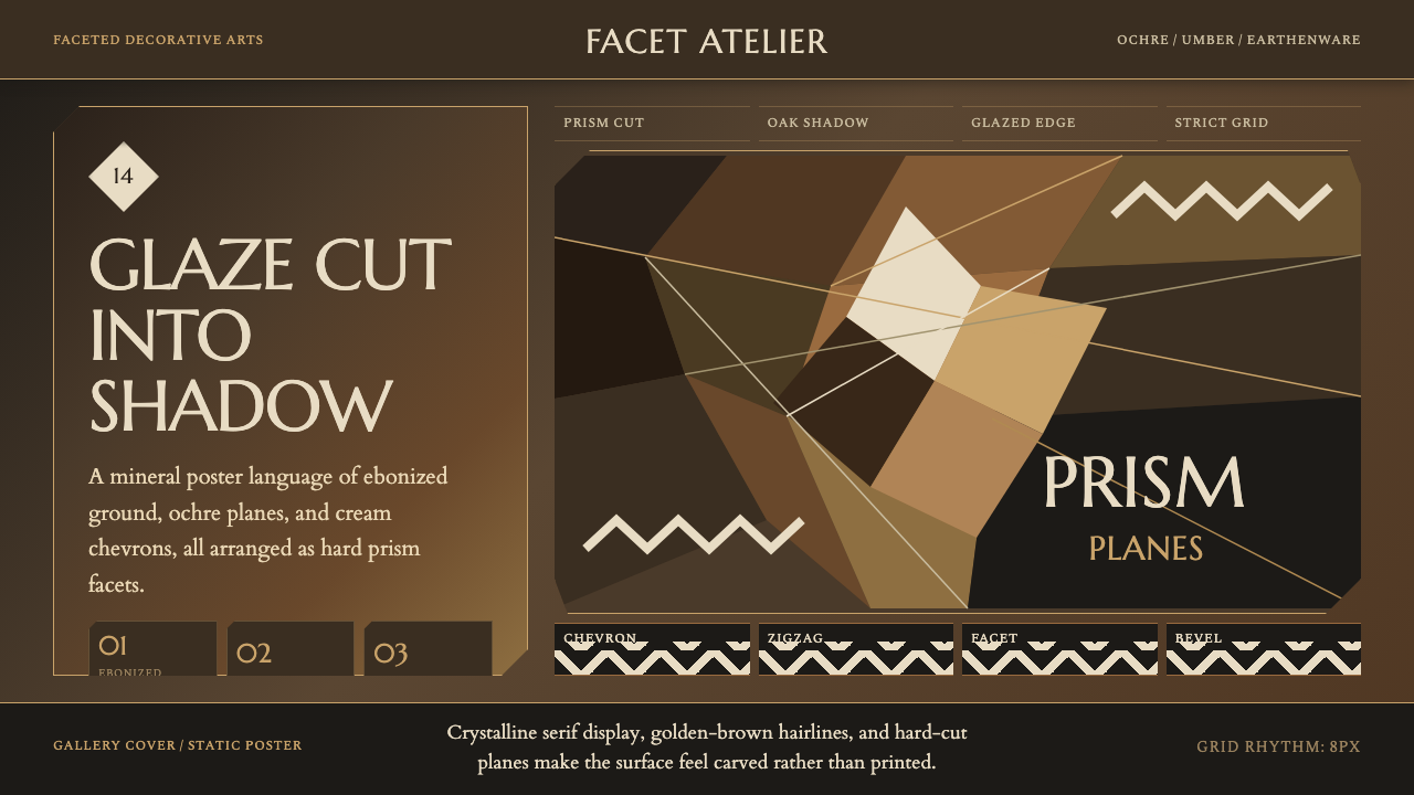 Czech Cubist Decorative ArtsGlazed geometry feels carved. Umber ground, ochre facets, and cream chevrons…
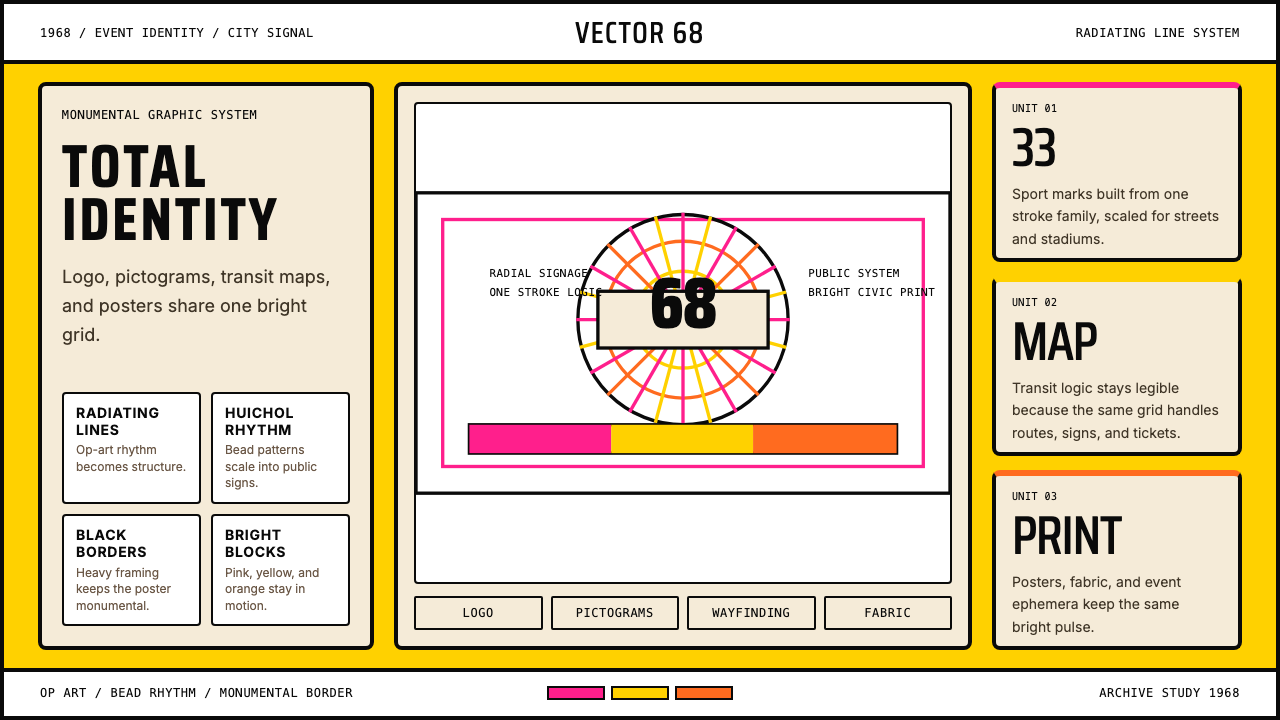 Lance Wyman Mexico Olympics (1968)Monumental and total. Radiating lines and Huichol bead rhythms lock the grid.
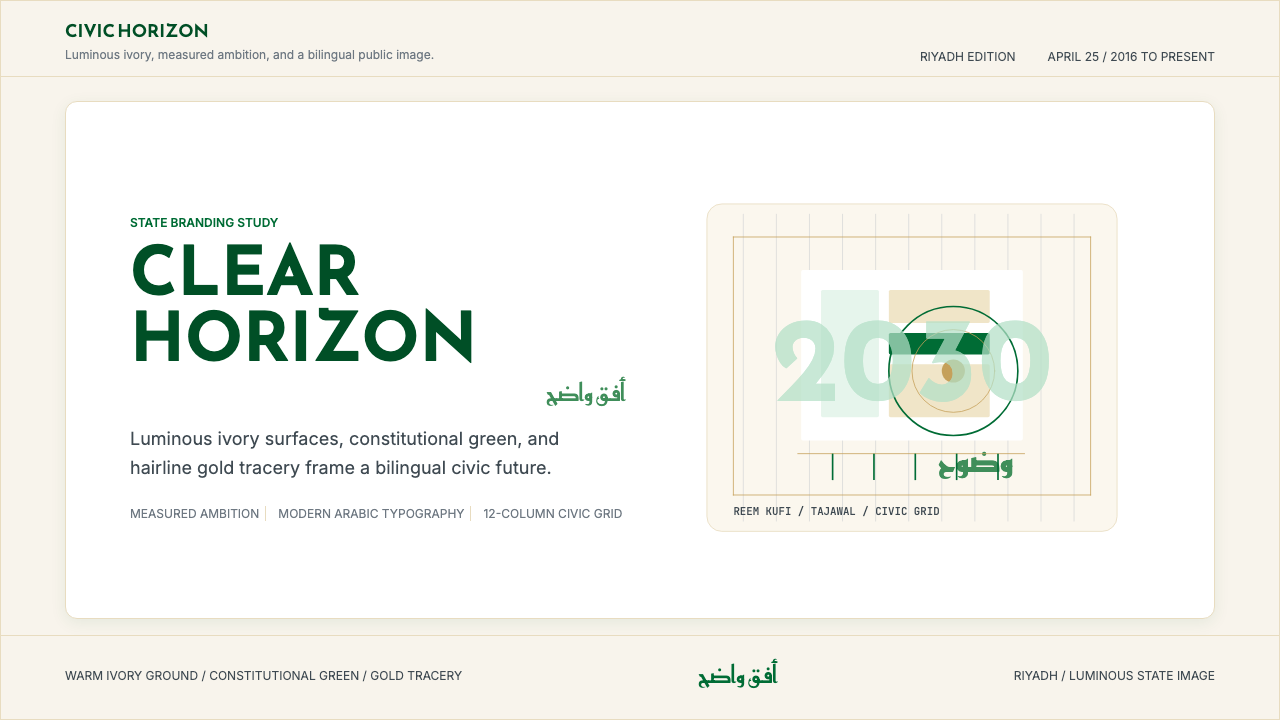 Saudi Vision 2030Measured ambition, made luminous. Ivory, green, and gold tracery on a civic g…
 Velodrome TrackSpeed is engineered. Shadow pine, black datum lines, and one cyan band measur…