Design style guide设计风格指南
What is Nairobi Silicon Savannah?什么是 Nairobi Silicon Savannah?
Nairobi's Silicon Savannah design language channels East Africa's mobile-money revolution into a warm, dashboard-ready visual system that balances professional confidence with genuine human warmth.内罗毕「硅草原」设计语言将东非移动金融革命提炼为一套温暖、适配仪表盘的视觉体系,在专业自信与人文温度之间取得平衡。
Nairobi Silicon Savannah in briefNairobi Silicon Savannah 速览
Nairobi Silicon Savannah is a design aesthetic that emerged from East Africa's fintech ecosystem during the 2010s and reached its most coherent visual form between roughly 2018 and 2024. It translates the lived experience of mobile-first financial infrastructure — the confidence of sending money by phone, the clarity of a balance confirmation screen, the optimism of a continent building its own digital economy — into a design language suited to SaaS products, dashboards, and financial applications.「硅草原」设计美学在2010年代东非金融科技生态系统中孕育成型,并在2018至2024年间达到最为清晰的视觉面貌。它将移动优先金融基础设施的真实体验——用手机汇款的信任感,余额确认屏幕的清晰度,一个大陆自建数字经济的乐观气质——转化为适用于SaaS产品、仪表盘与金融应用的设计语言。
The palette draws on the natural and cultural landscape of urban Nairobi: a dusty acacia olive-green that reads as both organic and professional, a sun-warm Maasai-inspired orange that carries energy without aggression, and matte white surfaces that give the whole system space to breathe. These colors work together to produce interfaces that feel grounded rather than sterile — a quality that is deliberate, since many of the products built in this tradition serve users for whom trust and legibility carry real financial stakes.色板取自内罗毕城市的自然与文化景观:尘土色金合欢橄榄绿,既有机又专业;马赛风格日暖橙,充满活力而不失温和;哑光白色界面为整套系统提供呼吸空间。这些颜色协同产生一种扎实而非冷硬的界面气质——这是有意为之的品质,因为在这一传统中构建的许多产品,服务于那些将信任与清晰度与真实金融利益挂钩的用户。
What distinguishes this style from generic fintech modernism is its relationship to local visual culture. The geometric stripe motifs of Maasai shuka cloth reappear as subtle structural dividers. Photography centers real African urban life rather than stock-image placeholders. The typographic choices favor clarity for multilingual contexts. The result is a system that signals global digital sophistication while remaining visibly, honestly rooted in its place of origin.将这种风格与通用金融科技现代主义区别开来的,是它与本地视觉文化的关系。马赛舒卡布料的几何条纹母题以细腻结构分隔线的形式重现;摄影聚焦真实的非洲城市生活,而非泛用图库素材;字体选择优先考虑多语言语境的清晰度。最终结果是一套既传递全球数字成熟感,又清晰、诚实地扎根于其原产地的视觉系统。
See the Nairobi Silicon Savannah design system →查看 Nairobi Silicon Savannah 完整设计系统 →
Where does Nairobi Silicon Savannah come from?Nairobi Silicon Savannah 从何而来?
The roots of this design language stretch back to 2007, when Safaricom launched M-Pesa in Kenya, transforming how millions of people transacted money. M-Pesa did not merely create a mobile payment service; it created a visual and experiential vocabulary for financial trust on a mobile screen in a context where bank branches were scarce and SMS was primary. The interface conventions it established — clear numerals, high-contrast confirmations, simple sequential flows — became a template that subsequent fintech builders would inherit and refine.这套设计语言的根脉延伸至2007年——那一年,肯尼亚Safaricom推出M-Pesa,彻底改变了数以百万计用户的转账方式。M-Pesa不仅仅创造了一项移动支付服务;它为银行网点稀缺、短信是主要通信手段的背景下,在移动屏幕上建立了金融信任的视觉与体验词汇。它确立的界面惯例——清晰数字、高对比度确认信息、简洁的顺序操作流程——成为此后金融科技建造者继承并深化的模板。
Through the early 2010s, Nairobi's Kilimani and Westlands neighborhoods became dense with startups, investor offices, and innovation hubs. iHub, founded in 2010 by Erik Hersman alongside colleagues from the tech community, became the most visible anchor of this scene: a co-working and events space that hosted developers, designers, and entrepreneurs building products for African markets. The hub model spread, and with it came a shared design sensibility — products needed to work on low-bandwidth connections, render legibly on a wide range of handsets, and earn trust from users who were often transacting significant portions of their income digitally for the first time.2010年代初期,内罗毕基利马尼和韦斯特兰兹一带密集分布着初创公司、投资机构和创新孵化器。2010年由Erik Hersman与科技社区同仁共同创立的iHub,成为这一场景中最具代表性的锚点:一个共同工作与活动空间,汇聚了为非洲市场构建产品的开发者、设计师与创业者。孵化器模式随之扩展,与此同时,一套共同的设计感性也逐渐成型——产品需要在低带宽连接下正常运行,能在各类手机上清晰渲染,并赢得那些往往是首次将收入的相当比例数字化转移的用户的信任。
The phrase 'Silicon Savannah' — a deliberate echo of Silicon Valley, adapted for the East African context — gained currency around 2012 and was used both by local practitioners and international press to describe Nairobi's growing tech sector. By 2015 to 2018, a second wave of companies, including Andela (which trained software developers across Africa), Flutterwave (a pan-African payments infrastructure company), and a constellation of local agritech and healthtech startups, began building more sophisticated interfaces. These products aimed at both local and international audiences, which pushed their design toward a hybrid aesthetic: warm and locally resonant in its color and photographic choices, but clean and universally readable in its layout logic.「硅草原」一词——刻意呼应「硅谷」,并针对东非语境加以改造——约于2012年开始流行,被当地从业者与国际媒体共同用来描述内罗毕蓬勃发展的科技产业。2015至2018年间,包括Andela(跨非洲培训软件开发者)、Flutterwave(泛非支付基础设施公司)以及一批本地农业科技与健康科技初创公司在内的第二波企业,开始构建更为复杂的界面。这些产品同时面向本地与国际受众,推动其设计走向一种混合美学:色彩与摄影选择温暖而具本土共鸣,布局逻辑则简洁、普适可读。
The consolidation of what can be recognized as a coherent Silicon Savannah visual style happened gradually across the late 2010s and early 2020s, as more design teams in Nairobi began sharing references, attending regional design conferences, and producing work that consciously articulated an East African design identity. Key figures such as Iyinoluwa Aboyeji, who co-founded Andela and later Future Africa, helped articulate the vision of a distinctly African digital economy with its own aesthetic character — professional, optimistic, and culturally grounded — rather than a derivative of Western tech design.可辨认为连贯「硅草原」视觉风格的整合,在2010年代末至2020年代初逐渐完成。内罗毕越来越多的设计团队开始分享参考资料、出席区域设计会议,并产出有意表达东非设计身份的作品——专业、乐观且有文化根基,而非西方科技设计的衍生品。Iyinoluwa Aboyeji等关键人物——他联合创立了Andela,后来又创立了Future Africa——帮助阐明了一个具有独特审美特质的非洲数字经济愿景。
What defines the Nairobi Silicon Savannah look?Nairobi Silicon Savannah 的视觉特征是什么?
Color Palette色彩系统
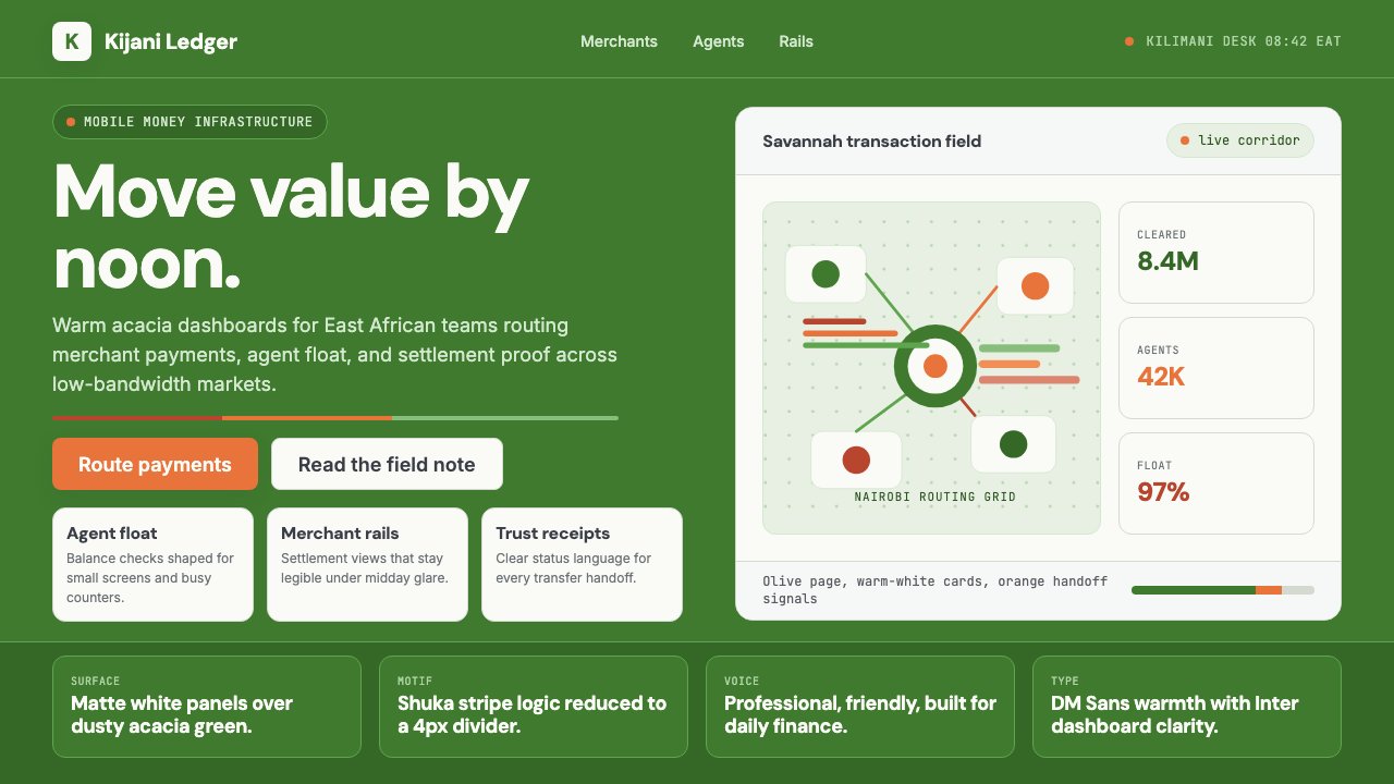
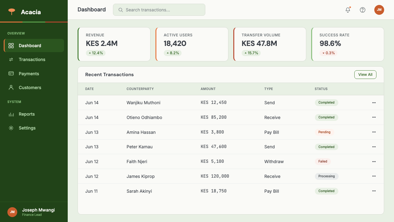
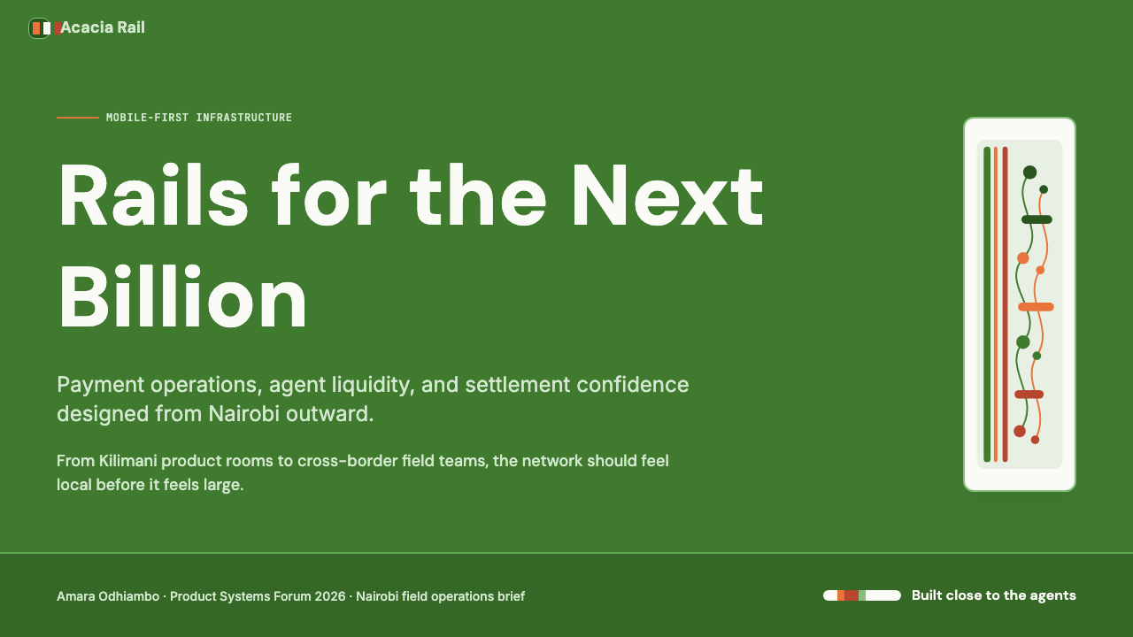
The foundational palette holds three registers in careful tension. An acacia olive-green — dusty and organic, closer to the savannah than to a corporate forest — serves as the primary brand color and is used for key actions, positive states, and navigational anchors. A Maasai-inspired warm orange occupies the accent register, deployed for calls to action, highlights, and data points that require human attention. Matte white provides the dominant surface, ensuring that both the olive and the orange read with full clarity without competing. Secondary neutrals — warm grays and light tans — soften transitions and support long-form content without introducing coldness.基础色板在三个层次之间保持微妙张力。金合欢橄榄绿——尘土质感、有机气息,更接近草原而非企业森林——作为核心品牌色,用于关键操作、正向状态与导航锚点。受马赛文化启发的日暖橙占据强调色层次,用于行动号召、高亮显示与需要吸引人眼的数据节点。哑光白色提供主导界面,确保橄榄绿与橙色都能以充分的清晰度呈现,互不竞争。暖灰与浅棕等次要中性色软化过渡,支撑长篇内容而不引入冷硬感。
Surface and Texture界面质感
Surfaces throughout this system are deliberately matte and flat. Cards sit on the white ground with gentle shadow lift rather than strong depth; the visual effect is of objects resting on a clean workspace rather than floating in digital space. There are no gradients simulating light or material — flatness is the default. Where texture appears, it is typographic or structural, not decorative: the subtle stripe of a section divider, the weight difference between a heading and a label, the deliberate emptiness of a margin that gives content room to land.整套系统的界面刻意保持哑光与平坦。卡片以柔和投影轻托于白色底面,视觉效果如同物体静置于整洁工作台,而非悬浮于数字空间。没有模拟光线或材质的渐变——平面性是默认状态。若有质感出现,它来自排版或结构,而非装饰:分节分隔线的细腻条纹,标题与标签之间的字重差异,为内容留出落点的刻意留白。
Structural Motifs结构性母题
The geometric stripe patterns of Maasai shuka cloth — bold bands of color traditionally worn as wraps and blankets — appear in reduced, abstracted form throughout this design system. At the macro level, a page might use a thin warm-orange horizontal band as a section break or a navigational landmark. At the micro level, data tables or card borders adopt stripe rhythms that echo the same cultural source without literal reproduction. The motif works because it is structural rather than decorative: a divider that happens to carry cultural resonance, rather than a decorative flourish applied to a neutral layout.马赛舒卡布料的几何条纹图案——传统上作为披布与毯子穿戴的大胆色带——以简化、抽象的形式贯穿整套设计系统。在宏观层面,一个页面可能用一条细暖橙水平带作为分节断点或导航地标;在微观层面,数据表格或卡片边框采用呼应同一文化来源的条纹节律,而非字面再现。这一母题之所以有效,是因为它是结构性的而非装饰性的:一条恰好携带文化共鸣的分隔线,而非叠加在中性版面上的装饰花饰。
Typography字体排印
The typographic approach prioritizes clarity across diverse contexts and screen sizes. Display settings favor humanist sans-serif typefaces — forms that carry warmth and approachability rather than the cold geometry of strict modernist grotesques. Body text is set with generous line height and comfortable measure, reflecting the need for legibility in financial contexts where misreading a number or a label has real consequences. Hierarchy is established through weight and size contrasts that are deliberate and wide — headline, subhead, label, and body each occupy clearly distinct registers, making the structure scannable without requiring decoration.排版方式优先考虑跨场景与屏幕尺寸的清晰度。展示文字选用人文主义无衬线字体——承载温暖与亲近感的字形,而非严格现代主义怪诞体的冷硬几何形。正文排版采用充裕的行高与舒适的行宽,体现了金融语境对清晰度的需求——误读数字或标签在现实中会产生后果。层级通过刻意且跨度宽广的字重与尺寸对比建立——标题、子标题、标签与正文各自占据清晰可辨的层次,使结构无需装饰即可被扫视理解。
Photography and Imagery摄影与图像
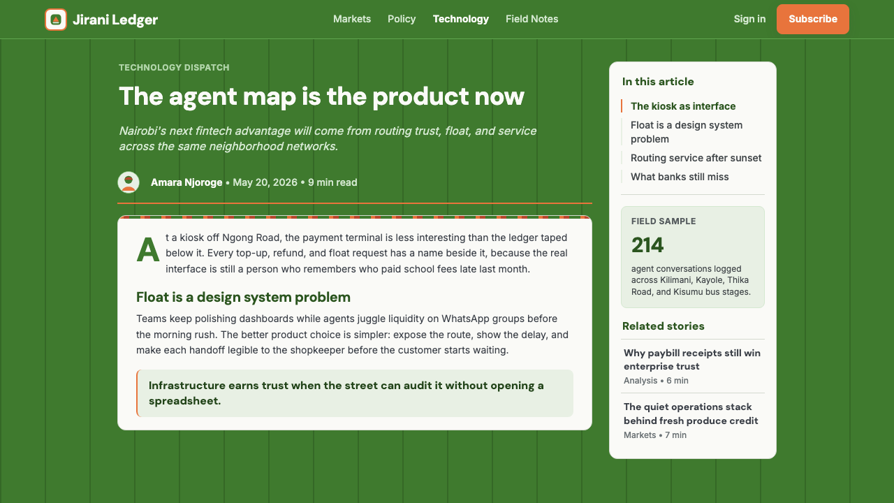
Photography in this style centers real African urban life: Nairobi street scenes, people using mobile phones in everyday contexts, market activity, office environments in Kilimani or Upper Hill. The imagery is candid and specific rather than aspirational and generic. When people appear, they are identifiably local — not the ethnically ambiguous 'global professional' of international stock photography. This specificity is a deliberate act of visual representation: it signals to the user that the product was built for them and their context, not adapted from a template designed elsewhere.这种风格的摄影聚焦真实的非洲城市生活:内罗毕街景,人们在日常情境下使用手机,市集活动,基利马尼或上山区的办公环境。图像是纪实而具体的,而非憧憬式的通用感。当人物出现时,他们具有清晰可辨的本地面貌——而非国际图库摄影中族裔模糊的「全球专业人士」。这种具体性是一种刻意的视觉表达行为:它向用户传递信号,这款产品是为他们和他们的情境而构建的,而非从别处设计的模板改编而来。
Data Visualization数据可视化
Transaction volume, growth metrics, and financial summaries are at the heart of many products built in this tradition, and the data visualization approach reflects this. Charts and graphs adopt the palette's olive and orange for primary data series, with neutral grays supporting comparison axes and secondary data. The orientation is practical rather than decorative: charts are legible at small sizes, consistent with the primary dataset labeled clearly and competing categories distinguished by value rather than hue. Pulse-like animations — green indicators rising and falling with live data — are used sparingly and purposefully, signaling activity without inducing anxiety.交易量、增长指标与金融摘要是这一传统中许多产品的核心,数据可视化方式正是对此的回应。图表以橄榄绿与橙色呈现主要数据系列,中性灰色支撑比较坐标轴与次要数据。取向是实用而非装饰的:图表在小尺寸下也清晰可读,主数据集标注清楚,竞争类别通过数值而非色相加以区分。脉冲式动效——随实时数据起伏的绿色指示器——使用克制而有目的,传递活跃状态而不引发焦虑。
Warmth as Function温暖作为功能
Perhaps the most distinctive characteristic of this aesthetic is that warmth is not decorative — it is functional. In a financial product, user trust is a design material as real as color or type. The matte olive-green projects steadiness; the warm orange signals energy without alarm; the matte surfaces avoid the visual fatigue that high-gloss or high-contrast interfaces produce in extended use. This warmth-as-function approach means that Silicon Savannah design typically ages better than purely trend-driven fintech aesthetics: because its core choices are grounded in user needs rather than visual fashion, they remain appropriate as trends shift.这套美学最鲜明的特征也许在于:温暖不是装饰性的——它是功能性的。在金融产品中,用户信任是一种设计材料,与色彩或字体同样真实。哑光橄榄绿传递稳重感;日暖橙传递能量而不令人警惕;哑光界面避免了高光泽或高对比度界面在长期使用中产生的视觉疲劳。这种「温暖即功能」的理念意味着,「硅草原」设计通常比纯粹潮流驱动的金融科技美学更经得起时间考验:因为其核心选择扎根于用户需求而非视觉时尚,随着潮流更迭,它们依然保持适切。
See the Nairobi Silicon Savannah design system →查看 Nairobi Silicon Savannah 完整设计系统 →
Who shaped Nairobi Silicon Savannah?谁塑造了 Nairobi Silicon Savannah?
Hersman co-founded iHub in Nairobi in 2010, creating the most prominent physical node in East Africa's emerging tech ecosystem. By providing a shared space where developers, designers, investors, and entrepreneurs could work alongside each other, iHub catalyzed a generation of products built for African markets. His work — including the Ushahidi crisis-mapping platform, which he also helped develop — demonstrated that world-class digital products could be designed and built in Nairobi, not just adapted from products designed elsewhere. iHub became the practical context in which Silicon Savannah design sensibilities were developed and transmitted.Hersman于2010年在内罗毕共同创立了iHub,打造了东非新兴科技生态系统中最重要的物理节点。通过为开发者、设计师、投资者与创业者提供共同工作空间,iHub催化了专为非洲市场构建的一代产品。他参与开发的Ushahidi危机地图平台证明,世界级数字产品可以在内罗毕设计和构建,而不仅仅是改编自他处的设计。iHub成为「硅草原」设计感性被开发和传播的现实土壤。
As Chief Executive of Safaricom from 2010 until his death in 2019, Collymore oversaw the period during which M-Pesa matured from a payments breakthrough into a full financial platform. Under his leadership, Safaricom's product design — the interface conventions, the trust signals, the visual language of mobile financial services in Kenya — reached its widest influence. His advocacy for digital inclusion and his emphasis on building products that genuinely served Kenyan users rather than imitating Western models contributed directly to the human-centered quality that distinguishes Silicon Savannah design from generic fintech aesthetics.作为Safaricom自2010年至2019年辞世前的首席执行官,Collymore主导了M-Pesa从支付突破成长为完整金融平台的阶段。在其领导下,Safaricom的产品设计——肯尼亚移动金融服务的界面惯例、信任信号与视觉语言——达到最广泛的影响力。他对数字普惠的倡导,以及他对真正服务肯尼亚用户而非模仿西方模式的强调,直接促成了「硅草原」设计区别于通用金融科技美学的以人为本品质。
Aboyeji co-founded Andela, which trained software engineers across Africa and placed them with global technology companies, and later founded Future Africa, an investment platform focused on African startups. His work was instrumental in articulating a vision for African technology that was not derivative of Silicon Valley — one that had its own values, aesthetics, and relationship to local context. By building institutions that developed African design and engineering talent, he helped create the professional infrastructure that makes a recognizable Silicon Savannah design identity possible.Aboyeji联合创立了Andela——在非洲各地培训软件工程师并将他们安置于全球科技公司——后来又创立了专注于非洲初创公司的投资平台Future Africa。他的工作对于阐明一种非硅谷衍生的非洲科技愿景至关重要——一种拥有自身价值观、美学与本地语境关系的愿景。通过构建培育非洲设计与工程人才的机构,他帮助创造了使可辨认「硅草原」设计身份成为可能的专业基础设施。
As co-founder of Twiga Foods, a Kenyan agritech and food distribution company, Njonjo built one of the most prominent examples of how Silicon Savannah design principles applied beyond fintech into adjacent sectors. Twiga's product and brand work demonstrated that the warmth, clarity, and local-cultural groundedness of East African digital design could serve supply-chain, agriculture, and logistics contexts as effectively as financial services. His work helped expand the design language's perceived applicability and influenced a broader generation of product builders across the region.作为肯尼亚农业科技与食品配送公司Twiga Foods的联合创始人,Njonjo构建了「硅草原」设计原则如何从金融科技延伸至相邻领域的最突出案例之一。Twiga的产品与品牌工作证明,东非数字设计的温暖感、清晰度与本地文化根基,可以在供应链、农业与物流领域发挥与金融服务同样有效的作用。他的工作帮助扩展了这套设计语言的感知适用范围,并影响了整个地区更广泛的一代产品建造者。
How do you use Nairobi Silicon Savannah today?今天怎么用 Nairobi Silicon Savannah?
Silicon Savannah is a style with strong contextual specificity: it works best for products that sit at the intersection of financial trust, human warmth, and practical utility. Applied thoughtfully, it carries immediate signals of seriousness and care; applied carelessly, it risks looking like a generic warm-green SaaS palette without cultural grounding. The key is understanding which choices are culturally generative — the shuka-derived stripe, the photography of specific places and people — and which are universally structural, such as the grid logic and typographic hierarchy.「硅草原」是一种具有强烈语境特异性的风格:它在金融信任、人文温度与实用性交汇处的产品中表现最佳。用心应用时,它立刻传递认真与关怀的信号;用心不足时,则可能沦为一套缺乏文化根基的通用暖绿SaaS色板。关键在于理解哪些选择具有文化生成力——源自舒卡的条纹,特定地点与人物的摄影——哪些是普遍结构性的,例如网格逻辑与排版层级。
For presentation slides, this style works with particular strength in fintech, impact investment, and regional development contexts. A cover slide benefits from a strong asymmetric composition anchored in the olive-green, with a warm-orange accent framing a headline at generous scale. Section slides should maintain the matte surface ethos: one organizing stripe as a divider, typography doing most of the structural work, and data presented in clearly labeled charts that use the palette's green for growth indicators and orange for attention states. When photography appears on a slide, it should be candid and specific — a real market scene, a real phone in a real hand — rather than polished studio imagery.在演示文稿中,这种风格在金融科技、影响力投资与区域发展领域尤为有力。封面幻灯片适合以橄榄绿为锚点的非对称构图,以日暖橙作强调色框住大尺度标题。分节幻灯片应保持哑光界面理念:一条组织性条纹作为分隔,排版承担大部分结构工作,数据以清晰标注的图表呈现——绿色用于增长指标,橙色用于需要注意的状态。幻灯片上出现的摄影应是纪实而具体的——真实的市集场景,真实的手持手机——而非精修的摄影棚图像。
For web dashboards and financial interfaces, the system translates directly. Define a column grid with comfortable gutters; anchor the primary navigation in olive-green or matte white with olive accents; use the warm orange exclusively for primary action buttons and alert states. Cards should carry very gentle shadow depth rather than flat borders — this is a style that values tactility even in its restraint. Data tables should apply stripe dividers at low contrast, echoing the shuka motif at a subtle register. Reserve animation for genuine data updates — a balance refreshing, a transaction confirming — rather than decorative motion.对于网页仪表盘与金融界面,这套系统可直接转化应用。定义带有舒适间距的列网格;以橄榄绿或带橄榄强调的哑光白色锚定主导航;将日暖橙专用于主要操作按钮与警示状态。卡片应承载极为柔和的投影深度而非平边框——这是一种即便在克制中也重视触感的风格。数据表格应以低对比度条纹分隔线,在细腻层次上呼应舒卡母题。动效保留给真实的数据更新——余额刷新,交易确认——而非装饰性运动。
For marketing and editorial work, the style supports confident, human-centered storytelling. A campaign layout might open with a full-bleed photograph of a Nairobi street scene, introduce the headline at large scale in a warm-neutral ground, and transition into content blocks that alternate the olive and the orange as accent colors. Editorial articles benefit from a wide left margin carrying pull-quotes in the olive-green, with body text set at a comfortable measure in warm near-black. The overall tone should avoid the clinical distance of pure white modernism — this is a style that invites the reader in rather than impressing them from a distance.对于营销与编辑内容,这种风格支持自信而以人为本的叙事。一个活动版面可能以满幅内罗毕街景照片开篇,在暖中性底面上以大尺度引入标题,然后过渡到以橄榄绿与橙色交替作为强调色的内容区块。编辑文章受益于宽阔左侧留白——以橄榄绿承载引言,正文以舒适行宽排在暖近黑色调中。整体基调应避免纯白现代主义的临床距离感——这是一种邀请读者走进来而非从远处令人印象深刻的风格。
A common mistake when applying this style is over-saturating the palette or using all its elements simultaneously at full intensity. Authentic Silicon Savannah work is restrained: the olive and orange appear at measured weights, not competing loudly for attention. A second mistake is treating the shuka stripe motif as a decorative flourish rather than a structural element — thick decorative banding at the expense of content clarity undermines the system's purpose. The photography choices matter as much as the color: substituting generic stock imagery for specific, local, human-centered photography produces a result that borrows the color palette but loses the cultural honesty that gives this design language its authority.应用这种风格时常见的错误是过度饱和色板,或同时以全强度使用所有元素。真实的「硅草原」作品是克制的:橄榄绿与橙色以有分量的方式出现,而不是大声竞争注意力。第二个错误是将舒卡条纹母题视为装饰花饰而非结构性元素——以牺牲内容清晰度为代价的粗厚装饰条纹,破坏了系统的目的。摄影选择与色彩同样重要:以通用图库素材替代具体、本地、以人为本的摄影,会产生一种借用了色板却失去了文化诚实性的结果——而正是这种诚实性,赋予这套设计语言权威感。
See the Nairobi Silicon Savannah design system →查看 Nairobi Silicon Savannah 完整设计系统 →
Nairobi Silicon Savannah — FAQNairobi Silicon Savannah · 常见问题
Is this style only appropriate for African markets?这种风格只适合非洲市场吗?
No. Silicon Savannah's underlying visual logic — warm, confident, matte, structured with subtle cultural motifs — is not geographically restricted in the way that, say, a style dependent on specific script or iconography might be. Its palette and surface choices work well for any fintech, impact, or SaaS product that wants to project warmth without sacrificing professional authority. The cultural specificity is an asset rather than a limitation: in a global market saturated with cold modernist fintech interfaces, a design language that is visibly grounded in a real place and tradition reads as distinctive and trustworthy rather than niche.不。「硅草原」的基础视觉逻辑——温暖、自信、哑光、以细腻文化母题构建结构——并不像某些依赖特定文字或图形符号的风格那样受地理限制。其色板与界面选择适用于任何希望在不牺牲专业权威的前提下传递温暖感的金融科技、影响力或SaaS产品。文化特异性是一种资产而非限制:在充斥着冷硬现代主义金融科技界面的全球市场中,一套清晰扎根于真实地域与传统的设计语言,读来是独特而值得信赖的,而非小众的。
How does this style differ from standard Material Design or generic fintech modernism?这种风格与标准 Material Design 或通用金融科技现代主义有何区别?
Material Design is a universal system designed to be culturally neutral and infinitely scalable across products. Silicon Savannah is a specific aesthetic tradition rooted in a particular place, history, and set of user relationships. The surface differences are visible — Material Design permits elaborate elevation systems and shadow hierarchies, while Silicon Savannah keeps surfaces matte and shadow minimal; Material Design's color system is built around dynamic theming, while Silicon Savannah's olive-and-orange palette is culturally inflected and intentional. But the deeper difference is philosophical: Material Design asks 'what is universally correct?' while Silicon Savannah asks 'what is right for these users, in this place, with this history?'Material Design是一套旨在文化中立、可跨产品无限扩展的通用系统。「硅草原」则是扎根于特定地域、历史与用户关系集合的具体美学传统。表面差异清晰可见——Material Design允许精细的高度系统与阴影层级,而「硅草原」保持哑光界面与极简投影;Material Design的色彩系统围绕动态主题构建,而「硅草原」的橄榄绿与橙色色板是有文化意涵的、刻意的。但更深层的差异是哲学性的:Material Design问的是「什么是普遍正确的?」而「硅草原」问的是「对于这些用户、在这个地方、带着这段历史,什么是正确的?」
Can the shuka stripe motif be used decoratively, outside its structural role?舒卡条纹母题可以脱离其结构角色、作为纯装饰使用吗?
Technically yes, but it produces a weaker result. The power of the shuka stripe as it appears in Silicon Savannah design comes from its dual function: it is simultaneously a structural element (a divider, a navigational landmark, a rhythm marker) and a cultural reference. When it is used purely decoratively — as a background pattern, a border embellishment, or a graphic element without structural purpose — it loses its structural contribution and becomes pastiche: a borrowed visual motif without the logic that gives it meaning. The best applications of the stripe use it where structure is already needed, letting the cultural resonance arrive as a secondary effect of a decision that was already justified on functional grounds.技术上可以,但结果会更弱。舒卡条纹在「硅草原」设计中的力量来自其双重功能:它同时是结构性元素(分隔线、导航地标、节律标记)和文化参照。当它被纯粹用作装饰——作为背景图案、边框点缀,或无结构目的的图形元素——它失去了结构性贡献,沦为拟古:一种借用的视觉母题,却缺少赋予其意义的逻辑。条纹最好的应用方式是将其用于本已需要结构的地方,让文化共鸣作为一个功能上已有合理依据的决定的次要效果自然到来。
How should this style handle dark mode?这种风格应如何处理深色模式?
Dark mode is an area of genuine tension for this style. The matte white surface is foundational to how the acacia olive and Maasai orange read — both colors were calibrated for warmth against a light ground. On a dark surface, the olive-green can shift toward a cooler, murkier tone, and the orange risks reading as overly aggressive. A successful dark variant requires deliberate recalibration: lightening the olive slightly toward a more luminous sage, softening the orange to a less saturated amber, and ensuring that the matte quality of surfaces is preserved by avoiding high-gloss or high-contrast dark backgrounds. The cultural warmth that defines the light-mode system should be preserved in the dark mode treatment rather than sacrificed to convention.深色模式对这种风格而言是真正的张力区域。哑光白色界面对于金合欢橄榄绿与马赛橙的呈现至关重要——两种颜色都是针对浅色底面的温暖感而校准的。在深色界面上,橄榄绿可能偏向更冷、更混浊的色调,而橙色则面临显得过于强烈的风险。成功的深色变体需要刻意重新校准:将橄榄绿略微提亮,趋向更具光泽的鼠尾草绿;将橙色柔化为饱和度较低的琥珀色;并通过避免高光泽或高对比度深色背景,确保界面的哑光品质得以保留。浅色模式系统所定义的文化温暖感,应在深色模式处理中加以保存,而非牺牲于约定俗成。
What makes this style feel trustworthy in a financial context?是什么让这种风格在金融语境中给人以信赖感?
Several interlocking choices produce the sense of trustworthiness. The matte surfaces signal restraint rather than glossy aspiration — they suggest a product confident enough not to need visual showmanship. The olive-green has an organic, grounded quality that reads as stable rather than volatile. The photography of real people in real places creates a sense that the product understands and respects its users' actual context. The typographic clarity — generous hierarchy, clean labels, no ambiguity between primary and secondary information — signals that the product has nothing to hide. And the cultural groundedness itself is trust-building: a design that is honest about where it comes from communicates, by analogy, that the product it represents is honest about what it does.若干相互咬合的选择共同产生了信赖感。哑光界面传递克制而非光鲜的抱负——暗示一款自信到无需视觉炫技的产品。橄榄绿具有有机、扎实的品质,读来是稳定而非易变的。真实地点真实人物的摄影,创造出一种产品理解并尊重用户实际语境的感受。排版的清晰度——充裕的层级,清晰的标签,主次信息之间无歧义——传递出产品无需隐瞒任何东西的信号。文化根基本身也是信任建构:一套对自身来处诚实的设计,类比地传递出它所代表的产品对自身功能诚实的信号。
Related design styles相关设计风格
 Shopify ModernMerchant ally, not corporate SaaS. Emerald actions on bordered white cards ca…商户盟友而非企业感:翡翠绿动作与白色描边卡片承载密集商业。
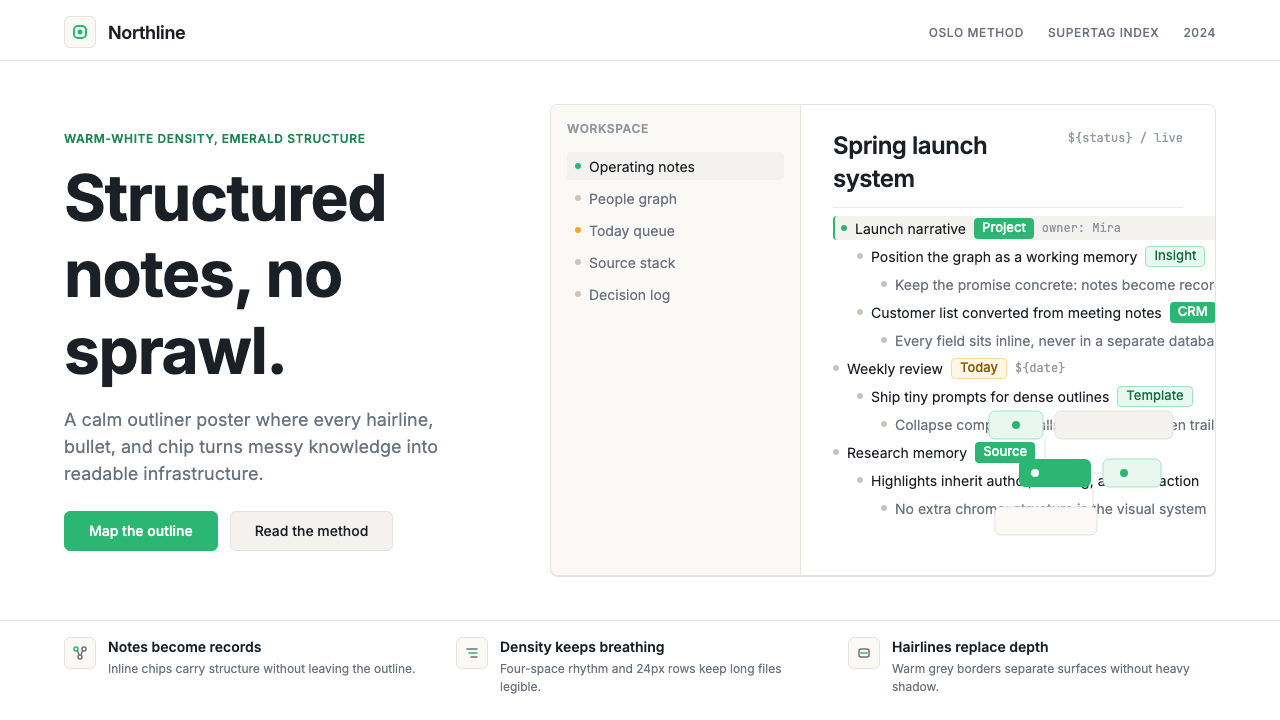 Tana SupertagsCalm density wins. Inter outlines and emerald chips punctuate pure white stru…冷静密度取胜:Inter 大纲与翡翠标签点亮纯白结构。
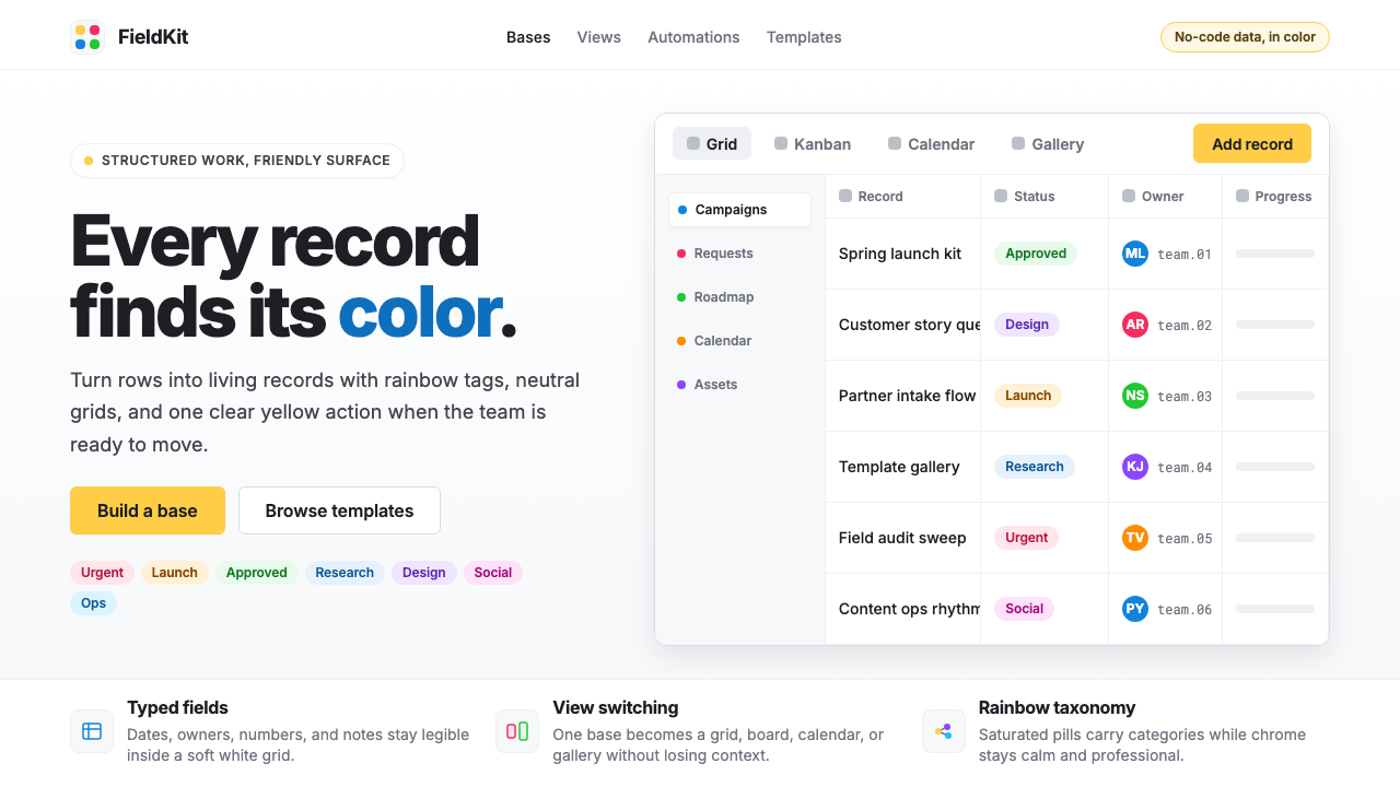 Airtable Spreadsheet-RainbowWork becomes celebratory. Inter grids stay white while rainbow pills and yell…工作变得欢快:白色 Inter 网格中,彩虹标签与黄色按钮点亮节奏。
 Atlassian Jira BlueWarm enterprise teamwork. Saturated blue cards on cream make status feel huma…温暖的企业协作:奶油底上的饱和蓝卡片,让状态更有人味。
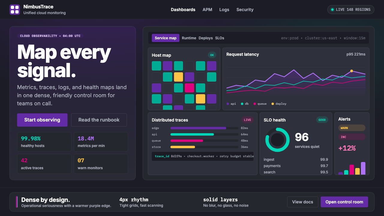 DatadogSerious telemetry, friendly pulse. Purple dark grids pack charts, badges, and…严肃监控也亲近:紫色暗网格塞满图表、徽章与追踪。
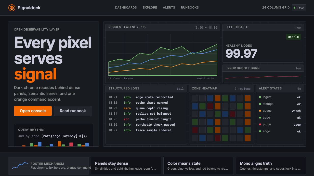 GrafanaData first, chrome last. Orange accent cuts through dense dark panels and sem…数据优先,界面退后:橙色强调穿透深色密集面板与语义图表。